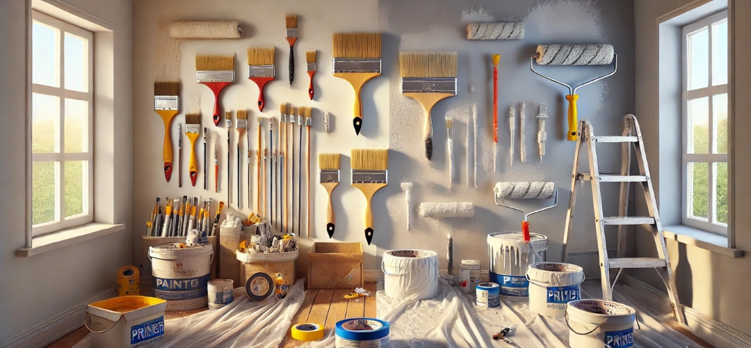
How to Use Wall Putty for a Smooth Surface Before Painting
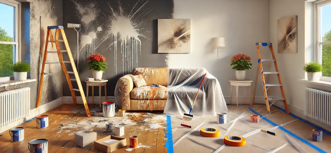
A flawless paint finish begins with a smooth and even surface. Walls that are cracked, uneven, or full of imperfections can ruin the final look, no matter how premium the paint quality is. This is where Wall Putty becomes indispensable. Wall Putty is the secret weapon that helps achieve a polished and professional appearance by filling in imperfections and creating a uniform surface.
In this guide, we’ll explore the importance of Wall Putty, its benefits, types, and a step-by-step process to use it effectively. By the end, you’ll be equipped to prepare your walls for painting with confidence and ease.
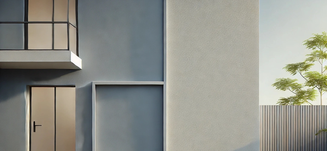
Importance of a Smooth Surface Before Painting
The smoothness of your wall surface plays a crucial role in determining the final paint outcome. Uneven or damaged walls can lead to visible cracks, patches, and an overall unappealing look. A smooth surface ensures:
- Better Paint Adhesion: Paint adheres evenly to a smooth surface, resulting in a durable and long-lasting finish.
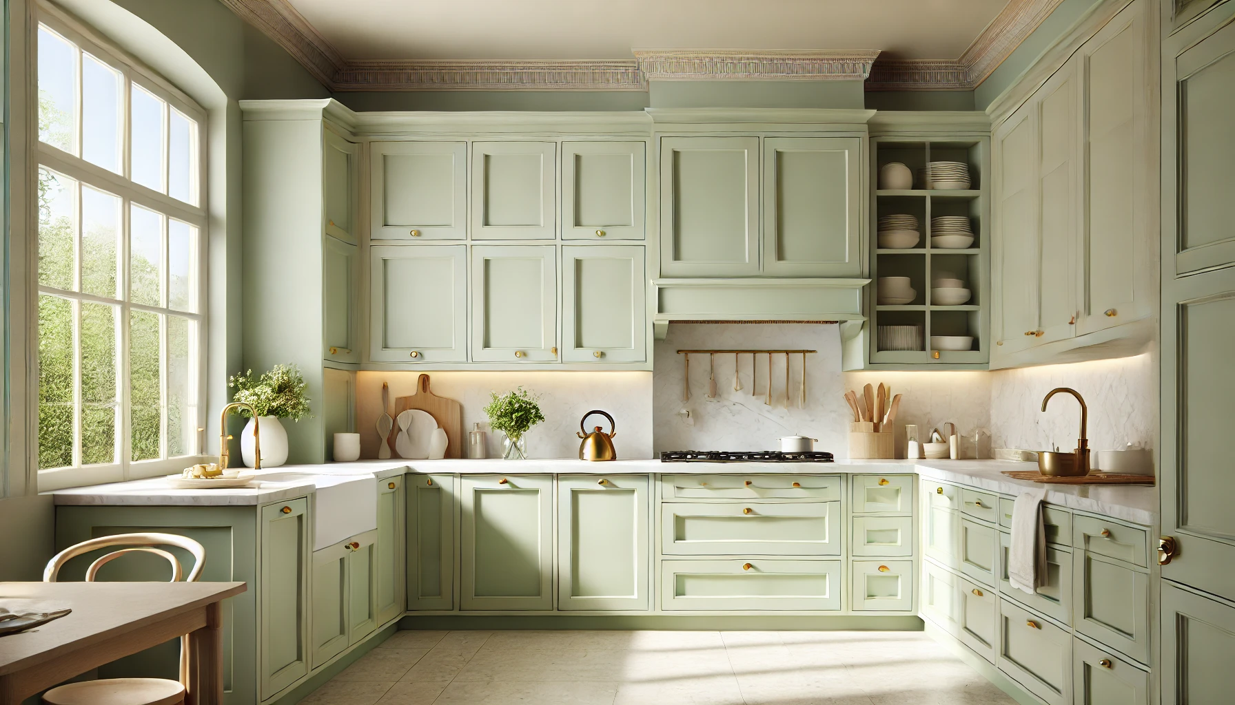
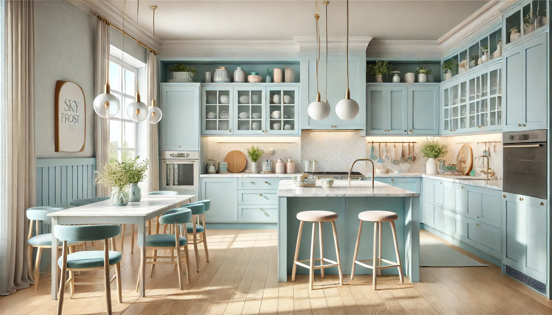
- Enhanced Appearance: A polished surface brings out the true beauty and vibrancy of your chosen paint colour.
- Cost Efficiency: A smooth base reduces paint consumption, preventing wastage due to uneven absorption.

Benefits of Wall Putty in Achieving Perfection
Using Wall Putty offers several advantages, making it an essential step in the painting process:
- Fills Cracks and Holes: Wall Putty seals gaps and imperfections, creating a level surface.
- Improves Paint Longevity: By providing a stable base, putty prevents peeling, cracking, and flaking of paint.
- Enhances Paint Finish: It ensures a uniform texture, allowing paint to glide on smoothly for a flawless result.
- Works on Multiple Surfaces: Wall Putty is versatile and can be applied to plastered walls, concrete, and even previously painted surfaces.
What is Wall Putty and Why is it Important?
Wall Putty is a white cement-based compound used to prepare walls for painting. It is applied to interior or exterior surfaces to smoothen imperfections and enhance the paint’s adhesion. Its importance lies in its ability to:
- Level Uneven Surfaces: Provides a consistent base for painting.
- Prevent Moisture Damage: Protects walls from dampness, especially in exterior applications.
- Improve Wall Strength: Adds durability to weak or damaged surfaces.
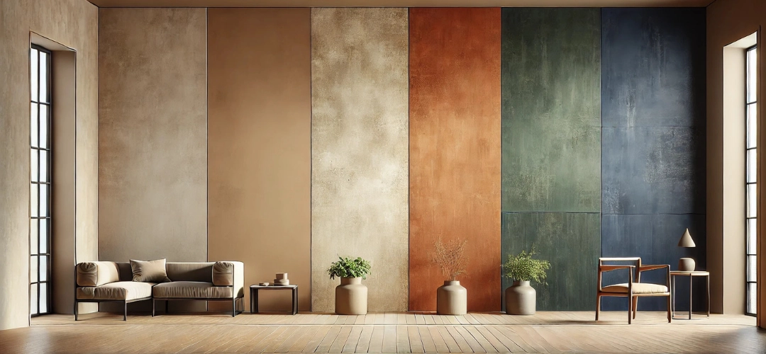
Types of Wall Putty and Their Uses
Wall Putty comes in different types, each designed for specific applications:
- White Cement-Based Putty
- Best for interior and exterior walls.
- Provides an even and durable finish.
- Acrylic Wall Putty
- Ideal for interior walls.
- Provides a rich and smooth finish
- Flexible and quick-drying, suitable for minor repairs.
When and Where to Use Wall Putty
Wall Putty can be used on both interior and exterior walls but serves different purposes in each setting:
- Interior Walls: Used to create a polished base for decorative paints, enhancing the aesthetic appeal.
- Exterior Walls: Applied to protect surfaces from weather elements and improve the durability of exterior paint.
Step-by-Step Process for Using Wall Putty
1. Cleaning the Wall
Before applying Wall Putty, clean the surface thoroughly. Remove dust, grease, and loose particles using a damp cloth or sandpaper. For exterior walls, pressure washing may be necessary.
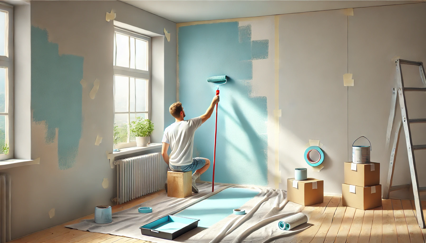
2. Mixing and Applying Wall Putty
- Mixing: Combine the putty powder with water as per recommended ratio Stir continuously to form a smooth, lump-free paste.
- First Coat: Apply the first layer evenly with a trowel. Let it dry completely (usually 6–8 hours).
- Second Coat: Apply a thinner second coat to refine the surface and achieve uniformity.
Once the putty is dry, use fine-grit sandpaper (220–240) to smoothen the surface. This step ensures an even texture, ready for painting.
Tips for Best Results
- Avoid Over-Mixing: Over-mixing can introduce air bubbles, affecting the application.
- Work in Thin Layers: Thick coats take longer to dry and may crack. Always apply thin, even layers.
- Check for Consistency: Ensure the putty paste is smooth and free from lumps for optimal application.

Common Errors to Avoid During Application
- Skipping Surface Cleaning: Dirt or grease on the wall can prevent the putty from adhering properly.
- Rushing the Drying Process: Allow sufficient time for each layer to dry before proceeding.
- Using the Wrong Type of Putty: Choose the right putty based on the surface and intended use.
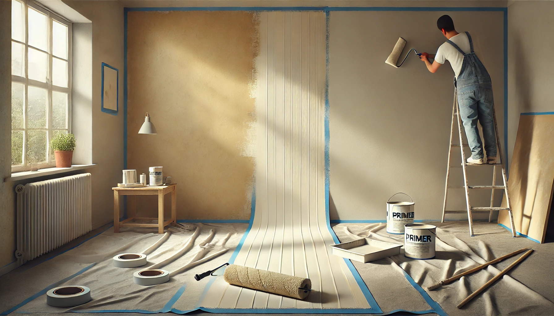
Preparing the Wall for Painting After Putty
After the Wall Putty application is complete, it’s essential to prime the surface before painting. Primer helps seal the putty, enhances paint adhesion, and prevents stains from bleeding through. Apply a high-quality primer evenly over the putty-coated surface and allow it to dry thoroughly. This step ensures your paint finish is vibrant and long-lasting.
Conclusion
Wall Putty is a crucial step in achieving a flawless paint finish. From filling cracks to creating a smooth, durable surface, its role in preparing walls cannot be overstated. By understanding the types of putty, proper application techniques, and preparation tips, you can elevate the quality of your painting projects and transform your space with ease.
Whether you’re repainting a single room or refreshing your entire home, Wall Putty ensures your walls are ready to showcase their best look. Invest time in preparation, and your final paint finish will speak volumes about your attention to detail.