You are using an outdated browser. Please upgrade your browser to improve your experience.

Top Blue Paint Shades for Modern Interiors and Exteriors in 2026

Top Blue Paint Shades for Modern Interiors and Exteriors in 2026

Blue as the Most Versatile Colour for Contemporary Indian Architecture

Among all colour families, blue continues to stand out as one of the most adaptable and enduring choices for Indian homes. Its ability to feel calm yet confident, modern yet timeless, makes it especially relevant for contemporary architecture in 2026.

In Indian contexts, blue carries both emotional and practical value. It reflects openness and tranquillity while responding well to varied lighting conditions, climates, and design styles. Whether used subtly indoors or boldly on exteriors, blue effortlessly bridges aesthetics and functionality, making it a preferred choice for homeowners seeking balance rather than excess.

Trending Blue Shades for 2026: Calm, Grounded, and Contemporary

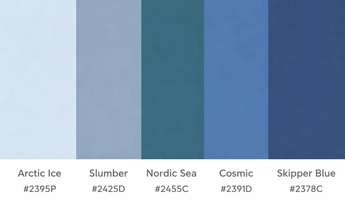
The blue palette for 2026 moves away from loud or overly saturated tones, leaning instead towards softer, more sophisticated shades that feel grounded and liveable.

Key blue shades shaping modern interiors and exteriors include:

  • Arctic Ice (2395P) – A light, airy shade that introduces freshness without feeling cold
  • Slumber (2425D) – A grey-infused blue offering depth and architectural elegance
  • Nordic Sea (2455C) – A balanced blend of blue and green, ideal for contemporary Indian homes
  • Cosmic (2391D) – Industrial yet refined, perfect for modern facades and accents
  • Skipper Blue (2378C) – Rich and expressive, adding drama without overwhelming a space

These shades work well because they adapt easily to both minimal and layered design approaches, making them suitable for long-term use rather than short-lived trends.

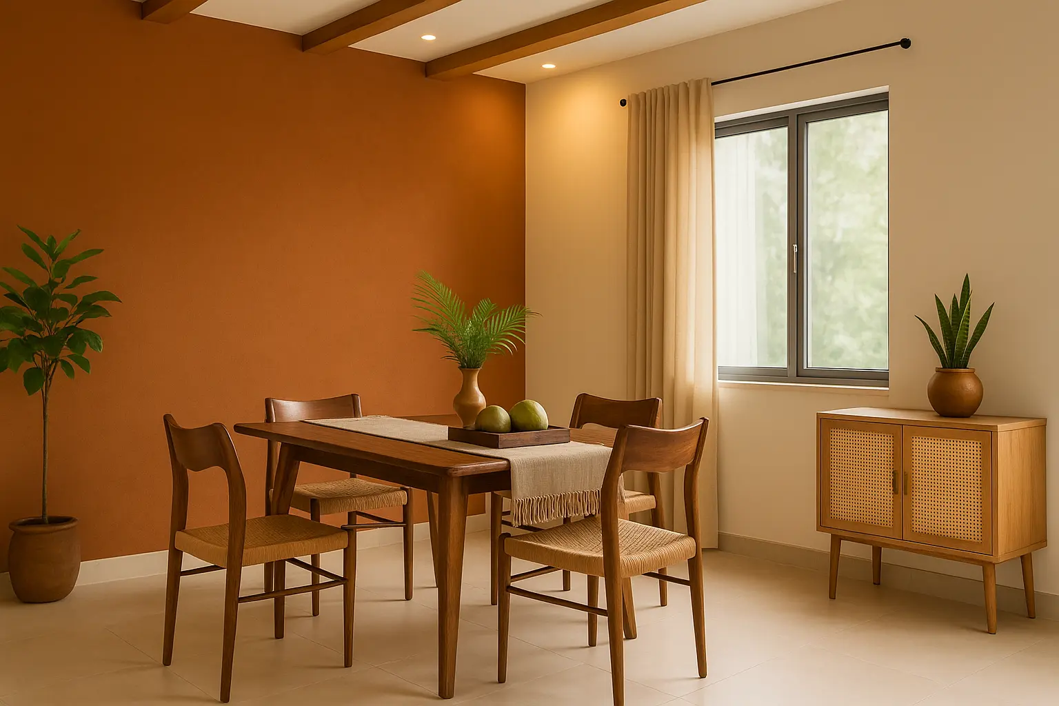
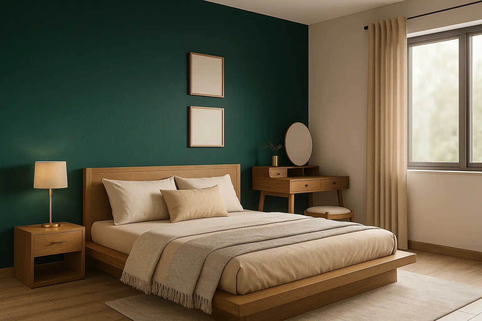
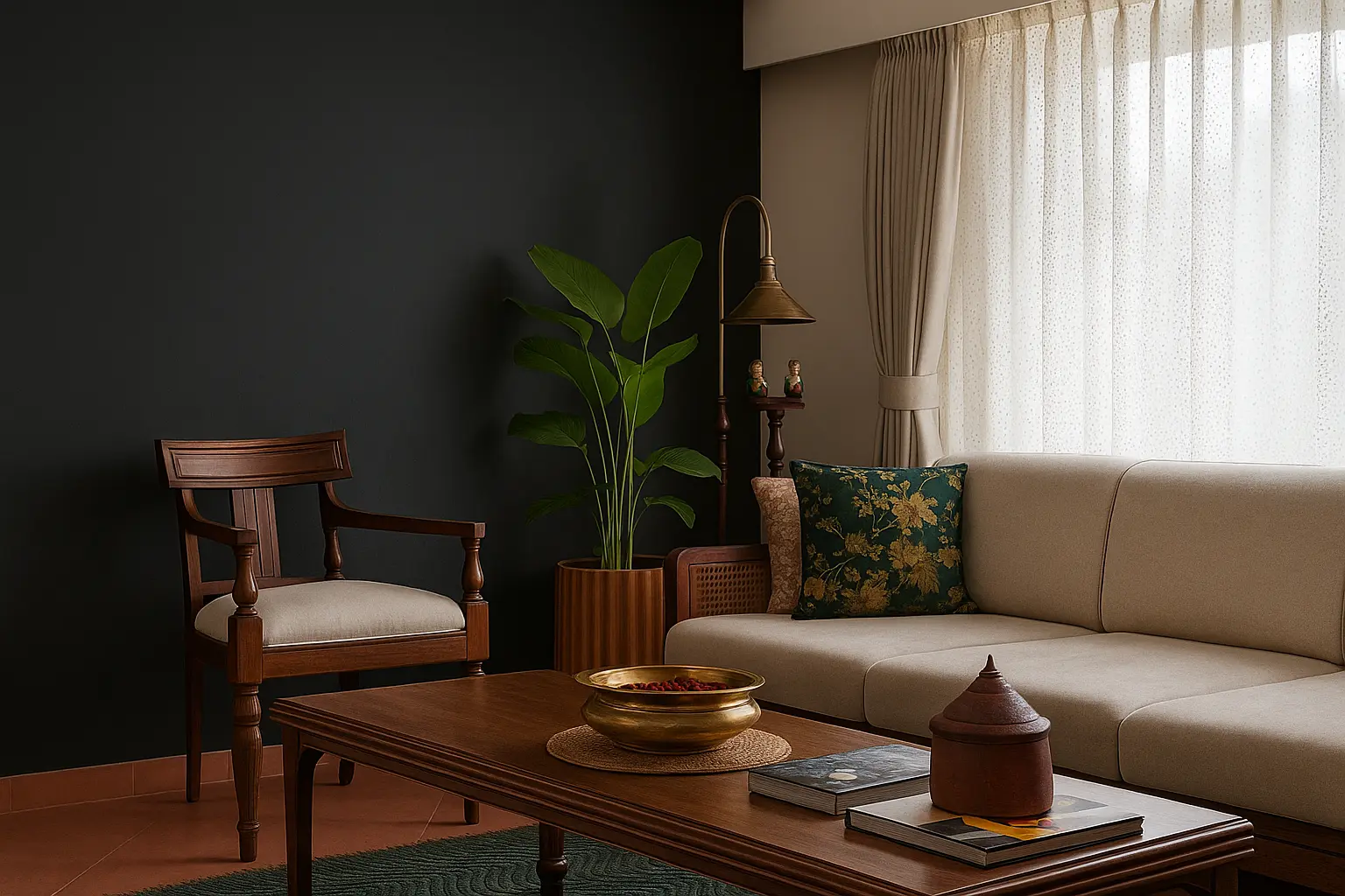
Interior Applications: Creating Calm, Functional Living Spaces

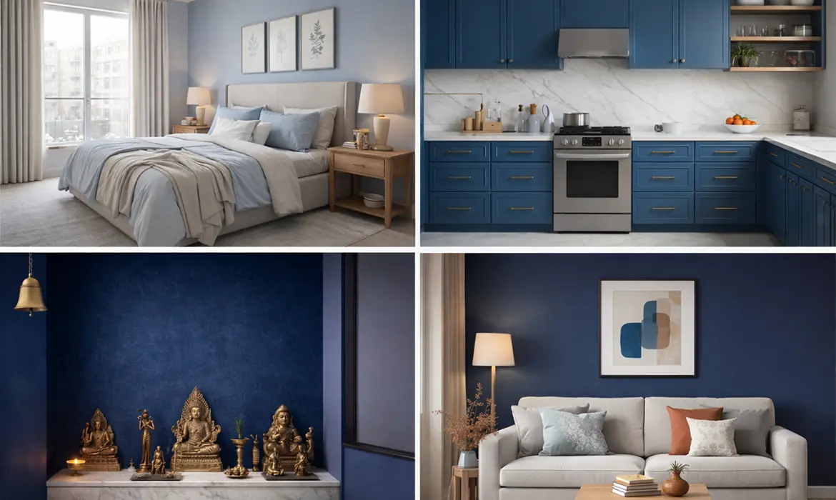
Blue has a unique ability to influence mood indoors, making it particularly effective in spaces meant for rest, focus, and everyday living.

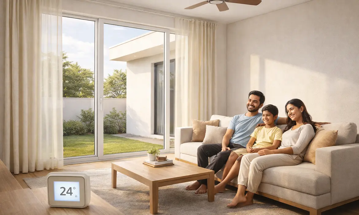
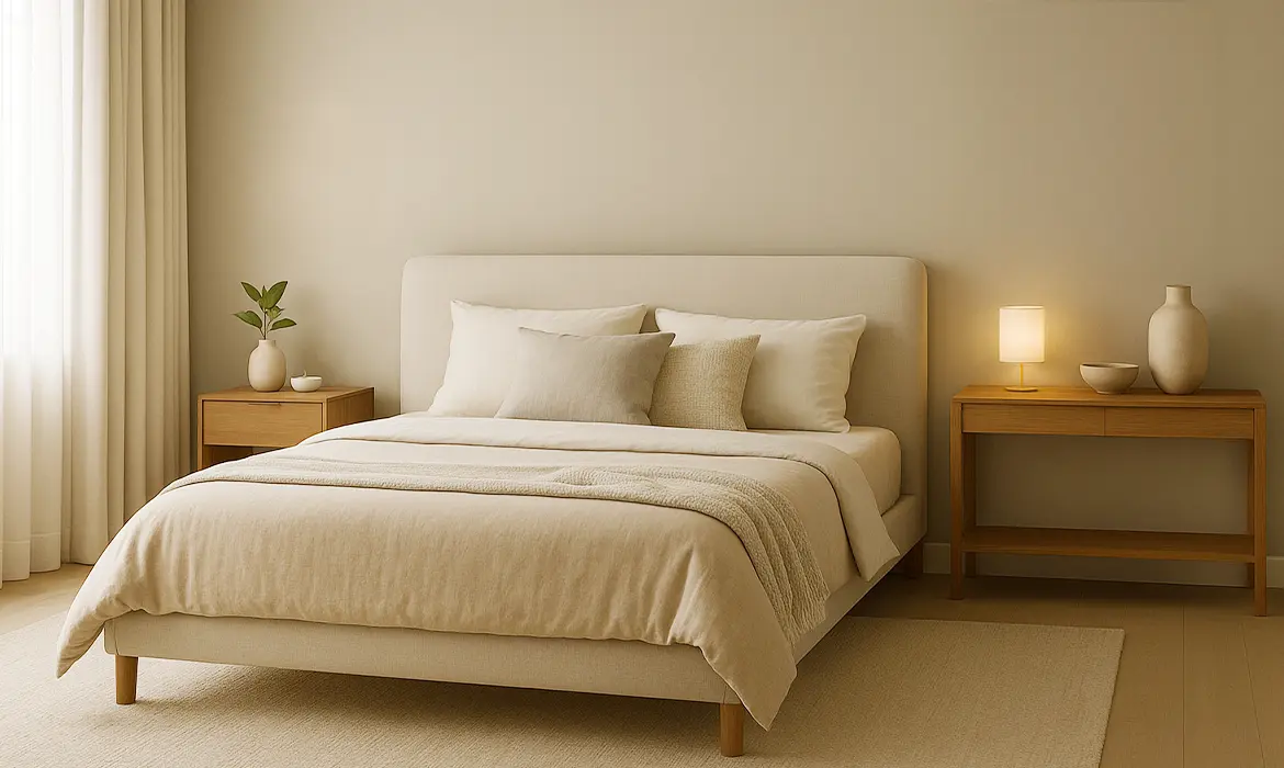
In bedrooms, softer blues like powder blue or slate blue shades promote relaxation and emotional balance. These shades help create restful environments, especially important in urban Indian homes where external noise and visual clutter are common.

For kitchens, teal blue and steel blue shades offer a modern alternative to whites and greys. They bring freshness while still feeling clean and structured, especially when paired with neutral cabinetry or natural stone finishes.

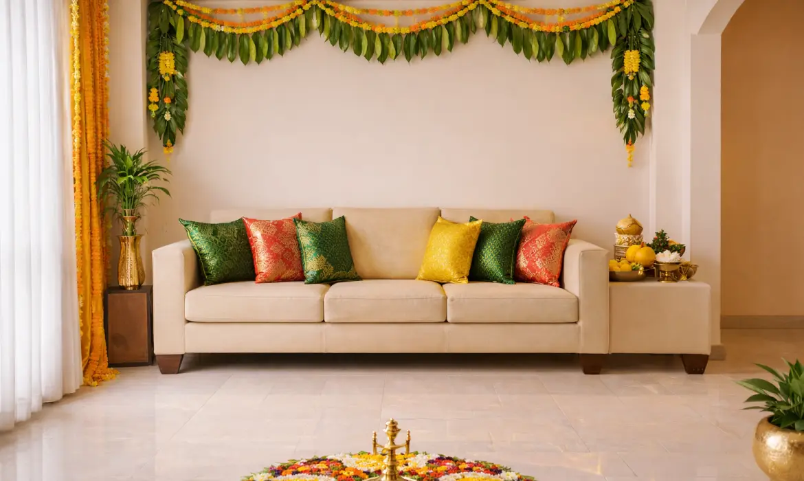
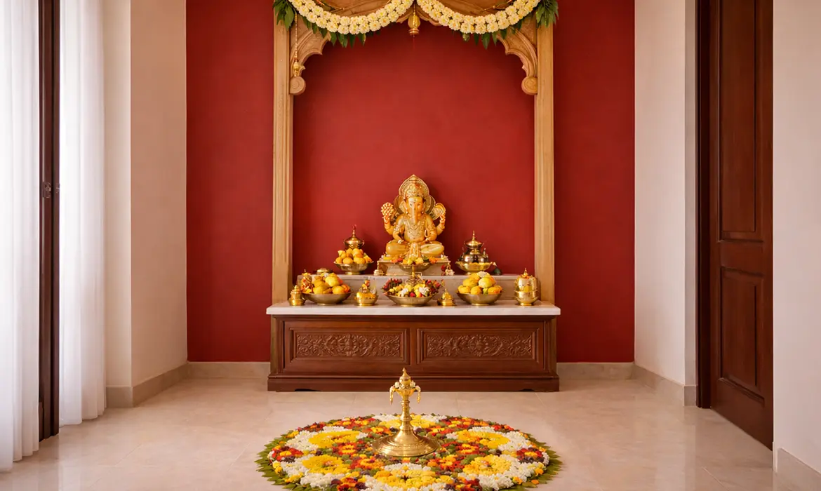
In pooja rooms, blue particularly deeper shades like indigo blue shade adds a sense of serenity and spiritual depth. When used sparingly, it enhances the sacred atmosphere without distracting from traditional elements.

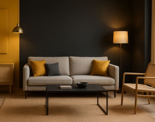
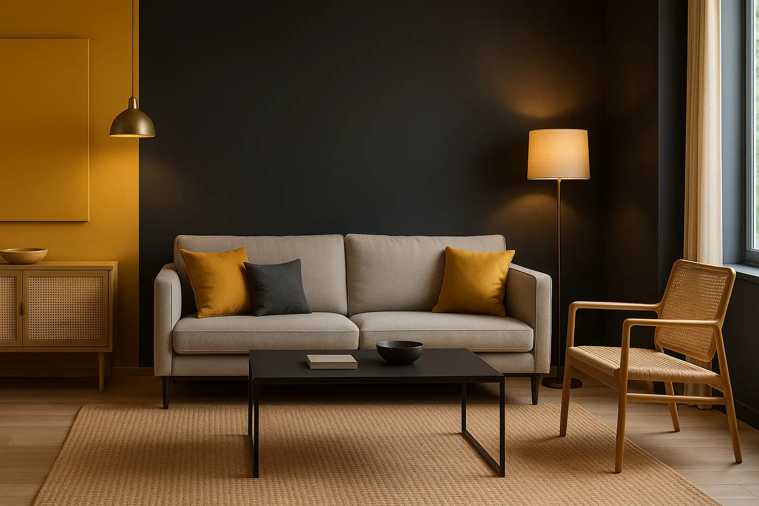
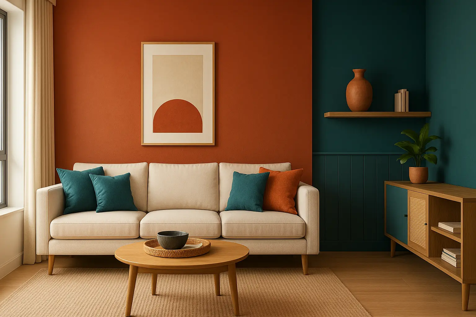
As accent walls, deeper blues create focal points in living rooms or dining areas. They add visual interest while allowing other elements, such as furniture and artwork, to stand out naturally.

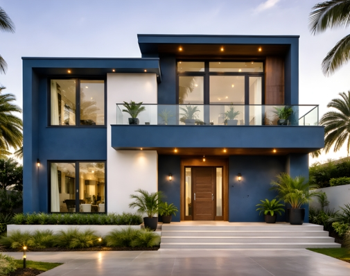
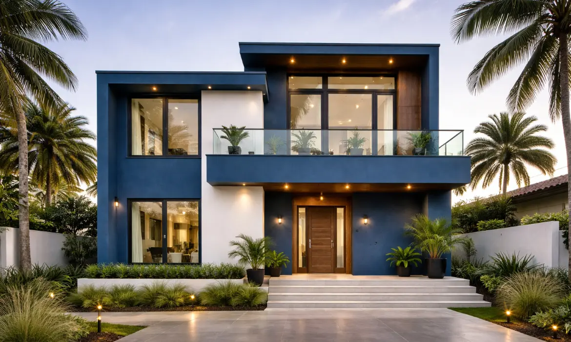
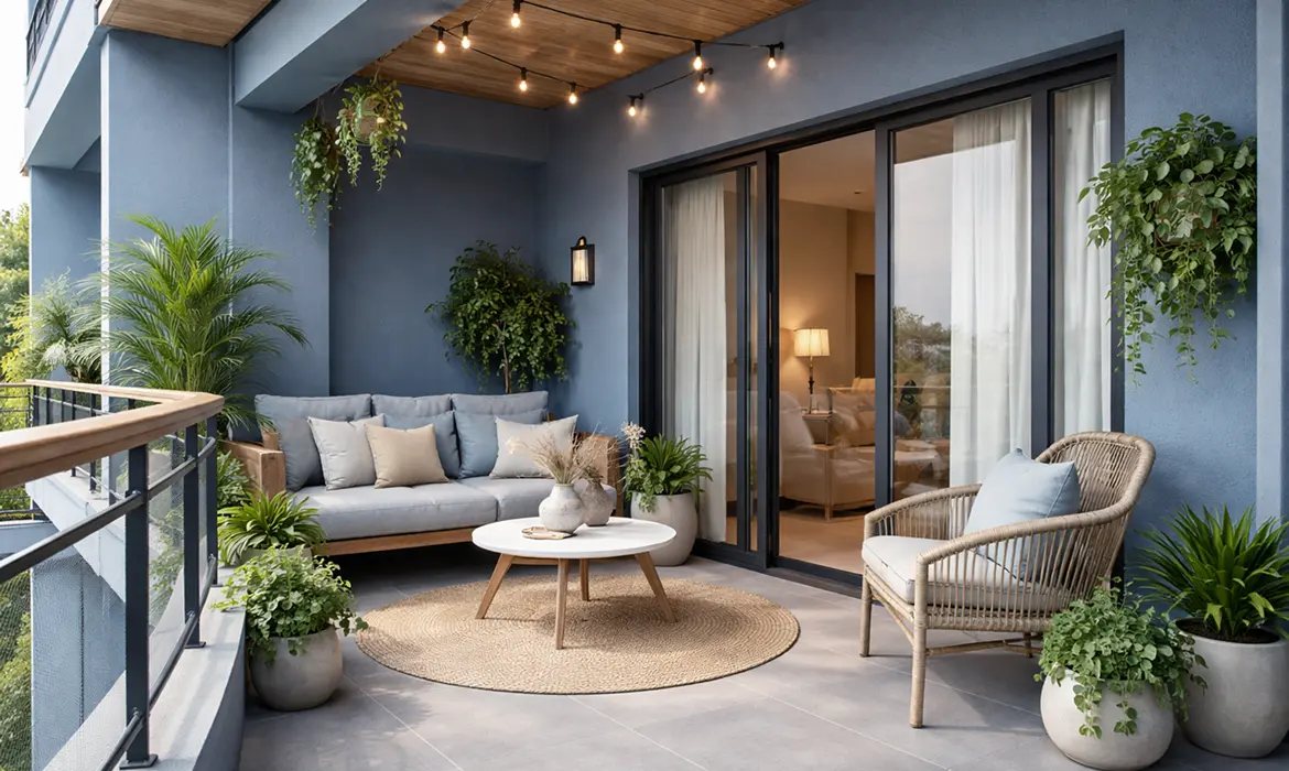
Exterior Applications: Strong Visual Identity with Practical Benefits

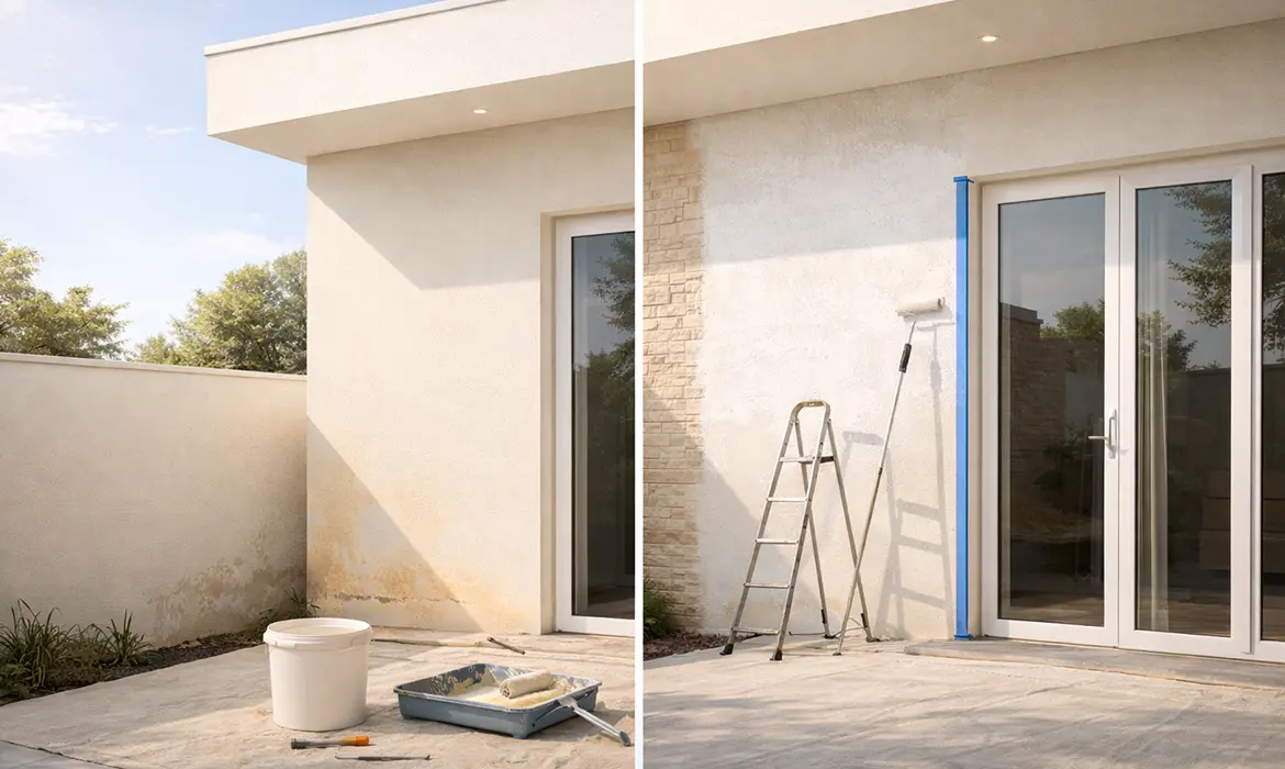
Blue is increasingly being embraced for exteriors, not just for its visual appeal but also for its performance in Indian conditions.

Common exterior applications include:

  • Facades, where slate blue or steel blue lends a contemporary architectural character
  • Balconies, using muted blues to create calm transitions between indoor and outdoor spaces
  • Compound walls, where deeper blues provide contrast while hiding dust and stains
  • Coastal homes, where blue tones naturally complement the surrounding environment

Unlike very light or very dark colours, mid-tone blues age gracefully on exteriors. They resist looking faded too quickly and maintain a neat appearance even in dusty or humid conditions.

Best Colour Pairings: Enhancing Blue with Balance

Blue becomes most effective when paired thoughtfully with complementary tones and textures. The right combinations prevent it from feeling cold or overpowering.

Some of the most successful pairings include:

  • White and off-white for a clean, timeless contrast
  • Sandstone beige to add warmth and softness
  • Charcoal grey for a bold, modern edge
  • Natural wood finishes to bring balance and organic warmth

These pairings work across both interiors and exteriors, allowing homeowners to maintain a cohesive colour story throughout the property.

Climate Suitability: Designed for Indian Summers and Beyond

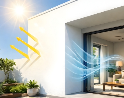
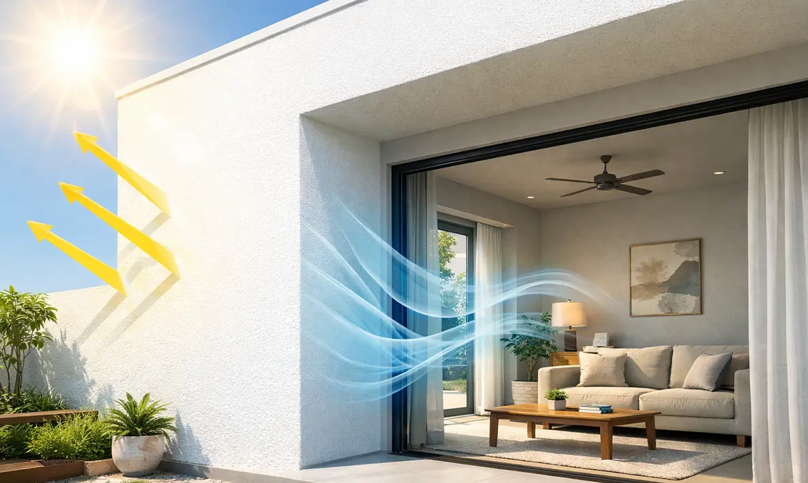
One of blue’s greatest strengths lies in its climate-friendly nature. In a country where heat, dust, and humidity are constant design considerations, blue performs exceptionally well.

Lighter blues create a visual cooling effect, making interiors feel more comfortable during long summers. Even on exteriors, blue tones absorb less visual heat compared to darker shades, contributing to a cooler overall appearance.

Muted and mid-tone blues are also more forgiving when it comes to dust and pollution, helping walls retain a fresh look for longer periods. This makes them a practical choice for homes in both urban and semi-urban areas.

A Colour That Evolves with Modern Indian Homes

Blue’s continued popularity in 2026 is no coincidence. It adapts effortlessly to changing lifestyles, architectural styles, and environmental needs. From calm bedrooms to striking facades, blue offers a design solution that is both expressive and enduring.

With thoughtfully developed shades suited to Indian light and climate, Indicus Paints offers blue palettes that balance style with performance. Each shade is crafted to feel contemporary yet timeless, ensuring homes look relevant not just today, but for years to come.

Because when chosen well, blue isn’t just a colour it’s a foundation for modern Indian living.

How Indicus HeatSeal Ensures Long-Term Protection for Your Home Roof

How Indicus HeatSeal Ensures Long-Term Protection for Your Home Roof

Your roof is your home’s first line of defence against extreme weather conditions, ensuring comfort, durability, and energy efficiency. Over time, exposure to intense sunlight, heavy rains, and fluctuating temperatures can lead to cracks, leaks, and structural damage, reducing the lifespan of your roof.

Indicus Heatseal is a revolutionary heat-reflective and waterproof coating designed for long-term roof protection. With its advanced thermal insulation, UV resistance, and anti-algal properties, it safeguards your home while reducing maintenance efforts and energy consumption. This article explores why roof protection is essential, the technology behind Indicus Heatseal, and how it ensures lasting durability for years to come.

Importance of Roof Protection

A well-maintained roof does more than shield your home from rain and heat; it plays a critical role in maintaining your home’s structural integrity and energy efficiency. Without adequate protection, roofs become vulnerable to cracks, leaks, and damage, leading to costly repairs.

Key Benefits of Roof Protection:

Preserves Structural Integrity – Prevents weather-related deterioration such as cracks and moisture damage.

Improves Indoor Comfort – Reduces heat absorption, keeping indoor temperatures cooler.

Enhances Energy Efficiency – Minimises the need for air conditioning, resulting in lower energy costs.

Reduces Maintenance Costs – Prevents frequent repairs caused by weather-related wear and tear.

Common Roof Issues Faced by Homeowners

Homeowners often experience roof deterioration due to constant exposure to environmental stressors. Some of the most common issues include:

1. Heat and UV Radiation

  • Excessive sun exposure causes roof materials to fade, degrade, and absorb heat, leading to higher indoor temperatures.

2. Water Infiltration & Leakage

  • Heavy rains can cause moisture seepage, weakening structural components and encouraging mould growth.

3. Cracks and Thermal Expansion

  • Fluctuating temperatures lead to constant expansion and contraction, resulting in visible cracks and weakening of the roof surface.

4. Algae and Fungal Growth

  • High humidity encourages algae, fungi, and moss formation, making roofs slippery and unsightly.

Understanding the Indicus Heatseal Technology

Indicus Heatseal is designed using advanced microsphere technology to reflect heat, resist water, and prevent damage. This innovative coating acts as a protective shield, ensuring your roof remains intact for years.

Key Features of Indicus Heatseal:

Microsphere Technology – Gas-filled thermoplastic bubbles within the coating create thermal insulation, reducing heat penetration.

High Solar Reflectance – The glossy white finish reflects solar radiation, preventing heat buildup.

UV and IR Resistance – Blocks harmful UV and infrared rays, reducing material degradation.

Waterproofing Barrier – Forms a seamless, water-resistant coating to prevent leaks.

Anti-algal Protection – Prevents fungal and moss growth, keeping roofs clean and durable.

How Indicus Heatseal Ensures Long-Term Protection

Unlike standard coatings, Indicus Heatseal is designed for lasting performance. Its high-durability formula ensures that it can withstand extreme weather conditions year after year, reducing the need for frequent repainting or repairs.

1. Extended Lifespan of Your Roof

  • The coating bridges cracks up to 0.5 mm, preventing further damage and reinforcing roof integrity.
  • Resists wear and tear, ensuring long-term protection with minimal maintenance.

2. Long-Term Energy Efficiency

  • By reflecting up to 85% of sunlight, Indicus Heatseal reduces roof surface temperatures significantly.
  • Lowers indoor temperatures by up to 10°C, leading to reduced air conditioning usage and lower electricity bills.

3. Dual Protection Against Heat & Water Damage

  • Acts as a thermal insulator in summer and a waterproof shield during monsoons.
  • Prevents moisture penetration, reducing the risk of leaks, dampness, and mould formation.

4. Minimal Maintenance for Years to Come

  • The coating is designed to be self-cleaning, meaning less accumulation of dirt and organic growth.
  • Requires only periodic checks and cleaning, making it an effortless long-term solution.

Easy Application and Maintenance

Indicus HeatSeal is formulated for hassle-free application with a simple three-step process:

Step 1: Surface Preparation

  • Clean the roof surface thoroughly, removing dirt, dust, and loose debris.
  • Ensure there are no existing leaks or cracks before application.

Step 2: Application of Indicus Heatseal

  • Apply the first coat evenly using a brush or roller.
  • Allow it to dry completely before applying the second coat for best results.

Step 3: Drying & Final Inspection

  • Let the coating cure properly to form a strong, durable layer.
  • Perform a final check to ensure uniform coverage and smooth finish.

Invest in Indicus Heatseal for Long-Lasting Roof Protection

Your roof endures constant exposure to harsh weather, making long-term protection essential for comfort, safety, and cost efficiency. Indicus Heatseal is the ultimate solution, combining heat reflectivity, waterproofing, and durability to extend the lifespan of your roof while ensuring energy efficiency.

By investing in Indicus Heatseal, you get a sustainable, high-performance coating that keeps your home cooler, drier, and protected for years – reducing maintenance hassles and saving on repair costs.

Make the smart choice today! Upgrade your roof with Indicus Heatseal and experience superior long-term protection.

How Exterior Waterproof Paint Helps Prevent Damp Patches Indoors

How Exterior Waterproof Paint Helps Prevent Damp Patches Indoors

In Indian homes, damp patches on walls are more than just an aesthetic problem, they are a sign of deeper moisture infiltration that can damage your interiors, weaken structures, and even affect health. For many homeowners, these damp marks first appear during the monsoon or in highly humid conditions, often spreading quickly and causing peeling paint.

The good news? There’s an effective way to stop the issue before it even begins. Exterior waterproof paint is designed to act as the first line of defence, protecting your home from rain, humidity, and harsh weather. Instead of waiting to repair damp patches inside, you can prevent them altogether by addressing the source: the outer walls.

1. Stops Moisture at the Source: Creating a Strong Protective Barrier

The outer walls of your home are constantly exposed to the elements. Rainwater, humidity, and even micro-cracks in the plaster can allow moisture to seep inside, slowly damaging your walls from within. This is often why dampness seems to “mysteriously” appear indoors, because the root cause lies outside.

Exterior waterproof paint solves this problem by forming a tough, water-resistant layer on the surface of the wall. Think of it as a shield that prevents moisture from entering in the first place.

Why it matters:

  • Proactive Protection: Instead of fixing dampness after it appears, waterproof coatings prevent it altogether.
  • Long-Lasting Results: When applied properly, waterproof paints protect walls for years, reducing the need for repeated repairs.
  • Added Strength: Many modern waterproof paints also strengthen wall surfaces, helping them resist cracks and weathering.

By addressing moisture at its source, you’re not only safeguarding your interiors but also extending the life of your home’s structure.

2. Protects Interior Surfaces: Safeguarding Walls and Décor

What happens outside inevitably shows up inside. When rainwater or humidity infiltrates exterior walls, the consequences are visible on interior walls. Damp patches don’t just spoil the look of your space, they compromise comfort and health as well.

Here’s how exterior waterproof paint helps:

  • Prevents Damp Patches
    Stop water seepage before it can create those unpleasant dark marks indoors.
  • Reduces Peeling or Bubbling Paint
    By keeping walls dry, it prevents paint films from lifting or cracking over time.
  • Blocks Mould and Mildew Growth
    Moisture is the breeding ground for mould, which can trigger allergies and breathing issues. Waterproofing keeps your interiors healthier.
  • Preserves Décor and Furnishings
    Dampness can extend beyond walls, damaging wooden furniture, electrical fittings, and decorative elements close to the wall.

Beyond these protective benefits, waterproof exterior paints also ensure that your interiors remain visually appealing for longer. Imagine investing in a freshly painted living room only for it to be ruined by damp patches a few months later. With the right exterior solution, that worry is taken care of before it even arises.

3. Ideal for Indian Weather: Built for Rain, Humidity, and Heat

India’s climate is as diverse as its culture. Homes face heavy monsoon showers in coastal areas, high humidity in the east and south, and scorching summers in central and northern regions. Standard paints often cannot cope with this range of challenges.

Indicus Godry Waterproofing Solutions are engineered to endure exactly these conditions, offering all-round protection.

Designed to withstand:

  • Heavy Monsoon Rains
    Rainwater is one of the biggest culprits for damp patches. Waterproof paints repel water, stopping it from soaking into walls.
  • High Humidity Levels
    Coastal and tropical regions often face year-round dampness. Special formulations resist moisture accumulation, keeping walls dry.
  • Intense Summer Heat
    Heat can cause cracks in ordinary paint layers, allowing water to seep in during the next rains. Waterproof coatings remain flexible and intact, reducing structural stress.

Why this matters for homeowners:

  • Durability Across Seasons: One product provides year-round protection, regardless of whether it’s the peak of summer or the height of monsoon.
  • Lower Maintenance Costs: By avoiding repeated repainting or patch repairs, you save significantly in the long run.
  • Peace of Mind: A home protected on the outside ensures comfort and safety on the inside.

By choosing Indicus Paints waterproof solutions, homeowners can enjoy not just protection but also aesthetic beauty, since these paints are available in modern, weather-resistant shades that enhance the exterior look of the home.

Conclusion: Exterior Protection, Interior Comfort

Damp patches are a common problem across Indian homes, but they don’t have to be inevitable. By addressing the root cause, moisture infiltration from exterior walls, you can ensure long-term comfort, durability, and visual appeal for your interiors.

Exterior waterproof paint offers:

  • A protective barrier against moisture.
  • Interior safety from damp patches, peeling paint, and mould.
  • A solution tailored to Indian weather, from monsoons to summer heat.

At Indicus Paints, our Godry waterproof coatings are designed with the Indian home in mind. They provide reliable, long-lasting defence while keeping your home’s aesthetic intact. By investing in the right exterior paint today, you not only prevent costly repairs tomorrow but also ensure that your interiors remain as inviting and comfortable as you envisioned.

Protect your walls, preserve your décor, and keep dampness where it belongs, outside your home.

Cooler Homes in 2026: Which Is the Best Time to Plan Heat Protection Coatings

Cooler Homes in 2026: Which Is the Best Time to Plan Heat Protection Coatings

As the year begins, many homeowners look for meaningful upgrades that improve comfort, efficiency and long-term value. While interior makeovers often take priority, exterior and terrace coating protection is one of the smartest ways to start the year, especially in regions with intense summers like Tamil Nadu.

Homeowners prepare their homes well before peak temperatures arrive, combining durable exterior paints designed for local climate conditions with heat-reflective terrace coatings to ensure a cooler, more comfortable living environment throughout 2026.

Start the Year with a Cooler, Smarter Home

The start of the year represents a fresh start, making it the ideal time to invest in practical home improvements. Instead of reacting to summer heat, proactive planning helps homeowners stay ahead of seasonal challenges.

While exterior walls protect the structure, the terrace or roof is the primary source of heat entry into a home. This is where heat-reflective coatings play a critical role. Applied exclusively on terraces, these coatings are engineered to reflect a significant portion of solar radiation, reducing heat transfer into the living spaces below.

When heat-reflective terrace coatings are applied early in the year, they act as a protective thermal shield long before summer sets in, delivering noticeable indoor comfort during the hottest months.

Understanding Tamil Nadu’s Climate Challenges

Tamil Nadu’s climate poses unique challenges for homeowners, particularly from March onwards. High temperatures, prolonged heat waves, humidity and intense sun exposure place constant stress on both terraces and exterior walls.

These conditions can:

  • Increase indoor heat retention
  • Accelerate surface deterioration
  • Cause cracks, damp patches and weather-related wear
  • Reduce the lifespan of exterior finishes

Waiting until summer to address these issues often leads to rushed decisions and compromised results.

Which Is the Ideal Month for Planning

The most favourable weather conditions in Tamil Nadu for exterior and terrace preparation. Mild temperatures and low moisture levels make it ideal for surface repairs, coating application and curing.

Early planning supports:

  • Thorough surface inspection and crack repairs
  • Proper terrace preparation
  • Better adhesion and curing of coatings
  • Avoidance of summer heat-related application issues

Coatings applied under stable conditions perform better, last longer and deliver consistent results.

The Right Combination for Tamil Nadu Homes

Heat-Reflective Coating for the Terrace

There is no such thing as heat-reflective coating for walls. These coatings are specifically designed for terraces and roofs, where direct sun exposure is highest.

A product like Heatseal, when applied on the terrace, helps:

  • Reflect solar heat
  • Reduce indoor temperature buildup
  • Protect the roof slab from thermal stress
  • Enhance waterproofing and durability

This makes it an essential component for summer-ready homes in Tamil Nadu.

Forto Exterior Emulsion Paint for Walls

For exterior walls, a climate-appropriate paint like Forto is a practical choice. While it does not reflect heat like a terrace coating, it is formulated to withstand Tamil Nadu’s harsh weather conditions.

Forto exterior paint offers:

  • Strong resistance to sun exposure and humidity
  • Protection against surface damage and fading
  • Long-lasting colour and finish
  • Reliable performance in coastal and high-heat regions

When paired with a heat-reflective terrace coating, Forto helps complete the home’s exterior protection system.

Step-by-Step Planning Tips for Homeowners

Choosing the Right Products

This combination addresses both heat control and long-term durability.

Scheduling Application and Preparation

  • Plan professional application
  • Schedule surface repairs
  • Prepare terraces and walls without urgency

Surface Preparation Matters

For best results:

  • Clean terraces thoroughly
  • Repair cracks and damaged plaster
  • Ensure proper waterproofing layers before coating
  • Apply recommended primers for exterior walls

Proper preparation ensures maximum performance and lifespan of both products.

Styling and Maintenance Tips

Exterior Colour Choices

Light and neutral exterior shades work well with Forto, maintaining a clean, contemporary appearance while handling sun exposure effectively.

Regular Maintenance

Even high-performance solutions benefit from upkeep. Annual inspections, terrace cleaning and timely touch-ups help maintain protection and appearance year after year.

Preparing for the Summer Ahead

Once application is complete:

  • Inspect drainage and water outlets on the terrace
  • Ensure no pooling or surface damage
  • Check shaded areas and exterior fixtures

This holistic approach ensures your home remains comfortable, resilient and protected throughout peak summer.

Conclusion

A cooler home is not the result of last-minute summer fixes, it begins with smart, early planning. By combining Indicus Heatseal heat-reflective terrace coatings with Indicus Forto exterior emulsion for walls, homeowners can effectively prepare their homes in Tamil Nadu for prolonged and intense heat conditions.

With Indicus Paints, homeowners can significantly improve indoor comfort, reduce heat stress on the structure and ensure long-lasting exterior protection throughout 2026.

Colours of Puthandu: Traditional Tamil New Year Shades for Your Homes

Colours of Puthandu: Traditional Tamil New Year Shades for Your Homes

Significance of Colours in Puthandu and Tamil Cultural Traditions

Puthandu, the Tamil New Year as it marks gratitude and the hopeful beginning of another year filled with prosperity and harmony. Across Tamil households, preparation for this festival begins with cleaning, decorating, and refreshing living spaces and colour plays a deeply symbolic role in this transformation.

In Tamil culture, colours are never chosen at random. They carry meaning rooted in tradition, spirituality, and nature. From the bright hues of festive kolams at the entrance to the rich tones of silk sarees and temple décor, colour becomes a language of celebration. Incorporating these traditional shades into home interiors during Puthandu is not only culturally meaningful but also visually uplifting.

Today, many homeowners are rediscovering these timeless palettes, adapting them thoughtfully to suit contemporary interiors while retaining their symbolic depth.

Traditional Colour Palette

The traditional colours of Puthandu are inspired by nature, harvest, and sacred rituals. These hues are vibrant, warm, and filled with life.

Key shades associated with Tamil New Year celebrations include:

  • Mango Yellow – A bright, joyful tone symbolising harvest and auspicious beginnings
  • Vermilion Red – A sacred shade associated with strength, energy, and devotion
  • Turmeric Gold – A warm golden-yellow reflecting purity and prosperity
  • Leaf Green – Representing growth, fertility, and renewal
  • Coconut White – A clean, calming shade symbolising peace and spiritual clarity

These colours are visible in everyday festival elements from mango leaf garlands (thoranams) to turmeric powder used in rituals. When thoughtfully incorporated into interiors, they bring authenticity and cultural richness to modern homes.

Symbolism of Shades

Each colour used during Puthandu carries a layered meaning, rooted in Tamil traditions and spiritual beliefs.
  • Prosperity: Mango yellow and turmeric gold are strongly associated with wealth and abundance. They mirror the colour of ripened crops and the warmth of the sun, signifying success and fullness.
  • Positivity: Vermilion red embodies vitality and auspiciousness. It energises spaces and is often seen in temple décor and festive adornments.
  • Renewal: Leaf green represents fresh beginnings, echoing the renewal of nature during harvest cycles.
  • Purity and Harmony: Coconut white brings balance to brighter tones, ensuring the home feels serene rather than overwhelming.
Together, these shades create a harmonious palette that celebrates life while encouraging optimism for the year ahead.

Where to Use Them

Introducing festive colours does not require a complete home overhaul. Instead, strategic placement can make a meaningful impact while maintaining elegance.

Entrance Walls

The entrance sets the tone for the home. Soft mango yellow or turmeric gold walls create an inviting first impression. Paired with traditional kolam patterns and brass lamps, the effect feels warm and celebratory.

Pooja Rooms

This is where deeper symbolism shines. Vermilion accents or muted gold backgrounds enhance the spiritual atmosphere. Leaf green can be used sparingly to add freshness without overpowering sacred elements.

Living Spaces

In living rooms, consider incorporating these shades through:

  • Accent walls in softened mango or muted terracotta-red
  • Cushions or throws in leaf green
  • Decorative pieces in gold and brass

The key is balance allowing vibrant hues to enhance rather than dominate the space.

Dining Areas

Dining spaces benefit from warm tones such as turmeric gold and soft red accents. These shades stimulate conversation and create a welcoming environment for festive meals shared with family.

Modern Adaptation: Bringing Tradition into Contemporary Homes

While traditional colours are vibrant, modern interiors often favour subtler palettes. The solution lies in adaptation rather than dilution.

Instead of bold, saturated shades, homeowners can explore:

  • Pastel mango instead of bright yellow
  • Muted terracotta-red instead of intense vermilion
  • Soft sage green as a refined alternative to bright leaf green
  • Warm ivory in place of stark white

These softened tones maintain cultural authenticity while blending seamlessly with minimalist furniture and contemporary layouts.

Additionally, using these colours as accents rather than covering entire rooms ensures that the décor feels sophisticated and suitable for year-round living.

Why It Works Today: Festive Yet Timeless

In modern Indian interiors, there is a growing appreciation for culturally rooted design. Rather than following fleeting global trends, homeowners are embracing palettes that reflect heritage while maintaining elegance.

Puthandu colours work beautifully today because:

  • They are emotionally meaningful, not just visually appealing.
  • They suit India’s warm climate, where sunlit interiors enhance golden and earthy tones.
  • They transition easily from festive décor to everyday sophistication.

A soft mango-toned wall can feel celebratory during Tamil New Year and remain cheerful throughout the year. Leaf green accents provide freshness in every season. Coconut white keeps spaces balanced and breathable.

By choosing the right intensity and placement, these shades remain timeless rather than seasonal.

A Celebration of Heritage Through Colour

Puthandu offers an opportunity to reconnect with tradition in a deeply personal way. Refreshing your home with culturally significant colours transforms walls into expressions of optimism, gratitude, and renewal.

Whether through a subtle accent wall, festive décor updates, or thoughtfully curated material pairings, the colours of Tamil New Year bring warmth and identity into contemporary homes. They celebrate prosperity, positivity, and abundance values that extend far beyond a single day.

By blending tradition with modern sensibilities, homeowners can create interiors that honour heritage while embracing the present as a true reflection of what Puthandu stands for: new beginnings rooted in timeless culture.

At Indicus Paints, we believe that colour is more than decoration, it is an expression of culture, emotion, and identity. The shades inspired by Puthandu beautifully combine tradition with contemporary living, allowing homes to feel festive yet refined throughout the year.

Top 10 Elegant Wall Shades That Age Beautifully Over Time

Top 10 Elegant Wall Shades That Age Beautifully Over Time

Choosing the right wall colour is more than just a design decision, it’s an investment. Elegant, timeless shades not only elevate your interiors but also continue to look refined as years pass. In Indian homes, where lighting, décor, and furniture evolve, opting for colours that age gracefully ensures longevity and a sense of continuity.

Indicus Paints offers a rich palette of over 1,000+ colours. Here are ten refined hues that strike the perfect balance between classic appeal and lasting charm.

The Charm of Timeless Colours

Timeless colours remain relevant across trends. They act as a neutral canvas, whether you’re layering décor, changing furniture, or updating accessories, they provide a stable backdrop. In Indian interiors, where architectural styles and décor influences vary widely, such shades offer both versatility and warmth.

These enduring tones:

  • Create a sense of harmony and calm.
  • Adapt well to different design styles, from modern minimalism to heritage-inspired homes.
  • Age attractively, without feeling dated or overused.

Factors That Make a Colour Age Gracefully

Not all colours are created equal when it comes to staying beautiful year after year. The ones that truly age well are backed by quality and thoughtful formulation. Here’s what makes a shade enduring:

  • Lightfastness & Pigment Quality: High-quality pigments resist fading even with prolonged exposure to sunlight.
  • Versatility: Shades that blend seamlessly with a variety of décor styles, from ethnic to contemporary.
  • Durability: Paint formulations that resist wear, scuffs, and dirt over time.
  • Emotional Comfort: Colours that feel familiar, calming, and inviting long after they are painted.

Indicus Paints uses advanced emulsion technology to deliver rich, resilient colours with outstanding washability and long-term vibrancy.

Top 10 Elegant Wall Shades That Age Beautifully

Here are ten refined shades from Indicus Paints’ colour range that bring timeless sophistication to any interior:

  1. Mission Beige (2078P) – A gentle, neutral shade that feels cosy and classic. Ideal for living rooms or corridors.
  2. Taupe Gray (2913P) – A balanced mix of grey and beige, offering a modern but soft touch.
  3. Light Tulip (2008P) – Clean and luminous, perfect for enhancing natural light and creating an airy feel.
  4. Damask Rose (2180T) – A subtle pink with elegance and softness, adding warmth without overwhelming.
  5. Golden Olive (2672C) – Earthy, calm, and inviting connects beautifully with natural materials.
  6. Fountain Creek (2998T) – Deep and sophisticated; works as a dramatic but timeless accent or main shade.
  7. Autumn Flame (2097D) – Inspired by traditional Indian clay hues, this shade brings grounded warmth and character.
  8. Stem (2613T) – A soft green with subtle sophistication, ideal for restful spaces like bedrooms.
  9. Taupe Mist (2883P) – Rich and graceful, offering a neutral base with richness and depth.
  10. Gray’Lily (2332P) – Airy and calm, this colour evokes a serene, slightly cool ambience.

These shades draw inspiration from Indicus’ broad colour categories (earthy tones, greys, greens & blues, neutrals) available on its palette.

Tips to Keep Timeless Shades Looking Fresh

Even the most elegant colour can fade in appeal if not maintained thoughtfully. Here are a few practical strategies to preserve their charm:

  • Regular Cleaning & Touch-ups: Use mild detergent and soft cloths to clean walls gently; repair minor scuffs or marks before they worsen.
  • Choose the Right Finish: A matte or low-sheen finish that helps hide imperfections and keeps walls looking smooth.
  • Use High-Quality Paint: Investing in premium emulsions ensures the pigment and film remain stable over time.
  • Smart Décor & Lighting Choices: Coordinate furniture, fabrics, and lighting both natural and artificial to enrich the hue rather than distort it. For example, warm bulbs enhance beige or taupe, while cooler lights suit grey or blue-grey.

Why Indicus Paints Shades Endure

There’s a strong reason why Indicus Paints is trusted for long-lasting, elegant finishes:

  • Superior Quality Formulations: Products like Admyra Premium Interior Emulsion offer stain resistance and washability, helping walls retain their vibrancy.
  • Durable Exterior Options: For exteriors that remain true-colour over time, Indicus offers Forto Durable Exterior Emulsion, engineered to resist UV rays, dirt, and peeling.
  • Extensive Colour Range: With 1000+ shades in its Colour Symphony palette, Indicus gives homeowners the flexibility to choose tones that are both timeless and tailored to their style.
  • Warranties & Performance Guarantees: High-performance paints like Forto Durable Exterior Emulsion that comes with performance warranty for film integrity, flaking and peeling.

Conclusion

Elegance is not always about the boldest colours, it often lies in subtle, refined shades that grow richer over time. The ten wall colours highlighted here offer the perfect blend of sophistication and resilience. Whether you’re repainting your home or planning a long-term interior scheme, these hues offer a timeless foundation.

By choosing Indicus Paints, you’re not just picking a colour you’re investing in quality, longevity, and a palette that remains relevant through changing décor trends and seasons. With their curated, high-performance range, your walls can reflect the beauty of time, not its wear.

Elevate your space with shades that age as gracefully as your memories. Let your walls become a legacy in colour.

The Unblinking Sentinel: Indicus Crossections Explores Drishti Bommai

THE UNBLINKING SENTINEL: INDICUS CROSSECTIONS EXPLORES DRISHTI BOMMAI

I. The Unblinking Sentinel

The face is unforgettable: wide-eyed, fearsome, often crowned with sharp teeth and an enormous, colourful moustache. This fearsome figure, the Drishti Bommai (known across South India as Drishti Gombe in Kannada or Drishti Bomma in Telugu), stares down from rooftops, guards the entrances of new construction sites, and rides the back of countless lorries and auto-rickshaws. It is an enduring cultural constant—a pervasive, unblinking sentinel regarded as an apotropaic talisman intended to ward off evil and malicious gazes.

Through our cultural platform Indicus Crossections, we premiered our latest feature documentary, “Drishti Bommai: Reviving The Tradition”. The film provides an examination of this essential piece of South Indian visual culture, tracing its deep anthropological roots, dissecting its powerful semiotics, celebrating its vibrant craftsmanship, and confronting the urgent socio-economic crisis facing the artists who create it.

This documentary is more than a film; it is a vital call to action. The feature traces the faith, practice and craft that mustn’t be lost. The film’s focus on preserving traditional arts aligns seamlessly with Indicus Paints’ commitment to revitalising and reinterpreting South Indian heritage.

II. The Deep Gaze: Tracing the Roots of Drishti and Fear

The documentary begins by establishing the universal nature of the central concern: the belief in the malevolent gaze, or the Evil Eye. This phenomenon, known as Drishti, is an ancient, global anxiety, with origins tracing thousands of years back. This belief is present in many cultures around the world, including in Mesopotamian and Greco-Roman cultures.

The Mechanism of Malice and Ancient Anxiety

The core of the Drishti belief lies in the conviction that a person’s intense thought or intent—particularly those rooted in negative emotions like jealousy, malice, or envy—can be transmitted telepathically through a fixed glance. This malevolent gaze is believed to potentially diminish the success, possessions, or general well-being of the victim. The film argues that this belief system developed as a crucial mechanism for managing the constant fear and social tension prevalent in resource-scarce environments, such as ancient forager or early agrarian communities.

In these societies, visible signs of prosperity—a thriving harvest, a healthy newborn, or a newly constructed dwelling—were highly valued but inherently vulnerable. Such success generated extreme community envy.

The protective Bommai functions as a social firewall, validating the anxiety of those who have achieved prosperity while simultaneously regulating the behaviour of the envious by attributing subsequent misfortune to their negative intent.

Indigenous Lineage and Cultural Defences

Within the Indian subcontinent, the concept is ancient and diverse. The film traces the Drishti Bommai specifically to the indigenous folk traditions prevalent across South India (Tamil Nadu, Karnataka, Telangana, and Andhra Pradesh). The documentary explores how the Bommai fits into a wider spectrum of protective cultural defences, ranging from temporary rituals to permanent installations.

The many different form include practices such as hanging garlands of lemons and green chilies at entrances, placing a black spot of kajal on a child’s cheek, or performing rituals involving the rotation of salt or mustard seeds to absorb negative energy. Among these protective measures, the Drishti Bommai stands out as the most fearsome, permanent, and visually arresting talisman, designed specifically to capture and deflect the gaze.

III. Semiotics of Intimidation: Decoding the Apotropaic Artefact

The efficacy and longevity of the Drishti Bommai are rooted in its sophisticated visual language, known technically as apotropaic semiotics—the use of intimidating visuals to avert harm.

The Principle of Deflection and Metonymy

The primary cultural function of the Bommai is that of a “drishti absorbent”. The object is intentionally placed prominently in the environment—on rooftops, at entrances, or on large machinery like rice mills, power looms, and cement factories—to ensure it is the first thing an onlooker notices. This strategic positioning absorbs or deflects the malevolent gaze, seizing the evil intent before it can affect the desired object or person.

Crucially, the protective mechanism relies on the semiotic principle of metonymy: the protection offered by the doll at the entrance or on the exterior is believed to extend to the entire space or asset it guards. The location thus serves as a proxy for the whole.

Visual Language and Exaggerated Symbolism

The visual intensity of the Drishti Bommai is not arbitrary; it is a calculated effort to symbolically amplify its repelling power through exaggeration. Key features analysed in the film include:

  • Oversized Eyes: The enormous, bulging eyes are the most defining feature, symbolizing intense vigilance and the capacity to confront the evil eye directly.
  • Intimidating Anatomy: The face is intentionally grotesque, often featuring raised brows that depict anger, sharp horns designed to stab the evil aura, and an open mouth with long white teeth and a protruding red tongue. These elements are engineered to horrify and strike immediate fear in the viewer.
  • Colour and Placement: The masks are brightly painted, utilizing red, yellow, or green, and are designed to command attention. They are typically regarded as protective figures.

Cultural Syncretism

The identity of the Drishti Bommai is subject to regional and devotional interpretation, highlighting its adaptability as a purely folk artifact. The figure is universally regarded as a benevolent Asura (demon) intended to frighten malicious forces. However, local beliefs vary: some communities identify the protective face as one of the Bhootha Kanangal (devotees of Lord Shiva), whose depiction prevents the evil angel (Thusta Devadai) from entering the premises.

IV. The Handcrafted Legacy: Craftsmanship, Evolution, and Contemporary Relevance

Traditional Craftsmanship and Techniques

Historically, the dolls or masks were constructed using durable materials appropriate for long-term exposure to the elements, such as clay, wood, or metal. The art form requires specialized knowledge in sculpting or carving, followed by vibrant painting techniques that have been preserved through generational instruction. The dolls are talismans whose craft focuses on maximizing intimidation.

Adaptation and Material Innovation

The art form is not monolithic; it has undergone significant and revealing modifications over time, often driven by the need for permanence and novelty. About twenty years ago, artists making large murals on industrial structures and vehicles transitioned from traditional water colour paints to more robust oil paints, seeking greater weather resistance and durability for their outdoor work.

In terms of style, newer generations of artists have introduced specific visual updates. For example, the addition of a dark scorpion mark onto the doll’s typically red, protruding tongue emerged 30 to 40 years ago. This innovation is a compelling case study in how folk art actively evolves its iconography to maintain its contemporary relevance and enhance its frightening effect, ensuring the talisman remains visually potent.

V. The Crisis of the Fading Canvas: Economic Hardship and Cultural Erosion

The final, and most compelling, narrative thread of the documentary addresses the human cost of this aesthetic decline. The film pivots sharply to the plight of the traditional artisans, whose generational craft is now severely threatened, causing cascading socio-economic consequences within their communities.

The Market Decline and Threat of Extinction

The market for indigenous art and craft in India has witnessed a significant decline, largely attributed to competition from cheaper and machine-made products. As urban expansion prioritizes streamlined aesthetics, the traditional, sometimes grotesque, folk art is being overlooked, contributing to the “fading” of these faces from the public landscape.

The Plight of the Artisans

The economic failure of the market directly translates into acute poverty for the artisans. Research, such as a study conducted on Drishti Bommai vendors in the Tiruchirappalli district, reveals the stark reality of their living conditions, where most families are struggling below the poverty line.

VI. An Attempt For Revival

The “Drishti Bommai: Reviving The Tradition” documentary is positioned as a catalyst designed to generate appreciation, which is essential to boost demand for authentic, handmade artifacts and stabilize the livelihoods of the artists.

Indicus Paints’ cultural initiative, Indicus Crossections, aims to shine a spotlight on these issues and to promote and develop traditional arts and handicrafts. By examining the faith, practice, and craft of the Drishti Bommai, the documentary ensures that this ancient sentinel, which was designed to guard prosperity against human envy, receives the necessary attention and protection it now requires from the forces of urbanization and economic precarity.

Unexpected Colour Combinations That Work Beautifully in Indian Interiors

Unexpected Colour Combinations That Work Beautifully in Indian Interiors

Indian homes have always celebrated colour. From the vibrant blues of Rajasthan to the soft earthy hues of Kerala’s traditional architecture, colour has long been at the heart of Indian design. As modern interiors continue to evolve, homeowners are increasingly exploring palettes beyond the familiar. Today, the best interior colour combinations are those that feel both expressive and effortlessly harmonious, bringing fresh personality and balance into every space.

Pairing contrasting tones or blending bold and subtle shades can transform spaces, making them feel fresh, stylish, and deeply personal. With Indicus Paints’ extensive range of shades curated for Indian homes and climates, creating these beautiful, unconventional pairings becomes effortless.

The Beauty of Contrast: Breaking the Monotony

When chosen thoughtfully, contrasting colours can create a sense of visual excitement without overwhelming a space. Instead of sticking to similar tones, blending opposites brings energy and depth to interiors.
Contrast works because it plays with visual tension, the eye moves between light and dark, warm and cool, muted and bright, creating a space that feels alive.

Some stunning contrast combinations for Indian homes include:

  • Terracotta and Teal: The earthy warmth of terracotta beautifully offsets the cool sophistication of teal, making it ideal for living rooms or entryways.
  • Mustard and Charcoal Grey: A bold, modern contrast that combines vibrancy with grounded elegance.
  • Olive Green and Blush Pink: Soft yet unexpected this pairing adds freshness to bedrooms or quiet corners.

When working with contrast:

  • Use one dominant shade (for walls or furniture) and keep the other as an accent.
  • Add natural textures through wooden furniture or woven accents to help tie both wall colours together and create a unified, grounded look.
  • Ensure lighting complements both hues and warm lighting enhances richer tones.

This balance of contrast and cohesion defines the charm of contemporary Indian interiors.

Soft Meets Bold: Balancing Subtle and Statement Shades

Another way to achieve an unexpected but beautiful look is by pairing a soft neutral base with a bold accent shade. This technique gives the room character while keeping it visually balanced.

Neutrals provide calmness and space for bold shades to shine and this works wonderfully in Indian homes that need both comfort and personality.

Try these pairings for your interiors:

  • Beige with Emerald Green: Creates an elegant, nature-inspired aesthetic that feels luxurious yet grounded.
  • Soft Grey with Burnt Orange: Adds warmth and vibrancy, perfect for living rooms or dining areas.
  • Ivory with Deep Indigo: A timeless duo that reflects both tradition and sophistication.

Styling Tips:

  • Use bold shades on a feature wall, headboard backdrop, or statement furniture piece.
  • Keep accessories with minimal brass accents or ceramic décor pieces that work beautifully.
  • For compact spaces, use the bold hue sparingly to maintain balance.

This soft-meets-bold palette is ideal for homeowners who want vibrancy without overpowering the calmness of their space.

Earthy Indian Hues with Modern Neutrals

India’s design sensibility has always embraced earth tones colours inspired by clay, spice, and nature. When paired with contemporary neutrals, they create a beautiful balance between the traditional and the modern.

This approach suits homes that carry cultural touches like handcrafted tiles, carved furniture, or brass detailing while maintaining a minimalist look.

A few effective combinations include:

  • Clay Brown with Cool White: A warm, grounded tone balanced by crisp freshness.
  • Turmeric Yellow with Stone Grey: Perfect for adding brightness without being too loud.
  • Brick Red with Off-White: Classic and comforting, yet timelessly stylish.

Design Note:

  • Use matte finishes for earthy tones to preserve their natural charm.
  • Add textured fabrics like linen or cotton in neutral shades to complement the palette.
  • Choose Indicus Paints’ range of natural-inspired hues, designed to withstand humidity and sunlight, keeping your walls vibrant through the seasons.
These pairings bridge the gap between cultural familiarity and modern design perfect for urban Indian homes that value both heritage and simplicity.

Playing with Monochrome Accents

For those who prefer a minimalist aesthetic, monochrome interiors can be surprisingly expressive when layered with subtle variations of a single colour. The key is to play with shades, textures, and finishes to avoid flatness.

Monochrome doesn’t mean just black and white. You can create depth using gradients of one hue from dark to light that work harmoniously.

Examples of modern monochrome pairings:

  • Charcoal with Silver Grey: Ideal for a sophisticated, urban living space.
  • Sand Beige with Warm Cream: A soft and inviting palette for bedrooms or lounges.
  • Slate Blue with Sky Blue: Adds serenity and subtle character to compact spaces.

Ways to bring dimension to monochrome palettes:

  • Use different wall finishes matte for the main walls, satin for trims or borders.
  • Incorporate metallic accents like brushed gold or copper for warmth.
  • Layer fabrics and décor cushions, rugs, and curtains in varying tones of the same colour.

Indicus Paints’ modern neutrals and monochrome collections make it simple to achieve this look, ensuring seamless blending between tones.

Finding Inspiration from Indian Elements

India’s landscape, crafts, and architecture offer endless inspiration for colour pairing. From the deep reds of temple bricks to the serene whites of coastal homes, every region has its own visual story. Translating these inspirations into paint combinations allows your interiors to reflect a piece of that heritage.

You can draw colour ideas from:

  • Traditional Crafts: Think Rajasthani block prints, Madhubani art, or Kanchipuram silk these patterns often feature striking colour juxtapositions.
  • Natural Elements: The burnt sienna of Indian soil, turmeric yellow from the spice markets, or the green of tropical foliage.
  • Regional Architecture: Jaipur pinks, Udaipur whites, or the bold blue of Jodhpur’s houses each offer timeless palettes.

Bringing these to life with Indicus Paints:

  • Explore curated collections inspired by Indian environments and materials.
  • Choose finishes that suit your regional climate matte for cooler tones, weather-resistant emulsions for warm or humid areas.
  • Blend traditional hues with modern textures for a balanced, enduring aesthetic.

This approach doesn’t just create stylish spaces it builds a sense of connection to India’s artistry and environment.

Conclusion

When it comes to home design, beauty often lies in the unexpected. Whether it’s pairing terracotta with teal, mustard with grey, or earthy browns with contemporary whites, unconventional combinations can bring warmth, character, and individuality to your interiors.

By balancing contrast, texture, and tone and drawing inspiration from India’s diverse palette you can create spaces that feel both modern and rooted in tradition.

With Indicus Paints, finding that perfect balance becomes effortless. Our wide range of shades and finishes are designed specifically for Indian homes, ensuring each wall tells a story that feels authentic, vibrant, and enduring. Because the most beautiful Indian interiors are often painted with a touch of surprise.