You are using an outdated browser. Please upgrade your browser to improve your experience.

How Indicus HeatSeal Ensures Long-Term Protection for Your Home Roof

How Indicus HeatSeal Ensures Long-Term Protection for Your Home Roof

Your roof is your home’s first line of defence against extreme weather conditions, ensuring comfort, durability, and energy efficiency. Over time, exposure to intense sunlight, heavy rains, and fluctuating temperatures can lead to cracks, leaks, and structural damage, reducing the lifespan of your roof.

Indicus Heatseal is a revolutionary heat-reflective and waterproof coating designed for long-term roof protection. With its advanced thermal insulation, UV resistance, and anti-algal properties, it safeguards your home while reducing maintenance efforts and energy consumption. This article explores why roof protection is essential, the technology behind Indicus Heatseal, and how it ensures lasting durability for years to come.

Importance of Roof Protection

A well-maintained roof does more than shield your home from rain and heat; it plays a critical role in maintaining your home’s structural integrity and energy efficiency. Without adequate protection, roofs become vulnerable to cracks, leaks, and damage, leading to costly repairs.

Key Benefits of Roof Protection:

Preserves Structural Integrity – Prevents weather-related deterioration such as cracks and moisture damage.

Improves Indoor Comfort – Reduces heat absorption, keeping indoor temperatures cooler.

Enhances Energy Efficiency – Minimises the need for air conditioning, resulting in lower energy costs.

Reduces Maintenance Costs – Prevents frequent repairs caused by weather-related wear and tear.

Common Roof Issues Faced by Homeowners

Homeowners often experience roof deterioration due to constant exposure to environmental stressors. Some of the most common issues include:

1. Heat and UV Radiation

  • Excessive sun exposure causes roof materials to fade, degrade, and absorb heat, leading to higher indoor temperatures.

2. Water Infiltration & Leakage

  • Heavy rains can cause moisture seepage, weakening structural components and encouraging mould growth.

3. Cracks and Thermal Expansion

  • Fluctuating temperatures lead to constant expansion and contraction, resulting in visible cracks and weakening of the roof surface.

4. Algae and Fungal Growth

  • High humidity encourages algae, fungi, and moss formation, making roofs slippery and unsightly.

Understanding the Indicus Heatseal Technology

Indicus Heatseal is designed using advanced microsphere technology to reflect heat, resist water, and prevent damage. This innovative coating acts as a protective shield, ensuring your roof remains intact for years.

Key Features of Indicus Heatseal:

Microsphere Technology – Gas-filled thermoplastic bubbles within the coating create thermal insulation, reducing heat penetration.

High Solar Reflectance – The glossy white finish reflects solar radiation, preventing heat buildup.

UV and IR Resistance – Blocks harmful UV and infrared rays, reducing material degradation.

Waterproofing Barrier – Forms a seamless, water-resistant coating to prevent leaks.

Anti-algal Protection – Prevents fungal and moss growth, keeping roofs clean and durable.

How Indicus Heatseal Ensures Long-Term Protection

Unlike standard coatings, Indicus Heatseal long term protection is designed for lasting performance. Its high-durability formula ensures that it can withstand extreme weather conditions year after year, reducing the need for frequent repainting or repairs.

1. Extended Lifespan of Your Roof

  • The coating bridges cracks up to 0.5 mm, preventing further damage and reinforcing roof integrity.
  • Resists wear and tear, ensuring long-term protection with minimal maintenance.

2. Long-Term Energy Efficiency

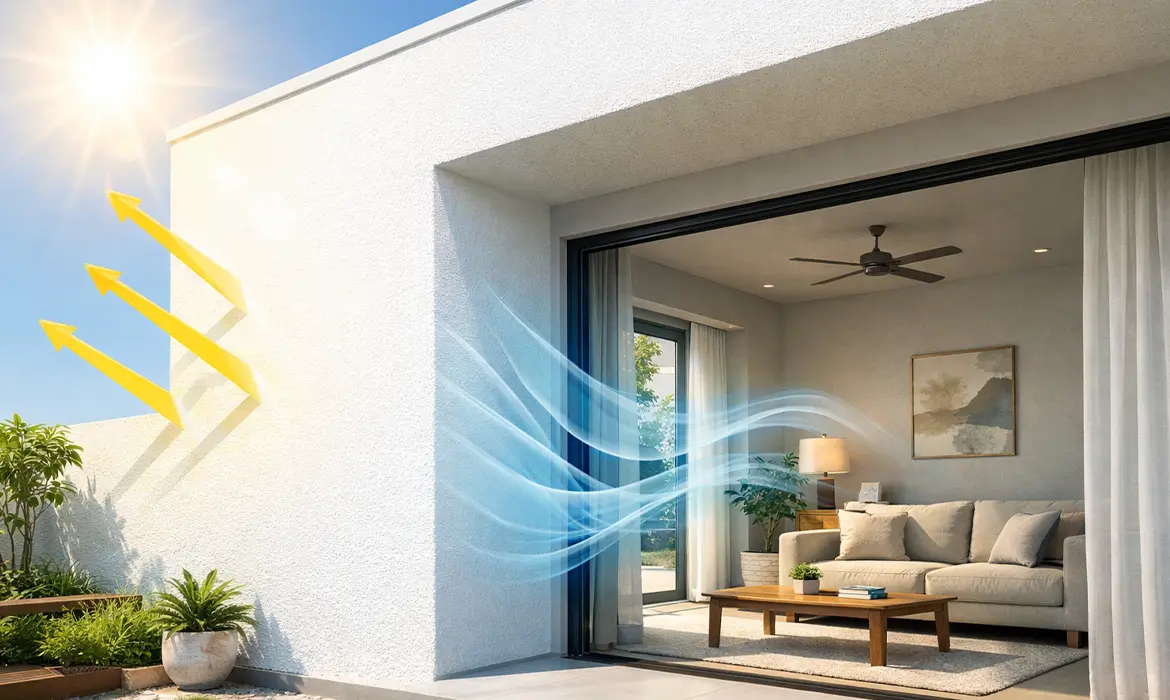
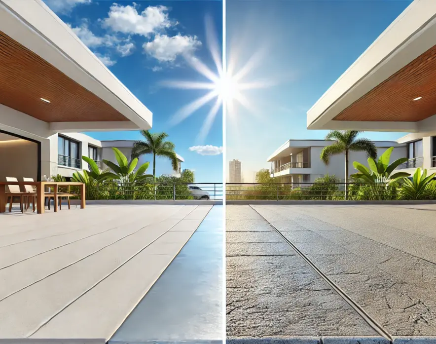
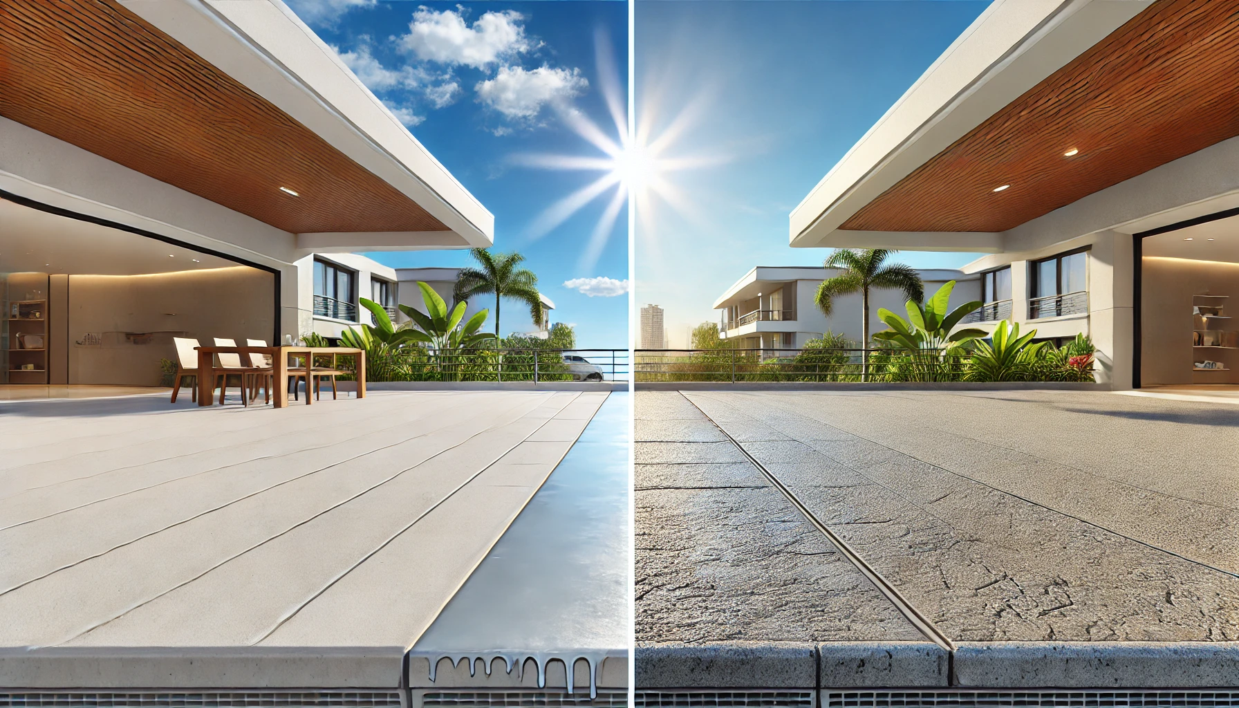
  • By reflecting up to 85% of sunlight, Indicus Heatseal reduces roof surface temperatures significantly.
  • Lowers indoor temperatures by up to 10°C, leading to reduced air conditioning usage and lower electricity bills.

3. Dual Protection Against Heat & Water Damage

  • Acts as a thermal insulator in summer and a waterproof shield during monsoons.
  • Prevents moisture penetration, reducing the risk of leaks, dampness, and mould formation.

4. Minimal Maintenance for Years to Come

  • The coating is designed to be self-cleaning, meaning less accumulation of dirt and organic growth.
  • Requires only periodic checks and cleaning, making it an effortless long-term solution.
Easy Application and Maintenance

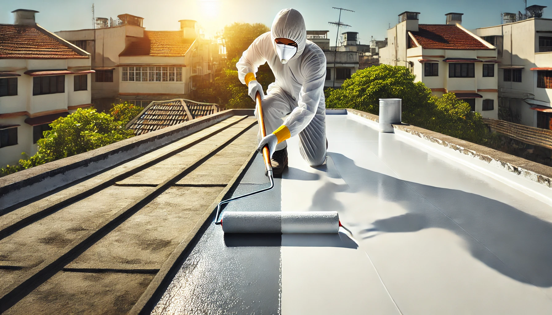
Indicus HeatSeal is formulated for hassle-free application with a simple three-step process:

Step 1: Surface Preparation

  • Clean the roof surface thoroughly, removing dirt, dust, and loose debris.
  • Ensure there are no existing leaks or cracks before application.

Step 2: Application of Indicus Heatseal

  • Apply the first coat evenly using a brush or roller.
  • Allow it to dry completely before applying the second coat for best results.

Step 3: Drying & Final Inspection

  • Let the coating cure properly to form a strong, durable layer.
  • Perform a final check to ensure uniform coverage and smooth finish.
Invest in Indicus Heatseal for Long-Lasting Roof Protection

Your roof endures constant exposure to harsh weather, making long-term protection essential for comfort, safety, and cost efficiency. Indicus Heatseal is the ultimate solution, combining heat reflectivity, waterproofing, and durability to extend the lifespan of your roof while ensuring energy efficiency.

By investing in Indicus Heatseal, you get a sustainable, high-performance coating that keeps your home cooler, drier, and protected for years – reducing maintenance hassles and saving on repair costs.

Make the smart choice today! Upgrade your roof with Indicus Heatseal and experience superior long-term protection.
How Exterior Waterproof Paint Helps Prevent Damp Patches Indoors

How Exterior Waterproof Paint Helps Prevent Damp Patches Indoors

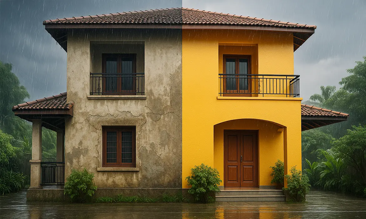
In Indian homes, damp patches on walls are more than just an aesthetic problem, they are a sign of deeper moisture infiltration that can damage your interiors, weaken structures, and even affect health. For many homeowners, these damp marks first appear during the monsoon or in highly humid conditions, often spreading quickly and causing peeling paint.

The good news? There’s an effective way to stop the issue before it even begins. Exterior waterproof paint is designed to act as the first line of defence, protecting your home from rain, humidity, and harsh weather. Instead of waiting to repair damp patches inside, you can prevent them altogether by addressing the source: the outer walls.

1. Stops Moisture at the Source: Creating a Strong Protective Barrier

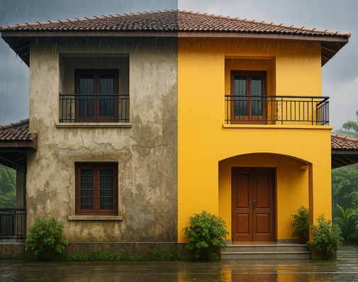
The outer walls of your home are constantly exposed to the elements. Rainwater, humidity, and even micro-cracks in the plaster can allow moisture to seep inside, slowly damaging your walls from within. This is often why dampness seems to “mysteriously” appear indoors, because the root cause lies outside.

Exterior waterproof paint solves this problem by forming a tough, water-resistant layer on the surface of the wall. Think of it as a shield that prevents moisture from entering in the first place.

Why it matters:

  • Proactive Protection: Instead of fixing dampness after it appears, waterproof coatings prevent it altogether.
  • Long-Lasting Results: When applied properly, waterproof paints protect walls for years, reducing the need for repeated repairs.
  • Added Strength: Many modern waterproof paints also strengthen wall surfaces, helping them resist cracks and weathering.

By addressing moisture at its source, you’re not only safeguarding your interiors but also extending the life of your home’s structure.

2. Protects Interior Surfaces: Safeguarding Walls and Décor

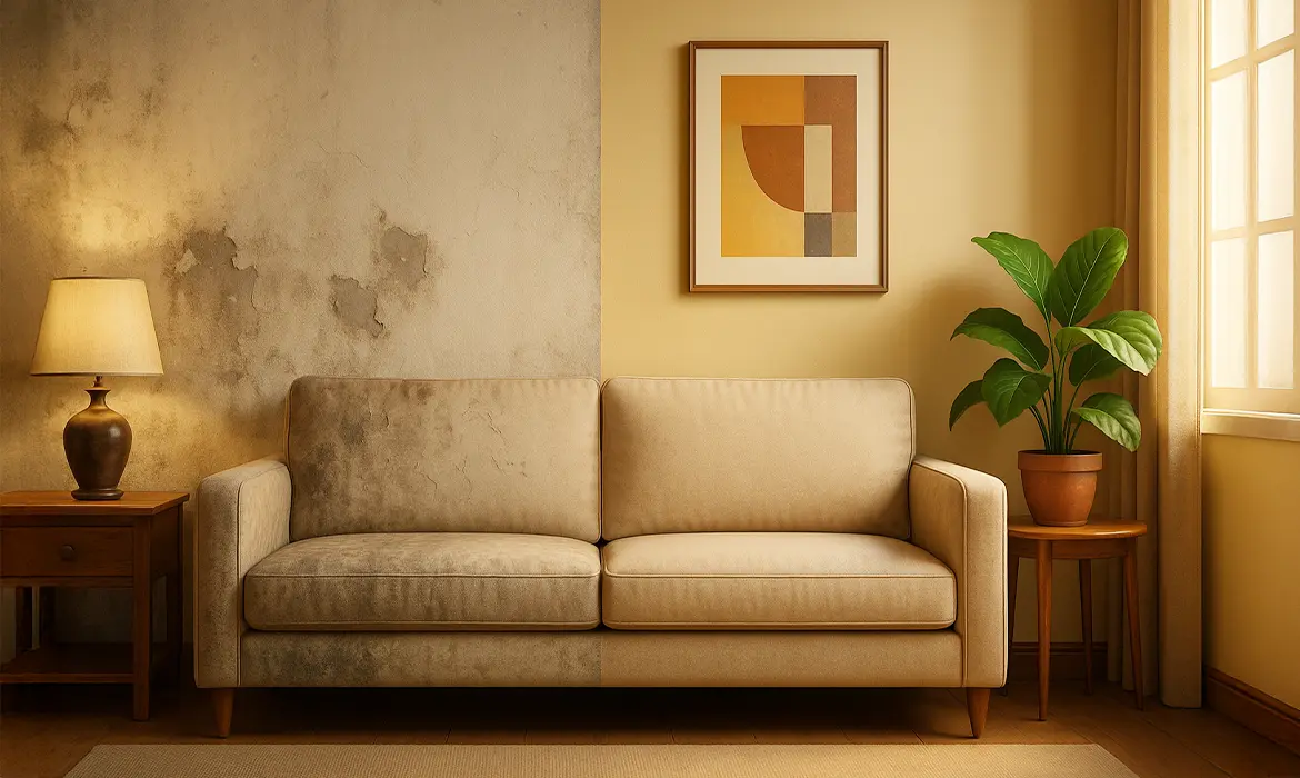
What happens outside inevitably shows up inside. When rainwater or humidity infiltrates exterior walls, the consequences are visible on interior walls. Damp patches don’t just spoil the look of your space, they compromise comfort and health as well.

Here’s how exterior waterproof paint helps:

  • Prevents Damp Patches
    Stop water seepage before it can create those unpleasant dark marks indoors.
  • Reduces Peeling or Bubbling Paint
    By keeping walls dry, it prevents paint films from lifting or cracking over time.
  • Blocks Mould and Mildew Growth
    Moisture is the breeding ground for mould, which can trigger allergies and breathing issues. Waterproofing keeps your interiors healthier.
  • Preserves Décor and Furnishings
    Dampness can extend beyond walls, damaging wooden furniture, electrical fittings, and decorative elements close to the wall.

Beyond these protective benefits, waterproof exterior paints also ensure that your interiors remain visually appealing for longer. Imagine investing in a freshly painted living room only for it to be ruined by damp patches a few months later. With the right exterior solution, that worry is taken care of before it even arises.

3. Ideal for Indian Weather: Built for Rain, Humidity, and Heat

India’s climate is as diverse as its culture. Homes face heavy monsoon showers in coastal areas, high humidity in the east and south, and scorching summers in central and northern regions. Standard paints often cannot cope with this range of challenges.

Indicus Godry Waterproofing Solutions are engineered to endure exactly these conditions, offering all-round protection.
Designed to withstand:

  • Heavy Monsoon Rains
    Rainwater is one of the biggest culprits for damp patches. Waterproof paints repel water, stopping it from soaking into walls.
  • High Humidity Levels
    Coastal and tropical regions often face year-round dampness. Special formulations resist moisture accumulation, keeping walls dry.
  • Intense Summer Heat
    Heat can cause cracks in ordinary paint layers, allowing water to seep in during the next rains. Waterproof coatings remain flexible and intact, reducing structural stress.

Why this matters for homeowners:

  • Durability Across Seasons: One product provides year-round protection, regardless of whether it’s the peak of summer or the height of monsoon.
  • Lower Maintenance Costs: By avoiding repeated repainting or patch repairs, you save significantly in the long run.
  • Peace of Mind: A home protected on the outside ensures comfort and safety on the inside.

By choosing Indicus Paints waterproof solutions, homeowners can enjoy not just protection but also aesthetic beauty, since these paints are available in modern, weather-resistant shades that enhance the exterior look of the home.

Conclusion: Exterior Protection, Interior Comfort

Damp patches are a common problem across Indian homes, but they don’t have to be inevitable. By addressing the root cause, moisture infiltration from exterior walls, you can ensure long-term comfort, durability, and visual appeal for your interiors.

Exterior waterproof paint offers:

  • A protective barrier against moisture.
  • Interior safety from damp patches, peeling paint, and mould.
  • A solution tailored to Indian weather, from monsoons to summer heat.

At Indicus Paints, our Godry waterproof coatings are designed with the Indian home in mind. They provide reliable, long-lasting defence while keeping your home’s aesthetic intact. By investing in the right exterior paint today, you not only prevent costly repairs tomorrow but also ensure that your interiors remain as inviting and comfortable as you envisioned.

Protect your walls, preserve your décor, and keep dampness where it belongs, outside your home.

Cooler Homes in 2026: Which Is the Best Time to Plan Heat Protection Coatings

Cooler Homes in 2026: Which Is the Best Time to Plan Heat Protection Coatings

As the year begins, many homeowners look for meaningful upgrades that improve comfort, efficiency and long-term value. While interior makeovers often take priority, exterior and terrace coating protection is one of the smartest ways to start the year, especially in regions with intense summers like Tamil Nadu.

Homeowners prepare their homes well before peak temperatures arrive, combining durable exterior paints designed for local climate conditions with heat-reflective terrace coatings to ensure a cooler, more comfortable living environment throughout 2026.

Start the Year with a Cooler, Smarter Home

The start of the year represents a fresh start, making it the ideal time to invest in practical home improvements. Instead of reacting to summer heat, proactive planning helps homeowners stay ahead of seasonal challenges.

While exterior walls protect the structure, the terrace or roof is the primary source of heat entry into a home. This is where heat-reflective coatings play a critical role. Applied exclusively on terraces, these coatings are engineered to reflect a significant portion of solar radiation, reducing heat transfer into the living spaces below.

When heat-reflective terrace coatings are applied early in the year, they act as a protective thermal shield long before summer sets in, delivering noticeable indoor comfort during the hottest months.

Understanding Tamil Nadu’s Climate Challenges

Tamil Nadu’s climate poses unique challenges for homeowners, particularly from March onwards. High temperatures, prolonged heat waves, humidity and intense sun exposure place constant stress on both terraces and exterior walls.

These conditions can:

  • Increase indoor heat retention
  • Accelerate surface deterioration
  • Cause cracks, damp patches and weather-related wear
  • Reduce the lifespan of exterior finishes

Waiting until summer to address these issues often leads to rushed decisions and compromised results.

Which Is the Ideal Month for Planning

The most favourable weather conditions in Tamil Nadu for exterior and terrace preparation. Mild temperatures and low moisture levels make it ideal for surface repairs, coating application and curing.

Early planning supports:

  • Thorough surface inspection and crack repairs
  • Proper terrace preparation
  • Better adhesion and curing of coatings
  • Avoidance of summer heat-related application issues

Coatings applied under stable conditions perform better, last longer and deliver consistent results.

The Right Combination for Tamil Nadu Homes

Heat-Reflective Coating for the Terrace

There is no such thing as heat-reflective coating for walls. These coatings are specifically designed for terraces and roofs, where direct sun exposure is highest.

A product like Heatseal, when applied on the terrace, helps:

  • Reflect solar heat
  • Reduce indoor temperature buildup
  • Protect the roof slab from thermal stress
  • Enhance waterproofing and durability

This makes it an essential component for summer-ready homes in Tamil Nadu.

Forto Exterior Emulsion Paint for Walls

Forto for exterior walls, a climate-appropriate paint like Indicus Forto is a practical choice. While it does not reflect heat like a terrace coating, it is formulated to withstand Tamil Nadu’s harsh weather conditions.

Forto exterior paint offers:

  • Strong resistance to sun exposure and humidity
  • Protection against surface damage and fading
  • Long-lasting colour and finish
  • Reliable performance in coastal and high-heat regions

When paired with a heat-reflective terrace coating, Forto helps complete the home’s exterior protection system.

Step-by-Step Planning Tips for Homeowners

Choosing the Right Products

This combination addresses both heat control and long-term durability.

Scheduling Application and Preparation

  • Plan professional application
  • Schedule surface repairs
  • Prepare terraces and walls without urgency

Surface Preparation Matters

For best results:

  • Clean terraces thoroughly
  • Repair cracks and damaged plaster
  • Ensure proper waterproofing layers before coating
  • Apply recommended primers for exterior walls

Proper preparation ensures maximum performance and lifespan of both products.

Styling and Maintenance Tips

Exterior Colour Choices

Light and neutral exterior shades work well with Forto, maintaining a clean, contemporary appearance while handling sun exposure effectively.

Regular Maintenance

Even high-performance solutions benefit from upkeep. Annual inspections, terrace cleaning and timely touch-ups help maintain protection and appearance year after year.

Preparing for the Summer Ahead

Once application is complete:

  • Inspect drainage and water outlets on the terrace
  • Ensure no pooling or surface damage
  • Check shaded areas and exterior fixtures

This holistic approach ensures your home remains comfortable, resilient and protected throughout peak summer.

Conclusion

A cooler home is not the result of last-minute summer fixes, it begins with smart, early planning. By combining Indicus Heatseal heat-reflective terrace coatings with Indicus Forto exterior emulsion for walls, homeowners can effectively prepare their homes in Tamil Nadu for prolonged and intense heat conditions.

With Indicus Paints, homeowners can significantly improve indoor comfort, reduce heat stress on the structure and ensure long-lasting exterior protection throughout 2026.

Repainting Your Home: A Practical Guide with Expert Tips

Repainting Your Home: A Practical Guide with Expert Tips

A fresh coat of paint can transform your home, but when should you repaint, and what should you choose? This guide is for homeowners who want to make smart, cost-effective decisions while keeping their homes looking beautiful for years.

Why Repainting Matters?

Over time, sunlight fades your walls, monsoons leave damp marks, and everyday life brings scuffs and stains. Repainting is not just about beauty; it protects your home from moisture, heat, and wear-and-tear.

How Often Should You Repaint?

The frequency of repainting depends on three main factors:

1. Climate: In Tamil Nadu, summers, monsoons, and humidity put stress on walls. Homes near the coast also face salty air, which causes faster paint deterioration and peeling. Exterior walls may need repainting every 3–5 years, while interiors usually last longer but still require attention in humid areas.

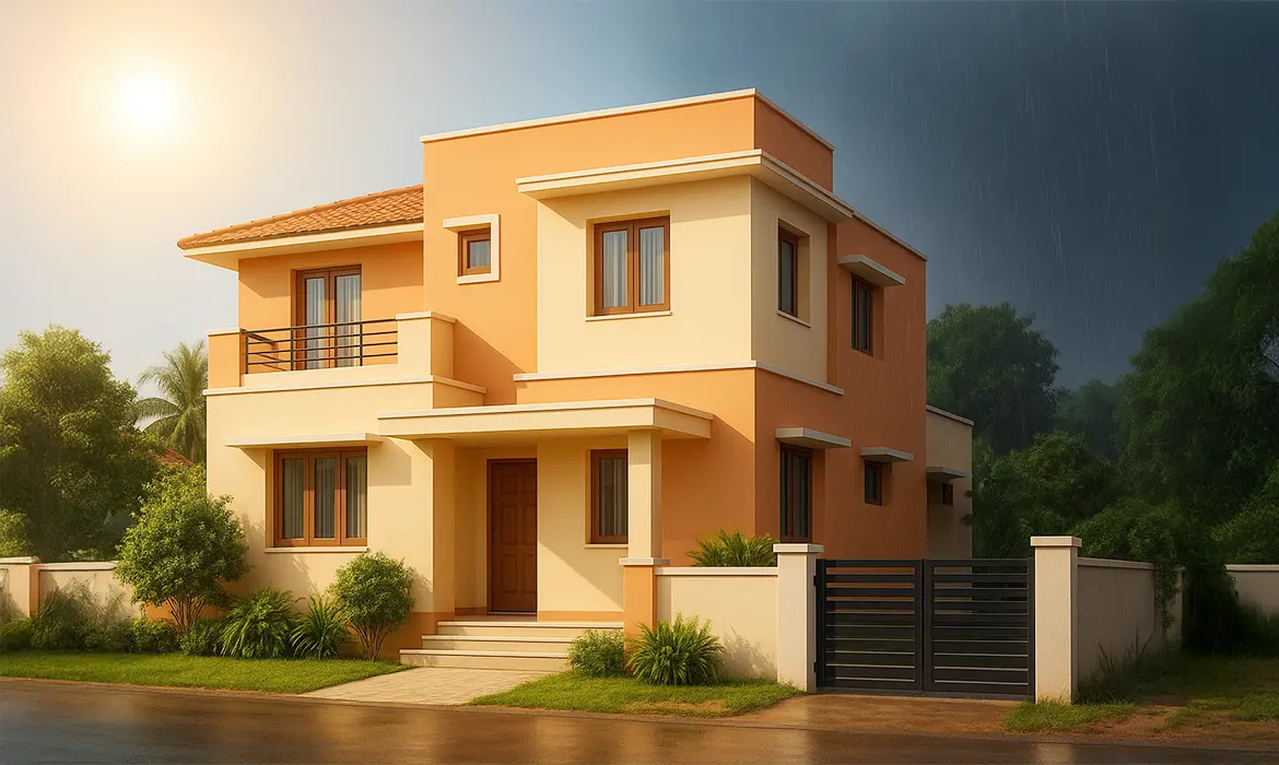
Weather protection

2. Usage: Some rooms face more wear and tear than others. Living rooms, kitchens, and kids’ rooms often collect stains, grease, or fingerprints, making them candidates for repainting every 2–3 years. Bedrooms, guest rooms, or storerooms may only need a fresh coat every 5–7 years.

Interior Warmth

3. Paint Type: The type of paint you choose affects how long your walls look fresh. Premium paints like Indicus Admyra offer washability, durability, and resistance to fungus and mildew, helping them last longer than basic options. Choosing the right paint can reduce how often you need to repaint and lower costs over time.

SurfaceTypical Repainting TimeWith Premium Indicus Paints
Exterior Walls3 to 4 yearsUp to 8 years
Interior Walls3 to 5 yearsUp to 7 years
Wooden Fixtures2 to 3 years4 to 5 years
Metal Gates/Grills1 to 2 years2 to 3 years
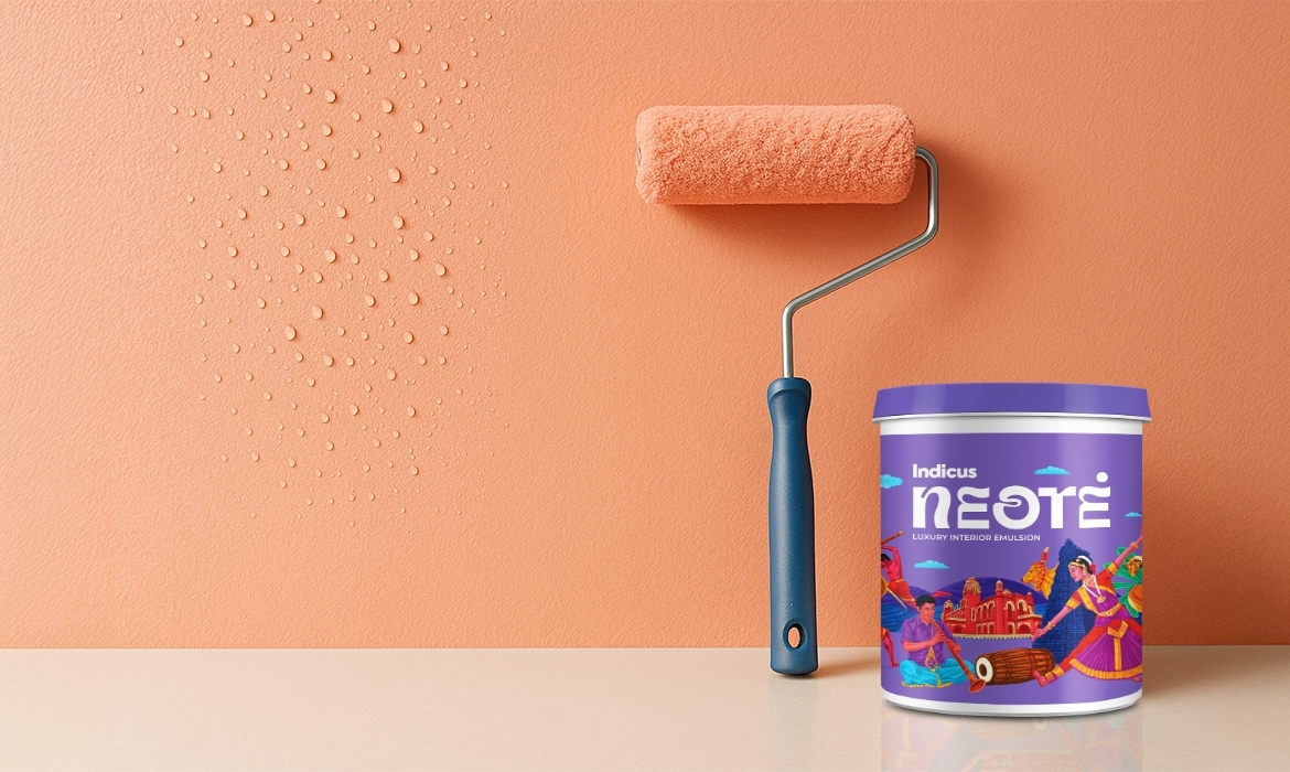
Indicus NEOTE

Choosing the Right Paint.

Homeowners often wonder whether to spend more on paint now or repaint sooner. Here is a simple way to think about it:
  • Short-term budget: A standard exterior paint might last 3 years, costing less upfront but needing frequent repainting.
  • Long-term savings: Premium weather-resistant paints like Indicus Forto may cost more initially but last up to 10 years , saving money and effort over time.
Other factors matter too. For instance, Indicus Admyra paints are an excellent choice for kitchens and kids’ rooms. They are easy to wash, long-lasting, and keep colors looking bright for longer. Plus, their fungus- and mildew-resistant properties help maintain a cleaner, healthier environment for your family.

When to Paint?

In Tamil Nadu, the ideal time for repainting is from January to July, after the monsoon season. During these months, walls are dry, humidity is lower, and temperatures are moderate to high. This allows the paint to cure properly, reducing the risk of peeling or blistering. Painting in this window also ensures longer-lasting results compared to the hotter summer months or the damp monsoon period.

Best Practices for Long-Lasting Paint

A good paint job starts with preparation. Skipping steps may save time upfront but usually leads to peeling, fading, or damp patches later. Here are the key practices to follow before and during painting:

  • Surface Cleaning: Walls collect dust, dirt, grease, and algae over time. If these are not cleaned, the paint does not bond well and may peel off quickly.
  • Fix Cracks: Even small cracks allow moisture to seep in, weakening the paint. Use acrylic fillers for hairline cracks and SBR-Cement mix for wider gaps to prevent water damage and keep walls structurally sound.
  • Treat Dampness: Moisture is one of the main reasons paint fails. Areas with seepage or damp spots should be treated with a waterproofing solution before painting. This stops recurring problems like bubbling paint or mildew growth.
  • Primer First: A primer helps paint grip the wall, improves coverage, and increases durability. Without primer, even the best paints may fade faster or look patchy. Always match the primer type to the surface and the paint being used.
  • Multiple Coats: One coat rarely provides enough coverage or protection. Two coats are the minimum for even color and durability. A third coat is often recommended for darker shades or surfaces exposed to heavy wear and weather.
Exterior dream home

Indicus Paint Chart.

CategoryProduct NameKey Features & TechnologyBenefits & PerformanceWarranty
Wall Paints – ExteriorForto (Durable Exterior Emulsion)Dura-colour technology, Dirt-pickup resistant, Anti-stress, UV & Anti-algal protectionLong-lasting colour; Resists weather, dirt, chemicals, UV; Keeps walls fresh for years8 Years
Resilio (Premium Exterior Emulsion)Strong adhesion, Weather protection, Colour retention, UV & Anti-algal protectionWithstands extreme weather; Prevents chalking, peeling; Maintains colour richness5 Years
Calibre (Exterior Emulsion)Anti-peel Technology, Excellent hiding, Higher coverage, Low VOC, Anti-algalPrevents peeling & flaking; Better coverage & smooth finish; Cost-effective & eco-friendly3 Years
Wall Paints – InteriorNeotė (Luxury Interior Emulsion)Scuff-resistant, Silver ion technology, Velvet touch effect, Excellent washabilityWashable & durable walls; Anti-bacterial protection8 Years
Admyra (Premium Interior Emulsion)Stain resistance, Rich colour depth, Fungus & mildew resistantLong-lasting vibrant finish; Withstands wear & tear5 Years
Draper (Interior Emulsion)Anti-peel Technology, Smooth finish, Excellent hiding, Higher coverage, Low VOCCrack-free walls; Smooth, fresh look; Better coverage than cement paints3 Years
Ceiling Bright (Ceiling Emulsion)Super bright white finishBright, spacious look; Reflects natural light; Energy saving due to reduced artificial lighting
Metal PaintsGlaz Premium Satin EnamelSatin finish, Weather resistant, Stain resistant, High durabilitySmooth satin finish; Weather & stain protection; Suitable for exterior metal surfaces
Glaz Premium Gloss EnamelGloss finish, Weather resistant, Stain resistant, High durabilityMirror-like gloss; Weather & stain protection; Long-lasting reflective finish
Glaz Aluminium PaintLustrous silver finish, Corrosion resistant, Heat reflective, Durable filmProtects metal from corrosion & heat; Reflective finish; Suitable for industrial & exterior structures
Wood PaintsGlaz Premium Satin EnamelSatin finish, Weather & stain resistant, High durabilityEnhances wooden surfaces with smooth, elegant satin look; Long-lasting protection
Glaz Premium Gloss EnamelGloss finish, Weather & stain resistant, High durabilityRich gloss finish; Long-lasting protection for wooden doors, windows, furniture

Bringing It All Together.

Repainting is more than just refreshing your walls. It is an essential part of maintaining your home. The right paint depends on your climate, lifestyle, and budget, and the right practices ensure lasting results.

With Indicus, you get more than paint. You gain the expertise of a brand that understands Tamil Nadu’s unique weather and your home’s needs. From cost-effective solutions to premium, long-lasting finishes, our range is designed to work for you.

Ready to get started? Speak to an Indicus expert today to plan your repainting schedule and choose the right products for your home.

The Complete, No-Confusion Guide to Choosing Home Office Colours

The Complete, No-Confusion Guide to Choosing Home Office Colours

A productive home office starts with colour. The right palette calms your mind, reduces visual noise, and makes small rooms feel purposeful. The wrong one creates glare, eye strain, or a background that looks odd on video. This guide gives you a clear, step-by-step path so you can choose colours with confidence and start painting.

1) Start with the outcome you want from the room

Colour influences attention, stress, and creative energy. If you do not define the outcome, you will pick shades that look pretty but do not support your work.

Decide your priority:

  • Deep focus and lower stress: Aim for cool, muted families.
  • Balanced, long hours at a screen: Choose nature-linked mid-tones that are gentle on eyes.
  • Warm energy for creative work: Use controlled warm accent hues against calm bases.
  • Professional video presence: Prefer soft, non-reflective mid-tones behind you.

Quick matches from Indicus:

2) Read the light before you pick a shade

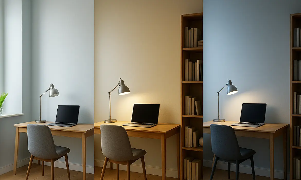
The same paint shifts in different light. Indian homes often have strong daytime sun and warm LEDs at night. A colour you love at noon can feel dull after sunset.

What to check?

  • Direction of natural light:
    • North or South facing rooms with less sunlight tend to feel cooler, so warmer neutrals and soft greens bring balance.
    • In contrast, the light in East and West facing rooms can be intense, making cooler blues and gentle greens a calming choice.
  • Artificial light:
    • Warm LEDs make colours look yellower.
    • Cool LEDs can make neutrals look stark.
  • Surface reflection:
    • Glossy floors, white wardrobes, or glass can bounce colour and change how walls read.
Light Conditions
Tip: If a room is dim, choose lighter values of your chosen family rather than switching families altogether.

3) Map existing furniture and undertones

Walls sit next to wood, fabrics, and metals. Their undertones either harmonise or fight. Harmony reduces mental clutter.

How to get the paint right?

  • Wood:
    • Warm teak and walnut goes well with Summer Green (2562P), Brown Tint (2890P), and soft creams.
    • Ash or pale oak pair well with Aegeon Blue (2396T) and Frozen Dew (2367P).
  • Metals:
    • Black and matt brass welcome earthy accents like Red Earth (2146D) in small doses.
    • Chrome and white read cleaner with quiet blues and greens.
  • Fabrics:
    • If your chair is already colourful, keep walls calm so the room does not feel noisy.
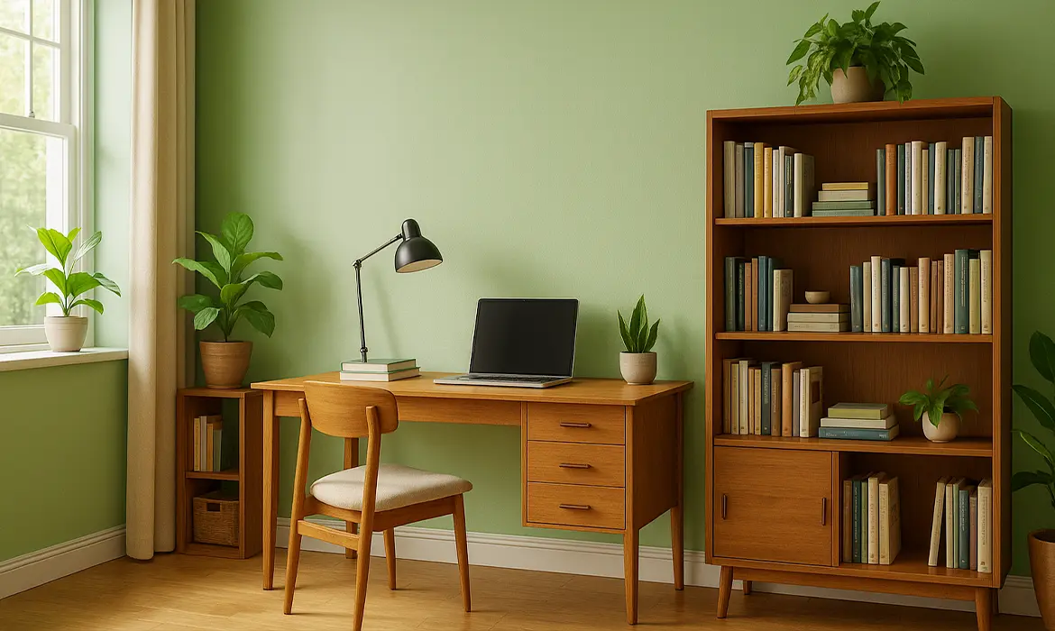
Green Walls

4) Choose your base colour family with intent

The base sets 60–70% of what your eye sees. Pick the family for how you need to feel during work hours, then adjust the depth.

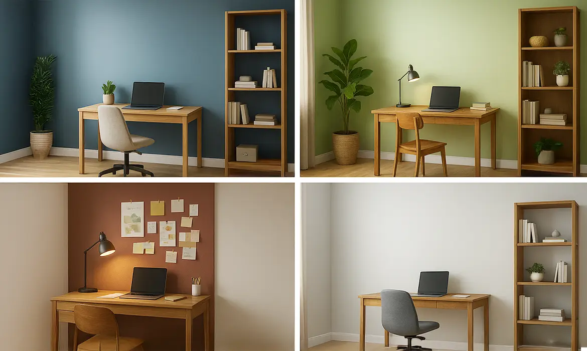
Proven families and when to use them:

  • Blues for focus:
    • What they do: Lower visual noise and steady attention.
    • Use cases: Accounting, coding, research, writing.
    • Indicus pick: Aegeon Blue (2396T) as an accent or softened on two walls with neutrals elsewhere.
  • Greens for balance:
    • What they do: Reduce eye strain and feel restorative, like a courtyard.
    • Use cases: Long reading, design, teaching.
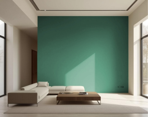
    • Indicus pick: Summer Green (2562P) for main walls.
  • Neutrals for versatility:
    • What they do: Offer a clean, professional backdrop that adapts to changing décor.
    • Use cases: Shared or compact rooms, rental homes.
    • Indicus picks: Frozen Dew (2367P) for a fresh, airy look. Brown Tint (2890P) for a warmer, grounded feel.
  • Earthy warms for creative lift:
    • What they do: Add gentle energy and depth when used in moderation.
    • Use cases: Brainstorm zones, backdrop niches.
    • Indicus pick: Red Earth (2146D) as a limited accent, not the main field.
Base Colour families

5) Build a simple scheme: base, accent, ceiling, trim

A clear structure prevents “colour creep” and keeps the room coherent on camera and in real life.

Use this easy structure:

  • Base walls (60–70%): One calm colour that suits your light.
  • Accent (10–20%): A deeper or contrasting wall behind the desk or shelves.
  • Ceiling (10%): Usually lighter than walls to lift height.
  • Trim and doors (the rest): A clean, repeatable neutral.

Ready-to-apply pairings:

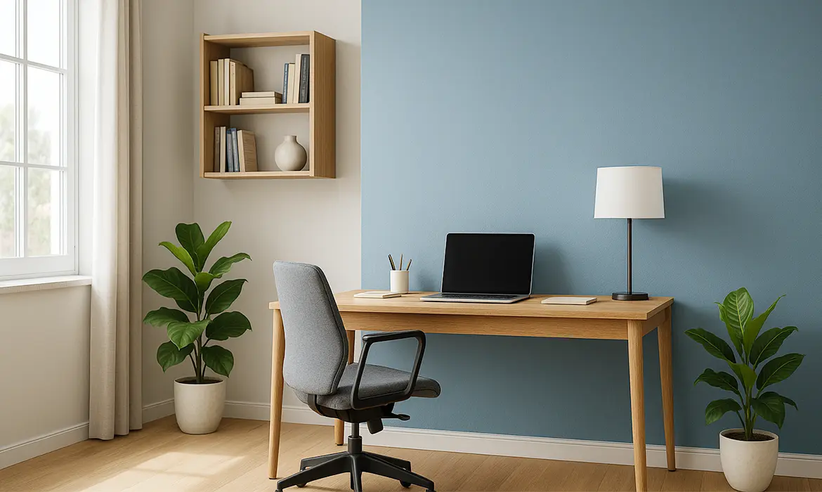
  • Calm focus: Frozen Dew (2367P) walls + Aegeon Blue (2396T) behind desk + white ceiling.
  • Nature balance: Summer Green (2562P) walls + Brown Tint (2890P) trim + off-white ceiling.
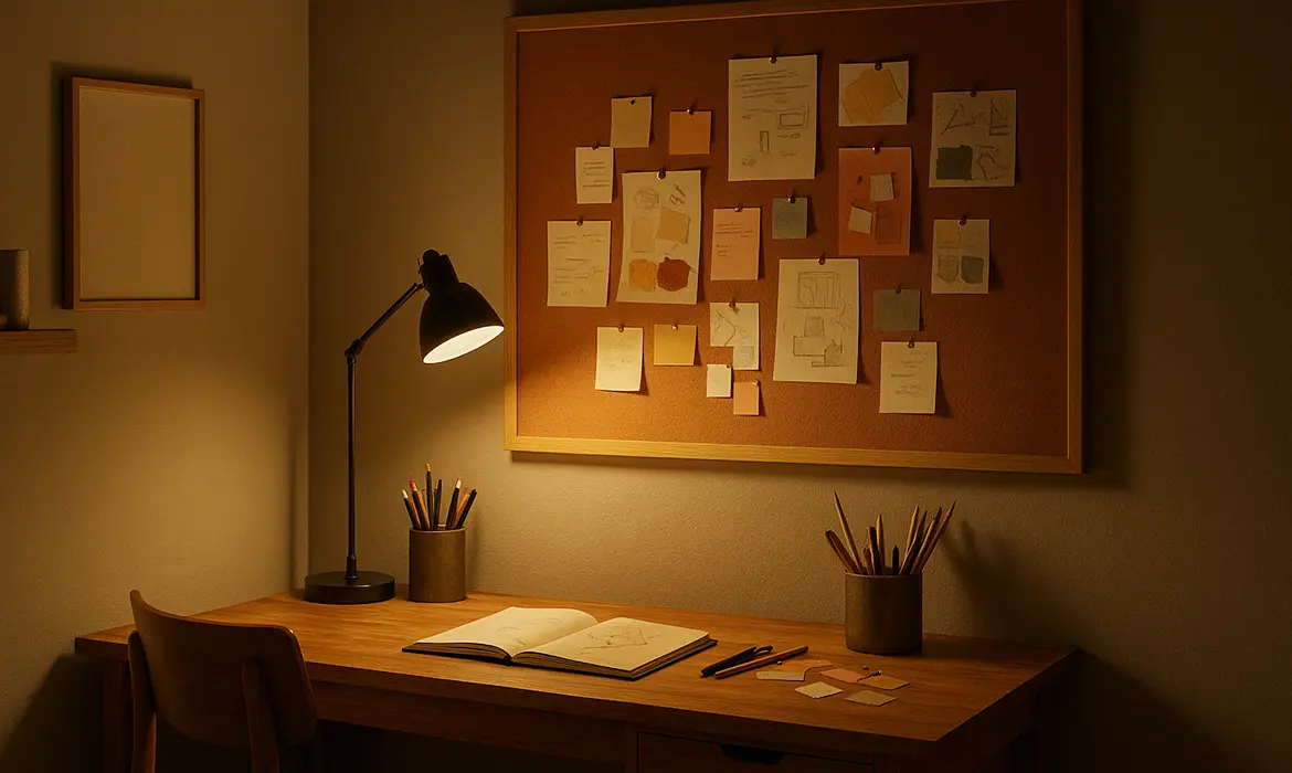
  • Warm creative corner: Brown Tint (2890P) walls + a Red Earth (2146D) niche or pinboard zone.

6) Plan for the camera

Your wall becomes your brand on video calls. Harsh whites or glossy finishes cause glare and washing out.

What works consistently:

  • Finishes: Prefer matte or eggshell to cut screen glare.
  • Tones: Mid-light, muted colours look professional.
  • Background styling: Keep shelves minimal so colour remains the hero.

Camera-friendly combos:

  • Frozen Dew (2367P) + tidy wood shelving.
  • Summer Green (2562P) + white trim for crisp edges.
  • Aegeon Blue (2396T) accent behind the desk, with soft neutral side walls.
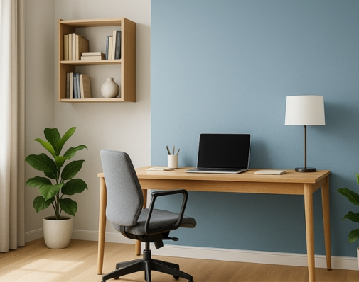
Home office

7) Choose the right finish for function

Finish changes both appearance and usability. The wrong sheen can tire your eyes or make cleaning difficult.

  • Matt: Best for work zones to reduce glare and visual fatigue.
  • Sheen: Best for living areas and bedrooms, offering a subtle shine that enhances color depth while being a bit easy to clean.

Health and upkeep: Low-VOC, low-odour paints keep indoor air comfortable during long workdays. Washable ranges like Indicus Admyra help walls stay fresh with routine cleaning.

8) Sample smart to avoid surprises

Colours shift with time of day and light temperature. Sampling protects you from costly repaints.

Here’s a quick, reliable method:

  • Get sample paints of your final two or three options.
  • Paint A4 or A3 cards with two coats, label them, and move them around the room.
  • View at 9 am, 2 pm, and 8 pm with your actual lights on.
  • Keep one card near your desk, another near the window, and one behind the camera view.
  • Decide after 24–48 hours, not immediately.

What you are looking for:

  • Does the colour stay calm under evening LEDs?
  • Does it clash with your desk or floor?
  • Does it look clean on camera without filters?
Night Feel

9) Prepare the surface so the colour reads true

Poor surface preparation changes colour and reduces durability. You do not need a full painting tutorial, just these essentials for accurate results.

  • Clean: Wipe oils and dust. Degloss shiny patches lightly so paint bonds evenly.
  • Patch: Fill cracks and sand smooth so light does not create shadows.
  • Prime where needed: Over dark colours, stains, fresh plaster, or patched areas. Primer evens absorption so the final colour matches the card.
  • Coats: Plan for two coats minimum for uniformity. Allow proper dry time between coats as per the can.
  • Edges: Use painter’s tape for crisp trim lines. Remove tape while paint is slightly tacky for the cleanest edge.

10) Common mistakes to avoid

Skipping some of these crucial yet often overlooked steps leads to repainting which incurs a toll on the overall budget.
  • Picking from a phone screen instead of real samples.
  • Choosing a bright accent first, then forcing the rest to fit. Always select the base first.
  • Ignoring evening lighting, which is when many of us work.
  • Using high-gloss on large walls, which increases glare and eye strain.
  • Painting every wall dark in a small, low-light room.

11) Your colour-to-paint checklist

  1. Define the room’s main outcome.
  2. Note light direction and your evening bulb type.
  3. List key furniture finishes and undertones.
  4. Pick a base family that fits your goal.
  5. Choose a simple scheme: base, accent, ceiling, trim.
  6. Select finishes for function and comfort.
  7. Sample on movable cards and review across the day.
  8. Prepare, prime where needed, and apply two coats.
  9. Style lightly so the colour can breathe.

Final touches from Indicus Paints

A good home office colour does more than look nice. It focuses your attention, calms your mind, and presents you well on camera. Use the steps above, test your shortlists, and trust what works in your light with your furniture. If you would like a second opinion, our team can help you refine choices and pick the right finish so you feel confident when you open the first can.

Happy painting. Your best workday can start on your walls.

Chettinad-Inspired Exterior Colours: Transforming Your Home’s Aesthetic

Chettinad-Inspired Exterior Colours: Transforming Your Home’s Aesthetic

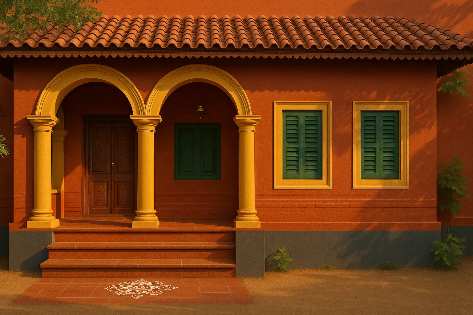
The Chettinad region of Tamil Nadu is renowned for its rich cultural heritage, stunning architecture, and traditional design elements. The Chettinad style is a blend of history, opulence, and artistry, known for its luxurious aesthetics and use of rich, earthy tones. When it comes to designing the exterior of your home, Chettinad-inspired colours bring warmth, elegance, and a sense of history to your living space.

Incorporating Chettinad-inspired exterior colours into your home can transport you to the heart of South India, where nature, tradition, and architecture come together in beautiful harmony. These colours not only make your home look visually striking but also reflect a rich cultural legacy that is both timeless and sophisticated. From the deep hues of terracotta to the warm golds and vibrant reds, Chettinad-inspired colours offer a unique way to add personality and elegance to your exterior.

In this blog, we’ll explore how you can use Chettinad-inspired exterior colours to transform your home’s aesthetic, creating a striking yet welcoming atmosphere that reflects both cultural heritage and contemporary style.

1. Rich Earthy Tones: Embracing Natural Warmth

Chettinad-inspired homes often feature a blend of earthy tones, which help to connect the architecture with the natural surroundings. These colours are deeply rooted in nature, offering a sense of warmth, richness, and earthiness that is both timeless and welcoming.

Key Colours:

  • Terracotta: The deep, burnt orange of terracotta is a hallmark of Chettinad-inspired exteriors. It is often used for large walls or accent features, giving the home an earthy, grounded feel.
  • Rustic Red: A vibrant yet earthy shade that complements traditional materials like wood and stone, rustic red is often used for doors, window trims, or to highlight architectural details.
  • Ochre Yellow: A warm, golden yellow that brings brightness and cheer to the exterior. Ochre is perfect for accentuating the edges of the house or for decorative elements like pillars or trims.

These rich, natural colours reflect the environment and evoke a sense of harmony with the earth, making them ideal for homes that want to establish a warm and inviting presence.

How to Style It:

  • Use terracotta or rustic red on the main façade to give your home an elegant, welcoming look.
  • Ochre yellow can be used on smaller features like window frames or door trims to add brightness without overwhelming the overall aesthetic.
  • Indicus Paints shades like Amber Sunset or Redwood are perfect for creating the earthy, rich look of Chettinad style exteriors.
Chettinad-Inspired Exterior Colours: Transforming Your Home’s Aesthetic

2. Golden Hues: Adding a Touch of Luxury

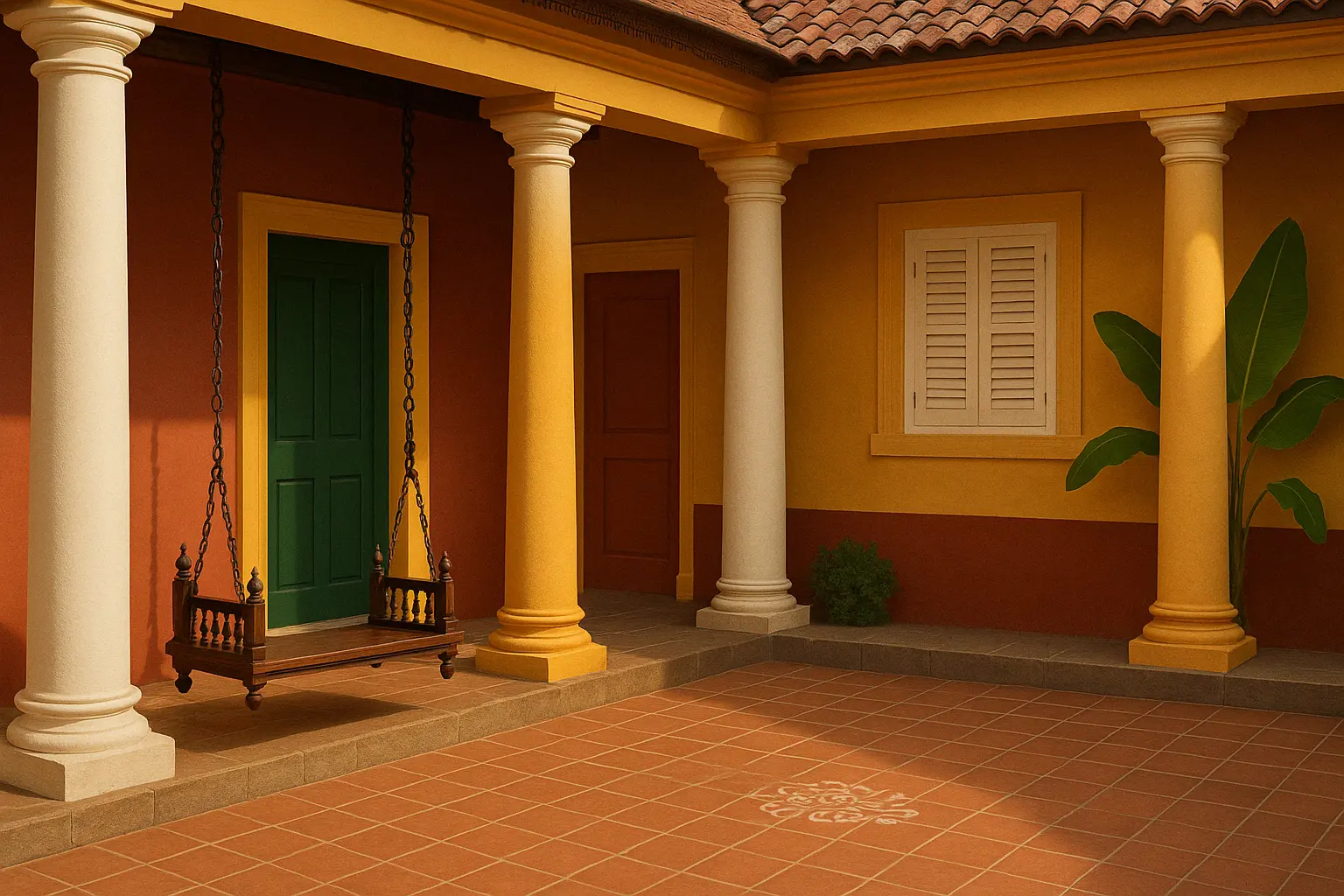
The Chettinad style also embraces golds and yellows, giving it an air of opulence and luxury. These shades are often used for accentuating the grand, historical elements of the architecture, such as columns, arches, and decorative details.

Key Colours:

  • Golden Ochre: This colour combines the richness of gold with the warmth of ochre, creating a vibrant yet refined look. It is often used in palaces and temples, making it a perfect choice for homeowners looking to add a regal touch to their exteriors.
  • Warm Gold: A brighter, more radiant shade of gold, this colour is often used in detailing and architectural features, bringing an elevated, royal aesthetic to the home.

How to Style It:

  • Consider using golden ochre for the main exterior walls if you want to make a bold statement.
  • Use warm gold for detailing such as trims, arches, or columns to accentuate the grandeur of the house.
  • For a traditional look with a modern twist, combine gold with terracotta or rustic red.

With Indicus Paints, you can achieve these opulent finishes with shades like Golden Harvest and Sunlit Gold that perfectly mimic the luxurious feel of Chettinad-inspired homes.

Chettinad-Inspired Exterior Colours: Transforming Your Home’s Aesthetic

3. Deep Green and Browns: Reflecting Nature’s Serenity

Incorporating deep green and brown tones into your exterior colour palette is another essential characteristic of Chettinad-inspired design. These colours, which are found in the lush landscapes and agricultural surroundings of the region, bring a sense of calm, serenity, and balance to the home.

Key Colours:

  • Deep Green: A rich, dark green evokes the natural beauty of the surrounding flora and brings a refreshing, organic touch to the exterior.
  • Brown and Taupe: Soft, earthy browns and taupes are used to add texture and depth to the exterior, complementing the natural materials like stone or wood commonly used in Chettinad architecture.

How to Style It:

  • Deep green can be used for doors, shutters, or smaller elements of the exterior to contrast with the warm tones of the main walls.
  • Pairing brown and taupe with warm yellows or reds gives a perfect balance of modernity and tradition while reflecting nature’s calmness.
  • Consider using Indicus Paints shades like Crisp Mint or Moss Green for the perfect nature-inspired, serene effect.
Chettinad-Inspired Exterior Colours: Transforming Your Home’s Aesthetic

4. Accentuating Architectural Features

The beauty of Chettinad architecture lies not just in the colours but also in the architectural features, from intricate columns to arches, window grills, and door frames. Accentuating these features with bold colours can enhance the aesthetic appeal of your home and draw attention to the historical richness of the design.

Key Colours:

  • Ivory White: A classic and versatile choice, ivory white brings contrast to darker shades and makes architectural features stand out. It’s often used for pillars, arches, and intricate detailing.
  • Muted Beige and Cream: These neutral tones balance out the warmth of red and yellow, creating a sophisticated contrast that highlights the architectural elements without overwhelming them.

How to Style It:

  • Use ivory white or muted cream to highlight windows, doors, and decorative features like railings or trim.
  • Pair beige or cream with warmer colours like terracotta for a refined yet rustic look.

Indicus Paints provides a range of elegant neutral tones such as Ivory Silk and Beige Whisper that are perfect for these architectural accents.

Chettinad-Inspired Exterior Colours: Transforming Your Home’s Aesthetic

5. Balancing Bright and Neutral Tones

While the rich tones of terracotta, gold, and green dominate Chettinad-inspired exteriors, it’s also important to balance these vibrant colours with neutral shades. This helps maintain harmony and prevents the exterior from feeling too overwhelming.

Key Colours:

  • Off-Whites: Soft off-whites like Ivory Silk or Linen White can serve as the perfect backdrop for bolder tones, allowing them to shine without clashing.
  • Muted Greys: For a more contemporary take, adding muted grey tones to your exterior can create a balanced aesthetic, especially when paired with traditional warm colours.

How to Style It:

  • Use neutral off-whites or muted greys on the main façade to ground the space, while adding deep red or gold accents to architectural features.
  • Create a layered look by using neutral tones for larger areas like the walls, with bold tones for smaller features like doors, windows, and trim.
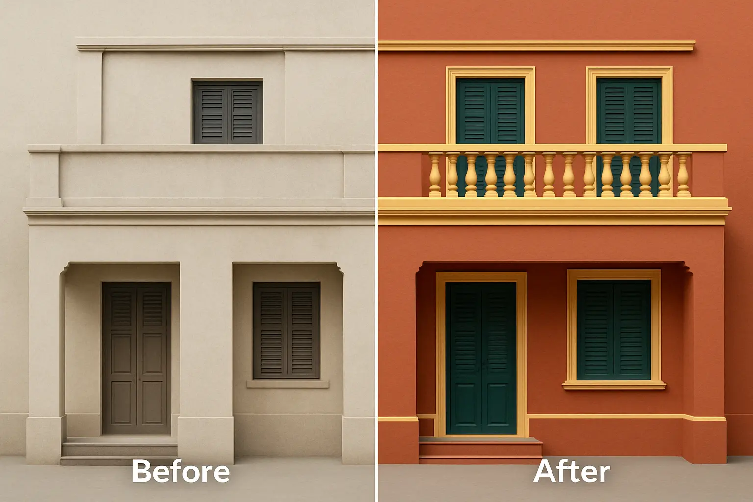
Chettinad Colour Swatch on Architecture.

Chettinad-inspired colours are the perfect way to infuse your home’s exterior with history, warmth, and character. Whether you prefer the earthy richness of terracotta and mahogany, the luxurious golds of traditional architecture, or the tranquil greens that reflect nature’s beauty, Chettinad tones offer a wide range of options to transform your home into a cultural masterpiece.

By using Indicus Paints premium shades such as Amber Sunset, Golden Harvest, and Ivory Silk, you can easily achieve the perfect Chettinad-inspired look that blends traditional beauty with modern elegance.

Ready to embrace the timeless charm of Chettinad-inspired colours? Explore Indicus Paints and create a stunning home that reflects both heritage and contemporary style.

Eurasia (2510D): December’s Colour of Stillness and Structure

Eurasia (2510D): December’s Colour of Stillness and Structure

December brings a natural pause. The year slows, the light cools, and spaces begin to ask for calm rather than stimulation. Eurasia (2510D) is chosen for this month precisely because it aligns with that shift. It is a grounded, quiet, and precise colour — one that supports clarity, resets visual noise, and brings focus back to the essentials.

Where some winter shades feel heavy, Eurasia sits in the sweet spot: clean but not cold, deep but not dark, sophisticated without drawing unnecessary attention. It creates an environment that feels intentional and composed, which makes it ideal for the reflective mood of December.

Why Eurasia Works for December

The decision behind the colour is rooted in how people actually experience their homes at year-end. December is a time of consolidation — finishing work, preparing for the new year, reorganising, and seeking visual calm. Eurasia provides that environment.

Its strength lies in its neutrality with personality. The shade stabilises a space, cools visual clutter, and encourages structural balance in interiors. It also responds well to natural winter light, maintaining its clarity throughout the day without appearing flat or dull.

Where Eurasia Performs Best

1. Living Rooms: A Clean Visual Break

Eurasia sharpens the architecture of a living room. It works especially well on primary walls where you want definition but not dominance. When paired with structured furniture, off-white upholstery, and matte metal finishes, it produces a modern, confident space that feels curated.
Eurasia (2510D)

2. Dining Areas: Focused, Warm Minimalism

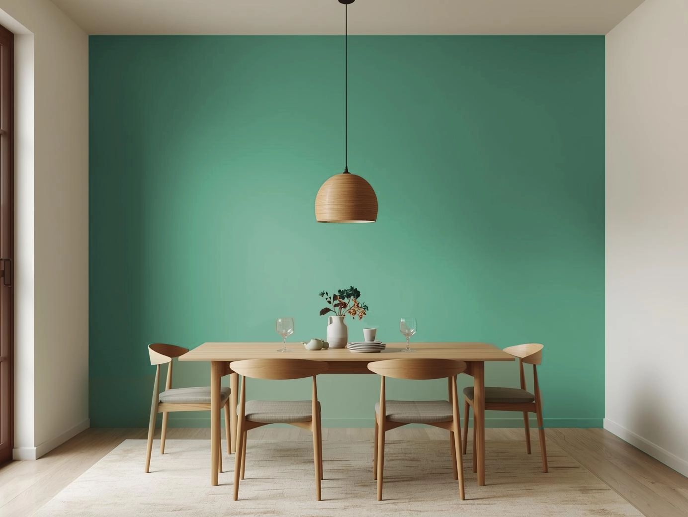
In dining zones, the colour acts as a stabiliser. It creates a cohesive backdrop for functional furniture and clean table settings. Pair it with light woods or cane for softness, or with charcoal accents for a more contemporary look.
Eurasia (2510D)

3. Kitchens: Precision and Order

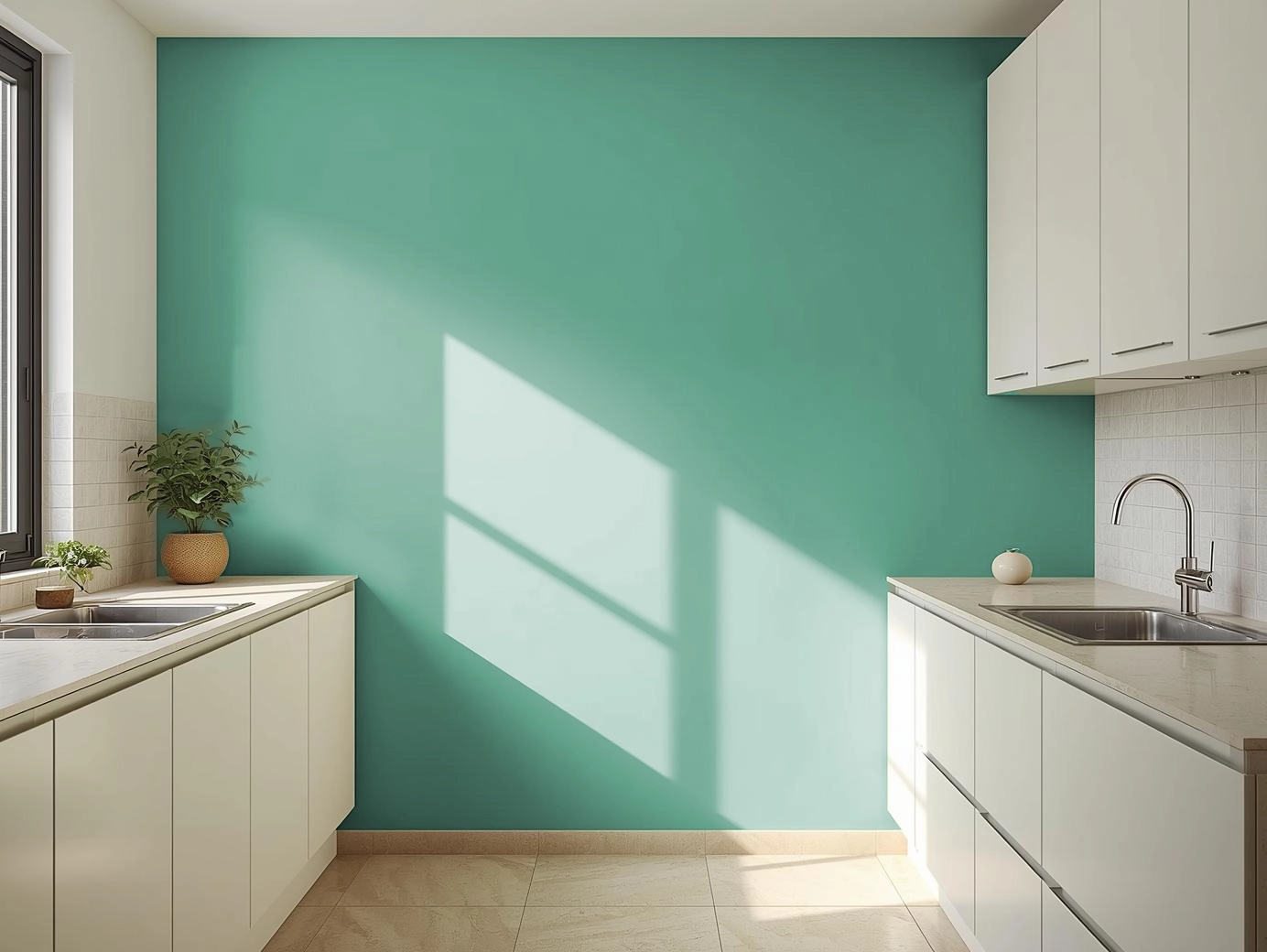
Kitchens benefit from Eurasia’s disciplined undertone. On cabinets or breakfast counters, it communicates neatness and modernity. White backsplashes, brushed steel, and uncluttered counters elevate the shade further, making the space look streamlined and controlled.
Eurasia (2510D)

4. Bedrooms: Rest Through Restraint

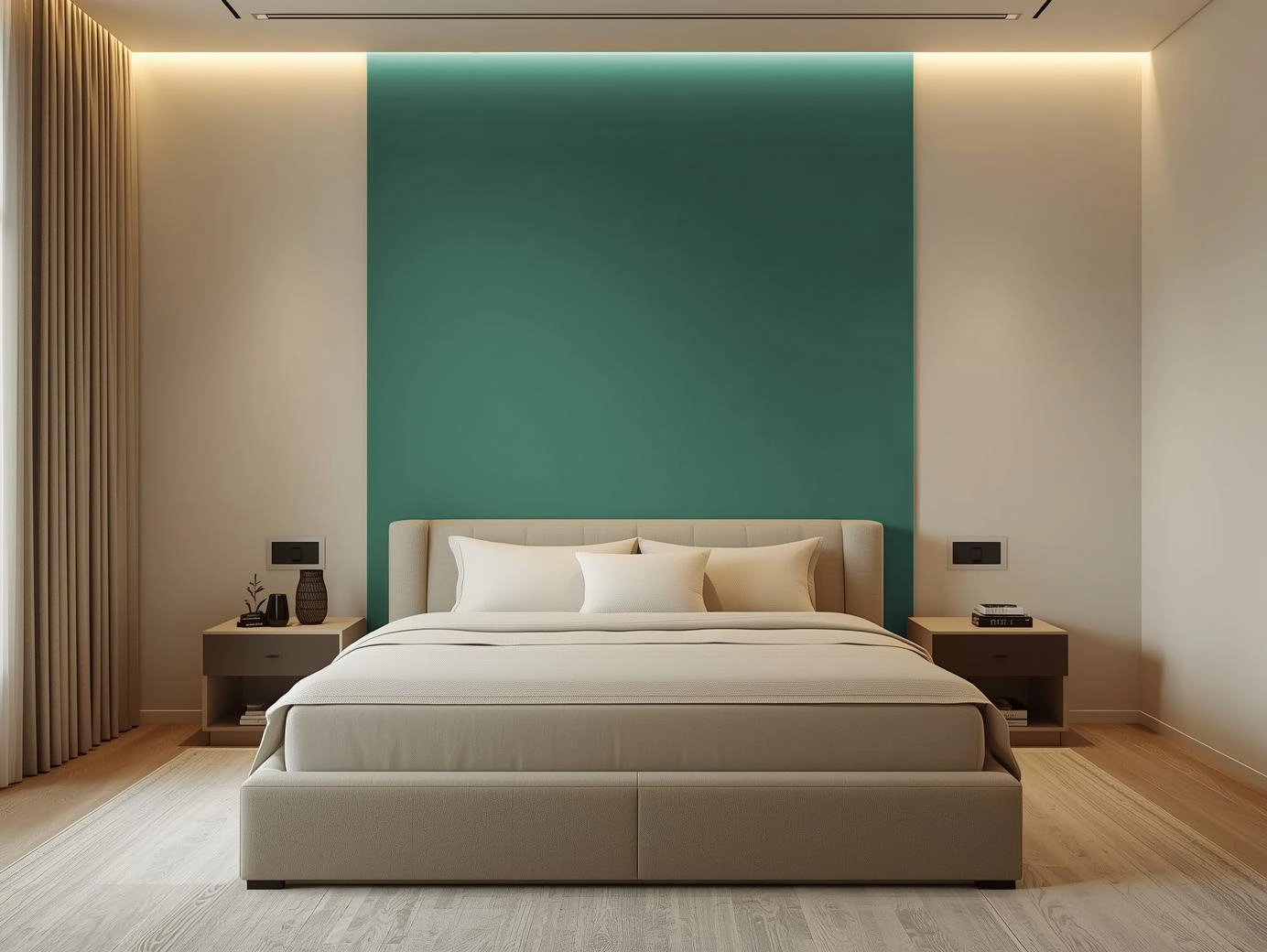
In bedrooms, Eurasia removes overstimulation. It allows textiles, lighting, and layout to take the lead. Use the shade behind the headboard or throughout the room with warm white lighting to create a minimalist, restful environment that naturally supports unwinding.
Eurasia (2510D)

5. Semi-Outdoor Spaces: Crisp Composure

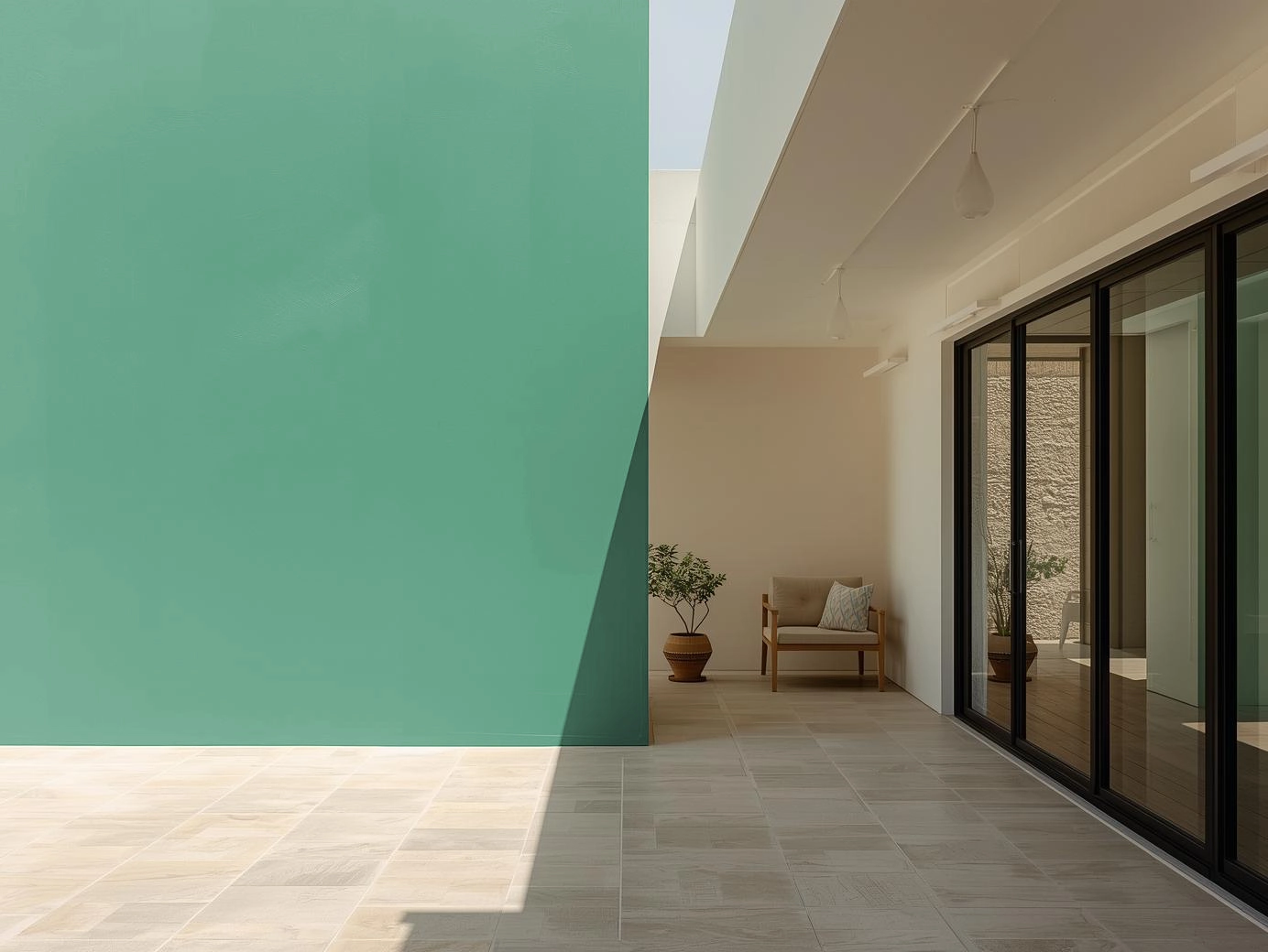
Balconies and courtyards benefit from the cool refinement of the shade. Eurasia sits well against stone, concrete, or greenery, creating a structured, quiet mood ideal for reflective mornings or evening breaks.
Eurasia (2510D)

6. Exteriors: Contemporary, Clear Lines

On facades, Eurasia projects clarity and restraint. It works particularly well for modern architecture with straight lines and minimal ornamentation. Offset it with white trims, slate elements, or light natural textures for a controlled, high-end finish.
Eurasia (2510D)

How to Style Eurasia (2510D) Intentionally

  • Combine it with controlled neutrals — warm white, light taupe, soft sand, or muted greys.
  • Use materials that echo clarity: ash wood, linen, stone, steel, or matte ceramics.
  • Prefer clean silhouettes over ornate décor; structure complements this shade better than embellishment.
  • Integrate focused lighting — warm LEDs, linear fixtures, or diffused lamps.
  • Add greenery sparingly; the shade thrives when visual noise is low.

A Colour for Resetting Spaces

Eurasia (2510D) represents more than a winter palette — it represents a mindset. December is not just the end of a year; it is a recalibration phase. Homes benefit from colours that remove excess, sharpen intention, and bring emotional and visual stability.

Eurasia does exactly that.

It gives rooms the clarity they need to close the year with focus — and enter the next with balance.

Common Bedroom Colour Mistakes That Make Your Bedroom Look Dull

Common Bedroom Colour Mistakes That Make Your Bedroom Look Dull

Your bedroom is your sanctuary, an intimate space where you can relax, recharge, and unwind. The colour scheme you choose plays a crucial role in setting the tone and atmosphere of your bedroom. However, picking the wrong colour palette can have the opposite effect, making your room feel dull, cramped, or uninviting.

In this article, we’ll explore some common bedroom colour mistakes that can make your space feel smaller, less lively, and less relaxing. We’ll also discuss how to avoid these mistakes by choosing the right colours and creating an open, comfortable atmosphere. Whether you’re revamping an old bedroom or planning a new look, we’ll help you avoid colour pitfalls and guide you toward the perfect palette for your personal retreat.

Bedroom Colour Mistakes That Make Your Bedroom Look Dull

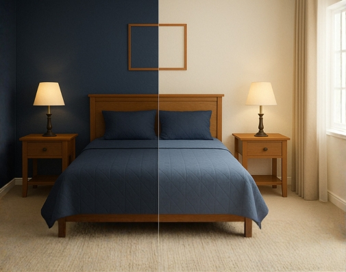
1. Avoid Using Dark Colours for Small Bedrooms

Dark colours like deep navy blue, charcoal grey, and burgundy can make a room feel cosy, but when used in small spaces, they have the potential to make your bedroom look smaller and more confined. While dark tones are elegant and sophisticated, they can absorb light and make a room feel heavy and suffocating, especially if the room lacks natural light.

Why It Makes Your Bedroom Look Smaller:

Dark colours tend to close in a room and reduce the perception of space. They can make the walls appear closer, thereby making the room feel more enclosed and cramped. In a small bedroom, this can make the space feel claustrophobic, leaving little room for relaxation.

Bedroom Colour Mistakes That Make Your Bedroom Look Dull

How to Fix It:

Opt for lighter shades like soft beiges, ivory whites, or light greys that reflect light, creating the illusion of more space. For a touch of depth, you can use dark colours on accent walls, trims, or furniture, rather than covering the entire room in heavy hues.

Indicus Paints offers soft, neutral shades like Ivory Silk and Soft Grey that can open up your space while still maintaining elegance and warmth.

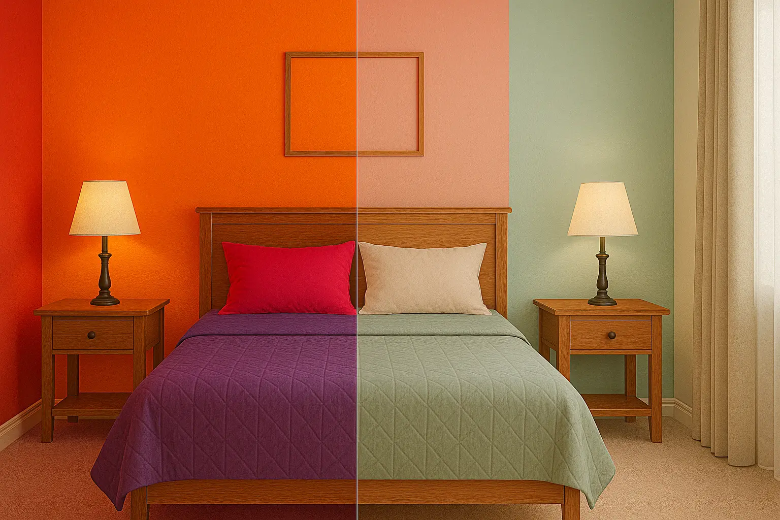
2. Too Many Bold, Saturated Colours

While bold colours like red, purple, and bright orange can inject energy and personality into a space, using too many of them in a bedroom can make the room feel overwhelming and chaotic. Bedrooms are meant to be relaxing, and too much stimulation from vibrant colours can make it hard to unwind.

Why It Makes Your Bedroom Look Dull:

When vibrant, saturated colours dominate the room, it creates visual noise that can detract from the peaceful and serene atmosphere that a bedroom should have. These colours can often clash, causing visual tension and making it difficult for the room to feel cohesive and inviting.

Bedroom Colour Mistakes That Make Your Bedroom Look Dull

How to Fix It:

Instead of covering large areas with bright, bold colours, use them sparingly as accents. For instance, you could incorporate red through pillows, artwork, or bed linens rather than painting an entire wall in it. Pastels or muted tones, like Soft Rose and Misty Lilac from Indicus Paints, will help create a soft and relaxing space while still allowing you to experiment with bold colours in smaller doses.

3. Overuse of Cool Tones

While cool tones such as blues, greens, and purples are calming, too much of them in a bedroom can make the room feel cold and impersonal. Cool tones are often used to create a relaxing atmosphere, but an excessive amount of them can result in a lack of warmth, making the room feel sterile or unwelcoming.

Why It Makes Your Bedroom Look Dull:

Cool colours can make the space feel disconnected and chilly. In a bedroom, where comfort and warmth are essential, an overuse of cool tones can cause the room to lose its cozy, inviting feel. It can also make the room feel flat, lacking in warmth and personality.

Bedroom Colour Mistakes That Make Your Bedroom Look Dull

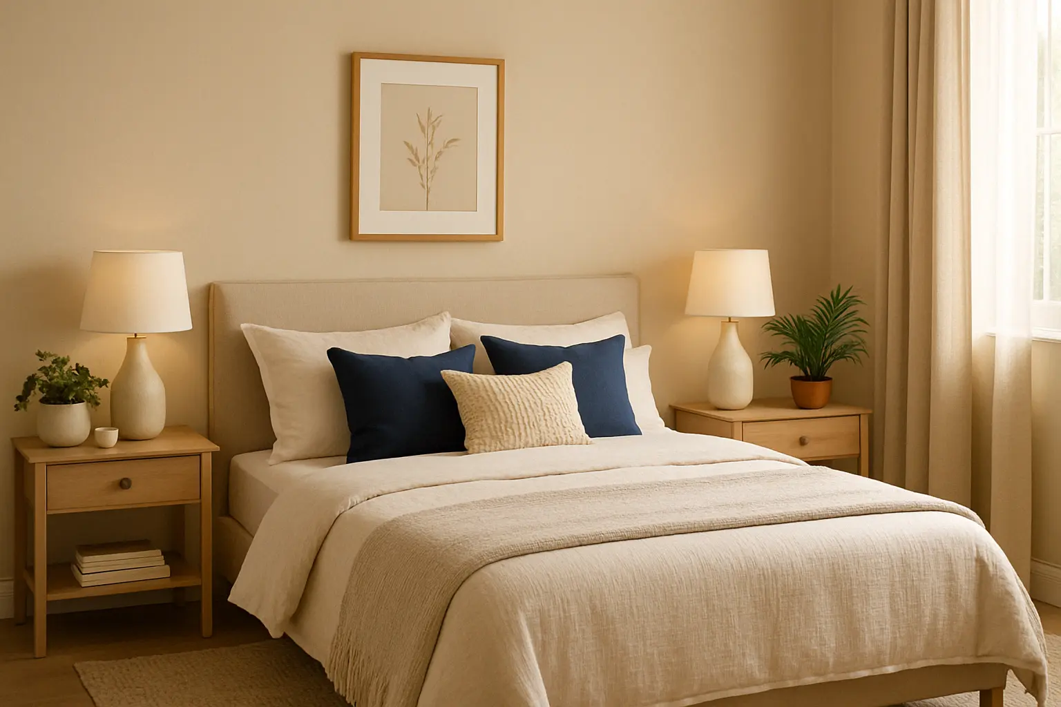
How to Fix It:

To keep your bedroom feeling warm and inviting, pair cool colours with warm neutrals like taupes, warm beiges, or soft browns. For example, using cool blue walls with warm wooden accents or light beige bedding can create a balanced, inviting environment. Indicus Paints’ shades like Crisp Mint paired with Golden Harvest can help add warmth and dimension to your space.

4. Avoid Overusing Dark Furniture with Light Walls

This mistake is a common one in bedroom design. While light-coloured walls and dark furniture may look appealing in theory, they can often create a sense of imbalance. If your furniture is dark and heavy and your walls are light, it can cause the room to feel top-heavy or unbalanced, making it appear smaller and less cohesive.

Why It Makes Your Bedroom Look Dull:

The contrast between light walls and dark furniture can sometimes create a jarring look that disrupts the flow of the room. Additionally, it can cause the furniture to dominate the space, making the room feel cluttered and heavy.

How to Fix It:

Balance the contrast by choosing mid-tone furniture that complements the walls. For example, if you have light-coloured walls, go for a darker wooden finish or neutral-toned furniture like beige, taupe, or light wood that doesn’t overpower the room. You can also add soft, light-coloured bedding or accessories to bring warmth to dark furniture.

5. Using Only One Colour Throughout the Room

While using one colour throughout the room may seem like a simple and cohesive design choice, it can often make the space feel monotonous and dull. An entirely uniform colour scheme can cause the room to lack depth, making it feel uninspired and flat.

Why It Makes Your Bedroom Look Dull:

Using only one colour on all surfaces walls, furniture, and decor, does not allow for any visual contrast or interest. Without layering different tones or textures, your room may lack the vibrancy and energy needed to create a dynamic living space.

How to Fix It:

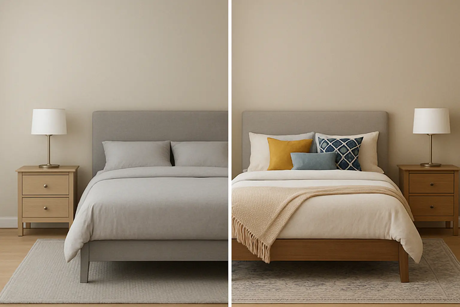
Introduce accent colours or textural contrasts. For example, you can use a muted wall colour like Soft Beige from Indicus Paints and then layer the space with various textures, such as wooden or metallic elements, as well as contrasting coloured furniture and accessories. Pillows, throws, and rugs in complementary colours, like deep blues or earthy oranges, can add layers and dimension to the room.

Bedroom Colour Mistakes That Make Your Bedroom Look Dull

6. Choosing Too Bright of Colours for a Bedroom

Bright colours like neon greens, fluorescent yellows, or bright pinks are typically best left for more energetic spaces like kitchens or playrooms. In a bedroom, too much brightness can create an overstimulating environment, making it difficult to relax or fall asleep.

Why It Makes Your Bedroom Look Dull:

The brightness of these colours can be overwhelming and distract from the room’s purpose of relaxation and sleep. It’s hard to achieve a calming atmosphere when the room feels too energetic.

How to Fix It:

Stick with more muted versions of bright colours, such as pale yellows, soft greens, or dusty pinks. These tones create a soft, calming environment that promotes relaxation. Indicus Paints Sunbeam Yellow and Soft Rose are perfect options to brighten up your bedroom without overwhelming the senses.

Choosing the right colour for your bedroom is essential in creating an atmosphere that is both relaxing and visually appealing. Avoiding common mistakes, like using too many dark colours or bright shades, and opting for colours that make the space feel open, warm, and balanced will ensure your bedroom remains a peaceful haven.

Remember, Indicus Paints offers a range of versatile colours that can help you create the perfect mood for your bedroom. Whether you prefer soft pastels, warm neutrals, or calming blues, there’s a perfect shade for every style and space.

Ready to transform your bedroom into a serene retreat? Explore Indicus Paints today and choose the perfect colour for your dream bedroom!