
Common Bedroom Colour Mistakes That Make Your Bedroom Look Dull
Listen to the audio version of the blog here:
Your bedroom is your sanctuary, an intimate space where you can relax, recharge, and unwind. The colour scheme you choose plays a crucial role in setting the tone and atmosphere of your bedroom. However, picking the wrong colour palette can have the opposite effect, making your room feel dull, cramped, or uninviting.
In this article, we’ll explore some common bedroom colour mistakes that can make your space feel smaller, less lively, and less relaxing. We’ll also discuss how to avoid these mistakes by choosing the right colours and creating an open, comfortable atmosphere. Whether you’re revamping an old bedroom or planning a new look, we’ll help you avoid colour pitfalls and guide you toward the perfect palette for your personal retreat.
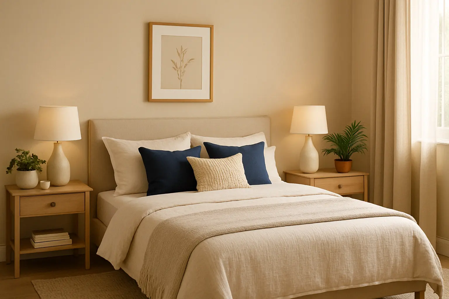
Avoid Using Dark Colours for Small Bedrooms
Dark colours like deep navy blue, charcoal grey, and burgundy can make a room feel cosy, but when used in small spaces, they have the potential to make your bedroom look smaller and more confined. While dark tones are elegant and sophisticated, they can absorb light and make a room feel heavy and suffocating, especially if the room lacks natural light.
Why It Makes Your Bedroom Look Smaller:
Dark colours tend to close in a room and reduce the perception of space. They can make the walls appear closer, thereby making the room feel more enclosed and cramped. In a small bedroom, this can make the space feel claustrophobic, leaving little room for relaxation.

How to Fix It:
Opt for lighter shades like soft beiges, ivory whites, or light greys that reflect light, creating the illusion of more space. For a touch of depth, you can use dark colours on accent walls, trims, or furniture, rather than covering the entire room in heavy hues.
Indicus Paints offers soft, neutral shades like Ivory Silk and Soft Grey that can open up your space while still maintaining elegance and warmth.
Too Many Bold, Saturated Colours
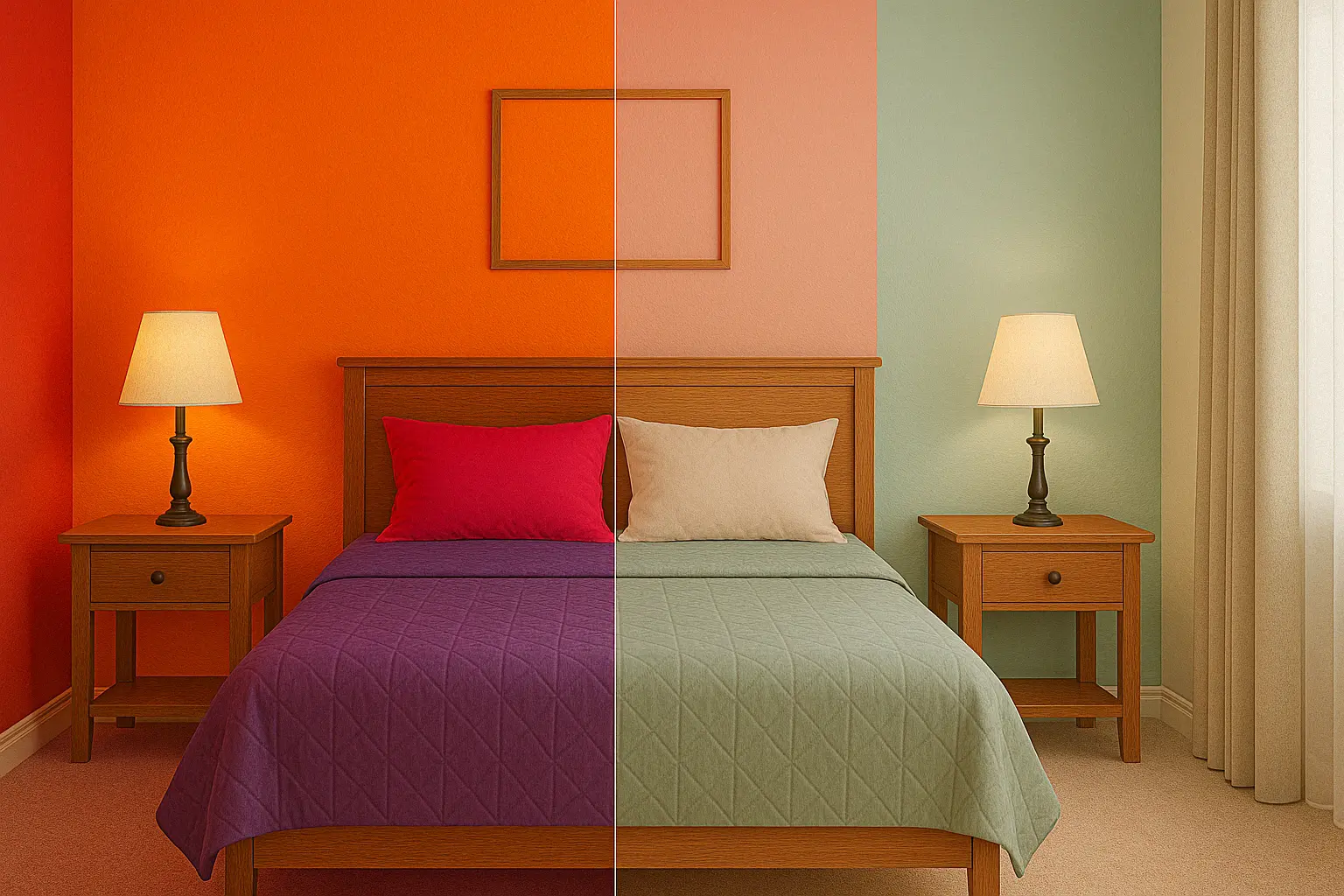
While bold colours like red, purple, and bright orange can inject energy and personality into a space, using too many of them in a bedroom can make the room feel overwhelming and chaotic. Bedrooms are meant to be relaxing, and too much stimulation from vibrant colours can make it hard to unwind.
Why It Makes Your Bedroom Look Dull:
When vibrant, saturated colours dominate the room, it creates visual noise that can detract from the peaceful and serene atmosphere that a bedroom should have. These colours can often clash, causing visual tension and making it difficult for the room to feel cohesive and inviting.
How to Fix It:
Instead of covering large areas with bright, bold colours, use them sparingly as accents. For instance, you could incorporate red through pillows, artwork, or bed linens rather than painting an entire wall in it. Pastels or muted tones, like Soft Rose and Misty Lilac from Indicus Paints, will help create a soft and relaxing space while still allowing you to experiment with bold colours in smaller doses.
Overuse of Cool Tones
While cool tones such as blues, greens, and purples are calming, too much of them in a bedroom can make the room feel cold and impersonal. Cool tones are often used to create a relaxing atmosphere, but an excessive amount of them can result in a lack of warmth, making the room feel sterile or unwelcoming.
Why It Makes Your Bedroom Look Dull:
Cool colours can make the space feel disconnected and chilly. In a bedroom, where comfort and warmth are essential, an overuse of cool tones can cause the room to lose its cozy, inviting feel. It can also make the room feel flat, lacking in warmth and personality.

How to Fix It:
To keep your bedroom feeling warm and inviting, pair cool colours with warm neutrals like taupes, warm beiges, or soft browns. For example, using cool blue walls with warm wooden accents or light beige bedding can create a balanced, inviting environment. Indicus Paints’ shades like Crisp Mint paired with Golden Harvest can help add warmth and dimension to your space.
Avoid Overusing Dark Furniture with Light Walls
This mistake is a common one in bedroom design. While light-coloured walls and dark furniture may look appealing in theory, they can often create a sense of imbalance. If your furniture is dark and heavy and your walls are light, it can cause the room to feel top-heavy or unbalanced, making it appear smaller and less cohesive.
Why It Makes Your Bedroom Look Dull:
The contrast between light walls and dark furniture can sometimes create a jarring look that disrupts the flow of the room. Additionally, it can cause the furniture to dominate the space, making the room feel cluttered and heavy.
How to Fix It:
Balance the contrast by choosing mid-tone furniture that complements the walls. For example, if you have light-coloured walls, go for a darker wooden finish or neutral-toned furniture like beige, taupe, or light wood that doesn’t overpower the room. You can also add soft, light-coloured bedding or accessories to bring warmth to dark furniture.
Using Only One Colour Throughout the Room
While using one colour throughout the room may seem like a simple and cohesive design choice, it can often make the space feel monotonous and dull. An entirely uniform colour scheme can cause the room to lack depth, making it feel uninspired and flat.
Why It Makes Your Bedroom Look Dull:
Using only one colour on all surfaces walls, furniture, and decor, does not allow for any visual contrast or interest. Without layering different tones or textures, your room may lack the vibrancy and energy needed to create a dynamic living space.
How to Fix It:
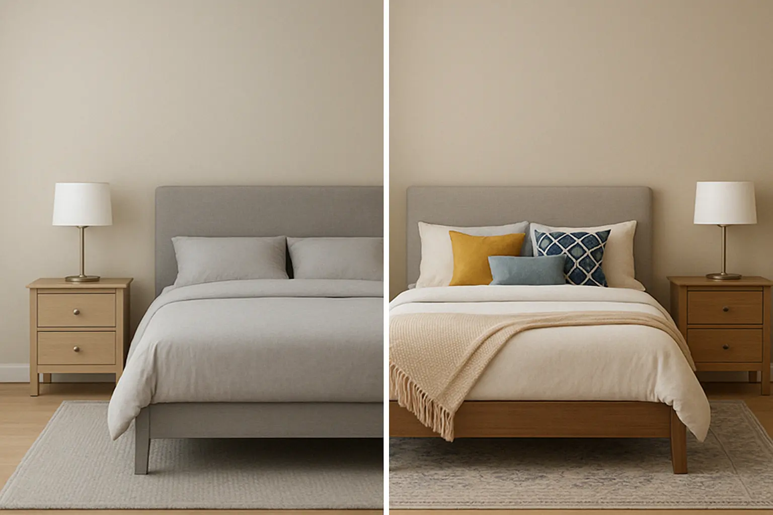
Introduce accent colours or textural contrasts. For example, you can use a muted wall colour like Soft Beige from Indicus Paints and then layer the space with various textures, such as wooden or metallic elements, as well as contrasting coloured furniture and accessories. Pillows, throws, and rugs in complementary colours, like deep blues or earthy oranges, can add layers and dimension to the room.
Choosing Too Bright of Colours for a Bedroom
Bright colours like neon greens, fluorescent yellows, or bright pinks are typically best left for more energetic spaces like kitchens or playrooms. In a bedroom, too much brightness can create an overstimulating environment, making it difficult to relax or fall asleep.
Why It Makes Your Bedroom Look Dull:
The brightness of these colours can be overwhelming and distract from the room’s purpose of relaxation and sleep. It’s hard to achieve a calming atmosphere when the room feels too energetic.
How to Fix It:
Stick with more muted versions of bright colours, such as pale yellows, soft greens, or dusty pinks. These tones create a soft, calming environment that promotes relaxation. Indicus Paints Sunbeam Yellow and Soft Rose are perfect options to brighten up your bedroom without overwhelming the senses.
Choosing the right colour for your bedroom is essential in creating an atmosphere that is both relaxing and visually appealing. Avoiding common mistakes, like using too many dark colours or bright shades, and opting for colours that make the space feel open, warm, and balanced will ensure your bedroom remains a peaceful haven.
Remember, Indicus Paints offers a range of versatile colours that can help you create the perfect mood for your bedroom. Whether you prefer soft pastels, warm neutrals, or calming blues, there’s a perfect shade for every style and space.
Ready to transform your bedroom into a serene retreat? Explore Indicus Paints today and choose the perfect colour for your dream bedroom!