You are using an outdated browser. Please upgrade your browser to improve your experience.

Pumpkin Patch (2066T): November’s Colour of the Month

Pumpkin Patch (2066T): November’s Colour of the Month

November carries a gentle transition — the festive sparkle begins to fade, and a golden calm settles in. The days grow shorter, the air cooler, and homes seek warmth and serenity after the celebrations. Pumpkin Patch (2066T) captures this shift beautifully.

It’s a colour that feels radiant yet composed, blending festive brightness with seasonal stillness. With its warm undertone and earthy depth, Pumpkin Patch reflects the mellow light of Indian winters, filling every space with quiet comfort and positivity.

The Thought Behind the Colour

Pumpkin Patch draws inspiration from the warmth of Indian living — the terracotta courtyards, marigold flowers, and sunlit verandahs that define our homes. It resonates with our sense of familiarity and comfort, while still feeling modern and fresh.
Pumpkin Patch 2066T
The hue was chosen for November because it perfectly bridges the energy of autumn and the tranquillity of approaching winter. It’s bright enough to keep interiors cheerful and inviting, yet soft enough to create balance after the vibrance of the festive months.

Design Inspirations for Indian Homes

Living Room: Inviting and Timeless

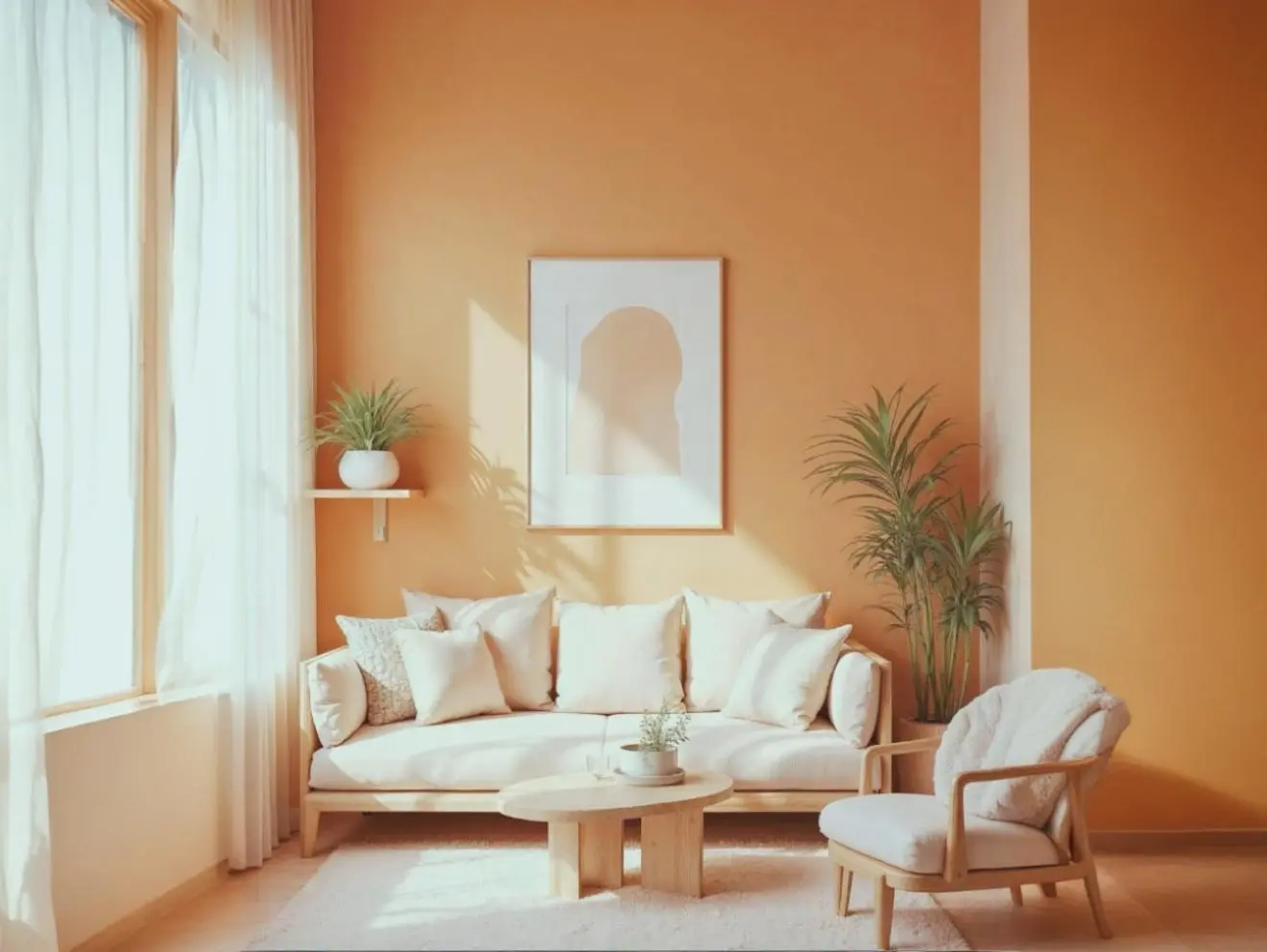
Pumpkin Patch brings a refined glow to living spaces. It works beautifully as an accent wall colour, setting a warm tone for gatherings or quiet evenings. Pair it with ivory or soft grey upholstery, wooden accents, and textured fabrics like linen or cotton. A touch of metallic décor or amber lighting adds subtle luxury to the space.
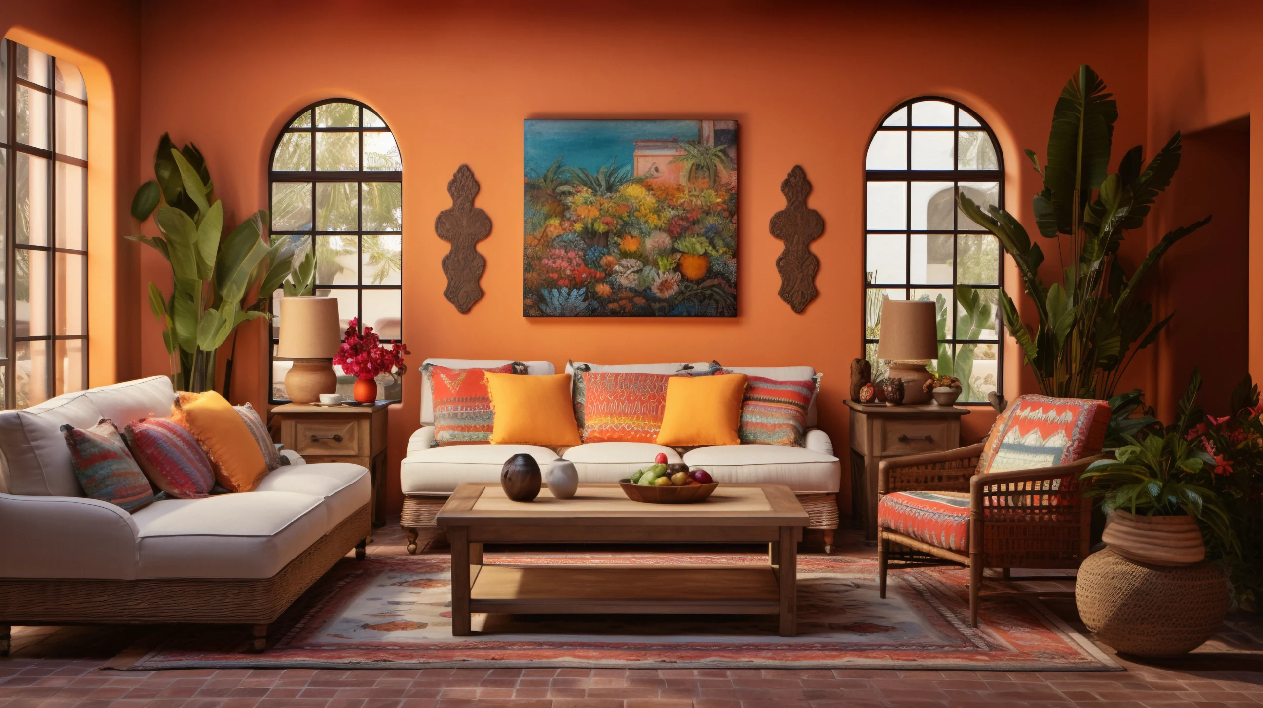
Pumpkin Patch 2066T

Dining Space: Comfort in Conversation

This shade lends a natural glow to dining areas, where connection and comfort meet. Use it on the backdrop wall or through décor elements like wall plates, woven runners, or dining chairs. Combine it with cane, beige, or polished wood finishes to create a welcoming, earthy atmosphere perfect for long dinners and festive reunions.

Kitchen: Fresh Energy with Familiar Warmth

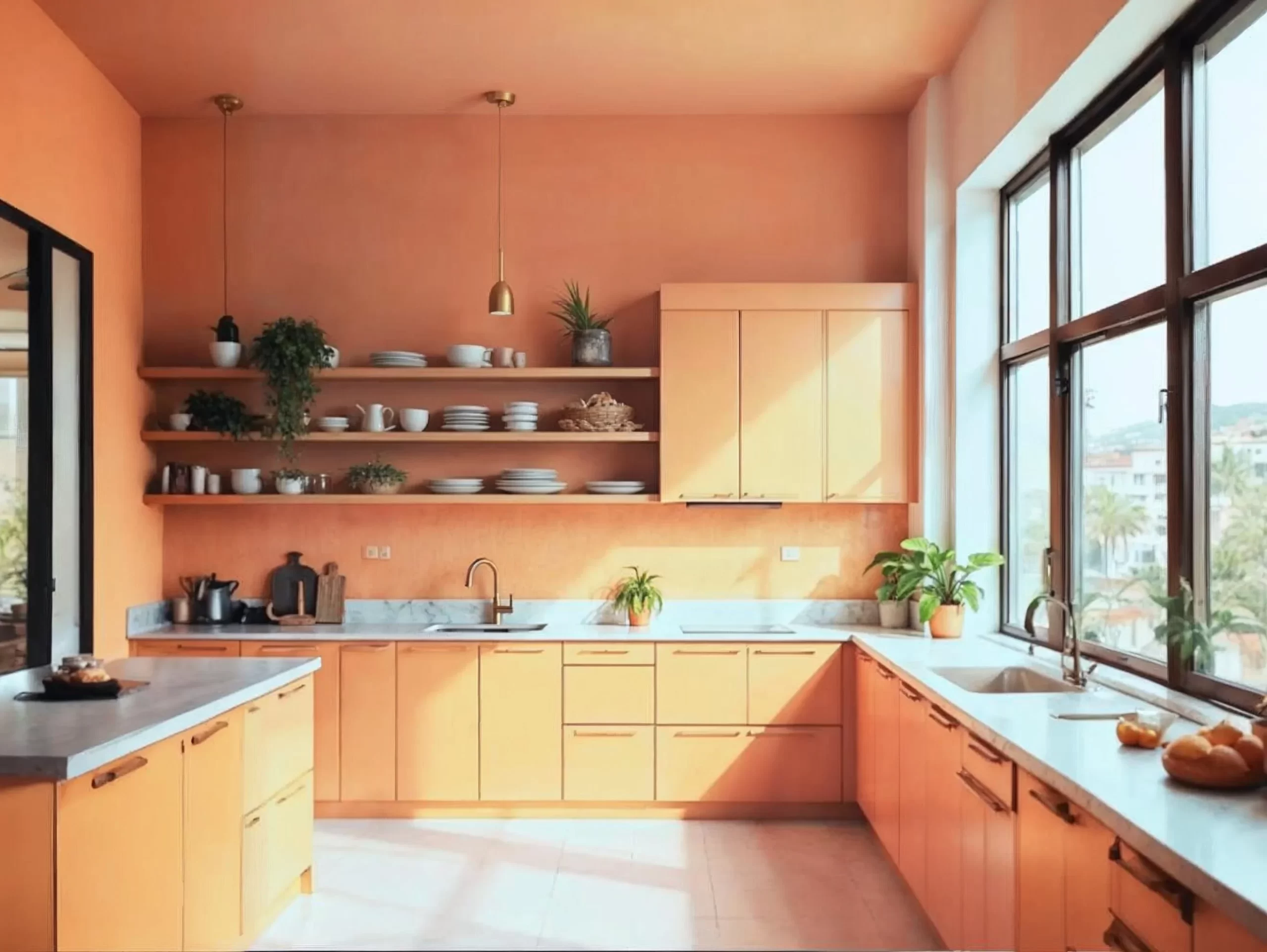
Pumpkin Patch can transform kitchens into lively, grounded spaces. Try it on cabinets or breakfast counters for a cheerful yet sophisticated look. Complement it with matte black or brushed brass hardware, white tile backsplashes, and natural stone finishes. It balances functionality with an inviting warmth that feels effortlessly homely.

Bedroom: Calm Wrapped in Warmth

In bedrooms, Pumpkin Patch feels soft and cocooning. Use it on a headboard wall or in muted doses through textiles — throws, cushions, or curtains. It pairs beautifully with off-whites, sand tones, and natural wood. Add diffused lighting and minimal décor for a tranquil, restful setting that still carries warmth.
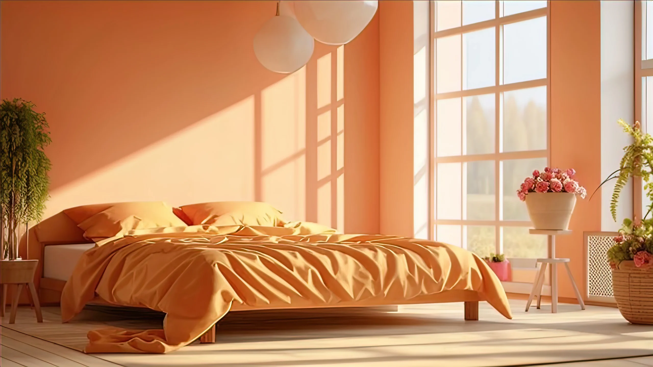
Pumpkin Patch 2066T

Courtyard & Balcony: Earthy Charm Outdoors

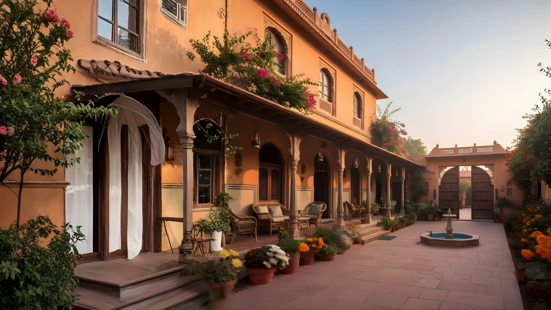
For Indian homes with semi-open or green spaces, Pumpkin Patch fits seamlessly. The colour complements terracotta tiles, bamboo furniture, and potted plants, bringing a cohesive, sunlit charm. Under morning or evening light, it enhances architectural details and feels naturally connected to the outdoors.

Exteriors: Warm Welcome in Every Facade

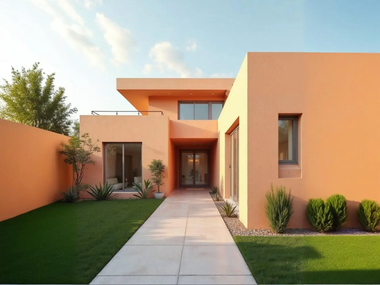
Pumpkin Patch makes for a distinctive yet elegant exterior shade. It glows beautifully under sunlight while maintaining a balanced earthy tone. Paired with off-white trims, stone textures, or muted roof colours, it adds personality without overpowering the structure — ideal for homes that want to feel rooted yet refreshed.

Pumpkin Patch 2066T

How to Style Pumpkin Patch (2066T)

  • Combine it with neutral palettes — beige, taupe, or ivory — for a grounded look.
  • Use natural materials like wood, jute, and linen to complement its earthy feel.
  • Add brass, amber glass, or gold-toned lighting for warmth and depth.
  • Balance its brightness with greenery or terracotta accessories for a cohesive finish.

A Colour That Belongs

Pumpkin Patch (2066T) reflects the Indian sense of comfort — where warmth meets simplicity and brightness carries emotion. It’s a shade that fits every corner of the home, from vibrant social spaces to calm private retreats.

This November, let your home glow with the soft energy of Pumpkin Patch — a colour that celebrates both the lingering joy of the season and the serenity of what comes next.

With Indicus Paints’ curated palette, you can find shades that capture every season’s story — from the glow of summer to the calm of winter. Pumpkin Patch (2066T) is November’s chapter — radiant, rooted, and undeniably home.
DIY Balcony Painting: Top Colour Trends for Indian Homes

DIY Balcony Painting: Top Colour Trends for Indian Homes

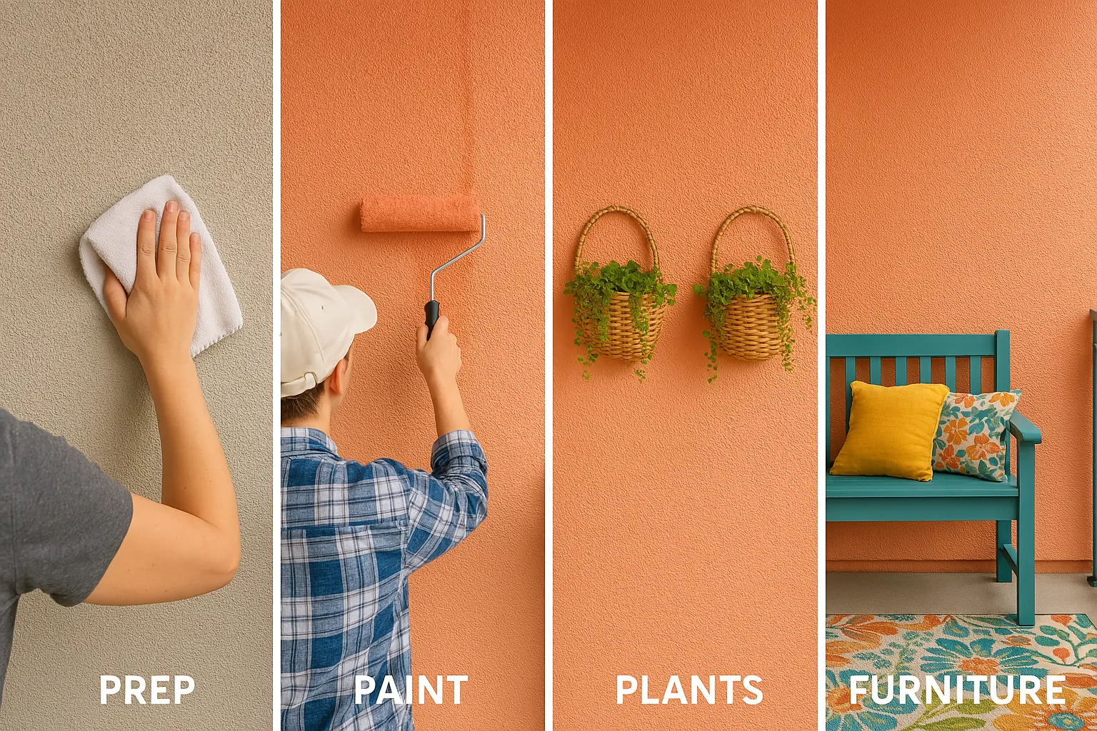
The balcony, often an overlooked space in many Indian homes, can be transformed into a serene outdoor retreat with just a bit of paint and creativity. A well-painted balcony not only enhances the curb appeal of your home but also creates a relaxing atmosphere where you can unwind, sip your morning tea, or entertain guests.

As the outdoor space continues to gain importance, choosing the right colours for your balcony is crucial in bringing both beauty and functionality to this area. The right colours can make your balcony look more expansive, complement your home’s exterior, and reflect your personal style. Whether you’re looking for bright and lively colours or subtle and calming shades, we’ll walk you through the top balcony painting trends that are perfect for Indian homes.

In this blog, we’ll explore some of the latest colour trends for balconies, as well as provide Indicus Paints recommendations, DIY tips, and ideas to help you achieve a stunning balcony makeover.

DIY Balcony Painting

Bright and Bold: Vibrant Colours to Infuse Energy

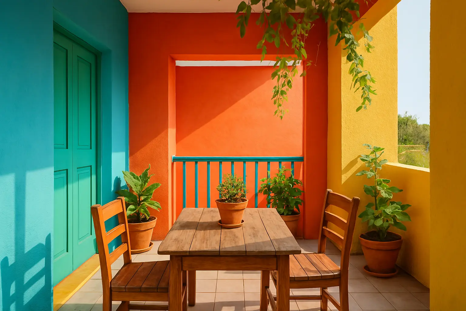
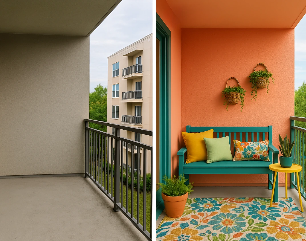
Vibrant, bold colours have always been a popular choice in Indian homes, and they are now making their mark in balcony designs. Using bright colours like turquoise, coral, or mustard yellow on your balcony walls can infuse the space with energy and create an inviting atmosphere.

For a refreshing look, consider using Indicus Paints Ocean Breeze or Sunset Orange. These colours are vibrant and lively and can turn your balcony into a cheerful escape. Whether you use them on feature walls, furniture, or door frames, bold colours can elevate the charm of your outdoor space, making it the perfect spot to relax or host casual get-togethers.

Why It Works:

  • Bright hues like turquoise or mustard yellow add a lively atmosphere to your outdoor space.
  • They reflect the vibrant energy of Indian culture, making them a great fit for balconies that are used to entertain guests.
  • Perfect for Indian homes that need a pop of colour to balance neutral exteriors.

How to Style It:

  • Combine bold colours with neutral furniture to avoid overwhelming the space.
  • Add greenery like potted plants, hanging vines, or succulents for a more refreshing, nature-inspired vibe.
  • Pair bold colour choices with rustic or wooden outdoor furniture to balance vibrancy with warmth.
DIY Balcony Painting

Soothing Pastels: Calm and Relaxing Ambience

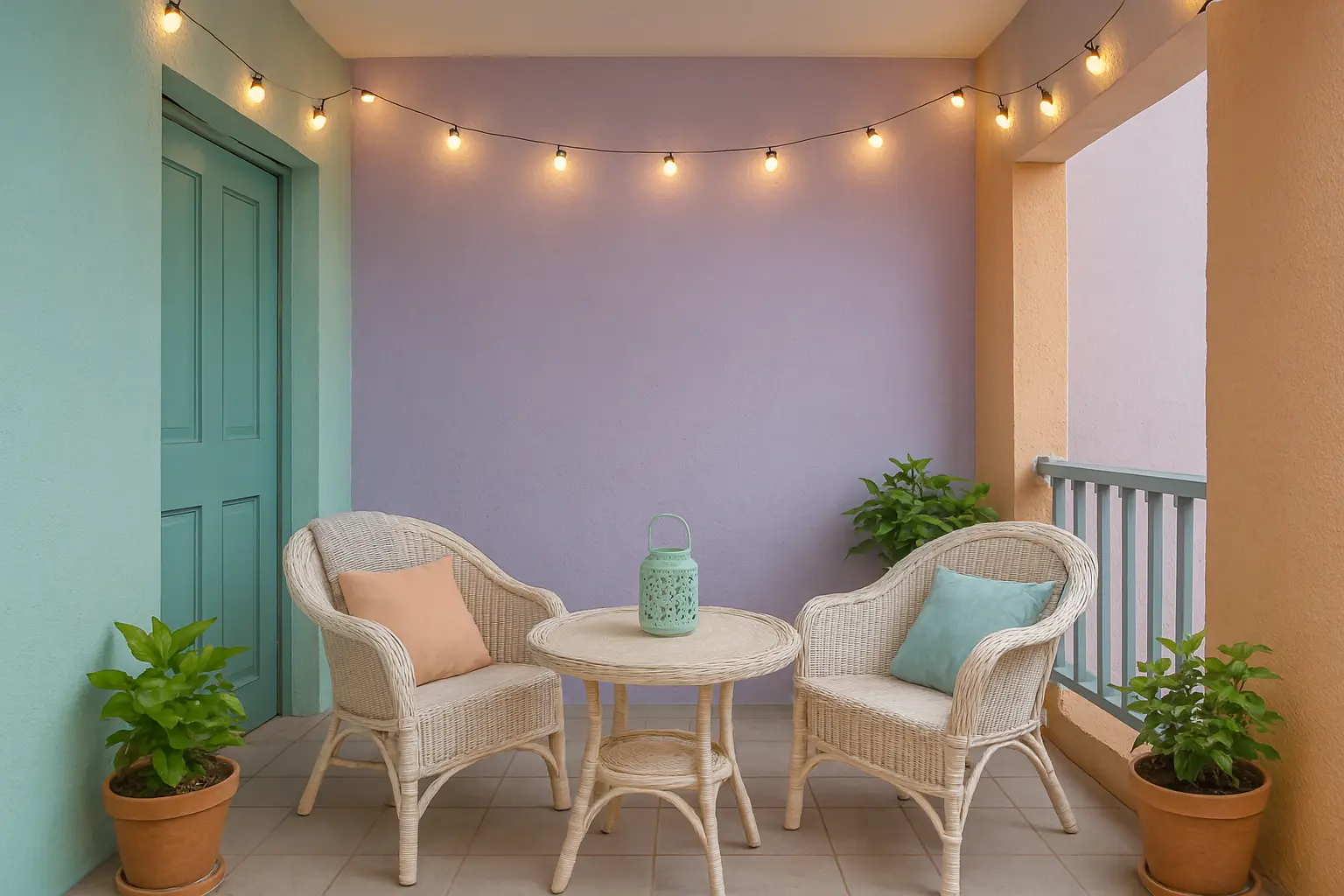
If you’re aiming for a more tranquil, soothing outdoor environment, soft pastels are the perfect choice for your balcony. Light shades like mint green, peach, lavender, and powder blue create a serene ambiance, making them ideal for relaxing or reading. These colours can make even small balconies feel more expansive and airy.For a soft and refreshing look, you can try Indicus Paints Sea Breeze or Soft Rose. These colours bring a sense of calm and relaxation to your outdoor space, making it feel like a private sanctuary. These shades also work well with traditional Indian décor and can be combined with cushions and throws in complementary tones.

Why It Works:

  • Pastel colours create a calming atmosphere, perfect for winding down.
  • They make small spaces appear larger and more open, which is ideal for city apartments or compact balconies.
  • Pastels add a touch of softness and elegance, without overpowering the exterior aesthetic of your home.

How to Style It:

  • Pair pastel colours with light, airy furniture like wicker chairs, outdoor cushions, and a small coffee table.
  • Complement pastel walls with simple décor—think natural textures like linen, rattan, or wooden furniture.
  • Add soft lighting, like fairy lights or lanterns, to enhance the calm atmosphere during the evenings.
DIY Balcony Painting

Earthy Tones: Nature-Inspired Shades for a Grounded Look

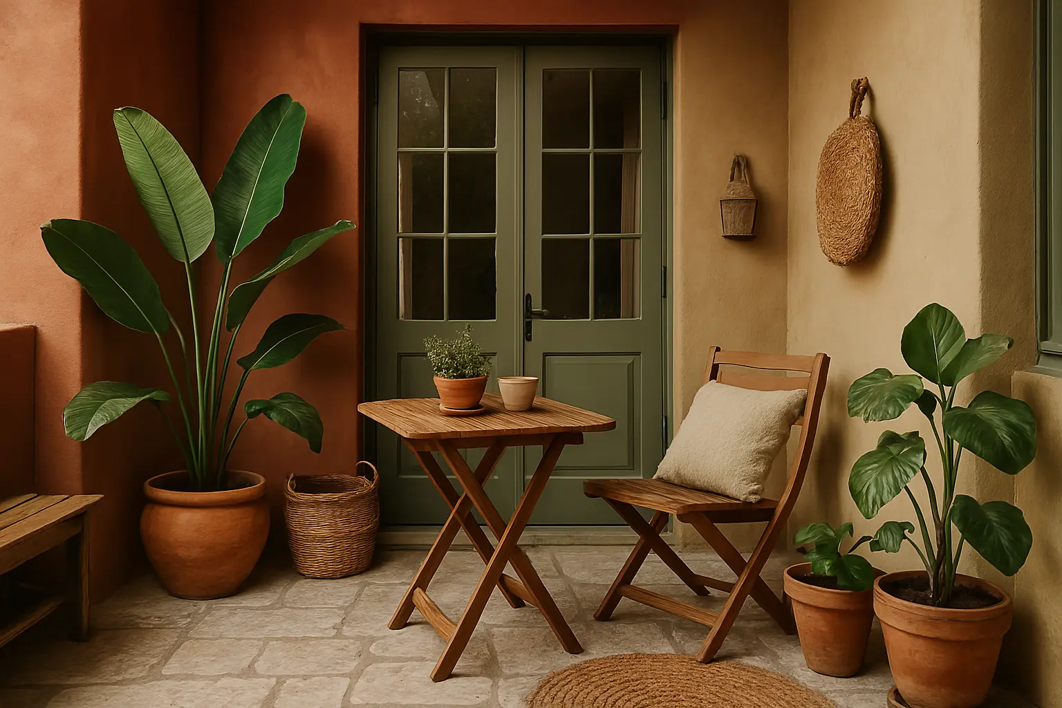
If you prefer a more organic, grounded look for your balcony, earthy tones like terracotta, warm beige, sandstone, and olive green are excellent choices. These colours evoke the natural beauty of the outdoors and work well to create a rustic, natural vibe on your balcony.Indicus Paints Golden Harvest and Saffron Glow are ideal examples of earthy tones that can elevate the aesthetic of your balcony. These shades evoke the beauty of the earth and provide warmth, which is perfect for balconies in tropical and subtropical regions of India. Earthy colours can help your balcony blend seamlessly with the surrounding environment, especially when combined with natural materials like wood, stone, and terracotta.

Why It Works:

  • Earthy tones bring a sense of warmth and connection with nature, ideal for outdoor spaces.
  • They are versatile and can complement a variety of architectural styles, from traditional Indian homes to contemporary designs.
  • These colours create a grounding effect and can help your balcony feel like an extension of your garden or yard.

How to Style It:

  • Mix and match earthy tones with large plants, wooden furniture, and woven textiles for a natural and rustic look.
  • Use terracotta planters or woven baskets to enhance the earthy vibe.
  • Add natural stone tiles for flooring to create a seamless blend with the surrounding environment.
DIY Balcony Painting

Classic White and Neutrals: Timeless Elegance

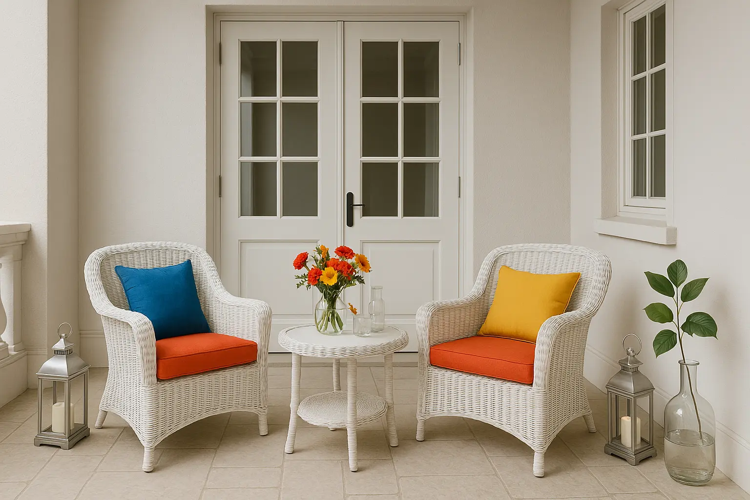
For a clean, sophisticated look, classic whites and neutral tones are always in style. White walls, beige, and light greys can help your balcony appear fresh, spacious, and elegant. These colours are especially effective in making your outdoor area look well-maintained and timeless.

Using Indicus Paints Ivory Silk or Moon Shell will give your balcony a light, airy feel while still providing an elegant touch. Neutral tones also act as a blank canvas for other colourful accessories, allowing your furniture, cushions, or plants to stand out and create a lively, personalized space.

Why It Works:

  • Neutral colours create a clean, polished, and timeless look.
  • They are incredibly versatile and can be paired with almost any décor style.
  • Ideal for urban environments or balconies with minimal space that need to appear larger.

How to Style It:

  • Add bold coloured furniture or vibrant accessories to complement neutral walls and give the space character.
  • Use white wicker furniture and bright throw pillows to bring some colour to the otherwise minimalist space.
  • Incorporate metallic or glass accents like lanterns or vases for a touch of elegance.
DIY Balcony Painting

Tropical Greens: A Refreshing Look for Your Balcony

If you’re seeking a tropical vibe for your balcony, shades of green are a fantastic choice. Green is synonymous with freshness, vitality, and nature, and it can make your outdoor space feel like a lush garden oasis. Choose from shades like forest green, sage, or even a bright lime green for a more lively and energetic feel.

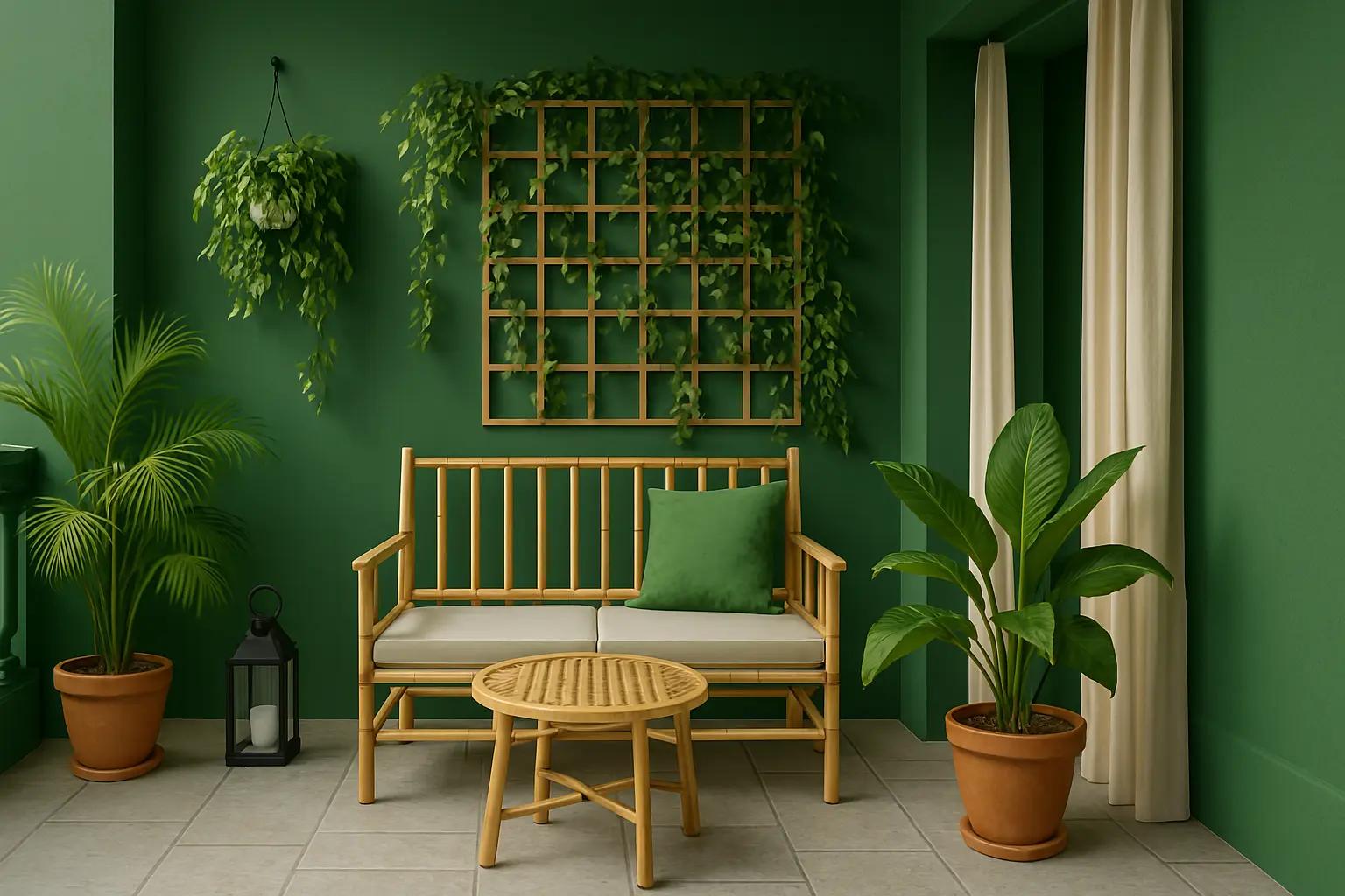
Indicus Paints Verdant Dream or Emerald Calm would be excellent options for creating a tropical, green-themed balcony. These colours bring an organic feel to the space and pair wonderfully with greenery and plants.

Why It Works:

  • Green is associated with growth, nature, and tranquility, making it perfect for outdoor living spaces.
  • It helps balance the often hot and sunny environment by creating a fresh and peaceful vibe.
  • Works particularly well in balconies surrounded by plants, flowers, and natural light.

How to Style It:

  • Mix green walls with vibrant potted plants, hanging vines, or trellises to enhance the tropical theme.
  • Pair with wooden or bamboo furniture for an earthy, natural look.
  • Add outdoor curtains or shade sails in neutral tones to complement the vibrancy of green.
DIY Balcony Painting

Painting your balcony is an easy and effective way to revamp your outdoor space and make it a functional extension of your home. By selecting the right colours, you can transform your balcony into a cozy, vibrant, or peaceful retreat. Whether you opt for bold vibrant colours, calming pastels, or earthy tones, the possibilities are endless.
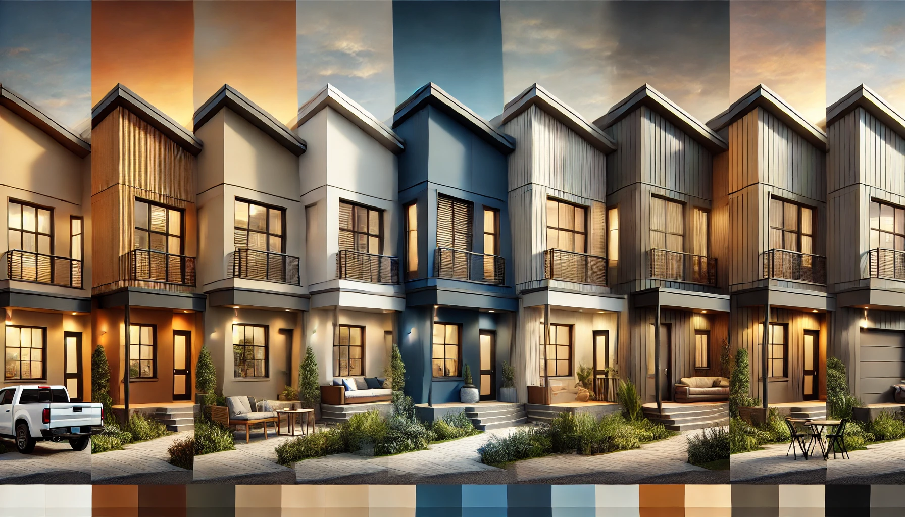
With Indicus Paints, you can explore a wide range of colours that suit every style and transform your balcony into a stylish, inviting space.

Ready to refresh your balcony? Dive into Indicus Paints colour palette and bring your vision to life with high-quality paints that will ensure lasting beauty.

Crushed Strawberry (2222D): October’s Colour of the Month

Crushed Strawberry (2222D): October’s Colour of the Month

There’s something unmistakable about October. A shift in the air, a softness in the light, and a quiet joy that lingers just before celebrations begin. Crushed Strawberry (2222D) from Indicus Paints captures that moment perfectly.It doesn’t whisper; it illuminates spaces with gentle confidence. It’s not bold in the obvious way, yet it uplifts every corner it touches. A hue that feels like warmth shared: tender, graceful, and effortlessly cheerful.As homes prepare to glow with festive colour, Crushed Strawberry sets the tone with clarity and charm, welcoming light, laughter, and togetherness. Every room it touches comes alive with subtle energy, creating a backdrop for moments that matter—a gentle celebration of life at home.
Why Crushed Strawberry Works in October

1. Embodies the Season

October is the threshold between calm and celebration. Crushed Strawberry mirrors this shift—soft yet radiant, quiet yet undeniably present. It’s the blush of evening skies, the warmth that transforms walls into a home you can feel, not just see.

2. Creates Warmth with Presence

This isn’t a decorative pink; it’s a shade that feels human, lived-in, and inviting. It turns every room into a space of care, laughter, and connection. Perfect for the festive season, where hospitality is as much about heart as tradition.

3. Elegantly Versatile

Crushed Strawberry adapts beautifully to every home style, from modern minimalism to culturally rooted design. Pair it with warm whites, creams, muted golds, or light woods to create spaces that feel intentional, cozy, and effortlessly stylish.

Bring Crushed Strawberry into Your Home

Living Room: Warmth That Draws People In

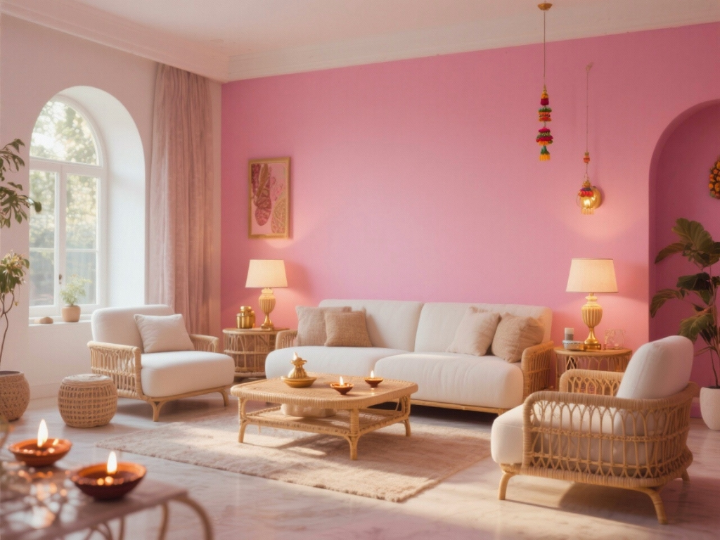
The living room is where stories unfold, and Crushed Strawberry makes it glow with quiet charm. Use it on an accent wall or as a subtle backdrop that welcomes attention without overpowering the space. The shade instantly warms up the room, creating a sense of light and connection.

  1. Pair with ivory or beige furniture to balance the vibrancy with calm.
  2. Add brass, rose-gold, or cane elements for an understated festive touch.
  3. Use warm, diffused lighting—table lamps, wall sconces, or diyas—to let the colour’s inner glow shine through.
  4. Complement with natural fabrics, soft cushions, and minimal décor to keep the look refined yet inviting.
Crushed Strawberry
Crushed Strawberry turns the living room into a space that feels alive—elegant, personal, and effortlessly welcoming.

Bedroom: Calm, Cozy, and Intimate

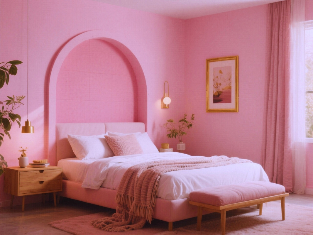
In bedrooms, Crushed Strawberry softens the atmosphere, wrapping the space in a cocoon of warmth and comfort. It’s a hue that whispers relaxation and feels inherently nurturing.

  1. Paint the wall behind the bed or create a blush-toned alcove to anchor the room.
  2. Layer the palette with white, nude, or pastel linens for a calm visual rhythm.
  3. Introduce textured throws, knitted cushions, or cane headboards for depth and tactility.
  4. Touches of matte gold in lighting or art frames add subtle elegance without overwhelming the calm.
Crushed Strawberry
This setting feels modern yet soulful—perfect for winding down while keeping an air of grace and intimacy.

Kitchen & Dining: Everyday Joy with a Festive Heart

Crushed Strawberry brings freshness and energy to spaces that thrive on activity and togetherness. In the kitchen or dining area, it adds a sense of cheer that turns even simple meals into shared celebrations.

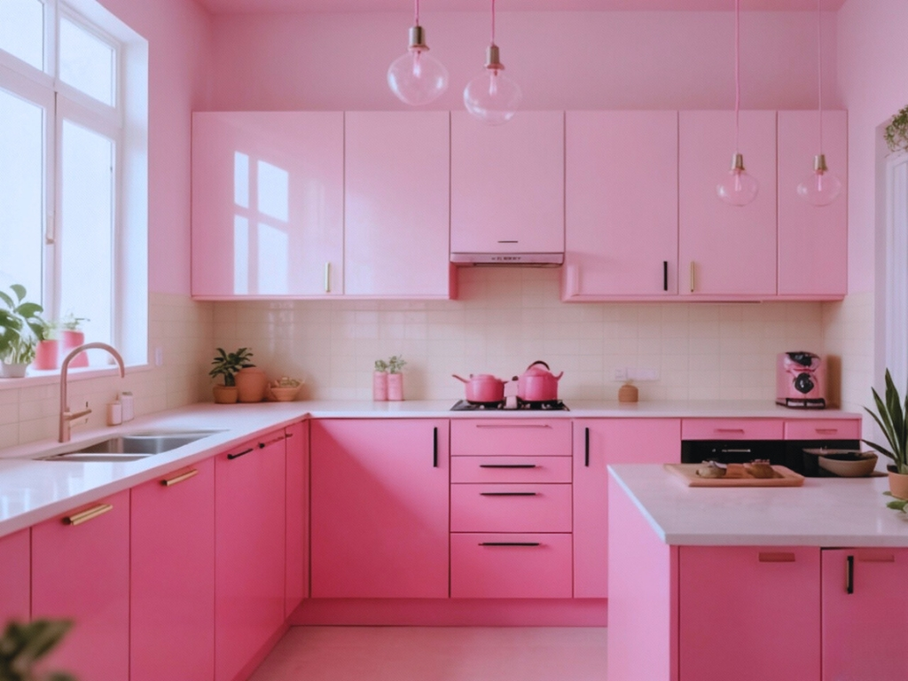
  1. Use the shade on lower cabinets, breakfast counters, or niche walls for a refreshing accent.
  2. Pair it with cream or sand-toned tiles to create visual balance.
  3. Add brushed black or matte gold handles and fixtures for a sophisticated contrast.
  4. Bring life into the space with potted herbs, terracotta jars, or wicker baskets to complement the warmth with natural textures.
Crushed Strawberry
It’s a look that feels both functional and festive—lively in the day, glowing softly at night.

Courtyards & Balconies: Where Nature Meets Celebration

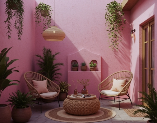
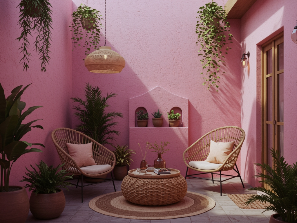
Few places showcase Crushed Strawberry better than outdoor corners bathed in sunlight. Its luminous undertone complements nature beautifully, glowing against green foliage and wooden textures.

  1. Paint a small parapet, feature wall, or planter section in Crushed Strawberry to introduce a gentle, joyful pop.
  2. Pair with rustic wooden or woven furniture for a relaxed yet chic setting.
  3. Add string lights, diyas, or lanterns to enhance the evening glow.
  4. Accessorize with clay planters, brass pots, or floral arrangements for festive charm.
Crushed Strawberry

As daylight shifts, the colour transforms—soft and romantic in the morning, vivid and radiant by dusk. It becomes the heart of your home’s outdoor warmth, bridging nature and festivity with effortless elegance.

October in Colour

October is alive with anticipation. Crushed Strawberry (2222D) by Indicus Paints transforms that feeling into colour—warm, radiant, and welcoming. It doesn’t shout; it declares presence, creating spaces where family, friends, and celebrations naturally gather.

As diyas light up corners and laughter fills rooms, Crushed Strawberry becomes more than paint. It’s the glow of shared moments, a colour that makes every day feel ready for celebration.

Beyond Strawberry: A World of Colour

At Indicus Paints, every month tells a story in colour. While October celebrates Crushed Strawberry (2222D), our palette extends far beyond—from serene pastels to radiant brights—each crafted to suit Indian homes, moods, and moments.

Whether you’re designing a festive corner or reimagining your entire home, there’s always a shade waiting to match your light, warmth, and personality.

Choosing the Right Exterior Painting Services for Your Home

Choosing the Right Exterior Painting Services for Your Home

Your home’s exterior is the first thing people notice. Beyond just visual appeal, a proper paint job also protects against harsh weather and other environmental damage. However, achieving a beautiful, long-lasting finish requires more than just high-quality paint, it demands skilled workmanship and reliable service. In this guide, we’ll explore the essential factors that make a professional exterior painting service worth considering, that can help you achieve impeccable results and stand the test of time.

Why Professional Painting Services Matter

Opting for a professional isn’t just about convenience, it’s about long-term benefits. Experts know how to properly prep surfaces, apply weather-resistant paints, and finish the job to last. They also save you time and reduce costs that might arise from repeated mistakes if you try to handle it on your own.

Most importantly, a reliable service gives you peace of mind. With trained professionals on the job, you can relax knowing safety measures are in place, deadlines are respected, and your investment is protected.

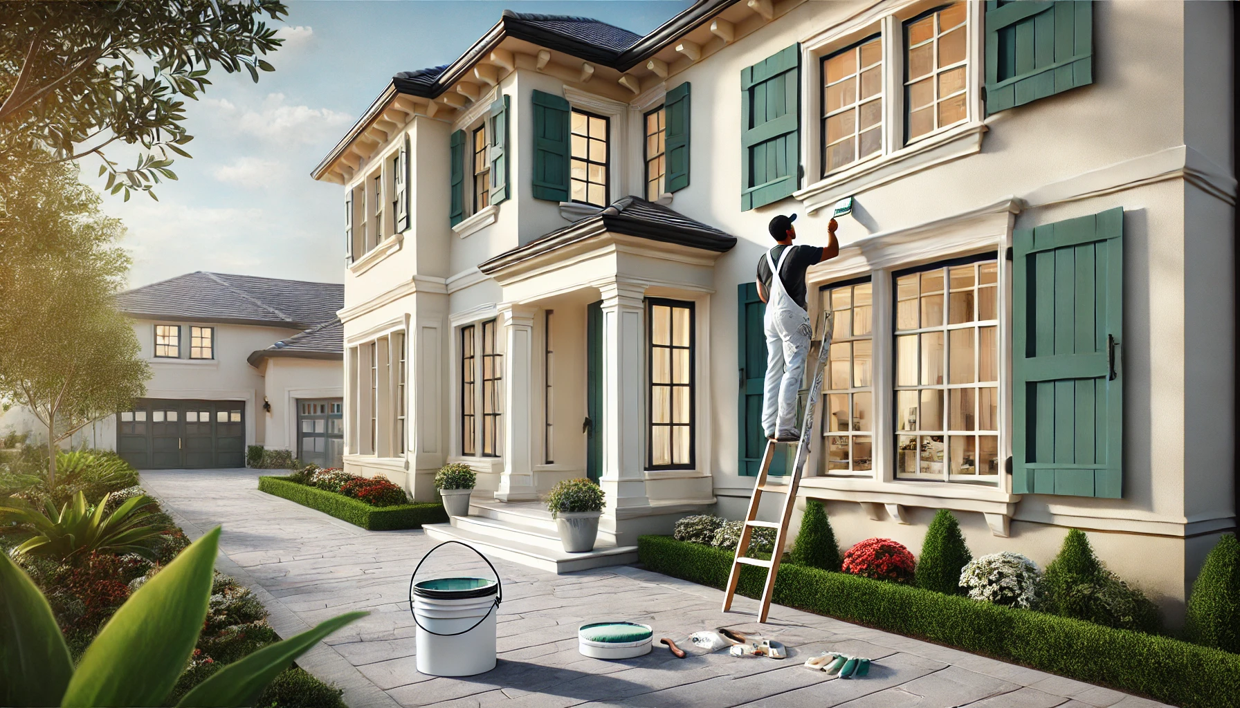
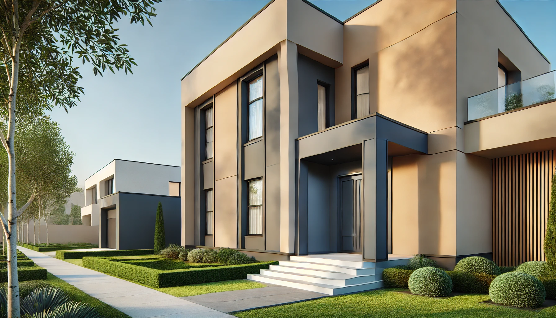
modern homes inviting exterior

Key Things to Consider

Reputation and Experience

Look for a painter or company with positive reviews, client testimonials, and a portfolio of completed projects. A transparent service will be open about its methods and happy to share references, which can help you gauge the quality of their work.

Safety and Insurance

Painting the exterior of a home can involve ladders, scaffolding, or other potentially risky setups. Ensure that the service you hire follows proper safety protocols and has relevant insurance. This not only protects the workers but also covers any potential damage to your property.

Use of Premium Products

High-grade, weather-resistant paints are essential for a finish that endures. Have an open conversation with your contractor about paint options. This is also a chance to inquire about eco-friendly or low-VOC products if you’re concerned about the environment or indoor air quality.

Comprehensive Services

It’s easier when one team handles everything from initial surface prep, from removing flaking paint, washing walls, patching holes, to post-project cleanup. Having experts who also offer colour consultations can make the entire experience smoother, ensuring you end up with a look you love.

Customization and Colour Consultation

Your home’s exterior should blend with your surroundings and reflect your style. Some painting services include professional colour advice. This can be a game-changer if you’re unsure about which shades will work best under your local climate or in your neighborhood.

modern house exterior

Transparent Pricing

Surprises can be fun, just not when it comes to your budget. A trustworthy contractor provides detailed, itemized quotes so you know exactly where your money is going. Be sure to ask for a free site evaluation, if possible, to get a clear sense of the project’s scope.

Timing, Aftercare, and Local Conditions

Exterior painting isn’t just about picking colours. The weather plays a big role in planning and scheduling. For example monsoons, humidity, or extreme heat can delay the process or affect the outcome. Any good painter will plan around local climate patterns to ensure the paint adheres properly.

Once the job is done, it’s smart to ask about recommended maintenance or warranties. Regular inspections and minor touch-ups can keep the paint looking fresh for longer, especially in regions with rapidly shifting weather.

Budgeting Wisely

Comparing quotes from different contractors can help you find the best value, but the cheapest option might not always offer the highest quality. Look into what each quote covers like surface prep, materials, safety measures, and warranties and think about the long-term savings of a durable paint job. Investing a bit more up front often means fewer repaints down the road.

How Indicus ColourCraft Painting Services Can Help

If you’re looking for a truly professional finish, Indicus ColourCraft is definitely a standout option. Our painters bring years of on-site experience, ensuring that everything from the first brushstroke to the final inspection goes smoothly. Our team uses premium Indicus Paints, designed to withstand everything from scorching sun to heavy rains. We also offer a tailored approach, meaning we’ll suggest colours and methods that fit your home’s design and local conditions. Throughout the entire process, you can count on us for prompt responses to any questions, transparent quotes, and a commitment to meeting deadlines.
Choosing the Right Exterior Painting Services for Your Home

Conclusion

Finding the right exterior painting service is about more than just liking a particular shade of blue or green. It’s about making sure your home remains beautiful and safeguarded against the elements for years to come. By focusing on a contractor’s reputation, safety standards, product quality, and pricing clarity, you’ll be on track to enjoy results that truly transform your space.

Ready to refresh your home’s exterior?

Get in touch with Indicus ColourCraft to book a free site visit and experience firsthand how professional expertise, premium products, and personalized service can make all the difference.

Empress Blue (2343C): September’s Colour of the Month

Empress Blue (2343C): September’s Colour of the Month

September carries the calm of fading summer skies and the quiet strength of new beginnings.

Empress Blue (2343C) captures this moment perfectly—deep yet serene, regal yet grounding. It reflects the richness of twilight evenings while offering a sense of balance and timeless elegance.

Empress Blue - 2343C

The Charm of Empress Blue

Rich and refined, Empress Blue draws its spirit from the evening skies and quiet waters after the rains. It carries a sense of stillness, yet has the strength to transform ordinary spaces into striking ones. Unlike fleeting seasonal tones, this shade has a classic appeal — equally at home in modern apartments and traditional houses.

Bringing Empress Blue into Indian Homes

Living Rooms

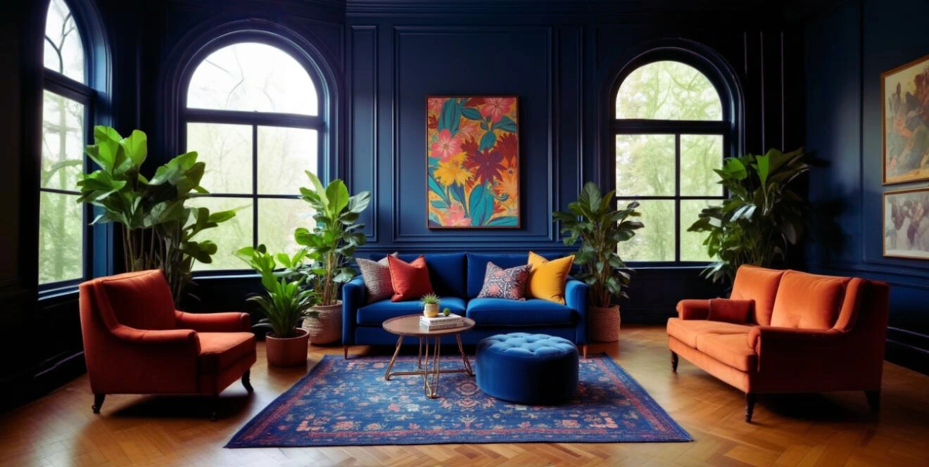
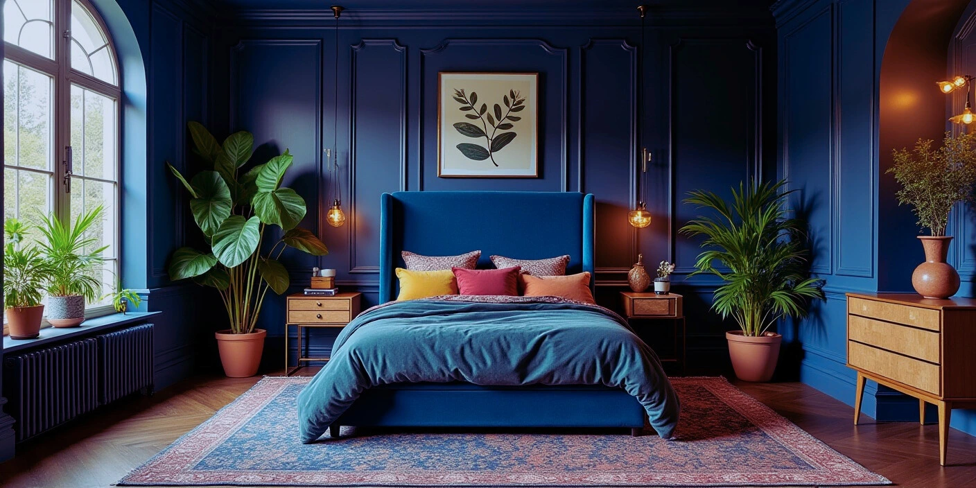
A single Empress Blue wall in the living room creates a dramatic yet inviting backdrop. Paired with cream upholstery, warm wooden furniture, and accents of brass or mustard, it instantly elevates gatherings while keeping the space grounded.
Empress Blue - 2343C

Bedrooms

In bedrooms, Empress Blue introduces calm and intimacy. A statement wall behind the bed or a wardrobe finished in this shade pairs beautifully with pastel linens, soft whites, or beige — creating a restful sanctuary.

Empress Blue - 2343C

Kitchens & Dining

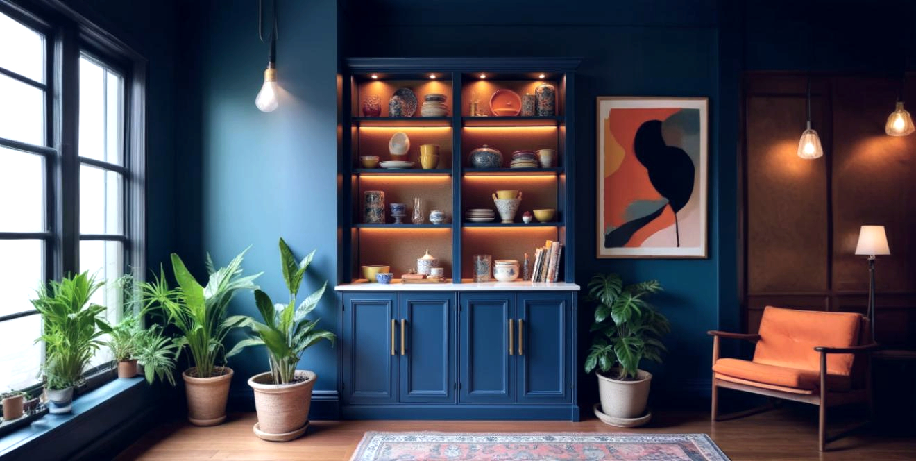
For kitchens, the shade adds depth without overpowering. Lower cabinets painted in Empress Blue work well with natural wood or stone counters. In dining rooms, it enhances the mood under warm lighting, making everyday meals and festive feasts equally memorable.
Empress Blue - 2343C

Courtyards & Balconies

Against plants and natural textures, Empress Blue stands out gracefully. Painted corners, planters, or alcoves in verandahs and courtyards highlight greenery, making outdoor areas fresh yet sophisticated.
Empress Blue - 2343C

Home Exteriors

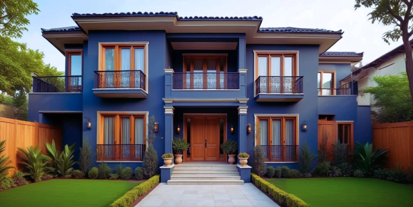
For exteriors, Empress Blue offers a bold yet tasteful personality. Used on gates, grills, or portions of the front wall, it blends beautifully with neutral tones like white, beige, or stone finishes. As evening lights fall, it gives homes a regal, welcoming glow.
Empress Blue - 2343C

Why September Belongs to Empress Blue

September is about harmony — the cool calmness of retreating rains balanced with the quiet anticipation of festivals ahead. Empress Blue mirrors this balance, being bold but serene, stylish yet versatile. It’s a colour that settles into the rhythm of Indian homes, ready to complement both everyday living and festive celebrations.

Beyond Blue: A World of Colour

At Indicus Paints, every month tells a story in colour. While September celebrates Empress Blue, the palette extends far beyond — from delicate pastels to radiant brights — crafted to suit Indian homes and lifestyles. Whether you’re redesigning a living room corner or reimagining your entire home, there’s always a shade waiting to match your mood and moment.

How to Get a Smooth, Even Finish on Metal Surfaces with Indicus Admyra Spray Paint

How to Get a Smooth, Even Finish on Metal Surfaces with Indicus Admyra Spray Paint

When it comes to painting metal surfaces, achieving a smooth, glossy finish is key to creating a professional and durable look. Whether you are working on furniture, metal gates, railings, or any other metal item, the right tools and techniques make all the difference in ensuring that the paint adheres well, lasts longer, and looks flawless.

Indicus Admyra Spray Paint offers a high-quality, glossy finish that transforms any metal surface with ease. With its smooth application and quick-drying formula, Indicus Admyra Spray Paint ensures a perfect, streak-free result every time. In this guide, we’ll walk you through the step-by-step process to achieve a smooth, even finish on your metal surfaces using Indicus Admyra Spray Paint.

Indicus Spray Paint
Let’s dive in and learn how to get professional-quality results using this easy-to-apply spray paint!

Why Choose Indicus Admyra Spray Paint?

Indicus Admyra Spray Paint is designed specifically to provide long-lasting durability, excellent coverage, and a glossy finish that enhances any metal surface. Some of the key features of Indicus Admyra Spray Paint include:

  • Glossy Finish: Creates a smooth, shiny surface that enhances the appearance of the painted item.
  • Fast-Drying Formula: Dries quickly, allowing for multiple coats in less time.
  • Superior Adhesion: Ensures that the paint adheres to metal surfaces effectively and lasts longer.
  • Rust Protection: Offers protection against rust and corrosion, which is especially important for outdoor metal items.

Whether you’re touching up old furniture or giving new items a fresh coat of paint, Indicus Admyra Spray Paint is the perfect choice for all your metal painting needs.

Step-by-Step Guide to Achieving a Flawless Finish on Metal Surfaces

Step 1: Prepare the Surface

Before applying spray paint, proper surface preparation is crucial to achieving a smooth and even finish.

  • Clean the Metal Surface: Start by cleaning the metal surface with soap and water to remove dirt, grease, and other contaminants. Wipe it down with a clean cloth. If the surface is particularly dirty or greasy, use a degreaser for better results.
  • Remove Rust and Old Paint: If there is any rust on the metal, use a wire brush or sandpaper to scrub it off. For surfaces with peeling or chipped paint, use a paint scraper or sanding block to remove the old paint. This will ensure the new coat of paint adheres properly and that you get a smooth surface.
  • Smooth the Surface: After removing any rust or old paint, use fine-grit sandpaper to smooth the metal surface. Sand in a circular motion to ensure an even texture.

Tip: If your metal surface has any dents or scratches, use filler putty to smooth them out before sanding.

Step 2: Apply Primer (If Necessary)

Priming is essential, especially if you are painting bare metal. It helps the paint adhere better and provides a uniform base for the topcoat.

  • Choose the Right Primer: For metal surfaces, use a metal primer that’s designed to prevent rust and improve the adhesion of the spray paint.
  • Apply the Primer: Hold the primer can approximately 10–12 inches away from the surface. Spray the primer in thin, even coats, ensuring full coverage. Allow the primer to dry according to the manufacturer’s instructions.

Tip: For smooth results, avoid spraying too much primer at once to prevent drips and unevenness.

Step 3: Shake the Spray Can

Before applying Indicus Admyra Spray Paint, shake the can thoroughly for 2–3 minutes to mix the paint evenly. This step is crucial to ensure a consistent and smooth finish.

Tip: Periodically shake the can while painting to keep the paint well-mixed.

Step 4: Apply the Spray Paint

Now, it’s time to apply the Indicus Admyra Spray Paint. Follow these tips for a flawless finish:

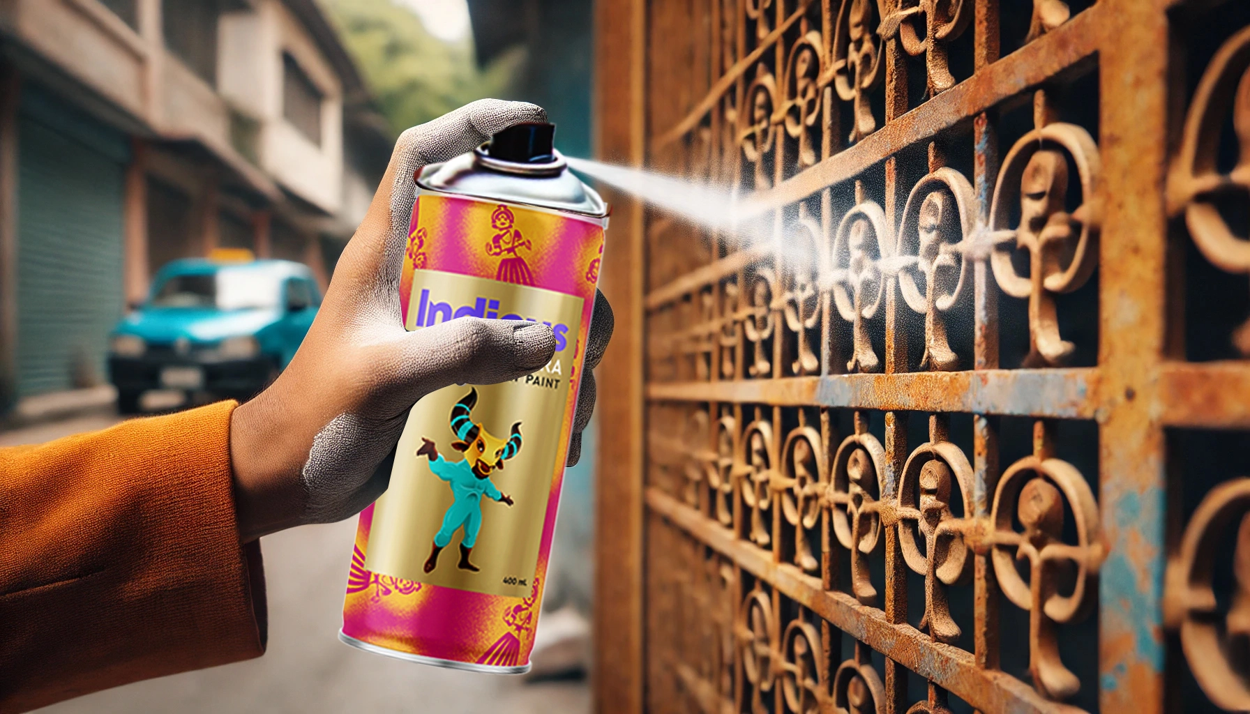
  • Spray in Thin Coats: Hold the spray can 6–8 inches away from the surface and spray in thin, even coats. Apply multiple coats rather than one thick coat to prevent drips.
  • Use a Sweeping Motion: Spray the paint in smooth, sweeping motions across the surface. Keep the can moving at all times to avoid pooling of paint.
  • Allow Drying Time Between Coats: After each coat, allow the paint to dry for 10-15 minutes before applying the next layer. For a smooth, glossy finish, you may need 2-3 coats of paint.
Indicus Spray Paint

Tip: If you’re painting a large surface, spray in horizontal or vertical sections, working from one end to the other for an even coat.

Step 5: Let It Dry and Cure

After you’ve applied the final coat, allow the paint to dry completely. Indicus Admyra Spray Paint dries quickly, but to achieve the best finish, let the painted surface cure for 24 hours before handling it.

Tip: If you’ve applied multiple coats, ensure the surface is fully dry and cured before moving the painted item or exposing it to regular use.

Step 6: Apply Clear Protective Coat (Optional)

To ensure your painted metal surfaces remain protected from scratches, moisture, and everyday wear, consider applying a clear protective coat. A clear acrylic sealer will help preserve the glossy finish and add an extra layer of protection.

Tip: If using a clear coat, follow the same spraying technique as with the paint and allow it to dry completely.

Pro Tips for a Smooth Finish

  • Test the Spray Paint: Always test the spray paint on a small, inconspicuous area first to ensure it adheres well and that the colour is to your liking.
  • Work in a Well-Ventilated Area: Spray painting should be done in a well-ventilated area. Use a drop cloth or newspaper to protect your surroundings from overspray.
  • Apply in a Well-Lit Space: Make sure the area is well-lit to avoid missing any spots during application.
  • Avoid Over-Spraying: Keep the can at the correct distance and spray in thin, even layers to avoid drips.
Indicus Spray Paint

Conclusion

Achieving a smooth, glossy finish on metal surfaces is easy when you follow the right preparation, application, and drying techniques. With Indicus Admyra Spray Paint, you can enjoy a flawless, professional-looking finish every time. Whether you’re sprucing up furniture, metal gates, or other items, this spray paint provides durability, rust protection, and a sleek finish for long-lasting beauty.

Ready to get started on your next DIY project? Indicus Admyra Spray Paint is the perfect solution for transforming your metal surfaces with ease and precision.

Orange Grove (2068T): August’s Colour of the Month

Orange Grove (2068T): August’s Colour of the Month

August is a month of quiet transitions. The sunlight still spills generously into the day, yet there’s a softer, slower quality to it — a warmth that invites both movement and pause. It’s a time when mornings feel alive, afternoons glow, and evenings settle into a calm embrace.

Orange Grove (2068T) is the embodiment of this seasonal rhythm. It draws from the brightness of citrus orchards, the earthy comfort of clay, and the gentle burnish of late-summer sunsets. The tone is vivid enough to lift a space, yet carries a grounded depth that keeps it from feeling overpowering.

Orange Grove

The Mood it Creates

Orange Grove is more than a colour – it’s a mood that shifts with the light.
  • In sunlit spaces, it radiates joy and energy, filling the room with a welcoming vibrance.
  • In evening light, it turns mellow and warm, creating a cocoon-like comfort.
  • In low-lit corners, it adds a subtle richness, deepening the atmosphere without closing it in.
This duality makes it ideal for August – a month that dances between brightness and warmth.

Design Inspiration

Living Areas

In a living room, Orange Grove becomes the anchor of hospitality. Use it on a main wall or behind open shelving to make the room feel alive. Pair with creamy off-whites, sandy beiges, and textured linens to keep the mood light. Woven rugs, rattan accents, and terracotta pottery echo the natural warmth of the shade.

Orange Grove

Bedrooms

In the bedroom, it can create a serene yet uplifting retreat. A single Orange Grove accent wall behind the bed draws focus without overwhelming. Layer with crisp white bedding, taupe throws, and soft lighting to recreate the feel of a golden hour glow. Wooden side tables and clay-toned ceramics add a grounded touch.

Kitchens

Kitchens in Orange Grove feel fresh and inviting. On cabinetry, it adds personality without sacrificing elegance. Complement it with cream or light stone countertops, matte black hardware, and warm wood shelving. Copper utensils, citrus bowls, and indoor herbs create a playful but cohesive theme.

Orange Grove

Outdoor & Transitional Spaces

Orange Grove isn’t just for interiors. On exterior walls, courtyard accents, or balcony nooks, it reflects light beautifully and pairs well with greenery. For a Mediterranean touch, combine it with natural stone, climbing plants, and white trim.

Orange Grove

Study Nooks & Home Offices

Orange Grove works beautifully in personal workspaces, striking a balance between focus and comfort.

In the featured room, soft orange walls set a lively yet calming backdrop for productivity. A sleek wooden desk, plush cream armchair, and brass desk lamp add elegance, while greenery brings freshness. Light curtains filter daylight, letting the colour glow softly throughout the day.

Orange Grove

Accents for Every Style

For those who prefer a lighter touch, Orange Grove thrives as an accent — on a statement armchair, in patterned cushions, or as part of wall art. Against neutral walls, these pops of colour create focal points that feel intentional and full of life.

August’s Essence in One Shade

Orange Grove carries the energy of summer’s last flourish and the warmth of autumn’s first steps. It’s lively, grounded, and timeless — a colour that turns walls into stories and spaces into experiences.

In August, when days are still bright but the evenings call for comfort, this shade finds its perfect moment. It’s the sunshine you can hold on to, long after the season shifts.

With Indicus Paints, Orange Grove(2068T) is just the beginning. Explore a world of colours designed to capture every mood, season, and style — because every space deserves a shade that speaks its language.

5 Key Factors to Consider When Selecting Paint Colours for Your Home’s Exterior

5 Key Factors to Consider When Selecting Paint Colours for Your Home’s Exterior

Your home’s exterior is its first impression – the face it presents to the world. Selecting the right paint colour doesn’t just boost curb appeal, it also reflects your style, enhances architecture, and withstands time and weather. With an abundance of shades and finishes available today, choosing the best exterior house paint colours can feel like a challenge. But when done right, it can completely transform your home.
Key Factors to Consider When Selecting Paint Colours

Here are five essential factors to help you select the ideal exterior paint colours and create a timeless, beautiful facade.

1. Consider the Architectural Style of Your Home

Your home’s architecture significantly influences which colours will look natural and elegant. A traditional or colonial-style home may pair beautifully with subtle, classic shades, whereas a modern home can handle bolder, minimalist combinations.

Key Factors to Consider When Selecting Paint Colours

For example, a rustic villa may benefit from earthy tones like Indicus Burnt Brick or Terracotta Touch, while a sleek, modern home would look striking in cool shades like Slate Charm or Urban Ash. Understanding your home’s design allows you to narrow down the best exterior wall paint shades that will complement rather than clash.

2. Blend with the Natural Surroundings

Your surroundings – neighbouring homes, landscape features, and even the local climate – should influence your exterior colour choices. Homes situated near the coast tend to look best with breezy whites and sea-inspired blues, while those in wooded or rural areas blend harmoniously with earthy greens and browns.

If your goal is to blend seamlessly with nature, tones like Coastal Beige, Sea Whisper, or Earth Ember from the Indicus palette work beautifully. On the other hand, if you want your home to stand out, subtle contrasts with the surrounding tones can create just the right amount of visual interest.

Key Factors to Consider When Selecting Paint Colours

3. Factor in Lighting and Sun Exposure

Sunlight can dramatically alter how a colour looks on your walls. A pale beige may look bright and warm in morning light but might appear dull during overcast afternoons. Similarly, very dark shades can absorb too much heat and fade faster under direct sunlight.

Homes that receive less natural light, such as those facing north, benefit from warmer tones like Golden Aura or Amber Dust. South-facing homes, exposed to more sunlight, often suit deeper tones like Charcoal Flame or Stone Bark. Always test swatches on your exterior walls and observe how they change in natural light throughout the day.

4. Think About Mood and Aesthetic Impact

The colours you choose communicate a story. Do you want your home to look elegant and timeless, bold and contemporary, or warm and welcoming?

Warm hues like Crimson Clay or Marigold Mist evoke vibrancy and energy, while soft neutrals like Moon Shell or Pebble Morn give your home a calm, classic appeal. Statement colours, such as Regal Teal or Deep Olive, can turn your exterior into a true eye-catcher.

Don’t forget about trim and accent areas – doors, window frames, and grills. Contrasting or complementary trim shades can add structure and dimension, enhancing the overall design.

5. Consider Maintenance and Long-Term Durability

Your exterior walls are constantly exposed to the elements – sun, dust, rain, and pollution. So while colour matters, so does the practicality of your selection. Lighter shades may show dirt and mildew, while darker ones may fade quicker in harsh sunlight.

Opt for mid-toned colours that strike a balance between style and practicality. Shades like Dusty Mocha, Sandhill Stone, or Walnut Cream tend to be low maintenance and age gracefully.

Also, make sure the paint you choose is weather-resistant. Indicus exterior paints, including finishes like Forto, are formulated to endure India’s diverse climate, offering both protection and beauty.

Key Factors to Consider When Selecting Paint Colours

Conclusion

Choosing the right exterior paint colour is a blend of art and strategy. When you consider architectural style, environment, lighting, mood, and durability, you not only enhance your home’s visual appeal but also ensure that your investment lasts.

Whether you’re going for modern sophistication, rustic charm, or timeless elegance, Indicus Paints’ curated exterior colour palette offers a wide range of shades to suit every taste and home style.

Take your time, sample generously, and let your home tell its story in colour.