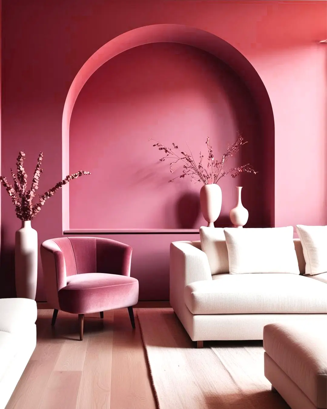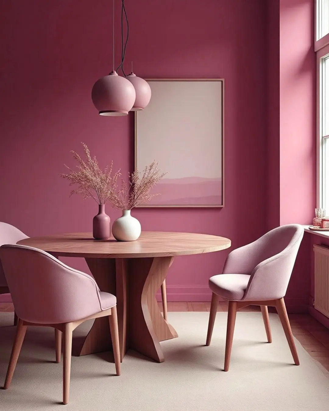

You are using an outdated browser. Please upgrade your browser to improve your experience.

Coraline (2154C): July’s Colour of the Month

Coraline (2154C): July’s Colour of the Month

July brings with it the full rhythm of summer—long golden days, late evenings, and a need for interiors that feel alive yet comforting. Enter Coraline (2154C): a radiant coral that captures the soul of the season.

Warm but not overwhelming, vibrant yet grounded—Coraline is your perfect companion for a mid-year refresh. It brings colour where it’s needed and calm where it counts.
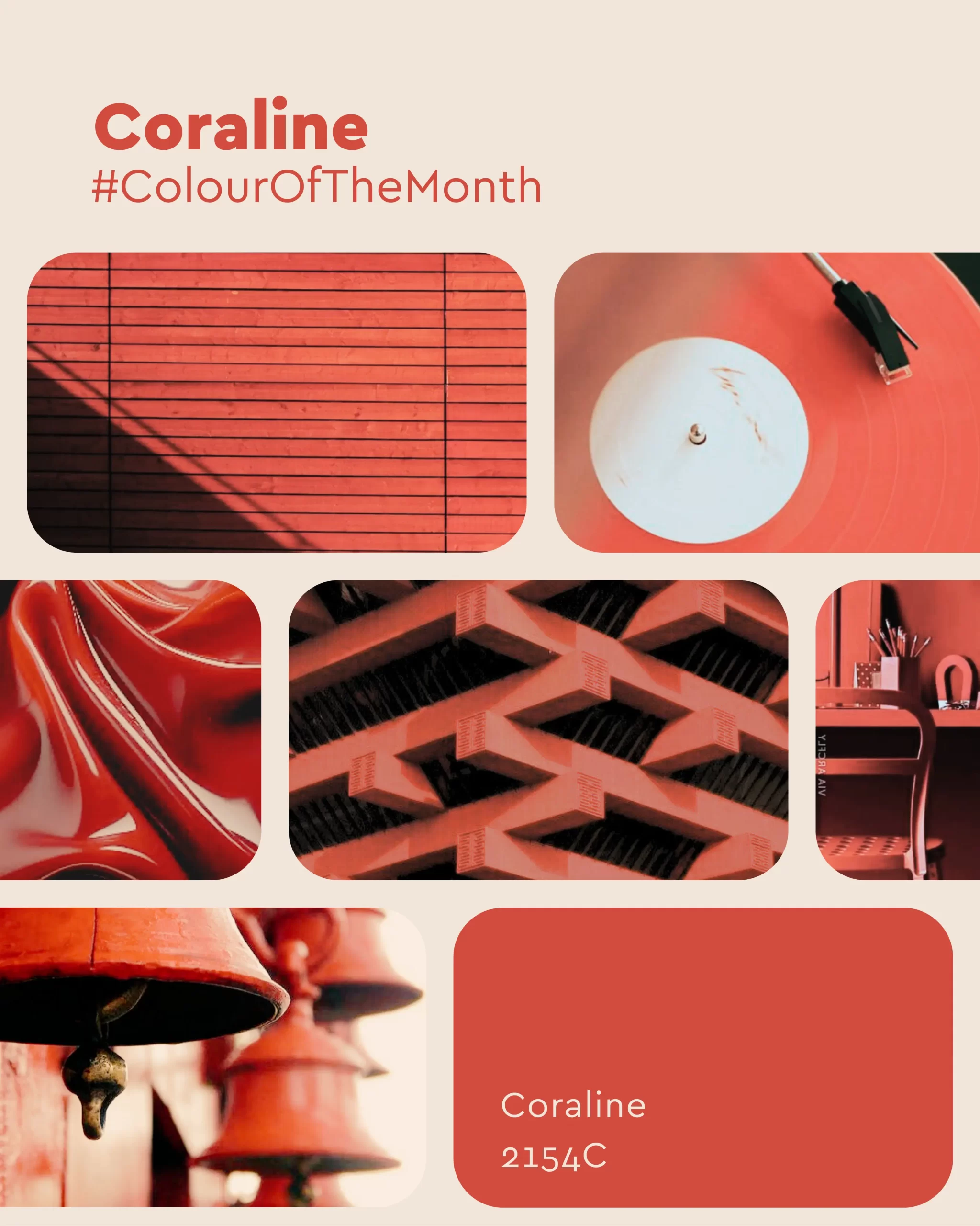
Coraline 2154C

Why Coraline in July?

Captures the Season’s Glow: With its sun-baked undertone, Coraline reflects July’s warmth without overpowering a space. Uplifting & Modern: Perfect for revitalizing tired corners or energizing entire rooms. Pairs Beautifully: Coraline loves soft neutrals, olives, terracottas, and matte blacks—making it incredibly versatile for mid-summer decor.

How to Use Coraline in Your Home

1. Living Room: Sculptural Serenity Meets Sunset Glow

Coraline transforms the living room into a warm, artful retreat. When paired with curved forms, layered textures, and soft furnishings, it creates an immersive space that’s both welcoming and design-forward.

How to Style It:

  • Use Coraline on walls or ceilings to create an enveloping, architectural feel.
  • Pair it with creamy beiges, pale pinks, or sandy neutrals for balance.
  • Introduce minimalist sculptures and organic shapes to enhance the artistic tone.
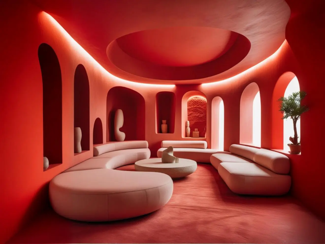
Coraline (2154C)

2. Bedroom: Calm Meets Character

Surprisingly soothing yet full of personality, Coraline makes a compelling case for bedroom walls. It creates a cocooning effect that’s both romantic and grounded—especially when offset by nature-inspired accents.

How to Style It:

  • Accent one or two walls with Coraline for a warm, inviting glow.
  • Layer with sage greens, taupe bedding, and natural wood tones for a balanced palette.
  • Opt for curved furniture and soft lighting to highlight the colour’s gentle vibrance.
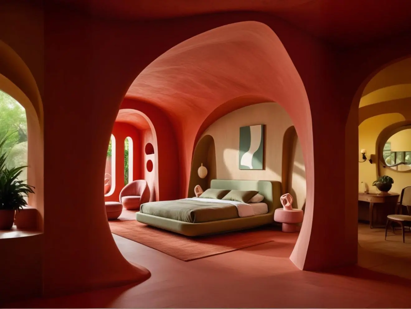
Coraline (2154C)

3. Kitchen: Energised, Earthy, Elevated

Coraline makes an eye-catching yet grounded choice for the kitchen, evoking both vibrancy and familiarity. Whether on cabinets, backsplashes, or full walls, it instantly uplifts the space without overwhelming it.

How to Style It:

  • Use Coraline on cabinetry for a fresh take on traditional kitchen colour.
  • Balance with beige or cream tiles and black fixtures for contrast.
  • Add wooden cutting boards, copper pots, and houseplants for texture and warmth.
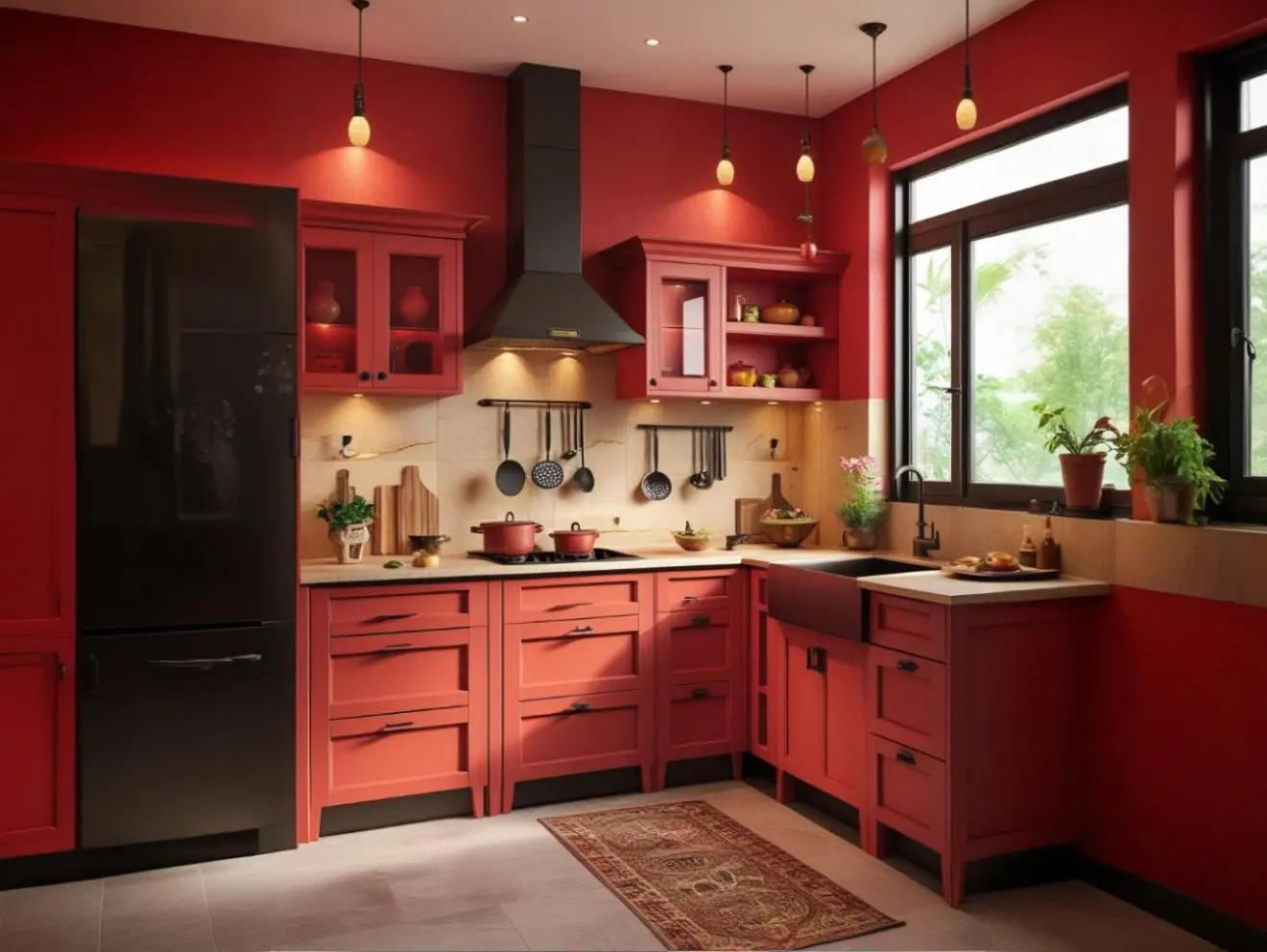
Coraline (2154C)

4. Accents & Accessories: A Pop That’s Playful and Sophisticated

If you’re not ready to commit fully, Coraline works beautifully as a supporting act. From accent chairs and side tables to art prints and cushions, it brings joy and warmth in small, thoughtful doses.

How to Style It:

  • Pair Coraline accessories with off-white or muted pastel backdrops.
  • Try coral ceramics, wall art, or even lampshades for subtle impact.
  • • Mix in with natural textures like rattan, jute, or linen to keep the space grounded.

July’s Energy, Bottled in a Hue.

Coraline (2154C) is for the spaces that want to feel alive. It suits homes that embrace creativity, kitchens filled with conversation, offices where ideas bloom, and living rooms that host golden hour magic.

This July, make space for Coraline—where vibrance meets versatility.

Coraline (2154C)

How to Choose the Perfect Beach-Inspired Colour Palette for Every Room

How to Choose the Perfect Beach-Inspired Colour Palette for Every Room

The tranquil beauty of the beach is more than just a holiday escape – it can inspire a serene, breezy home environment that promotes relaxation and harmony. From soft sandy hues to ocean blues and lush coastal greens, a beach-inspired colour palette can transform any space into a peaceful retreat.

Choosing the right beach-themed colours isn’t just about blues and whites – it’s about balancing earthy tones, calming neutrals, and natural textures to reflect the diverse beauty of the seaside. Let’s explore how you can incorporate beach-inspired shades in different rooms of your home using earthy, nature-infused tones.

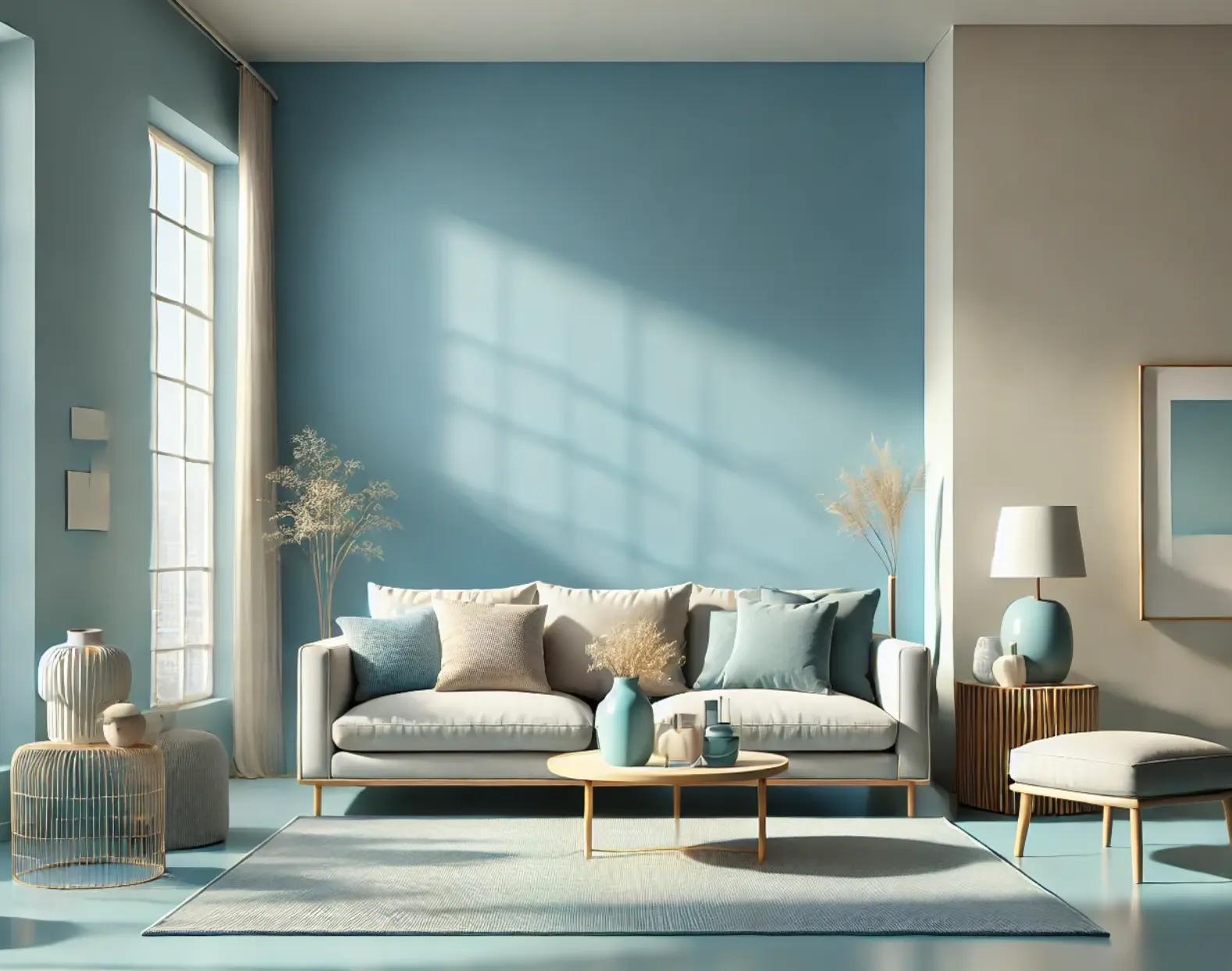
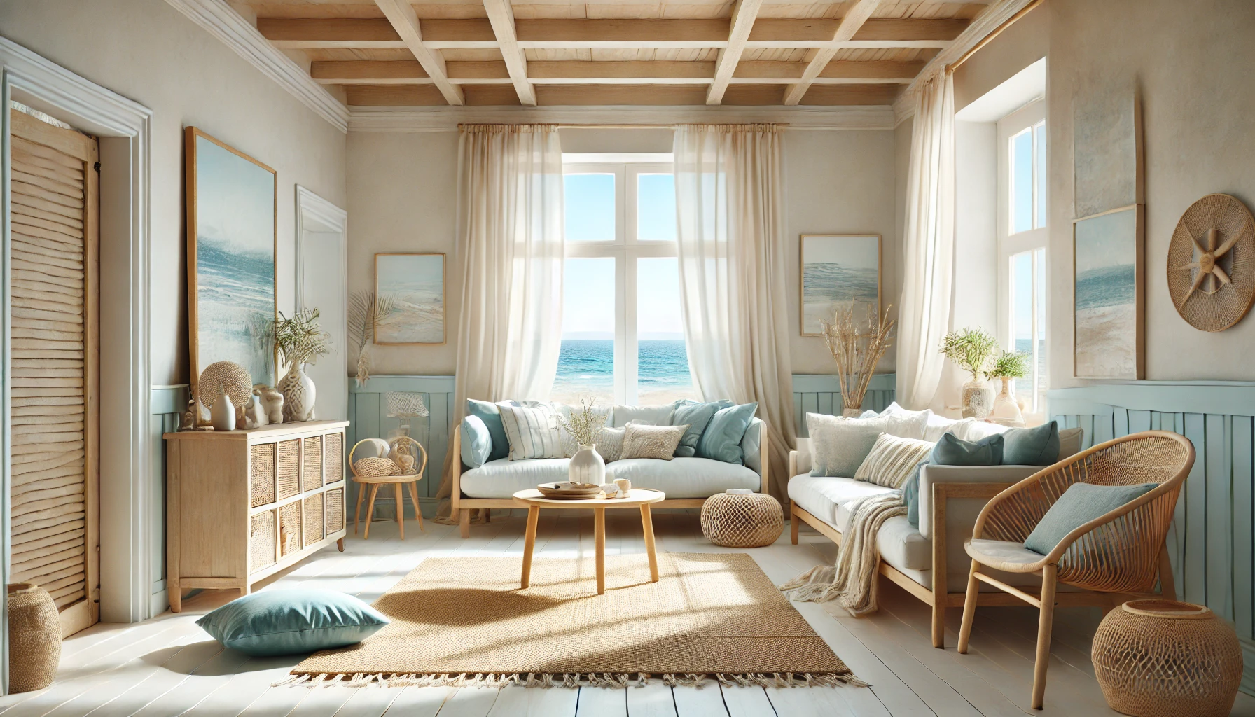
Coastal Calm for the Living Room (Soft Sand + Ocean Blue + Driftwood Grey)

Why It Works

A living room inspired by the beach should feel airy, open, and welcoming. This palette captures the warmth of sunlit sand, the depth of the ocean, and the softness of weathered driftwood, creating a space that is both refreshing and cosy.

How to Style It

  • Walls: A soft sandy beige or muted taupe provides a neutral backdrop that keeps the space light and inviting.
  • Furniture: Opt for driftwood-inspired wooden coffee tables and ocean-blue upholstery for a fresh, coastal touch.
  • Accents & Décor: Use woven rugs, white sheer curtains, and rattan elements to complete the breezy aesthetic.
Create a Serene Home with the Perfect Beach-Inspired Colour Palette

Perfect For

  • Open-plan living spaces that need a light and airy feel.
  • Homes with natural light that enhance soft, sandy tones.
  • Those who love a minimal yet warm coastal look.

Serene Bedroom Oasis (Seafoam Green + Warm Beige + Ivory White)

Why It Works

A beach-inspired bedroom should feel like a restful escape, reflecting the gentle hues of waves rolling onto the shore. The combination of seafoam green and warm beige creates a soft, soothing effect, perfect for unwinding at the end of the day.

How to Style It

  • Walls: Use a subtle seafoam green or a muted aqua to create a relaxing atmosphere.
  • Furniture: Opt for white-washed wooden bed frames and neutral-toned side tables.
  • Accents & Décor: Incorporate linen bedding, soft cotton throws, and seashell or coral-inspired décor for an authentic beachy vibe.
Create a Serene Home with the Perfect Beach-Inspired Colour Palette

Perfect For

  • Bedrooms where calm and relaxation are the top priorities.
  • Spaces with soft lighting to enhance the natural tranquillity.
  • Anyone who enjoys a fresh, coastal-inspired sleeping space.

Breezy Beach Kitchen & Dining Area (Sky Blue + Soft Sand + White Linen)

Why It Works

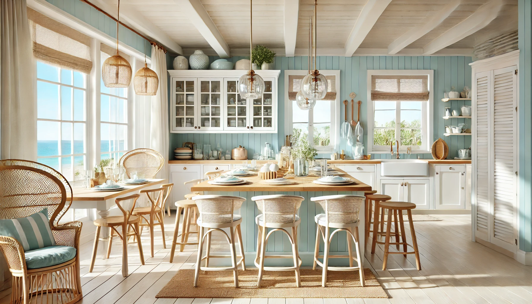
A coastal kitchen should feel bright and airy, reflecting the open skies and sunlit shores. This colour palette brings together crisp white, sun-washed sand, and soft sky blue to create a fresh, inviting space.

How to Style It

  • Walls: A light sky blue or soft greyish blue makes the space feel bright and open.
  • Cabinetry & Furniture: Choose white or off-white cabinets with beige or wood countertops for a clean, breezy aesthetic.
  • Accents & Décor: Add woven placemats, rattan bar stools, and glass pendant lights to maintain the coastal theme.
Create a Serene Home with the Perfect Beach-Inspired Colour Palette

Perfect For

  • Kitchens and dining spaces that need a fresh, airy vibe.
  • Homes with open shelving or large windows to maximise natural light.
  • Those who enjoy a coastal-chic kitchen with a touch of elegance.

Tranquil Home Office (Deep Ocean Blue + White + Light Wood Accents)

Why It Works

A beach-inspired home office should promote focus and calmness. Deep ocean blue brings depth and sophistication, while white and light wood keep the space grounded and well-balanced.

How to Style It

  • Walls: A deep blue accent wall creates a bold yet calming statement.
  • Furniture: Light wood desks, white shelving, and natural textures keep the space relaxed and inviting.
  • Accents & Décor: Add coastal artwork, linen curtains, and woven storage baskets for a fresh, breezy feel.

Perfect For

  • Creating a calm and productive workspace.
  • Offices that need depth without feeling too dark.
  • Those who want a sophisticated yet tranquil home office.
Create a Serene Home with the Perfect Beach-Inspired Colour Palette

Conclusion

A beach-inspired colour palette brings calmness, warmth, and elegance into any home. Whether you prefer the soft neutrals of sandy shores, the refreshing blues of the ocean, or the grounding tones of driftwood and greenery, these carefully selected palettes can help you achieve a coastal retreat in every room.

Looking to create your dream beach-inspired home? Explore Indicus Paints‘ earthy and coastal tones to bring the essence of the beach into your interiors effortlessly.

Colour of the Month – Tulip Yellow (2020D)

Colour of the Month – Tulip Yellow (2020D)

Bring the warmth of sunshine home

June marks the arrival of longer days, brighter skies, and that unmistakable energy of fresh beginnings. It’s a season of movement—of homes coming alive again with gatherings, quiet corners refreshed, and outdoor spaces getting their glow back.

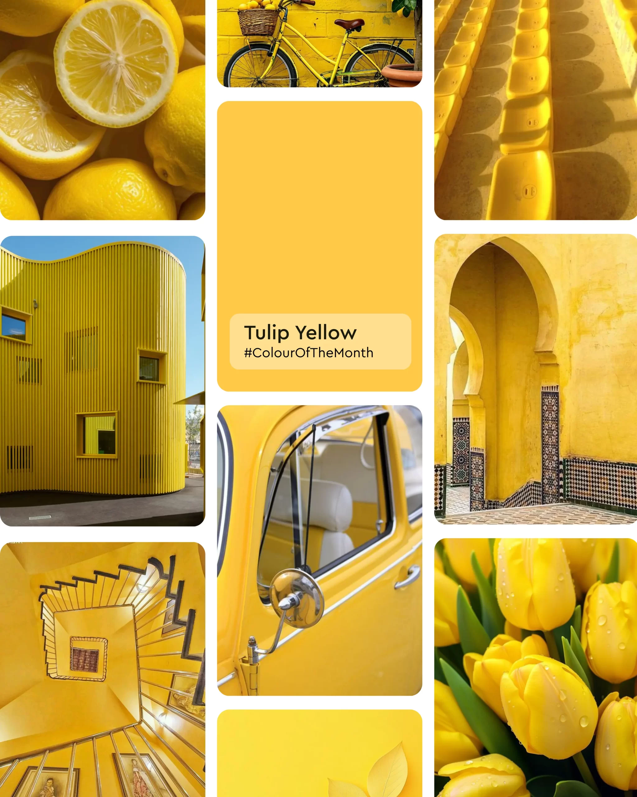
What better way to reflect that feeling than with a colour that mirrors the mood perfectly? Meet Tulip Yellow (2020D) from Indicus Paints, our Colour of the Month. Radiant yet calm, cheerful yet grounded—it’s the colour of sunshine brought indoors.
Tulip Yellow 2020D

Why Tulip Yellow for June?

Yellow has long been a symbol of positivity, clarity, and warmth. But Tulip Yellow isn’t just any yellow—it’s that perfect in-between: bright enough to energize a space, yet soft enough to make it feel welcoming.

As the world outside starts blooming and transforming, this shade helps you carry that feeling indoors. Think of the soft glow of early sunlight, the freshness after summer rains, or the sparkle of laughter around the dining table—Tulip Yellow fits beautifully into all of it.

It’s not just a colour. It’s an atmosphere.

The Mood of Tulip Yellow (2020D)

Vibrant Yet Soft – Adds brightness without ever overwhelming the senses

Warm & Timeless – Inspired by mornings, gatherings, and fresh possibilities

Perfect for Any Space – Works beautifully across interiors and exteriors

Whether you’re styling a sunlit living room, a cosy nook for your morning tea, or a welcoming entryway, Tulip Yellow brings life to every corner.

Where to Use Tulip Yellow in Your Home?

1. Living Rooms That Feel Alive

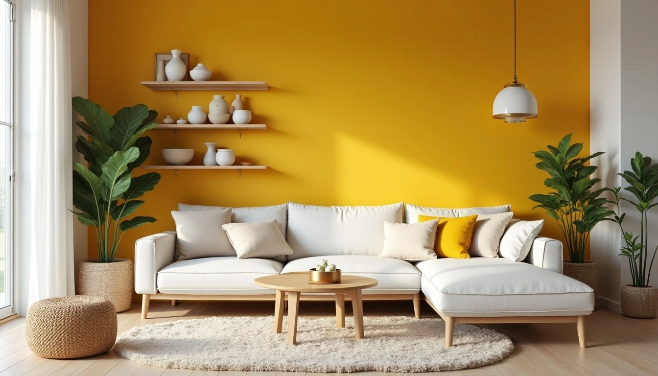
Want to create a lively, inviting space for family and friends? Use Tulip Yellow on an accent wall behind your seating area or entertainment unit. It naturally draws attention and lifts the whole room’s energy.

Style Tip: Pair it with earthy materials like wooden shelves, linen fabrics, and soft whites for a balanced, elegant finish.

Tulip Yellow 2020D

2. Kitchens & Dining Spaces Full of Joy

Yellow has always been known to boost energy—and what better space to feel energized than your kitchen? A pop of Tulip Yellow on the cabinets or a feature wall adds freshness to your daily routine.

Style Tip: Match with deep green plants, terracotta cookware, or handcrafted ceramics to bring in a playful, earthy vibe.

Tulip Yellow 2020D

3. Corners for Calm & Creativity

Create a reading nook, creative workspace, or meditation corner with Tulip Yellow on the backdrop. Its warmth encourages focus while still feeling cosy.
Tulip Yellow 2020D
Style Tip: Accessorize with woven baskets, soft cushions, or fresh flowers to enhance the calm.

4. Outdoor Spaces That Shine

Imagine a boundary wall, balcony railing, or verandah pillar bathed in gentle yellow light—it instantly makes your outdoor areas feel fresh and welcoming.

Style Tip: Contrast with olive greens, deep browns, or textured planters for a striking outdoor look.

Tulip Yellow 2020D

Pair Tulip Yellow With:

  • Olive or leafy greens for garden-fresh contrast
  • Ivory or off-whites for clean, airy simplicity
  • Burnt oranges or terracotta for earthy, festive warmth
  • Charcoal or deep browns for bold, contemporary spaces

Celebrate June with Colour

Tulip Yellow (2020D) is more than just a paint—it’s a mood-lifter, a conversation starter, and a symbol of fresh beginnings. It invites light into your life, making everyday spaces feel special again.

So whether you’re planning a complete makeover or just refreshing a room, let Tulip Yellow be the colour of new energy this June.

Ready to bring sunshine indoors?

Explore the Indicus Paints collection and find beautiful, lasting finishes designed to make every wall—and every day—shine brighter.

May Colour of the Month: Twinig Vine (2630C)

May Colour of the Month: Twinig Vine (2630C)

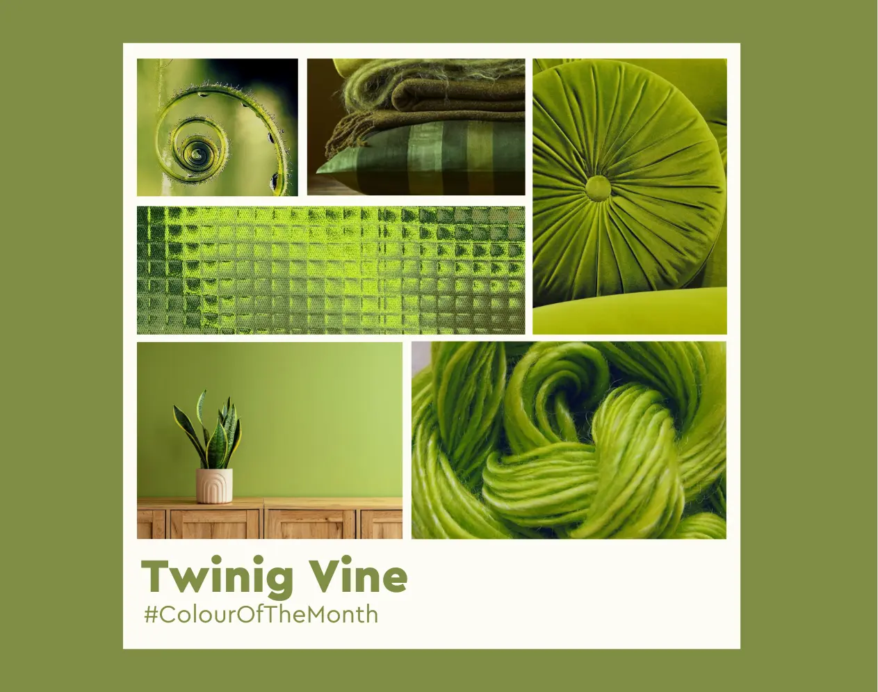
As we welcome the lush, lively month of May, it’s only fitting to embrace a shade that captures the spirit of new beginnings, calm energy, and natural rejuvenation. Twinig Vine, a soft and breezy green from the Indicus Colour Palette, is our Colour of the Month for May 2025.

With its subtle earthy undertone and uplifting vibrancy, Twinig Vine strikes the perfect balance between freshness and elegance. It evokes the feeling of a dewy morning garden or a sun-dappled vine-covered courtyard—making it a versatile shade for both interiors and exteriors.

Twinig Vine

Whether you’re looking to create a calming bedroom oasis or a cheerful kitchen corner, Twinig Vine offers a soothing yet spirited hue that suits a wide range of styles and spaces.

Why Twinig Vine (2630C) for May?

May is the time when nature is in full bloom and daylight stretches longer. Twinig Vine reflects this seasonal transition beautifully. It brings a sense of growth, balance, and serenity—qualities we naturally associate with this time of year.

From a design perspective, it introduces a cool, grounding quality that works equally well with earthy tones, neutrals, and even pops of brighter colours. As a wall colour, it can either recede softly into the background or shine as a subtle statement, depending on how you pair it.

What Makes Twinig Vine (2630C) Special?

Nature-Inspired Tranquillity – Brings a botanical calm that connects indoors to the outdoors
Versatile Appeal – Complements modern, rustic, Scandinavian, and traditional aesthetics

Twinig Vine
Mood-Lifting Hue – Fresh, airy, and ideal for wellness-centred spaces
Seasonally Perfect – Evokes leafy vines and springtime foliage, ideal for May’s renewal vibe

How to Use Twinig Vine (2630C) in Your Home

1. A Serene Touch in the Living Room

Twinig Vine works wonders in a living room where you want to blend comfort with a sense of connection to nature. When paired with light beiges, greys, or off-whites, it becomes the perfect backdrop for natural wood furniture and linen upholstery.

Twinig Vine

Styling Tip: Use Twinig Vine on a main feature wall behind your sofa or fireplace. Layer it with neutral furnishings and leafy indoor plants to create a calming, organic space.

2. A Calming Bedroom Oasis

Soft greens like Twinig Vine are ideal for bedrooms. They support relaxation, making them suitable for winding down at the end of the day. Whether you opt for full walls or a single accent area, this shade brings balance and peace.

Styling Tip: Complement Twinig Vine with warm ivory bed linen, brass lamps, and wooden accents for a tranquil yet grounded palette.

3. A Fresh Pop in the Kitchen or Dining Area

In kitchen or dining spaces, Twinig Vine adds a touch of colour without overpowering. It pairs beautifully with white cabinets, marble countertops, and even soft coral or muted pink accessories.

Styling Tip: Try painting the lower half of your kitchen walls or island in Twinig Vine to bring in a soft, garden-fresh charm.

4. Perfect for Outdoor Walls and Terraces

Green tones naturally blend with outdoor settings, and Twinig Vine is no exception. Its subtle warmth brings life to verandas, terraces, and exterior accent walls.

Styling Tip: Pair with natural stone flooring, terracotta pots, and woven furniture for a relaxed yet cohesive outdoor retreat.

Pairing Twinig Vine (2630C) with Other Shades

While Twinig Vine stands confidently on its own, it also plays well with a wide palette:
  • Warm Neutrals – Ivory, soft tan, and warm beige for an earthy, grounded look
  • Dusty Pinks & Mauves – For a fresh, slightly romantic interior
  • Terracotta & Clay – To deepen the palette with rustic accents
  • Matte Blacks or Deep Browns – For contrast and depth in a more modern or masculine aesthetic

Twinig Vine (2630C) is the perfect hue to refresh your interiors and exteriors this May. It offers a fresh nod to the season of growth and renewal, while remaining versatile enough for year-round appeal. Whether you’re painting an entire room or just an accent wall, this gentle green promises to calm the senses and uplift your space.

Twinig Vine
Ready to embrace the beauty of Twinig Vine? Explore Indicus Paints to find the perfect Low VOC, durable formulation to bring your walls to life, indoors and out.

Benefits of Heat Reflective Coatings for Long-Lasting Building Protection

Benefits of Heat Reflective Coatings for Long-Lasting Building Protection

Protecting buildings from the relentless forces of nature is a constant challenge. From extreme heat to heavy rainfall, environmental factors can compromise structural integrity and lead to skyrocketing energy costs. Heat reflective coatings offer an innovative solution, combining thermal insulation, durability, and sustainability in a single layer of protection.

But what exactly are heat reflective coatings, and why are they becoming a go-to option for building protection? This guide delves into the benefits, applications, and maintenance of heat reflective coatings, offering insights into how they safeguard your property while reducing environmental impact.

1. What Are Heat Reflective Coatings?

Heat reflective coatings are advanced protective layers specifically designed to shield buildings from extreme temperatures and water damage. Unlike traditional paints, they are engineered with unique thermal insulation properties that reflect sunlight and reduce heat absorption.

They are suitable for various surfaces, including concrete, exterior walls, terrace and asbestos sheets making them versatile for residential, commercial, and industrial applications.

Key Features:

  • Reflect heat to maintain cooler indoor temperatures.
  • Protect against UV radiation and water seepage.
  • Enhance durability by preventing wear and tear on exterior surfaces.
Benefits of Heat Reflective Coatings

2. Key Benefits of Heat Reflective Coatings

a. Thermal Insulation and Energy Efficiency

One of the standout advantages of heat reflective coatings is their ability to reflect heat. By reducing the amount of solar heat absorbed by your building, these coatings help maintain cooler indoor temperatures, lowering the need for air conditioning. The result? Substantial energy savings and a more comfortable living or working environment.

b. Weather and UV Protection

Heat reflective coatings act as a shield against harsh weather conditions. Whether it’s relentless UV rays, torrential rain, or fluctuating temperatures, these coatings preserve the exterior of your building by preventing fading, cracking, and other damage caused by the elements.

c. Durability and Longevity

Buildings treated with heat reflective coatings experience less wear and tear over time. The coatings resist cracking, peeling, ensuring that your walls and roofs remain intact and visually appealing for years.

d. Water and Corrosion Resistance

In humid climates, moisture infiltration can lead to structural issues such as mold, mildew, and corrosion of rebars. Heat reflective coatings form a water-resistant barrier, safeguarding the building’s structural integrity and reducing maintenance costs.

e. Eco-Friendliness

Many heat reflective coatings are formulated to be non-toxic and environmentally friendly. By reducing energy consumption and offering sustainable solutions, they contribute to a greener planet.

3. Applications of Heat Reflective Coatings

Heat reflective coatings are versatile and can be applied to various surfaces and structures, including:
  • Rooftops: Reflects heat, reducing indoor temperatures and protecting against leaks.
Benefits of Heat Reflective Coatings
  • Exterior Walls: Prevents weathering and enhances aesthetic appeal.
Benefits of Heat Reflective Coatings
  • Industrial Facilities: Protects infrastructure from extreme temperatures and corrosion.
Benefits of Heat Reflective Coatings
  • Residential Buildings: Ideal for homes in hot or humid climates to ensure comfort and durability.
Benefits of Heat Reflective Coatings

4. Choosing the Right Heat Reflective Coating for Your Building

Selecting the right heat reflective coating involves considering several factors:

  • Climate: Hot and sunny regions may require coatings with high solar reflectivity.
  • Coating Thickness: Thicker applications offer greater durability but may require professional expertise.

Consulting with experts ensures tailored solutions that meet your building’s unique requirements. Indicus Paints provides a range of heat reflective coatings designed for diverse needs, combining performance and longevity.

5. Maintenance and Lifespan of Heat Reflective Coatings

To maximise the lifespan of heat seal coatings, proper maintenance is essential.

Tips for Ensuring Durability:

  • Regular Cleaning: Remove dirt and debris to maintain reflectivity and prevent surface wear.
  • Inspect Annually: Check for signs of wear, cracks, or peeling and address issues promptly.
  • Reapplication: Depending on the coating type and exposure, reapply every 5–10 years for optimal protection.

Investing in high-quality products and routine inspections ensures your building remains protected and visually appealing.

Benefits of Heat Reflective Coatings

Conclusion

Heat reflective coatings are a game-changer for long-lasting building protection. By offering thermal insulation, weather resistance, waterproofing and eco-friendly benefits, these coatings enhance the durability and efficiency of your property while reducing environmental impact. Whether it’s a rooftop, exterior wall, or industrial facility, heat reflective coatings provide unmatched performance for all surfaces.

Explore the range of Indicus Paints’ heat reflective coatings to find the perfect solution for your building. With premium products and expert guidance, Indicus ensures your property is protected, energy-efficient, and visually stunning for years to come.

Which Exterior Painting Style Suits Your Home

Which Exterior Painting Style Suits Your Home

Importance of Exterior Paint for Your Home

The exterior paint of your home plays a crucial role in defining its overall appearance and aesthetic appeal. More than just a cosmetic touch-up, the right exterior paint helps protect your home from the elements such as harsh sunlight, heavy rainfall, and fluctuating temperatures. Quality paint acts as a barrier against moisture, preventing potential damage like rot and mould that can compromise the structure of your home. Moreover, a fresh coat of paint can also increase the property’s value, making it an essential factor to consider for homeowners looking to boost curb appeal or prepare their house for sale.

Beyond protection and resale value, the style of exterior paint speaks volumes about the personality of a home. It can make your property stand out in the neighbourhood, reflect the architectural design, and even hint at your personal taste. Whether you opt for a traditional or modern look, the right choice can enhance your home’s character and create a welcoming atmosphere.

Factors to Consider When Choosing an Exterior Paint Style

When selecting an exterior paint style for your home, several factors should guide your decision to ensure both practicality and aesthetic harmony. Firstly, consider the architectural style of your home. A Victorian house may not suit bold, modern tones, just as a contemporary structure could look mismatched with overly ornate, traditional designs.

Secondly, the surrounding environment plays a significant role. Homes in coastal areas, for example, require paint that withstands saltwater exposure and humidity, while those in rural settings may benefit from rustic styles that blend naturally with the landscape. Climate conditions are also important as some paints are better suited for extreme weather, such as UV-resistant formulas for sunnier regions.

Lastly, think about your personal preferences and the impression you wish to convey. Your home is a reflection of your style, so whether you prefer the timeless elegance of classic colours or the bold statement of a modern hue, the choice should align with your vision.

Traditional Exterior Painting Styles

Traditional exterior painting styles are characterised by classic and timeless designs. These styles are often associated with historic homes, particularly those that follow Georgian, Colonial, or Tudor architectural patterns. They focus on elegance, symmetry, and subdued colours.

Neutral palettes, such as soft whites, creams, and pastel tones, dominate traditional styles. These colours allow the architectural features, such as columns, gables, and shutters, to stand out. In many traditional homes, accent colours are used for window frames, trims, and doors, enhancing the structure’s classic features without overpowering them.

Exterior Painting Style Suits Your Home

Traditional styles provide a warm, welcoming look, ideal for those who wish to maintain a sophisticated yet understated aesthetic for their property. This style is particularly well-suited for period homes but can also work in newer builds looking to capture an essence of timeless charm.

Modern Exterior Painting Styles

Modern exterior painting styles embrace minimalism and clean lines. These styles often feature bold colour contrasts, geometric patterns, and innovative material pairings like concrete, metal, and glass. The key focus is on simplicity and creating an ultra-sleek appearance.

In terms of colour choices, modern homes often play with monochromatic palettes or bold contrasts, such as blacks, greys, or bright whites paired with vivid accent colours like deep blues, reds, or greens. Rather than intricate detailing, modern styles emphasise flat surfaces and seamless transitions.

This painting style works particularly well for contemporary architectural designs and homeowners who prefer a bold, sophisticated look. It is also popular in urban areas where cutting-edge design and creativity are encouraged.

Exterior Painting Style Suits Your Home

Coastal Exterior Painting Styles

Coastal exterior painting styles are designed to complement homes situated near the sea, blending with the natural surroundings of the coast. The hallmark of this style is light, airy colours that reflect the ocean and sky, creating a breezy, tranquil atmosphere.

Soft blues, sandy beiges, white, and pale greys dominate coastal palettes, often complemented by nautical-inspired accents, such as navy or seafoam green. This paint style is not only visually appealing but also practical—paints used in coastal regions need to be durable and resistant to saltwater corrosion and high humidity levels.

Coastal styles create a serene, relaxed feel, perfect for beach houses or homes that want to evoke a calm, seaside retreat.

Rustic Exterior Painting Styles

Rustic exterior painting styles are inspired by natural elements and rural surroundings. They aim to create a cosy, earthy appearance that blends harmoniously with the environment. These styles often complement country cottages, log cabins, or homes situated in woodland areas.

Rustic colour palettes include earthy tones like warm browns, muted greens, terracotta, and ochre. These hues give homes a natural, grounded feel that mimics the surrounding landscape. Wood stains and natural finishes are also common in rustic styles, enhancing the organic, unpolished look.

The rustic aesthetic is ideal for homeowners who prefer a relaxed, countryside vibe and want their property to feel connected to nature.

Exterior Painting Style Suits Your Home

Mediterranean Exterior Painting Styles

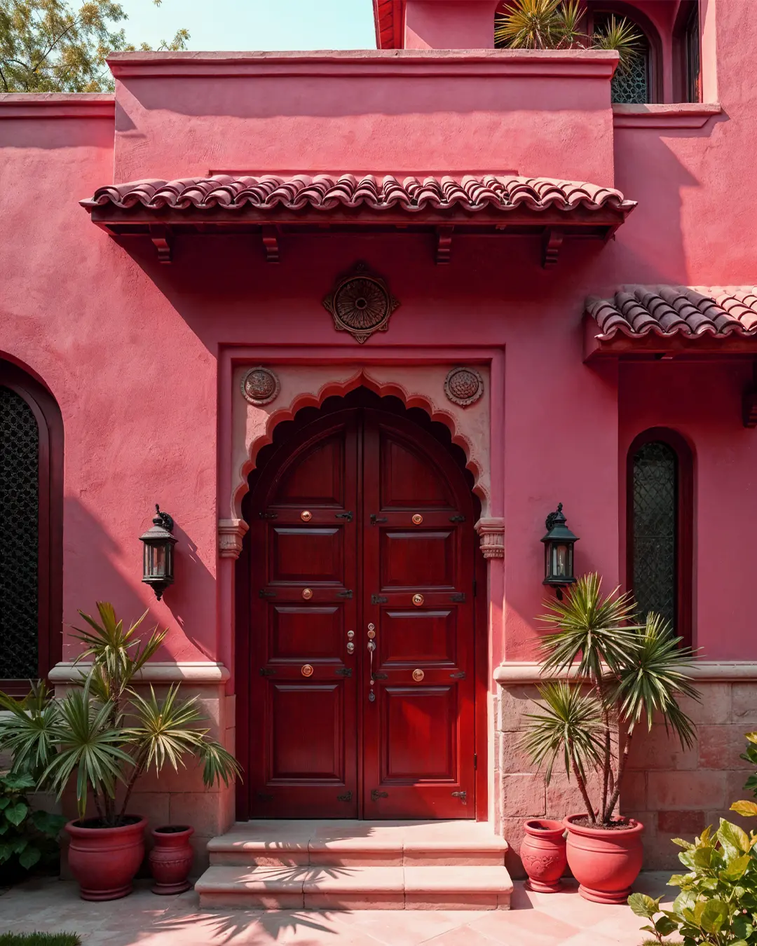
Mediterranean exterior painting styles are full of warmth, inspired by the colours and architecture of southern European countries such as Spain, Italy, and Greece. This style is characterised by sun-baked hues and stucco walls, often creating an inviting, sunlit aesthetic.

Typical Mediterranean colour schemes include shades of terracotta, sandy beige, olive green, and soft blue. White or off-white trim details, along with wrought iron accents, further enhance the Mediterranean charm. This style is particularly well-suited for homes with clay roof tiles and arched windows, as these architectural features pair beautifully with the colour palette.

Homes styled with Mediterranean paint give off a sense of warmth and hospitality, ideal for sunny climates and those looking for a welcoming, European-inspired aesthetic.

Victorian Exterior Painting Styles

Victorian exterior painting styles are famous for their ornate, decorative designs and intricate details. Victorian homes, often referred to as “painted ladies,” typically feature bold, contrasting colour schemes that highlight the architecture’s elaborate trim, gables, and columns.

Popular colour choices for Victorian homes include rich, deep tones such as burgundy, hunter green, and dark blue, often paired with complementary lighter shades for the trim. The use of multiple colours helps to accentuate the architectural detailing, adding drama and charm to the exterior.

For homeowners who want to celebrate their home’s history and embrace a more decorative look, Victorian styles offer a grand and elegant option.

Exterior Painting Style Suits Your Home

Choosing the Right Colour Palette for Your Exterior Paint

Selecting the right colour palette for your home’s exterior paint is a critical step in creating the overall aesthetic. The chosen colours should enhance your home’s architectural style, blend with the surrounding environment, and reflect your personal taste.

Neutral colours, such as whites, greys, and beiges, are versatile and work well with almost any style, providing a timeless and sophisticated appearance. For those looking to make a bolder statement, consider adding accent colours to highlight features such as doors, shutters, or trim. Darker hues, such as charcoal grey or navy blue, can make a modern home feel sleek, while softer pastels may be ideal for a traditional or coastal property.

When choosing a colour palette, also think about long-term appeal—trendy colours may fall out of favour, while classic tones often have lasting appeal. Finally, consider how the exterior paint will complement the landscape, neighbours’ homes, and any regulations that might apply within your local area, especially if you live in a listed building or a conservation area.

Conclusion: Finding the Perfect Exterior Paint Style for Your Home

Choosing the right exterior painting style for your home requires a balance of personal preference, architectural harmony, and environmental considerations. Whether you lean towards the timeless elegance of traditional designs, the cutting-edge look of modern styles, or the breezy charm of coastal and Mediterranean influences, your home’s exterior paint should enhance both its beauty and durability. By carefully selecting a colour palette and painting style that suits your property, you can create a home that not only looks stunning but also feels like a true reflection of your personality.
April Colour of the Month: Red Glow (2217C)

April Colour of the Month: Red Glow (2217C)

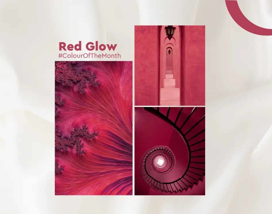
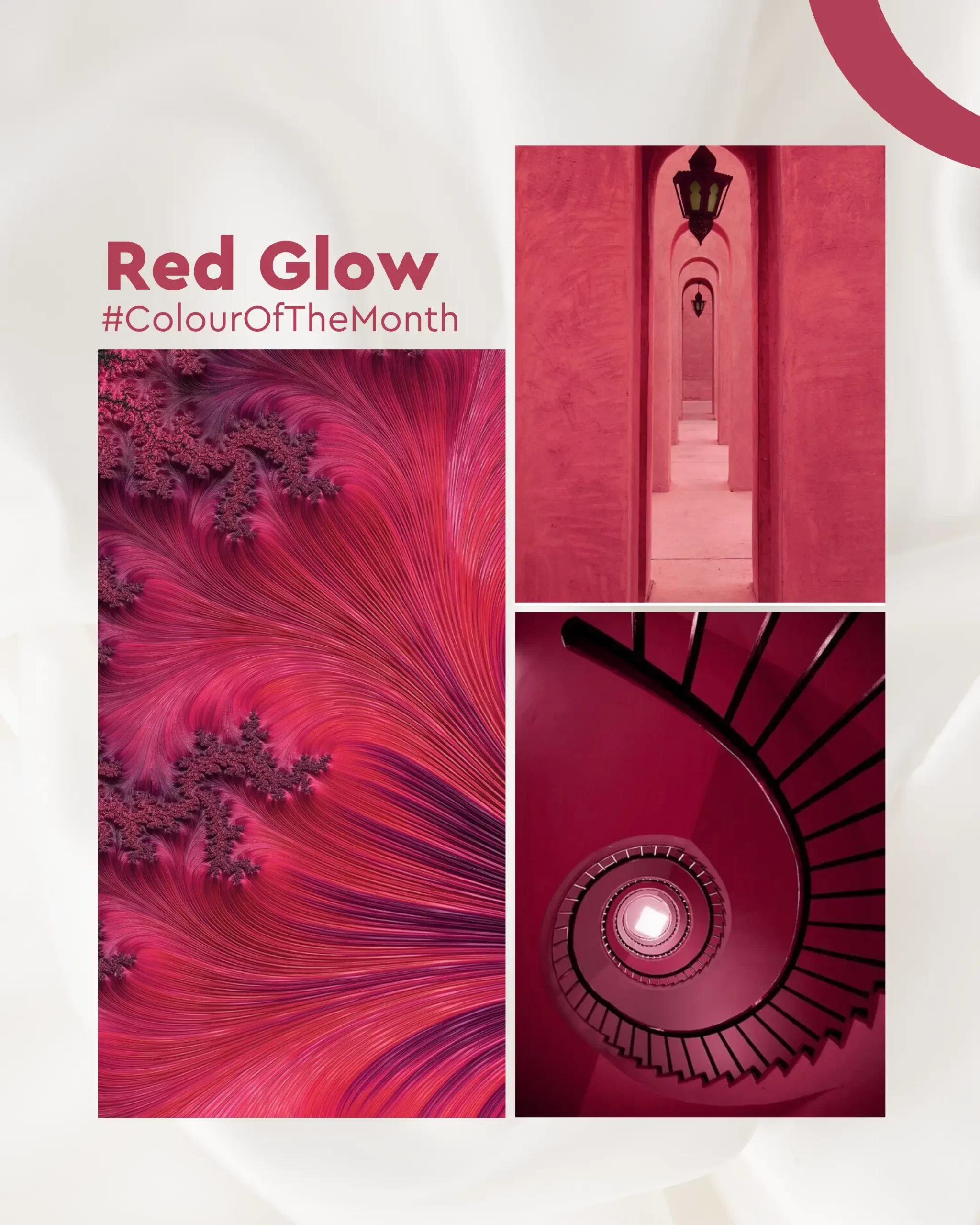
As the seasons shift and spring arrives, there’s no better way to invigorate your home than by infusing it with Red Glow (2217C), April’s Colour of the Month. This dynamic and bold shade of red brings a sense of warmth, energy, and vibrancy that can transform any room, creating an atmosphere that is both inviting and full of life. Whether used as a statement colour or as an accent, Red Glow adds a fresh burst of colour that rejuvenates your living space.

This month, we explore the power of Red Glow and how to incorporate it into your home to energise your interiors and elevate your décor. Whether you’re aiming to create a passionate atmosphere or simply want to add a pop of colour to your walls, Red Glow is the perfect choice to add intensity and character to your home.

Red Glow

Why Choose Red Glow (2217C) for Your Home?

Red is traditionally associated with warmth, passion, and energy. As a bold and powerful colour, Red Glow takes these associations and amplifies them, offering a rich, deep hue that brings both elegance and dynamism. This shade of red is perfect for anyone looking to make a statement or infuse their interiors with a touch of boldness and character.


Some of the reasons to choose Red Glow (2217C) for your home include:

  • Energising and Invigorating: Red is known to stimulate activity and enthusiasm, making it perfect for spaces where you need energy, like the living room or kitchen.
  • Timeless Elegance: Red is a classic colour that has been used for centuries to create a regal and sophisticated look. Red Glow strikes the perfect balance between boldness and elegance.
  • Creates a Bold Statement: Whether you use it as an accent wall or in furniture and décor, Red Glow is a colour that catches attention and sparks conversation.

With its warm undertones and timeless appeal, Red Glow can be incorporated into various home styles, from modern minimalism to traditional charm.

How to Use Red Glow in Your Home

Now that we’ve established why Red Glow is the colour to embrace this April, let’s look at how you can incorporate this striking hue into your home. Whether you’re using it for wall painting, furniture, or décor, here are some great ways to add Red Glow to your interiors:

1. Living Room: Create a Warm and Inviting Ambiance

In the living room, Red Glow works wonders as a statement wall colour. This space, where family and friends gather, can benefit from the vibrant energy that Red Glow exudes. By choosing a feature wall in Red Glow, you’ll immediately draw attention and create a captivating focal point for the room.

How to Style It:

  • Pair Red Glow with neutral tones like whites, greys, and beiges to balance out the intensity of the red and create a cohesive look.
  • Add warm, wooden furniture for a grounded, earthy touch that complements the boldness of the red.
  • Incorporate soft textiles, such as cream cushions, throws, or rugs, to keep the space cosy and inviting.
Red Glow

2. Dining Room: Set the Mood for Elegant Gatherings

The dining room is another great space for using Red Glow. Red is known to stimulate the appetite, making it a perfect colour for dining areas. Whether you use it on the walls, as a feature behind the dining table, or in accents like cabinetry, Red Glow can bring warmth and sophistication to your dining space.

Red Glow

How to Style It:

  • Combine Red Glow with gold or brass accents for an elegant, upscale look.
  • Pair with white or light grey furniture for a clean, balanced effect.
  • Add lush greenery with plants and elegant lighting to bring a calming touch to the vibrancy of the red.

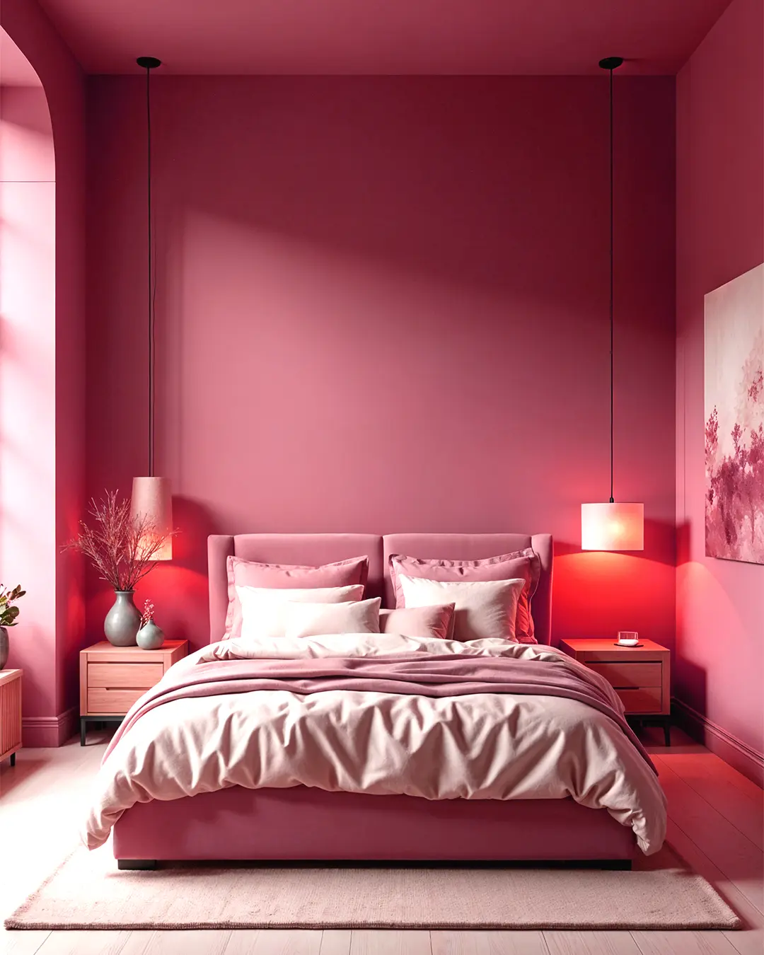
3. Bedroom: Bold Yet Calming

If you want to create a passionate yet serene atmosphere in your bedroom, Red Glow can help achieve just that. Use this rich red hue on one or two accent walls to create warmth and intimacy, without overwhelming the space.

How to Style It:

  • Pair Red Glow with soft neutrals, like beige or off-white bedding, to soften the look.
  • Use deep, plush fabrics like velvet or cotton for curtains and bed linens to enhance the richness of the red.
  • Gold or brass accessories, like lamps, mirrors, or frames, will add a luxurious touch to your bedroom.
Red Glow

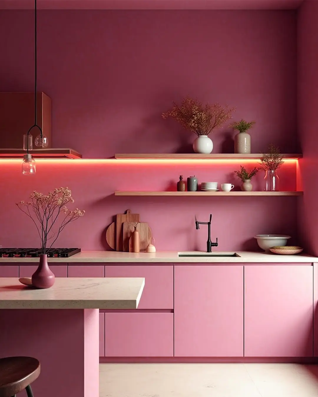
4. Kitchen: Energise Your Cooking Space

The kitchen is the heart of the home, and using a vibrant hue like Red Glow can give it an energetic vibe. This shade will uplift the space and create a stimulating atmosphere, perfect for those who love to cook and entertain.

How to Style It:

  • Apply Red Glow to the backsplash or cabinetry for an instant pop of colour.
  • Pair with neutral countertops or wooden accents to balance out the vibrant tone.
  • Use white or grey kitchenware to avoid overwhelming the space.
Red Glow

5. Accessories and Accents: Add a Touch of Red Glow

Not ready to commit to Red Glow on your walls? You can still incorporate this bold hue through accessories and décor pieces. Think throw pillows, vases, wall art, or bed linens that feature accents of this warm red.

How to Style It:

  • Use Red Glow in combination with other warm tones, such as orange or gold, to create a cohesive and inviting space.
  • Place statement furniture pieces, like red chairs or side tables, to add pops of colour without dominating the entire room.
  • Add red light fixtures or decorative lamps for a subtle yet striking glow.

Red Glow (2217C) is more than just a colour—it’s a statement. This vibrant, energetic shade brings warmth, passion, and character to any space, making it an excellent choice for your home this April. Whether you’re using it as a statement wall colour, in your furniture, or through accessories, Red Glow has the power to transform your interiors and elevate your décor.

With Indicus Paints, you have access to the highest quality paints that will help you bring this bold shade to life in your home. Choose Red Glow for a captivating, energetic transformation and watch as your living space comes alive with warmth and charm.

Ready to make a statement? Embrace Red Glow this April and infuse your home with elegance and vibrancy.

Red Glow

How to Choose a Primer for Different Surfaces

How to Choose a Primer for Different Surfaces

Introduction

Whether you’re refreshing a single room or tackling a large renovation, one critical step to ensure a smooth and durable finish is using the right primer. A primer helps paint adhere properly to a surface, improves the overall durability of the paint job, and provides a clean base for the final coat. However, not all primers are the same, and selecting the right one depends on the surface you’re working with, be it walls, wood, metal, or concrete. In this guide, we’ll break down how to choose the perfect primer for each surface and ensure your project has a professional, long-lasting finish.

The Importance of Using a Primer

A primer does more than just prepare a surface for paint. It acts as a sealant, prevents stains and marks from showing through the final coat, and increases paint adhesion, ensuring your paint job lasts for years. For porous surfaces like brick walls or wooden surfaces, a primer prevents the paint from being absorbed unevenly, while for non-porous surfaces like metal surfaces, it helps with adhesion. Primers also offer protection against issues like rust on metal or tannin bleed from wood, which can ruin an otherwise perfect paint job. Skipping the primer or using the wrong one can result in peeling paint, poor adhesion, and the need for extra coats, costing more time and money.

Understanding Different Surfaces and Their Needs

Each type of surface has unique properties that can affect how well the paint adheres and how it looks. For example, a plastered wall is highly absorbent, and wooden surfaces can have knots or natural oils that interfere with paint. Metal surfaces may rust, and concrete has rough textures that require a thick primer to create a smooth surface. Understanding these unique challenges will help guide you toward selecting the appropriate primer, which will enhance the durability and aesthetics of the final paint job. Whether the surface is porous, slick, prone to moisture, or exposed to the elements, there is a primer designed to meet those needs.

Choosing the Right Primer for Concrete and Masonry Surfaces

Concrete and masonry surfaces, are highly porous and often rough. A good masonry primer is essential to seal the surface and create a smooth foundation for paint. For exterior concrete, consider using a high-build primer that can fill in small cracks and imperfections. This type of primer will also protect against water infiltration, which can cause paint to peel over time. Interior concrete surfaces, like basement floors or walls, can benefit from a water-based primer, which seals the surface and prevents the absorption of moisture, ensuring the topcoat adheres well and remains durable.
Primer for Different Surfaces

Selecting a Primer for Wood Surfaces

Wood surfaces come with their own set of challenges. Knots, tannins, and the grain can bleed through and ruin your paint finish if not properly sealed. When working with raw or unfinished wood, it’s crucial to use Wood Primer or Sanding Sealer to prevent these issues. This type of primer seals the wood and creates a smooth, paint-ready surface. For painted or varnished wood, a bonding primer is essential as it ensures the new coat of paint will adhere properly. It’s also a good idea to lightly sand the wood before priming to enhance adhesion and ensure an even finish.

Primers for Metal Surfaces

Painting metal surfaces requires special attention to prevent issues like rust, corrosion, and peeling. Bare metal should be primed with an etching primer, which contains chemicals that create a strong bond between the metal and the paint. This is especially important for metals like aluminium or steel, which tend to be slick and difficult for paint to adhere to. If you’re working with rusted metal, a rust-inhibitive primer is key. This type of primer not only helps the paint adhere but also protects the metal from further corrosion, extending the life of your paint job. For galvanised metals, which resist rust but are tricky to paint, a specialised galvanised primer for metal surfaces should be used.

Right Primer for Drywall Surfaces

Drywalls are becoming increasingly popular due to their easy installation and low dead weight. However, their porous nature makes them highly absorbent. Without a primer, drywall can soak up paint unevenly, resulting in an inconsistent finish. For older or damaged drywall that has been affected by stains or smoke, an oil-based primer may be a better option, as it provides superior stain-blocking capabilities.

Tips for Applying Primer Correctly

Proper application of primer is just as important as selecting the right type. Start by thoroughly cleaning the surface to remove any dust, dirt, grease, or old paint chips. For surfaces like wood or metal, light sanding will help create a smooth, even surface, improving the primer’s adherence. Use the right tools for application: a brush for tight corners and edges, and a roller for larger surfaces. Be sure to apply primer in thin, even coats, allowing each coat to dry completely before adding another. Typically, one coat of primer is enough, but highly porous or stained surfaces may require two coats for maximum coverage.
Primer for Different Surfaces

Common Mistakes to Avoid When Choosing a Primer

One of the most common mistakes people make is choosing a primer that is not suited for the surface they are working with. Another frequent mistake is skipping the primer altogether, especially when painting over difficult surfaces or in high-traffic areas. Many believe they can skip the primer to save time, but this often results in more work later, as the paint may not adhere well or will require multiple coats. Investing in a good primer from the start will save time, money, and effort in the long run.
Primer for Different Surfaces

Conclusion: Finding the Perfect Primer for Your Project

Choosing the right primer for your project can make all the difference between a paint job that lasts and one that quickly deteriorates. Whether you’re working with drywall, wood, metal, or concrete, understanding the specific needs of each surface will guide you in selecting the right product. Primers not only enhance adhesion but also protect your surfaces from stains, moisture, and wear. By investing in the right primer and applying it correctly, you’ll ensure a professional painting service for long-lasting finish that will stand the test of time.