
You are using an outdated browser. Please upgrade your browser to improve your experience.

Burnt Brick – March Colour of the Month

Burnt Brick – March Colour of the Month

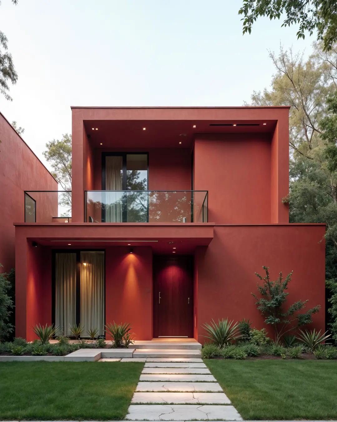
As we step into March, a month that signals a transition from winter’s chill to spring’s warmth, there’s no better time to embrace a colour that reflects earthiness, depth, and timeless elegance. This month, our featured shade is Burnt Brick (2132D)—a rich, warm, and sophisticated hue that brings a cosy yet stylish touch to interiors.  

Inspired by the natural tones of clay, terracotta, and aged brick, Burnt Brick blends rustic charm with modern appeal, making it an ideal choice for accent walls, furniture, and décor. Whether used as a statement shade or paired with neutrals, it adds warmth and character to any space.

Burnt Black

Let’s explore how you can incorporate Burnt Brick into your home this March.

What Makes Burnt Brick Special?

A Warm & Earthy Hue – Inspired by natural clay and terracotta, this shade brings a grounded and comforting feel to interiors.

Versatile for Any Space – Works beautifully as an accent wall, full-room colour, or even on furniture and décor.

Timeless Appeal – A colour that feels both classic and contemporary, making it suitable for a variety of design styles.

Perfect for Every Season – Cozy enough for winter, yet warm and inviting for the spring transition.

Pairs Well with Multiple Tones – Complements earthy neutrals, warm wood finishes, and deep greens or blues for a harmonious look.
Burnt Brick

Best Ways to Use Burnt Brick in Your Home

1. Living Room – A Statement of Warmth & Character

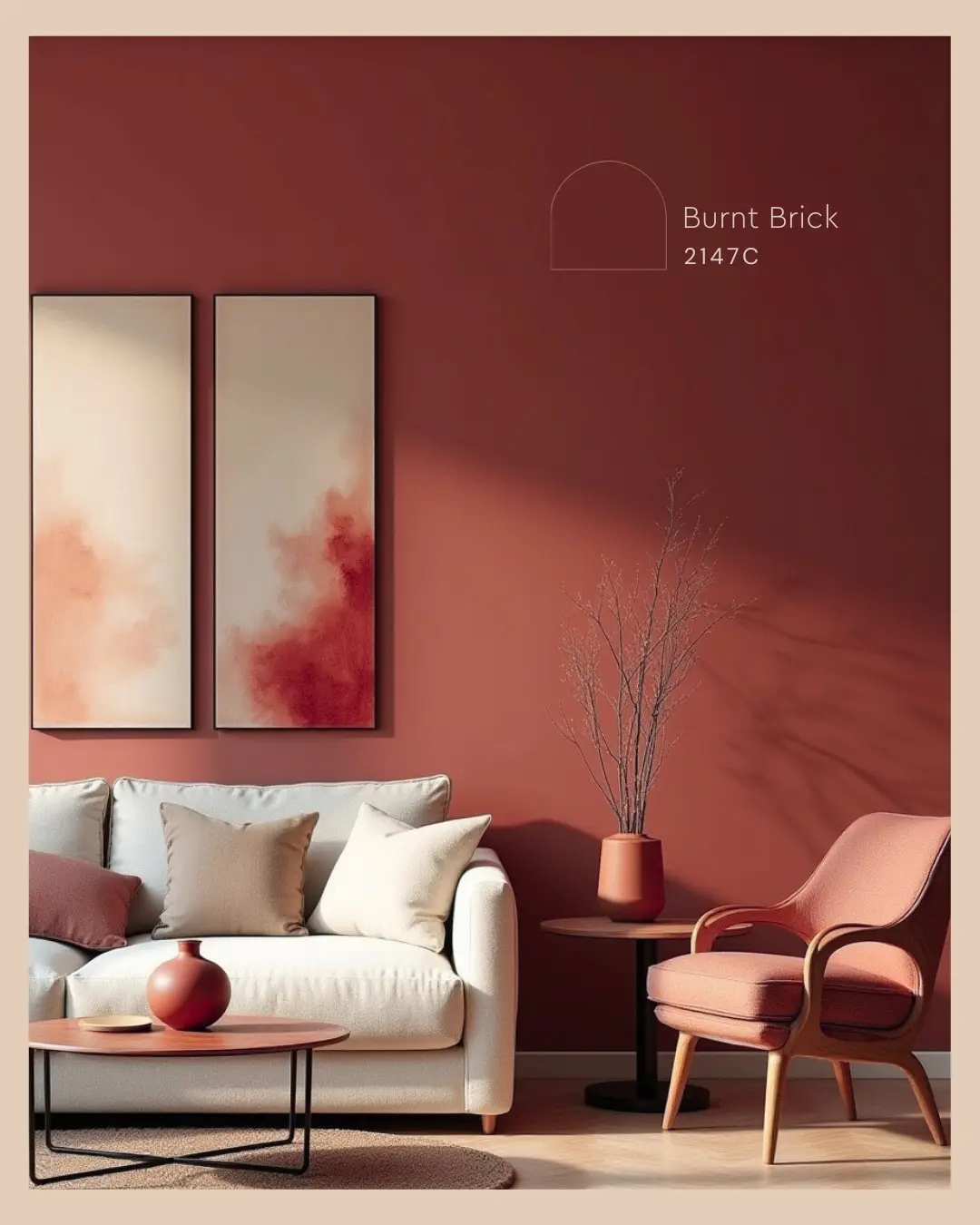
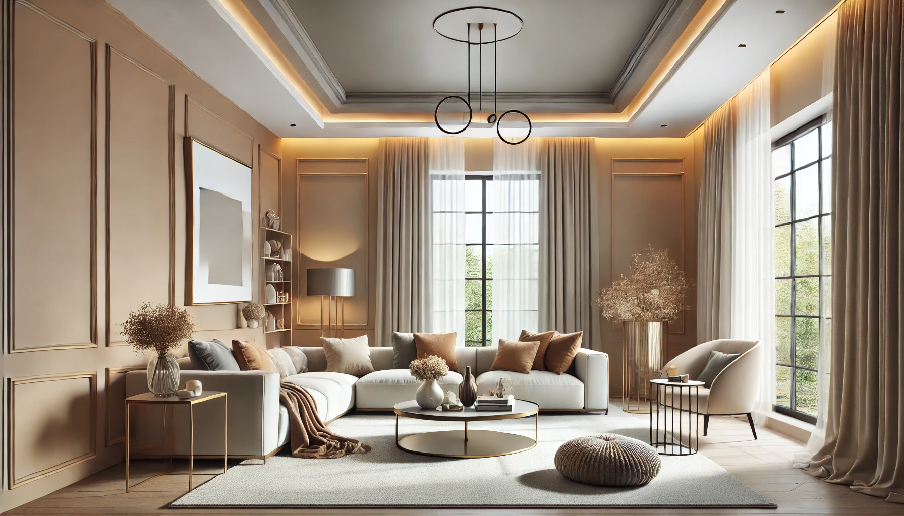
Burnt Brick makes for a stunning feature wall in the living room, creating an inviting and grounded atmosphere. When paired with beige or cream-toned furniture, it enhances the space’s warmth while maintaining balance.

Styling Tip: Complement Burnt Brick walls with wooden coffee tables, terracotta pots, and linen textures for a cosy, rustic aesthetic.
Burnt Brick

2. Bedroom – A Cosy & Earthy Retreat

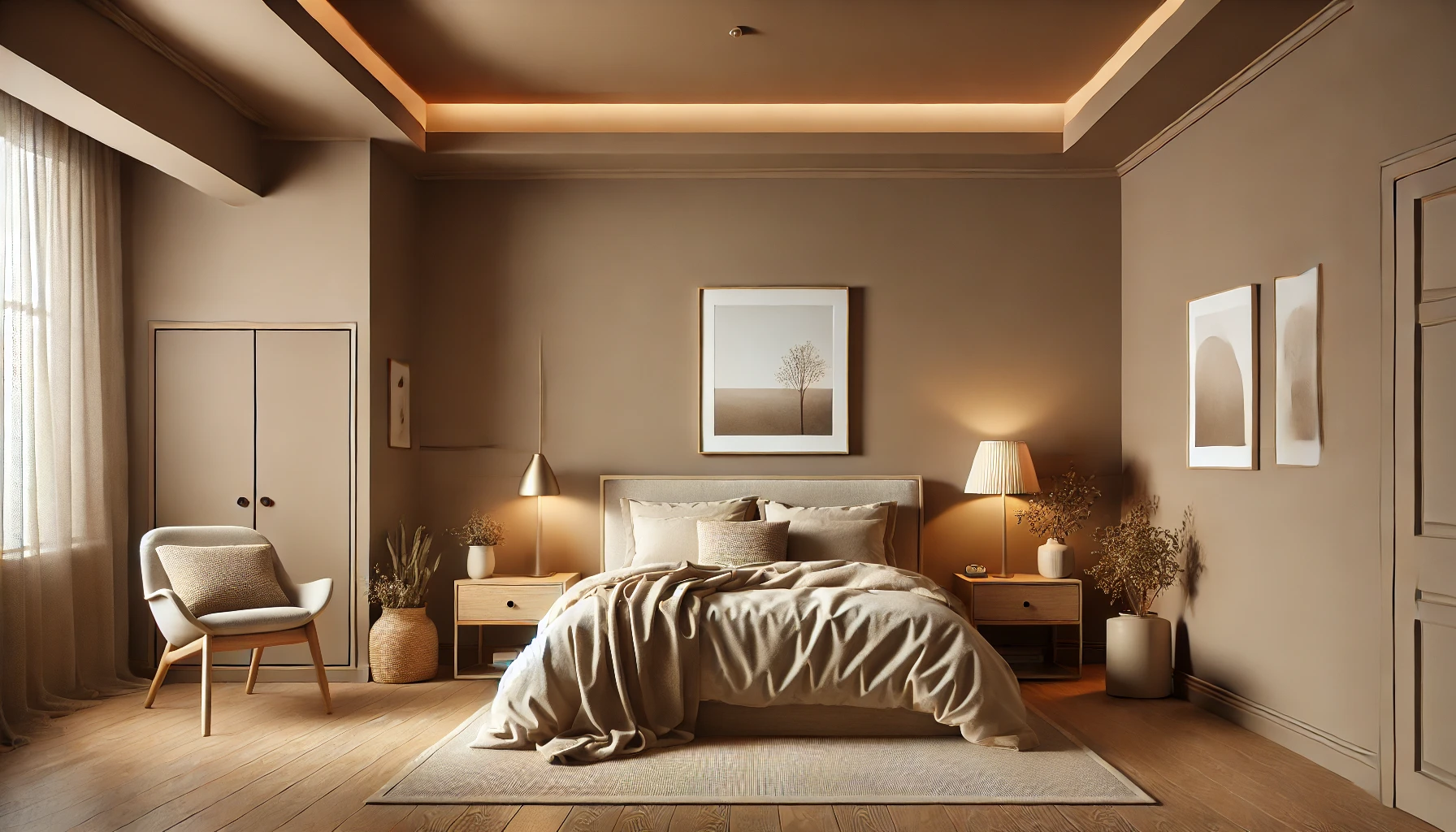
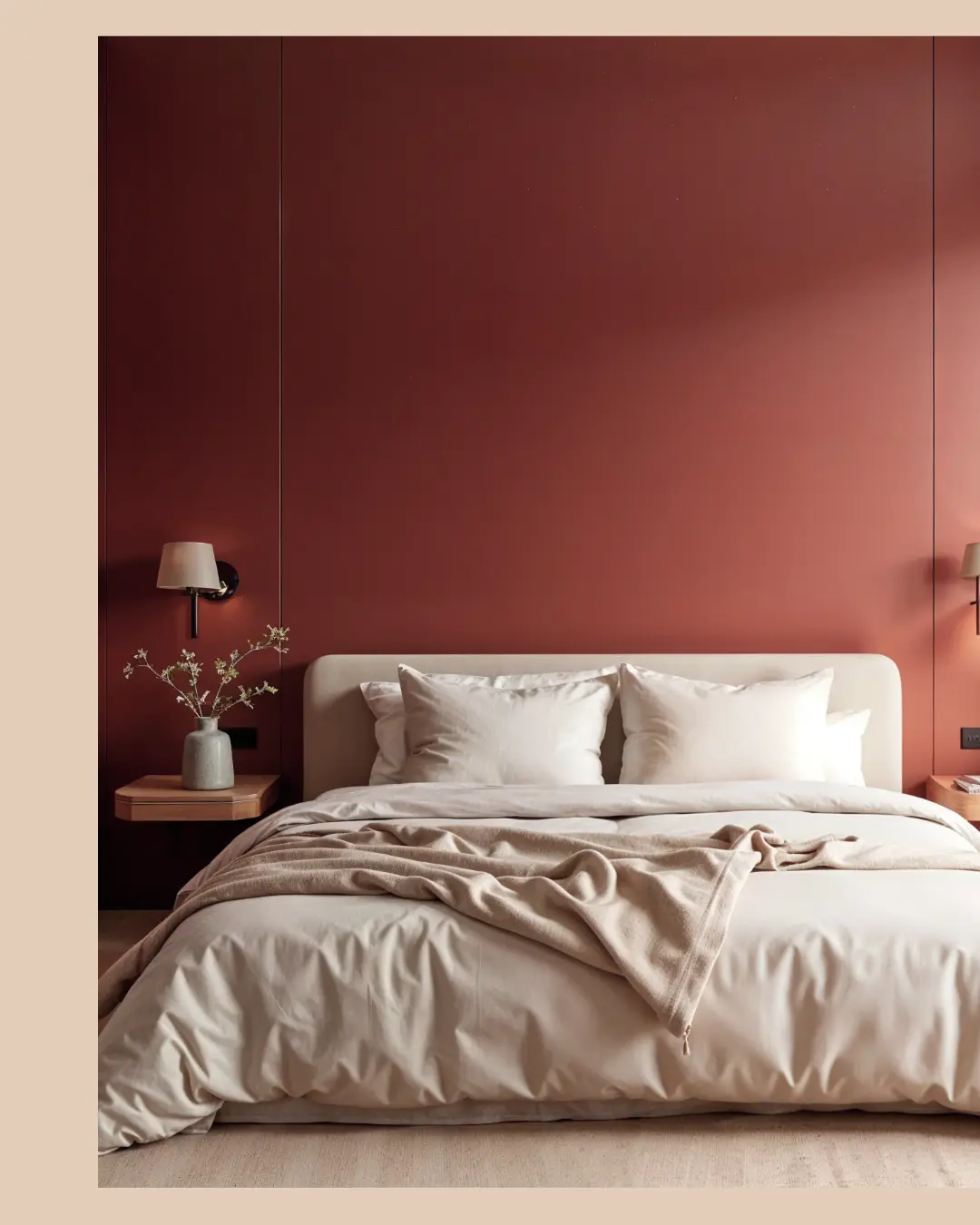
For a soothing and intimate ambiance, Burnt Brick works wonderfully on bedroom walls or even as a headboard backdrop. Pair it with neutral bedding and soft lighting to create a warm and inviting space.

Styling Tip: Use wooden or brass-finish lamps, along with soft beige and white textiles, to enhance the earthy tone.
Burnt Brick

3. Dining Area – A Space for Rustic Elegance

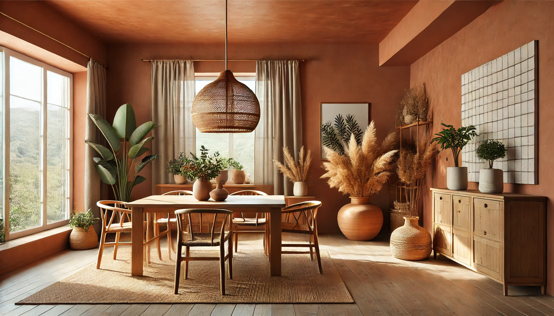
A Burnt Brick accent wall in the dining room can add a sophisticated yet relaxed feel, making meals feel even more special. This warm hue pairs well with dark wooden furniture, woven décor, and brass elements.

Styling Tip: Add handmade ceramics, terracotta planters, and warm-hued pendant lighting to complement the richness of Burnt Brick.

4. Home Office – A Bold & Motivating Colour

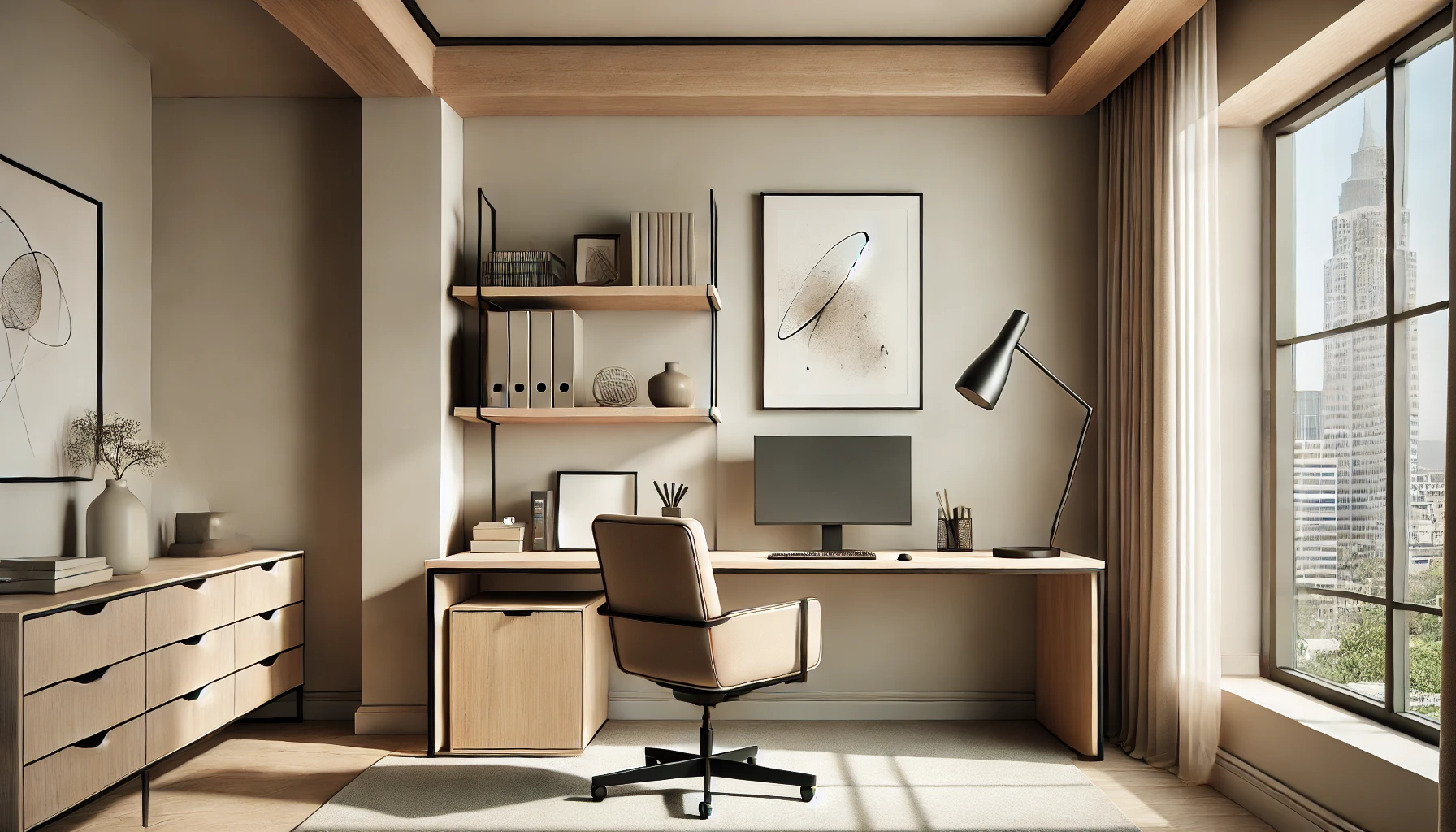
Burnt Brick isn’t just about warmth—it also exudes depth and creativity, making it a great choice for a home office. It can help create a focus-driven yet inspiring work environment.

Styling Tip: Pair it with off-white or olive green accents, wooden desks, and textured rugs for a balanced and productive space.

5. Accent Elements & Décor

Not ready for a full-room transformation? Incorporate Burnt Brick in smaller ways:

  • Painted bookshelves or cabinets for a subtle yet impactful touch.
  • Statement furniture like chairs, headboards, or side tables for a pop of earthy warmth.
  • Decorative elements such as vases, cushions, or wall art to introduce the colour without commitment.

Conclusion

March is the perfect time to embrace Burnt Brick (2132D) , a shade that balances rustic charm with modern elegance. Whether used in large or small doses, this earthy hue transforms interiors into warm, inviting spaces.

Bring the beauty of Burnt Brick into your home with Indicus Paints and experience a colour that is timeless, bold, and versatile. Explore our premium-quality paints to turn your vision into reality!
Coloured Ceilings: The Pros and Cons of Matching Your Ceiling with Your Walls

Coloured Ceilings: The Pros and Cons of Matching Your Ceiling with Your Walls

When it comes to home décor, walls often take centre stage, while ceilings remain an afterthought, typically painted white or left neutral. However, coloured ceilings are becoming an exciting design trend, offering a way to enhance depth, style, and cohesion in a room. But is matching your ceiling with your walls a smart choice?

While a single-colour scheme can create a seamless, modern aesthetic, it may also affect how spacious or bright a room feels. Before committing to this bold design choice, it’s essential to explore the pros and cons of painting your ceiling the same colour as your walls. 

Coloured Ceilings

The Pros of Matching Your Ceiling with Your Walls

1. Creates a Cohesive and Elegant Look

Matching your ceiling with your walls can create a harmonious, uniform appearance that feels well put together. This approach works particularly well in modern, minimalist, or contemporary interiors, where a seamless transition between walls and ceilings adds to the overall sophistication.

2. Makes a Small Room Feel Bigger

Contrary to popular belief, painting the ceiling the same colour as the walls can make a small room appear larger. When there’s no contrast between the ceiling and the walls, it eliminates visual breaks, giving the illusion of expanded space.

Coloured Ceilings
3. Enhances a Cosy, Enclosed Feel

For bedrooms, libraries, or lounges where warmth and intimacy are desired, a single-colour approach creates a wrapped-in effect, making the space feel comfortable and inviting. This is especially effective with darker or warm-toned colours.

4. Allows for Bold, Dramatic Statements

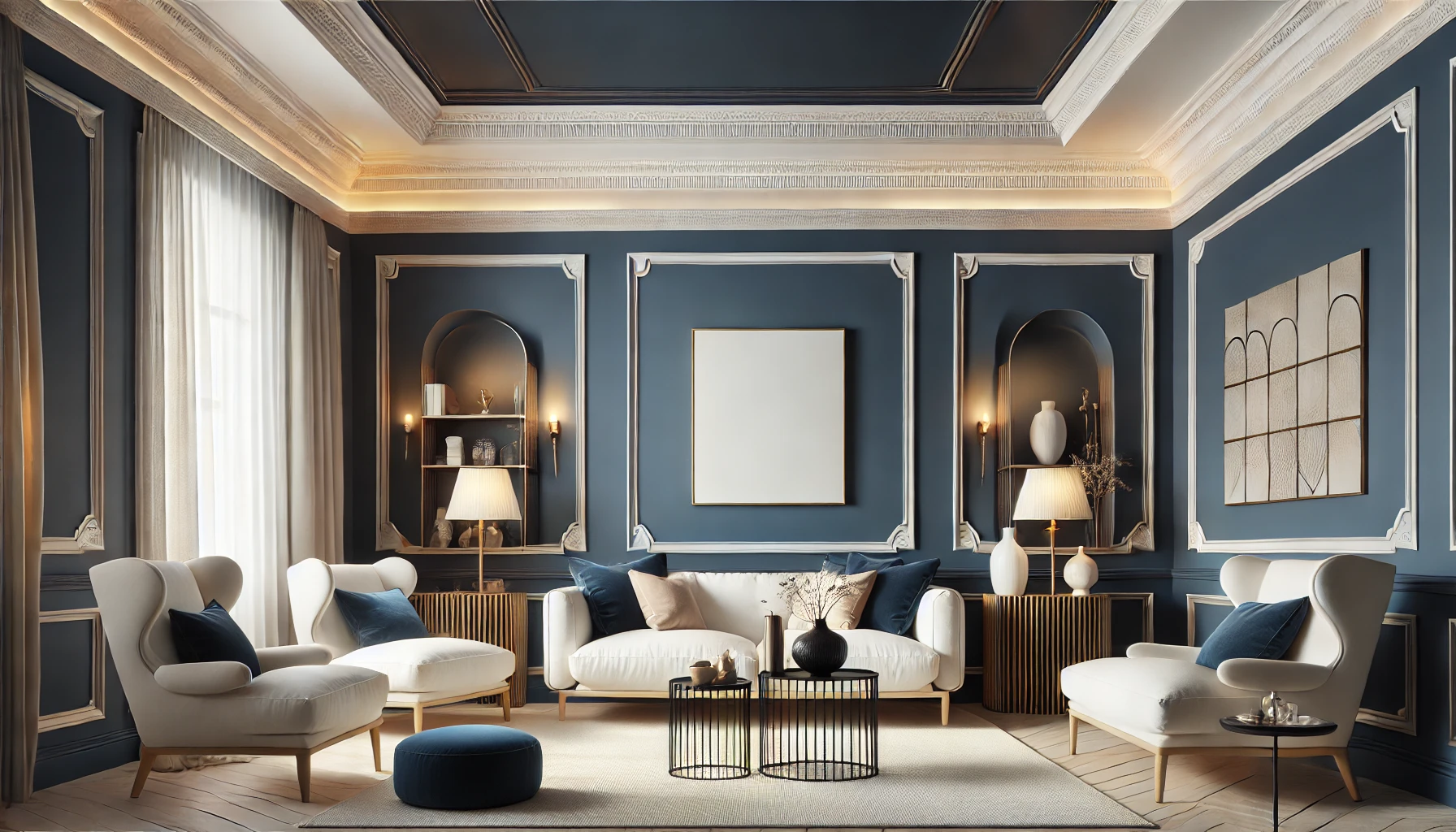
Using a rich or deep colour across both walls and ceilings can make a bold statement. Deep blues, greens, or terracotta shades can add depth and character, making a space feel luxurious and well-designed.

5. Works Well with High Ceilings

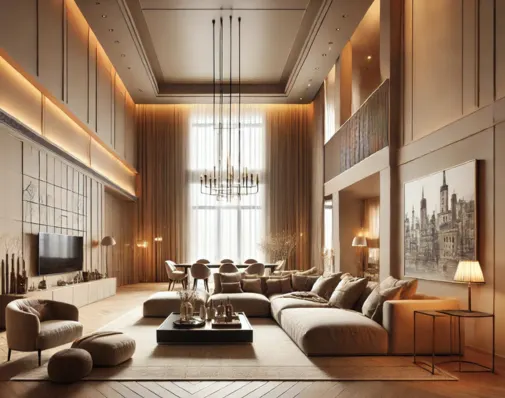
Homes with vaulted or high ceilings can benefit from a single colour scheme, making the room feel less cavernous and more balanced. When a ceiling is painted the same colour as the walls, it visually lowers the ceiling height slightly, making the space feel more intimate and well-proportioned.

high-ceiling living room

The Cons of Matching Your Ceiling with Your Walls

1. Can Make Low Ceilings Feel Smaller

While matching colours can expand a space visually, the effect is reversed in rooms with low ceilings. Using dark or medium tones on both the walls and ceiling can make a room feel closed-in or cramped, which may not be ideal for smaller spaces.

2. May Reduce Natural Light Reflection

White or light-coloured ceilings are popular because they reflect natural light, making a room feel brighter. Dark or bold-coloured ceilings, on the other hand, absorb light, which can make a room feel dimmer and require additional lighting solutions.

3. Limits Design Flexibility

A single-colour scheme may limit future décor changes. If you enjoy frequently switching up furniture, artwork, or accent pieces, a neutral ceiling provides more flexibility than one that matches your walls.

Coloured Ceilings
4. Might Feel Overwhelming in Certain Colours

While a monochromatic look can be beautiful, using highly saturated or overly dark shades can make a space feel overwhelming. Deep reds, purples, or blacks across both ceilings and walls need to be used carefully to avoid creating a claustrophobic atmosphere.

5. Can Be Harder to Touch Up or Change

If you decide to switch colours later, repainting a coloured ceiling can be more challenging than repainting just the walls. Lighter ceilings allow for easier updates, while darker or bolder ceilings require more preparation and multiple coats of paint to cover effectively.

Best Colours to Use for Matching Walls and Ceilings

While choosing the same colour for walls and ceilings is a bold move, selecting the right shade makes all the difference.

Soft Neutrals (Beige, Off-White, Taupe) – Creates a warm, modern, and seamless feel without being too overpowering.

Coloured Ceilings

Pale Blues and Greens – Brings a sense of tranquillity, ideal for bedrooms or relaxing spaces.
Earthy Tones (Terracotta, Warm Greys, Olive Green) – Adds depth while keeping a natural and inviting aesthetic.
Deep Jewel Tones (Navy Blue, Emerald Green, Burgundy) – Perfect for luxurious and dramatic interiors.
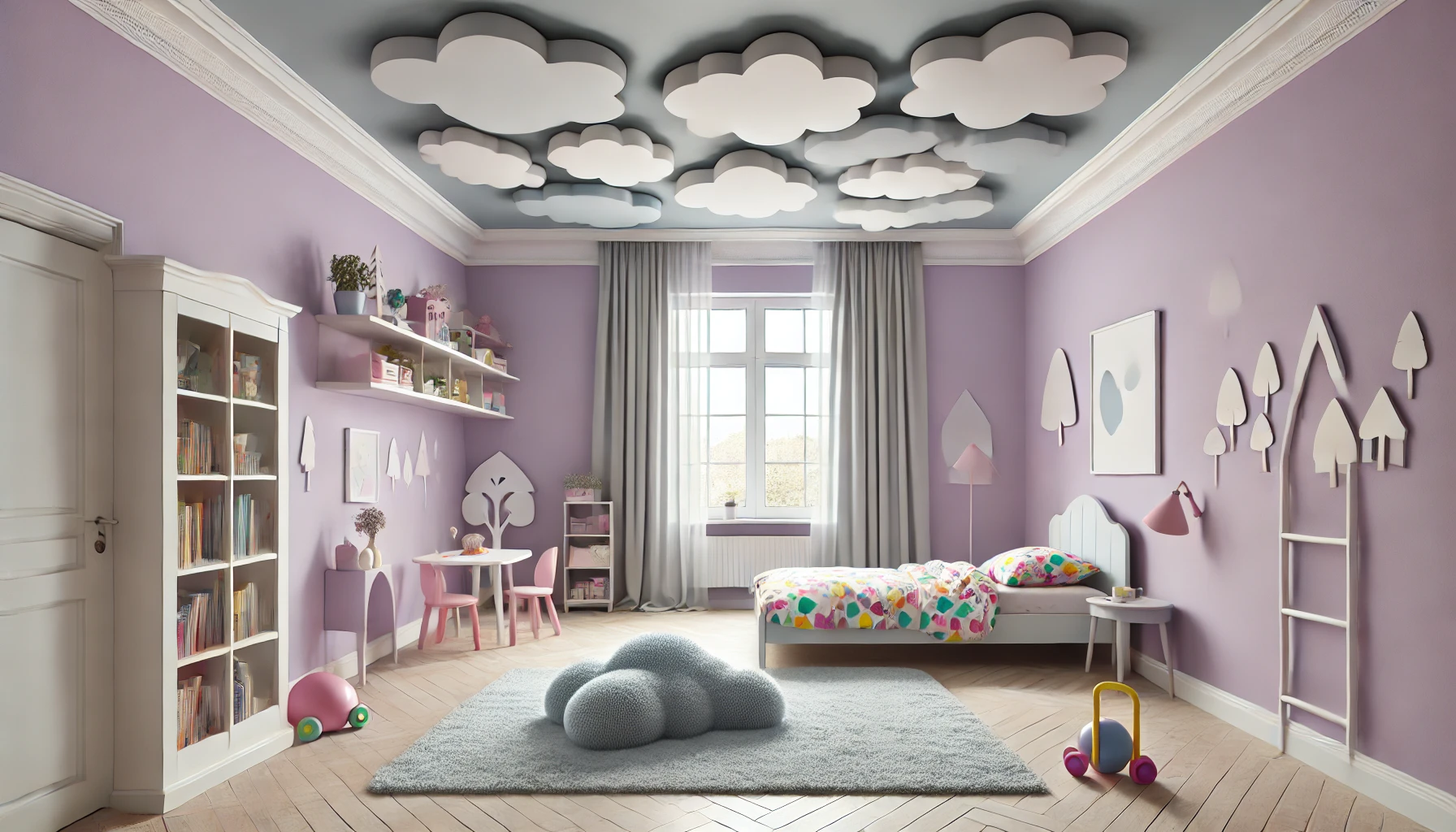
Muted Pastels (Lavender, Blush Pink, Soft Yellow) – Works well in children’s rooms or elegant, light-filled spaces.

Coloured Ceilings

When to Match Your Ceiling with Your Walls

If You Want a Modern, Cohesive Look – Works well in contemporary, minimalist, and sophisticated interiors.
If You Have High Ceilings – Helps bring balance to lofty spaces.
For Creating a Statement or Mood – Works great with deep, bold colours for a striking, dramatic effect.
For Smaller Rooms Without Many Windows – Lighter monochrome schemes can make the space feel bigger.

When to Avoid Matching Your Ceiling with Your Walls

If You Have Low Ceilings – Can make a room feel smaller and more enclosed.
If Your Room Lacks Natural Light – Dark ceilings may absorb too much light and make the space feel dim.
If You Frequently Redecorate – A neutral ceiling offers more flexibility for changing wall colours and décor.
If the Colour is Too Intense – Highly saturated colours can make the room feel overwhelming.

Alternative Ceiling Colour Ideas for a Stylish Contrast

If you’re hesitant about matching your ceiling with your walls but still want a unique look, consider these alternatives:

Classic White Ceiling – Keeps the space bright and open while allowing colourful walls to stand out.

Coloured Ceilings
Lighter Ceiling Shade – A soft variation of the wall colour can maintain harmony while keeping the ceiling airy.
Metallic or Textured Finishes – Adds depth and interest to a space without overpowering it.
Two-Tone Ceiling Designs – Try incorporating a border or decorative moulding to define the ceiling in a creative way.

Conclusion: Is a Coloured Ceiling Right for You?

Matching your ceiling with your walls is a bold, stylish design choice that can create a seamless, cosy, or dramatic look, depending on the colour and room type. While this trend has many benefits, including a cohesive aesthetic, space-enhancing qualities, and design elegance, it also comes with potential drawbacks, such as reduced brightness, overwhelming colour intensity, or difficulty in redecorating later.

The key is to consider your room size, ceiling height, natural lighting, and personal style before making a decision. Whether you embrace a monochromatic colour scheme or opt for a contrasting ceiling, the right choice will enhance your home’s aesthetic and ambiance beautifully.

Thinking about adding colour to your ceilings? Explore Indicus Paints’ premium colour palette for expert-recommended shades that suit your style!

Quick and Easy DIY Spray Painting for Door and Cabinet Makeovers

Quick and Easy DIY Spray Painting for Door and Cabinet Makeovers

Looking for a quick, hassle-free way to refresh your doors and cabinets? Spray painting is the perfect solution! Unlike traditional brush painting, spray paint provides a smooth, even finish, dries faster, and eliminates brush strokes, making it ideal for DIY home makeovers.

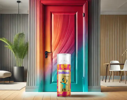
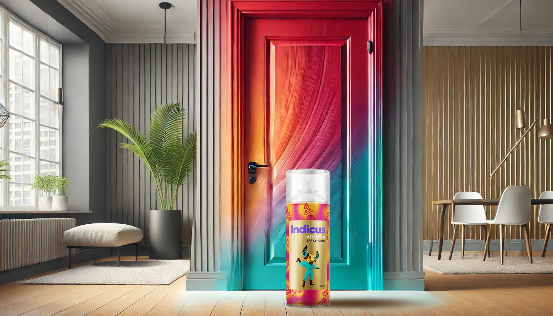
With Indicus Admyra Spray Paint, you can transform your old cabinets and doors into sleek, stylish statement pieces with minimal effort and maximum impact. Whether you’re aiming for a modern, high-gloss finish or a rustic, distressed look, these easy spray painting ideas will help you achieve professional-quality results in no time.

Let’s dive into step-by-step techniques, expert tips, and creative ideas to make your DIY spray painting project a success!

Why Choose Spray Painting for Your Doors & Cabinets?

Spray painting is an efficient and stylish way to update your home without the hassle of traditional painting methods. It offers smooth coverage, a streak-free finish, and a variety of colours and finishes to match your desired aesthetic.

Some key benefits of spray painting include:

  • Quick and easy application with no need for brushes or rollers
  • Even, streak-free finish for a professional look
  • Faster drying time, allowing for multiple coats in a single day
  • Versatile finishes with a range of colours and gloss levels
  • Ideal for different surfaces, including wood, laminate, and metal
Admyra Spray Paint

Choosing the Right Spray Paint for a Professional Finish

1. Why Indicus Admyra Spray Paint?

For the best results, use Indicus Admyra Spray Paint, designed for doors, cabinets, furniture, and metal surfaces. It is formulated to provide:

  • Quick-drying technology – Reduces waiting time between coats.

  • Superior adhesion
    – Ensures lasting durability.

  • Smooth, even coverage
    – No drips or streaks.
  • Wide range of finishes – Glossy, matte, and metallic options.
2. Selecting the Right Finish for Your Style
  • Gloss Finish – Ideal for modern, high-shine cabinets and doors

  • Matte Finish
    – Provides a soft, elegant look for contemporary spaces

  • Metallic Finish
    – Adds a touch of luxury and depth to accent pieces

Step-by-Step Guide to Spray Painting Doors & Cabinets

Step 1: Prep Your Space & Surface

Work in a well-ventilated area, such as outdoors or in a garage with open windows. Cover floors and surrounding areas with drop cloths or newspapers to protect them from overspray. Remove hardware like knobs, handles, and hinges for an even application. Clean the surface thoroughly with soap and water to remove dirt, grease, or any old paint residues.

Step 2: Sand & Prime for Better Adhesion

If the surface is glossy or laminated, lightly sand it with fine-grit sandpaper to create a rough texture that helps the paint adhere. Wipe down the area with a damp cloth to remove dust. Applying a spray primer before painting can improve adhesion, especially on laminate or metal surfaces.

Step 3: Apply the Spray Paint

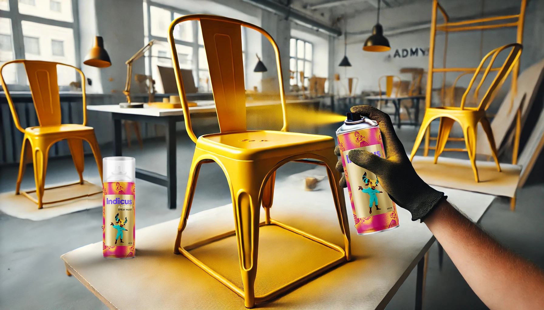
Shake the spray well for at least 30 seconds before use. Hold the can 6-8 inches away from the surface and apply the paint in thin, even coats using a smooth, sweeping motion. Avoid spraying too close, as this can cause drips or uneven coverage. Allow each coat to dry completely before applying the next, usually within 15-30 minutes.

Step 4: Apply a Clear Protective Coat (Optional)

For added durability, consider finishing with a clear sealant spray. This will help protect against scratches, moisture, and everyday wear and tear.

Step 5: Reassemble & Enjoy Your Fresh Look!

Once the paint is fully dry, reattach all hardware and admire your beautifully transformed doors and cabinets.

Admyra Spray Paint

Creative DIY Spray Painting Ideas for Doors & Cabinets

1. Two-Tone Colour Blocking – Modern & Stylish

Use painter’s tape to create sections and spray different colours for a bold, contemporary look. Contrasting shades like navy blue and white or black and gold can make a striking statement.

2. Distressed Vintage Look – Rustic Charm

For a vintage aesthetic, apply a base coat and let it dry completely. Then, lightly sand the edges and high-touch areas to achieve a naturally worn effect. This technique works particularly well for farmhouse-style kitchen cabinets and antique furniture.

3. Stencilled Patterns – Personalised & Artistic

Add a unique touch by using stencils to spray floral, geometric, or tribal designs onto your cabinets or doors. This works especially well on cabinet panels and wardrobe fronts.

4. Metallic Accents for a Luxe Finish

Upgrade your cabinets by spraying knobs, handles, or trim in metallic shades like gold, copper, or silver. This pairs beautifully with deep, rich wall colours like dark green or navy blue.

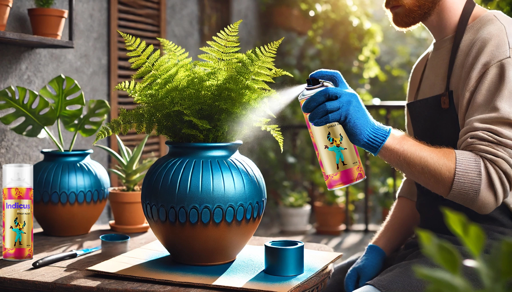
Admyra Spray Paint

Pro Tips for a Perfect Spray Paint Finish

Always test on a small area before painting the entire surface.
Apply multiple thin coats rather than one thick coat to avoid drips.
Keep the spray can moving in smooth, sweeping motions to ensure even coverage.
Let the paint fully cure before reattaching hardware, ideally for at least 24 hours.
Store spray paint cans properly and shake before each use for best consistency.

Maintaining Your Newly Spray-Painted Cabinets & Doors

After completing your project, regular maintenance will help keep your newly painted surfaces looking fresh and flawless.

Clean with a soft cloth and mild soap to prevent dirt buildup.

Avoid abrasive cleaners that can scratch or dull the finish.
Handle doors and cabinets with care to prevent chipping.

Touch up small imperfections with leftover spray paint when necessary.
.
Keep cabinets and doors away from direct sunlight to prevent fading over time.

Elevate Your Home with Indicus Admyra Spray Paint

A quick and easy spray paint makeover can instantly upgrade your doors and cabinets, giving them a fresh, modern look with minimal effort. Whether you prefer a glossy modern finish, a rustic distressed effect, or bold colour accents, Indicus Admyra Spray Paint makes it easy to achieve professional-quality results at home.

Ready to start your DIY project? Explore Indicus Admyra Spray Paint for long-lasting durability, smooth application, and a stunning finish!

Admyra Spray Paint

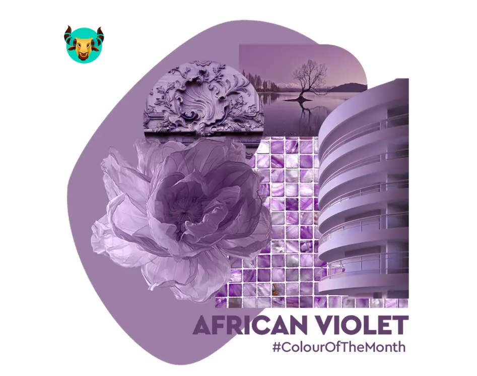
African Violet – February Colour of the Month

African Violet – February Colour of the Month

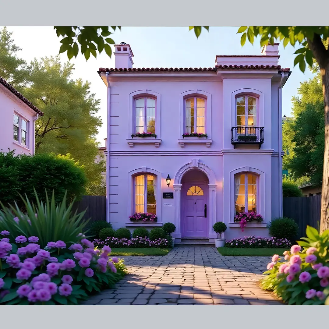
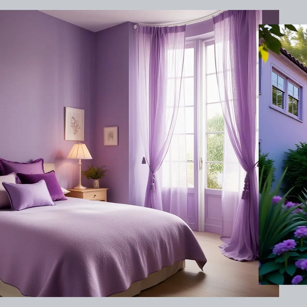
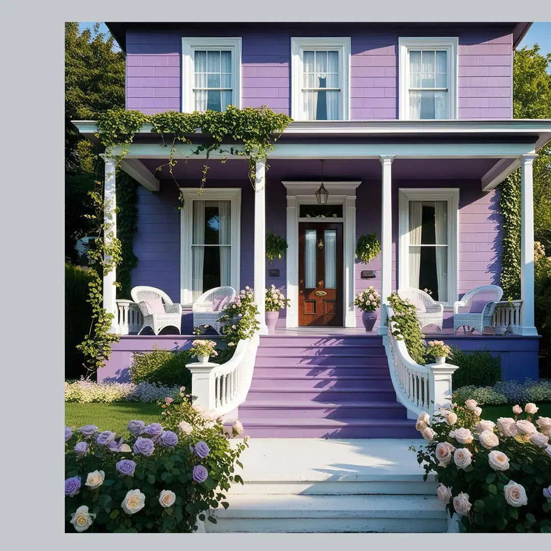
February is a month of romance, creativity, and transformation, making it the perfect time to embrace a colour that exudes depth, elegance, and regality. African Violet, a rich, luxurious shade, carries a unique blend of warmth and boldness, offering a royal aesthetic that enhances any interior. Whether used as a statement wall, an accent colour, or across an entire space, African Violet adds a sense of grandeur and sophistication that makes any home feel more refined.

Let’s explore how you can incorporate African Violet into your home and make the most of this regal and enchanting shade this February.
 

Why African Violet?

As a colour that represents luxury, creativity, and tranquillity, African Violet is perfect for elevating interiors with a refined and majestic touch. Deeply associated with royalty, it has been used historically in palaces, grand homes, and ceremonial spaces, making it a timeless choice for those who appreciate elegance and grandeur.

African Violet

What Makes African Violet Special?

A Perfect Winter-to-Spring Transition Shade – Deep and cosy for winter, yet refreshing as the seasons change.
Regal & Sophisticated – A colour long associated with royalty, power, and opulence, making any space feel more elegant.
Versatile for Any Space – Works beautifully as a bold accent, an entire room colour, or on furniture pieces.
Mood-Enhancing – Adds a sense of luxury, creativity, and introspection, making it ideal for both relaxation and inspiration.

African Violet

Best Ways to Use African Violet in Your Home

1. Living Room – A Grand Statement of Elegance

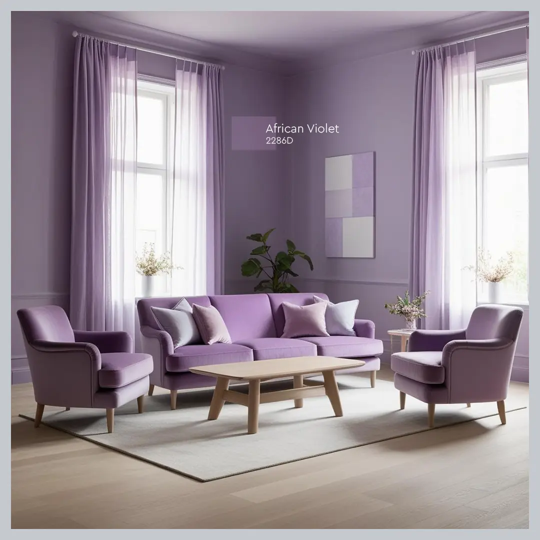
African Violet makes for a stunning feature wall in a living room, creating a regal and dramatic backdrop. It pairs beautifully with gold accents, neutral-toned furniture, and rich textures like velvet and silk, enhancing the feeling of luxury and sophistication.

2. Bedroom – A Royal & Cozy Retreat

For a warm, intimate ambiance, African Violet transforms bedrooms into elegant sanctuaries. Incorporate plush bedding, deep wooden furniture, and soft ambient lighting to achieve a refined and restful atmosphere fit for royalty.

African Violet

3. Dining Area – A Luxurious & Timeless Space

In dining rooms, African Violet creates an elevated and sophisticated environment, perfect for grand dinner settings. Complement the space with dark wood furniture, warm lighting, and crystal tableware to enhance its classic, regal charm.

4. Home Office – A Colour for Focus & Prestige

African Violet is known to stimulate creativity and intellect, making it an ideal choice for home offices, reading nooks, or study areas. Pair it with white or grey furniture, metallic accents, and structured décor for a polished and inspiring workspace.

5. Accent Elements & Décor – Subtle Yet Impactful

Not ready for a full-room transformation? African Violet can be incorporated in smaller ways to add a touch of royal charm:

Painted bookshelves or cabinets for an understated yet refined touch.
Statement furniture like chairs, headboards, or ornate side tables to enhance the space.
Decorative elements such as vases, cushions, and wall art to subtly introduce this rich hue without overwhelming the room.
African Violet

Conclusion

February is the perfect time to embrace African Violet, a colour that exudes elegance, warmth, and regal sophistication. Whether used in bold statements or subtle accents, this shade elevates interiors, bringing a sense of grandeur and refinement to any space.

Get inspired and bring the luxurious charm of African Violet into your home with Indicus Paints. Explore premium-quality paints and expert recommendations to make your African Violet vision a reality this February!

How to Create a Stunning Tri-Colour Accent Wall for Your Home

How to Create a Stunning Tri-Colour Accent Wall for Your Home

A tri-colour accent wall is a fantastic way to add character, depth, and sophistication to your home. Combining three carefully chosen hues allows you to create a dynamic and visually stunning feature that serves as a focal point. Using the Indicus Colour Palette, you can achieve a look that is not only stylish but also uniquely tailored to your home’s aesthetic. Whether you’re looking to create a calming atmosphere or make a bold statement, a tri-colour wall is a versatile option to elevate your interiors.  

Why Opt for a Tri-Colour Accent Wall?

Tri-colour accent walls are an innovative approach to home décor, offering depth and creative flexibility. This design style allows you to experiment with layers of colour to highlight textures, architectural details, or even furnishings. By choosing complementary colours, you can create a harmonious environment that ties the entire room together. Whether you prefer soft, neutral tones or vibrant, bold shades, a tri-colour wall offers endless possibilities for expression. It’s also a great way to incorporate trends without overwhelming your space.

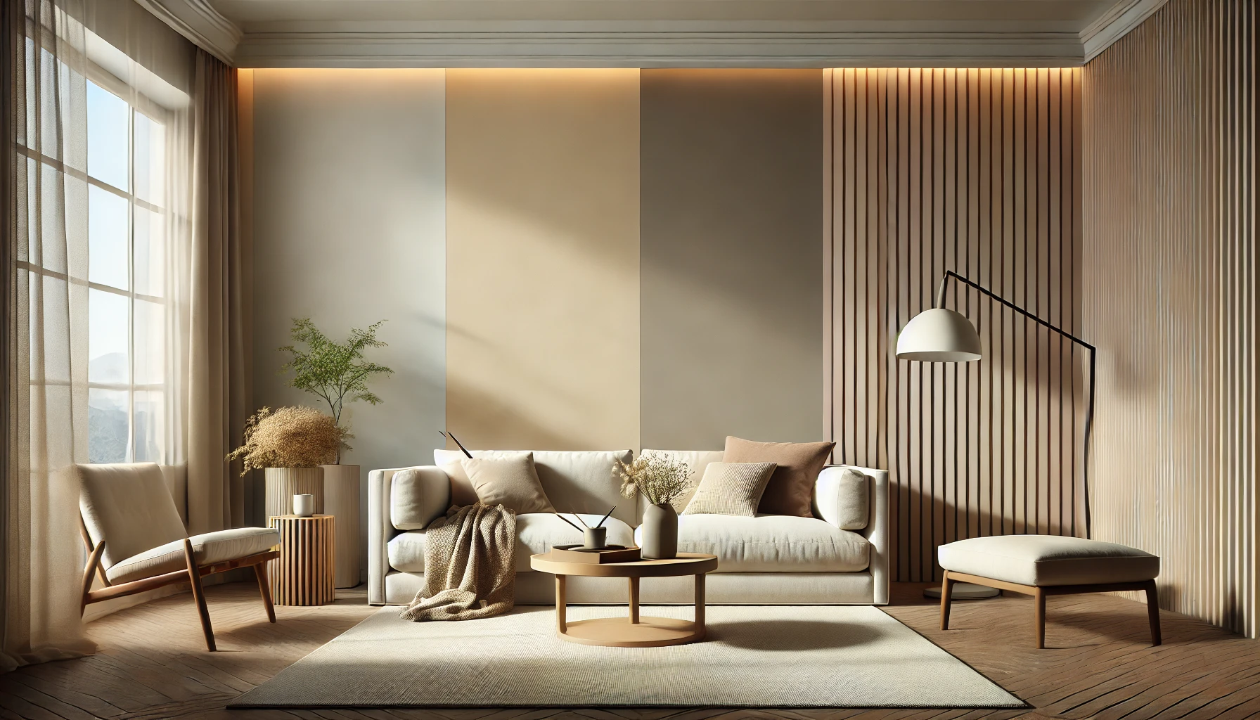
Neutral Harmony concept for a tri-colour accent wall

Choosing the Right Indicus Colours

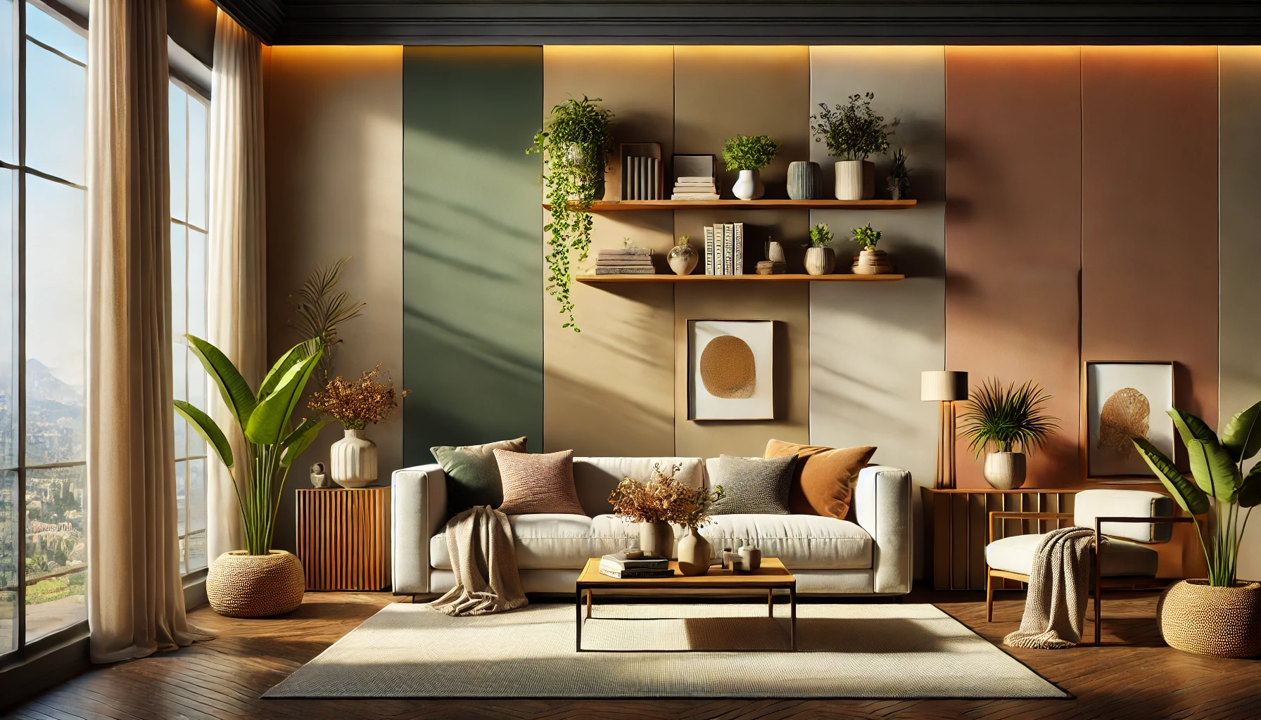
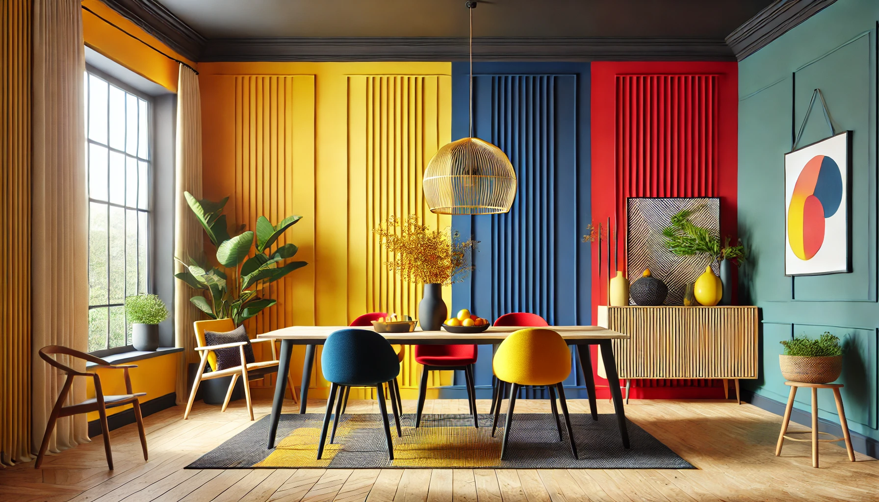
Selecting the perfect palette is essential to achieving a cohesive and visually appealing tri-colour wall. The Indicus Colour Palette offers a wide range of hues, making it easy to customise your design. For a serene and timeless look, opt for shades like Ivory Bliss, Misty Beige, and Warm Taupe, which create a neutral harmony. If you’re drawn to more vibrant combinations, consider pairing Marigold Bloom, Crimson Charm, and Midnight Blue for an energetic and dramatic effect. For a cosy, earthy vibe, colours like Olive Whisper, Sandstone Glow, and Terracotta Bliss work beautifully. Alternatively, for a modern and fresh aesthetic, choose a cool palette with Cloudy Sky, Ocean Mist, and Frosted Mint.

Designing Your Tri-Colour Accent Wall

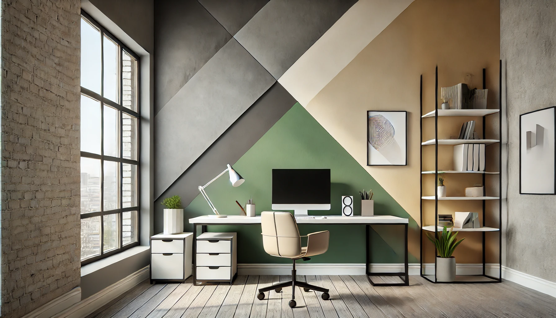
Creating a tri-colour wall isn’t just about the colours—it’s about how you use them. One option is to divide your wall into horizontal stripes, with lighter colours at the top to create a sense of openness. For a bolder approach, geometric shapes like triangles or rectangles allow for an artistic and modern look. You can also opt for a gradient or ombre effect, seamlessly blending the three colours for a soft transition. Colour blocking is another striking option, where distinct sections of the wall feature each colour. Whatever design you choose, ensure that the placement of each colour complements your room’s layout and décor.

vibrant dining room

Step-by-Step Guide to Painting Your Tri-Colour Wall

Divinity Cream looks stunning when paired with various textures and finishes:

  1. Prepare the Wall:
    • Clean the surface to remove dust or grease.
    • Sand the wall to ensure smoothness.
    • Apply a primer for an even base.
  2. Plan Your Design:
    • Sketch your chosen pattern (stripes, geometric shapes, or gradients).
    • Use painter’s tape to mark boundaries for crisp lines.
  3. Apply the Base Colour:
    • Paint the lightest colour first, covering the largest section.
    • Allow the paint to dry completely.
  4. Add the Mid-Tone Colour:
    • Remove the tape from the base section and re-tape for the next section.
    • Apply the mid-tone colour evenly and let it dry.
  5. Paint the Accent Colour:
    • Use the boldest or darkest shade for highlights or focal areas.
    • Re-tape as needed for clean edges.
  6. Finishing Touches:
    • Carefully remove all tape once the paint dries.
    • Touch up any uneven lines or missed spots for a flawless finish.
workspace concept

Tips for a Perfect Finish

Using high-quality materials is essential for achieving professional results. Indicus Paints are formulated for smooth application, vibrant colour, and long-lasting durability. Before committing to a palette, test small swatches on your wall to see how the colours look under different lighting conditions. Invest in good-quality brushes and rollers for even application and always work in layers, allowing each coat to dry completely before adding the next. These steps ensure a clean, polished appearance that will last for years to come.

Enhancing Your Tri-Colour Wall with Décor

A well-designed accent wall becomes even more impactful when paired with the right décor. Neutral furniture allows bold walls to shine, while statement pieces like artwork, mirrors, or lighting fixtures can further enhance the overall effect. Add texture with cushions, rugs, or curtains that complement your colour palette. For a cohesive look, consider incorporating small decorative elements, such as vases or candles, in one of the accent colours from your wall.

tri-colour accent wall

Conclusion

A tri-colour accent wall is a creative and stylish way to transform your home. With the Indicus Colour Palette, you can easily craft a design that reflects your personal taste while elevating your interiors. From serene neutrals to vibrant hues, the possibilities are endless. Take the leap and experiment with this versatile décor trend to create a unique space that’s truly your own.

Let Indicus Paints help you bring your vision to life with premium-quality products and expert colour solutions. Start your project today and watch your home come alive with colour and personality.

Divinity Cream: The Colour of the Month for a Serene and Elegant Home

Divinity Cream: The Colour of the Month for a Serene and Elegant Home

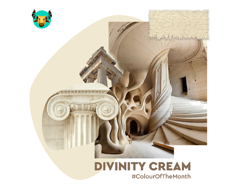
As we step into January, a time for fresh starts, reflection, and setting intentions for the months ahead. It’s the perfect opportunity to refresh your surroundings and create an atmosphere that mirrors this sense of renewal. For this reason, Divinity Cream has been chosen as the Colour of the Month for January.

This warm, versatile neutral encapsulates the calm and clarity often associated with the start of the year. Its soothing tone helps set the stage for tranquillity and focus, making it ideal for creating a serene and welcoming environment in your home. Whether you’re looking to brighten your space during the winter months or establish a foundation for creativity and productivity, Divinity Cream provides the perfect balance of elegance and comfort.
 

1. Why Choose Divinity Cream?

Divinity Cream is more than just a neutral—it’s a shade that bridges elegance and simplicity. Its subtle warmth makes it perfect for spaces that need a calming touch, while its versatility allows it to blend seamlessly with various colour palettes and styles.

Key Attributes of Divinity Cream:
  • Timeless Appeal: A classic neutral that never goes out of style.
  • Light Enhancing: Reflects natural light beautifully, making spaces feel brighter and more spacious.
  • Versatile Pairing: Complements both bold accent colours and muted tones.
  • Calming Effect: Evokes feelings of relaxation and balance, ideal for creating peaceful spaces.
Divinity Cream

2. Where to Use Divinity Cream in Your Home

Divinity Cream’s adaptability makes it suitable for almost every room. Here are some ideas to inspire you:

a. Living Room
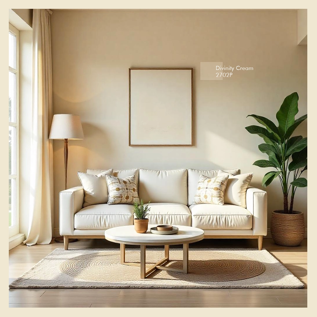
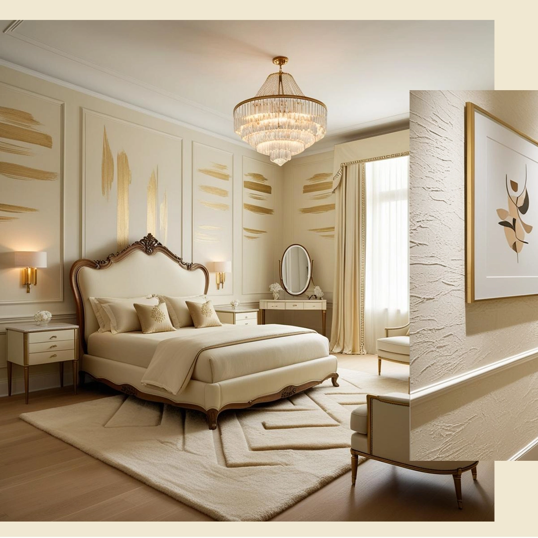
This shade works wonderfully as a base colour for living rooms, creating an inviting and cosy atmosphere. Pair it with accents like navy blue cushions, textured throws, or natural wood furniture for a balanced and elegant look.

b. Bedroom
For a restful retreat, use Divinity Cream on your bedroom walls. Add soft pastel accents such as blush pink or sage green for a touch of colour without overpowering the serene vibe.

c. Kitchen
In kitchens, Divinity Cream creates a clean and polished backdrop. Combine it with white cabinets and metallic accents (like brass or stainless steel) to achieve a modern yet warm aesthetic.

d. Home Office
This creamy shade provides a calm and distraction-free environment for workspaces. Pair it with minimalist furniture and greenery for a productive and stylish office.

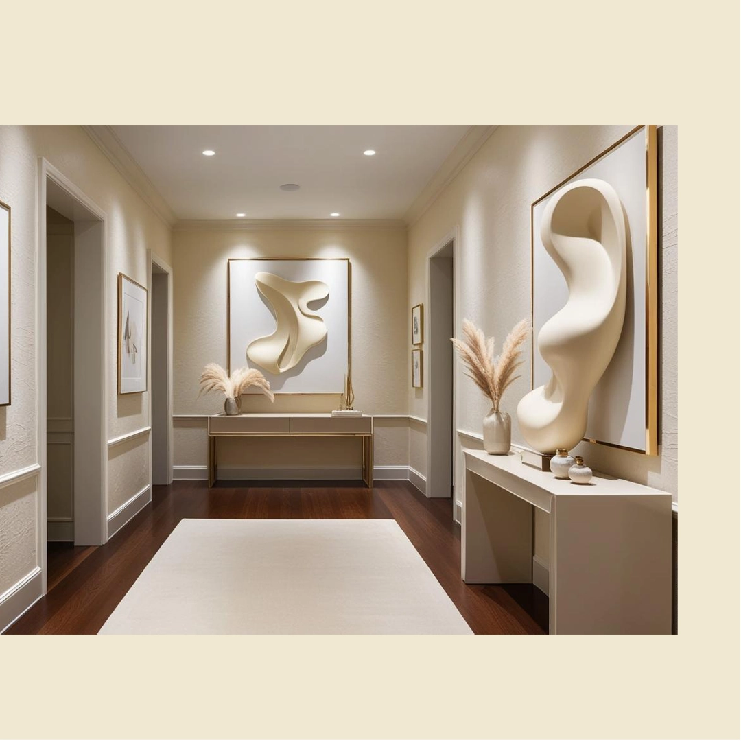
e. Hallways and Entryways
Divinity Cream is ideal for narrow hallways or small entryways as it opens up the space, making it feel more expansive and welcoming.

Divinity Cream

3. Best Colour Combinations with Divinity Cream

a. Pairing with Bold Colours

To create a dynamic look, pair Divinity Cream with rich, bold colours:

  • Navy Blue: For a sophisticated contrast.
  • Emerald Green: For a luxurious, earthy vibe.
  • Charcoal Grey: For a modern and sleek appearance.
b. Pairing with Pastels

For softer, more serene spaces, combine Divinity Cream with pastel tones:

  • Blush Pink: Perfect for feminine and romantic spaces.
  • Powder Blue: Adds a cool and calming touch.
  • Mint Green: Infuses freshness and balance.
c. Pairing with Natural Tones

Earthy tones complement Divinity Cream beautifully, creating a warm and cohesive design:

  • Terracotta: For a rustic charm.
  • Beige: For a layered, neutral palette.
  • Wood Finishes: Enhances the warmth and depth of the space.

4. Textures and Finishes to Complement Divinity Cream

Divinity Cream looks stunning when paired with various textures and finishes:

  • Matte Walls: Creates a soft and velvety appearance, perfect for calm interiors.
  • Glossy Accents: Use glossy finishes for trims, doors, or skirting boards to add a subtle contrast.
  • Textured Fabrics: Incorporate cushions, rugs, or curtains in materials like linen, velvet, or wool to enhance the overall cosiness.
  • Natural Elements: Add wooden furniture, rattan décor, or indoor plants for a harmonious blend of warmth and freshness.
Divinity Cream

5. Lighting Tips for Divinity Cream

Lighting can dramatically affect how Divinity Cream appears in a space.
  • Natural Light: In spaces with ample sunlight, Divinity Cream appears bright and airy. Pair with light curtains or sheer blinds to maximise natural light.
  • Artificial Light: Use warm lighting (yellow-toned bulbs) to highlight the creamy undertones for a cosy evening ambience. For a modern vibe, cool white lighting works well in kitchens and bathrooms.

6. Why Divinity Cream is Perfect for All Seasons

Unlike bold or seasonal shades, Divinity Cream is a versatile colour that works year-round.
  • In Summer: Its light-reflecting quality keeps spaces cool and fresh.
  • In Winter: Its warm undertones create a snug and inviting atmosphere, especially when paired with soft textiles and warm lighting.

7. Expert Tips for Painting with Divinity Cream

To ensure a flawless finish with Divinity Cream, follow these expert tips:
  1. Prep Your Walls: Clean and smoothen your walls to enhance the paint’s appearance.
  2. Prime First: Use a high-quality primer for even colour application, especially on darker walls.
  3. Choose the Right Finish: Opt for a matte or satin finish for walls and a semi-gloss finish for trims or accents.
  4. Test Swatches: Apply a small swatch of Divinity Cream and observe how it looks under different lighting conditions before committing to the colour.
Divinity Cream

8. Explore Divinity Cream with Indicus Paints

Divinity Cream is the perfect shade to transform your home into a sanctuary of calm and elegance. At Indicus Paints, we offer premium-quality paints that ensure seamless application, rich pigmentation, and lasting durability.

Whether you’re repainting your entire home or creating feature walls, Indicus Paints’ Divinity Cream can help you achieve the aesthetic you’ve always dreamed of. With our expert guidance and customised colour solutions, your vision is just a brushstroke away.

Conclusion

Divinity Cream is more than just a colour; it’s a lifestyle choice that brings harmony, elegance, and tranquillity into your home. Its versatility makes it a timeless addition to any space, whether you’re revamping your living room, bedroom, or kitchen.

This Colour of the Month celebrates the beauty of simplicity while encouraging creativity in design. Explore Indicus PaintsDivinity Cream and other complementary shades to bring your interior dreams to life.

How to Choose the Right Paint Colours for Different Office Spaces

How to Choose the Right Paint Colours for Different Office Spaces

The right paint colours can make a significant difference in your office environment, influencing everything from mood and productivity to aesthetics and brand identity. A thoughtfully designed colour scheme not only enhances the visual appeal of your office but also creates an environment that inspires employees and impresses clients.

This guide explores how to choose the perfect paint colours for different office spaces, from reception areas to break rooms, ensuring every corner of your office serves its purpose beautifully.

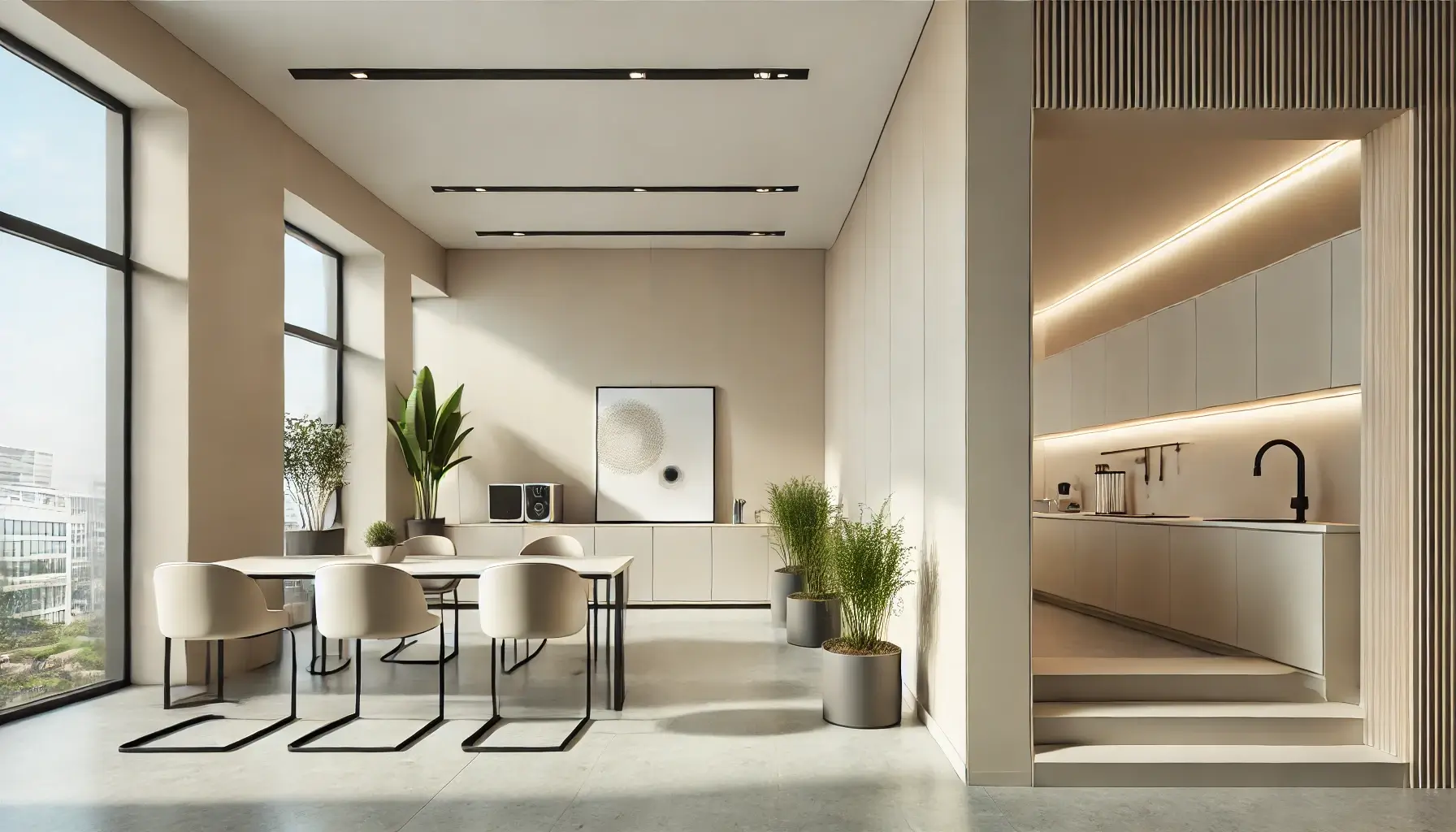
painted walls prominently in a modern office kitchen

1. Understanding the Purpose of Different Office Spaces

Each office space serves a unique function, and the right colours can amplify its effectiveness.

Reception Areas: Creating a Welcoming and Professional First Impression

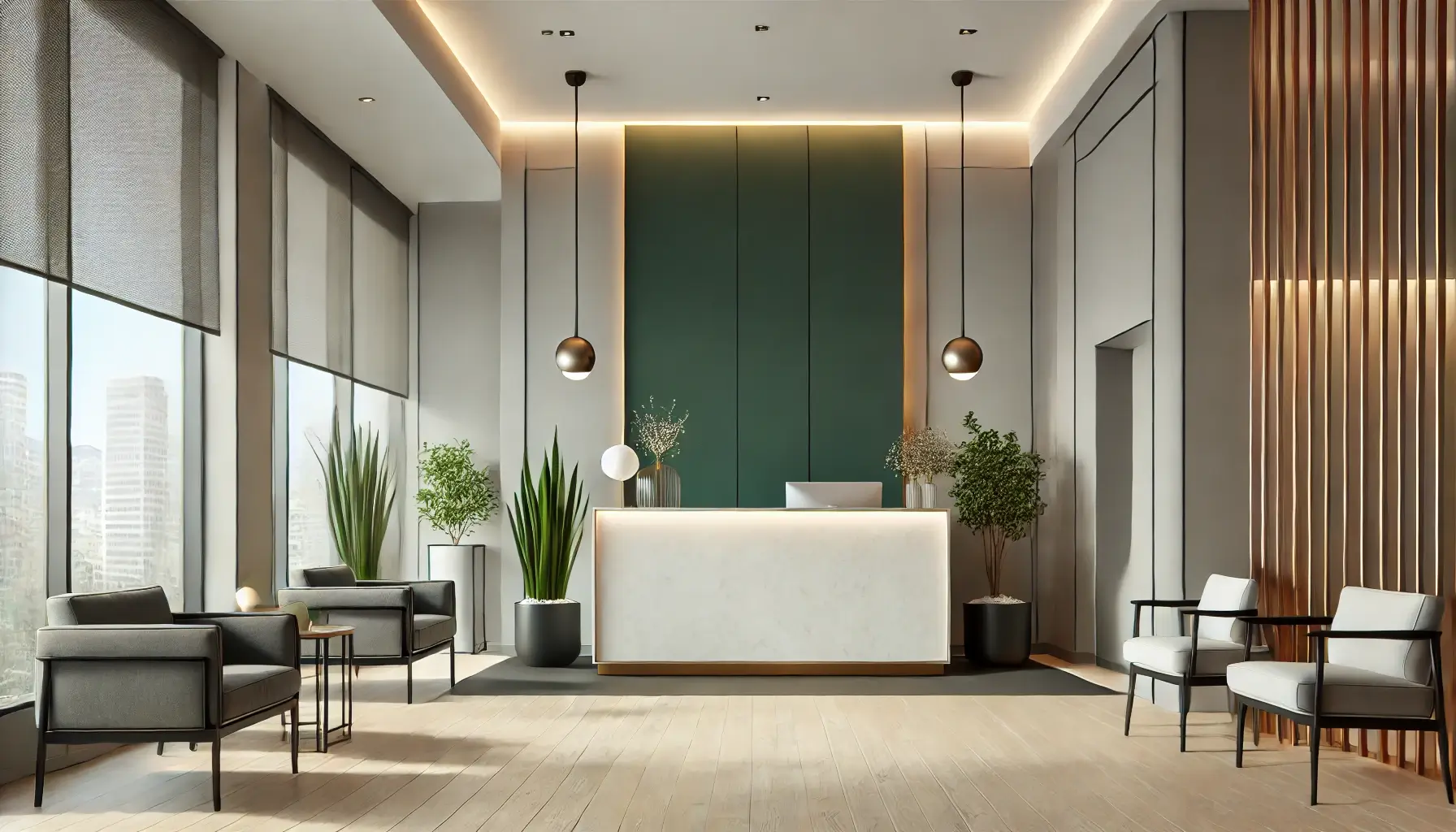
The reception area is the face of your office and should create an inviting atmosphere while reflecting your brand’s identity. Neutral tones like soft greys or off-whites paired with bold accents such as deep navy or green can convey professionalism and warmth.

Workspaces: Boosting Productivity and Reducing Eye Strain

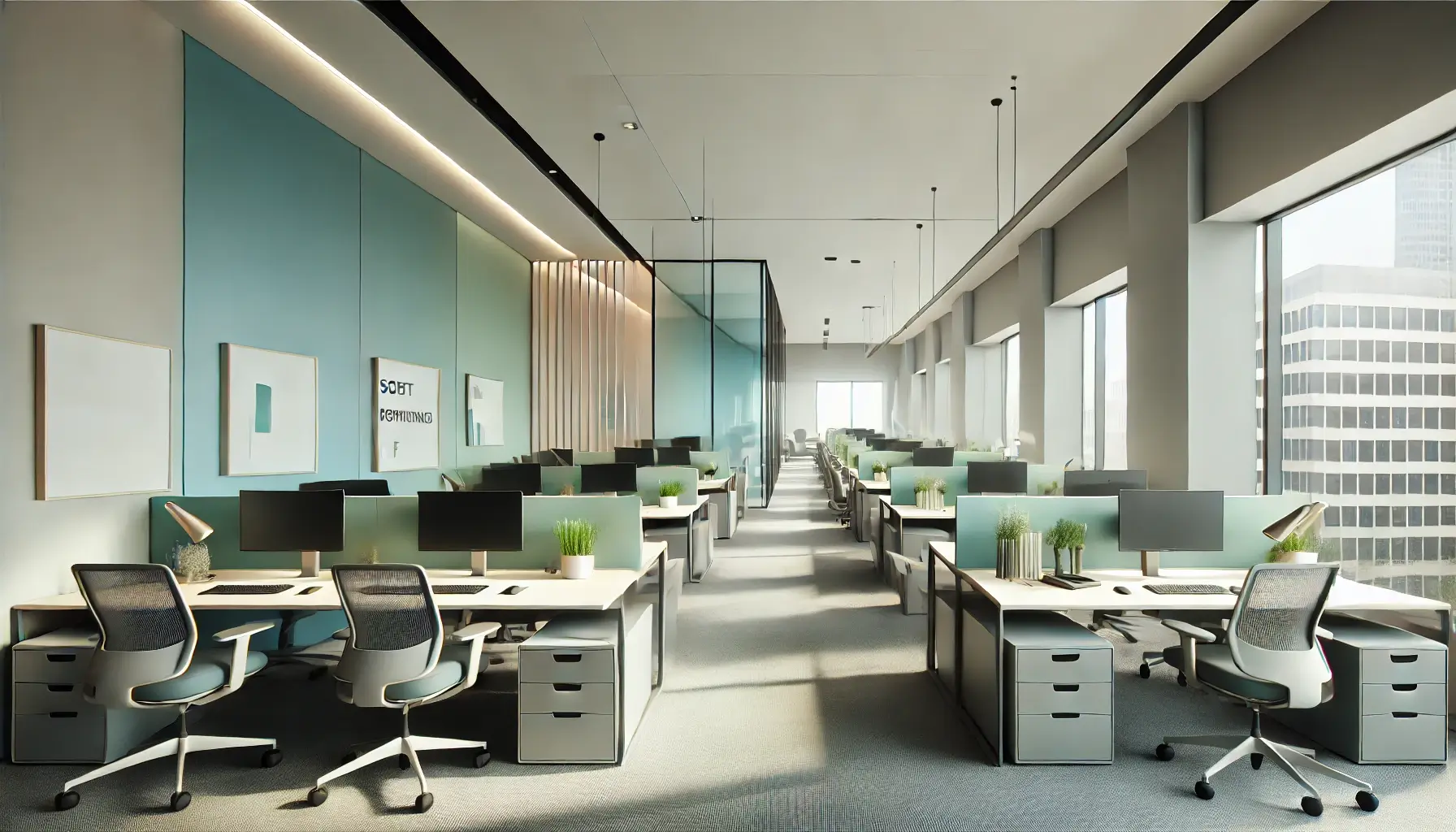
In workspaces, colours play a crucial role in maintaining focus and reducing stress. Blues and greens are ideal for promoting calm and concentration, while soft neutrals create a harmonious backdrop. Avoid overly bright colours, which can be distracting.

Conference Rooms: Encouraging Collaboration and Focus

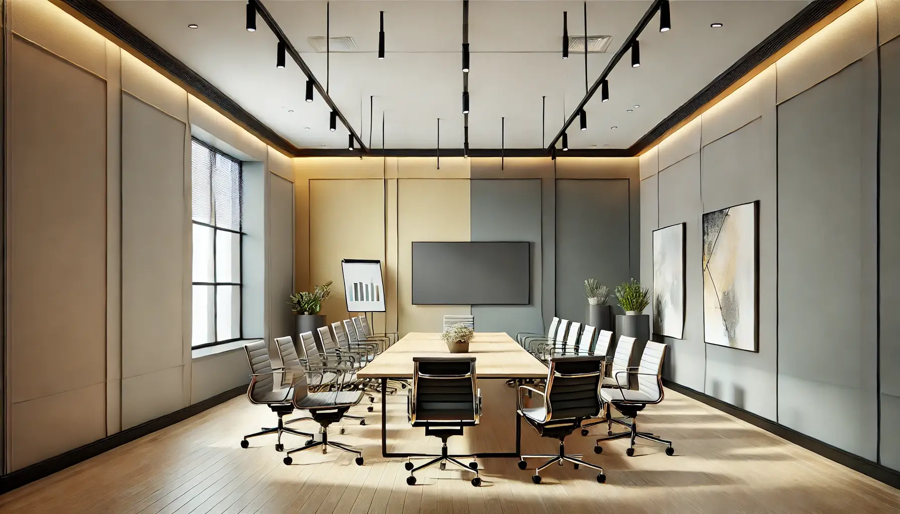
Conference rooms benefit from balanced colours that inspire creativity and collaboration. Greys and blues provide a professional and focused environment, while subtle pops of yellow can stimulate innovative thinking.

Break Rooms: Promoting Relaxation and Rejuvenation

Break rooms are spaces to unwind, and their colours should promote relaxation. Warm, cheerful tones like light yellow, orange, or pastel green can create an uplifting vibe, making employees feel energised and refreshed.

modern reception area

2. Key Factors to Consider When Choosing Paint Colours

Selecting the right colours requires more than aesthetics—it’s about understanding the needs of your office and its surroundings.

Lighting Conditions

Lighting significantly affects how colours appear. Offices with ample natural light can handle cooler tones, while darker spaces may benefit from warm, light-reflecting hues to make them feel brighter.

Brand Identity

Your office’s colours should align with your brand’s personality. A tech company might opt for bold, innovative hues, while a law firm may lean towards timeless neutrals that convey trust and professionalism.

professional conference room

3. Choosing Paint Colours for Productivity and Mood

Calming Tones for Focus

Blues, greens, and neutrals are perfect for individual workspaces where concentration is key. These tones reduce stress and create a focused environment.

Energising Colours for Creativity

Bright yellows, oranges, and coral hues are excellent for creative departments or brainstorming areas. These colours stimulate energy and enthusiasm.

Neutral and Versatile Options

Shades like white, grey, and beige offer versatility and modern minimalism. These neutral palettes create a professional look while allowing flexibility with accent décour.

painted wall surfaces

5. Final Tips for Office Paint Colour Selection

  • Consult Professionals: Work with architect to develop a cohesive colour scheme that aligns with your office’s purpose and style.
  • Test Swatches: Apply test patches on walls to see how colours look under various lighting conditions throughout the day.
  • Prioritise Quality: Invest in high-quality paints that are durable, easy to maintain, and resistant to wear and tear.

Conclusion

Choosing the right paint colours for your office spaces is an art that blends functionality with aesthetics. From calming workspaces to energising break rooms, the right colours can influence mood, productivity, and the overall atmosphere. By understanding the purpose of each space and considering factors like lighting, durability, and brand identity, you can create a cohesive and inspiring work environment.

For premium paints and expert advice, explore Indicus Paints. With a wide range of high-quality products tailored for office spaces, Indicus Paints ensures your office looks as professional as it feels productive.

5 Common Exterior Painting Mistakes and How to Avoid Them

5 Common Exterior Painting Mistakes and How to Avoid Them

Exterior painting is more than just adding colour to your home—it’s about protecting your walls from the elements and enhancing curb appeal. A well-executed exterior paint job can increase the longevity of your home’s façade while creating a polished, inviting aesthetic. However, achieving a flawless finish requires careful planning and execution. Common mistakes during exterior painting can lead to uneven coverage, peeling paint, and wasted time and effort.

In this guide, we’ll discuss the five most common exterior painting mistakes and provide expert tips on how to avoid them for a durable, professional finish.

Why Exterior Painting is Essential for Durability and Aesthetics

Exterior painting acts as a protective layer for your home, shielding it from harsh weather conditions, moisture, and UV rays. A high-quality paint job prevents cracking, fading, and structural damage caused by prolonged exposure to the elements. Beyond protection, exterior paint enhances your home’s aesthetic appeal, boosting its value and creating a welcoming first impression.

Skipping key steps or making mistakes during the painting process can compromise these benefits, making it essential to approach the project with the right knowledge and tools.

1. Skipping Surface Preparation

One of the biggest mistakes homeowners make is neglecting proper surface preparation before painting. Dirt, grease, cracks, and peeling paint create an uneven surface that prevents new paint from adhering properly. This can lead to premature chipping, bubbling, or peeling, reducing the durability of your paint job.

How to Avoid:

  • Clean the Surface: Use a pressure washer to remove dirt, grime, and mildew. Allow the surface to dry thoroughly before proceeding.
  • Repair Cracks and Damage: Fill in cracks and holes with exterior-grade filler. Sand rough areas to create a smooth base.
  • Remove Old Paint: Scrape away loose or peeling paint and sand the edges to blend seamlessly with the surface.
use of professional tools and techniques

2. Ignoring Weather Conditions

Exterior painting is highly sensitive to weather conditions. Painting on days with high humidity, extreme heat, or impending rain can compromise the finish, leading to uneven drying or peeling. Temperature fluctuations also impact paint adhesion, affecting the longevity of the job.

How to Avoid:

  • Check the Forecast: Choose a day with mild temperatures (between 10–30°C) and low humidity. Avoid painting on windy days as it can cause dust and debris to stick to the wet paint.
  • Plan for Drying Time: Ensure there are no rain forecasts for at least 24–48 hours after painting.
  • Work in Shade: Paint areas of your home that are not directly exposed to the sun during the hottest part of the day to prevent uneven drying.

3. Applying Inadequate Coats of Paint

Applying too few coats of paint is a common mistake that leads to poor coverage, streaking, and visible brush marks. A single coat often fails to provide sufficient protection against weather damage or create a uniform appearance.

How to Avoid:

  • Prime the Surface: Use a high-quality exterior primer before applying paint, especially on porous or previously unpainted surfaces.
  • Apply Multiple Coats: Two coats of paint are typically required for even coverage and durability. Allow each coat to dry completely before applying the next.
  • Choose the Right Paint: Invest in weather-resistant exterior paints that provide better coverage and longevity.

4. Neglecting Post-Painting Maintenance

After completing the painting project, many homeowners overlook maintenance, leading to early deterioration of the paint job. Without periodic touch-ups, the paint can fade, peel, or become damaged by weather conditions.

How to Avoid:
  • Inspect Regularly: Check for cracks, peeling, or damage, especially after harsh weather, and address issues promptly.
  • Clean the Surface: Wash the painted surface annually to remove dirt and prevent mildew buildup.
  • Protect the surface: Prevent any damage to the paint film by sharp objects, overgrowth of plants or trees, etc.
importance of checking weather conditions

5. Using the Wrong Tools or Techniques

Improper tools or painting techniques can result in uneven coverage, drips, and a patchy finish. For instance, using the wrong brush or roller can leave streaks or miss hard-to-reach areas.

How to Avoid:
  • Choose Quality Tools: Use high-quality brushes, rollers, or spray equipment designed for exterior painting.
  • Apply Even Strokes: Work in smooth, consistent strokes, starting from the top and moving downwards.
  • Follow Manufacturer Guidelines: Always adhere to the paint manufacturer’s instructions for application and drying times.

How to Avoid These Mistakes

Avoiding these mistakes requires careful planning, the right tools, and an understanding of the painting process. Here are some pro tips for a flawless exterior painting experience:

  1. Invest in Premium Paints and Primers: High-quality products are more durable and provide better coverage.
  2. Test Colours First: Apply a small patch to ensure the colour matches your expectations under natural light.
  3. Work in Sections: Divide the project into manageable areas to maintain consistency and prevent fatigue.
  4. Hire Professionals: For large or complex projects, consider hiring experienced painters to ensure a polished, long-lasting result.
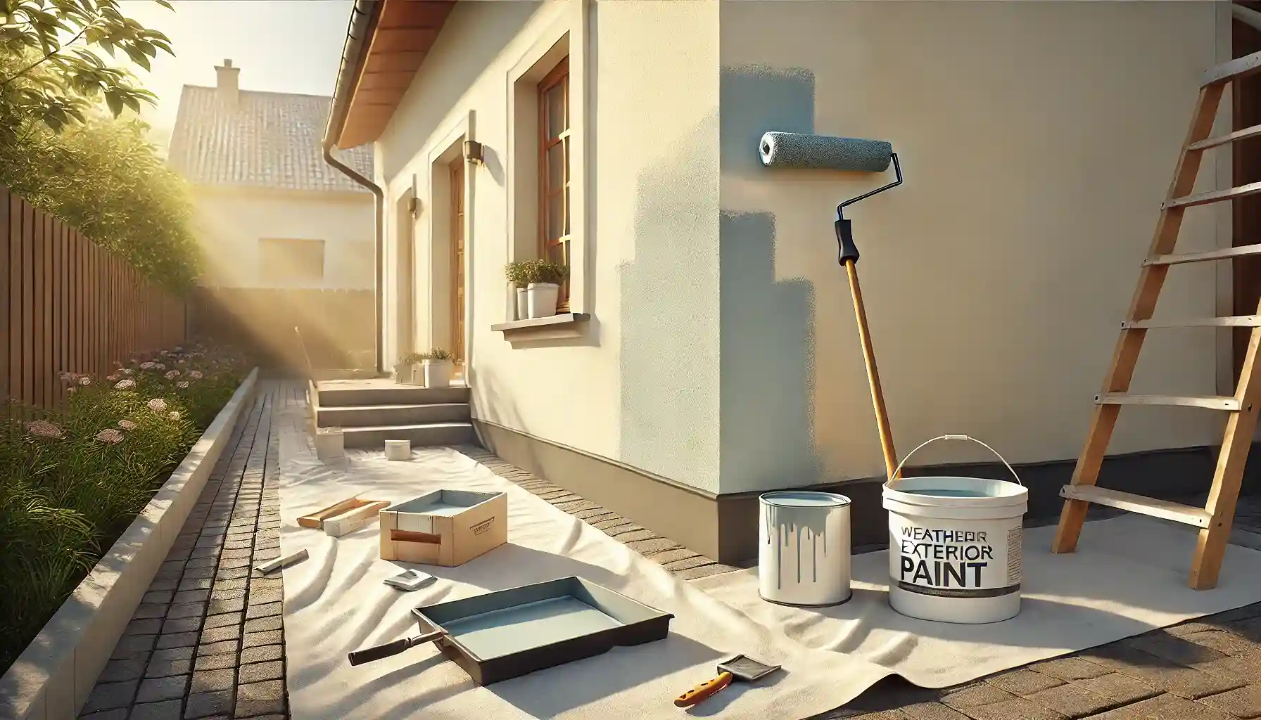
application of the first coat of paint

Conclusion

Exterior painting is a rewarding project that protects your home while enhancing its aesthetic appeal. However, common mistakes like skipping preparation, ignoring weather conditions, and applying insufficient coats can compromise the quality and durability of the job. By understanding and avoiding these pitfalls, you can achieve a flawless finish that lasts for years.

Whether you’re tackling the project yourself or hiring professionals, careful planning and execution are key to transforming your home’s exterior into a durable and visually stunning masterpiece.