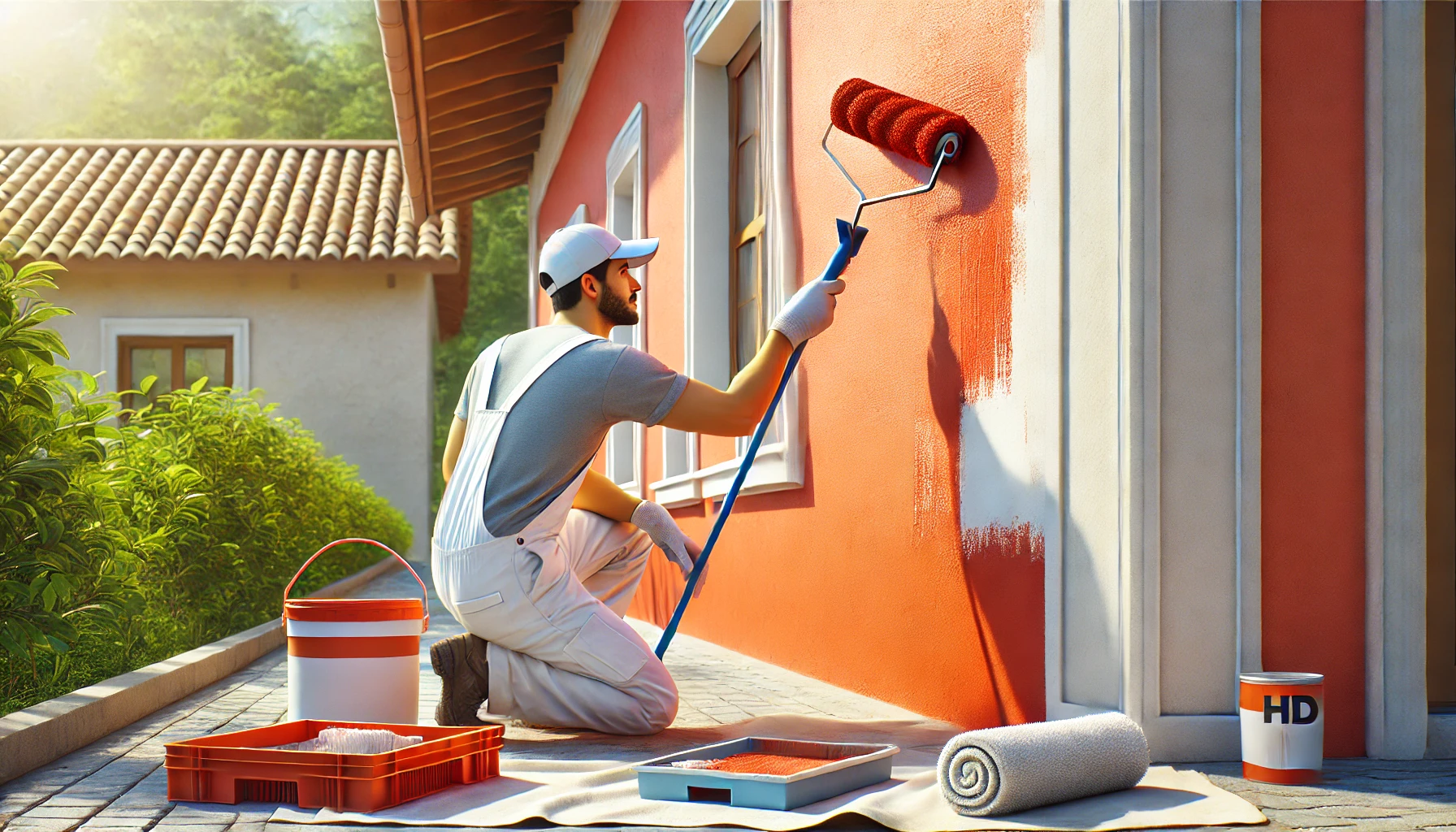
DIY Balcony Painting: Top Colour Trends for Indian Homes
The balcony, often an overlooked space in many Indian homes, can be transformed into a serene outdoor retreat with just a bit of paint and creativity. A well-painted balcony not only enhances the curb appeal of your home but also creates a relaxing atmosphere where you can unwind, sip your morning tea, or entertain guests.
As the outdoor space continues to gain importance, choosing the right colours for your balcony is crucial in bringing both beauty and functionality to this area. The right colours can make your balcony look more expansive, complement your home’s exterior, and reflect your personal style. Whether you’re looking for bright and lively colours or subtle and calming shades, we’ll walk you through the top balcony painting trends that are perfect for Indian homes.
In this blog, we’ll explore some of the latest colour trends for balconies, as well as provide Indicus Paints recommendations, DIY tips, and ideas to help you achieve a stunning balcony makeover.
Bright and Bold: Vibrant Colours to Infuse Energy
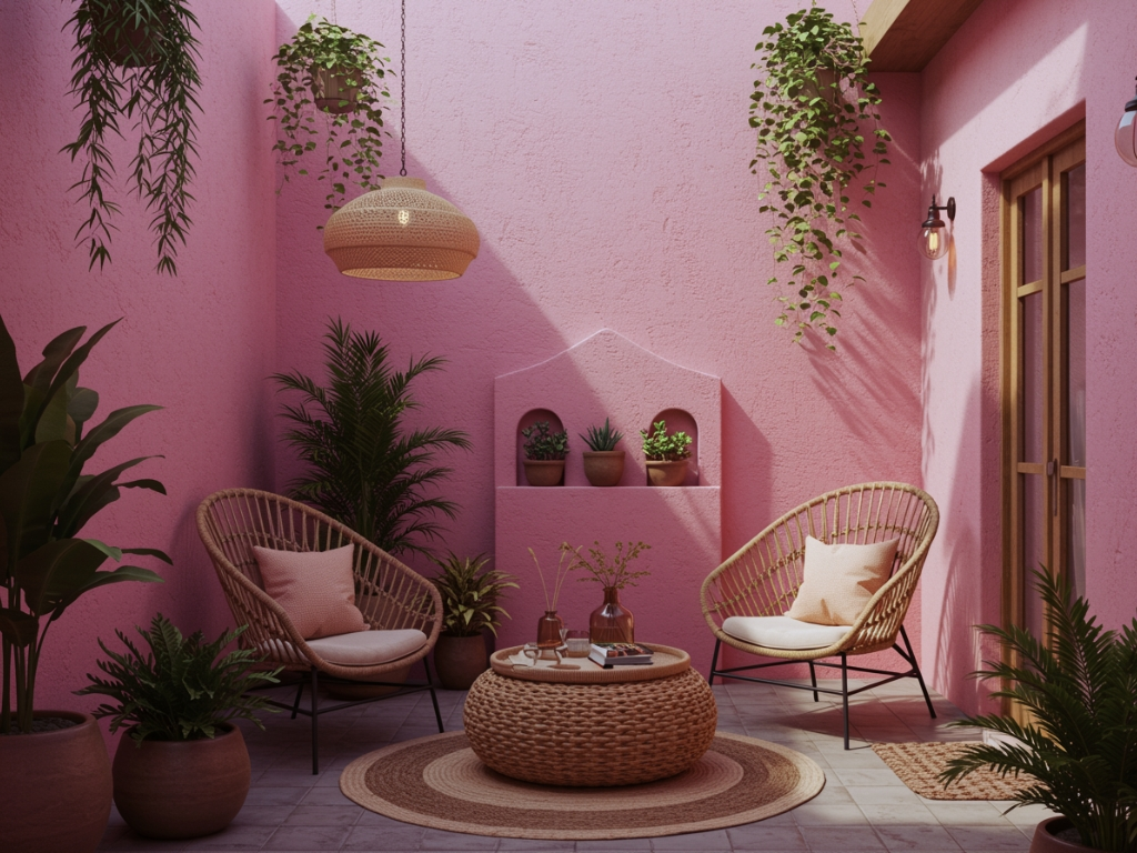
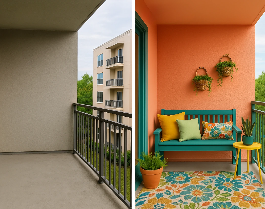
Vibrant, bold colours have always been a popular choice in Indian homes, and they are now making their mark in balcony designs. Using bright colours like turquoise, coral, or mustard yellow on your balcony walls can infuse the space with energy and create an inviting atmosphere.
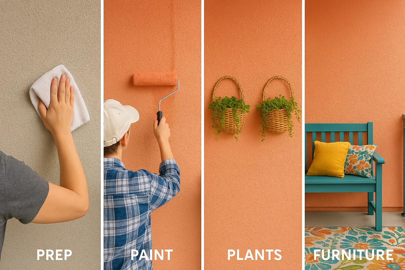
For a refreshing look, consider using Indicus Paints Ocean Breeze or Sunset Orange. These colours are vibrant and lively and can turn your balcony into a cheerful escape. Whether you use them on feature walls, furniture, or door frames, bold colours can elevate the charm of your outdoor space, making it the perfect spot to relax or host casual get-togethers.
Why It Works:
- Bright hues like turquoise or mustard yellow add a lively atmosphere to your outdoor space.
- They reflect the vibrant energy of Indian culture, making them a great fit for balconies that are used to entertain guests.
- Perfect for Indian homes that need a pop of colour to balance neutral exteriors.
How to Style It:
- Combine bold colours with neutral furniture to avoid overwhelming the space.
- Add greenery like potted plants, hanging vines, or succulents for a more refreshing, nature-inspired vibe.
- Pair bold colour choices with rustic or wooden outdoor furniture to balance vibrancy with warmth.
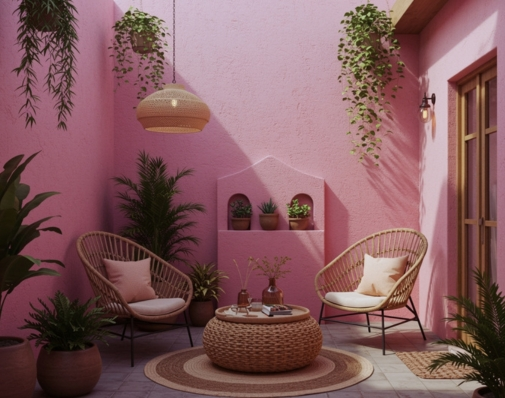
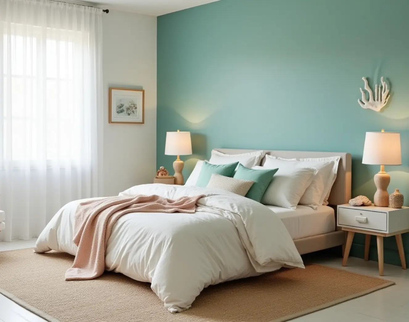
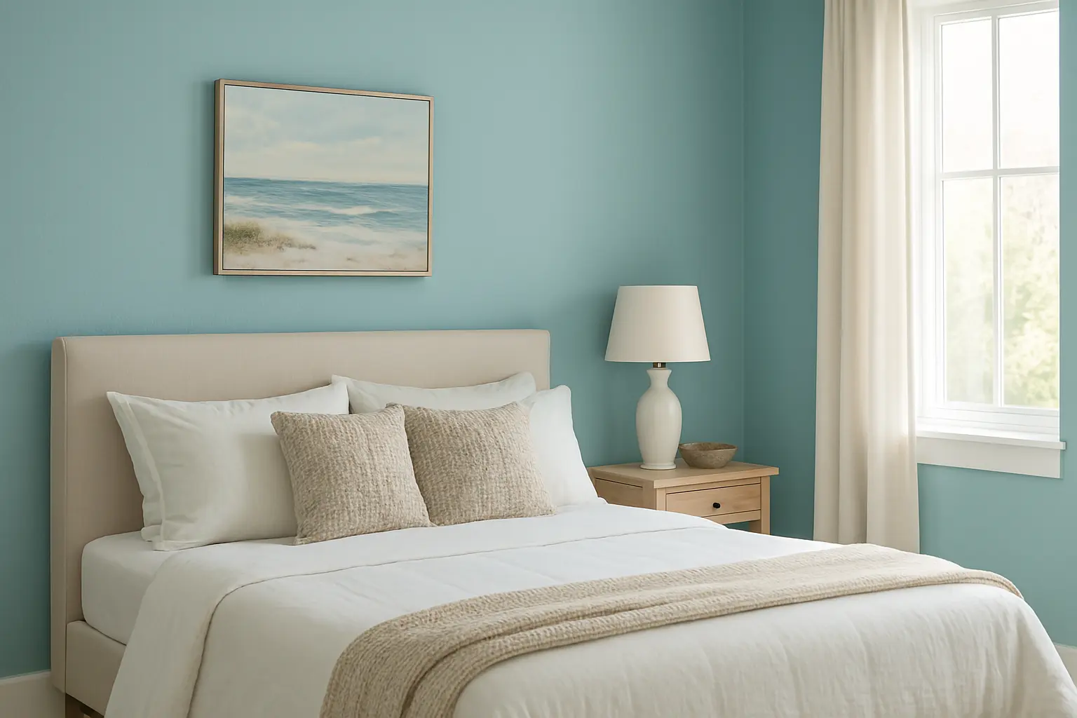
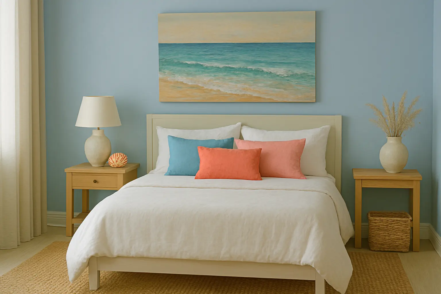
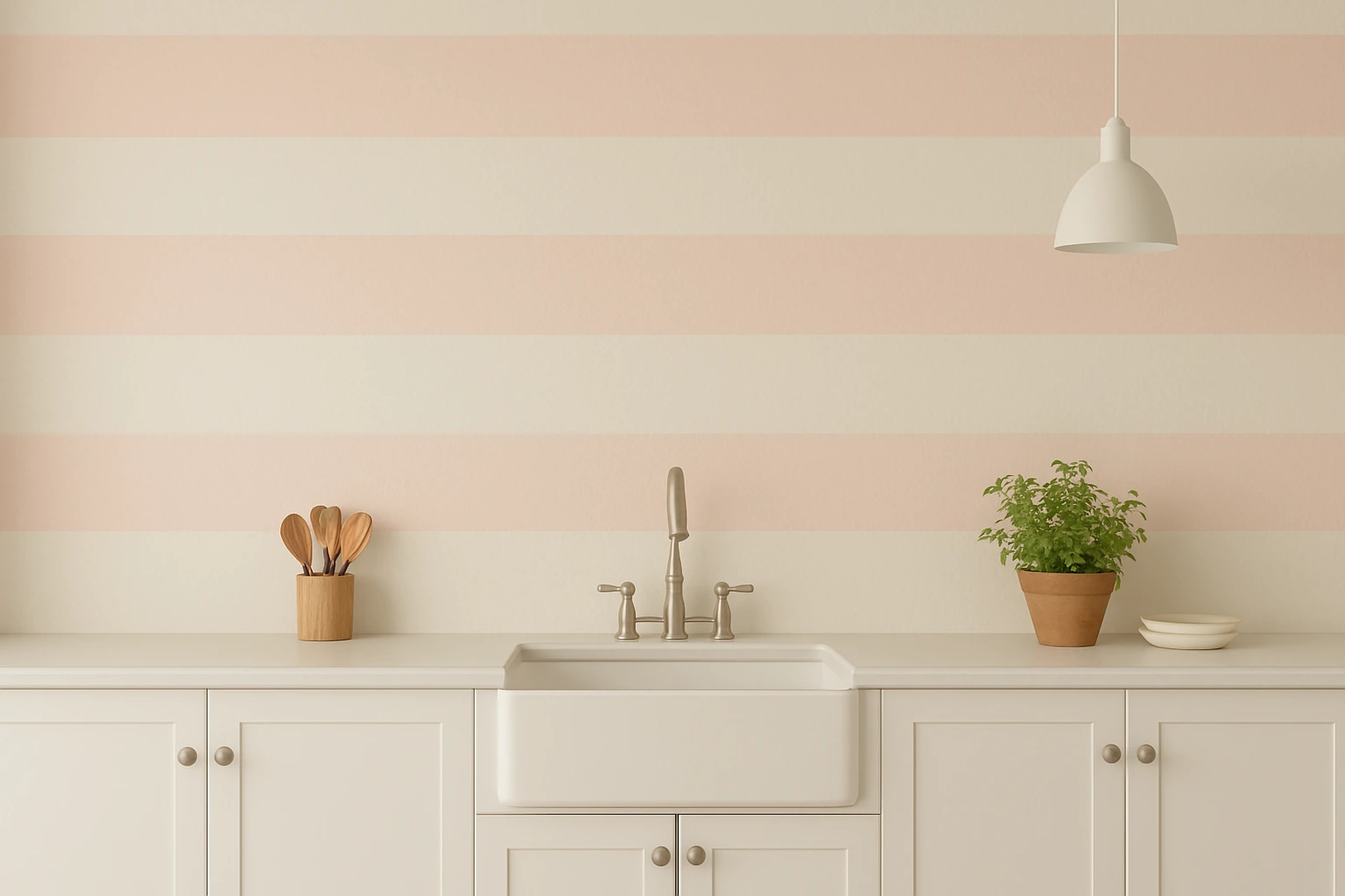
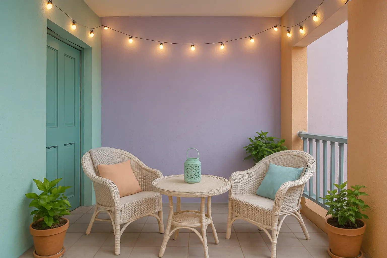
Soothing Pastels: Calm and Relaxing Ambience
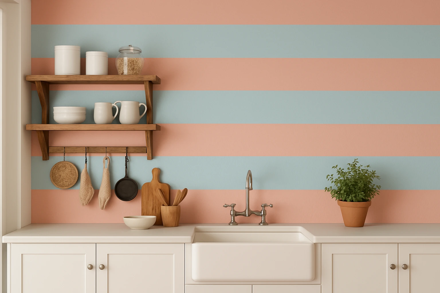
If you’re aiming for a more tranquil, soothing outdoor environment, soft pastels are the perfect choice for your balcony. Light shades like mint green, peach, lavender, and powder blue create a serene ambiance, making them ideal for relaxing or reading. These colours can make even small balconies feel more expansive and airy.For a soft and refreshing look, you can try Indicus Paints Sea Breeze or Soft Rose. These colours bring a sense of calm and relaxation to your outdoor space, making it feel like a private sanctuary. These shades also work well with traditional Indian décor and can be combined with cushions and throws in complementary tones.Why It Works:
- Pastel colours create a calming atmosphere, perfect for winding down.
- They make small spaces appear larger and more open, which is ideal for city apartments or compact balconies.
- Pastels add a touch of softness and elegance, without overpowering the exterior aesthetic of your home.
How to Style It:
- Pair pastel colours with light, airy furniture like wicker chairs, outdoor cushions, and a small coffee table.
- Complement pastel walls with simple décor—think natural textures like linen, rattan, or wooden furniture.
- Add soft lighting, like fairy lights or lanterns, to enhance the calm atmosphere during the evenings.
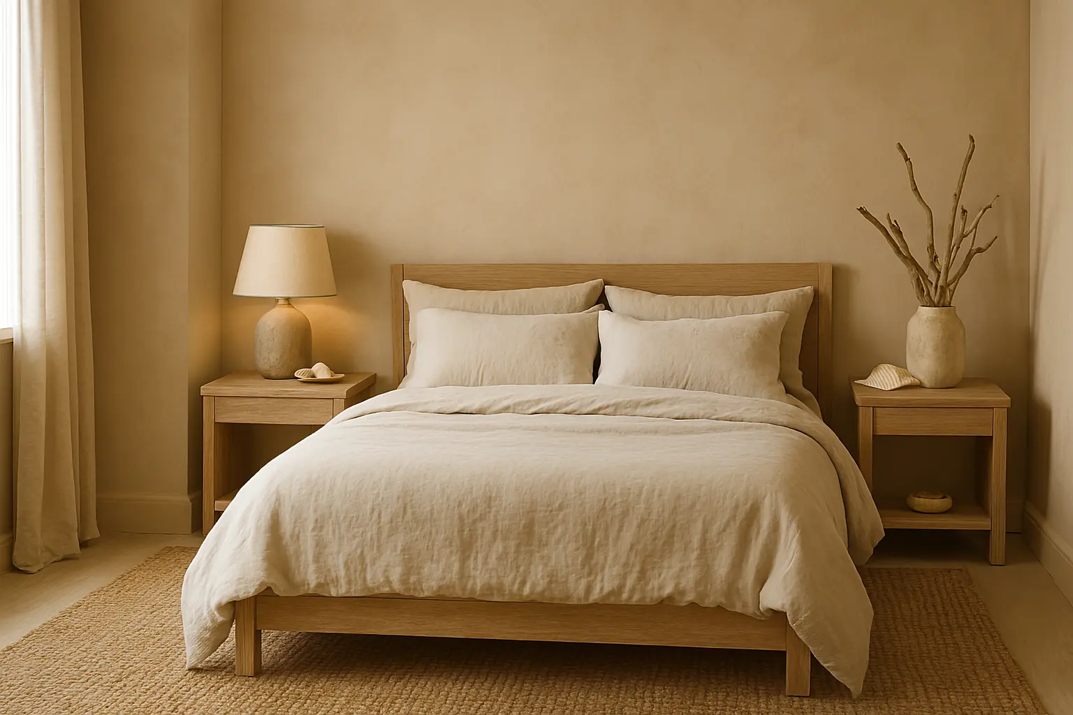
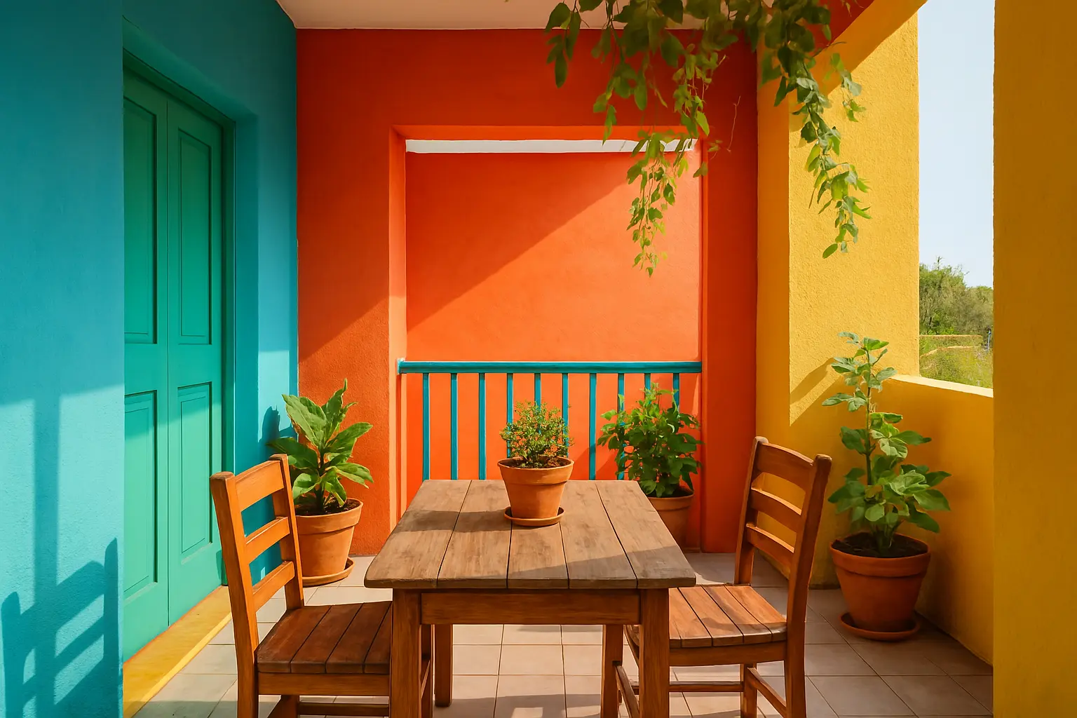
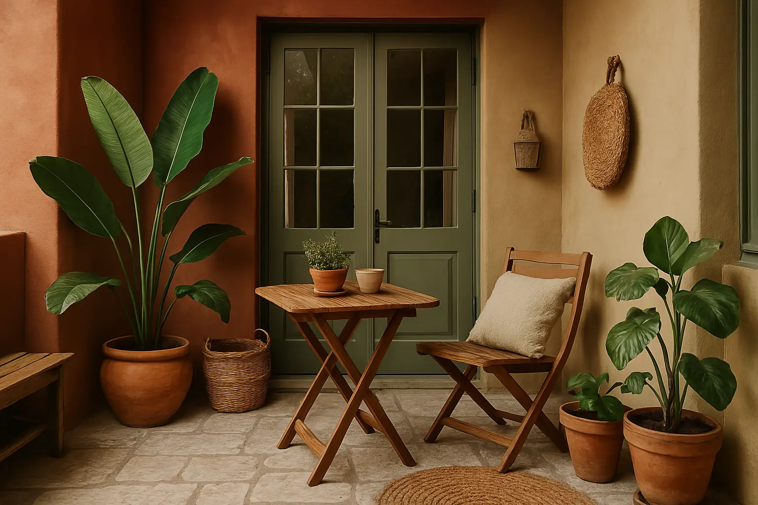
Earthy Tones: Nature-Inspired Shades for a Grounded Look
If you prefer a more organic, grounded look for your balcony, earthy tones like terracotta, warm beige, sandstone, and olive green are excellent choices. These colours evoke the natural beauty of the outdoors and work well to create a rustic, natural vibe on your balcony.Indicus Paints Golden Harvest and Saffron Glow are ideal examples of earthy tones that can elevate the aesthetic of your balcony. These shades evoke the beauty of the earth and provide warmth, which is perfect for balconies in tropical and subtropical regions of India. Earthy colours can help your balcony blend seamlessly with the surrounding environment, especially when combined with natural materials like wood, stone, and terracotta.Why It Works:
- Earthy tones bring a sense of warmth and connection with nature, ideal for outdoor spaces.
- They are versatile and can complement a variety of architectural styles, from traditional Indian homes to contemporary designs.
- These colours create a grounding effect and can help your balcony feel like an extension of your garden or yard.
How to Style It:
- Mix and match earthy tones with large plants, wooden furniture, and woven textiles for a natural and rustic look.
- Use terracotta planters or woven baskets to enhance the earthy vibe.
- Add natural stone tiles for flooring to create a seamless blend with the surrounding environment.
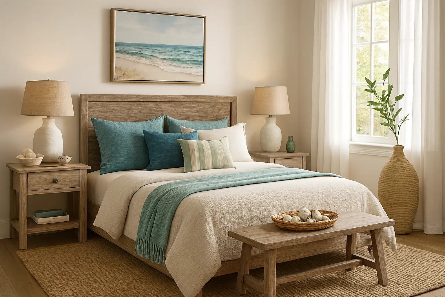
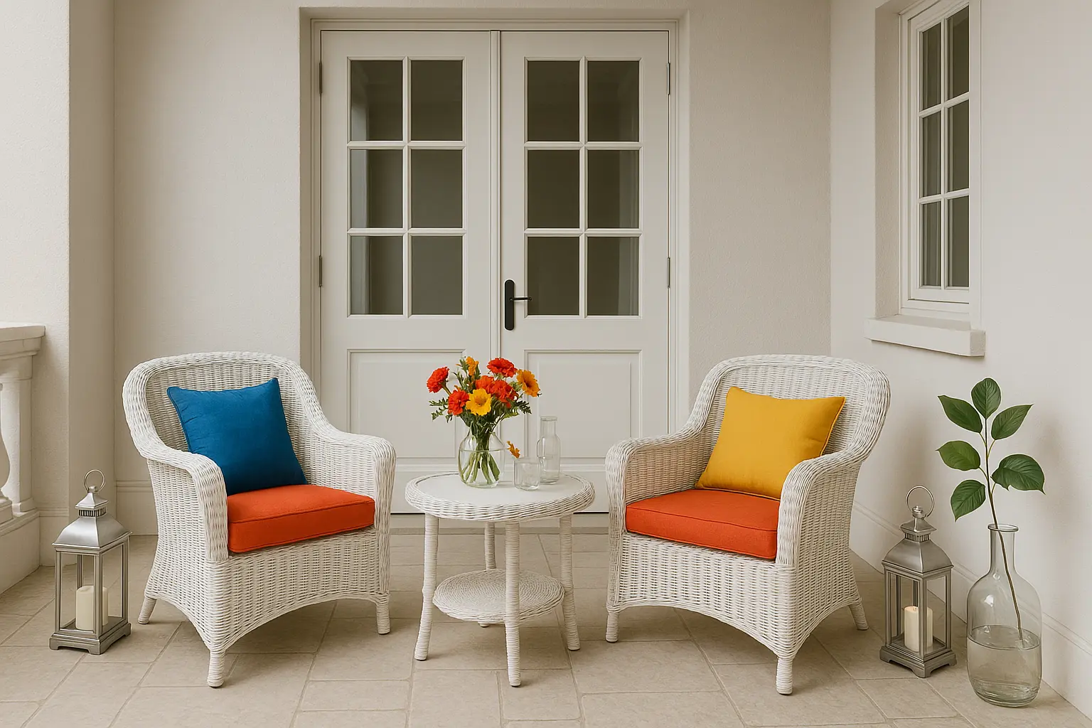
Classic White and Neutrals: Timeless Elegance
For a clean, sophisticated look, classic whites and neutral tones are always in style. White walls, beige, and light greys can help your balcony appear fresh, spacious, and elegant. These colours are especially effective in making your outdoor area look well-maintained and timeless.
Using Indicus Paints Ivory Silk or Moon Shell will give your balcony a light, airy feel while still providing an elegant touch. Neutral tones also act as a blank canvas for other colourful accessories, allowing your furniture, cushions, or plants to stand out and create a lively, personalized space.
Why It Works:
- Neutral colours create a clean, polished, and timeless look.
- They are incredibly versatile and can be paired with almost any décor style.
- Ideal for urban environments or balconies with minimal space that need to appear larger.
How to Style It:
- Add bold coloured furniture or vibrant accessories to complement neutral walls and give the space character.
- Use white wicker furniture and bright throw pillows to bring some colour to the otherwise minimalist space.
- Incorporate metallic or glass accents like lanterns or vases for a touch of elegance.
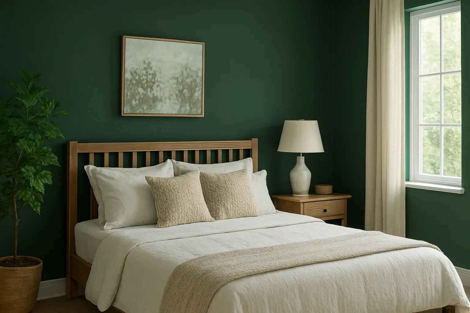
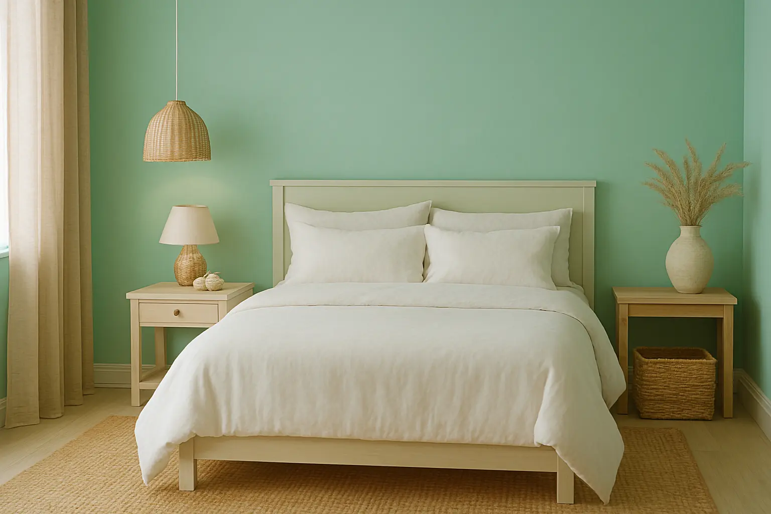
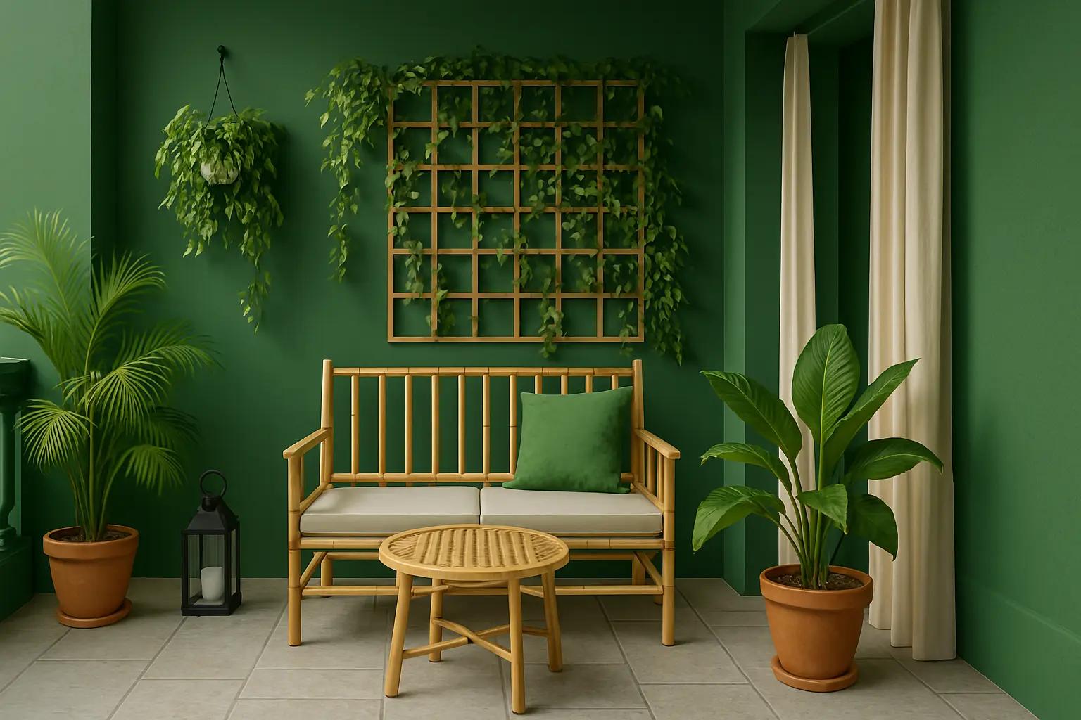
Tropical Greens: A Refreshing Look for Your Balcony
If you’re seeking a tropical vibe for your balcony, shades of green are a fantastic choice. Green is synonymous with freshness, vitality, and nature, and it can make your outdoor space feel like a lush garden oasis. Choose from shades like forest green, sage, or even a bright lime green for a more lively and energetic feel.
Indicus Paints Verdant Dream or Emerald Calm would be excellent options for creating a tropical, green-themed balcony. These colours bring an organic feel to the space and pair wonderfully with greenery and plants.
Why It Works:
- Green is associated with growth, nature, and tranquility, making it perfect for outdoor living spaces.
- It helps balance the often hot and sunny environment by creating a fresh and peaceful vibe.
- Works particularly well in balconies surrounded by plants, flowers, and natural light.
How to Style It:
- Mix green walls with vibrant potted plants, hanging vines, or trellises to enhance the tropical theme.
- Pair with wooden or bamboo furniture for an earthy, natural look.
- Add outdoor curtains or shade sails in neutral tones to complement the vibrancy of green.
Painting your balcony is an easy and effective way to revamp your outdoor space and make it a functional extension of your home. By selecting the right colours, you can transform your balcony into a cozy, vibrant, or peaceful retreat. Whether you opt for bold vibrant colours, calming pastels, or earthy tones, the possibilities are endless.
With Indicus Paints, you can explore a wide range of colours that suit every style and transform your balcony into a stylish, inviting space.
Ready to refresh your balcony? Dive into Indicus Paints colour palette and bring your vision to life with high-quality paints that will ensure lasting beauty.