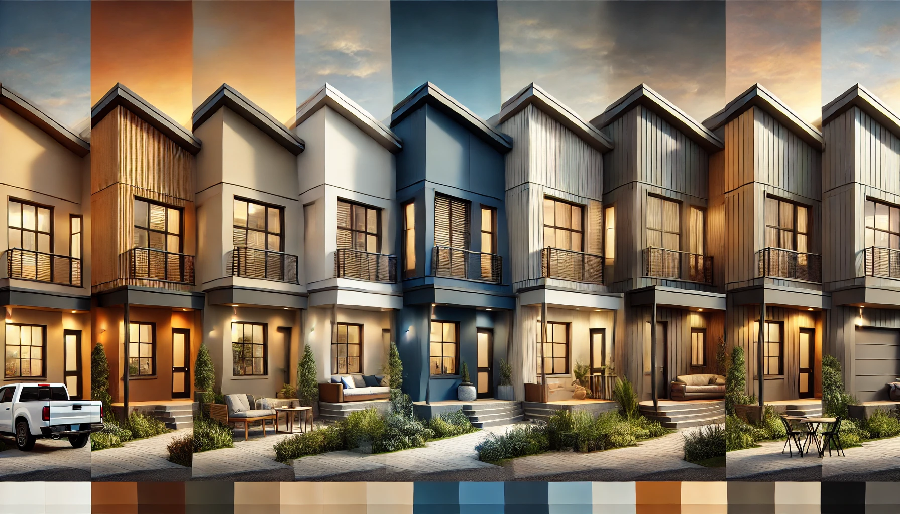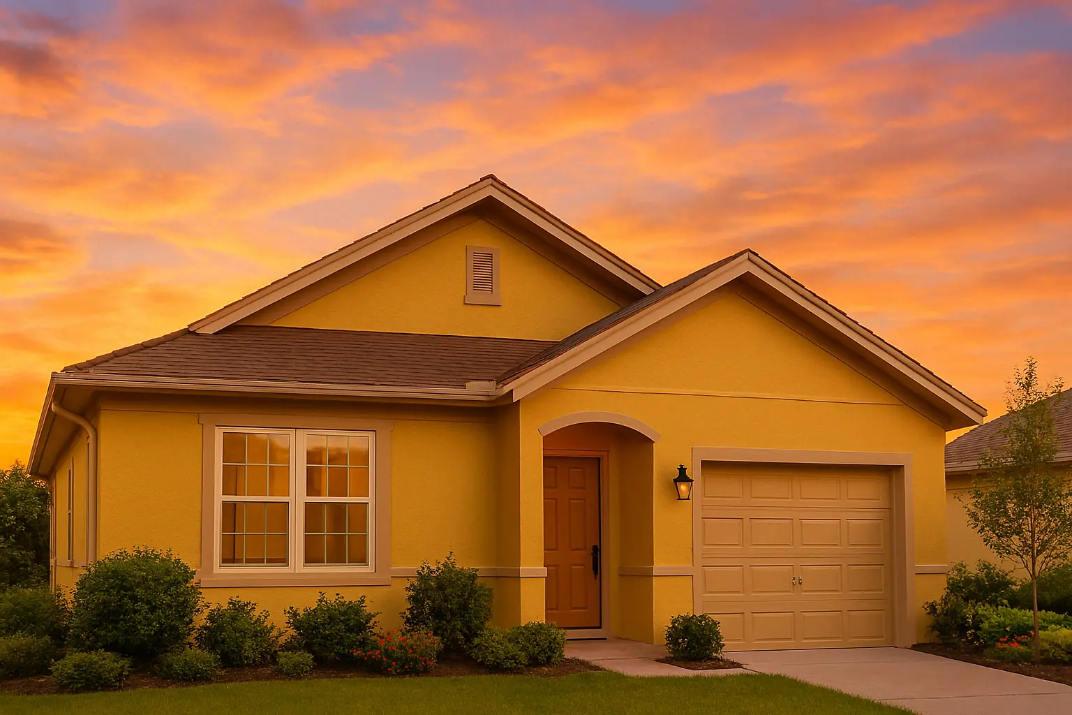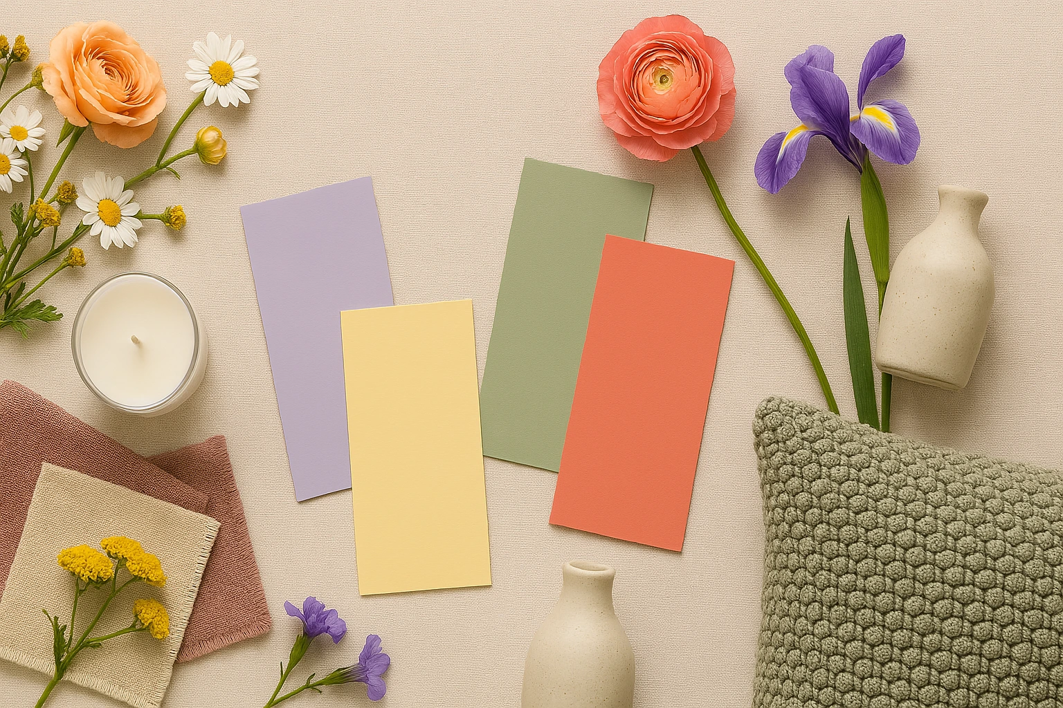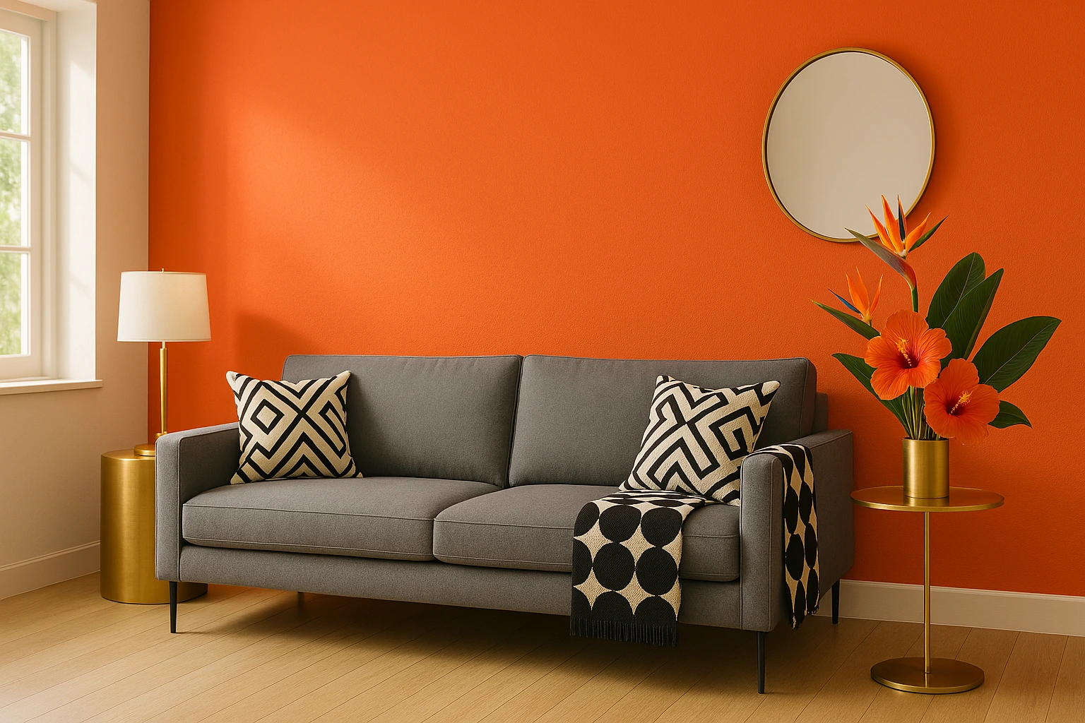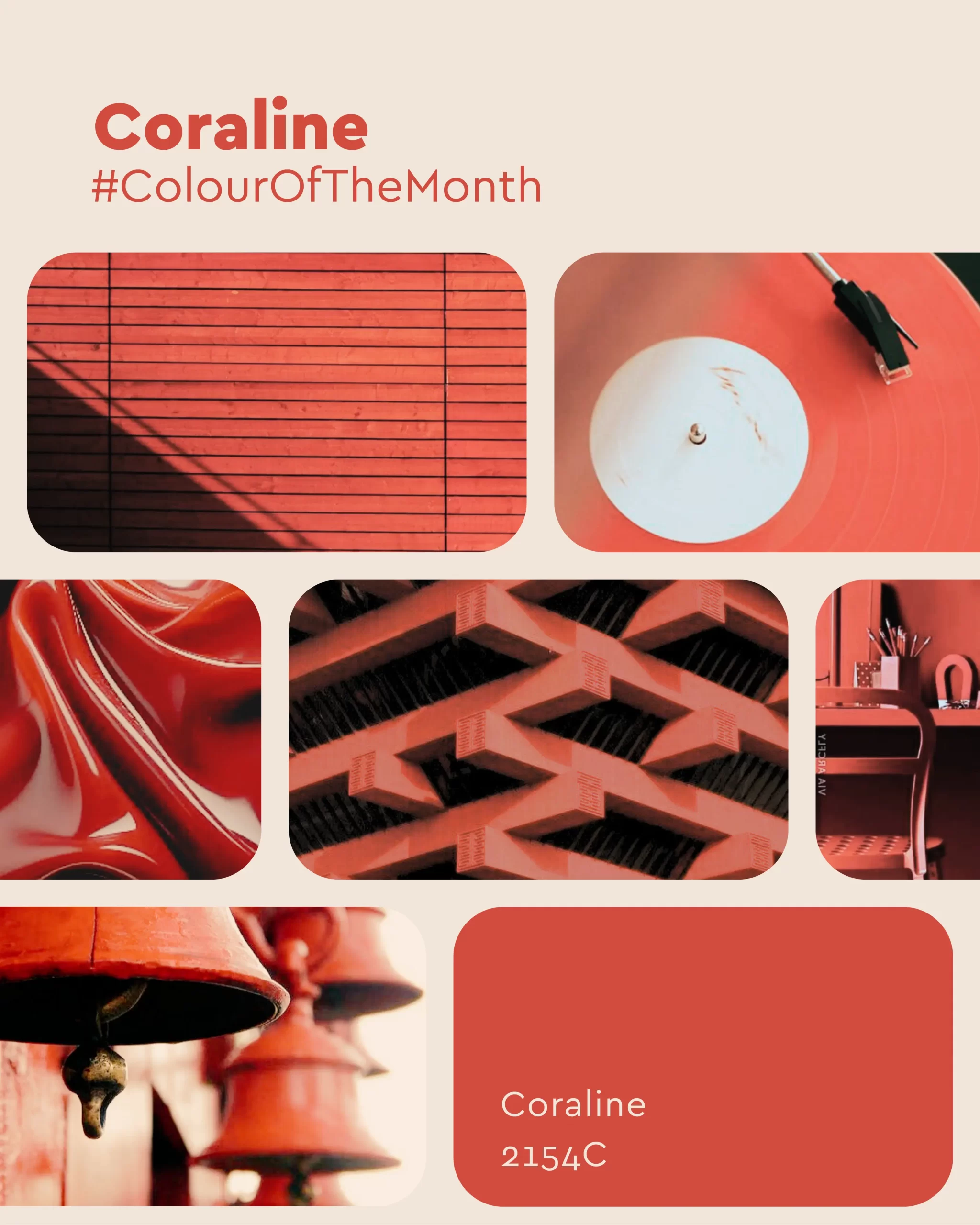
Orange Grove (2068T): August’s Colour of the Month
August is a month of quiet transitions. The sunlight still spills generously into the day, yet there’s a softer, slower quality to it — a warmth that invites both movement and pause. It’s a time when mornings feel alive, afternoons glow, and evenings settle into a calm embrace.
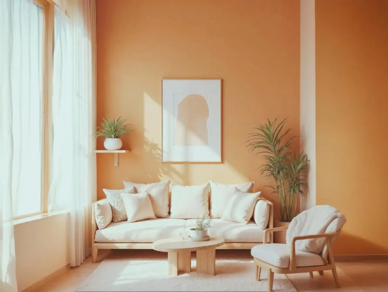
Orange Grove (2068T) is the embodiment of this seasonal rhythm. It draws from the brightness of citrus orchards, the earthy comfort of clay, and the gentle burnish of late-summer sunsets. The tone is vivid enough to lift a space, yet carries a grounded depth that keeps it from feeling overpowering.

The Mood it Creates
Orange Grove is more than a colour – it’s a mood that shifts with the light.- In sunlit spaces, it radiates joy and energy, filling the room with a welcoming vibrance.
- In evening light, it turns mellow and warm, creating a cocoon-like comfort.
- In low-lit corners, it adds a subtle richness, deepening the atmosphere without closing it in.
Design Inspiration
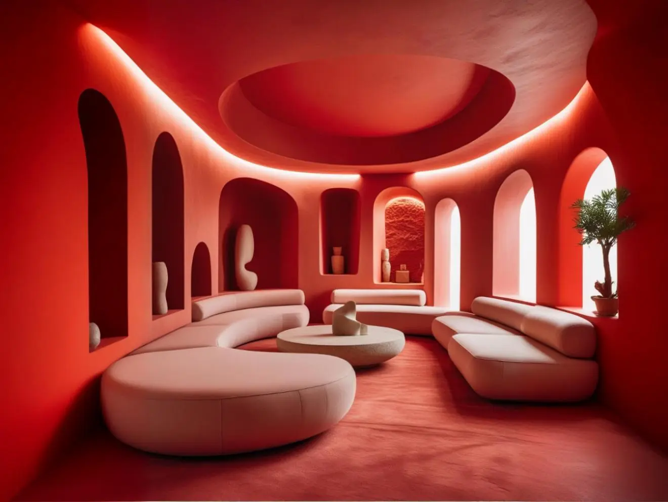
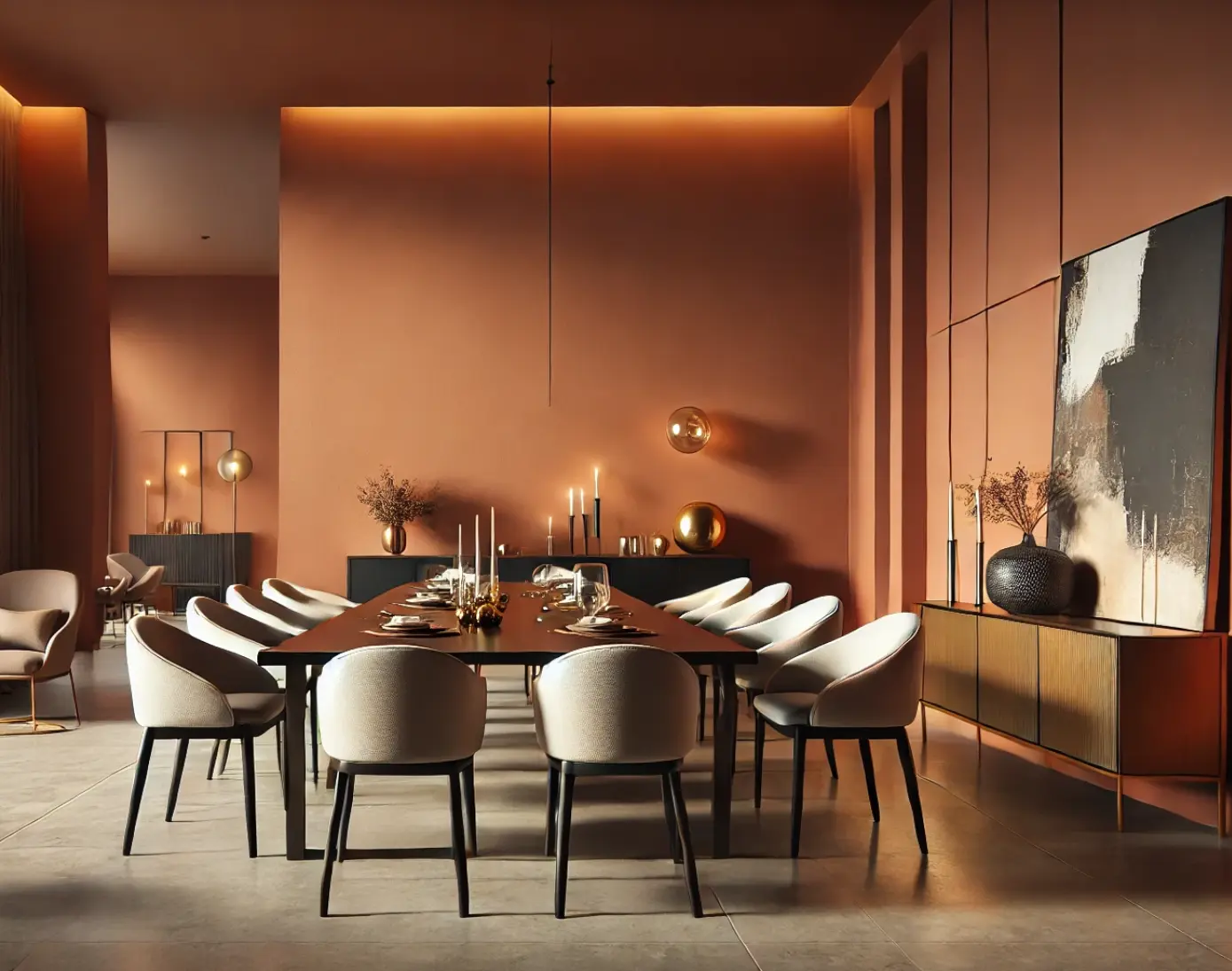
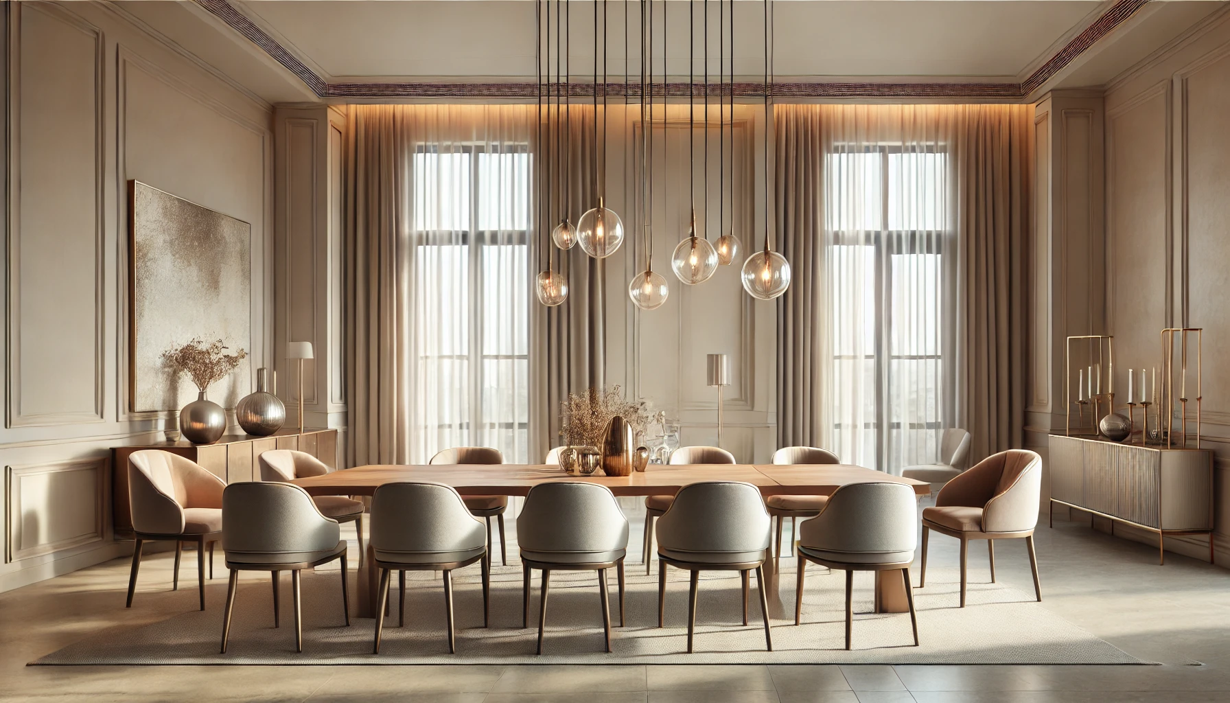
Living Areas
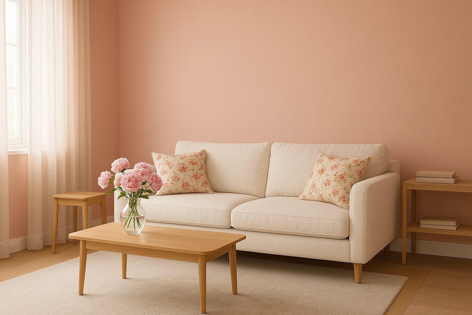
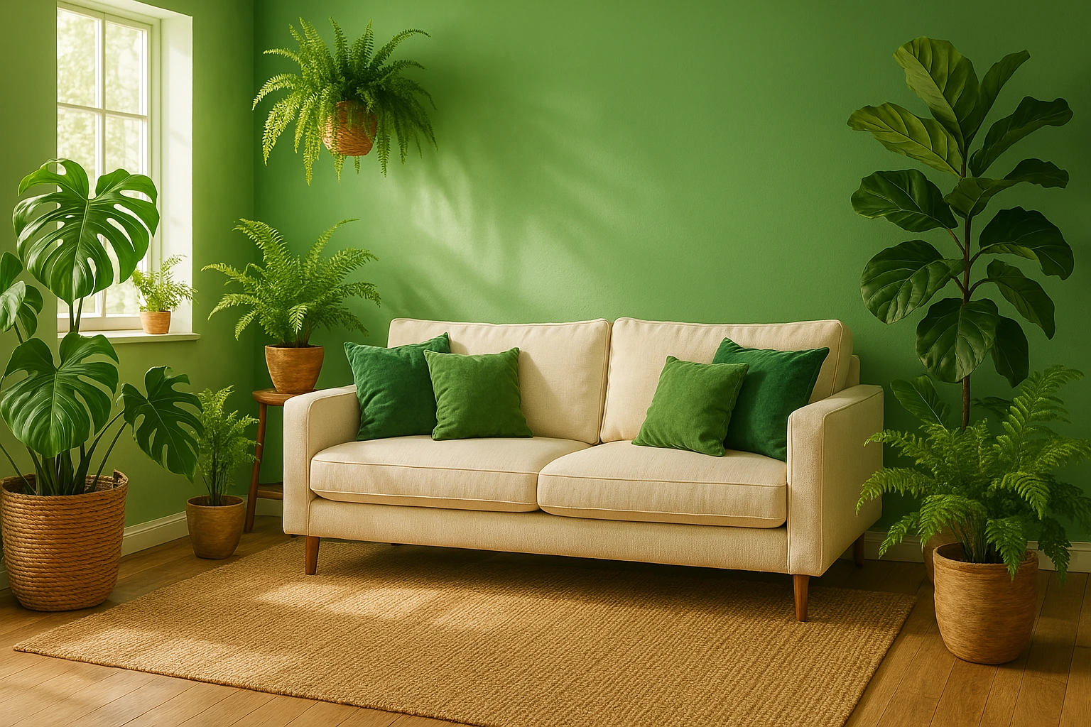
In a living room, Orange Grove becomes the anchor of hospitality. Use it on a main wall or behind open shelving to make the room feel alive. Pair with creamy off-whites, sandy beiges, and textured linens to keep the mood light. Woven rugs, rattan accents, and terracotta pottery echo the natural warmth of the shade.
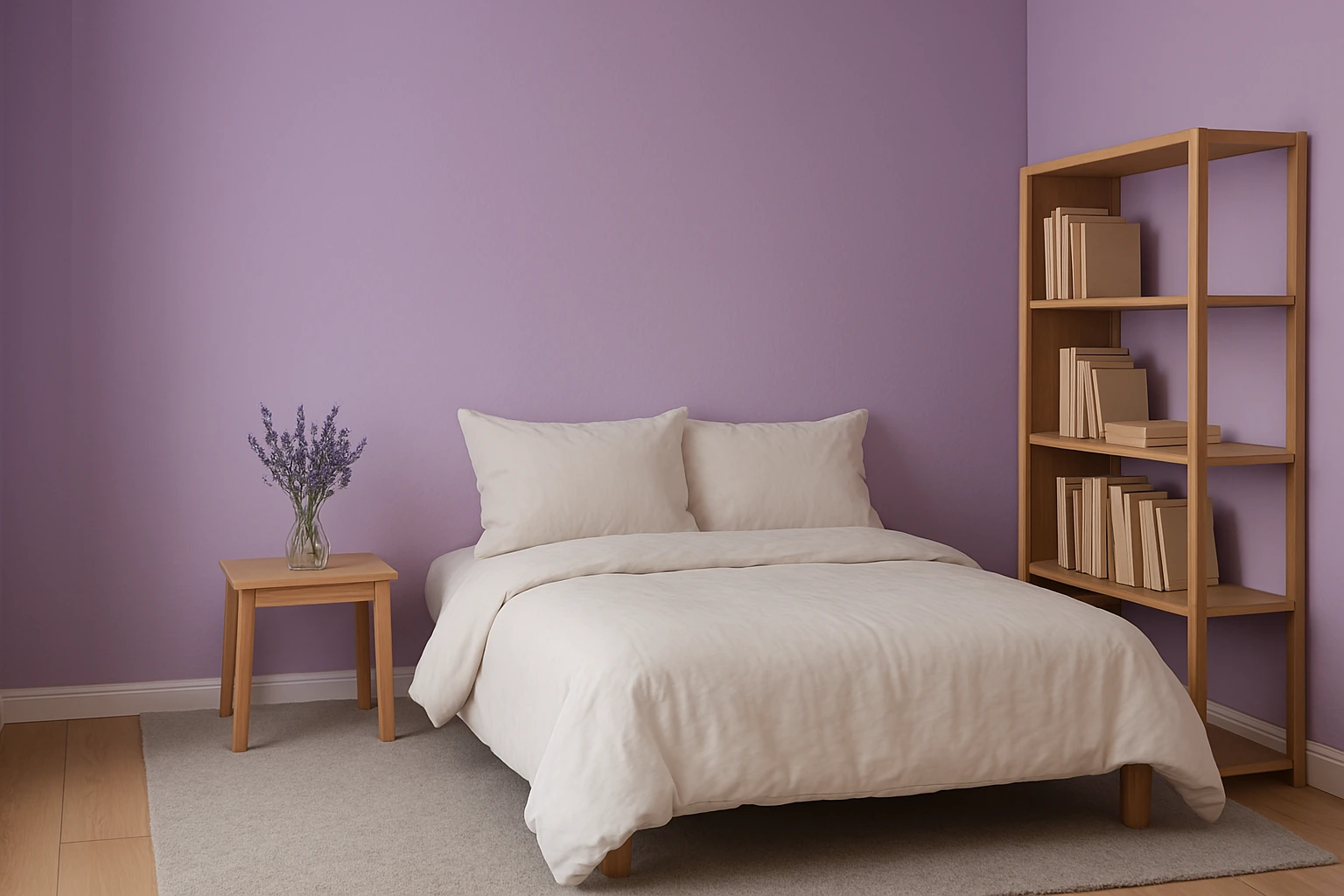
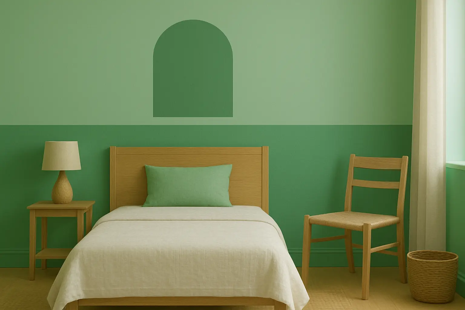
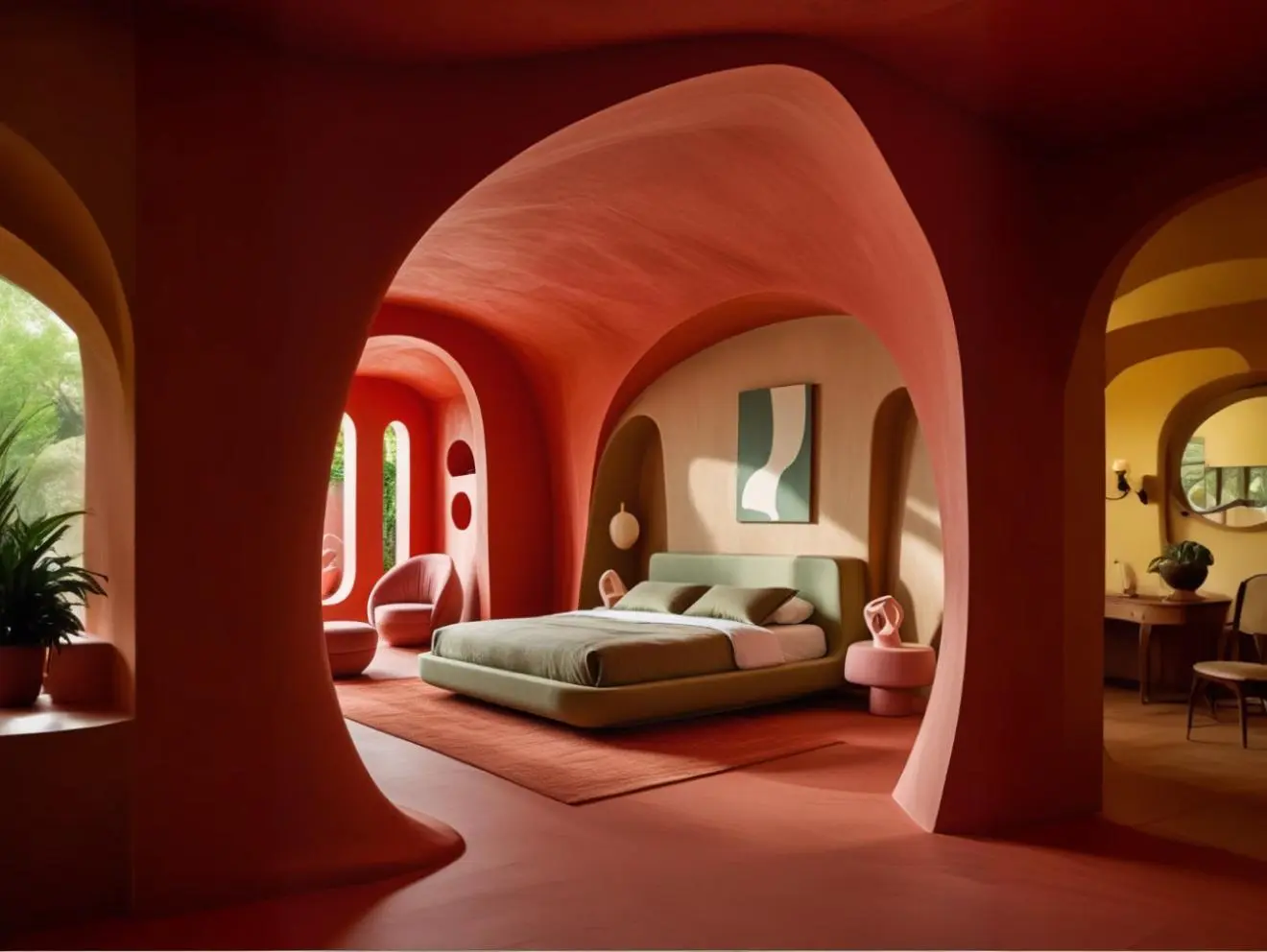
Bedrooms
In the bedroom, it can create a serene yet uplifting retreat. A single Orange Grove accent wall behind the bed draws focus without overwhelming. Layer with crisp white bedding, taupe throws, and soft lighting to recreate the feel of a golden hour glow. Wooden side tables and clay-toned ceramics add a grounded touch.
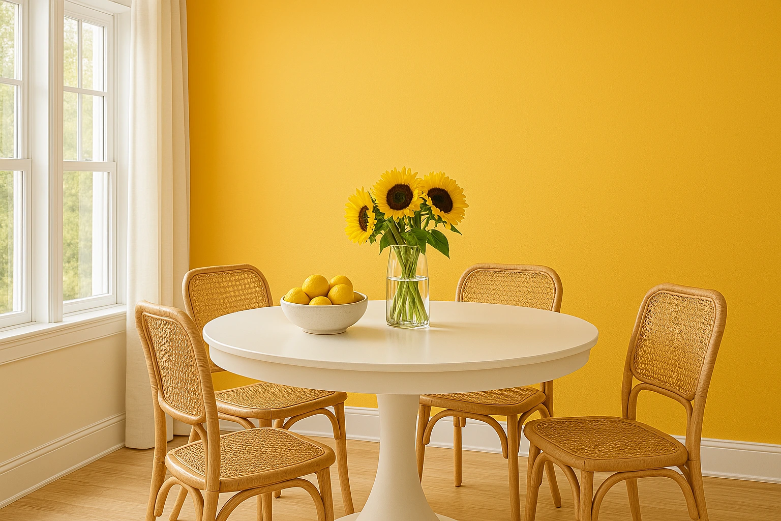
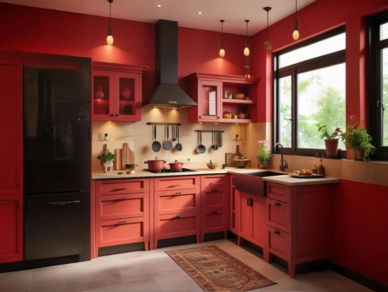
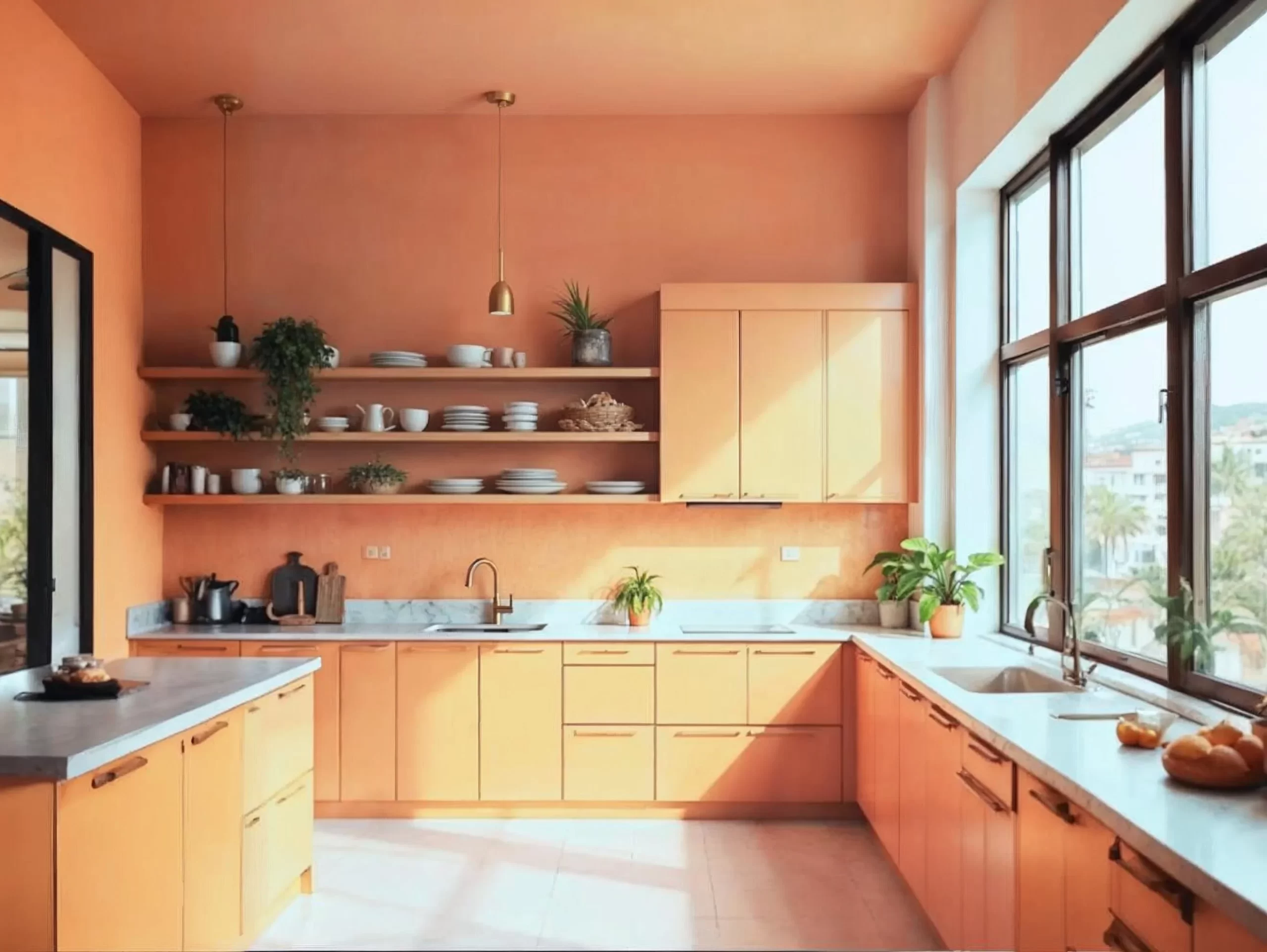
Kitchens
Kitchens in Orange Grove feel fresh and inviting. On cabinetry, it adds personality without sacrificing elegance. Complement it with cream or light stone countertops, matte black hardware, and warm wood shelving. Copper utensils, citrus bowls, and indoor herbs create a playful but cohesive theme.
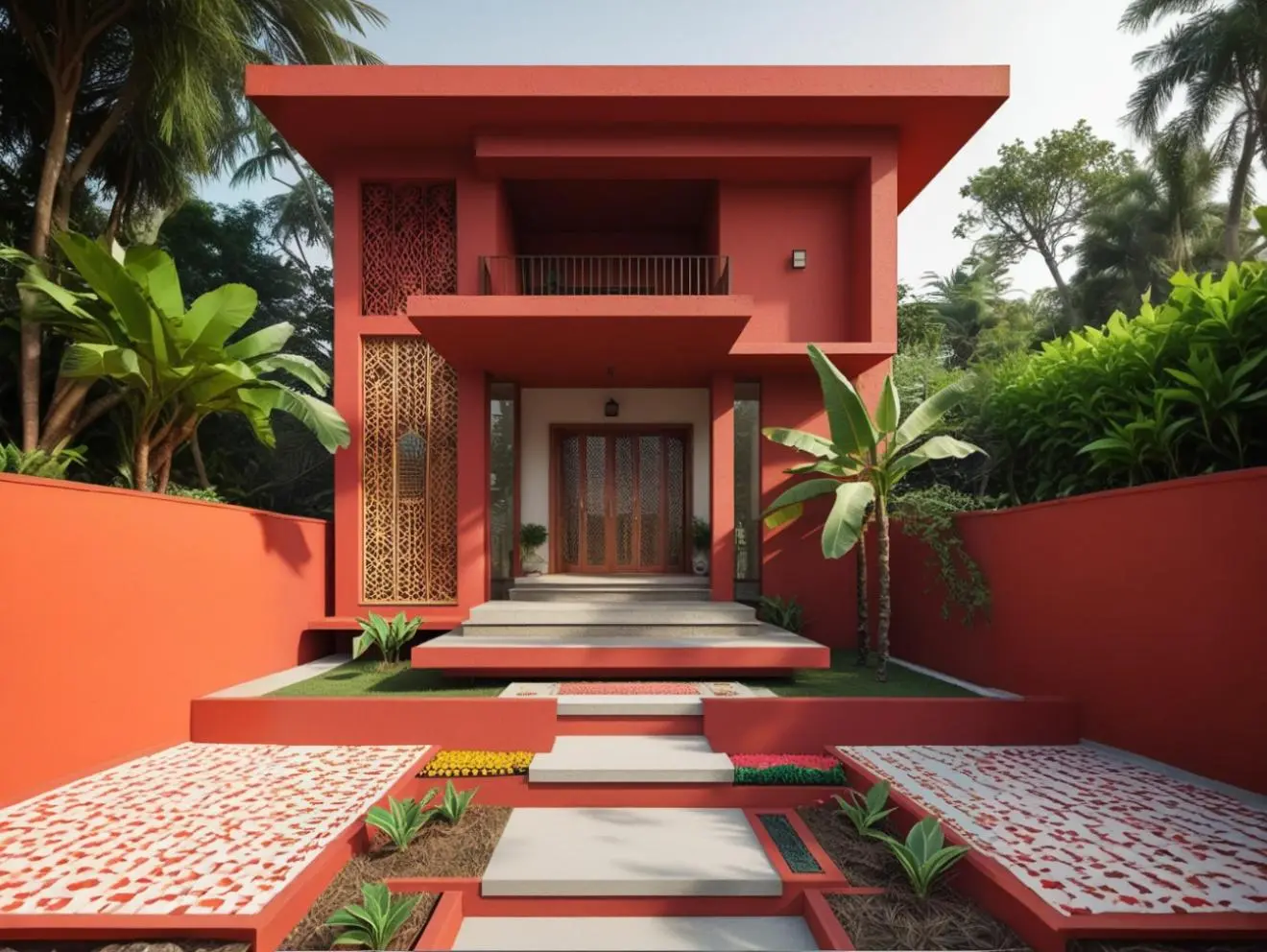
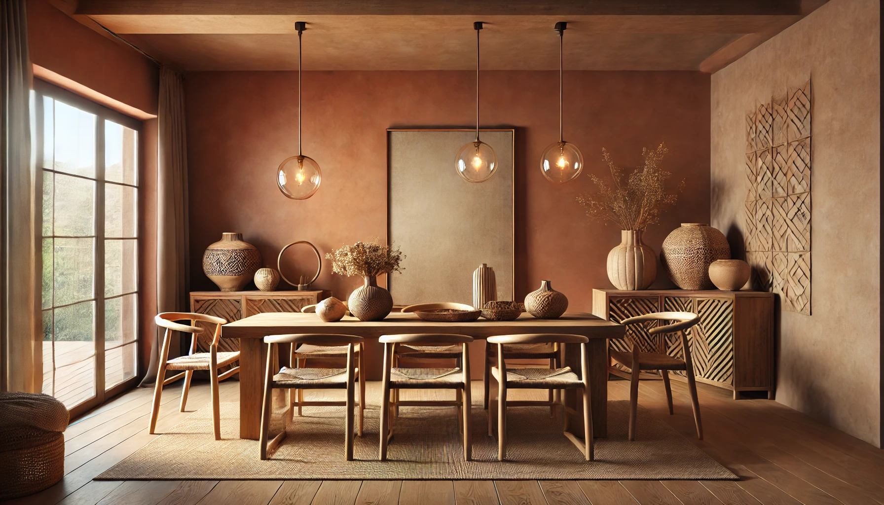
Outdoor & Transitional Spaces
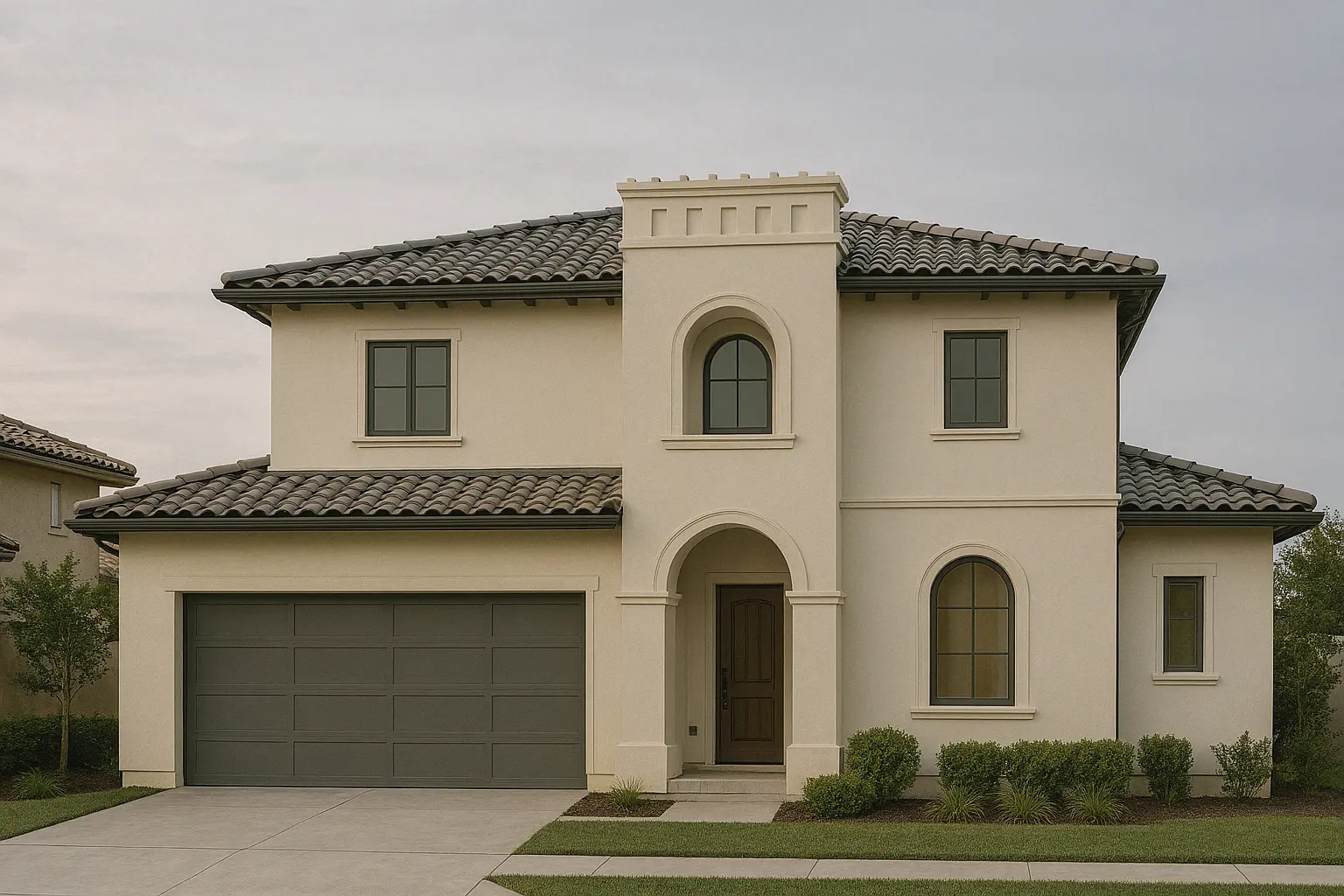
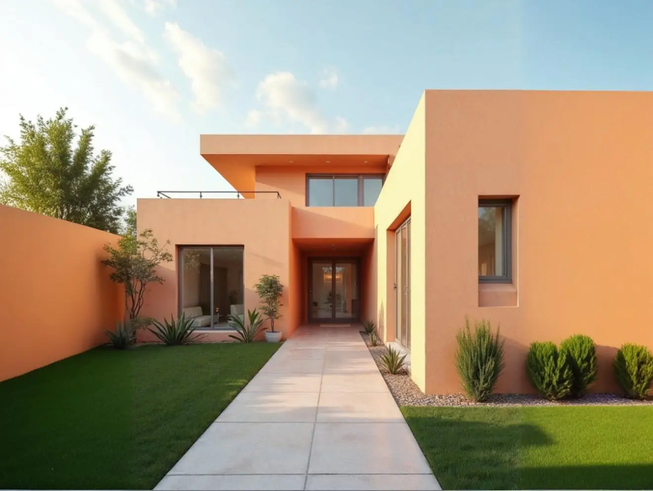
Orange Grove isn’t just for interiors. On exterior walls, courtyard accents, or balcony nooks, it reflects light beautifully and pairs well with greenery. For a Mediterranean touch, combine it with natural stone, climbing plants, and white trim.
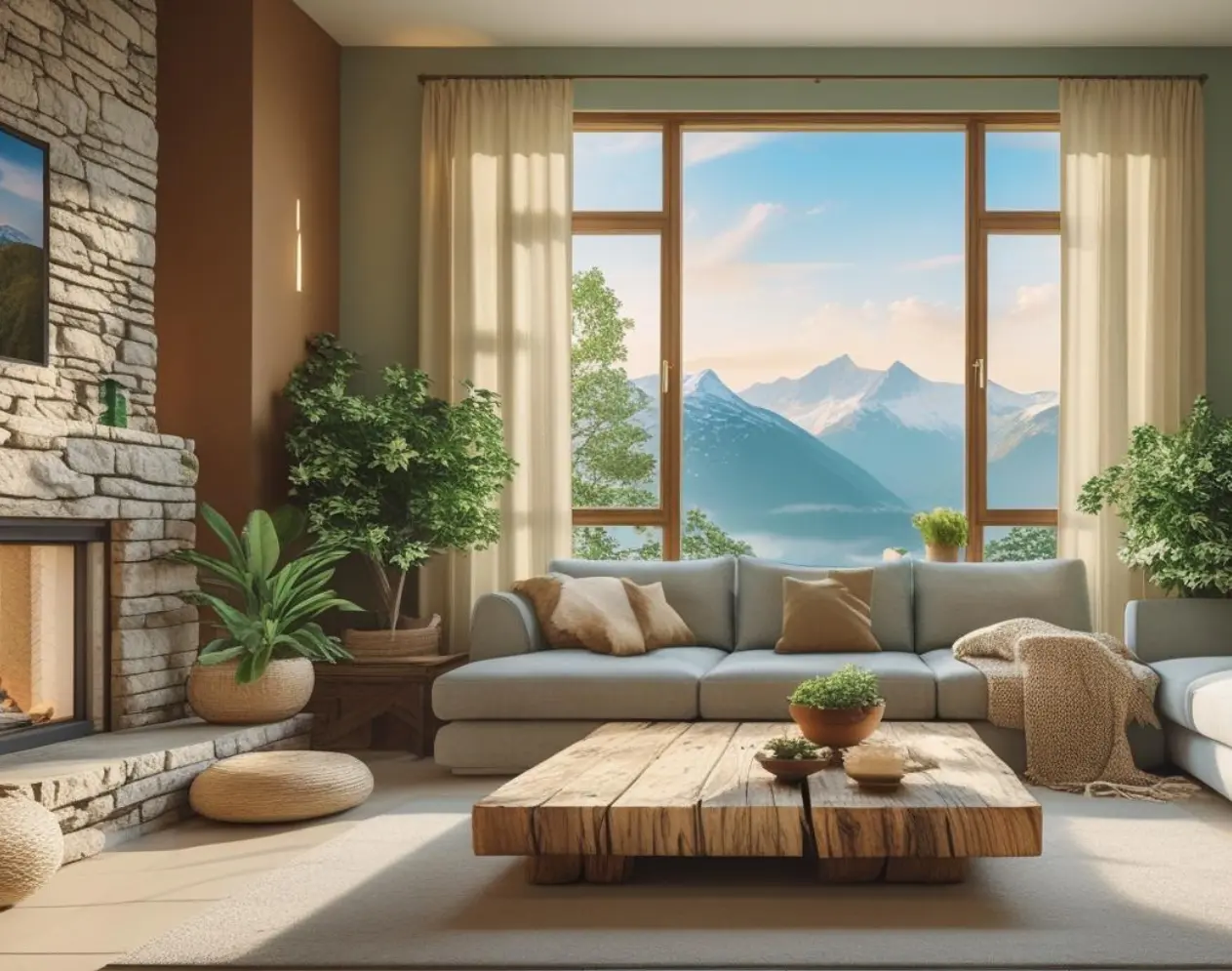
Study Nooks & Home Offices
Orange Grove works beautifully in personal workspaces, striking a balance between focus and comfort.
In the featured room, soft orange walls set a lively yet calming backdrop for productivity. A sleek wooden desk, plush cream armchair, and brass desk lamp add elegance, while greenery brings freshness. Light curtains filter daylight, letting the colour glow softly throughout the day.

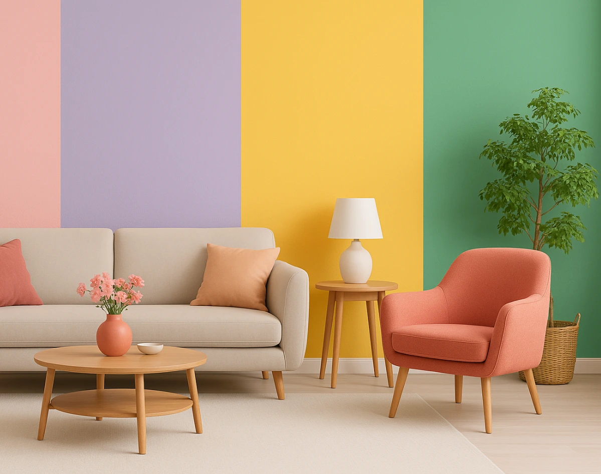
Accents for Every Style
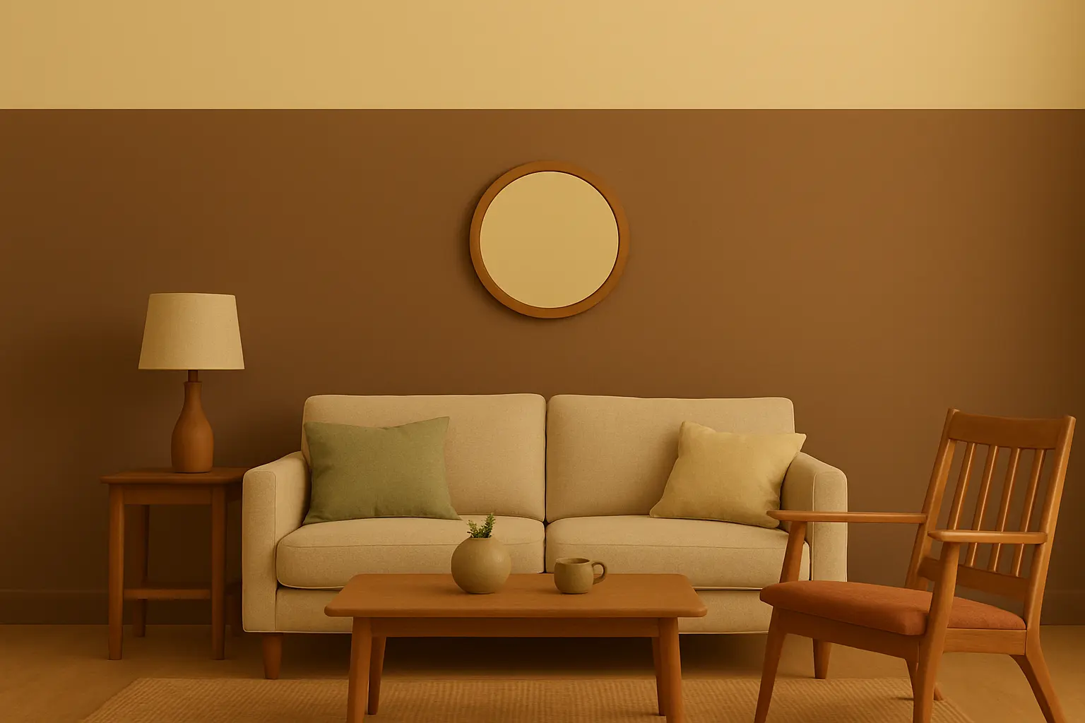
For those who prefer a lighter touch, Orange Grove thrives as an accent — on a statement armchair, in patterned cushions, or as part of wall art. Against neutral walls, these pops of colour create focal points that feel intentional and full of life.
August’s Essence in One Shade
Orange Grove carries the energy of summer’s last flourish and the warmth of autumn’s first steps. It’s lively, grounded, and timeless — a colour that turns walls into stories and spaces into experiences.
In August, when days are still bright but the evenings call for comfort, this shade finds its perfect moment. It’s the sunshine you can hold on to, long after the season shifts.
With Indicus Paints, Orange Grove(2068T) is just the beginning. Explore a world of colours designed to capture every mood, season, and style — because every space deserves a shade that speaks its language.