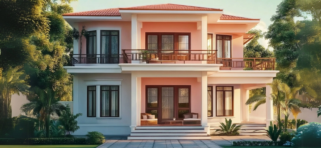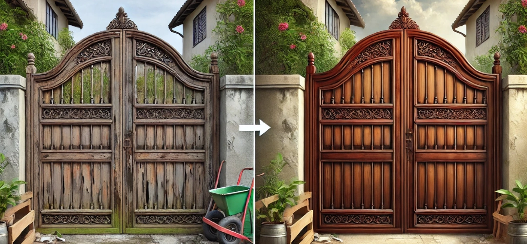
Increase Longevity of Buildings with Waterproofing
When it comes to protecting your building, waterproofing should be at the top of the list. While many people focus on cosmetic improvements or interior design, the true durability of your home depends on how well it’s protected from the elements, especially water penetration. Seepages can cause hidden, slow damage to your building, leading to cracked walls, weakening foundations, and the growth of mould-all of which can dramatically reduce the lifespan of your home.
Proper waterproofing ensures that your building can withstand the test of time. In this blog, we’ll walk through the importance of waterproofing, identify areas that need special attention, and recommend the right products to use to ensure your building remains strong and resilient. Whether you’re building a new home or protecting an existing one, understanding waterproofing solutions is essential for preserving your investment.
Proper waterproofing ensures that your building can withstand the test of time. In this blog, we’ll walk through the importance of waterproofing, identify areas that need special attention, and recommend the right products to use to ensure your building remains strong and resilient. Whether you’re building a new home or protecting an existing one, understanding waterproofing solutions is essential for preserving your investment.
Why Waterproofing Matters?
Water damage is one of the leading causes of building deterioration, affecting everything from the foundation to the roof. Seepages can weaken concrete, erode structural materials, and cause long-term issues like mould growth and rust. Over time, water damage can lead to costly repairs, decreased property value, and health risks.Waterproofing prevents these problems by creating a protective barrier that keeps water out. Investing in quality waterproofing solutions not only protects your property from water damage but also increases its durability, safety, and overall lifespan.
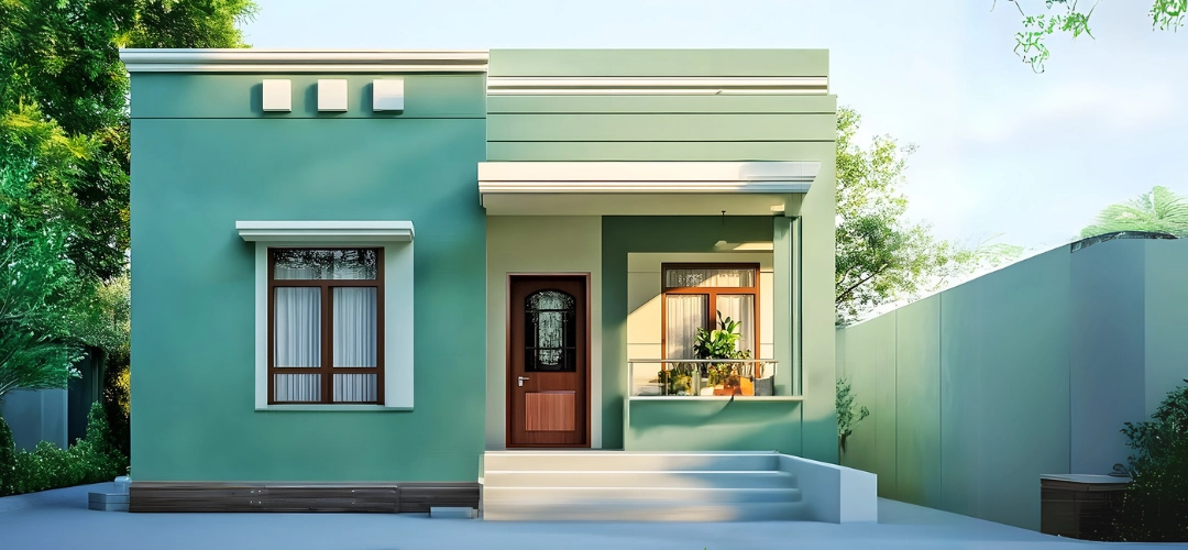
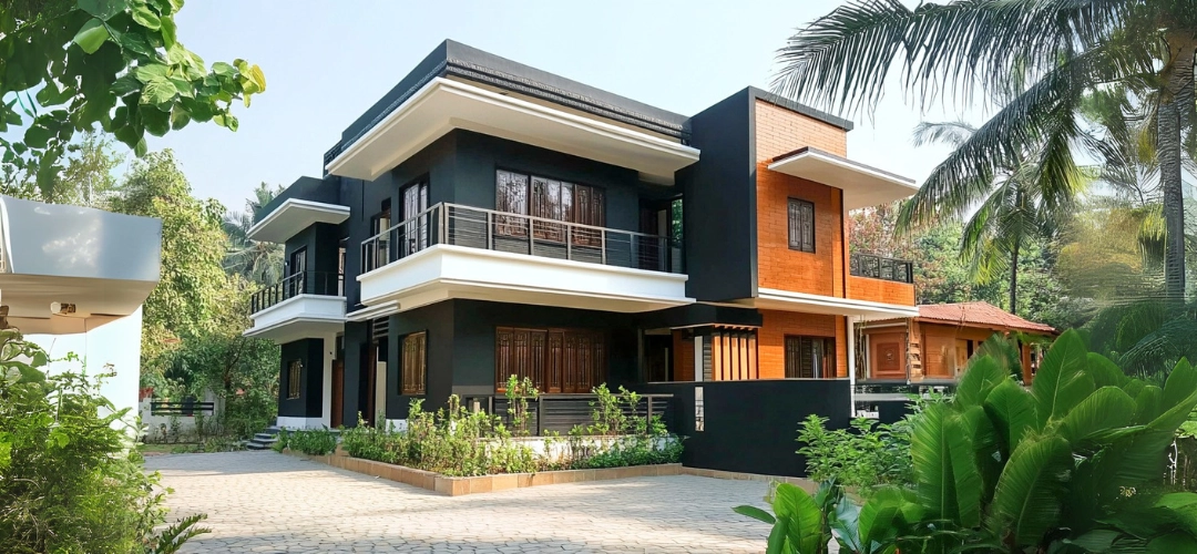
Areas to Waterproof
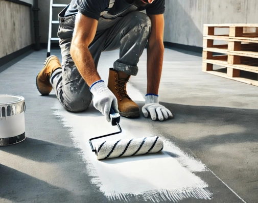
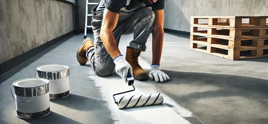
Certain areas of your building are more vulnerable to water damage than others, making it crucial to prioritise waterproofing in high-risk spots. To ensure your building’s longevity and protect it from water infiltration, here are the key areas to focus on, along with Indicus Paints’ reliable waterproofing solutions for each.1. Concrete Roofs, Columns & Beams: Indicus Godry Uniproof
Concrete is a durable material, but it’s naturally porous, which means water can seep through over time. Concrete foundations, basement walls, and floors are especially susceptible to moisture damage. That’s where Godry Uniproof comes in—a waterproofing solution specifically designed for concrete surfaces. This product fills the pores in concrete and prevents water from penetrating, ensuring your foundation remains strong and intact.
Why Uniproof Works: It’s a highly effective barrier that prevents water infiltration, ensuring that your concrete surfaces are protected from the damaging effects of moisture.
2. Bathrooms & Terraces: Indicus Godry Maxcoat 2X
Bathrooms and terraces are wet areas, and they often face the brunt of water exposure. Without proper waterproofing, you risk leaks, mould growth, and even structural damage. Godry Maxcoat 2X is ideal for these areas as it offers superior protection against water. This product is designed for surfaces that are constantly exposed to water, such as bathroom floors and terrace decks.
Why Maxcoat 2X Works: Its superior adhesion and flexibility makes it perfect for wet areas. It not only waterproofs but also ensures the longevity of the surfaces, preventing water-related issues over time.
3. Utility Rooms & Balconies: Indicus Maxcoat 1X
While larger areas like foundations and roofs need heavy-duty protection, smaller spaces like utility rooms, balconies, or small bathroom corners still need waterproofing. Godry Maxcoat 1X is a more affordable solution that provides reliable waterproofing for these smaller, less exposed areas.
Why Maxcoat 1X Works: It’s a versatile, cost-effective solution that offers adequate protection without the need for heavier products, making it perfect for small-scale applications.
4. Wall & Floor Cracks: Indicus Easyseal
Cracks in your walls and floors are common entry points for water, but fortunately, they can be easily sealed with Easyseal. This product is designed to fill cracks in concrete, plaster, and brickwork, preventing water from penetrating through.
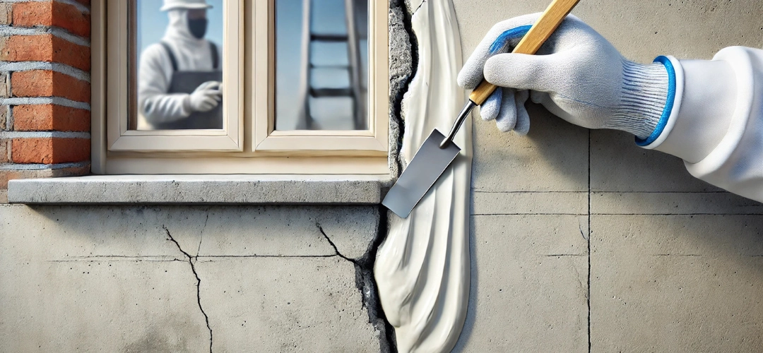
Why Easyseal Works: It creates a flexible seal that expands and contracts with the material, ensuring that the cracks remain sealed even with changes in temperature or humidity.
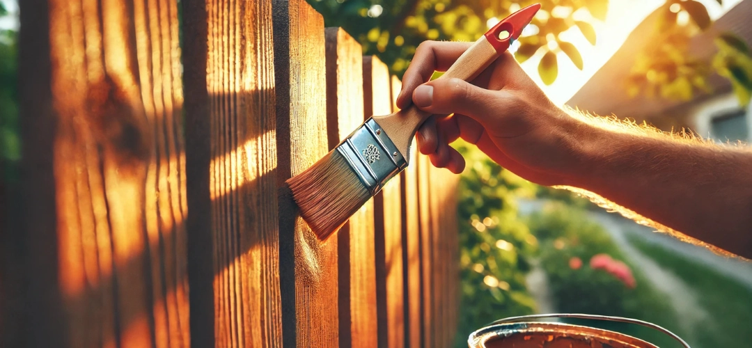
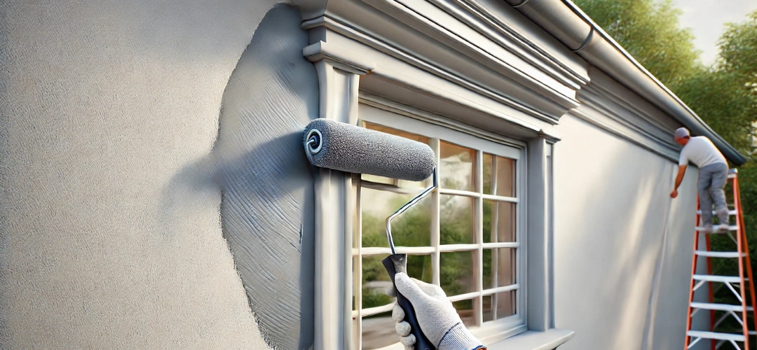
5. Paint Undercoat: Indicus Aquaseal
Before applying paint it’s important to use an undercoat like Aquaseal. This product acts as a primer for waterproofing surfaces, creating a strong base layer that improves adhesion for the final coat and prevents moisture from seeping through.
Why Aquaseal Works: It provides an added layer of protection by sealing porous surfaces, ensuring that your topcoat adheres properly and that water stays out.
6. Paint Topcoat: Indicus Forto
The final step in completing your house is applying a topcoat, and Forto is the ideal product for this. It provides long-term protection against algae and fungi growth on walls and keeps your house looking fresh and clean.
Why Forto Works: Provides superior anti-algal and UV resistant properties, helping to maintain your building’s appearance for years to come.
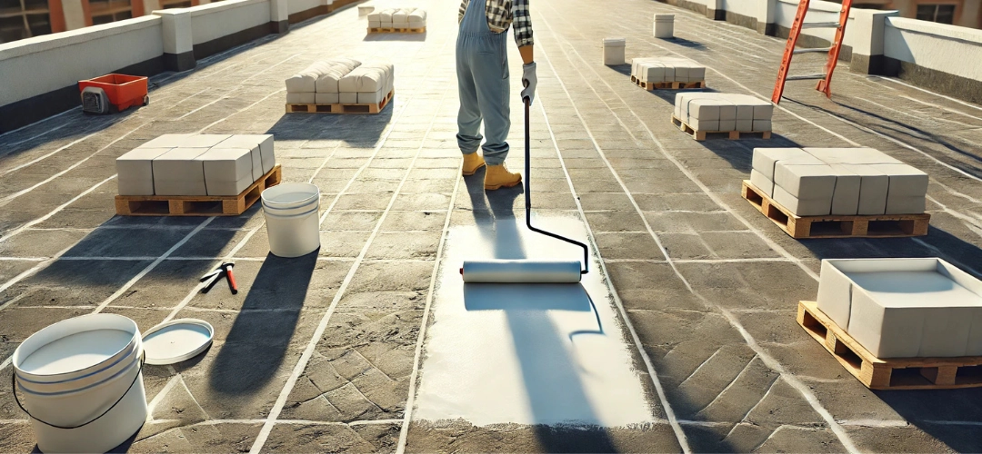
7. Roof Terraces: Indicus Heatseal Advanced
For terraces, which are constantly exposed to the elements, Heatseal Advanced offers an exceptional waterproofing solution. It not only prevents water penetration but also reflects heat, which helps maintain a cooler temperature inside your building.
Why Heatseal Advanced Works: It combines waterproofing with thermal insulation, making it a perfect solution for terraces exposed to both rains and high temperatures.
5. Paint Undercoat: Indicus Aquaseal
Before applying paint it’s important to use an undercoat like Aquaseal. This product acts as a primer for waterproofing surfaces, creating a strong base layer that improves adhesion for the final coat and prevents moisture from seeping through.
Why Aquaseal Works: It provides an added layer of protection by sealing porous surfaces, ensuring that your topcoat adheres properly and that water stays out.
6. Paint Topcoat: Indicus Forto
The final step in completing your house is applying a topcoat, and Forto is the ideal product for this. It provides long-term protection against algae and fungi growth on walls and keeps your house looking fresh and clean.
Why Forto Works: Provides superior anti-algal and UV resistant properties, helping to maintain your building’s appearance for years to come.
7. Roof Terraces: Indicus Heatseal Advanced
For terraces, which are constantly exposed to the elements, Heatseal Advanced offers an exceptional waterproofing solution. It not only prevents water penetration but also reflects heat, which helps maintain a cooler temperature inside your building.
Why Heatseal Advanced Works: It combines waterproofing with thermal insulation, making it a perfect solution for terraces exposed to both rains and high temperatures.
Conclusion: Waterproofing as a Vital Investment in Building Longevity
Waterproofing is much more than just an aesthetic choice—it’s a vital investment in the longevity of your building. By focusing on key areas like concrete foundations, bathrooms, terraces, and cracks, and by using the right products like Uniproof, Maxcoat 2X, Aquaseal, and Easyseal, you can ensure that your property is protected from the damaging effects of moisture.Waterproofing helps prevent costly repairs, protects your building’s structural integrity, and improves the overall safety of your living environment. Whether you’re building a new home or maintaining an existing one, the benefits of waterproofing are clear: it’s the best way to protect your investment and ensure your building stands the test of time.
FAQs
1. Why is waterproofing essential for buildings?Waterproofing helps protect buildings from water damage, which can weaken the structure, cause mould, and lead to costly repairs. It’s an investment that improves durability and reduces maintenance costs.
2. How long does waterproofing last?
With the right products, waterproofing can last anywhere from 5 to 15 years. Regular maintenance can extend the lifespan of your waterproofing system.
3. Can I waterproof my home after construction?
Yes, you can waterproof your home after construction. But it is always easier & more effective to waterproof during construction.
4. What are the best products for waterproofing?
Top products like Uniproof, Maxcoat 2X, Easyseal,and Aquaseal are excellent for ensuring long-lasting protection against water damage.
5. What areas should be prioritised for waterproofing?
Focus on high-risk areas like foundations, bathrooms, terraces, and roofs—these are the most vulnerable to water damage and should be waterproofed first.