You are using an outdated browser. Please upgrade your browser to improve your experience.

The Timeless Appeal of Teak, Mahogany, and Other Rich Brown Wooden Door Colours

The Timeless Appeal of Teak, Mahogany, and Other Rich Brown Wooden Door Colours

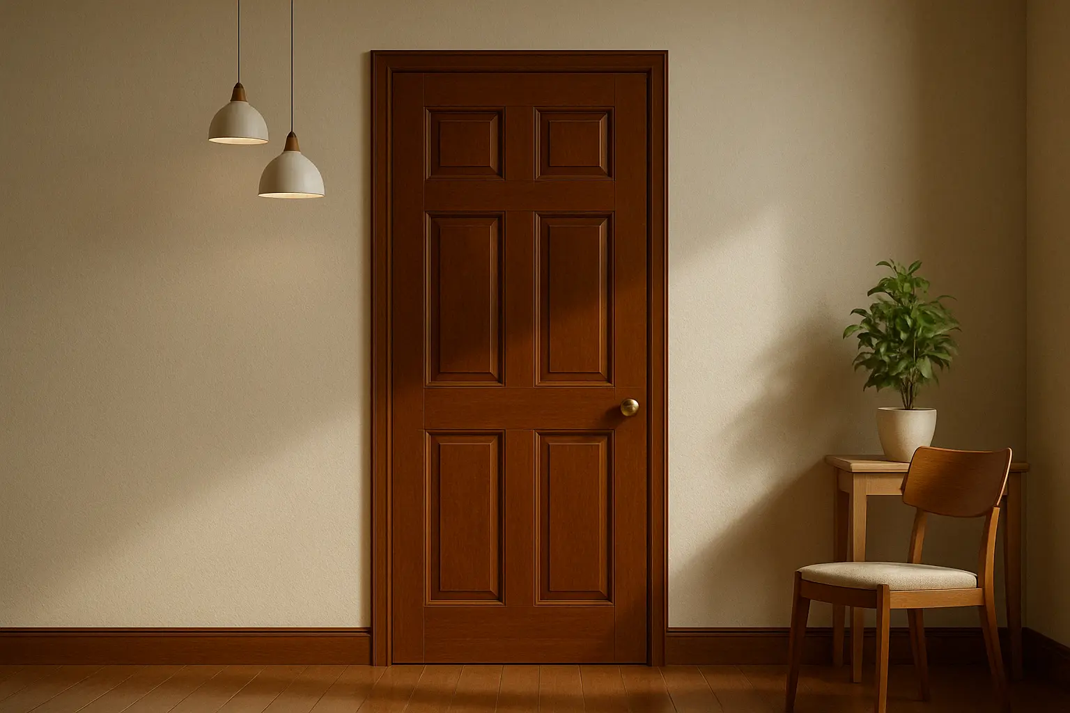
When it comes to doors, the colour and finish can make a world of difference. A well-painted or stained wooden door does more than just provide functionality; it’s an essential part of your home’s curb appeal. One of the most timeless and elegant choices for wooden doors is the range of brown shades, especially teak, mahogany, and other rich, warm wood tones. These colours are celebrated for their enduring appeal, bringing both sophistication and warmth to any space.

As design trends evolve, brown wooden doors have remained a staple, making them a sought-after choice for both modern and traditional interiors. With Indicus Woodfina, the richness and depth of these wooden tones are enhanced, offering a sleek, high-quality finish that makes a bold statement while maintaining a sense of natural elegance. In this blog, we’ll explore the beauty and versatility of these timeless brown shades, their advantages, and how Indicus Woodfina can elevate your wooden doors to new heights.

1. Why Brown Wooden Doors Are a Timeless Choice

Brown shades, from the deep richness of mahogany to the warm elegance of teak, have been celebrated for their timeless appeal. The natural grain and colour variations in wood offer a unique texture that adds warmth and character to any room or exterior.

Here’s why brown wooden doors, particularly teak, mahogany, and other rich brown hues, continue to be such a popular choice:

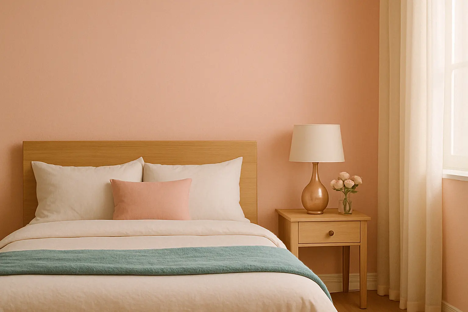
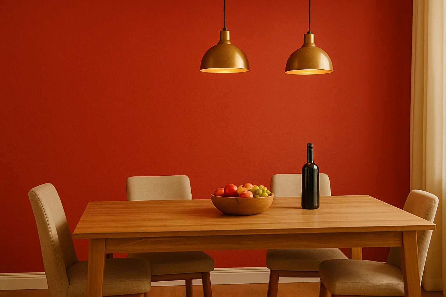
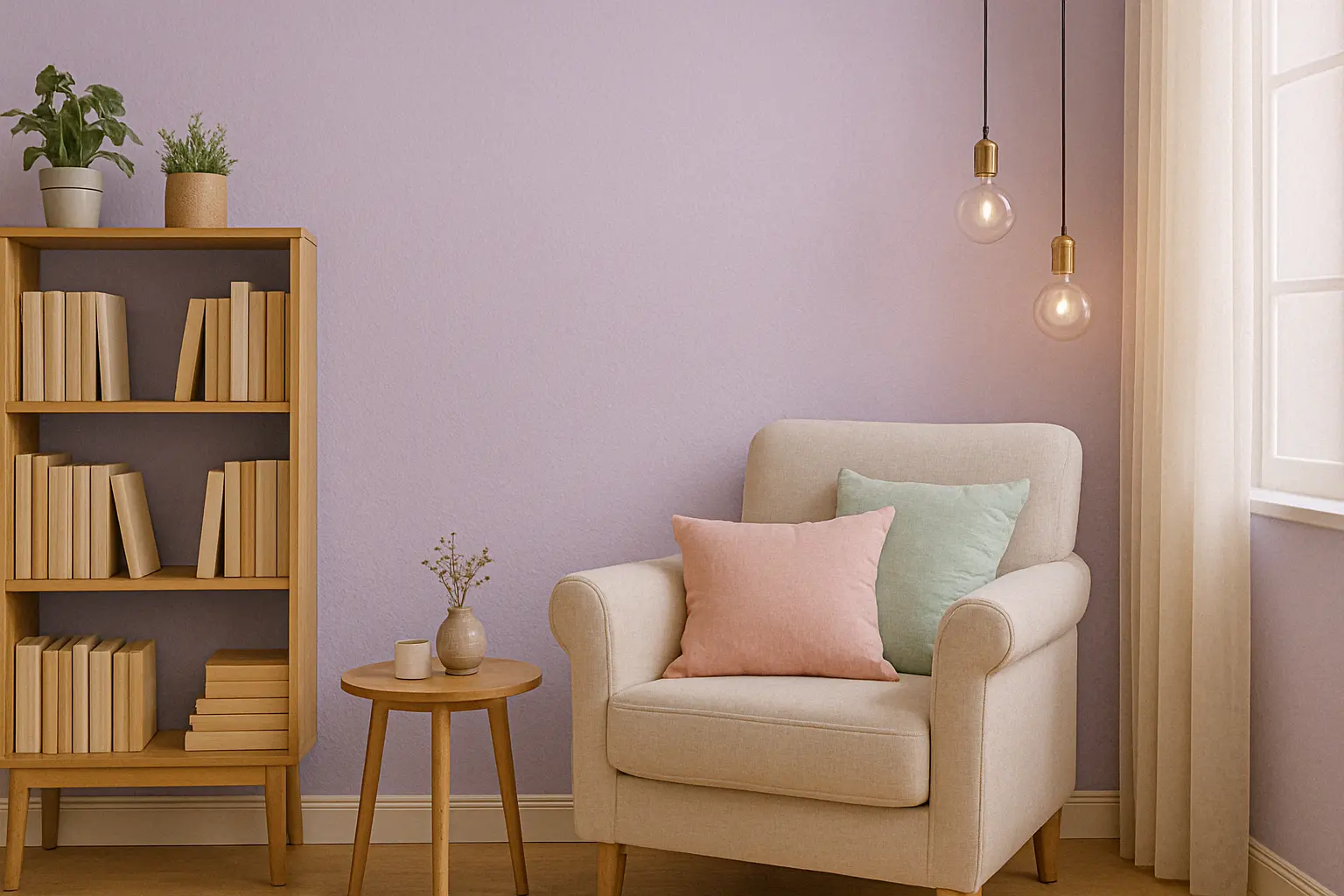
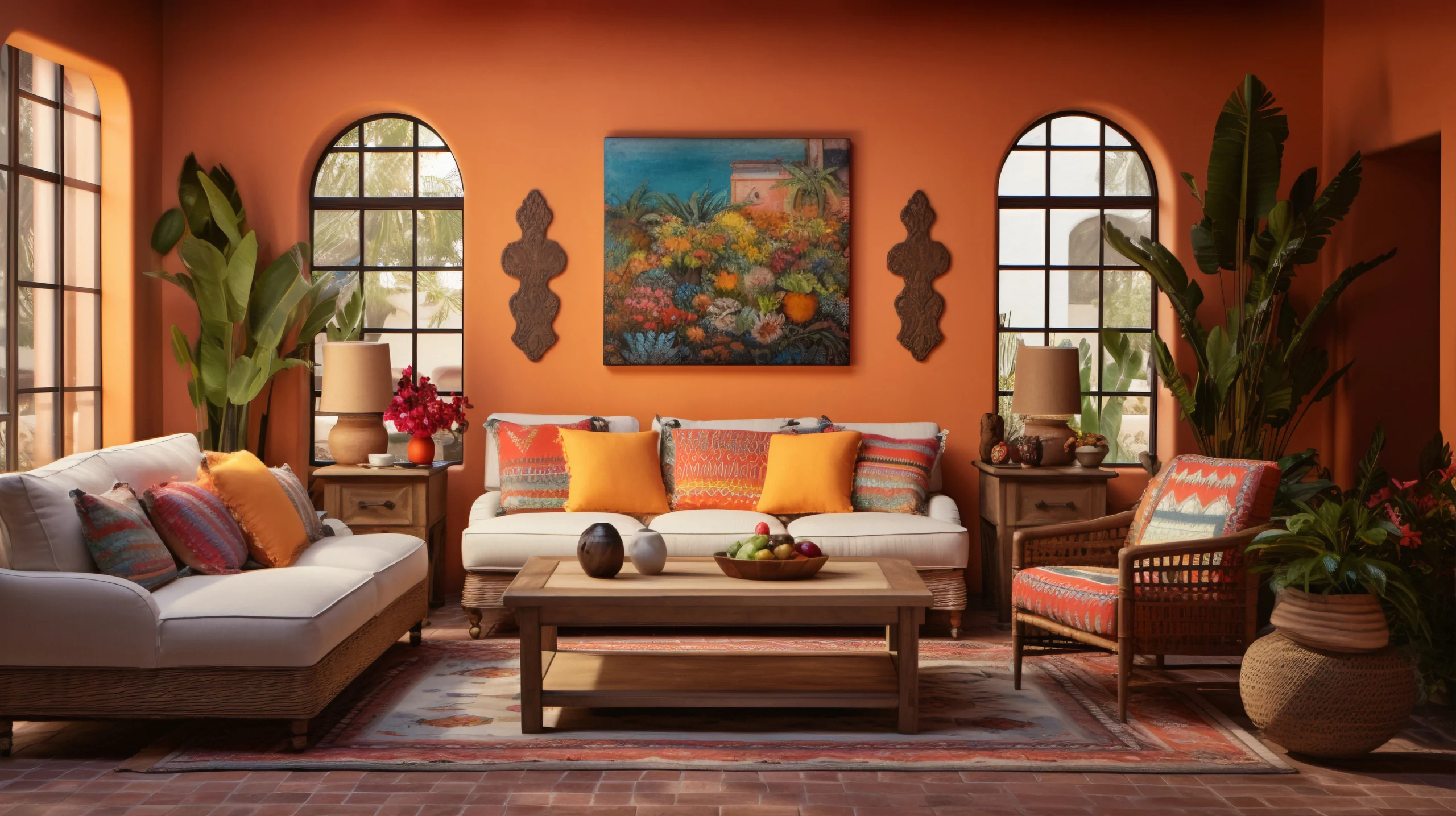
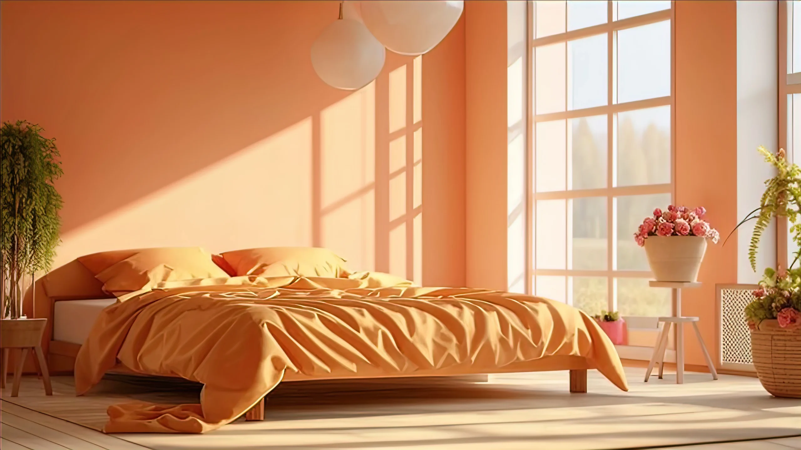
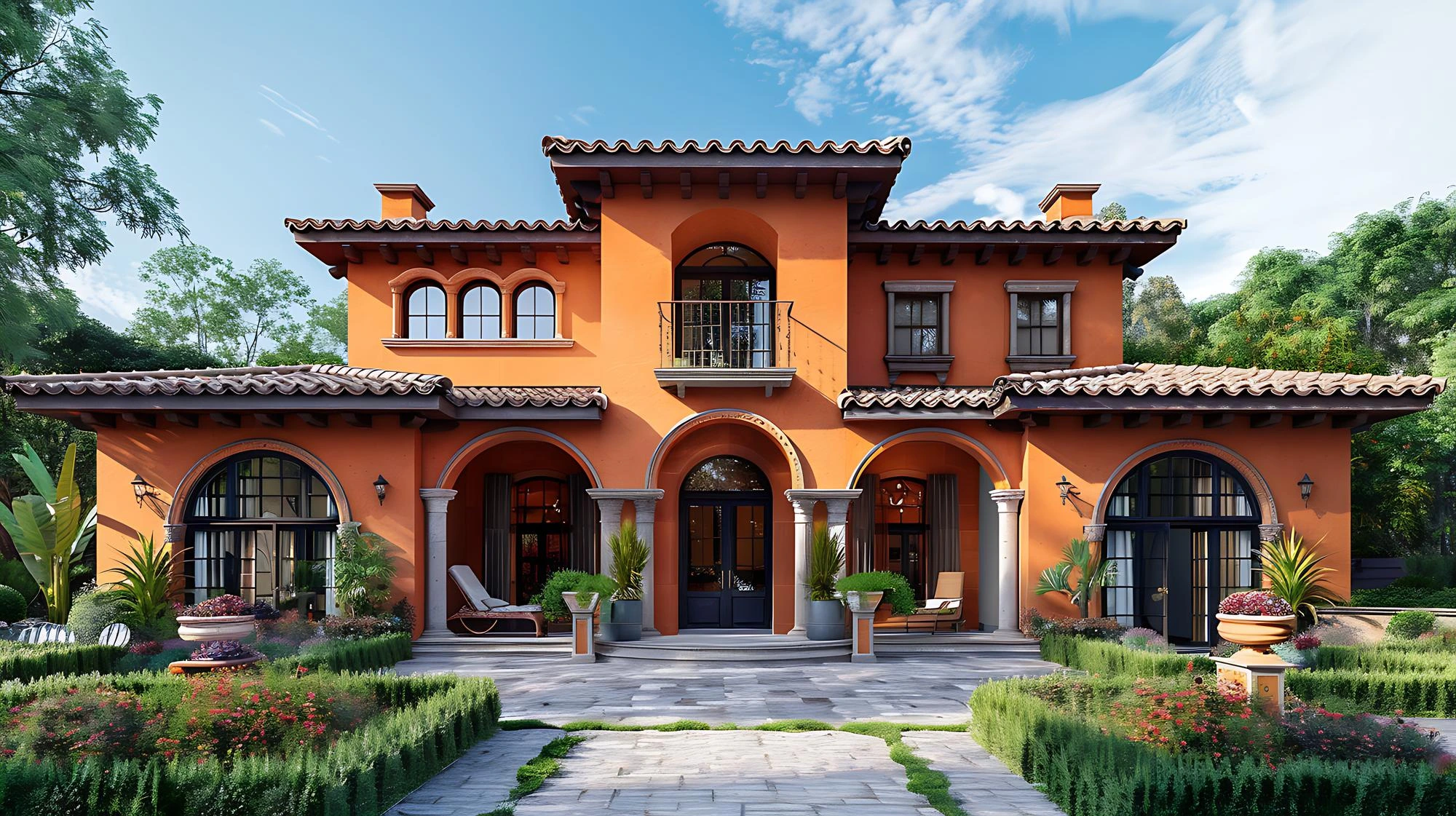
  • Warmth and Elegance: Brown tones bring a sense of warmth and richness to a space, making it feel more inviting and homely. The organic nature of wood paired with these colours creates an elegant, timeless look.
  • Versatility: Brown doors are highly adaptable and can complement both modern and traditional interior styles. Whether your décor is sleek and contemporary or rustic and vintage, brown wooden doors are versatile enough to match various themes.
  • Durability: Brown wooden doors, especially those made from hardwoods like teak and mahogany, are not just beautiful, they are incredibly durable and long-lasting, making them an ideal investment for your home.
The timeless appeal of teak

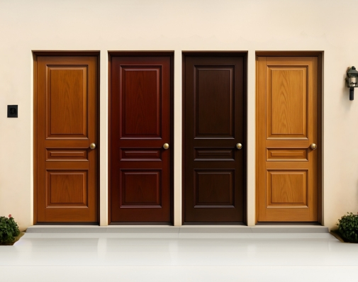
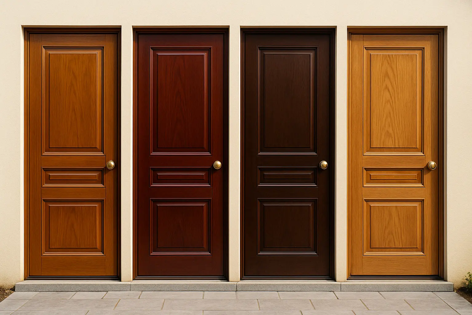
2. Exploring Teak, Mahogany, and Other Rich Brown Tones

Let’s dive deeper into some of the most popular brown wooden door colours:

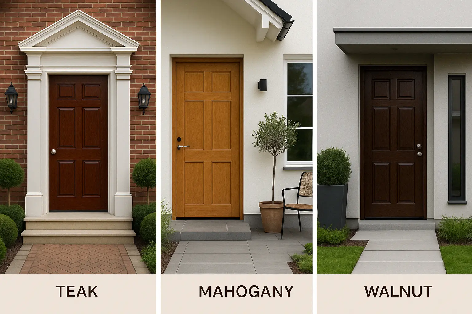
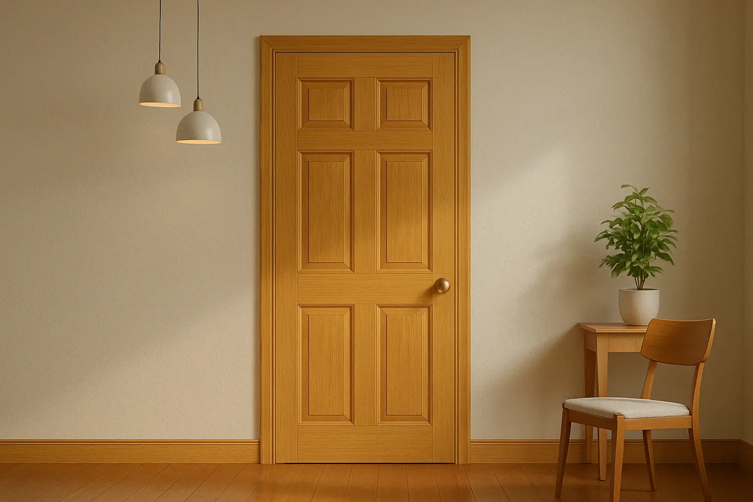
Teak: Timeless Warmth with a Rich Glow

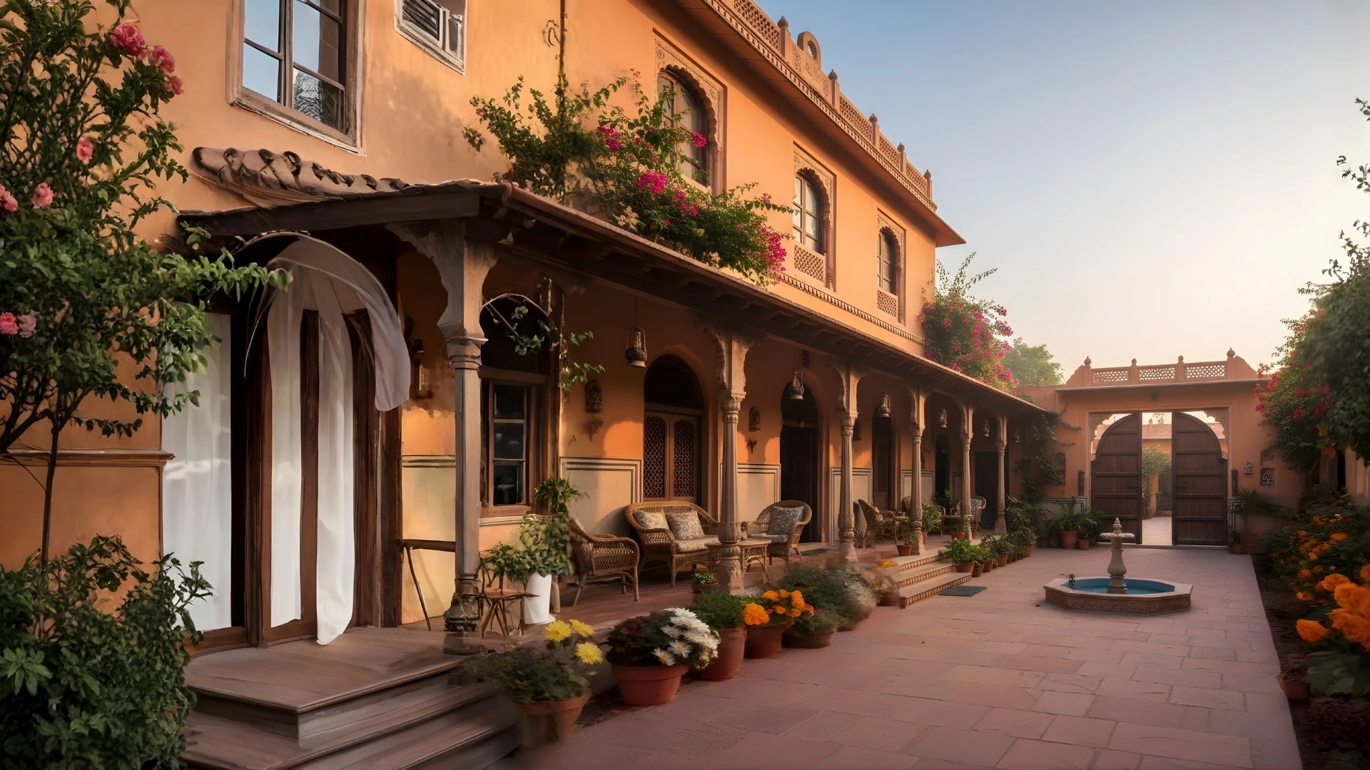
Teak is renowned for its golden-brown hue and natural resilience. It’s one of the most sought-after woods for doors due to its strength and rich colour. Teak doors often develop a beautiful patina over time, adding to their charm.

  • Indicus Woodfina enhances the inherent glow of teak, giving your door a premium, high-gloss finish that highlights the wood’s natural grain.
  • Perfect for: Homes with a warm, earthy interior style or traditional architecture.

Mahogany: Luxurious and Bold

Mahogany is a deep, reddish-brown wood that exudes luxury and sophistication. Its rich, deep hue and distinctive grain make it an excellent choice for doors that demand attention. Mahogany doors are a favourite for formal settings, lending an air of grandeur to your home’s entrance.

  • Indicus Woodfina can amplify mahogany’s bold and luxurious feel, providing an enduring shine that enhances its natural beauty.
  • Perfect for: Formal homes, grand entrances, or traditional interior styles.

Walnut: A Modern Brown Classic

Walnut is another stunning option for wooden doors. With its deep, chocolatey brown tones and beautiful grain patterns, walnut doors add a modern yet timeless feel to any home. Walnut doors can serve as a statement piece, adding both beauty and sophistication.

  • With the Indicus Woodfina finish, walnut doors receive an extra layer of protection while maintaining their stunning depth and elegance.
  • Perfect for: Modern, contemporary homes looking for a rich, dark wood.

Oak: Light, Warm, and Inviting

For a slightly lighter yet equally rich tone, oak wood offers a warm, honey-brown hue that creates a bright and inviting atmosphere. Oak is a fantastic choice for those who want a more subtle yet sophisticated wood door that still carries the warmth of brown tones.

  • Indicus Woodfina enhances the lighter, warm tones of oak, making it look polished and fresh without losing its natural appeal.
  • Perfect for: Homes with Scandinavian or minimalist décor that prefer lighter wooden tones.
The timeless appeal of teak

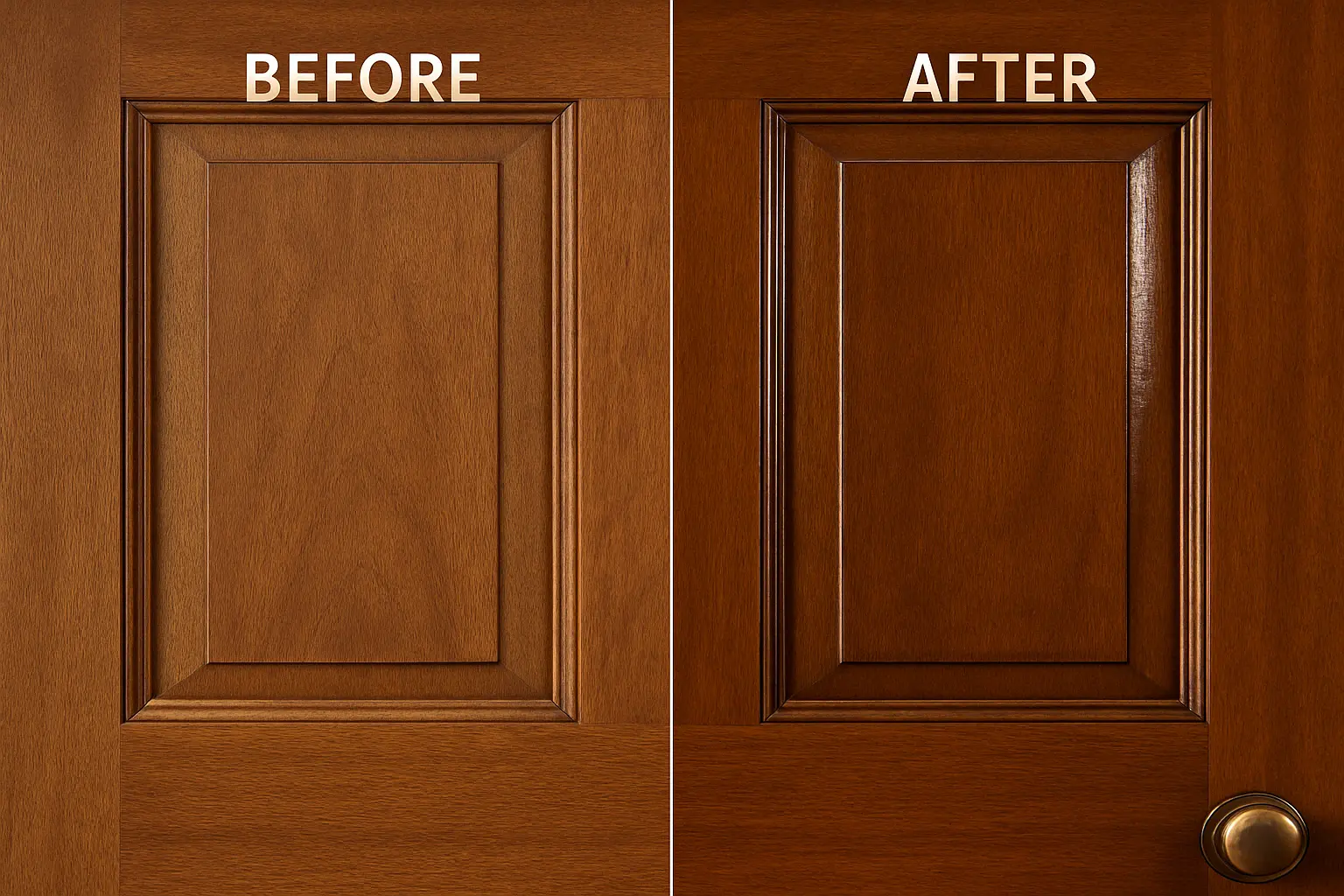
3. How Indicus Woodfina Enhances Wooden Doors

While the natural beauty of wood speaks for itself, a high-quality finish is key to bringing out its full potential. This is where Indicus Woodfina comes in. Designed to complement rich wooden doors, Indicus Woodfina enhances the wood’s grain, colour, and texture with a high-gloss, durable finish.

Key Benefits of Using Indicus Woodfina:

  • Durability: The Indicus Woodfina finish offers long-lasting protection, ensuring that your wooden doors maintain their beauty for years. It resists wear, scratches, and fading.
  • High-Gloss Shine: The glossy finish enhances the natural sheen of woods like teak and mahogany, making the colours more vibrant and eye-catching.
  • Weather Resistance: Especially important for external doors, Indicus Woodfina creates a protective barrier that helps safeguard your wooden doors from the elements, including UV rays and humidity.

By using Indicus Woodfina, you give your doors the durability and shine they deserve while accentuating their natural beauty, making them a standout feature of your home.

The timeless appeal of teak

4. Styling Your Wooden Doors with Brown Shades

Now that we know why brown shades are an excellent choice for wooden doors, let’s talk about how to style these doors in your home.

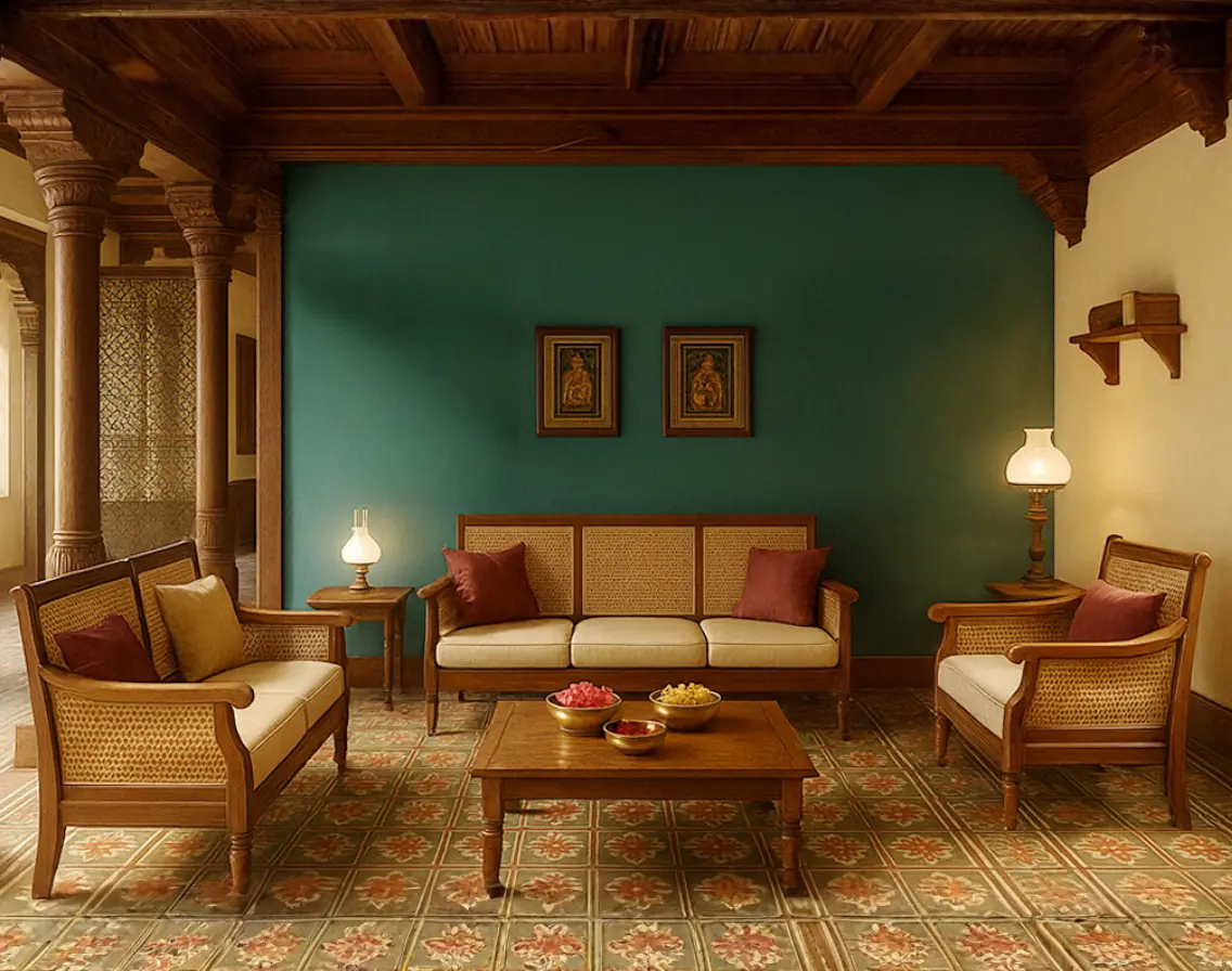
For Traditional Homes:

Rich, dark browns like mahogany or teak are perfect for homes with classic or colonial-style interiors. Pair them with warm, earthy tones like olive greens, deep oranges, or creamy beiges to create a welcoming atmosphere that is both classic and inviting.

For Modern Homes:

Lighter shades like oak or walnut work beautifully in modern or contemporary spaces. Pair these wood tones with cooler neutrals like grays, whites, and blues to create a sleek, minimalist look that still feels cozy and stylish.

For Rustic or Industrial Homes:

The rugged, natural feel of woods like walnut or oak can be paired with industrial accents like black metal, brick, and concrete to create an edgy, rustic vibe. Use Indicus Woodfina to keep the natural texture intact while adding a sophisticated shine.

The timeless appeal of teak

5. Maintenance Tips for Wooden Doors

Wooden doors require a bit of care to maintain their beauty and functionality. Here are some tips for ensuring your brown wooden doors stay in top shape:

  • Regular Dusting: Wipe down your doors regularly to prevent dust buildup and preserve their sheen.
  • Cleaning: Use a soft cloth and mild cleaning solution to remove dirt and stains without damaging the finish.
  • Reapplication of Gloss Finish: Every few years, consider reapplying Indicus Woodfina to maintain the door’s shine and durability.
  • Protection from the Elements: If your door is exposed to the outdoors, ensure that the finish protects it from harsh weather conditions by reapplying as needed.
The timeless appeal of teak

Teak, mahogany, and other rich brown wooden door colours offer a timeless elegance that never goes out of style. Whether you’re drawn to the deep reds of mahogany, the golden tones of teak, or the neutral richness of walnut and oak, brown wooden doors bring warmth, character, and sophistication to your home.

Enhancing these tones with Indicus Woodfina ensures that your doors not only look stunning but are protected against the elements for years to come.

Ready to transform your space with a beautifully finished wooden door? Choose from Indicus Paints range of premium products and bring the timeless beauty of brown wooden doors into your home today.

Eurasia (2510D): December’s Colour of Stillness and Structure

Eurasia (2510D): December’s Colour of Stillness and Structure

December brings a natural pause. The year slows, the light cools, and spaces begin to ask for calm rather than stimulation. Eurasia (2510D) is chosen for this month precisely because it aligns with that shift. It is a grounded, quiet, and precise colour — one that supports clarity, resets visual noise, and brings focus back to the essentials.

Where some winter shades feel heavy, Eurasia sits in the sweet spot: clean but not cold, deep but not dark, sophisticated without drawing unnecessary attention. It creates an environment that feels intentional and composed, which makes it ideal for the reflective mood of December.

Why Eurasia Works for December

The decision behind the colour is rooted in how people actually experience their homes at year-end. December is a time of consolidation — finishing work, preparing for the new year, reorganising, and seeking visual calm. Eurasia provides that environment.

Its strength lies in its neutrality with personality. The shade stabilises a space, cools visual clutter, and encourages structural balance in interiors. It also responds well to natural winter light, maintaining its clarity throughout the day without appearing flat or dull.

Where Eurasia Performs Best

1. Living Rooms: A Clean Visual Break

Eurasia sharpens the architecture of a living room. It works especially well on primary walls where you want definition but not dominance. When paired with structured furniture, off-white upholstery, and matte metal finishes, it produces a modern, confident space that feels curated.
Eurasia (2510D)

2. Dining Areas: Focused, Warm Minimalism

In dining zones, the colour acts as a stabiliser. It creates a cohesive backdrop for functional furniture and clean table settings. Pair it with light woods or cane for softness, or with charcoal accents for a more contemporary look.
Eurasia (2510D)

3. Kitchens: Precision and Order

Kitchens benefit from Eurasia’s disciplined undertone. On cabinets or breakfast counters, it communicates neatness and modernity. White backsplashes, brushed steel, and uncluttered counters elevate the shade further, making the space look streamlined and controlled.
Eurasia (2510D)

4. Bedrooms: Rest Through Restraint

In bedrooms, Eurasia removes overstimulation. It allows textiles, lighting, and layout to take the lead. Use the shade behind the headboard or throughout the room with warm white lighting to create a minimalist, restful environment that naturally supports unwinding.
Eurasia (2510D)

5. Semi-Outdoor Spaces: Crisp Composure

Balconies and courtyards benefit from the cool refinement of the shade. Eurasia sits well against stone, concrete, or greenery, creating a structured, quiet mood ideal for reflective mornings or evening breaks.
Eurasia (2510D)

6. Exteriors: Contemporary, Clear Lines

On facades, Eurasia projects clarity and restraint. It works particularly well for modern architecture with straight lines and minimal ornamentation. Offset it with white trims, slate elements, or light natural textures for a controlled, high-end finish.
Eurasia (2510D)

How to Style Eurasia (2510D) Intentionally

  • Combine it with controlled neutrals — warm white, light taupe, soft sand, or muted greys.
  • Use materials that echo clarity: ash wood, linen, stone, steel, or matte ceramics.
  • Prefer clean silhouettes over ornate décor; structure complements this shade better than embellishment.
  • Integrate focused lighting — warm LEDs, linear fixtures, or diffused lamps.
  • Add greenery sparingly; the shade thrives when visual noise is low.

A Colour for Resetting Spaces

Eurasia (2510D) represents more than a winter palette — it represents a mindset. December is not just the end of a year; it is a recalibration phase. Homes benefit from colours that remove excess, sharpen intention, and bring emotional and visual stability.

Eurasia does exactly that.

It gives rooms the clarity they need to close the year with focus — and enter the next with balance.

Common Bedroom Colour Mistakes That Make Your Bedroom Look Dull

Common Bedroom Colour Mistakes That Make Your Bedroom Look Dull

Your bedroom is your sanctuary, an intimate space where you can relax, recharge, and unwind. The colour scheme you choose plays a crucial role in setting the tone and atmosphere of your bedroom. However, picking the wrong colour palette can have the opposite effect, making your room feel dull, cramped, or uninviting.

In this article, we’ll explore some common bedroom colour mistakes that can make your space feel smaller, less lively, and less relaxing. We’ll also discuss how to avoid these mistakes by choosing the right colours and creating an open, comfortable atmosphere. Whether you’re revamping an old bedroom or planning a new look, we’ll help you avoid colour pitfalls and guide you toward the perfect palette for your personal retreat.

Bedroom Colour Mistakes That Make Your Bedroom Look Dull

1. Avoid Using Dark Colours for Small Bedrooms

Dark colours like deep navy blue, charcoal grey, and burgundy can make a room feel cosy, but when used in small spaces, they have the potential to make your bedroom look smaller and more confined. While dark tones are elegant and sophisticated, they can absorb light and make a room feel heavy and suffocating, especially if the room lacks natural light.

Why It Makes Your Bedroom Look Smaller:

Dark colours tend to close in a room and reduce the perception of space. They can make the walls appear closer, thereby making the room feel more enclosed and cramped. In a small bedroom, this can make the space feel claustrophobic, leaving little room for relaxation.

Bedroom Colour Mistakes That Make Your Bedroom Look Dull

How to Fix It:

Opt for lighter shades like soft beiges, ivory whites, or light greys that reflect light, creating the illusion of more space. For a touch of depth, you can use dark colours on accent walls, trims, or furniture, rather than covering the entire room in heavy hues.

Indicus Paints offers soft, neutral shades like Ivory Silk and Soft Grey that can open up your space while still maintaining elegance and warmth.

2. Too Many Bold, Saturated Colours

While bold colours like red, purple, and bright orange can inject energy and personality into a space, using too many of them in a bedroom can make the room feel overwhelming and chaotic. Bedrooms are meant to be relaxing, and too much stimulation from vibrant colours can make it hard to unwind.

Why It Makes Your Bedroom Look Dull:

When vibrant, saturated colours dominate the room, it creates visual noise that can detract from the peaceful and serene atmosphere that a bedroom should have. These colours can often clash, causing visual tension and making it difficult for the room to feel cohesive and inviting.

Bedroom Colour Mistakes That Make Your Bedroom Look Dull

How to Fix It:

Instead of covering large areas with bright, bold colours, use them sparingly as accents. For instance, you could incorporate red through pillows, artwork, or bed linens rather than painting an entire wall in it. Pastels or muted tones, like Soft Rose and Misty Lilac from Indicus Paints, will help create a soft and relaxing space while still allowing you to experiment with bold colours in smaller doses.

3. Overuse of Cool Tones

While cool tones such as blues, greens, and purples are calming, too much of them in a bedroom can make the room feel cold and impersonal. Cool tones are often used to create a relaxing atmosphere, but an excessive amount of them can result in a lack of warmth, making the room feel sterile or unwelcoming.

Why It Makes Your Bedroom Look Dull:

Cool colours can make the space feel disconnected and chilly. In a bedroom, where comfort and warmth are essential, an overuse of cool tones can cause the room to lose its cozy, inviting feel. It can also make the room feel flat, lacking in warmth and personality.

Bedroom Colour Mistakes That Make Your Bedroom Look Dull

How to Fix It:

To keep your bedroom feeling warm and inviting, pair cool colours with warm neutrals like taupes, warm beiges, or soft browns. For example, using cool blue walls with warm wooden accents or light beige bedding can create a balanced, inviting environment. Indicus Paints’ shades like Crisp Mint paired with Golden Harvest can help add warmth and dimension to your space.

4. Avoid Overusing Dark Furniture with Light Walls

This mistake is a common one in bedroom design. While light-coloured walls and dark furniture may look appealing in theory, they can often create a sense of imbalance. If your furniture is dark and heavy and your walls are light, it can cause the room to feel top-heavy or unbalanced, making it appear smaller and less cohesive.

Why It Makes Your Bedroom Look Dull:

The contrast between light walls and dark furniture can sometimes create a jarring look that disrupts the flow of the room. Additionally, it can cause the furniture to dominate the space, making the room feel cluttered and heavy.

How to Fix It:

Balance the contrast by choosing mid-tone furniture that complements the walls. For example, if you have light-coloured walls, go for a darker wooden finish or neutral-toned furniture like beige, taupe, or light wood that doesn’t overpower the room. You can also add soft, light-coloured bedding or accessories to bring warmth to dark furniture.

5. Using Only One Colour Throughout the Room

While using one colour throughout the room may seem like a simple and cohesive design choice, it can often make the space feel monotonous and dull. An entirely uniform colour scheme can cause the room to lack depth, making it feel uninspired and flat.

Why It Makes Your Bedroom Look Dull:

Using only one colour on all surfaces walls, furniture, and decor, does not allow for any visual contrast or interest. Without layering different tones or textures, your room may lack the vibrancy and energy needed to create a dynamic living space.

How to Fix It:

Introduce accent colours or textural contrasts. For example, you can use a muted wall colour like Soft Beige from Indicus Paints and then layer the space with various textures, such as wooden or metallic elements, as well as contrasting coloured furniture and accessories. Pillows, throws, and rugs in complementary colours, like deep blues or earthy oranges, can add layers and dimension to the room.

Bedroom Colour Mistakes That Make Your Bedroom Look Dull

6. Choosing Too Bright of Colours for a Bedroom

Bright colours like neon greens, fluorescent yellows, or bright pinks are typically best left for more energetic spaces like kitchens or playrooms. In a bedroom, too much brightness can create an overstimulating environment, making it difficult to relax or fall asleep.

Why It Makes Your Bedroom Look Dull:

The brightness of these colours can be overwhelming and distract from the room’s purpose of relaxation and sleep. It’s hard to achieve a calming atmosphere when the room feels too energetic.

How to Fix It:

Stick with more muted versions of bright colours, such as pale yellows, soft greens, or dusty pinks. These tones create a soft, calming environment that promotes relaxation. Indicus Paints Sunbeam Yellow and Soft Rose are perfect options to brighten up your bedroom without overwhelming the senses.

Choosing the right colour for your bedroom is essential in creating an atmosphere that is both relaxing and visually appealing. Avoiding common mistakes, like using too many dark colours or bright shades, and opting for colours that make the space feel open, warm, and balanced will ensure your bedroom remains a peaceful haven.

Remember, Indicus Paints offers a range of versatile colours that can help you create the perfect mood for your bedroom. Whether you prefer soft pastels, warm neutrals, or calming blues, there’s a perfect shade for every style and space.

Ready to transform your bedroom into a serene retreat? Explore Indicus Paints today and choose the perfect colour for your dream bedroom!

Bright & Cheerful Tones: Wall Colours to Instantly Lift Your Mood

Bright & Cheerful Tones: Wall Colours to Instantly Lift Your Mood

Our surroundings play a significant role in shaping our mood and energy levels. The walls of our home, in particular, can have a profound effect on how we feel and how we interact with the space. Bright and cheerful colours, such as warm yellows, energetic oranges, soft pinks, and light lilacs, can instantly lift your spirits and add vibrancy to your home. These colours not only bring joy but also create an atmosphere that feels welcoming, energising, and full of life.

In this blog, we’ll explore how you can use bright and cheerful tones to instantly uplift your mood at home. Whether you’re decorating your living room, bedroom, or dining area, these colours can transform your space into an energising retreat. Additionally, we’ll highlight how Indicus Paints offers the perfect hues to make your dream of a bright, happy home a reality.

1. Yellow: The Ultimate Sunshine Colour

There’s no colour that radiates warmth and positivity like yellow. Associated with the sun, yellow brings an instant burst of energy and happiness into any room. Whether you choose a soft buttery shade or a bold canary yellow, this cheerful colour can transform your walls into a beacon of light.

Indicus Paints Golden Harvest and Lemon Twist are perfect yellow shades to create a warm, welcoming atmosphere in your space. Yellow also has the power to stimulate creativity and communication, making it an ideal choice for spaces where you spend time socialising, like living rooms and kitchens.

Why It Works:

  • Energising: Yellow naturally evokes feelings of happiness and optimism.
  • Brightens Small Spaces: It makes rooms feel larger and more open.
  • Perfect for Social Areas: Yellow stimulates conversation and is a great colour for gathering spaces.

How to Style It:

  • Pair yellow with neutral tones like white or grey for a balanced look.
  • Use yellow as an accent wall or pair it with blue or green for a complementary contrast.
  • Add wooden furniture and plants for a natural, grounding touch.
Bright & Cheerful Tones: Wall Colours to Instantly Lift Your Mood

2. Orange: The Colour of Creativity and Enthusiasm

Orange is known for its vibrant energy and ability to create a lively, enthusiastic atmosphere. This colour stimulates creativity and is ideal for spaces where you want to feel inspired or motivated. It works wonderfully in areas like home offices, kitchens, or even playrooms, where activity and energy are desired.

Indicus Paints Sunset Orange and Tangerine Glow bring the warmth of the sun indoors, creating a space that’s both lively and inviting. When used strategically, orange can create a dynamic focal point without being overwhelming.

Why It Works:

  • Encourages creativity: Orange is associated with creativity and positive energy.
  • Boosts energy levels: Ideal for rooms where you want to feel motivated.
  • Creates warmth: Adds a sense of warmth and cheer to any room.

How to Style It:

  • Combine orange with neutral tones like white, cream, or beige to tone down its intensity.
  • Pair with wooden accents or brass details for a retro or eclectic vibe.
  • Use orange on one wall or in accents like furniture or accessories for a subtle burst of energy.
Bright & Cheerful Tones: Wall Colours to Instantly Lift Your Mood

3. Pink: Soft & Playful Elegance

Pink is often associated with love, gentleness, and calmness, yet it can also be playful and full of life. It’s a versatile colour that ranges from soft, romantic hues like blush pink to vibrant shades like fuchsia. Soft pinks and peachy tones are especially known for their soothing and uplifting qualities, making them ideal for bedrooms, bathrooms, and cozy corners.

For a modern twist, Indicus Paints Blush Peach and Cotton Candy offer a soft, pastel pink palette that adds a refreshing vibe to any space. These hues pair perfectly with both neutral and complementary colours to create a space that feels both serene and cheerful.

Why It Works:

  • Soothing & calming: Soft pinks create a peaceful, relaxing environment.
  • Feminine yet bold: Perfect for bedrooms, dressing areas, or living rooms.
  • Versatile: Works with almost any décor style, from modern to vintage.

How to Style It:

  • Pair pink with gold or silver accents for a luxurious, feminine touch.
  • Combine with pastel blues or mint greens for a soft, serene palette.
  • Use pink on furniture or accent pieces to brighten up a neutral room.
Bright & Cheerful Tones: Wall Colours to Instantly Lift Your Mood

4. Red: Bold & Passionate

If you’re looking to create a room that exudes passion, red is the perfect choice. This bold and powerful colour can instantly add energy and warmth to any space. Whether used on a feature wall or in accessories, red can elevate your décor and make a statement.

Indicus Paints Crimson Glow and Saffron Glow are rich shades of red that can be used to create an inviting atmosphere in the living room or dining room. Red is also known to stimulate appetite and conversation, making it ideal for dining areas or entertaining spaces.

Why It Works:

  • Bold & energising: Red energises a space and adds passion and drama.
  • Creates a sense of warmth: Perfect for colder months or spaces that need a welcoming vibe.
  • Stimulates interaction: Great for social spaces where conversation is key.

How to Style It:

  • Pair with neutral tones like beige or white to balance its intensity.
  • Use red on one accent wall to make a bold statement without overwhelming the space.
  • Combine with metallic accents like gold or brass for a luxurious feel.
Bright & Cheerful Tones: Wall Colours to Instantly Lift Your Mood

5. Lighter Pastels: Soft, Refreshing, and Inviting

If you prefer a more subtle yet cheerful palette, pastel colours like peach, light pink, and lilac are perfect for creating a refreshing atmosphere. These colours are light, airy, and welcoming, making them ideal for spaces where relaxation is key.

For a soft, pastel touch, try Indicus Paints Soft Rose and Lilac Mist, which add a sense of tranquillity and playfulness to your home. These colours work wonderfully in bedrooms, bathrooms, and smaller spaces where you want to keep the energy light and refreshing.

Why It Works:

  • Soft & serene: Pastels create a calm and peaceful environment.
  • Versatile & adaptable: Works in any room, from bedrooms to hallways.
  • Inviting & refreshing: Perfect for spring and summer, these colours create a cool, fresh feel.

How to Style It:

  • Combine with white furniture or floral décor for a soft, feminine touch.
  • Pair pastel pinks or lilacs with light wood for a Scandi-inspired look.
  • Use pastels in accent pieces like cushions or throw blankets to create a subtle, cohesive vibe.
Bright & Cheerful Tones: Wall Colours to Instantly Lift Your Mood

Bright and cheerful colours are an easy and effective way to refresh your home and uplift your mood. Whether you choose yellow for warmth, orange for energy, pink for playfulness, red for passion, or pastels for a soothing atmosphere, these tones can transform any room into a vibrant, welcoming space.

Indicus Paints offers a wide range of beautiful, high-quality colours that can help you create the exact mood and aesthetic you want for your home. From the bold hues of Crimson Glow and Tangerine Glow to the soft, calming shades of Soft Rose and Lilac Mist, the possibilities are endless.

Ready to brighten up your space? Explore Indicus Paints and bring these cheerful tones to life in your home. Let the colours you choose not only enhance your décor but also inspire positivity and joy every day.

Pumpkin Patch (2066T): November’s Colour of the Month

Pumpkin Patch (2066T): November’s Colour of the Month

November carries a gentle transition — the festive sparkle begins to fade, and a golden calm settles in. The days grow shorter, the air cooler, and homes seek warmth and serenity after the celebrations. Pumpkin Patch (2066T) captures this shift beautifully.

It’s a colour that feels radiant yet composed, blending festive brightness with seasonal stillness. With its warm undertone and earthy depth, Pumpkin Patch reflects the mellow light of Indian winters, filling every space with quiet comfort and positivity.

The Thought Behind the Colour

Pumpkin Patch draws inspiration from the warmth of Indian living — the terracotta courtyards, marigold flowers, and sunlit verandahs that define our homes. It resonates with our sense of familiarity and comfort, while still feeling modern and fresh.
Pumpkin Patch 2066T
The hue was chosen for November because it perfectly bridges the energy of autumn and the tranquillity of approaching winter. It’s bright enough to keep interiors cheerful and inviting, yet soft enough to create balance after the vibrance of the festive months.

Design Inspirations for Indian Homes

Living Room: Inviting and Timeless

Pumpkin Patch brings a refined glow to living spaces. It works beautifully as an accent wall colour, setting a warm tone for gatherings or quiet evenings. Pair it with ivory or soft grey upholstery, wooden accents, and textured fabrics like linen or cotton. A touch of metallic décor or amber lighting adds subtle luxury to the space.
Pumpkin Patch 2066T

Dining Space: Comfort in Conversation

This shade lends a natural glow to dining areas, where connection and comfort meet. Use it on the backdrop wall or through décor elements like wall plates, woven runners, or dining chairs. Combine it with cane, beige, or polished wood finishes to create a welcoming, earthy atmosphere perfect for long dinners and festive reunions.

Kitchen: Fresh Energy with Familiar Warmth

Pumpkin Patch can transform kitchens into lively, grounded spaces. Try it on cabinets or breakfast counters for a cheerful yet sophisticated look. Complement it with matte black or brushed brass hardware, white tile backsplashes, and natural stone finishes. It balances functionality with an inviting warmth that feels effortlessly homely.

Bedroom: Calm Wrapped in Warmth

In bedrooms, Pumpkin Patch feels soft and cocooning. Use it on a headboard wall or in muted doses through textiles — throws, cushions, or curtains. It pairs beautifully with off-whites, sand tones, and natural wood. Add diffused lighting and minimal décor for a tranquil, restful setting that still carries warmth.

Pumpkin Patch 2066T

Courtyard & Balcony: Earthy Charm Outdoors

For Indian homes with semi-open or green spaces, Pumpkin Patch fits seamlessly. The colour complements terracotta tiles, bamboo furniture, and potted plants, bringing a cohesive, sunlit charm. Under morning or evening light, it enhances architectural details and feels naturally connected to the outdoors.

Exteriors: Warm Welcome in Every Facade

Pumpkin Patch makes for a distinctive yet elegant exterior shade. It glows beautifully under sunlight while maintaining a balanced earthy tone. Paired with off-white trims, stone textures, or muted roof colours, it adds personality without overpowering the structure — ideal for homes that want to feel rooted yet refreshed.

Pumpkin Patch 2066T

How to Style Pumpkin Patch (2066T)

  • Combine it with neutral palettes — beige, taupe, or ivory — for a grounded look.
  • Use natural materials like wood, jute, and linen to complement its earthy feel.
  • Add brass, amber glass, or gold-toned lighting for warmth and depth.
  • Balance its brightness with greenery or terracotta accessories for a cohesive finish.

A Colour That Belongs

Pumpkin Patch (2066T) reflects the Indian sense of comfort — where warmth meets simplicity and brightness carries emotion. It’s a shade that fits every corner of the home, from vibrant social spaces to calm private retreats.

This November, let your home glow with the soft energy of Pumpkin Patch — a colour that celebrates both the lingering joy of the season and the serenity of what comes next.

With Indicus Paints’ curated palette, you can find shades that capture every season’s story — from the glow of summer to the calm of winter. Pumpkin Patch (2066T) is November’s chapter — radiant, rooted, and undeniably home.

Find the Perfect Wall Colour to Match Your Tamil-Inspired Interiors

Find the Perfect Wall Colour to Match Your Tamil-Inspired Interiors

South Indian homes, especially those shaped by Tamil tradition, are more than just structures. They are sensory experiences defined by breezy courtyards, carved columns, vibrant murals, and natural materials. At the heart of these spaces is colour: not just as decoration, but as memory, identity, and function.

Let’s dive deep in translating this rich aesthetic into modern homes using Indicus Paints, giving you both inspiration and clear, practical steps to choose the right shades for each space.

1. Understanding the Colour Logic Behind Tamil Architecture

Before choosing your wall colours, it’s important to understand the design philosophy of traditional Tamil architecture. At its core, Tamil architecture prioritises function over form, with an emphasis on clean lines, easy maintenance, and minimalistic layouts.Wall colours follow this same principle. The palette is typically restrained, with beiges, whites, greens, and earthy tones chosen to enhance the simplicity and practicality of the space. Accent colours are used thoughtfully, often inspired by traditional art forms like Athangudi tiles, Tanjore paintings, and temple murals.Here’s how colour choices were traditionally guided:
  • Heat Reflection: Lighter shades like Divinity Cream and Mission Beige help keep interiors cool in hot climates.
  • Symbolism & Ritual: Yellows and reds, seen in areas like entrances or pooja rooms, represent auspiciousness and spiritual energy.
  • Material Harmony: Colours were selected to complement native materials like wood, stone, lime plaster, and Athangudi tiles.
When you follow this logic, you’re not just picking colours. You’re preserving the soul of the space and avoiding choices that feel out of place or overpowering.
Wall Colour to Match Your Tamil-Inspired Interiors

2. Finding the right Tamil colour

Tamils have always used colours to bring life and feeling into their homes. Over the years, many unique shades have become part of everyday culture. These colours are often known by local names like Kili Pachai (parrot green), Ramar Neelam (Rama’s blue), and Kathiripoo Colour (lavender), each carrying a bit of tradition and familiarity.

One of the first challenges in recreating these heritage-inspired interiors is finding the right modern paint equivalents. To help you get started, we’ve mapped a few iconic Tamil architectural colours to their closest matches in the Indicus colour palette.

Traditional InspirationIndicus ShadeBest Used In
Kaavi (Brick Red)Adventure (2189C)Accent walls, columns, verandas
Manjal (Turmeric Yellow)Mustard (2698D)Kitchen walls, dining nooks, entrances
Ramar Niram (Ramar’s colour)Navy Blue (2994C)Bedrooms, window borders, reading corners
Kili Pachai (Parrot Green)Radiant Green 2567CCourtyard-facing walls, balconies
Sandalwood BeigeMission Beige (2078P)Living rooms, hallways
Temple Wall WhiteWhite Cliffs (2505P)Ceilings, pooja spaces, full-room coverage
Coconut Husk BrownAmber Brown (2105C)Doors, trims, furniture
Rose Powder PinkTearose Pink (2122P)Guest rooms, kid-friendly spaces
Temple Stone GreyGrey Shadow (2946P)Guest rooms, kid-friendly spaces

Use a neutral shade for larger surfaces, and layer heritage colours as highlights, trims, or feature walls.

3. Room-by-Room: Where to Use What

In a Tamil home, every room tells a story and every colour carries mood, memory, and meaning. You can’t just pick shades at random and expect your space to feel right. Let’s walk through your home, room by room, and explore how to use Indicus colours to reflect purpose, tradition, and beauty.

Living Room

Inspiration: The Tamil living room is where hospitality takes center stage. It is the space where guests are welcomed, conversations flow, and traditions are shared. The design draws from the warmth of Chettinad courtyards, the earthy tones of terracotta flooring, and the grounded elegance seen in ancestral homes and temple halls.
  • Mood: Warm, vibrant, and welcoming
  • Colours:
    • Adventure (2189C) on the main wall—a terracotta-inspired tone that brings earthy depth and boldness
    • Mission Beige (2078P) on remaining walls—a calming, neutral backdrop that lets furniture and accents shine
  • Pair With: Wooden or cane furniture, brass lamps, Athangudi tile flooring, warm white or gold-toned LED lights
  • Cultural Cue: Terracotta tones are found in temple architecture and Chettinad roof tiles, evoking rootedness and warmth
Wall Colour to Match Your Tamil-Inspired Interiors

Dining Room

Inspiration: Designed for gathering and conversation, the dining space in a Tamil home balances tradition with ease. Colour choices here are influenced by the vibrancy of Tamil cuisine, using warm yellows, muted browns, and earthy neutrals. Paired with bronze serveware and clean-lined furniture, these tones create a setting that feels rooted in culture and modern in style.
  • Mood: Energetic and bonding
  • Colours:
    • Mustard walls to stimulate appetite and brighten the space
    • Amber Brown (2105C) for trims, door frames, or lower walls—adding depth and contrast
  • Pair With: Bronze serveware, dark wood dining sets, yellow-hued pendant lights
  • Cultural Cue: Mustard yellow reflects turmeric’s sacred and celebratory role in Tamil rituals and cooking
Wall Colour to Match Your Tamil-Inspired Interiors

Bedroom

Inspiration: Tamil bedrooms often embrace a sense of coolness and calm, drawing from shaded verandas, soft indigo fabrics, and the quiet stillness of early mornings. These spaces are designed for rest, reflection, and understated elegance. Choose colours that support relaxation while still honouring the cultural soul of the home.
  • Mood: Calm, grounding, restful
  • Colours:
    • Navy Blue (2994C) or Grey Shadow (2946P)—cool, soothing tones for rest.
    • Accents in Divinity Cream (2702P) or Mission Beige to balance depth with softness.
  • Pair With: Off-white curtains, contemporary artwork for a modern twist, and minimal lighting
  • Cultural Cue: In rooms with limited natural light, choose Grey Shadow over deep blues to avoid a heavy look
Pooja Niche or Entry way

Kitchen

Inspiration: Tamil kitchens are practical, bright, and built for efficiency. Traditionally compact and well-ventilated, they favour surfaces that are easy to clean and colours that reflect light and freshness. Lime-washed walls and earthy tones offer a timeless reference point, making way for modern updates that still feel grounded and familiar.
  • Mood: Clean, bright, and functional
  • Colours:
    • Divinity Cream (2702P) as a base—crisp, light-reflective, and airy
    • Amber Brown (2105C) for cabinetry or backsplash adding a sense of groundedness.
  • Pair With: Brass or steel utensils, patterned tile backsplashes, and potted herbs
  • Cultural Cue: Cream tones are inspired by lime-washed walls seen in agraharam homes and temple kitchens.

Pooja Niche or Entryway

Inspiration: In modern Tamil homes, entryways and compact pooja niches are subtle yet meaningful spaces. Even in smaller layouts, thoughtful use of colour can create a sense of calm and focus. Inspired by temple motifs, kolam outlines, and festive powders, these shades bring a touch of tradition to corners that often serve as both functional and reflective zones.
  • Mood: Sacred, serene, and uplifting
  • Colours:
    • Golden Mustard for a devotional base
    • Tearose Pink (2122P) to bring festive softness
    • Grey Shadow (2946P) for trims or kolam-style borders
  • Pair With: Bronze idols, fresh jasmine, wooden shelves, and soft diyas
  • Cultural Cue: Tearose Pink evokes temple rose powders, while grey tones mimic vibhuti (sacred ash) borders seen in shrines
Wall Colour to Match Your Tamil-Inspired Interiors

4. Choosing the Right Paint: More Than Just Colour

here is aesthetics and there is quality. Sure there are a lot of cheap after market paints that would help you achieve a decent result, but quality in terms of consistent colours, coverage, durability, low emissions etc. would help you save a lot more in the long run.

Key factors for considering a good quality paint.
  • Low-VOC, high-quality paints: Safe for kids, elders, and pets.
  • Durable formulations: Withstands humidity and heat in tropical climates.
  • Expansive colour palette.

5. Final Planning Checklist Before You Paint

  • Measure your light exposure: Darker colours like Navy Blue work best in well-lit spaces
  • Choose a neutral base (like Mission Beige or Divinity Cream) to avoid visual clutter
  • Match your furniture material with the colour tone: wood goes well with warm shades
  • Use tester pots before full application
  • Don’t forget trims and borders, they add detail and definition

At Indicus Paints, we offer a wide range of products and colour collections to help you bring your dream home to life, no matter what style you love. Whether you’re drawn to rich, traditional Tamil-inspired colours or prefer clean, modern Scandinavian looks, we have it all. All you need is a vision. We’ll take care of the rest with the right tools, materials, and expert support to guide you along the way.

Visit our Colours page and check out our blogs for more ideas, inspiration, and helpful tips. Let your home reflect meaning, memories, and beauty with every brushstroke.

DIY Balcony Painting: Top Colour Trends for Indian Homes

DIY Balcony Painting: Top Colour Trends for Indian Homes

The balcony, often an overlooked space in many Indian homes, can be transformed into a serene outdoor retreat with just a bit of paint and creativity. A well-painted balcony not only enhances the curb appeal of your home but also creates a relaxing atmosphere where you can unwind, sip your morning tea, or entertain guests.

As the outdoor space continues to gain importance, choosing the right colours for your balcony is crucial in bringing both beauty and functionality to this area. The right colours can make your balcony look more expansive, complement your home’s exterior, and reflect your personal style. Whether you’re looking for bright and lively colours or subtle and calming shades, we’ll walk you through the top balcony painting trends that are perfect for Indian homes.

In this blog, we’ll explore some of the latest colour trends for balconies, as well as provide Indicus Paints recommendations, DIY tips, and ideas to help you achieve a stunning balcony makeover.

DIY Balcony Painting

Bright and Bold: Vibrant Colours to Infuse Energy

Vibrant, bold colours have always been a popular choice in Indian homes, and they are now making their mark in balcony designs. Using bright colours like turquoise, coral, or mustard yellow on your balcony walls can infuse the space with energy and create an inviting atmosphere.

For a refreshing look, consider using Indicus Paints Ocean Breeze or Sunset Orange. These colours are vibrant and lively and can turn your balcony into a cheerful escape. Whether you use them on feature walls, furniture, or door frames, bold colours can elevate the charm of your outdoor space, making it the perfect spot to relax or host casual get-togethers.

Why It Works:

  • Bright hues like turquoise or mustard yellow add a lively atmosphere to your outdoor space.
  • They reflect the vibrant energy of Indian culture, making them a great fit for balconies that are used to entertain guests.
  • Perfect for Indian homes that need a pop of colour to balance neutral exteriors.

How to Style It:

  • Combine bold colours with neutral furniture to avoid overwhelming the space.
  • Add greenery like potted plants, hanging vines, or succulents for a more refreshing, nature-inspired vibe.
  • Pair bold colour choices with rustic or wooden outdoor furniture to balance vibrancy with warmth.
DIY Balcony Painting

Soothing Pastels: Calm and Relaxing Ambience

If you’re aiming for a more tranquil, soothing outdoor environment, soft pastels are the perfect choice for your balcony. Light shades like mint green, peach, lavender, and powder blue create a serene ambiance, making them ideal for relaxing or reading. These colours can make even small balconies feel more expansive and airy.For a soft and refreshing look, you can try Indicus Paints Sea Breeze or Soft Rose. These colours bring a sense of calm and relaxation to your outdoor space, making it feel like a private sanctuary. These shades also work well with traditional Indian décor and can be combined with cushions and throws in complementary tones.

Why It Works:

  • Pastel colours create a calming atmosphere, perfect for winding down.
  • They make small spaces appear larger and more open, which is ideal for city apartments or compact balconies.
  • Pastels add a touch of softness and elegance, without overpowering the exterior aesthetic of your home.

How to Style It:

  • Pair pastel colours with light, airy furniture like wicker chairs, outdoor cushions, and a small coffee table.
  • Complement pastel walls with simple décor—think natural textures like linen, rattan, or wooden furniture.
  • Add soft lighting, like fairy lights or lanterns, to enhance the calm atmosphere during the evenings.
DIY Balcony Painting

Earthy Tones: Nature-Inspired Shades for a Grounded Look

If you prefer a more organic, grounded look for your balcony, earthy tones like terracotta, warm beige, sandstone, and olive green are excellent choices. These colours evoke the natural beauty of the outdoors and work well to create a rustic, natural vibe on your balcony.Indicus Paints Golden Harvest and Saffron Glow are ideal examples of earthy tones that can elevate the aesthetic of your balcony. These shades evoke the beauty of the earth and provide warmth, which is perfect for balconies in tropical and subtropical regions of India. Earthy colours can help your balcony blend seamlessly with the surrounding environment, especially when combined with natural materials like wood, stone, and terracotta.

Why It Works:

  • Earthy tones bring a sense of warmth and connection with nature, ideal for outdoor spaces.
  • They are versatile and can complement a variety of architectural styles, from traditional Indian homes to contemporary designs.
  • These colours create a grounding effect and can help your balcony feel like an extension of your garden or yard.

How to Style It:

  • Mix and match earthy tones with large plants, wooden furniture, and woven textiles for a natural and rustic look.
  • Use terracotta planters or woven baskets to enhance the earthy vibe.
  • Add natural stone tiles for flooring to create a seamless blend with the surrounding environment.
DIY Balcony Painting

Classic White and Neutrals: Timeless Elegance

For a clean, sophisticated look, classic whites and neutral tones are always in style. White walls, beige, and light greys can help your balcony appear fresh, spacious, and elegant. These colours are especially effective in making your outdoor area look well-maintained and timeless.

Using Indicus Paints Ivory Silk or Moon Shell will give your balcony a light, airy feel while still providing an elegant touch. Neutral tones also act as a blank canvas for other colourful accessories, allowing your furniture, cushions, or plants to stand out and create a lively, personalized space.

Why It Works:

  • Neutral colours create a clean, polished, and timeless look.
  • They are incredibly versatile and can be paired with almost any décor style.
  • Ideal for urban environments or balconies with minimal space that need to appear larger.

How to Style It:

  • Add bold coloured furniture or vibrant accessories to complement neutral walls and give the space character.
  • Use white wicker furniture and bright throw pillows to bring some colour to the otherwise minimalist space.
  • Incorporate metallic or glass accents like lanterns or vases for a touch of elegance.
DIY Balcony Painting

Tropical Greens: A Refreshing Look for Your Balcony

If you’re seeking a tropical vibe for your balcony, shades of green are a fantastic choice. Green is synonymous with freshness, vitality, and nature, and it can make your outdoor space feel like a lush garden oasis. Choose from shades like forest green, sage, or even a bright lime green for a more lively and energetic feel.

Indicus Paints Verdant Dream or Emerald Calm would be excellent options for creating a tropical, green-themed balcony. These colours bring an organic feel to the space and pair wonderfully with greenery and plants.

Why It Works:

  • Green is associated with growth, nature, and tranquility, making it perfect for outdoor living spaces.
  • It helps balance the often hot and sunny environment by creating a fresh and peaceful vibe.
  • Works particularly well in balconies surrounded by plants, flowers, and natural light.

How to Style It:

  • Mix green walls with vibrant potted plants, hanging vines, or trellises to enhance the tropical theme.
  • Pair with wooden or bamboo furniture for an earthy, natural look.
  • Add outdoor curtains or shade sails in neutral tones to complement the vibrancy of green.
DIY Balcony Painting

Painting your balcony is an easy and effective way to revamp your outdoor space and make it a functional extension of your home. By selecting the right colours, you can transform your balcony into a cozy, vibrant, or peaceful retreat. Whether you opt for bold vibrant colours, calming pastels, or earthy tones, the possibilities are endless.

With Indicus Paints, you can explore a wide range of colours that suit every style and transform your balcony into a stylish, inviting space.

Ready to refresh your balcony? Dive into Indicus Paints colour palette and bring your vision to life with high-quality paints that will ensure lasting beauty.

Crushed Strawberry (2222D): October’s Colour of the Month

Crushed Strawberry (2222D): October’s Colour of the Month

There’s something unmistakable about October. A shift in the air, a softness in the light, and a quiet joy that lingers just before celebrations begin. Crushed Strawberry (2222D) from Indicus Paints captures that moment perfectly.It doesn’t whisper; it illuminates spaces with gentle confidence. It’s not bold in the obvious way, yet it uplifts every corner it touches. A hue that feels like warmth shared: tender, graceful, and effortlessly cheerful.As homes prepare to glow with festive colour, Crushed Strawberry sets the tone with clarity and charm, welcoming light, laughter, and togetherness. Every room it touches comes alive with subtle energy, creating a backdrop for moments that matter—a gentle celebration of life at home.

Why Crushed Strawberry Works in October

1. Embodies the Season

October is the threshold between calm and celebration. Crushed Strawberry mirrors this shift—soft yet radiant, quiet yet undeniably present. It’s the blush of evening skies, the warmth that transforms walls into a home you can feel, not just see.

2. Creates Warmth with Presence

This isn’t a decorative pink; it’s a shade that feels human, lived-in, and inviting. It turns every room into a space of care, laughter, and connection. Perfect for the festive season, where hospitality is as much about heart as tradition.

3. Elegantly Versatile

Crushed Strawberry adapts beautifully to every home style, from modern minimalism to culturally rooted design. Pair it with warm whites, creams, muted golds, or light woods to create spaces that feel intentional, cozy, and effortlessly stylish.

Bring Crushed Strawberry into Your Home

Living Room: Warmth That Draws People In

The living room is where stories unfold, and Crushed Strawberry makes it glow with quiet charm. Use it on an accent wall or as a subtle backdrop that welcomes attention without overpowering the space. The shade instantly warms up the room, creating a sense of light and connection.

  1. Pair with ivory or beige furniture to balance the vibrancy with calm.
  2. Add brass, rose-gold, or cane elements for an understated festive touch.
  3. Use warm, diffused lighting—table lamps, wall sconces, or diyas—to let the colour’s inner glow shine through.
  4. Complement with natural fabrics, soft cushions, and minimal décor to keep the look refined yet inviting.
Crushed Strawberry
Crushed Strawberry turns the living room into a space that feels alive—elegant, personal, and effortlessly welcoming.

Bedroom: Calm, Cozy, and Intimate

In bedrooms, Crushed Strawberry softens the atmosphere, wrapping the space in a cocoon of warmth and comfort. It’s a hue that whispers relaxation and feels inherently nurturing.

  1. Paint the wall behind the bed or create a blush-toned alcove to anchor the room.
  2. Layer the palette with white, nude, or pastel linens for a calm visual rhythm.
  3. Introduce textured throws, knitted cushions, or cane headboards for depth and tactility.
  4. Touches of matte gold in lighting or art frames add subtle elegance without overwhelming the calm.
Crushed Strawberry
This setting feels modern yet soulful—perfect for winding down while keeping an air of grace and intimacy.

Kitchen & Dining: Everyday Joy with a Festive Heart

Crushed Strawberry brings freshness and energy to spaces that thrive on activity and togetherness. In the kitchen or dining area, it adds a sense of cheer that turns even simple meals into shared celebrations.

  1. Use the shade on lower cabinets, breakfast counters, or niche walls for a refreshing accent.
  2. Pair it with cream or sand-toned tiles to create visual balance.
  3. Add brushed black or matte gold handles and fixtures for a sophisticated contrast.
  4. Bring life into the space with potted herbs, terracotta jars, or wicker baskets to complement the warmth with natural textures.
Crushed Strawberry
It’s a look that feels both functional and festive—lively in the day, glowing softly at night.

Courtyards & Balconies: Where Nature Meets Celebration

Few places showcase Crushed Strawberry better than outdoor corners bathed in sunlight. Its luminous undertone complements nature beautifully, glowing against green foliage and wooden textures.

  1. Paint a small parapet, feature wall, or planter section in Crushed Strawberry to introduce a gentle, joyful pop.
  2. Pair with rustic wooden or woven furniture for a relaxed yet chic setting.
  3. Add string lights, diyas, or lanterns to enhance the evening glow.
  4. Accessorize with clay planters, brass pots, or floral arrangements for festive charm.
Crushed Strawberry

As daylight shifts, the colour transforms—soft and romantic in the morning, vivid and radiant by dusk. It becomes the heart of your home’s outdoor warmth, bridging nature and festivity with effortless elegance.

October in Colour

October is alive with anticipation. Crushed Strawberry (2222D) by Indicus Paints transforms that feeling into colour—warm, radiant, and welcoming. It doesn’t shout; it declares presence, creating spaces where family, friends, and celebrations naturally gather.

As diyas light up corners and laughter fills rooms, Crushed Strawberry becomes more than paint. It’s the glow of shared moments, a colour that makes every day feel ready for celebration.

Beyond Strawberry: A World of Colour

At Indicus Paints, every month tells a story in colour. While October celebrates Crushed Strawberry (2222D), our palette extends far beyond—from serene pastels to radiant brights—each crafted to suit Indian homes, moods, and moments.

Whether you’re designing a festive corner or reimagining your entire home, there’s always a shade waiting to match your light, warmth, and personality.