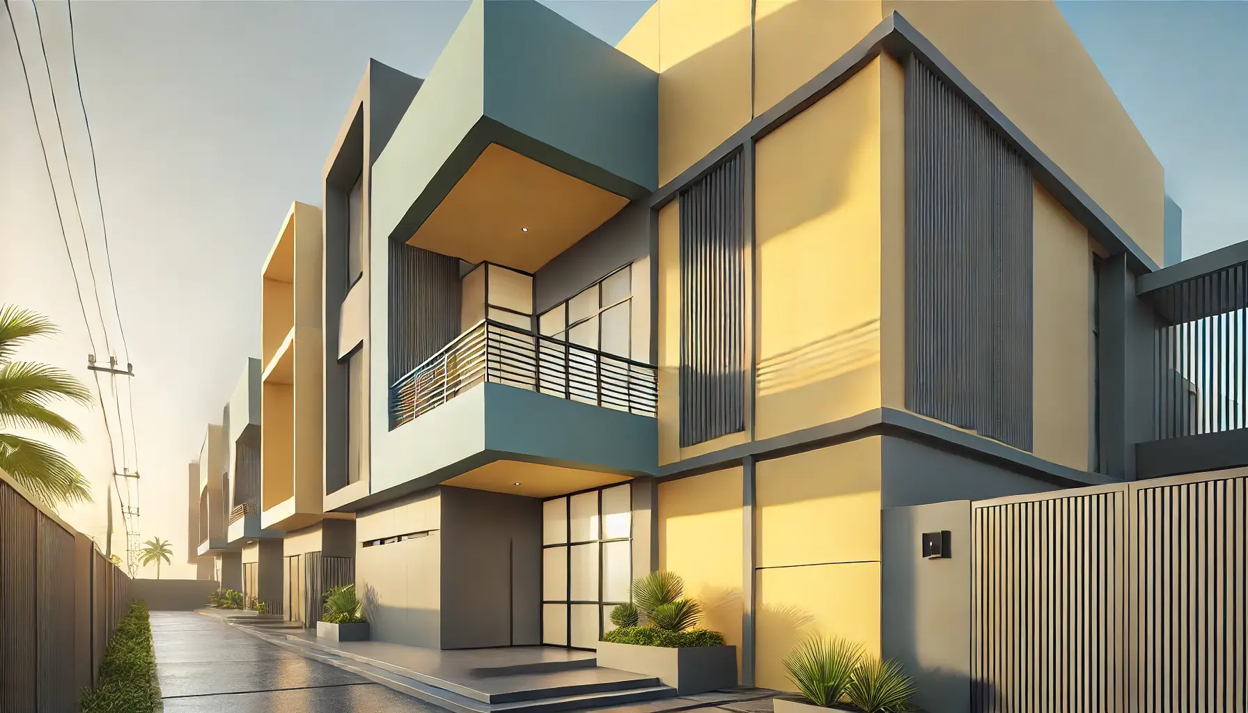
Quick and Easy DIY Spray Painting for Door and Cabinet Makeovers
Looking for a quick, hassle-free way to refresh your doors and cabinets? Spray painting is the perfect solution! Unlike traditional brush painting, spray paint provides a smooth, even finish, dries faster, and eliminates brush strokes—making it ideal for DIY home makeovers.
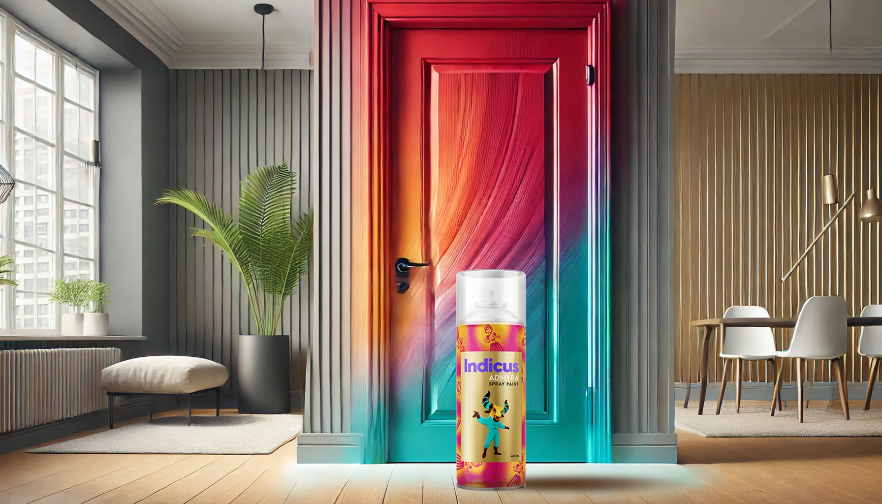
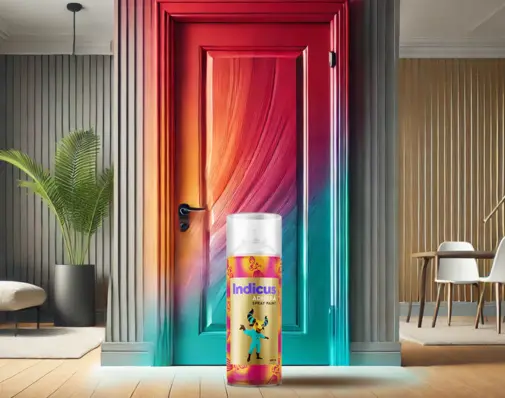
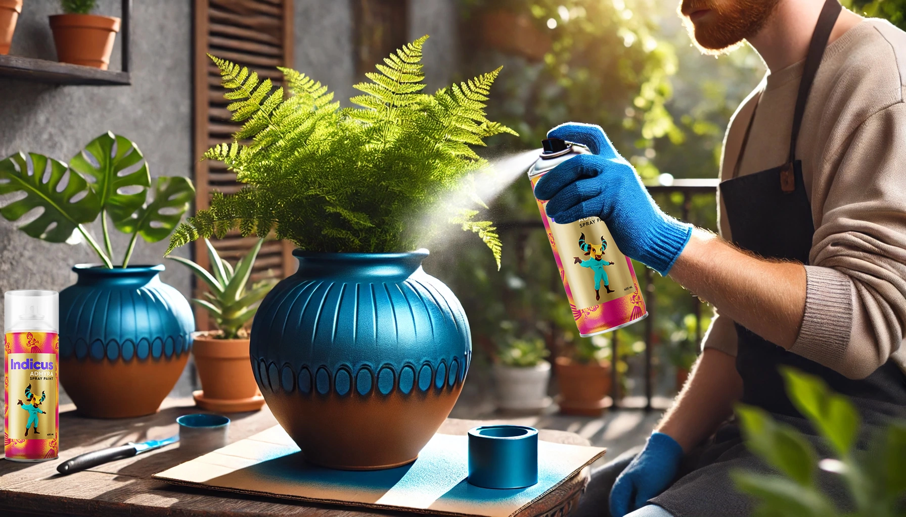
With Indicus Admyra Spray Paint, you can transform your old cabinets and doors into sleek, stylish statement pieces with minimal effort and maximum impact. Whether you’re aiming for a modern, high-gloss finish or a rustic, distressed look, these easy spray painting ideas will help you achieve professional-quality results in no time.
Let’s dive into step-by-step techniques, expert tips, and creative ideas to make your DIY spray painting project a success!
Why Choose Spray Painting for Your Doors & Cabinets?
Spray painting is an efficient and stylish way to update your home without the hassle of traditional painting methods. It offers smooth coverage, a streak-free finish, and a variety of colours and finishes to match your desired aesthetic.
Some key benefits of spray painting include:
- Quick and easy application with no need for brushes or rollers
- Even, streak-free finish for a professional look
- Faster drying time, allowing for multiple coats in a single day
- Versatile finishes with a range of colours and gloss levels
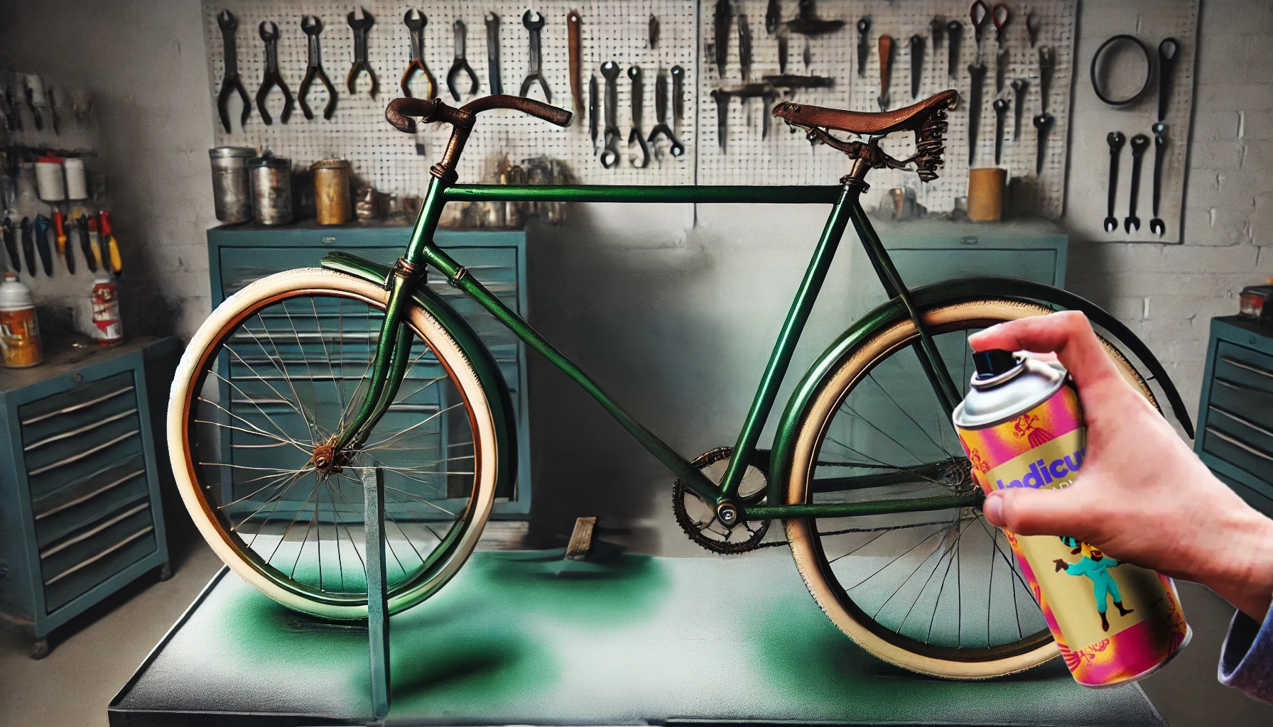
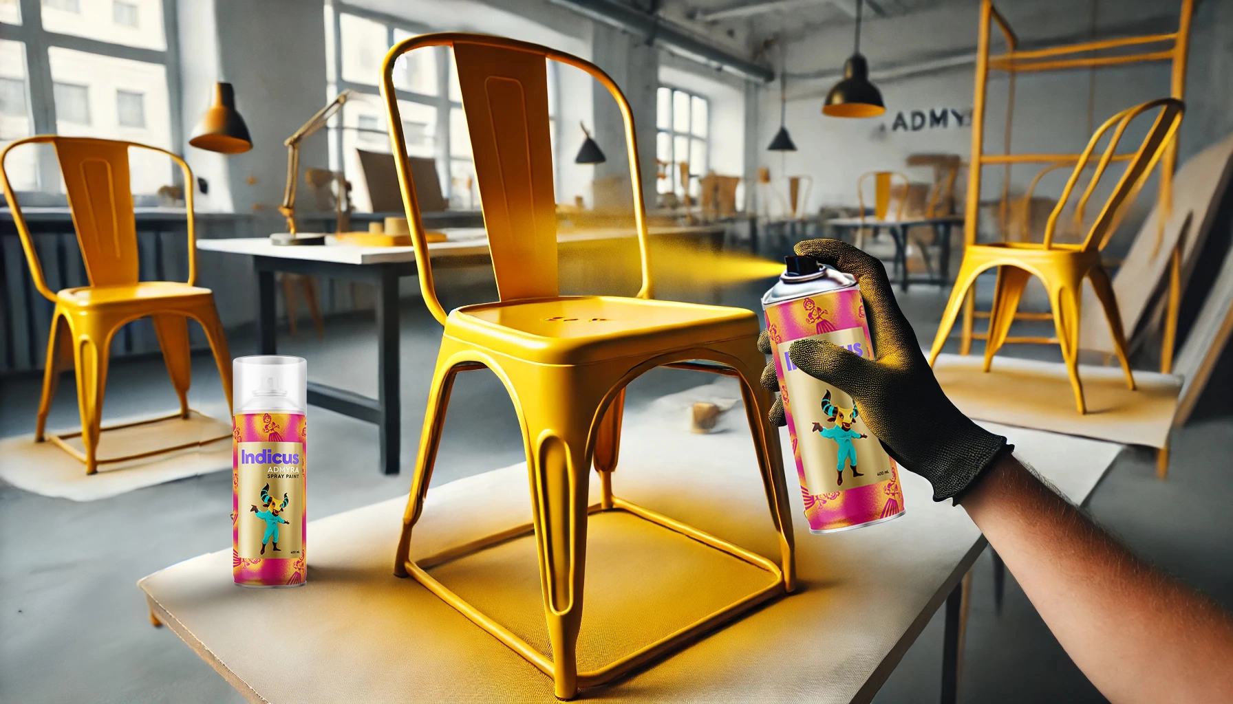
- Ideal for different surfaces, including wood, laminate, and metal
Choosing the Right Spray Paint for a Professional Finish
1. Why Indicus Admyra Spray Paint?
For the best results, use Indicus Admyra Spray Paint, designed for doors, cabinets, furniture, and metal surfaces. It is formulated to provide:
- Quick-drying technology – Reduces waiting time between coats.
- Superior adhesion – Ensures lasting durability.
- Smooth, even coverage – No drips or streaks.
- Wide range of finishes – Glossy, matte, and metallic options.
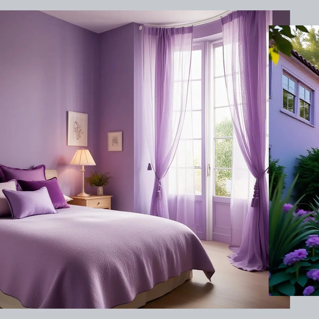
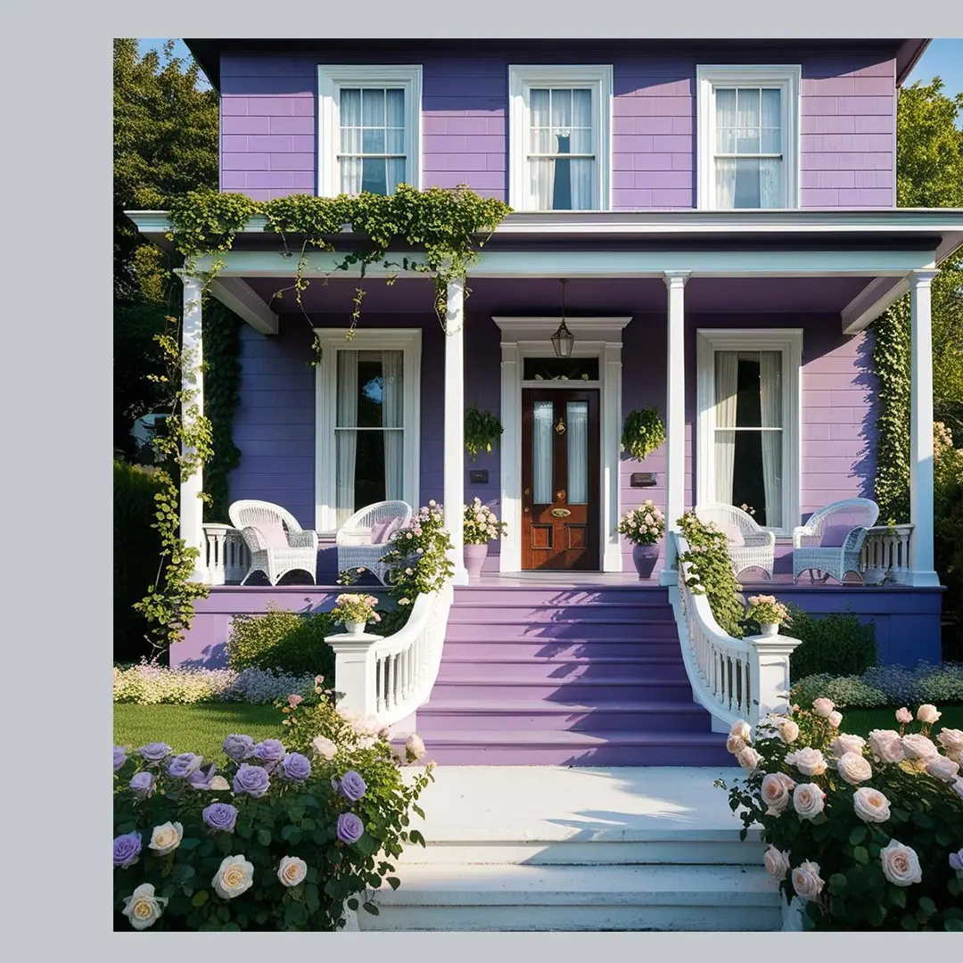
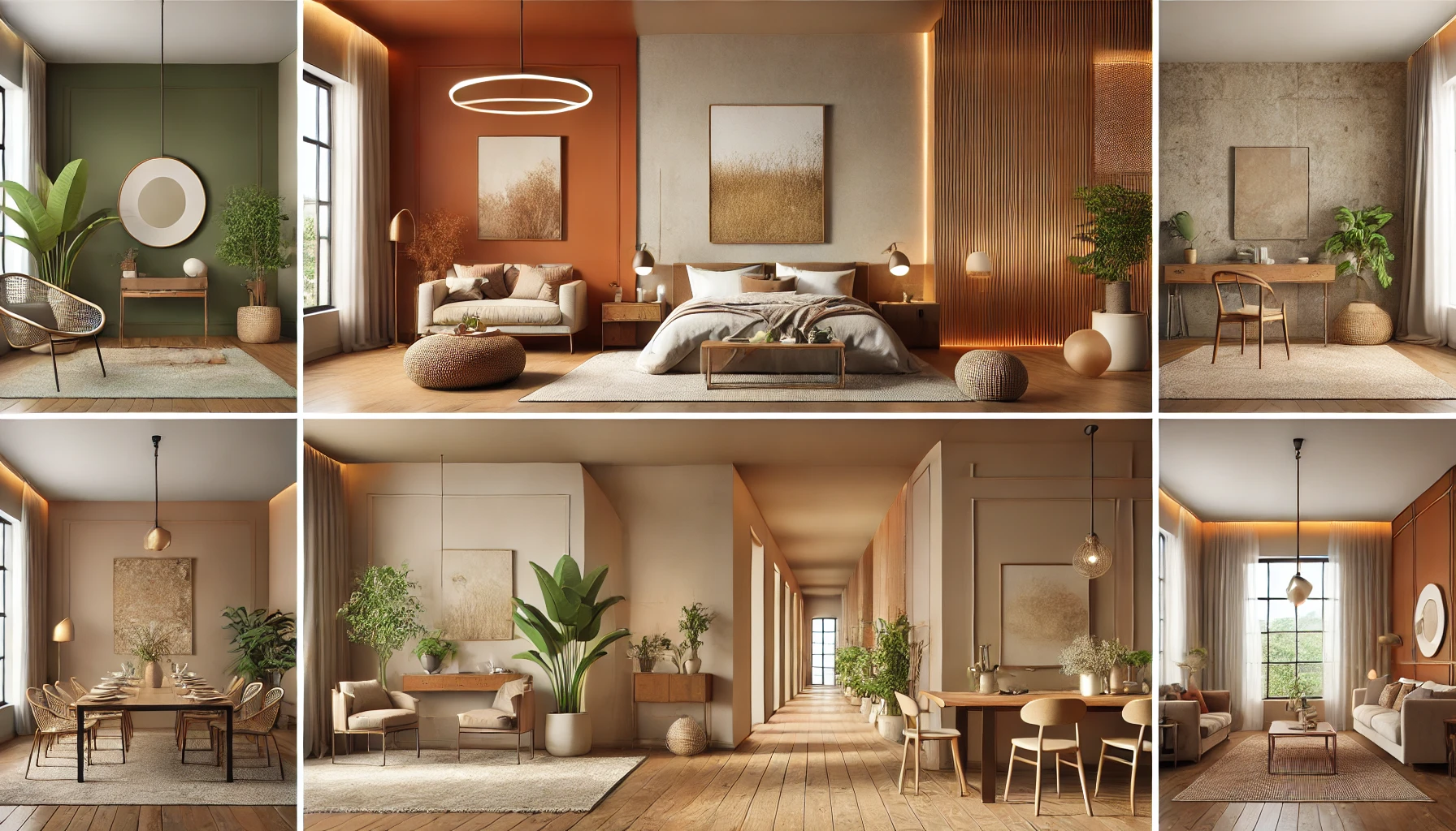
2. Selecting the Right Finish for Your Style
- Gloss Finish – Ideal for modern, high-shine cabinets and doors
- Matte Finish – Provides a soft, elegant look for contemporary spaces
- Metallic Finish – Adds a touch of luxury and depth to accent pieces
Step-by-Step Guide to Spray Painting Doors & Cabinets
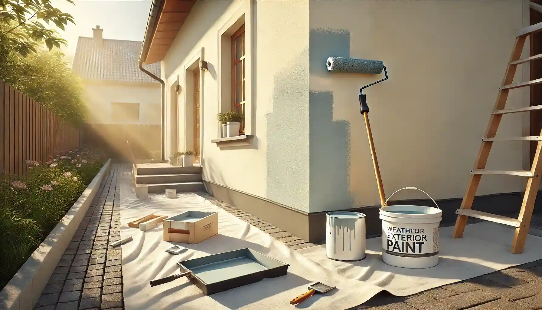
Step 1: Prep Your Space & Surface
Work in a well-ventilated area, such as outdoors or in a garage with open windows. Cover floors and surrounding areas with drop cloths or newspapers to protect them from overspray. Remove hardware like knobs, handles, and hinges for an even application. Clean the surface thoroughly with soap and water to remove dirt, grease, or any old paint residues.
Step 2: Sand & Prime for Better Adhesion
If the surface is glossy or laminated, lightly sand it with fine-grit sandpaper to create a rough texture that helps the paint adhere. Wipe down the area with a damp cloth to remove dust. Applying a spray primer before painting can improve adhesion, especially on laminate or metal surfaces.
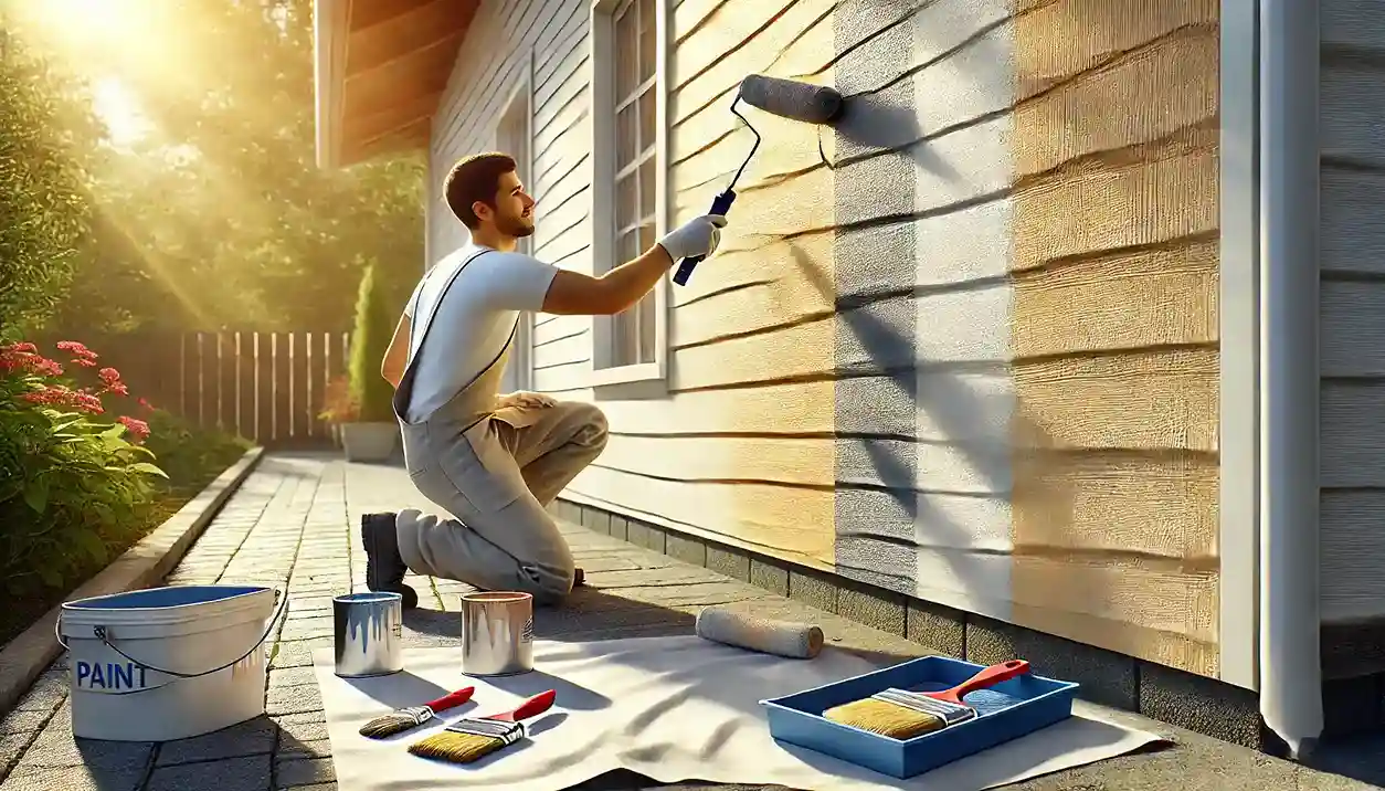
Step 3: Apply the Spray Paint
Shake the spray well for at least 30 seconds before use. Hold the can 6-8 inches away from the surface and apply the paint in thin, even coats using a smooth, sweeping motion. Avoid spraying too close, as this can cause drips or uneven coverage. Allow each coat to dry completely before applying the next, usually within 15-30 minutes.
Step 4: Apply a Clear Protective Coat (Optional)
For added durability, consider finishing with a clear sealant spray. This will help protect against scratches, moisture, and everyday wear and tear.
Step 5: Reassemble & Enjoy Your Fresh Look!
Once the paint is fully dry, reattach all hardware and admire your beautifully transformed doors and cabinets.
Creative DIY Spray Painting Ideas for Doors & Cabinets
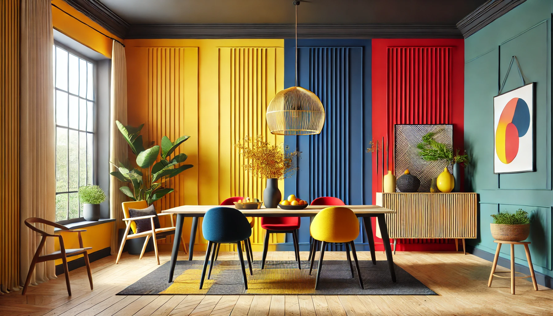
1. Two-Tone Colour Blocking – Modern & Stylish
Use painter’s tape to create sections and spray different colours for a bold, contemporary look. Contrasting shades like navy blue and white or black and gold can make a striking statement.
2. Distressed Vintage Look – Rustic Charm
For a vintage aesthetic, apply a base coat and let it dry completely. Then, lightly sand the edges and high-touch areas to achieve a naturally worn effect. This technique works particularly well for farmhouse-style kitchen cabinets and antique furniture.
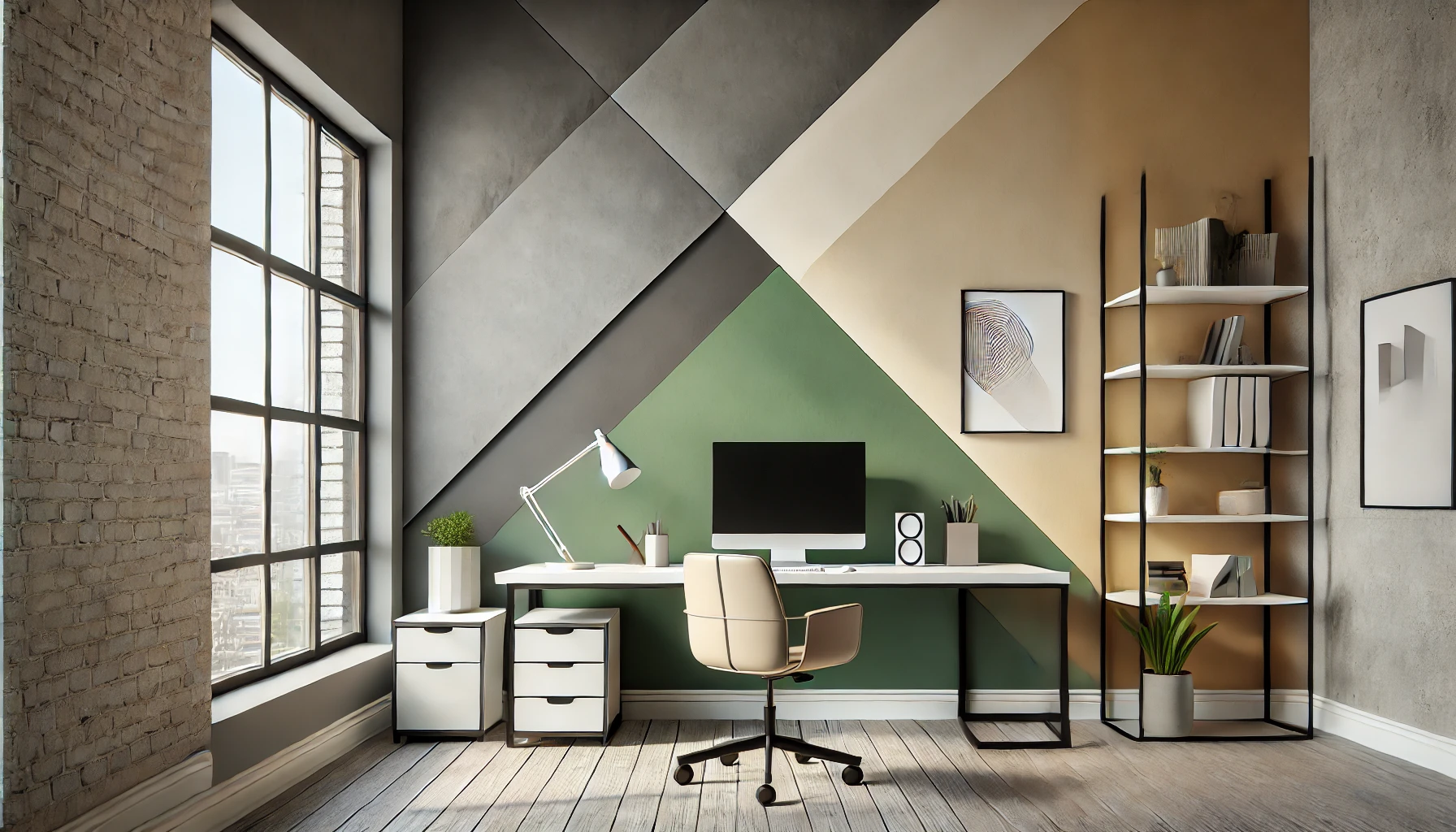
3. Stencilled Patterns – Personalised & Artistic
Add a unique touch by using stencils to spray floral, geometric, or tribal designs onto your cabinets or doors. This works especially well on cabinet panels and wardrobe fronts.
4. Metallic Accents for a Luxe Finish
Upgrade your cabinets by spraying knobs, handles, or trim in metallic shades like gold, copper, or silver. This pairs beautifully with deep, rich wall colours like dark green or navy blue.
Pro Tips for a Perfect Spray Paint Finish
✔ Always test on a small area before painting the entire surface.
✔ Apply multiple thin coats rather than one thick coat to avoid drips.
✔ Keep the spray can moving in smooth, sweeping motions to ensure even coverage.
✔ Let the paint fully cure before reattaching hardware, ideally for at least 24 hours.
✔ Store spray paint cans properly and shake before each use for best consistency.
Maintaining Your Newly Spray-Painted Cabinets & Doors
After completing your project, regular maintenance will help keep your newly painted surfaces looking fresh and flawless.
✔ Clean with a soft cloth and mild soap to prevent dirt buildup.
✔ Avoid abrasive cleaners that can scratch or dull the finish.
✔ Handle doors and cabinets with care to prevent chipping.
✔ Touch up small imperfections with leftover spray paint when necessary..
✔ Keep cabinets and doors away from direct sunlight to prevent fading over time.
Elevate Your Home with Indicus Admyra Spray Paint
A quick and easy spray paint makeover can instantly upgrade your doors and cabinets, giving them a fresh, modern look with minimal effort. Whether you prefer a glossy modern finish, a rustic distressed effect, or bold colour accents, Indicus Admyra Spray Paint makes it easy to achieve professional-quality results at home.
Ready to start your DIY project? Explore Indicus Admyra Spray Paint for long-lasting durability, smooth application, and a stunning finish!