You are using an outdated browser. Please upgrade your browser to improve your experience.

Why Bright Colours Make Kids Rooms More Fun and Engaging

Why Bright Colours Make Kid's Rooms More Fun and Engaging

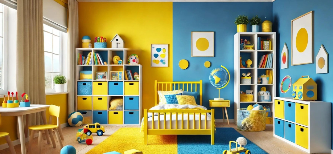
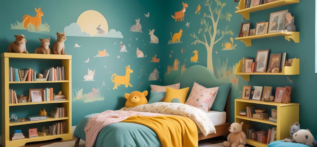
Designing a child’s room is an exciting opportunity to create a space that nurtures creativity, play, and learning. One of the most effective ways to make a kid’s room more fun and engaging is by incorporating bright colours. These vibrant hues can stimulate imagination, enhance mood, and transform a simple room into an energetic environment that supports a child’s development. In this blog, we explore how bright colours can make kids’ rooms more enjoyable and share tips on how to use them effectively.
Designing a childs room

The Importance of a Well-Designed Kid’s Room

Designing a child’s room is more than just creating a space for sleeping; it’s about crafting an environment that nurtures creativity, play, and learning. A well-thought-out kids’ room provides a sense of comfort and excitement, helping children feel secure while allowing them to express themselves. By choosing the right colours, parents can make their child’s room a haven of fun, imagination, and learning.
The Importance of a Well-Designed Kids Room

How Colours Affect Children’s Mood and Behaviour

Colours have a profound effect on our emotions, especially for young children. Bright colours, in particular, can influence a child’s mood, cognitive functions, and even behaviour. While soft blues and greens can calm children, vibrant colours like yellow and orange can boost energy, happiness, and engagement. When selecting shades for a child’s room, parents can use colour psychology to their advantage by picking hues that promote the desired mood.
How Colours Affect Childrens Mood and Behaviour

The Psychology of Bright Colours

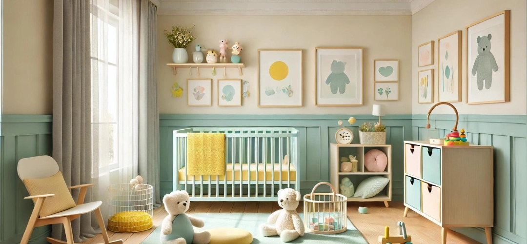
Bright colours are attention-grabbing and evoke excitement. Children are naturally drawn to them because they are visually stimulating and can trigger imagination. Colours like red, yellow, and orange are associated with positivity, energy, and warmth, while shades like green and blue provide a sense of calm and balance. Incorporating a variety of these hues can create a dynamic and balanced room that feels both lively and cosy.
The Psychology of Bright Colours

Popular Bright Colour Choices for Kid’s Rooms

Some of the most popular bright colour choices for kids’ rooms include:

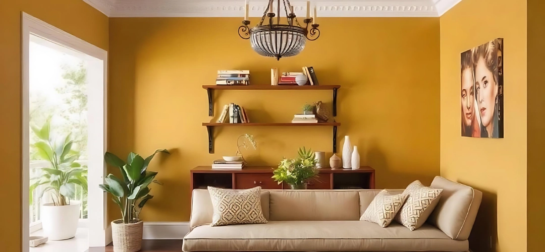
  • Yellow: A cheerful colour associated with happiness and optimism.
  • Orange: Stimulates socialisation and conversation.
  • Bright Blue: Encourages creativity and can be calming when used moderately.
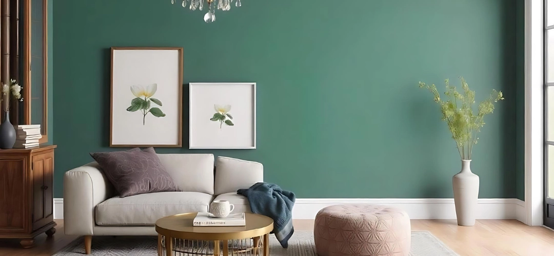
  • Green: Linked to nature, it offers a refreshing, calming effect while still being vibrant.

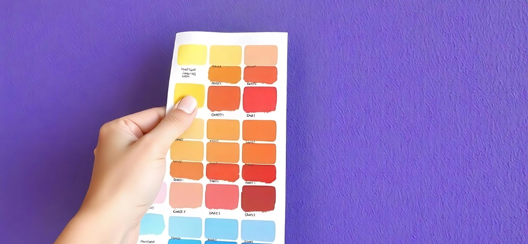
We offer a vast palette of colours that can be easily explored through our mobile app, making it simpler for parents to visualise these colours in their child’s space.

Incorporating Bright Colours Through Furniture and Decor

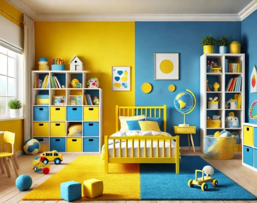
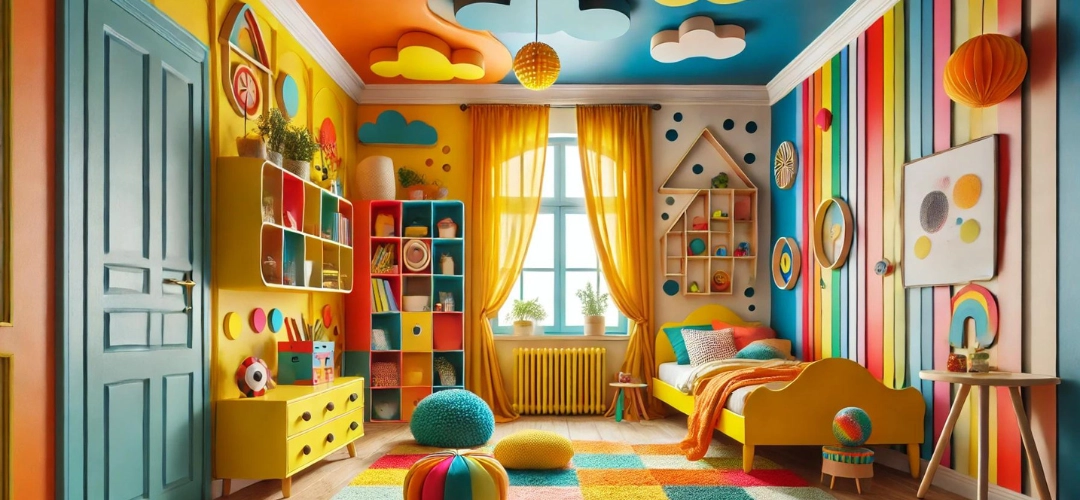
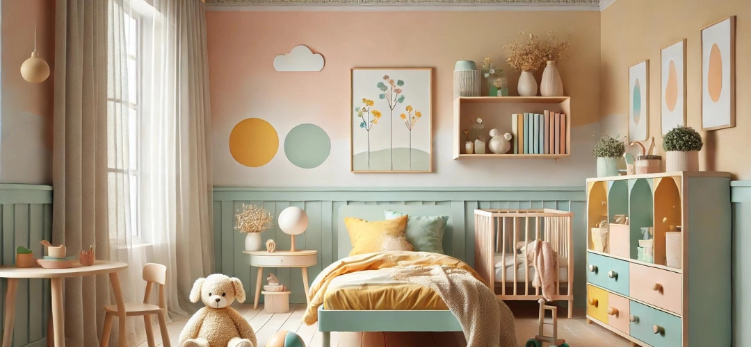
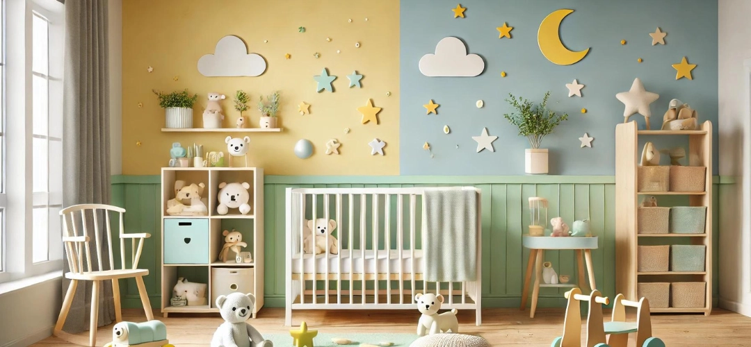
Beyond walls, bright colours can be incorporated through furniture, textiles, and decor pieces. A bright yellow bed frame or a colourful set of bookshelves can add personality to a child’s room without overwhelming the space. Playful decor elements like multi-coloured rugs, pillows, or even a fun painted ceiling can bring life into the room in subtle, creative ways.
Incorporating Bright Colours Through Furniture and Decor

Creating a Theme with Bright Colours

Themes offer an excellent way to tie everything together. Whether it’s a jungle adventure with greens and browns or an underwater world with blues and purples, using bright colours as a foundation makes the theme come alive. Indicus Paints’ wide range of functional coatings and wallpapers also offer endless possibilities for unique designs.

Tips for Using Bright Colours in Small Spaces

In small rooms, it’s important to use bright colours strategically. Here are some tips:
  • Accents, not overload: Use bright colours on accent walls or specific decor items to avoid overwhelming the room.
  • Light contrasts: Balance bright colours with neutral tones like white or light grey to create the illusion of more space.
  • Multi-functional furniture: Choose colourful furniture that serves more than one purpose, such as storage-friendly bed frames.

Safety Considerations When Using Bright Colours

When decorating a child’s room, safety is a top priority. It’s essential to use non-toxic, safe paints that are free from harmful chemicals like VOCs (Volatile Organic Compounds). Brands like Indicus Paints offer eco-friendly paints that ensure the health and safety of your children while providing vibrant hues.

DIY Ideas for Adding Bright Colours to Kid’s Rooms

Parents looking to add personal touches can try fun DIY projects such as:
  • Wall stencils or murals: Let your child choose a theme and paint an accent wall with fun shapes or characters.
  • Painted furniture: A coat of bright, bold paint can revamp old furniture and add character to the room.
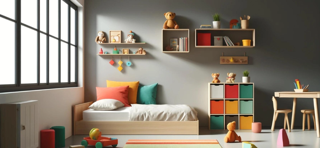
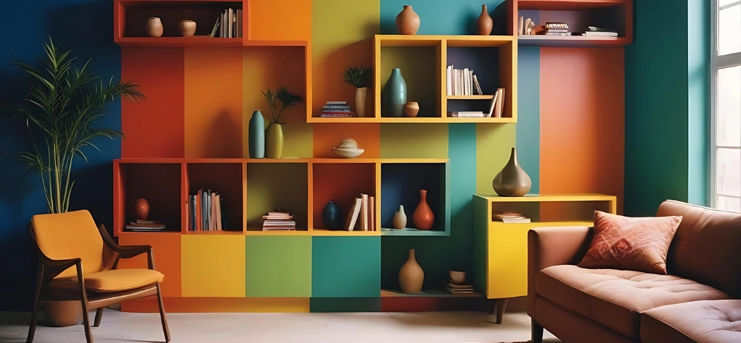
  • Creative shelving: Install colourful shelves that not only serve as storage but also as a playful decor element.
DIY Ideas for Adding Bright Colours to Kids Rooms

Conclusion: Creating a Vibrant and Stimulating Space for Kids

Bright colours can transform a kid’s room into a space of creativity, fun, and engagement. By thoughtfully selecting hues and incorporating them through decor, furniture, and paint choices, parents can create a lively yet balanced environment. With quality products from Indicus Paints, it’s easy to achieve this perfect combination of style and safety. Our extensive colour range and user-friendly tools, like the Colourcast app, make the process even more accessible, helping you visualise and create a joyful and vibrant space for your little ones.

Choosing the Best Waterproof Coatings for Your Monsoon-Ready Home

Choosing the Best Waterproof Coatings for Your Monsoon-Ready Home

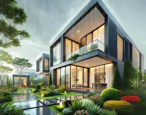
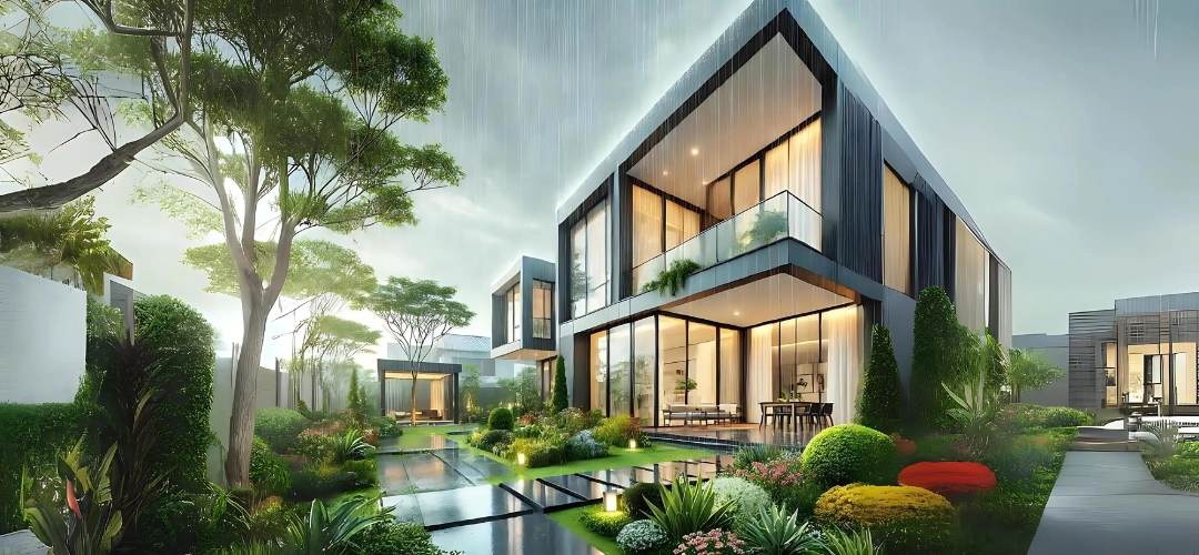
Are you searching for the best waterproof paint to protect your home this monsoon? You’ve come to the right place! This guide will provide all the information you need about choosing the ideal waterproof coating to keep your home safe and dry during the rainy season.

Not all coatings offer the same level of water resistance. High-quality waterproof coatings are essential to guard your walls against water penetration that will result in seepage and leakage, moisture, dampness, and fungal growth. Whether you’re painting exterior surfaces, or your terrace, we’ll help you choose the right paint.

This guide explores different types of waterproof coatings, their key features, and how to choose the best one for your needs. We’ll also discuss durability, application techniques, and surface compatibility.
Importance of Waterproof Coatings During Monsoon

Importance of Waterproof Coatings During Monsoon

The monsoon season brings heavy and continuous rains, which has the possibility to wreak havoc on your home’s aesthetics, water tightness and quality of structure. Water damage can lead to peeling paint, mould growth, and even structural deterioration, which compromises the aesthetic and integrity of your home.

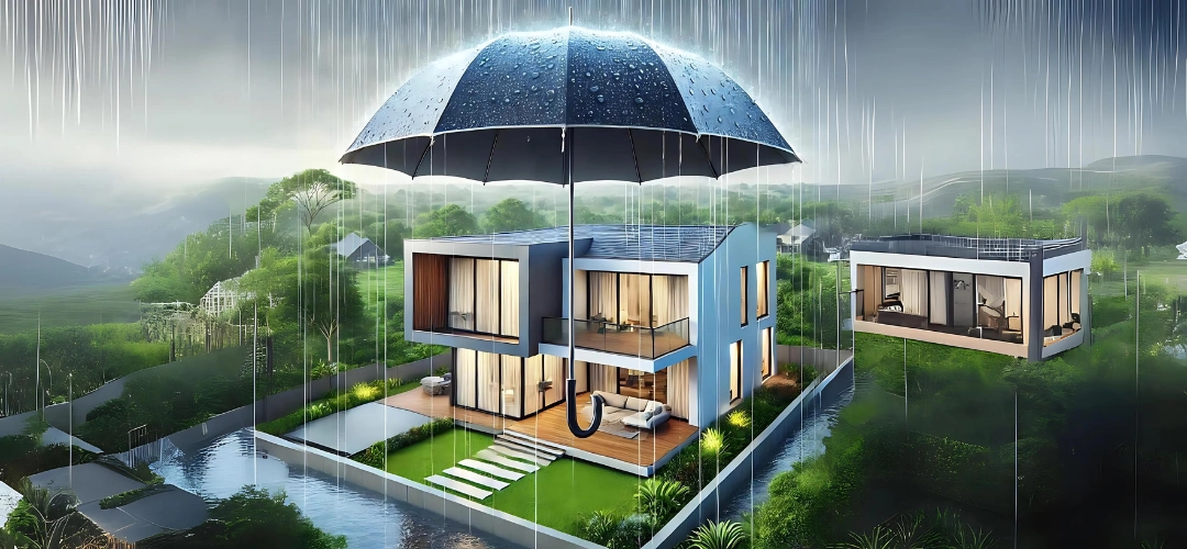
Waterproof coatings provide a barrier against moisture, preventing water from seeping into the walls and other surfaces. This not only stops water penetration into the building but also inhibits mould and mildew growth, which can affect air quality and your family’s health. Additionally, waterproof coatings are designed to withstand extreme weather, ensuring your home’s exterior remains protected even in heavy rain and strong winds.

Investing in the right waterproof coating ensures long-term protection, so you don’t have to worry about the monsoon ruining your home.
Best Waterproof Coatings for Your Monsoon

Factors to Consider When Choosing Waterproof Coatings

To make the right choice, here are key factors you should consider:

  1. Water Resistance and Durability: Ensure the coating offers high water resistance and can withstand prolonged exposure to environmental factors.
  2. Surface Compatibility: Different surfaces like walls, ceilings, terrace, and roofs may require different waterproof coatings. Always check the manufacturer’s recommendations for surface compatibility.
  3. Ease of Application: Opt for coatings that are easier to use considering the building’s structure and surface conditions.
  4. Maintenance: Consider the long-term maintenance. Some waterproof coatings may require reapplication after a few years, while others offer longer-lasting protection.


Waterproof Coating in the Long Term

Maintaining your waterproof coating ensures long-term protection. Here’s how to keep it in good condition:

  • Regular Inspection: Check your coated surfaces for peeling, cracking, or other signs of wear and tear.
  • Repair Damage: If you notice any damage, repair it immediately to avoid water seeping through.
  • Reapplication: Depending on the type of coating, reapply after a few years to maintain waterproofing.
Waterproof Coatings

Cost Considerations of Waterproof Coatings

While waterproof coatings may have a higher initial cost, they provide long-term savings by reducing the need for repairs. High-quality waterproof coatings are more durable, requiring less frequent maintenance or reapplication.

Indicus Waterproof Coatings

When it comes to reliable waterproof paints, Indicus offers several high-quality options:
  • Godry Uniproof: An integral waterproofing admixture that enhances the water resistance of concrete and plaster mixes. It improves durability while reducing water permeability.
  • Godry Maxcoat 1X: A modified styrene-butadiene rubber (SBR) emulsion designed for waterproofing small areas and repairing concrete surfaces. It provides excellent bonding for cement and other materials.
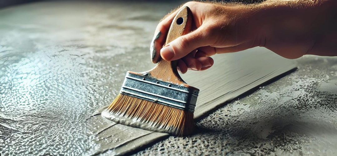
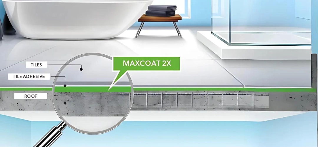
  • Godry Maxcoat 2X: A two-component elastomeric waterproof coating for concrete and masonry. This product offers robust protection for external surfaces against water damage.
Godry Maxcoat 2X
  • Aquaseal Waterproof Coating: Indicus Aquaseal is an acrylic waterproof coating for all types of cementitious surfaces in exterior areas. It forms a durable and elastic membrane that provides excellent waterproofing for a building. The specially added polyester fibres deliver excellent mechanical properties and adhesion.
  • Easyseal: Ready to Apply Crack Filler – Indicus Easyseal is a ready to apply acrylic filler for cracks on walls and ceilings. It can be used on a variety of porous surfaces like concrete, plaster, asbestos, etc. and can be sanded for a smooth finish.

Conclusion: Choosing the Right Waterproof coating

Waterproof coatings are crucial for protecting your home during the monsoon season. Choosing the right type of paint depends on your specific needs and the surfaces you’re protecting. By following proper surface preparation, application techniques, and maintenance practices, you can ensure your home stays safe and beautiful no matter how heavy the rain gets.

Classic vs. Modern: Wooden Door Colour Ideas for Every Home Style

Classic vs. Modern: Wooden Door Colour Ideas for Every Home Style

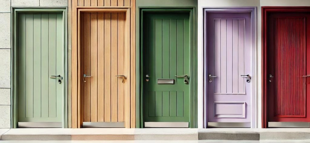
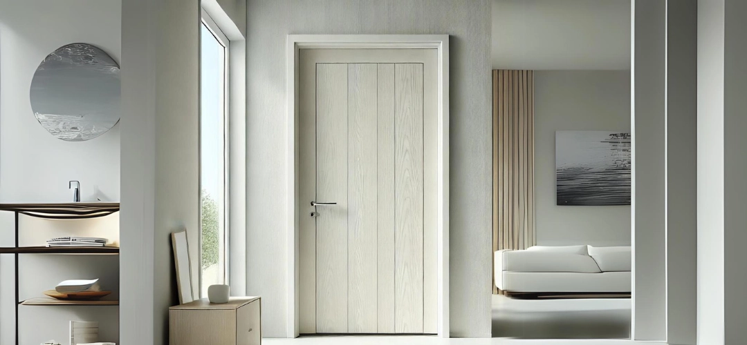
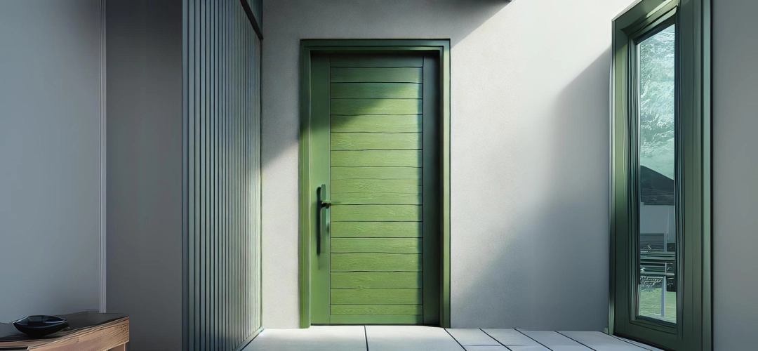
Are you torn between classic and modern wooden door colours for your home? Don’t worry, we’ve got you covered! In this article, we will take you on a journey of exploring various colour ideas that can transform your wooden doors into statement pieces for your home.

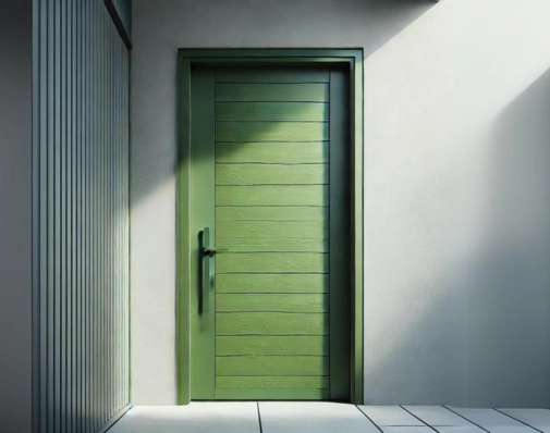
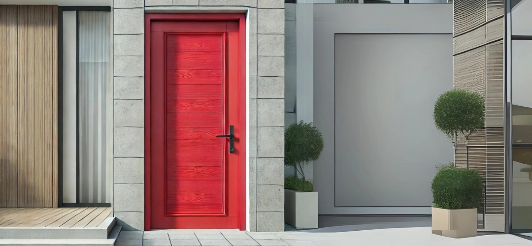
When it comes to choosing the right door colour, it’s important to consider the overall style and aesthetic you want to achieve. Classic colours such as deep red, rich brown, or timeless black can add a touch of elegance and sophistication to your home. These colours are perfect for traditional and vintage-inspired interiors, creating a warm and welcoming atmosphere.

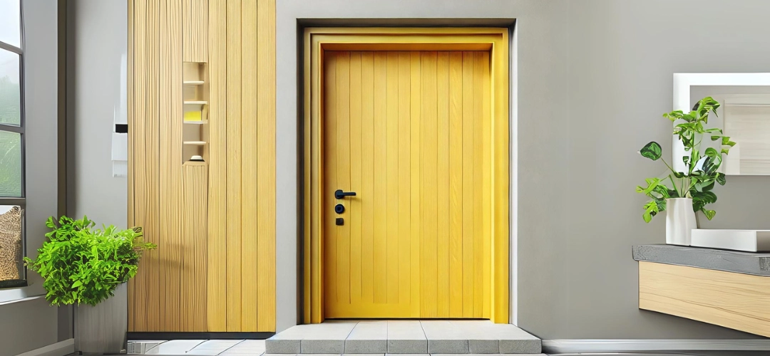
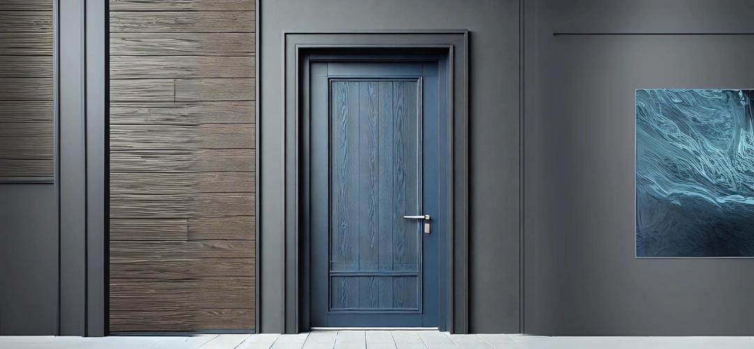
On the other hand, modern wooden door colours like vibrant blue, bold yellow, or trendy grey can bring a contemporary and fresh look to your space. These colours work well in minimalistic and modern interiors, adding a pop of colour and personality.

Whether you prefer the timeless charm of classic colours or the sleek appeal of modern hues, this article will provide you with plenty of inspiration and guidance to help you choose the perfect wooden door colour for your home. So, let’s unlock the potential of your doors and make a style statement that reflects your unique taste and personality.
Classic vs Modern Wooden Door Colour Ideas for Every Home Style

Classic wooden door colours and their significance

Classic wooden door colours have a timeless appeal that has stood the test of time. These colours are rooted in tradition and evoke a sense of warmth, sophistication, and elegance. From the deep, rich hues of mahogany to the timeless charm of natural oak, classic wooden door colours have the ability to enhance the architectural features of a home and create a harmonious and inviting atmosphere.

One of the primary advantages of classic wooden door colours is their ability to complement a wide range of home styles, from traditional to transitional. These colours seamlessly blend with the existing design elements, creating a cohesive and visually appealing look. Whether your home boasts ornate Victorian-inspired details or clean, minimalist lines, classic wooden door colours can be tailored to suit the overall aesthetic.

Moreover, classic wooden door colours often convey a sense of permanence and stability. They are associated with quality craftsmanship and attention to detail, which can be particularly appealing to homeowners who value the enduring beauty and durability of their home’s features. These colours can also add a touch of sophistication and timelessness to a home, making it a timeless investment that can withstand the ebb and flow of design trends.
Classic vs Modern Wooden Door Colour Ideas for Every Home Style

Advantages of classic wooden door colours for traditional homes

For traditional homes, classic wooden door colours are a natural choice that can enhance the architectural features and create a warm, inviting atmosphere. These colours often complement the rich, ornate details and historical elements that are characteristic of traditional design styles.

One of the key advantages of classic wooden door colours in traditional homes is their ability to create a sense of continuity and cohesion. By selecting colours that harmonize with the existing design elements, such as ornate moldings, intricate woodwork, and antique furnishings, homeowners can achieve a seamless and visually appealing look that reflects the timeless elegance of their home.

Moreover, classic wooden door colours can also help to accentuate the architectural features of a traditional home, drawing the eye towards the entryway and creating a focal point that sets the tone for the entire space. This can be particularly effective in homes with grand, imposing entryways or intricate door designs, where the choice of colour can make a significant impact on the overall aesthetic.
Classic vs Modern Wooden Door Colour Ideas for Every Home Style

Modern wooden door colours and their impact on contemporary home design

In contrast to the timeless appeal of classic wooden door colours, modern wooden door colours offer a fresh and dynamic approach to home design. These colours are often associated with sleek, minimalist aesthetics and a focus on clean lines and bold statements.

One of the primary advantages of modern wooden door colours is their ability to infuse a space with a sense of contemporary style and sophistication. By incorporating bold, vibrant hues or striking neutral tones, homeowners can create a striking visual impact that sets their home apart from the traditional.

Moreover, modern wooden door colours can also help to create a sense of cohesion and harmony within a contemporary home design. By selecting colours that complement the overall aesthetic, such as the use of natural materials, geometric patterns, or a monochromatic colour scheme, homeowners can achieve a cohesive and visually appealing look that reflects their personal style and preferences.
Classic vs Modern Wooden Door Colour Ideas for Every Home Style

Benefits of modern wooden door colours for modern and minimalist homes

For homeowners who favour a modern or minimalist design approach, the strategic use of modern wooden door colours can offer a range of benefits. These colours can help to create a sense of clean, uncluttered elegance and highlight the architectural features of the home.

One of the key advantages of modern wooden door colours in modern and minimalist homes is their ability to create a sense of visual balance and harmony. By selecting colours that complement the sleek, streamlined aesthetic of the home, homeowners can achieve a cohesive and visually appealing look that reflects their personal style.

Additionally, modern wooden door colours can also help to create a sense of visual interest and contrast within a minimalist space. By incorporating bold, vibrant hues or striking neutral tones, homeowners can add depth and dimension to their home, creating a focal point that draws the eye and adds a touch of personality to the overall design.
Classic vs Modern Wooden Door Colour Ideas for Every Home Style

Factors to consider when choosing between classic and modern wooden door colours

When it comes to choosing between classic and modern wooden door colours, there are several important factors to consider. These include the overall style and aesthetic of the home, the architectural features, the desired mood and ambiance, and the personal preferences of the homeowner.

For homeowners who favor a more traditional or transitional design approach, classic wooden door colours may be the more appropriate choice. These colours can help to create a sense of timeless elegance and sophistication, while also complementing the existing design elements of the home.

On the other hand, for homeowners who prefer a more contemporary or minimalist design style, modern wooden door colours may be the better option. These colours can help to create a sense of visual interest and contrast, while also reflecting the homeowner’s personal style and preferences.

Ultimately, the choice between classic and modern wooden door colours will depend on the individual needs and preferences of the homeowner, as well as the overall design goals for the home. By carefully considering these factors, homeowners can make an informed decision that will enhance the overall aesthetic and functionality of their home.
Classic vs Modern Wooden Door Colour Ideas for Every Home Style

Popular classic wooden door colour ideas and their aesthetic appeal

When it comes to classic wooden door colours, there are several timeless options that have stood the test of time. From the rich, warm tones of mahogany to the natural, rustic charm of oak, these colours offer a range of aesthetic appeal that can enhance the overall design of a home.

One popular classic wooden door colour is deep, rich mahogany. This colour is often associated with traditional, formal design styles and can add a sense of grandeur and sophistication to a home. Mahogany doors can also complement a wide range of architectural features, from ornate moldings to intricate woodwork, creating a cohesive and visually appealing look.

Another classic wooden door colour option is the natural, warm tones of oak. This colour is often associated with a more rustic, farmhouse-inspired design aesthetic, but can also work well in traditional and transitional homes. Oak doors can add a sense of warmth and charm to a space, while also highlighting the natural beauty of the wood grain.

In addition to mahogany and oak, classic wooden door colours can also include deep, rich shades of brown, such as walnut or cherry, as well as timeless black or white. These colours can help to create a sense of elegance and sophistication, while also complementing a wide range of design styles and architectural features.

Trending modern wooden door colour ideas and their unique features

In contrast to the classic wooden door colours, modern wooden door colours offer a fresh and dynamic approach to home design. These colours are often associated with sleek, minimalist aesthetics and a focus on clean lines and bold statements.

One popular modern wooden door colour is a striking, vibrant blue. This colour can add a sense of energy and vibrancy to a space, while also creating a visually striking contrast against the natural wood grain. Blue wooden doors can work particularly well in contemporary or modern homes, where they can help to create a sense of visual interest and personality.

Another trending modern wooden door colour is a bold, sunny yellow. This colour can add a sense of warmth and cheerfulness to a space, while also creating a focal point that draws the eye. Yellow wooden doors can work well in a variety of design styles, from minimalist to eclectic, and can help to create a sense of energy and vitality.

In addition to vibrant hues, modern wooden door colours can also include more muted, neutral tones, such as sleek grey or crisp white. These colours can help to create a sense of clean, uncluttered elegance, while also complementing a wide range of design styles and architectural features. Grey wooden doors, for example, can add a sense of sophistication and modernity to a space, while white doors can help to create a sense of brightness and openness.

How to incorporate classic and modern wooden door colours in different home styles

When it comes to incorporating classic and modern wooden door colours into different home styles, there are a variety of approaches that homeowners can take. The key is to carefully consider the overall design aesthetic of the home and select colours that complement the existing architectural features and design elements.

For traditional or historic homes, classic wooden door colours, such as rich mahogany or warm oak, can help to create a sense of timeless elegance and sophistication. These colours can also help to highlight the ornate details and intricate woodwork that are often found in traditional design styles.

In contrast, for modern or minimalist homes, homeowners may opt for more contemporary wooden door colours, such as bold blues or vibrant yellows. These colours can help to create a sense of visual interest and contrast, while also reflecting the clean, uncluttered aesthetic of the home.

For transitional or eclectic homes, a mix of classic and modern wooden door colours can be an effective approach. Homeowners may choose to incorporate a classic colour, such as a deep, rich brown, alongside a more modern hue, such as a sleek grey. This can help to create a sense of balance and harmony, while also reflecting the homeowner’s personal style and design preferences.

Ultimately, the key to successfully incorporating classic and modern wooden door colours into different home styles is to carefully consider the overall design aesthetic and select colours that complement the existing architectural features and design elements. By doing so, homeowners can create a cohesive and visually appealing look that reflects their personal style and enhances the overall functionality and appeal of their home.

Conclusion: Finding the perfect wooden door colour for your home

When it comes to choosing the perfect wooden door colour for your home, there is no one-size-fits-all solution. The choice will ultimately depend on a variety of factors, including the overall design aesthetic, the architectural features of the home, and the personal preferences of the homeowner.

Whether you prefer the timeless charm of classic wooden door colours or the bold, contemporary appeal of modern hues, there are a range of options available to suit every home style and design preference. By carefully considering the advantages and unique features of each colour option, homeowners can make an informed decision that will enhance the overall aesthetic and functionality of their home.

Ultimately, the perfect wooden door colour is the one that resonates with you and reflects your personal style and design preferences. By taking the time to explore the various options and consider the factors that are most important to you, you can unlock the full potential of your wooden doors and create a home that is truly a reflection of your unique taste and personality.

How to Match Paint Colors with Your Home Decor: A Comprehensive Guide

How to Match Paint Colors with Your Home Decor: A Comprehensive Guide

Choosing the perfect paint colour for your home can feel like a daunting task. It’s not just about picking a shade you like; it’s about ensuring it complements your existing decor and creates a cohesive look. Whether you’re giving a room a fresh coat or embarking on a full home makeover, matching paint colours with your home decor requires a blend of creativity and strategy. Here’s a guide to help you navigate this colourful journey.
paint colour for your home

1. Understand Your Existing Decor

Before selecting a paint colour, take stock of your current decor. Look at the major elements in your space, such as:

  • Furniture: Note the colours, textures, and styles.
  • Textiles: Consider curtains, rugs, and upholstery.
  • Art and Accessories: Identify prominent colours and patterns.
  • Flooring: Assess whether it’s neutral or has a distinctive colour.

Understand Your Existing Decor

2. Determine the Mood You Want to Create

Paint colour can significantly influence the mood of a room. Think about the atmosphere you want:
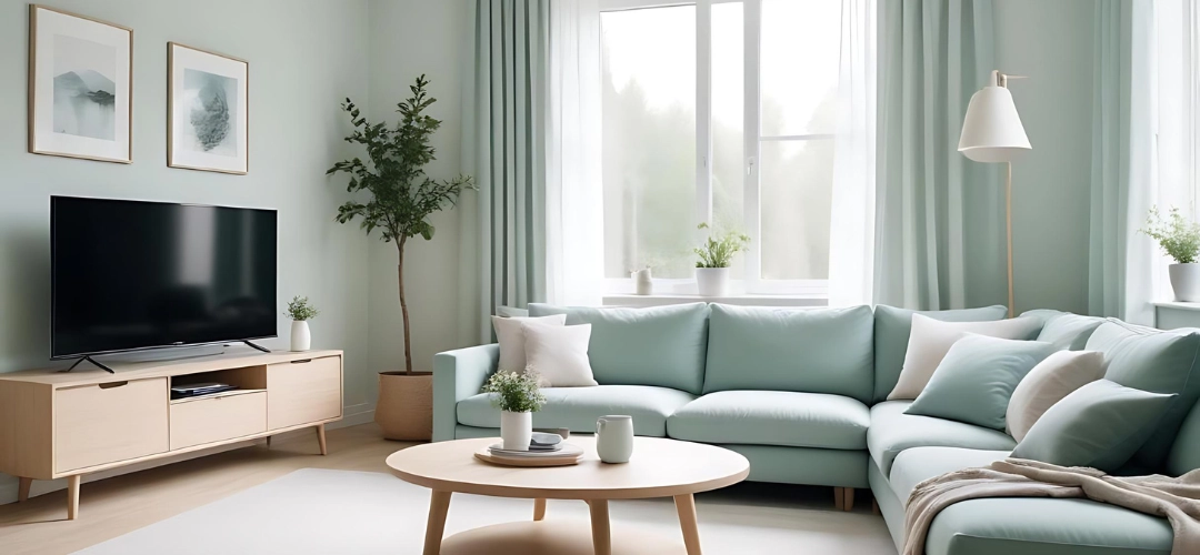
  • Calm and Relaxing: Soft blues, greens, or neutrals create a tranquil environment.
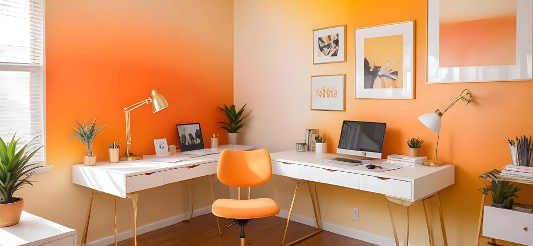
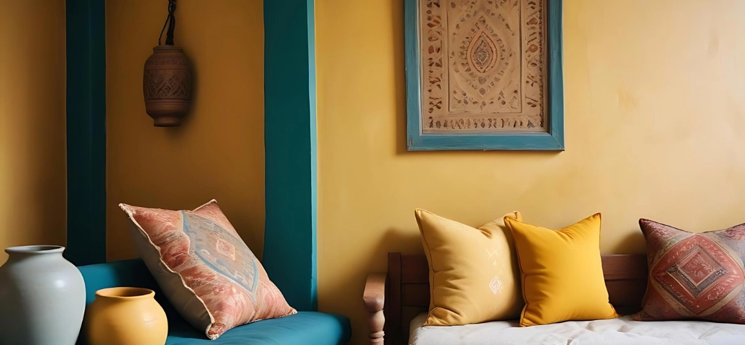
  • Energetic and Vibrant: Bright yellows, oranges, or bold hues add energy and excitement.
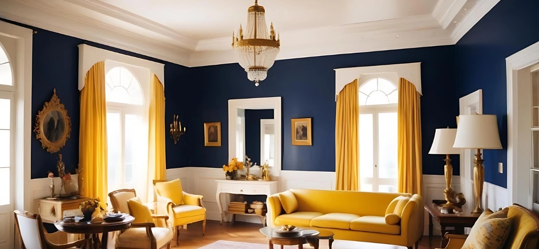
  • Elegant and Sophisticated: Rich tones like deep greens, navy blues, or dark greys offer a sense of luxury.
Mood You Want to Create

3. Consider Color Theory

Are you confused How to choose paint colours for your home? Using colour theory can guide your choices:
  • Complementary Colours: These are opposite on the colour wheel (e.g., blue and orange) and can create a vibrant look.
  • Analogous Colours: These are next to each other on the colour wheel (e.g., blue, blue-green, and green) and offer a harmonious feel.
  • Monochromatic Colours: Different shades and tints of one colour create a cohesive and subtle look.
Colour Theory

4. Test Paint Samples

Before committing to a colour, test samples on your walls. Paint a few patches and observe how they look at different times of day and under various lighting conditions. This will help you see how the paint interacts with your decor and how it changes with natural and artificial light.

5. Match to Existing Colours

  • Pulling from Accent Colors: Use colours from your decor items, such as cushions or artwork, as inspiration for your wall colour.
  • Matching Undertones: Ensure the undertones of your paint colour align with the undertones in your furniture and decor. For example, if you have warm-toned wood furniture, choose paint with warm undertones.

6. Create a Colour Palette

Develop a colour palette for your space:
  • Primary Colour: This is the dominant wall colour.
  • Secondary Colours: These can be used for accent walls or features.
  • Neutral Colours: Use these for trim, ceilings, or to balance more vibrant hues.
Colour Palette

7. Consider the Size and Function of the Room

  • Small Rooms: Lighter colours can make a space feel larger and more open.
  • Large Rooms: Darker colours or bold shades can add cosiness and definition.
  • Functional Areas: Think about the purpose of the room. For example, soothing colours are ideal for bedrooms, while bright, lively colours might be better for playrooms or home offices

8. Plan for Flow and Continuity

If you’re painting multiple rooms, ensure there’s a sense of continuity throughout your home. Choose colours that complement each other and create a harmonious flow from one room to the next.

9. Think About Finish

The finish of your paint also affects the look:

  • Matte: Great for hiding imperfections and creating a soft look. Indicus Admyra adds a sense of depth and dimension to the painted wall, making the colours appear dynamic and alive. It gives rich and smooth colours that elevate the overall aesthetics of the space, creating a sophisticated ambiance.
  • Eggshell/Satin: Offers a slight sheen and is easier to clean, suitable for living areas.
  • Glossy: Adds shine and reflects light, perfect for high-traffic areas or accents.

10. Consult a Professional

If you’re unsure about colour choices or how they’ll interact with your decor, consider consulting a professional interior designer. They can offer personalised advice, best paint colours for home decor and help you achcarosoulieve a cohesive look. INDICUS Colourcraft Painting Services provides the best residential painting services with exceptional service and experience. Our professional and trusted painting contractors have decades of experience in the field as well as the best equipment and training that creates stunning results.

Conclusion

Matching paint colours with decor involves more than just picking a shade you like. By considering your existing decor, the mood you want to create, and how colours interact with each other, you can select a paint colour that enhances your home’s aesthetic and creates a harmonious environment. Remember to test samples and think about the overall flow of your home to ensure a cohesive and inviting space. Happy painting!

Enhancing Bedroom Ambience with Ombre Wall Painting

Enhancing Bedroom Ambience with Ombre Wall Painting

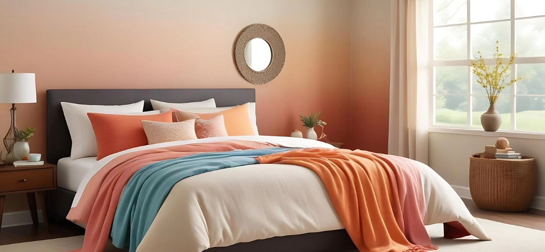
Creating the perfect bedroom ambience can be both exciting and challenging. One increasingly popular trend that adds a unique and modern touch to bedroom decor is ombre wall painting. This technique blends colours seamlessly, creating a gradient effect that can transform any space. Here’s how you can enhance your bedroom ambience with ombre wall painting, along with some useful tips and ideas. 
Ombre Wall Painting

Ombre Wall Painting

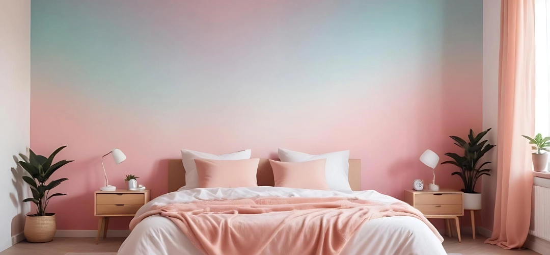
Ombre wall painting involves transitioning colours from light to dark or from one colour to another. This gradient effect adds depth and dimension to a room, making it feel more dynamic and visually appealing. Ombre walls can be bold and vibrant or soft and soothing, depending on the colour scheme you choose.
Ombre Wall Painting

Bedroom Ambience Tips

When considering ombre walls for your bedroom, think about your preferences and desired ideas you want to create. Soft pastels can create a calm and relaxing atmosphere, perfect for winding down after a long day. Conversely, bold and vibrant colours can inject energy and excitement into the room. Pairing ombre walls with the right lighting, furniture, and accessories can further enhance the desired ambience.
Bedroom Ambience Tips

DIY Ombre Walls

Creating ombre walls yourself can be a fun and rewarding project. Start by selecting your colours – you’ll need at least two shades of the same colour or two different colours that blend well together. Use painter’s tape to divide the wall into sections where each colour will transition. Begin with the lightest colour at the top, gradually blending in the darker shades as you move down. Use a sponge or brush to blend the colours seamlessly.

Ombre Painting Techniques

There are several techniques you can use to achieve the perfect ombre effect. One popular method is the “wet-on-wet” technique, where you blend the colours while the paint is still wet. This creates a smooth transition and avoids harsh lines. Another method is the “dry brushing” technique, which involves lightly brushing over the colours to blend them softly.

Bedroom Decor Ideas

Complement your ombre walls with decor that enhances the overall ambience of the room. Soft, neutral bedding and curtains can balance out bold ombre walls, while colourful accessories can add a pop of interest to more subtle gradients. Consider incorporating textures like plush rugs, throw pillows, and blankets to add warmth and cosiness.
Bedroom Decor Ideas

Ombre Colour Schemes

Choosing the right colour scheme is crucial for achieving the desired effect. For a serene and calming ambience, consider shades of blue, green, or lavender. If you want a more energetic and vibrant look, opt for bold colours like red, orange, or yellow. You can also experiment with unique combinations like navy to teal or coral to peach.
Ombre Colour Schemes
Enhancing your bedroom ambience with ombre wall painting is a creative and effective way to transform your space. With the right colour schemes, techniques, and decor, you can create a beautiful and inviting bedroom that reflects your personal style. So grab your paintbrushes and get ready to bring a touch of ombre magic to your home!

Happy decorating!

Click here for more information about Indicus Paints or call 1800 599 3939.

Perfect Lighting in Your Home Using Paints

Perfect Lighting in Your Home Using Paints

Creating the perfect lighting in your home can be challenging, but with the right paints, you can achieve a beautifully lit space that feels both spacious and cosy. Here are some tips to help you out!

1. Choose Light Colours

Light colours such as white, beige, and pastels reflect more light, making a room feel brighter and more spacious. For instance, painting your living room walls a soft white can enhance natural light and create a welcoming ambience. Light colours are especially effective in smaller rooms or areas with limited natural light, as they can make these spaces appear larger and more open. These are the best paint colours for bright rooms, as they help in creating a vibrant and airy atmosphere.
Choose Light Colours

2. Accent Walls for Depth

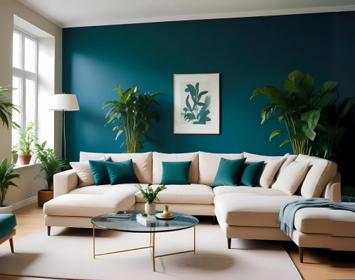
Adding an accent wall can bring depth and character to a room. A darker colour on one wall can make the space feel cosier without absorbing too much light. For example, a deep blue accent wall in a bedroom can create a relaxing atmosphere, while the lighter surrounding walls keep the room bright and airy. This technique can also highlight architectural features or focal points in a room. For better lighting, strategically placing accent walls can effectively balance light and shadow.
Accent Walls for Depth

3. Reflective Surfaces

Incorporating reflective surfaces like mirrors or metallic accents can bounce light around the room, enhancing brightness. A strategically placed mirror can reflect natural light from windows, making the room appear more luminous. Similarly, metallic accents, such as silver or gold, can add a touch of elegance and improve lighting. For instance, a silver accent in your hallway can make the space look more sophisticated and well-lit. Light-reflecting paint colours can further enhance this effect, ensuring that your room feels bright and inviting.
Reflective Surfaces

4. Consider the Ceiling

Often overlooked, the ceiling can play a crucial role in lighting. Painting the ceiling a lighter colour than the walls can help reflect light down into the room. In spaces with low ceilings, using lighter paint can create an illusion of height and reflect more light. For an added touch, consider adding a subtle metallic sheen to the ceiling to enhance its reflective properties. Brighten ceilings with paint to make the entire room feel more open and spacious. Checkout the advantages of bright ceilings.
Consider the Ceiling

5. Layered Lighting

While paint can significantly impact a room’s brightness, combining it with layered lighting ensures a well-lit space. Use a mix of ambient, task, and accent lighting to complement the reflective qualities of your paint choices. For example, recessed lighting combined with table lamps and wall sconces can create a balanced and inviting atmosphere. This approach is essential in making the most of illuminating paint colours, as the combination of paint and lighting can transform the feel of any room.

6. Colour Temperature

When selecting paint colours, consider the colour temperature of your lighting. Warm white lights (2700K-3000K) can make warm colours like beige and cream feel cozier, while cool white lights (3500K-4100K) can enhance cooler colours like blues and greens. This synergy between paint and lighting can create a harmonious and visually pleasing environment. Choosing the right paint colours for perfect lighting involves understanding how these colours interact with different light temperatures.

Colour Temperature
By choosing the right paints and finishes, you can create a well-lit, inviting home that feels both spacious and cozy. Light colours, accent walls, and reflective surfaces all play a part in enhancing the brightness and ambiance of your space. Don’t forget to consider the ceiling, layer your lighting, and test colours before making a final decision. With these tips, you can achieve the perfect lighting in your home using paints.

Happy decorating!

Click here for more information about Indicus Paints or call 1800 599 3939.

15 Creative Ways To Use Paint Around Your Home

15 Creative Ways To Use Paint Around Your Home

Transforming your living space doesn’t always require a full renovation or expensive decor. Sometimes, all it takes is a splash of paint and a bit of creativity to breathe new life into your home. Whether you’re looking to refresh a tired room, add a unique touch to your furniture, or create a striking focal point, paint offers endless possibilities. In this blog post, we’ll explore 15 decorative paint ideas to use paint around your home, from bold accent walls to subtle details that can make a big impact. Get ready to unleash your inner artist and discover how a simple coat of paint can transform your space into a vibrant and personalized haven.

1. Accent Walls

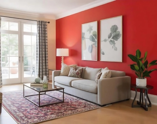
An accent wall is a great way to add a bold statement to any room without overwhelming the space. Choose a vibrant colour that complements interior paint trends with your existing decor to create a focal point that draws the eye. Consider using colours like deep blue, rich burgundy, or even a bright yellow to make a dramatic statement. Check out 1000+ vibrant and serene shades here. Accent walls work particularly well behind headboards in bedrooms, behind sofas in living rooms, or as a backdrop for a home office.
Accent Walls

2. Painted Ceilings

Don’t overlook the “fifth wall” – your ceiling! A painted ceiling can add depth and interest to a room. Opt for a lighter colour to make the room feel more spacious or a darker hue for a cozy, intimate atmosphere. For a subtle yet impactful change, consider a soft pastel shade. For a more dramatic effect, try a bold colour like navy blue or even a metallic finish. This technique is especially effective in dining rooms, bedrooms, or entryways where you want to create a memorable impression.

Painted Ceilings

3. Geometric Patterns

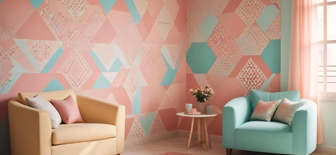
Add a modern touch to your walls with geometric patterns. Use painter’s tape to create clean lines and shapes, then fill them in with your favorite colours. This technique works well in living rooms, bedrooms, or even hallways. Geometric patterns can range from simple stripes or triangles to more complex designs like hexagons or chevrons. Choose colours that contrast for a bold look or stick to a monochromatic palette for something more subtle.
Geometric Patterns

4. Ombre Walls

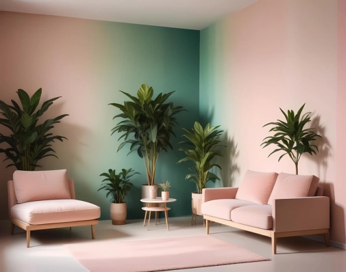
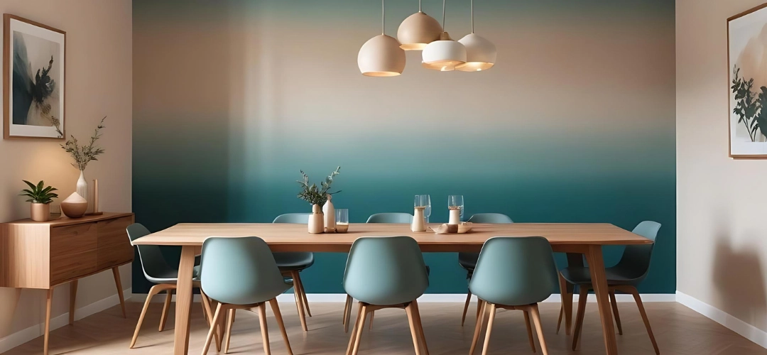
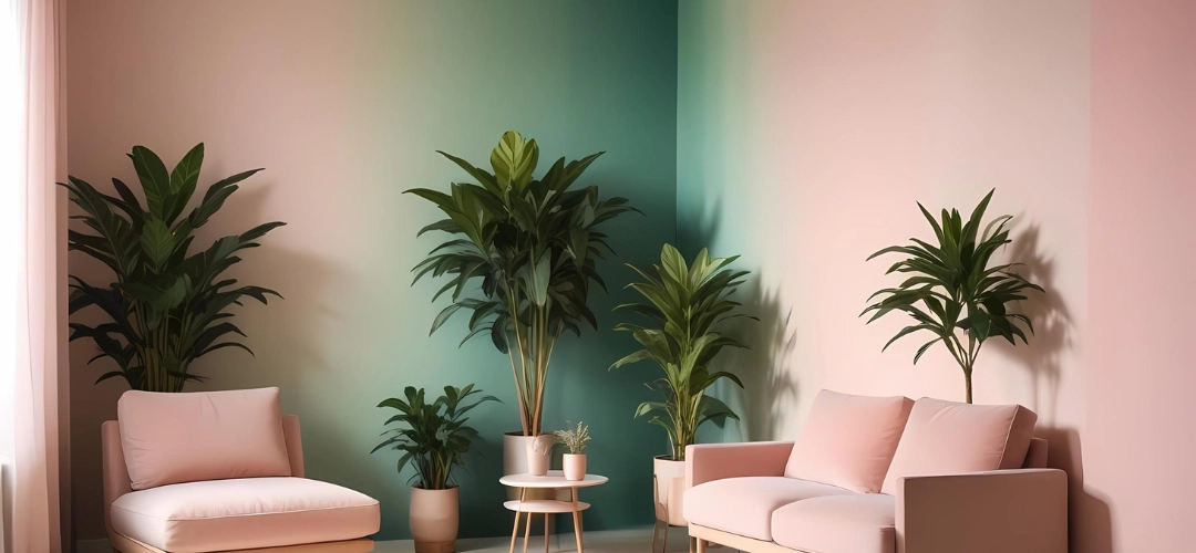
Create a gradient effect on your walls by blending two or more colours. Start with the darkest shade at the bottom and gradually lighten the colour as you move up. This technique adds a serene, artistic flair to any space. Ombre walls are perfect for bedrooms, nurseries, or bathrooms, creating a calming and visually appealing atmosphere. Use colours that transition well together, such as different shades of blue or green.

Ombre Walls

5. Furniture Makeovers

Give old furniture a new lease on life with a fresh coat of paint. To protect your wooden furniture, try Indicus Glaz provides a hard, glossy and durable finish and makes a good choice for metal and wooden substrates like doors, gates, grills, etc. It gives a premium gloss finish and is easy to clean and maintain. From chairs and tables to dressers and bookshelves, painted furniture can add a pop of colour and a unique touch to your decor. Chalk paint is particularly popular for furniture makeovers because it adheres well to most surfaces without the need for extensive prep work. Consider painting a dresser in a bold colour to serve as a statement piece or using stencils to add intricate designs.
Furniture Makeovers

6. Cabinet Transformations

Tired of your kitchen or bathroom cabinets? Repaint them! Choose a bright, cheerful colour for a fun, modern look, or a classic neutral for timeless elegance. Repainting cabinets can completely change the feel of your kitchen or bathroom without the need for a full renovation. For a trendy look, try two-tone cabinets with a darker colour on the lower cabinets and a lighter colour on the upper ones.
Cabinet Transformations

7. Stenciled Designs

Stencils are a fantastic way to add intricate designs to your walls or furniture. Whether you prefer floral patterns, geometric shapes, or custom designs, stencils can help you achieve a professional look with minimal effort. Stenciling is a great option for those who want to add detailed decor without freehand painting. Use stencils to create a feature wall, add interest to a piece of furniture, or even create a faux tile effect on a backsplash.
Stenciled Designs

8. Chalkboard Paint

Turn any wall into a writable surface with chalkboard paint. This is perfect for kitchens, home offices, or kids’ rooms, providing a space to jot down notes, grocery lists, or let your little ones unleash their creativity. Chalkboard paint is versatile and can be applied to walls, doors, or even furniture. In the kitchen, it can be used for menus and shopping lists, while in kids’ rooms, it offers a fun and interactive surface for drawing and learning.
Chalkboard Paint

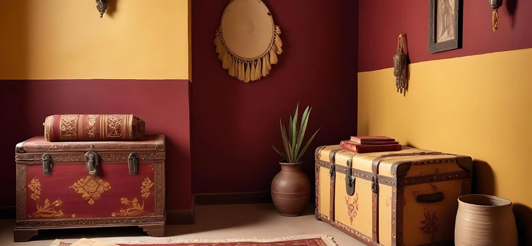
9. Two-Tone Walls

For a sophisticated look, consider painting your walls in two complementary colours. Checkout Indicus Draper its anti-peel technology prevents the paint film from cracking, flaking or peeling off that are common with cement paints. Use a darker shade on the bottom half and a lighter one on top, separated by a crisp line or decorative trim. Two-tone walls can add height and depth to a room, making it feel more dynamic. This technique works well in dining rooms, living rooms, or bedrooms, and allows you to incorporate bold colours without overwhelming the space.
Two-Tone Walls

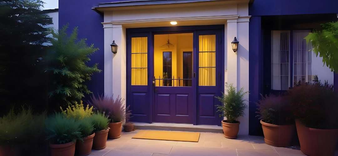
10. Outdoor Touches

Extend your creativity outdoors by painting your front door, shutters, or even outdoor furniture with Indicus Glaz. It provides a glossy and durable finish and makes a good choice for metal and wooden substrates like doors, gates, grills, etc. A bright, welcoming front door can significantly boost your home’s curb appeal. Choose a colour that contrasts with your home’s exterior for a standout look. Painted shutters and furniture can tie your outdoor decor together and create a cohesive, inviting space. Don’t be afraid to use bold, vibrant colours that reflect your personality.
Outdoor Touches

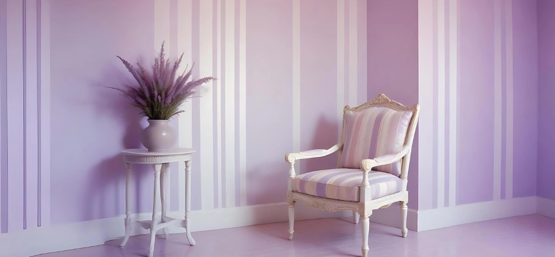
11. Stripes and Borders

Add visual interest to your walls with stripes or borders. Horizontal stripes can make a room feel wider, while vertical stripes can add height. Borders can frame a room or highlight architectural features. Stripes can be subtle with neutral colours or bold with contrasting hues. Use borders to create a chair rail effect or to frame the top of a room, adding a touch of elegance and sophistication. For perfect walls, Check Indicus Admyra which  adds a sense of depth and dimension to the painted wall, making the colours appear dynamic and alive. It gives rich and smooth colours that elevate the overall aesthetics of the space, creating a sophisticated ambiance.
Stripes and Borders

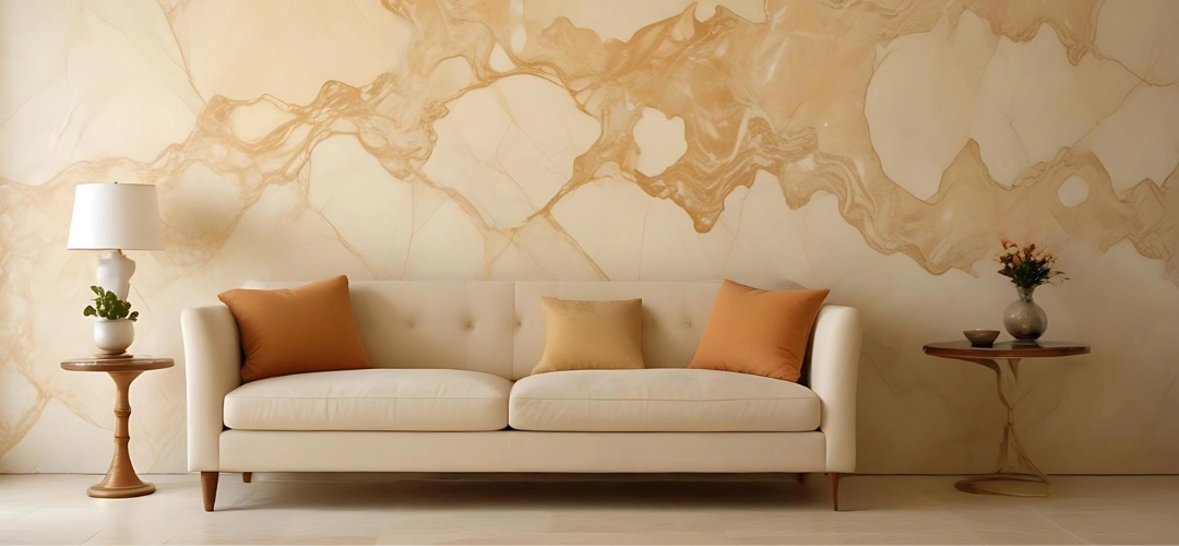
12. Faux Finishes

Create the look of marble, wood, or other expensive materials with faux finish painting techniques. These can add texture and depth to your walls, giving them a luxurious feel without the high cost. Faux finishes can mimic the appearance of materials like Venetian plaster, brushed metal, or aged patina. This technique requires a bit more skill and patience but can transform your walls into stunning works of art.

Faux Finishes

13. Murals

For a truly unique and personalized touch, consider painting a mural. Whether it’s a scenic landscape, abstract art, or a whimsical design for a child’s room, murals can transform a plain wall into a stunning work of wall paint creativity. Murals allow you to express your creativity and bring a piece of your personality into your home. If painting a mural yourself feels daunting, consider hiring a local artist to bring your vision to life.
Murals

14. Colour Blocking

Color blocking involves painting large, solid blocks of colour on your walls or furniture to create a bold, modern look. This technique can be used to highlight specific areas of a room or to create an eye-catching design. For example, you could paint a block of colour behind a shelving unit or create a colour-blocked headboard in a bedroom. This technique is simple but can have a big impact.

Colour Blocking

15. Highlighting Architectural Features

Use paint to highlight architectural features in your home, such as moldings, trim, and built-ins. Painting these elements in a contrasting colour can make them stand out and add a touch of elegance to your space. For example, painting the trim in a crisp white or a bold colour can make it pop against a darker wall colour. This technique is an easy way to enhance the character of your home without a major renovation.

Highlighting Architectural Features

Paint is one of the most versatile tools in home decor, offering endless possibilities to express your style and creativity. By exploring these 15 creative ways to use paint around your home, you can easily transform any space into a vibrant and personalized haven. So grab your brushes, pick your colours, and start your next painting project today with our best interior and exterior paints.

Happy decorating!

Click here for more information about Indicus Paints or call 1800 599 3939.

Your Path to a Stylish Home: 9 Interior Design Styles for Beginners

Your Path to a Stylish Home: 9 Interior Design Styles for Beginners

Embarking on the journey of decorating your home can be both exciting and overwhelming, especially with so many design styles to choose from. To help you navigate this world, we’ve broken down nine popular interior design styles, each with its own unique characteristics and appeal. Whether you’re a minimalist at heart or a lover of vintage charm, there’s a style here for everyone. Let’s explore these styles with a touch of Indian influence to make them more relatable and applicable.

1. Modern

Clean Lines and Simple Forms: Modern design emphasizes simplicity and clarity in form. Furniture often features straight lines and smooth surfaces without ornate details.

Neutral Colour Palette: Modern spaces typically use neutral colours such as whites, blacks, and grays. Bold accent colours are used sparingly to add interest. Explore a range of neutral colours from our Colour Symphony.

Natural Materials: Wood, glass, and metal are commonly used in modern design, contributing to a sleek and polished look.

Minimal Ornamentation: Decorations are minimal and functional, focusing on the essentials and avoiding clutter.
Ideal For:

Those who appreciate a sleek, streamlined look and want a functional, clutter-free space. Modern design suits people who enjoy clean, open spaces with a sophisticated edge.

2. Contemporary

Evolving Style: Unlike modern design, contemporary style is fluid and reflects current trends. It’s always changing and adapting.

Mix of Textures and Materials: Combining different textures, such as metal, glass, and fabric, adds depth and interest.

Neutral Colours with Bold Accents: While the base palette is neutral, contemporary design often features bold, contrasting colours and striking accents.

Curved Lines: Soft, curved lines and shapes are common, adding a touch of elegance and comfort.

Contemporary
Ideal For:

Individuals who enjoy staying up-to-date with design trends and like a mix of modern elements. Contemporary design is perfect for those who want a home that feels fresh and current.

3. Minimalist

Extreme Simplicity: Minimalism is all about stripping down to the essentials. Furniture is simple and unadorned. Click here for the tips to effectively arrange furniture.

Neutral Colour Schemes: The colour palette is typically limited to white, black, and gray, creating a clean and calm environment.

Bare Essentials: Only essential items are included, and decorative objects are minimal.

Open Spaces: Spaces are uncluttered and open, often featuring large windows to maximize natural light.

Minimalist
Ideal For:

People who prefer a clean, uncluttered environment and focus on essentials. Minimalism suits those who find beauty in simplicity and order.

4. Scandinavian

Light, Airy Spaces: Scandinavian design emphasizes light and open spaces. Large windows and white walls are common.

Natural Materials: Wood, wool, and other natural materials are used to create a warm and inviting atmosphere.

Neutral Colours with Pastels: The primary palette is neutral, but it’s often accented with pastel colours for a fresh and cheerful look.

Cozy Decor: Elements like throws, pillows, and rugs add a cozy touch, creating a welcoming environment.

Scandinavian
Ideal For:

Those who appreciate a cozy, yet functional aesthetic with a touch of nature. Scandinavian design is perfect for anyone looking to create a bright and inviting space.

5. Industrial

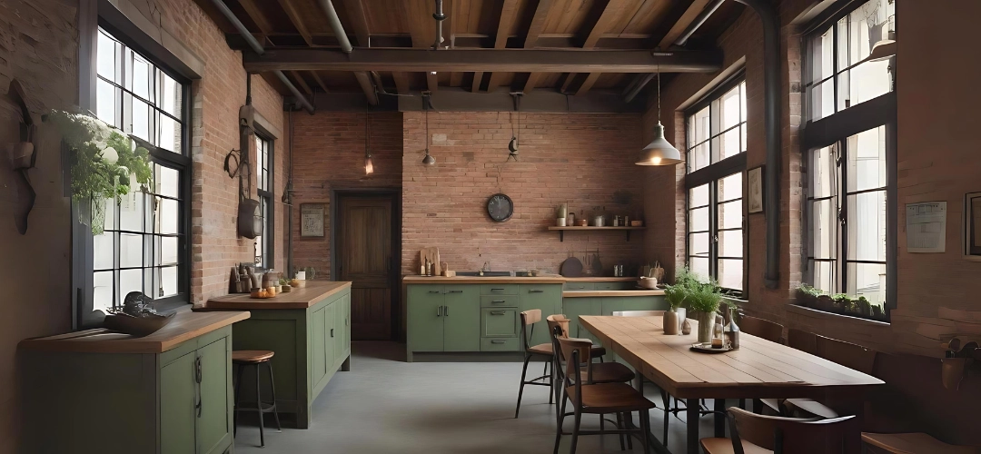
Raw, Unfinished Look: Exposed brick walls, pipes, and beams give an industrial space its characteristic raw and edgy feel.

Neutral Colour Palette: Industrial design often uses a palette of grays, blacks, and browns.

Use of Metal and Wood: Metal fixtures and wooden furniture are staples, often combined with reclaimed materials.

Open Spaces: High ceilings and open floor plans are typical in industrial design, reflecting its warehouse origins.

Industrial
Ideal For:

Fans of the urban loft look who appreciate raw, edgy design elements. Industrial design suits those who love a mix of old and new with a utilitarian edge

6. Bohemian

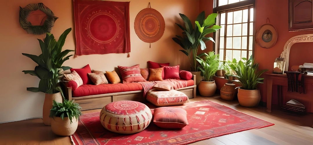
Eclectic Mix: Bohemian design is all about mixing different styles, colours, and patterns to create a unique and personal space.

Natural and Handcrafted Items: Use of natural materials and handcrafted items like woven baskets and textiles.

Layered Textiles: Rugs, throws, and cushions in various patterns and textures create a cozy, layered look.

Relaxed Atmosphere: Bohemian spaces are informal and inviting, often featuring a variety of seating options and lots of greenery.

Ideal For:

Creative individuals who love an eclectic, carefree style with a personal touch. Bohemian design is perfect for those who enjoy expressing their individuality through their home decor.

7. Mid-Century Modern

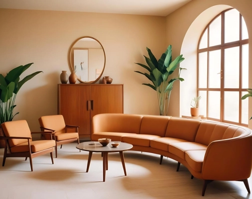
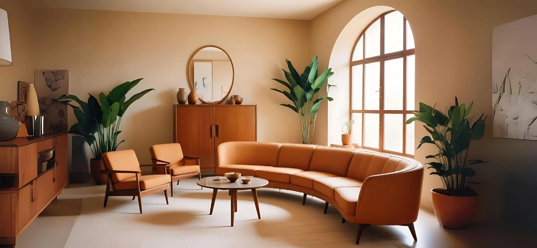
Clean Lines and Organic Curves: Mid-century modern design features simple, clean lines and organic curves.

Use of Wood, Metal, and Glass: These materials are used to create furniture that is both functional and stylish. Get Smooth finish wood coating surfaces with Indicus Woodfina which provides good hardness to the surface.

Bold Colours and Patterns: Bright colours and geometric patterns are often used to add interest.

Functional Spaces: Mid-century modern design focuses on creating functional, uncluttered spaces with a minimalist aesthetic.
Mid-Century Modern
Ideal For:

Those who appreciate vintage aesthetics combined with modern functionality. Mid-century modern design suits anyone looking to add a touch of retro charm to their home.

8. Traditional

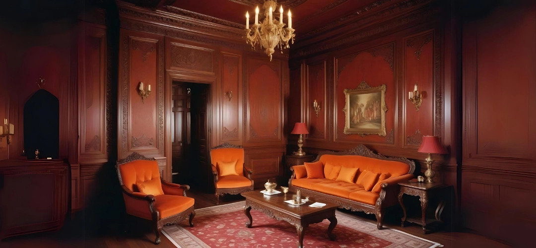
Rich Colours and Intricate Patterns: Traditional design features a rich colour palette and intricate patterns. Explore 1,000+ colours from our Colour Symphony palette here.

Classic Furniture and Antiques: Furniture is often heavy and ornate, with an emphasis on quality and craftsmanship.

Symmetry and Balance: Traditional spaces are symmetrical and balanced, creating a formal and elegant atmosphere.

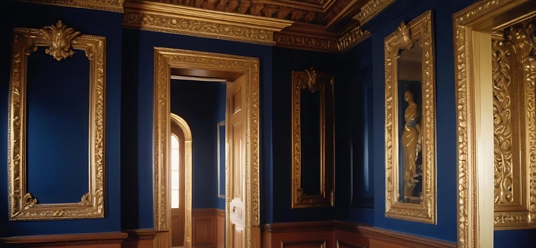
Decorative Details: Elements like crown molding, wood paneling, and elegant drapery add to the classic look.

Traditional
Ideal For:

People who love timeless elegance and a sense of history in their home decor. Traditional design is ideal for those who appreciate the grandeur and formality of classic interiors.

Check out the secrets of creating the ultimate 70’s inspired living room in your home.

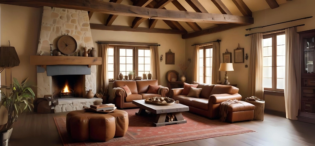
9. Rustic

Emphasis on Natural, Raw Materials: Rustic design focuses on using natural materials like wood, stone, and metal.

Warm, Earthy Colour Palette: Colours are typically warm and earthy, creating a cozy and inviting atmosphere.

Cozy, Homey Furnishings: Furniture is often sturdy and comfortable, with a worn, lived-in look.

Handcrafted Items: Incorporating handcrafted items and vintage pieces adds to the rustic charm.

Ideal For:

Those who appreciate a cozy, country-style home with natural charm. Rustic design is perfect for creating a warm and inviting space that feels like a retreat from the hustle and bustle of modern life.

Choosing an interior design style is a personal decision that should reflect your tastes, lifestyle, and personality. By understanding the key characteristics of these nine popular styles, you can better identify what resonates with you and how to incorporate those elements into your own home. Whether you’re drawn to the clean lines of modern design or the eclectic mix of bohemian, there’s a style out there that can help you create a space that feels uniquely yours.
Happy decorating!

Click here for more information about Indicus Paints or call 1800 599 3939.