You are using an outdated browser. Please upgrade your browser to improve your experience.

Choosing Between Warm and Cool Tones for Your Interior Walls

Choosing Between Warm and Cool Tones for Your Interior Walls

When designing an interior space, one of the most crucial decisions revolves around the colour palette. The colours you choose not only set the mood but also influence the way a room feels. Two major categories that often come into play are warm tones and cool tones. Each of these categories brings a unique energy to the room, affecting the perception of space, light, and ambiance. Whether you’re looking for a cosy retreat or an open, airy feel, understanding how to use warm and cool tones effectively can make all the difference.

In this blog, we will explore the significance of warm and cool tones, their psychological impact, how to blend them for balance, and offer specific room-wise suggestions to help you choose the best colour for your interior. Let’s dive in.
Choosing Between Warm and Cool Tones for Your Interior Walls

Understanding Warm and Cool Tones: A Brief Overview

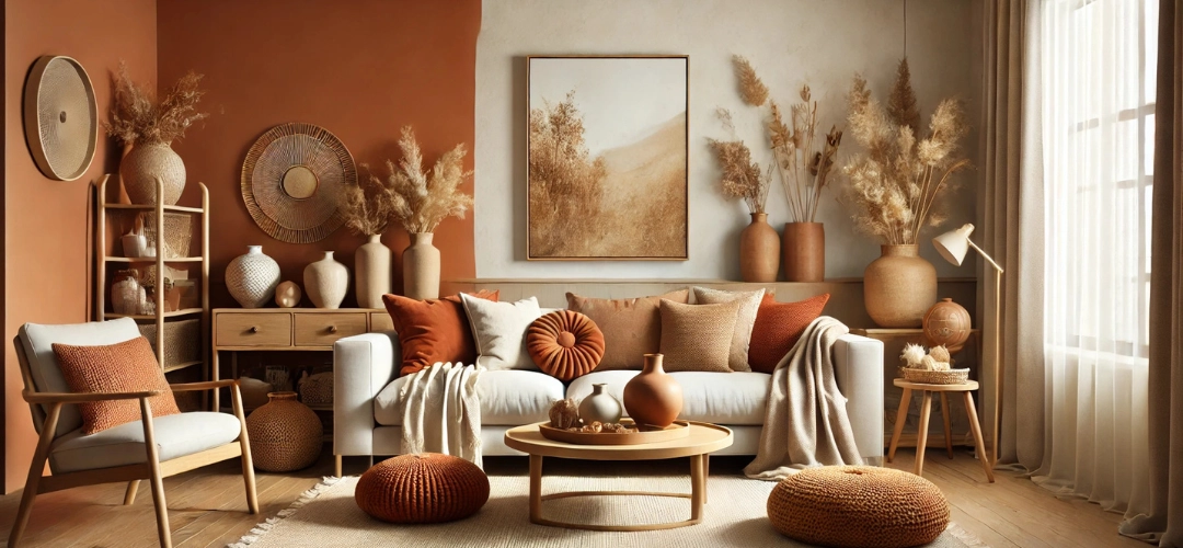
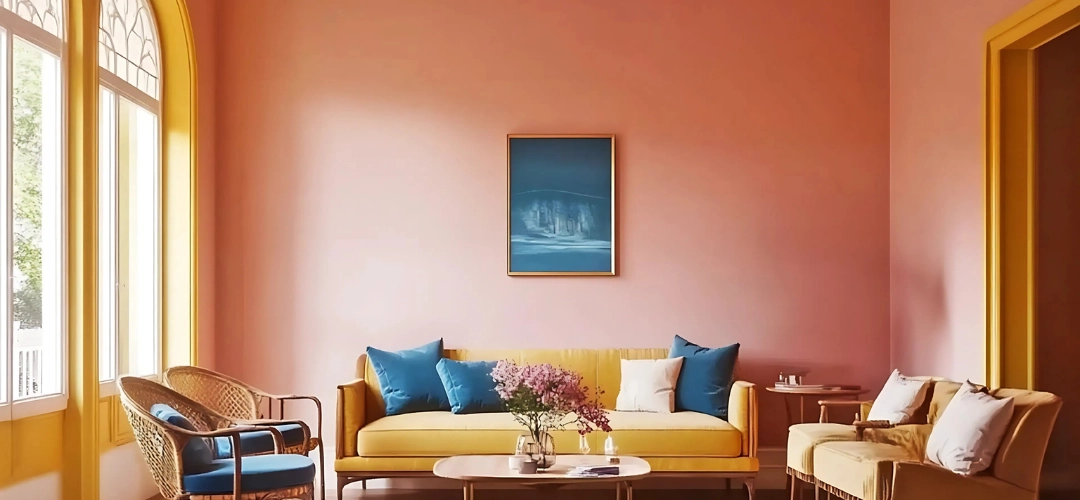
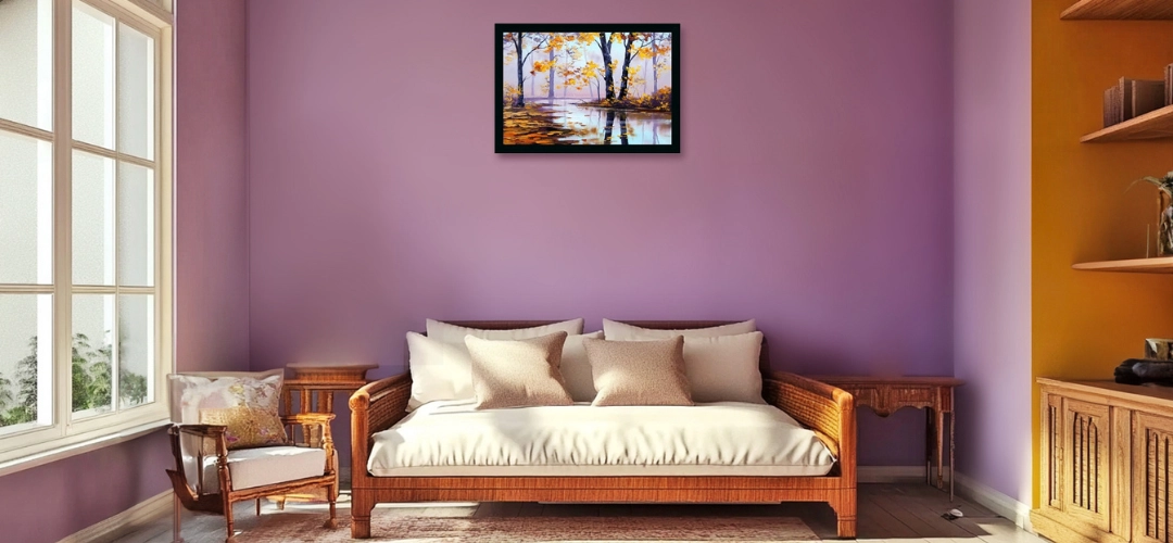
The distinction between warm tones and cool tones is fundamental to creating the desired mood in any room. Warm tones, like reds, oranges, and yellows, evoke energy, intimacy, and cosiness, making them ideal for social spaces. Cool tones, such as blues, greens, and purples, bring calmness, tranquility, and elegance, often used to foster relaxation in bedrooms or bathrooms.

In the sections ahead, we’ll explore how warm tones influence mood and space perception, when to use cool tones for creating serenity, and practical tips for harmonising these contrasting palettes to craft a cohesive interior design.

Impact of Warm Tones on Mood and Space Perception

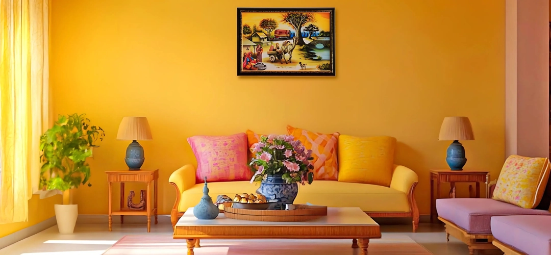
The impact of warm tones on a room’s mood is immediate and noticeable. Warm colours have been shown to stimulate energy, increase heart rates, and even enhance appetite. These tones can make a space feel cosy, intimate, and inviting, which is why they are often used in living rooms, dining areas, and kitchens—places where people gather and socialise.

Psychologically, warm tones are uplifting and can help create an atmosphere of comfort and joy. A rich, warm red accent wall, for example, can evoke feelings of passion and excitement, while soft terracotta or earthy yellows can make a room feel grounded and welcoming.
Choosing Between Warm and Cool Tones for Your Interior Walls
Space Perception: Warm tones also have an interesting effect on the perception of space. Unlike cool tones, which recede and create a sense of openness, warm colours tend to advance, making a room feel more enclosed. This effect can be useful in larger spaces that may feel too open or echoey. By incorporating warm tones, you can bring a sense of closeness and intimacy to larger rooms. However, in smaller rooms, too many warm colours might make the space feel cramped and overwhelming, so it’s essential to balance them with lighter or neutral shades.

Psychological Effects: colours like red and orange are known to stimulate action and conversation. These colours are perfect for spaces designed for socialising, such as the living room or dining room. A soft golden yellow can bring cheer and optimism, making it ideal for areas where you want to foster creativity and warmth, like kitchens or home offices.

Energy & Vibrancy: Warm tones can also promote physical activity. This makes them excellent choices for kitchens, dining rooms, and other high-traffic spaces. The energy that warm tones bring helps to keep the flow of activity vibrant, making them perfect for spaces that need an energetic vibe.

Cool Tones for Serenity and Elegance: When to Use Them

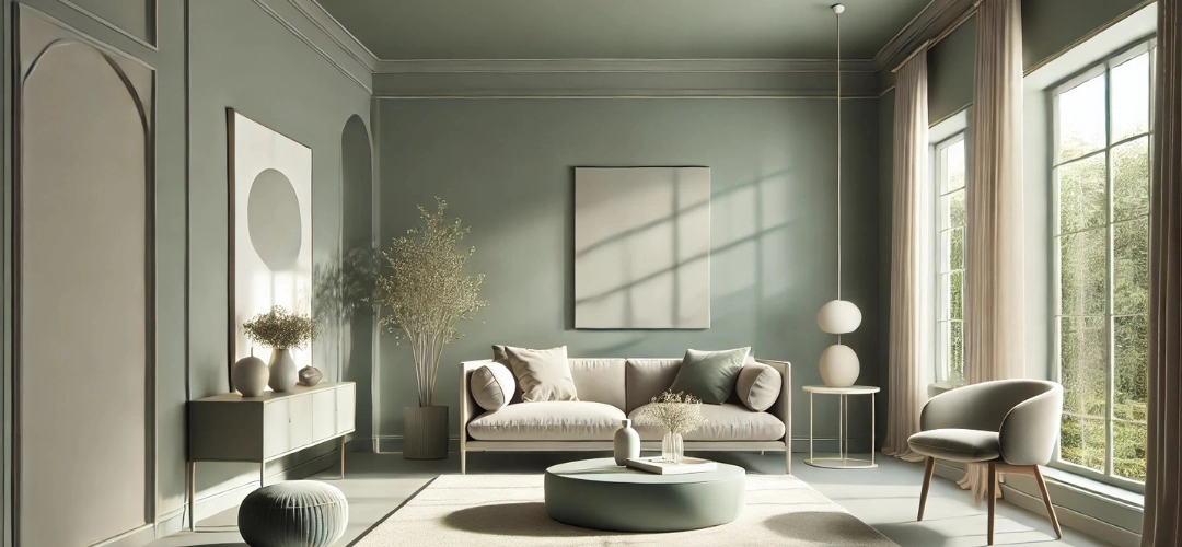
Cool tones offer a sharp contrast to warm tones. They evoke a sense of serenity, calmness, and even sophistication. When used in interior spaces, cool colours can help create a tranquil environment that encourages relaxation and reflection.

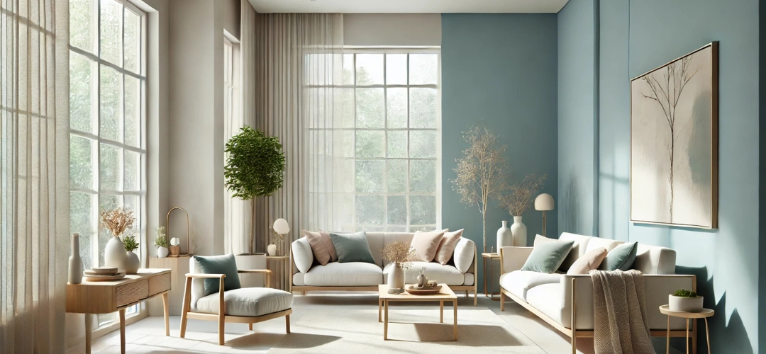
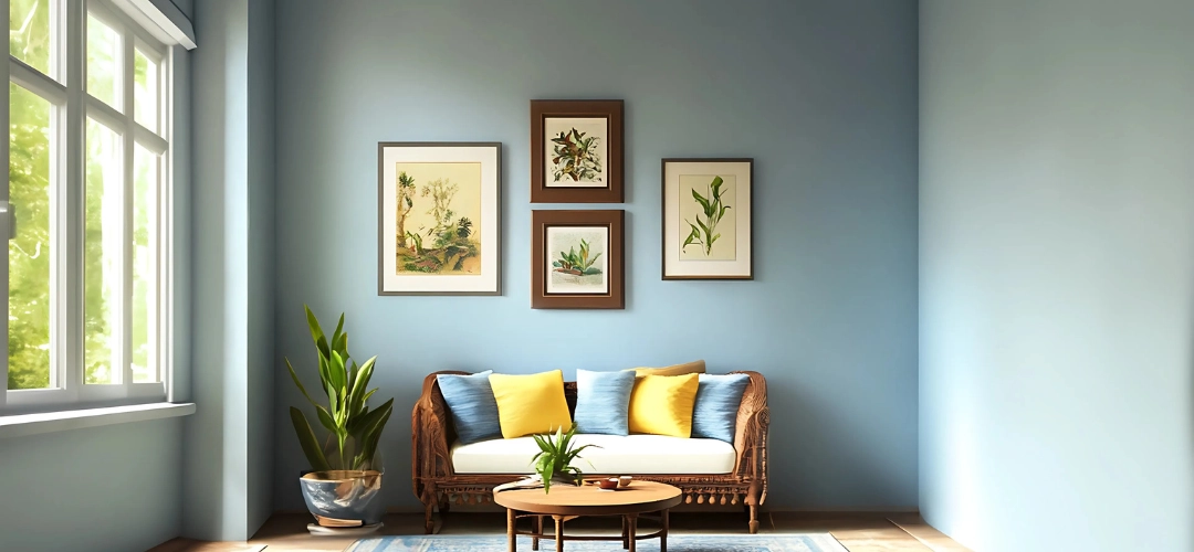
The psychological impact of cool tones is profound. Blues and greens are inherently calming and are often associated with nature—blue skies, green forests, and bodies of water. These tones can lower blood pressure and heart rate, making them ideal for spaces where relaxation and unwinding are essential.
Choosing Between Warm and Cool Tones for Your Interior Walls
Space Perception: Cool tones tend to recede in the visual field, making them excellent choices for rooms where you want to create the illusion of space. If you have a small or cramped room, a cool-toned paint can visually expand the area, making it appear larger and more open. This is particularly effective in bedrooms, bathrooms, or home offices where a sense of calm and space is needed.

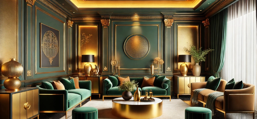
Additionally, cool tones can lend a sophisticated and elegant feel to a room. Shades of navy blue, charcoal gray, or deep teal are perfect for creating a sense of refined elegance. These colours work particularly well in formal dining rooms, living rooms, or home offices where you want to project professionalism and calm authority.

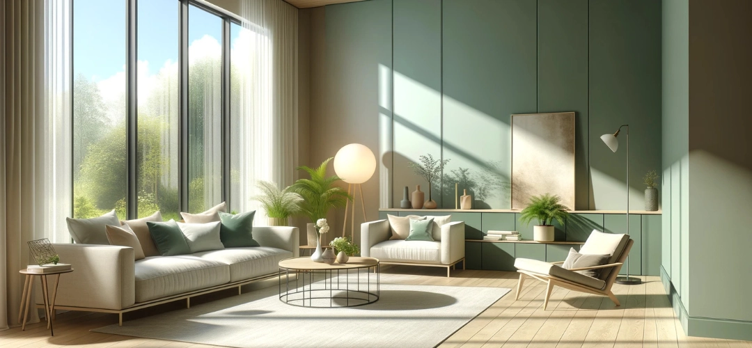
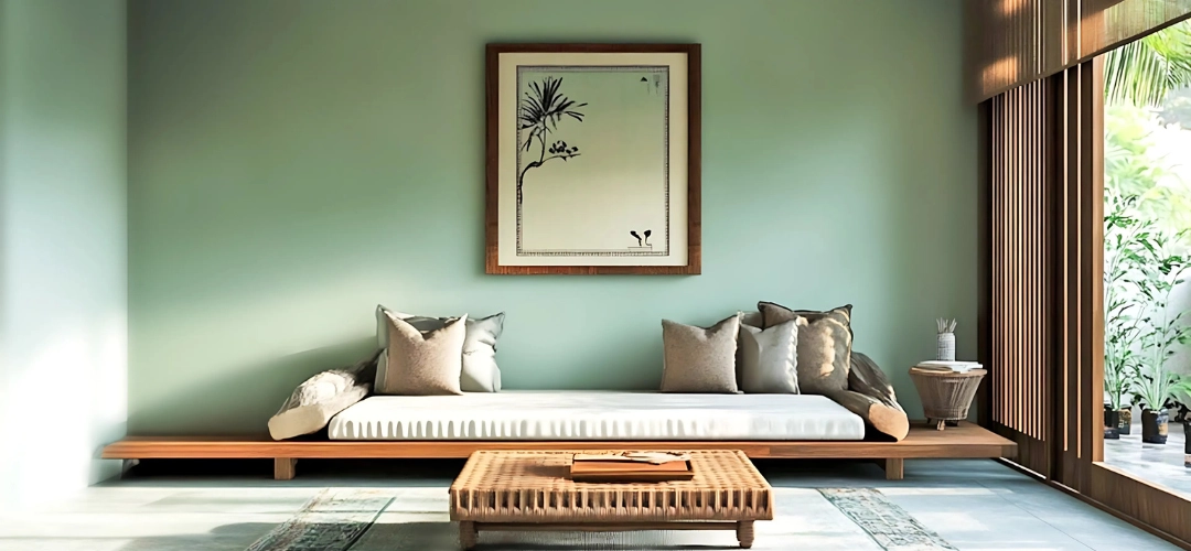
When to Use Cool Tones: Cool tones are best used in spaces where relaxation, tranquility, and focus are key. Bedrooms are an ideal space for soft blues or greens to encourage restful sleep, while bathrooms often benefit from calming, serene tones like light blue or soft seafoam green. These tones also work well in open-plan living areas or hallways, where they create a calm, spacious feel that connects various parts of the home.

Tips for Blending Warm and Cool Tones Harmoniously

While both warm and cool tones offer unique benefits, the key to creating a balanced and harmonious interior lies in blending these tones thoughtfully. Mixing warm and cool tones can create a dynamic and visually appealing space, but it’s important to use them in a way that feels intentional rather than chaotic. Here are a few tips to blend them seamlessly:
  1. Use Warm Tones as Accents: If you’re working with a predominantly cool-toned room, introduce warm accents to add contrast and vibrancy. For example, a room painted in soft gray or blue can benefit from a pop of rich mustard yellow, burnt orange, or deep red in the form of pillows, rugs, or artwork.
  2. Focus on One Dominant Tone: When blending warm and cool tones, it’s essential to have one tone dominate the room while the other serves as an accent. If you have a room with a cool base, like a soft blue wall colour, you could introduce warm, natural textures such as wood furniture, brass light fixtures, or earthy-coloured throw pillows.
  3. Create Zones with colour: In open-plan spaces or larger rooms, you can create distinct zones using warm and cool tones. For instance, use cooler colours in areas where you want a relaxed atmosphere, like a reading nook or a study area, and warmer tones in spaces designed for socialising, such as the living or dining areas.
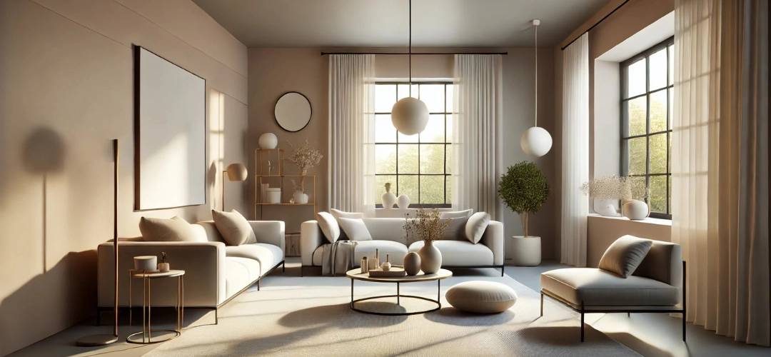
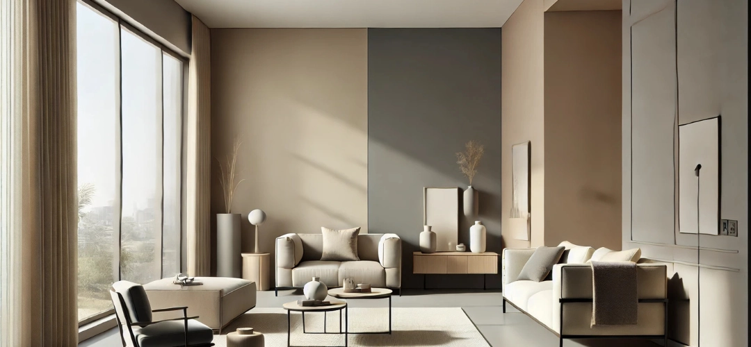
  4. Use Neutrals to Balance: Neutrals, like whites, grays, and beige, are an excellent bridge between warm and cool tones. These colours can serve as a neutral backdrop that helps balance the two extremes, creating cohesion in the room.
  5. Consider the Lighting: Both warm and cool tones react differently to natural and artificial lighting. Warm tones can appear more intense under bright natural light, while cool tones can appear cooler and more subdued. Make sure to test your chosen colours in different lighting conditions to see how they interact.
Choosing Between Warm and Cool Tones for Your Interior Walls

Room-Wise Suggestions: Which Tone Works Best Where?

Each room in your home has a specific function and mood you want to create. Here’s a quick guide to help you choose the right warm or cool tones for different spaces:
  • Living Room: The living room is a gathering space, so warm tones can help create a welcoming, energetic atmosphere. Shades like deep red, mustard yellow, or soft terracotta can bring warmth and vibrancy to the room. If your living room has a lot of natural light, you can balance it with cooler tones such as a soft gray accent wall, which helps to calm the energy and create a sense of balance.
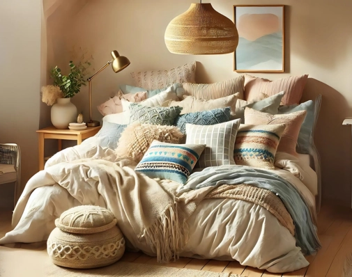
  • Bedroom: For bedrooms, cool tones are the best choice, as they promote relaxation and restfulness. Soft blues, greens, and lavender are perfect for creating a serene environment that encourages sleep. However, incorporating warm neutrals like beige or light brown in bedding or furniture can still make the room feel cosy without overpowering the tranquility.
  • Kitchen: The kitchen is often the heart of the home, so choosing warm tones is ideal. colours like pale yellow, soft red, or peach can help create an inviting, energising space where people gather. For a more contemporary look, pairing warm tones with cool-toned accents like stainless steel appliances can add a stylish, modern touch.
  • Bathroom: Cool tones like light blues, seafoam greens, or soft grays are perfect for bathrooms, creating a calming, spa-like environment. If you want to add a bit of warmth, opt for natural wood accents or warm-toned towels to add contrast without sacrificing serenity.
  • Dining Room: In dining rooms, warm tones like deep reds, terracotta, or rich golds can encourage conversation and create a cosy, intimate atmosphere. These tones stimulate the appetite and contribute to a warm, welcoming dining experience.
Choosing Between Warm and Cool Tones for Your Interior Walls

Conclusion

Choosing between warm and cool tones for your interior walls depends on the mood and atmosphere you want to create. Warm tones energise a space, making it feel cosy and inviting, while cool tones promote relaxation and serenity, often expanding the visual perception of space. The key to creating a balanced and harmonious interior lies in understanding the psychological impact of each colour, blending them thoughtfully, and using the right tone for each room’s function. Whether you opt for the bold, energising hues of warm tones or the calming elegance of cool shades, selecting the right palette will transform your home into a place of comfort, style, and personal expression.
The Ultimate DIY Guide to Geometric Wall Art for Your Home

The Ultimate DIY Guide to Geometric Wall Art for Your Home

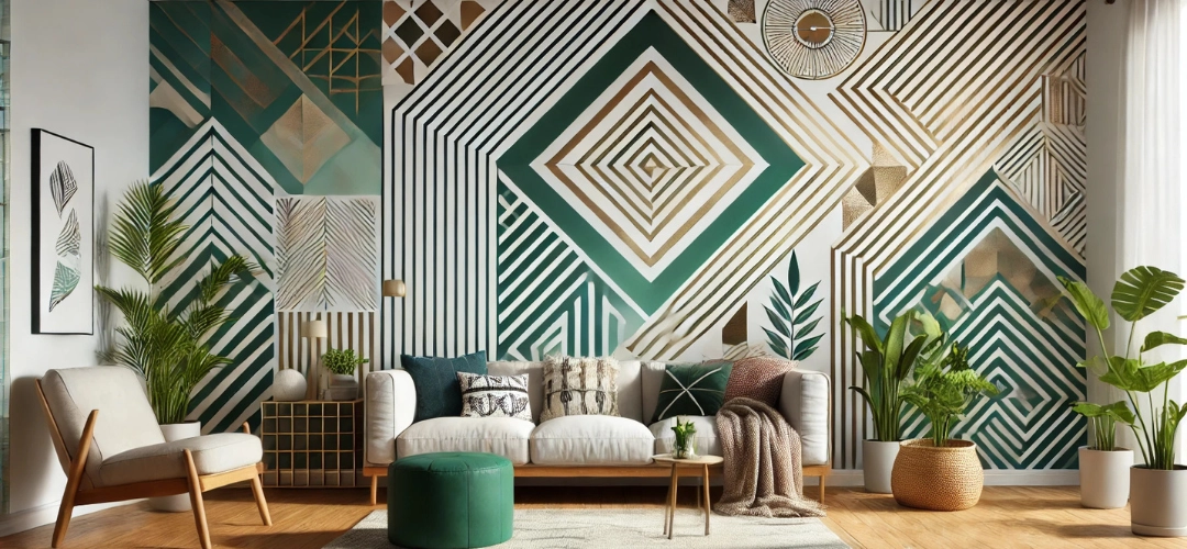
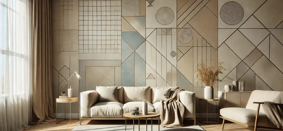
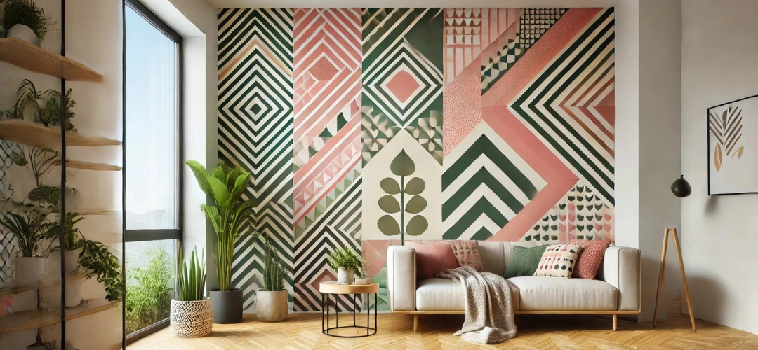
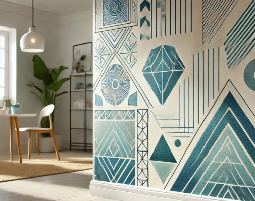
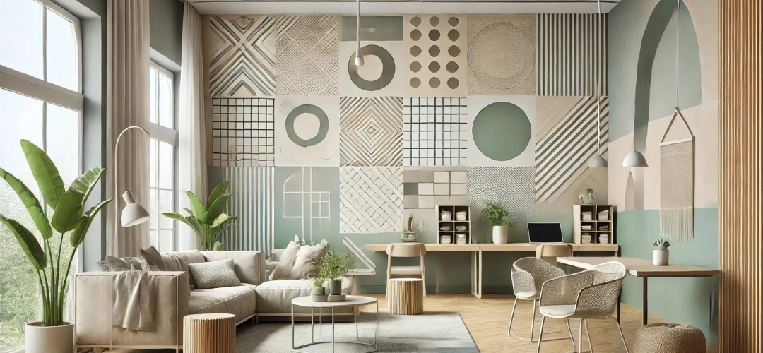
Geometric wall art has taken the interior design world by storm, offering a stylish and customizable way to transform blank walls into statement pieces. Whether you prefer sharp, angular patterns or flowing, symmetrical curves, geometric designs are versatile enough to fit any décor style. Best of all, creating your geometric wall art is not only affordable but also a rewarding DIY project that allows you to add a personal touch to your home.

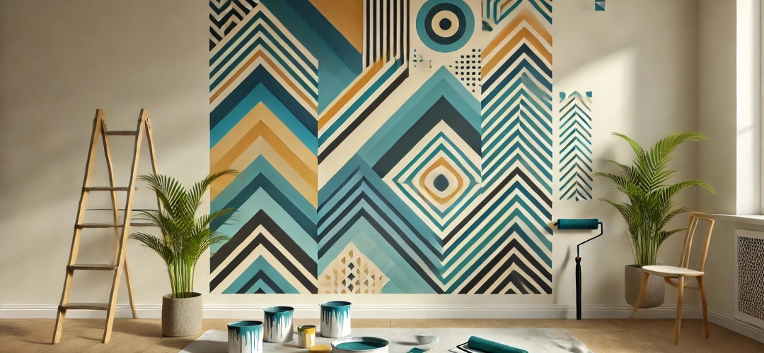
This guide will take you through every step of the process, from understanding why geometric wall art is a great choice, gathering the necessary materials, and creating your design to achieving a professional finish that wows everyone who sees it. Let’s dive in!
The Ultimate DIY Guide to Geometric Wall Art for Your Home

Why Choose Geometric Wall Art for Your Home?

Timeless Aesthetic Appeal
Geometric patterns have a classic, structured look that never goes out of style. Their symmetry and clean lines bring order and elegance to a space, making them perfect for modern, minimalistic, or even eclectic interiors.

Versatility in Design
The possibilities are endless when it comes to geometric wall art. You can create simple patterns like triangles or squares for a subtle effect or opt for more complex designs like hexagons or fractals to make a bold statement.

Customizable for Every Space
Geometric art can be tailored to suit different areas of your home. A large-scale design can act as a focal point in the living room, while smaller, intricate patterns work beautifully in bedrooms, hallways, or home offices.
The Ultimate DIY Guide to Geometric Wall Art for Your Home
A Budget-Friendly Solution
Unlike expensive wallpaper or art installations, DIY geometric wall art requires minimal materials, most of which are readily available. This makes it an economical way to refresh your home.

Adds Depth and Character
By using contrasting colors or textured finishes, geometric wall art can create depth and dimension, making a small room feel larger or adding personality to an otherwise plain space.

Essential Tools and Materials You’ll Need

To create flawless geometric wall art, having the right tools is essential. Here’s what you’ll need:

Core Materials
  • Painter’s Tape: Ensures crisp, clean lines and allows you to section off shapes easily.
  • Paints: Choose high-quality wall paint or acrylics in your preferred colors. Matte or satin finishes work best for a modern look.
  • Paintbrushes and Rollers: A variety of brush sizes helps with precision, while rollers make covering large areas quicker.
Measuring and Planning Tools
  • Measuring Tape: Ensures accurate dimensions for geometric shapes.
  • Ruler or T-Square: Helps maintain straight edges and precise angles.
  • Level: Ensures your design stays aligned and symmetrical.
For Prep and Clean-Up
  • Drop Cloths or Plastic Sheets: Protect floors and furniture from accidental spills.
  • Pencil and Eraser: For sketching your design directly on the wall.
  • Masking Paper or Cardboard: Useful for testing colors and practicing brush strokes.
Optional Enhancements
  • Metallic Paints: Add a luxurious touch with gold, silver, or bronze accents.
  • Clear Sealant: Protects your finished design and gives it a polished look.
The Ultimate DIY Guide to Geometric Wall Art for Your Home

Step-by-Step Guide to Creating Geometric Wall Art

Step 1: Choose Your Design
  • Select a Pattern: Research geometric designs that resonate with your aesthetic, such as triangles, diamonds, chevrons, or hexagons.
  • Plan Placement: Decide where your design will go and consider the dimensions of the wall.
Step 2: Prep the Wall
  • Clean the wall surface thoroughly to remove dust and grime.
  • If the wall isn’t already painted in your desired base color, apply a base coat and allow it to dry completely.
Step 3: Sketch Your Design
  • Lightly pencil in your geometric pattern on the wall. Use a ruler, level, and measuring tape for accuracy. Ensure all lines and shapes are evenly spaced and aligned.
Step 4: Apply Masking Tape
  • Tape along the edges of your shapes. Make sure the masking tape adheres well to the wall to prevent paint bleeding.
Step 5: Paint the Shapes
  • Start filling in the shapes with your chosen colors. Use a small brush for edges and a roller for larger areas.
  • Apply at least two coats for full opacity, letting each layer dry before applying the next.
Step 6: Remove the Masking Tape
  • While the paint is still slightly wet, carefully remove the masking tape at a 45-degree angle. This helps prevent peeling or chipping.
Step 7: Touch Up
  • Use a fine brush to clean up any smudges or uneven edges for a professional finish.
The Ultimate DIY Guide to Geometric Wall Art for Your Home

Color Choices: Matching Art with Wall Palettes

The right color palette can elevate your geometric wall art, ensuring it complements the rest of your décor.

Neutral Tones for Subtle Sophistication
Shades like beige, taupe, and soft gray create an understated elegance that works well in living rooms or bedrooms with a modern or Scandinavian aesthetic.

Vibrant Hues for Bold Statements
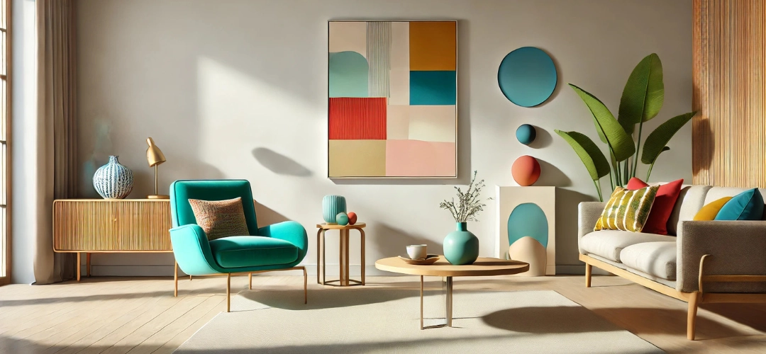
Bright colors like mustard yellow, teal, and coral infuse energy and fun into your design. These colors are great for accent walls in playrooms or dining spaces.

Monochromatic Magic
Using varying shades of one color—such as light, medium, and dark blue—creates a cohesive, sophisticated look that’s perfect for offices or hallways.

Metallic Highlights
Gold, silver, or copper accents add a luxurious feel, especially in spaces like master bedrooms or formal dining rooms.

Pastels for Serenity
Soft pinks, mint greens, and baby blues create a calming effect, making them ideal for nurseries or reading nooks.
The Ultimate DIY Guide to Geometric Wall Art for Your Home

Tips to Achieve a Professional-Looking Finish

  • Take Your Time: Precision is key for clean lines and even shapes. Work patiently to avoid mistakes.
  • Test Colors First: Always test your color combinations on a small area or masking paper to see how they interact.
  • Use High-Quality Masking Tape: Avoid budget masking tape, as it may bleed or leave residue.
  • Maintain a Steady Hand: Use a level for straight lines and take breaks if you’re painting intricate details.
  • Layer Strategically: Start with lighter colors and layer darker ones on top for better coverage.
  • Seal Your Work: Consider adding a clear sealant to protect your design from fading or wear.

Conclusion

Geometric wall art is more than just a DIY project—it’s a way to express your creativity and transform your home into a space that truly reflects your personality. With a little planning, the right tools, and careful execution, you can create a stunning feature wall that rivals professional artwork.

Whether you opt for bold, vibrant patterns or subtle, neutral tones, the possibilities with geometric wall art are endless. So, grab your tools, unleash your inner artist, and start turning your walls into masterpieces!

Creative Colour Palettes for False Ceilings in Indian Homes

Creative Colour Palettes for False Ceilings in Indian Homes

False ceilings are no longer just a practical solution for concealing wires and pipes — they’ve evolved into an integral part of modern interior design. They provide an opportunity to add a touch of creativity and flair to a room, enhancing both the aesthetics and ambiance of your living space.

When choosing a colour palette for your false ceiling, it’s important to remember that ceilings are often the largest surface area in a room. The right choice of colour can completely transform the mood of the space, making it feel more spacious, cosy, or vibrant. Whether you’re looking to add contrast, create a serene atmosphere, or blend seamlessly with your existing décour, selecting the perfect ceiling colour can have a profound impact.

In this blog, we’ll guide you through different colour palettes for false ceilings in Indian homes using Indicus Paints to suit every style—whether modern, traditional, or eclectic.
Creative Colour Palettes for False Ceilings in Indian Homes

Why False Ceilings Deserve a Thoughtful Colour Choice

The colour you choose for your false ceiling has the power to influence the entire look and feel of your space. Here’s why you should carefully consider your ceiling colour:

Aesthetic Impact
The ceiling is often the “fifth wall” in interior design, and it can make or break the room’s vibe. A well-chosen ceiling colour can harmonise your walls, floors, and furniture, or create a striking contrast to add visual interest.

Mood and Ambience
Colours evoke emotions, and the ceiling colour is no exception. Light and neutral shades tend to open up a space, making it feel larger and brighter, while darker colours create a sense of intimacy and warmth.
Functional Considerations
In addition to aesthetics, the ceiling’s colour can affect the overall lighting in the room. Light colours reflect more light, making rooms appear brighter, while darker shades absorb light, creating a more subdued, cosy atmosphere.
Creative Colour Palettes for False Ceilings in Indian Homes

Bold Contrasts for Modern Indian Living Spaces

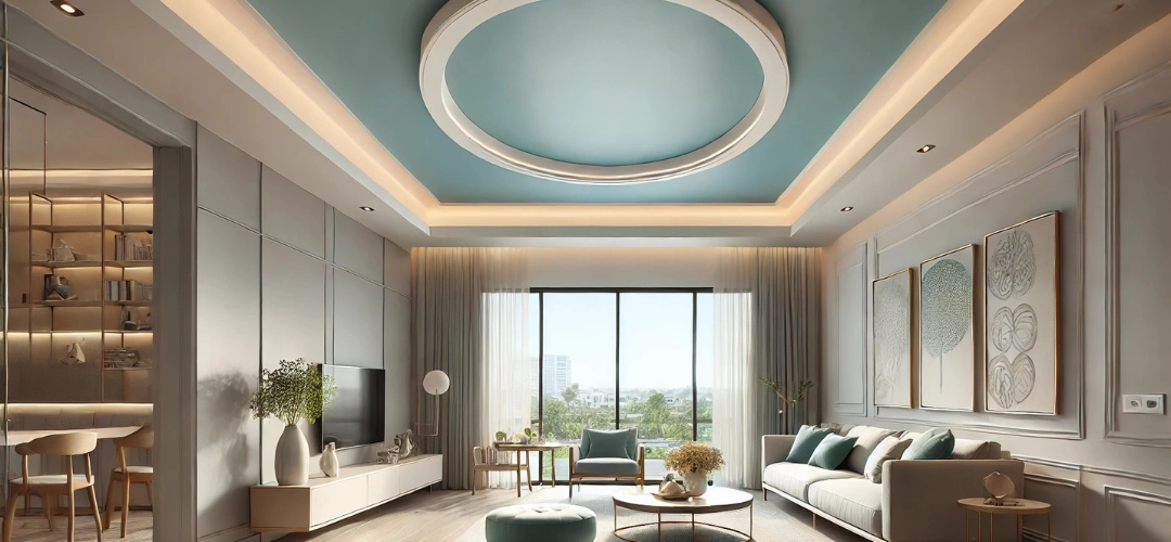
If you live in a modern, contemporary Indian home, bold colour contrasts for your false ceiling can create an exciting focal point that catches the eye and adds depth to the room. In today’s interiors, designers are using ceiling colours to create dramatic statements—whether it’s a deep, rich hue or a sharp contrast with the walls.

Why It Works
Bold contrasts are perfect for spaces with high ceilings or open layouts, where you can afford to experiment with colours that pop. A contrasting ceiling draws the eye upward, helping to elongate the space while introducing a dynamic visual element.

Styling Tips
  • Combine darker tones on the ceiling with lighter walls for a balanced, striking effect.
  • Use metallic or textured accents in your furniture or décour to complement the bold ceiling colour.
  • Contrasting ceiling colours are especially effective in living rooms, dining rooms, and even home offices, where the energy and ambiance play an important role.
Creative Colour Palettes for False Ceilings in Indian Homes

Subtle Pastels for a Sophisticated Look

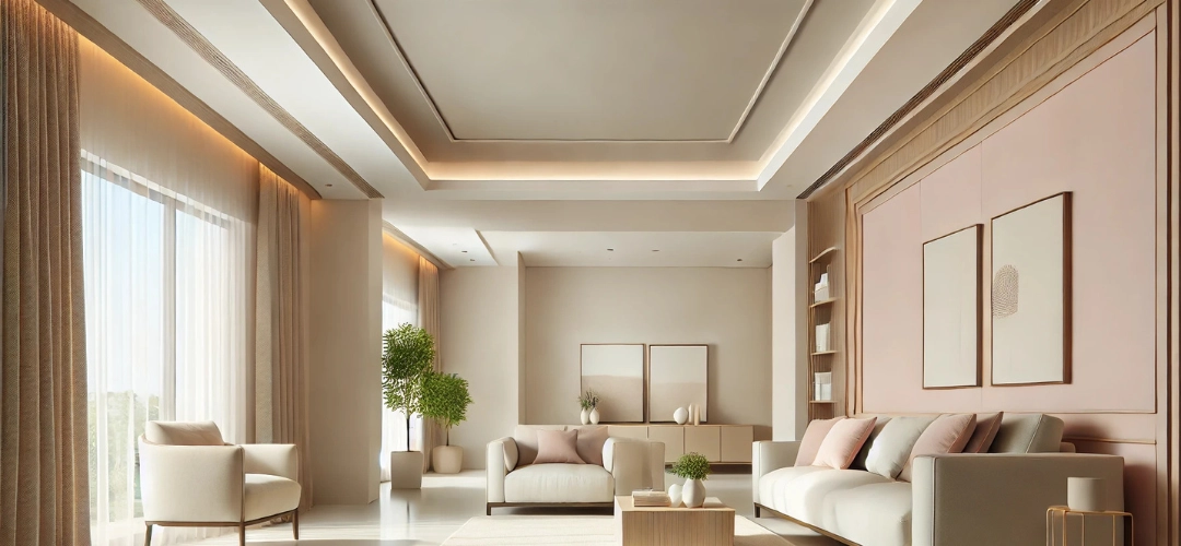
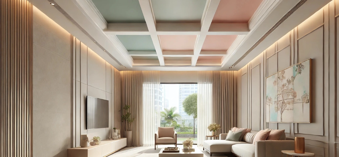
For a more serene, elegant ambiance, pastel shades are the way to go. Soft pastel colours like pale pinks, muted blues, and light greens are ideal for creating a tranquil environment, making them perfect for spaces such as bedrooms, nurseries, or quiet reading corners.

Why It Works
Pastels bring a calm, sophisticated aura to a space. They are subtle enough to not overwhelm the room, yet they add a fresh touch that lifts the overall aesthetic. Using pastels for your false ceiling can make the room feel airy and spacious without the harshness of brighter colours.
Creative Colour Palettes for False Ceilings in Indian Homes
Styling Tips
  • Pair pastel ceilings with neutral walls or soft wood tones to maintain an elegant, cohesive look.
  • Consider soft lighting fixtures that complement the pastel shades, as these will enhance the calming atmosphere of the room.
  • Pastels work best in bedrooms or living rooms where a relaxed, peaceful vibe is desired.

Earthy Tones and Warm Shades for Traditional Homes

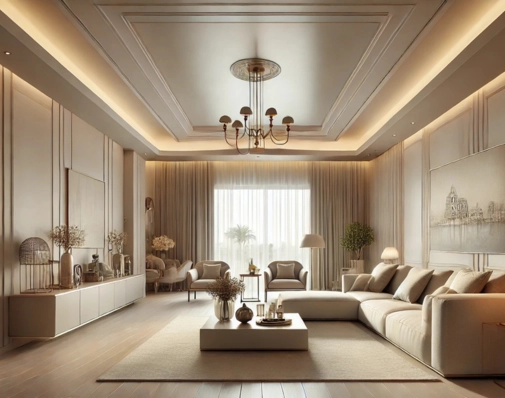
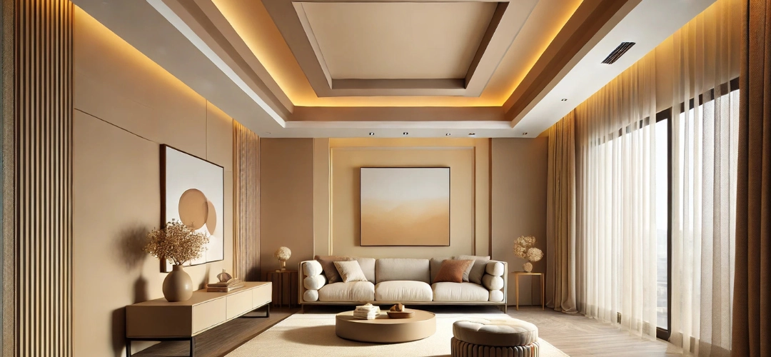
In Indian homes, especially those with traditional décour, earthy tones and warm shades work wonders to create a grounded, inviting atmosphere. Warm shades like terracotta, ochre, and rich browns add an earthy charm to the space, bringing warmth and cosiness.

Why It Works
Earthy tones have an inherent connection to nature, making them perfect for homes that embrace rustic, vintage, or ethnic designs. These colours evoke warmth and comfort, making them ideal for spaces like living rooms, dining areas, and even traditional pooja rooms.

Styling Tips
  • Pair warm ceiling colours with rich wooden furniture and traditional décour pieces to create a harmonious, rustic environment.
  • Gold or brass accents in lighting fixtures or accessories will elevate the warmth and luxury of the earthy tones.
  • Earthy shades are ideal for spaces that benefit from a welcoming and homely atmosphere.
Creative Colour Palettes for False Ceilings in Indian Homes

Integrating Ceiling Colours with Wall and Floor Palettes

To create a cohesive, visually balanced space, your ceiling colour should integrate seamlessly with the walls and floors. Harmonising the ceiling with the rest of the room helps create a fluid, unified design without overwhelming the eye.

How to Achieve This
  • Complementary Colour Schemes: If your walls feature bold, vibrant colours, consider a lighter ceiling shade to create contrast and balance. On the other hand, if your walls are neutral, you can afford to experiment with deeper, more saturated colours for the ceiling.
  • Harmonising with Flooring: Match ceiling tones with the flooring palette to maintain a sense of continuity throughout the space. If you have wooden flooring, for instance, earthy or warm ceiling shades will work best.
  • Accents and Contrast: Use accent colours for walls or décour elements to create pockets of interest that complement the ceiling rather than competing with it.
Creative Colour Palettes for False Ceilings in Indian Homes
Example Combination

Conclusion

Ceilings are a powerful design element in Indian homes, and choosing the right colour palette can completely transform the feel of a room. Whether you’re looking for bold contrasts, serene pastels, or earthy warmth, the right ceiling colours can enhance the beauty of your space while reflecting your personal style.

Using Indicus Paints colours provides endless possibilities to match any interior style – whether modern, traditional, or eclectic. By thoughtfully selecting your false ceiling colour, you can not only improve the aesthetics of your home but also create a harmonious and inviting atmosphere. So, take the plunge and reimagine your space with a fresh, creative palette for your false ceiling today!

What Is Minimalist Home Styling? How Colours Shape Minimalist Design?

What Is Minimalist Home Styling? How colours Shape Minimalist Design?

Minimalism isn’t just a design style; it’s a philosophy that revolves around embracing simplicity, clarity, and functionality. In the world of interior design, minimalist styling has become synonymous with serene spaces that are free of clutter but full of personality. One of the most powerful ways to achieve a minimalist aesthetic is by focussing on your wall colours. Whether you’re drawn to the calming vibes of neutral shades or the bold statements made by vivid hues, the wall colour you choose plays a pivotal role in shaping the entire mood of your home.

But how can you marry minimalism with colour? Does a minimalist home have to be devoid of vibrant tones, or can bold colours be embraced without overwhelming the space? In this post, we’ll dive into how minimalist styling works with all wall colour palettes—from the timeless neutrals to the daring bolds. By the end of this blog, you’ll have the tools to style your home with confidence, using colour as a tool to create a minimalist sanctuary that feels both refreshing and refined.
Minimalist Home Styling

Key Minimalist Home Styling Principles

In minimalist styling, the emphasis is placed on quality over quantity. Every piece of furniture, artwork, and decoration should have purpose and meaning, and each item should contribute to the overall aesthetic. colour plays a crucial role in minimalist design, as it helps to enhance the mood of the space and create a cohesive flow. When selecting wall colours, you want to choose shades that promote a sense of calm and openness while also complementing the furniture and décor.

Minimalism is not about stark, empty spaces but about achieving balance and intentional design. Whether you’re working with neutral tones or introducing bolder hues, minimalist design can accommodate a wide range of colours, as long as they are used thoughtfully and sparingly.

Neutral Tones and Minimalism: A Match Made in Heaven

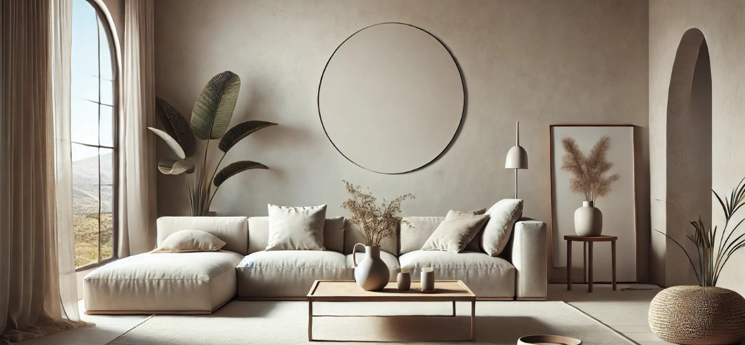
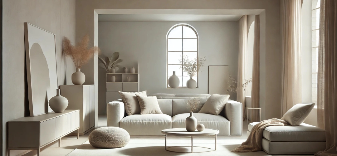
Neutral tones are the backbone of minimalist design, and for good reason. Shades like whites, off-whites, greys, and beiges create a clean, timeless backdrop that allows other elements in the room—such as furniture, textures, and lighting—to shine. These colours have the ability to create a sense of spaciousness and openness, making them ideal for minimalist homes, especially those with smaller rooms or open floor plans.
Minimalist Home Styling
Neutral wall colours create an atmosphere of calm and tranquillity, which is essential in minimalist design. By using soft, muted shades, you allow the natural light to bounce off the walls, making the space feel airy and inviting. Additionally, neutral tones serve as a versatile canvas, allowing you to easily update your décor and accessories without the need for major changes in the wall colour.
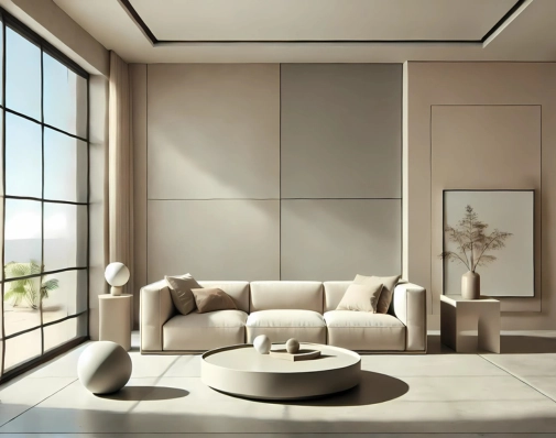
Psychologically, neutral tones are soothing and unobtrusive, helping to reduce stress and anxiety. Soft whites, light greys, and beige tones evoke feelings of peace and clarity, making them ideal for bedrooms, living rooms, and even home offices. These tones also offer a timeless aesthetic that doesn’t require frequent updates, making them a long-term investment in your home’s design.

Practical Tip: When styling with neutral tones, use varying textures and materials to add depth and interest to the space. For example, a light grey wall can be paired with a plush velvet sofa or a woven jute rug to create warmth and contrast.

Incorporating Bold colours into Minimalist Designs

While neutral tones dominate minimalist homes, incorporating bold colours strategically can create stunning focal points and add vibrancy to the space. Minimalist design doesn’t mean a complete lack of colour—it simply means using colour in a controlled, intentional way. Bold hues, when used sparingly, can bring energy and personality to a minimalist interior without overwhelming the simplicity of the space.

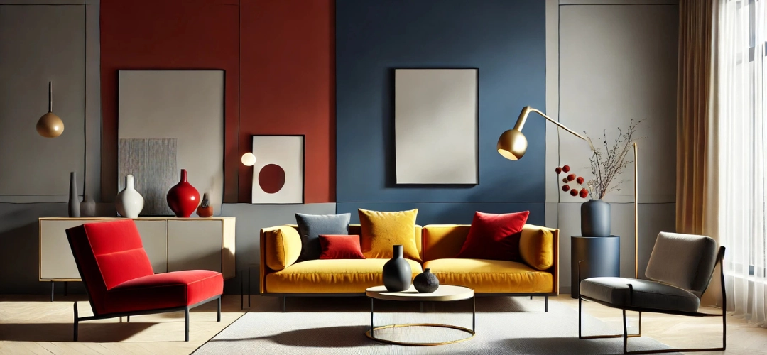
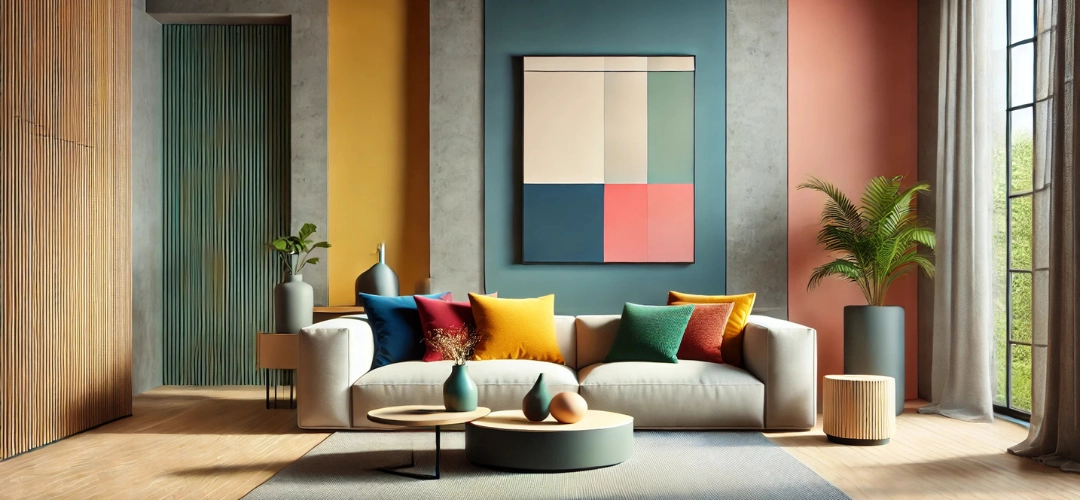
One effective way to incorporate bold colours is by focussing on accent walls. A deep blue, emerald green, or even a rich mustard yellow can create a striking visual contrast without dominating the room. If you’re hesitant to commit to a bold accent wall, you can use smaller pops of colour thru artwork, throw pillows, or other décor elements. This allows the bold colour to stand out without overpowering the room.
Minimalist Home Styling
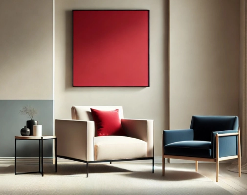
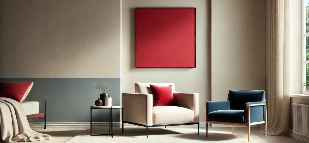
Another approach is using bold colours in furniture or accessories. A bright red chair or a vibrant blue vase can create a stunning contrast against neutral walls, drawing the eye and adding a modern flair. When working with bold colours, it’s important to maintain a sense of balance—ensure that the colour you choose complements the overall palette of the room rather than clashing with it.

Psychological Impact: Bold colours can energise a room and add character. For example, deep blues can evoke a sense of calm sophistication, while warm oranges or reds can infuse energy and warmth into the space. The key is moderation—bold colours should be used to highlight key areas, rather than overwhelming the room.

Practical Tip: When incorporating bold colours, balance them with neutral tones to keep the space feeling cohesive. A deep teal accent wall works beautifully against white or light grey walls, and a vivid yellow cushion can add a pop of colour to a neutral-toned sofa.

Accessorising Minimally: Less Is More

One of the key tenets of minimalist design is the concept of “less is more.” This principle extends beyond furniture and colour choices to how you accessorise your space. In a minimalist home, every accessory should be purposeful and intentional. Instead of cluttering the space with numerous items, select a few high-quality pieces that contribute to the overall aesthetic of the room.

Furniture in a minimalist home should be streamlined, functional, and simple. Think clean lines, neutral tones, and materials like wood, metal, or glass. When accessorising, focus on items that are both practical and visually striking, such as a single statement piece of art, a sculptural vase, or a well-placed plant.
Minimalist Home Styling
For walls painted in neutral tones, a piece of striking artwork or a single large mirror can serve as the focal point of the room. On the other hand, if you’re using bold colours for your walls, you may want to opt for more understated accessories to avoid overwhelming the space.

Practical Tip: When accessorising in a minimalist design, think about quality over quantity. Instead of filling a room with many small items, choose fewer but more impactful pieces. A single, oversized piece of artwork or a few elegant, well-chosen plants can add character and life to a room without overwhelming it.

Creating Balance Between Walls, Furniture, and Decor

In minimalist styling, achieving balance between the walls, furniture, and décor is essential. Since the foundation of minimalist design lies in simplicity, you want each element to complement the others in a harmonious way. Here’s how you can create this balance:

Walls: Start with your wall colour. Whether you choose neutral or bold tones, ensure that the wall colour creates a soothing background for the room. Neutral walls provide a calming backdrop, allowing other elements to take centre stage, while bold accent walls should be used to highlight key areas.

Furniture: Minimalist furniture should complement the wall colour without competing with it. If you have bold-coloured walls, opt for neutral furniture pieces in shades of grey, black, or white. Conversely, if your walls are neutral, you can introduce furniture in bolder tones or interesting textures to create contrast. The key is to keep the furniture simple and functional, focussing on clean lines and high-quality materials.

Minimalist Home Styling
Décor: Décor in a minimalist home should be purposeful and restrained. Accessories should be chosen for their aesthetic value and the way they contribute to the overall ambience of the room. For example, a small, well-placed vase, a simple rug, or a piece of modern art can tie the room together. Avoid cluttering the space with unnecessary items, and instead focus on quality, functional pieces that add to the room’s tranquillity.

Practical Tip: Consider the overall proportions of each element. A large piece of furniture may require a larger room, so ensure that the furniture and walls are in proportion to each other. Avoid oversized accessories that might overpower the furniture or walls, and always maintain clean lines to preserve the minimalist aesthetic.
Minimalist Home Styling

Conclusion

Minimalist home styling is all about creating a serene, harmonious space with an emphasis on simplicity, function, and intentionality. Whether you’re working with neutral tones, incorporating bold colours, or accessorising minimally, the key is to focus on the essentials and make every piece count. By understanding how wall colours influence the mood and ambience of a room, you can create a space that feels both inviting and stylish without overwhelming the senses. Whether you’re creating a soothing sanctuary with neutral tones or infusing energy with pops of bold colour, minimalist design offers endless possibilities for creating a beautifully balanced home.

Top Paint Colours to Make Your Home Shine in the Sun

Top Paint Colours to Make Your Home Shine in the Sun

Choosing the perfect exterior paint colour for your home is not just about personal preference – it’s about finding a shade that complements the environment and enhances your home’s visual appeal. In sunny climates, the interplay of light and colour becomes particularly important, as bright sunlight can amplify certain shades while washing out others. While the functionality of paint, such as its UV resistance or heat-reflective properties, depends on its formulation, colour choices can significantly influence the overall aesthetic of your home.

In regions with tropical or warm climates, such as parts of South India, including Tamil Nadu, homes often draw inspiration from the natural surroundings and cultural heritage. This approach ensures a harmonious and visually appealing exterior that stands out while blending beautifully with the landscape.
Top Paint Colours to Make Your Home Shine in the Sun

How Sunny Climates Influence Colour Perception

In sunny environments, light colours can appear brighter and more reflective, creating a crisp and clean look. On the other hand, darker tones gain depth and richness, offering a dramatic and sophisticated vibe. The key to selecting the right paint colour is to choose shades that thrive under bright sunlight and retain their vibrancy over time.

Colours inspired by the natural environment, such as earthy tones, coastal blues, and lush greens, often work well in sunny regions. These shades not only create a connection to the surroundings but also look timeless and elegant.

Light and Neutral Colours for Timeless Elegance

Neutral tones are a popular choice for sunny environments due to their versatility and ability to reflect light. White and off-white shades are classic options that create a fresh and welcoming look, making your home stand out against the bright sky.

Beige and sandstone hues offer a warm and natural aesthetic, blending seamlessly with the surrounding landscape. These colours are ideal for homes with stone or brick elements, creating a cohesive and grounded appearance. Similarly, light grey and silver shades bring a modern edge to homes, pairing beautifully with both traditional and contemporary architecture.
Top Paint Colours to Make Your Home Shine in the Sun

Warm Colours for Vibrancy

Warm colours can infuse energy and personality into your home’s exterior, making them perfect for sunny climates. Sunny yellows, for example, are cheerful and inviting, reflecting light in a way that makes the home feel bright and uplifting.

Earthy oranges and terracottas are inspired by natural clay tones and work exceptionally well in both rural and urban settings. These shades provide a rustic charm while harmonising with the environment. Rustic reds, a colour often associated with traditional architecture in regions with strong cultural influences, create a bold and striking exterior that remains timeless.

Cool Colours for a Calming Effect

Cool tones bring a sense of calm and serenity, making them ideal for tropical or warm climates. Soft blues and aqua hues mimic the soothing tones of the sea and sky, creating a relaxed and tranquil atmosphere.

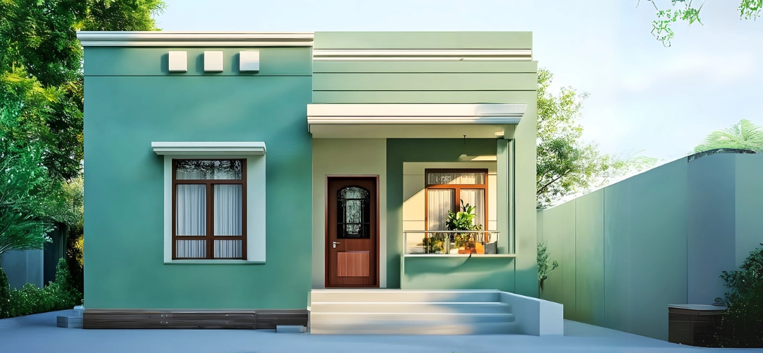
For a more natural touch, mint greens and sage tones blend beautifully with gardens and greenery, offering a refreshing and harmonious look. Homes in coastal areas or regions surrounded by lush vegetation can especially benefit from these shades. Pale lavender or lilac, though less common, adds a unique and elegant touch to the exterior.

Bold and Dark Colours for Striking Contrast

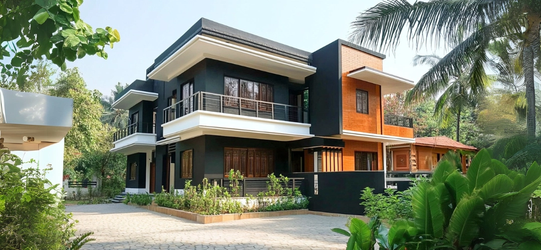
Dark colours can create dramatic and impactful exteriors when used thoughtfully. Charcoal grey and deep navy blue are excellent choices for modern homes, offering a sleek and sophisticated appearance. These shades look particularly striking when paired with light-ed trims or accents.

Forest green, inspired by dense vegetation, is another bold option that creates a natural and grounding aesthetic. Such colours work well in regions where homes are surrounded by greenery, as they blend seamlessly with the landscape while maintaining a distinct presence.
Top Paint Colours to Make Your Home Shine in the Sun

Enhancing Your Home with Trims and Accents

Trims and accents play a vital role in elevating your home’s overall aesthetic. For example, pairing a white or beige base with black or navy trims creates a striking contrast, while a rustic red exterior with cream or grey accents exudes warmth and charm.

Elements like shutters, doors, and window frames are great opportunities to experiment with bolder colours. Vibrant accents, such as yellow or blue, can add personality to the home, while neutral trims provide balance and sophistication.
Top Paint Colours to Make Your Home Shine in the Sun

Practical Considerations for Painting in Sunny Climates

When choosing exterior paint for sunny environments, prioritise high-quality products with UV-resistant properties to prevent fading and peeling. It’s also essential to test your colours in different lighting conditions before committing. The appearance of a shade can vary depending on the time of day, so observing it in morning, afternoon, and evening light ensures the best choice for your home.

Conclusion

Selecting the right exterior paint colour for a sunny environment involves balancing aesthetics with practicality. From timeless neutrals like white and beige to vibrant yellows and earthy reds, the options are vast and versatile. Cool tones like blues and greens bring a sense of calm, while bold, dark shades like charcoal and navy add a modern touch.

By considering the natural surroundings, cultural influences, and the specific lighting conditions of your home, you can create a stunning exterior that reflects both your style and the environment it inhabits. With the right combination of colours, accents, and high-quality paint, your home can become a true standout in any sunny setting.

Perfect Color Combos to Create a Stylish Living Room Ambiance

Perfect Color Combos to Create a Stylish Living Room Ambiance

Creating the perfect living room ambiance is about more than just furniture and lighting; the right color combinations can transform your space into a stylish haven. Indicus Paints offers a versatile palette to help you achieve any look, from vibrant energy to soothing minimalism. Below, we explore some trending color combinations using the Indicus Colour Palette to inspire your next living room makeover.

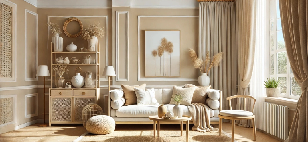
1. Neutral Elegance: Beige & Soft Whites

Why It Works: Neutral tones create a serene and timeless ambiance. Beige provides warmth, while soft white brightens the space and adds an air of freshness. This combination is versatile and adapts beautifully to both minimalistic and modern interiors.

Indicus Picks: Sand Dune Beige paired with Pure Bliss White.
Perfect Color Combos to Create a Stylish Living Room Ambiance

Styling Tips:

  • Apply beige on walls to create a cozy atmosphere, with white for trim, ceilings, or accents to maintain crispness.
  • Add texture with elements like jute rugs, woven baskets, and linen throws.
  • Use light-coloured wooden furniture or metallic decor like gold or silver vases to subtly elevate the aesthetic.

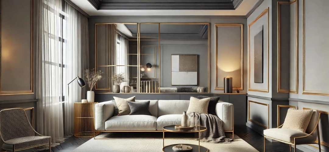
2. Modern Monochrome: Charcoal Gray & Ivory

Why It Works: This high-contrast combination brings depth and modernity to any space. Charcoal grey provides a dramatic grounding effect, while ivory introduces a soft, airy balance. Together, they create a sleek, contemporary look.

Indicus Picks: Urban Gray with Ivory Glow.
Perfect Color Combos to Create a Stylish Living Room Ambiance
Styling Tips:
  • Use charcoal grey on an accent wall or built-in shelves for a bold statement, complemented by ivory walls or furniture.
  • Incorporate plush ivory furnishings and throws to soften the starkness of the charcoal.
  • Add metallics like gold-framed mirrors, silver candle holders, or chrome lighting for a sophisticated touch.

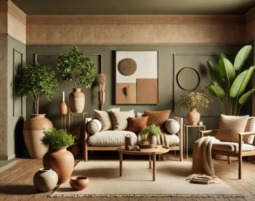
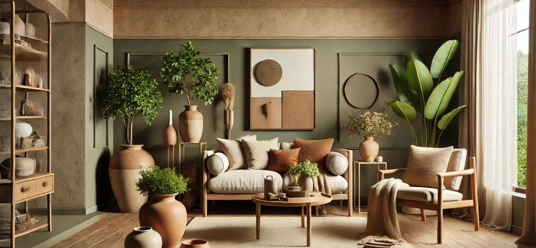
3. Earthy Retreat: Olive Green & Terracotta

Why It Works: Earth tones evoke a connection to nature, offering a calming and grounded vibe. Olive green brings balance and freshness, while terracotta adds warmth and a rustic charm. Together, they create an inviting, homely feel.

Indicus Picks: Rustic Olive and Clay Terracotta.
Perfect Color Combos to Create a Stylish Living Room Ambiance
Styling Tips:
  • Paint walls in olive green to form a soothing backdrop, and use terracotta in decorative accents like cushions, planters, or area rugs.
  • Pair with wooden furniture in warm tones to amplify the natural theme.
  • Layer in beige or cream fabrics for contrast, and add potted greenery like ferns or succulents to enhance the organic vibe.

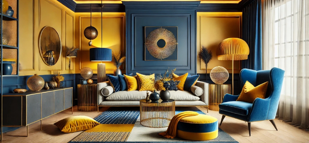
4. Bold and Beautiful: Navy Blue & Mustard Yellow

Why It Works: This combination brings energy and sophistication to your living room. Navy blue offers depth and serenity, while mustard yellow provides a cheerful and lively contrast. Together, they form a harmonious yet dynamic look.

Indicus Picks: Deep Sapphire Blue with Golden Mustard.
Perfect Color Combos to Create a Stylish Living Room Ambiance
Styling Tips:
  • Paint navy blue on the walls for an enveloping effect, while mustard yellow accents like cushions, lampshades, or a feature chair bring warmth.
  • Use neutral-toned furniture, such as white or light wood, to balance the boldness of the colors.
  • Layer in patterned textiles, such as navy and mustard area rugs or curtains, for a cohesive and stylish touch.

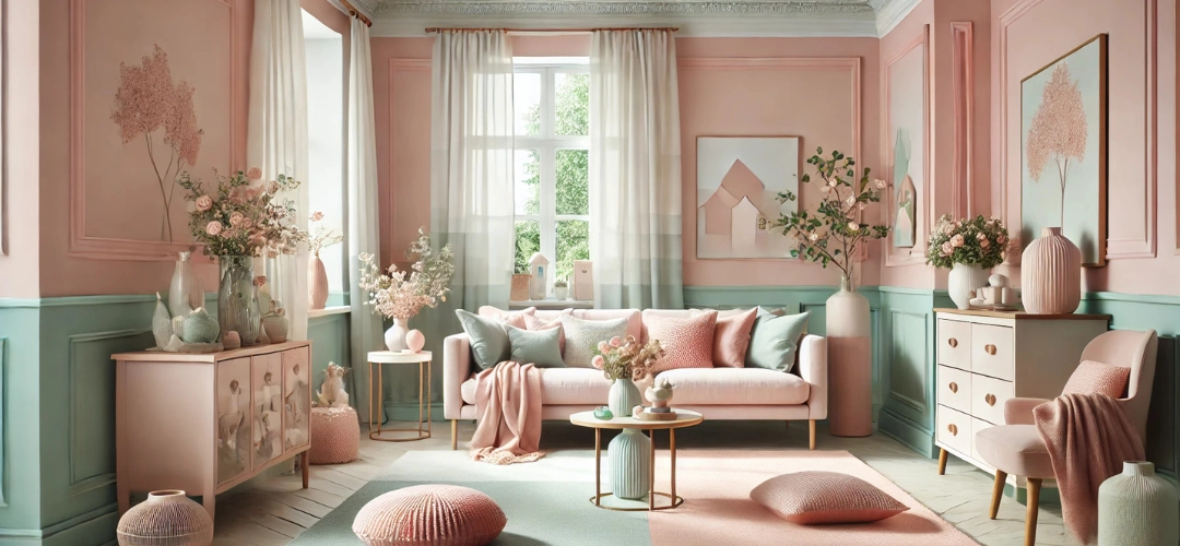
5. Pastel Perfection: Blush Pink & Cool Mint

Why It Works: This pastel pairing is soft and soothing, making it ideal for a relaxed and inviting living space. Blush pink adds warmth and charm, while cool mint introduces a refreshing and calming element.

Indicus Picks: Rose Petal Blush and Minty Fresh.
Perfect Color Combos to Create a Stylish Living Room Ambiance
Styling Tips:
  • Use blush pink on the walls or a prominent feature area, with cool mint incorporated into furniture or accent pieces like painted side tables.
  • Keep furniture light and simple, such as white or pastel wood finishes, to maintain the airy feel.
  • Add rose gold or copper metallic accents in lighting or decorative pieces to complement the pastel palette beautifully.

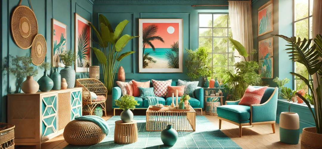
6. Tropical Paradise: Teal & Coral

Why It Works: This vibrant pairing instantly energises a space. Teal evokes a sense of tranquillity reminiscent of tropical waters, while coral adds a pop of playful energy. Together, they create a lively and refreshing ambiance.

Indicus Picks: Lagoon Teal with Sunset Coral.
Perfect Color Combos to Create a Stylish Living Room Ambiance
Styling Tips:
  • Paint walls teal to set a bold yet calming tone, and add coral through soft furnishings like throw pillows or an accent chair.
  • Use natural textures like bamboo or rattan furniture to enhance the tropical vibe.
  • Incorporate plenty of greenery, such as large indoor plants or hanging planters, to complete the look.

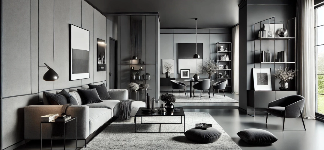
7. Urban Chic: Black & Ash Gray

Why It Works: A monochromatic scheme with black and grey exudes sophistication and modernity. Black adds depth and boldness, while ash grey softens the look, creating a balanced and chic interior.

Indicus Picks: Midnight Black and Soft Ash Gray.
Perfect Color Combos to Create a Stylish Living Room Ambiance
Styling Tips:
  • Use black sparingly on feature walls or furniture pieces, with ash grey for the remaining walls to create an open feel.
  • Brighten the space with reflective surfaces like glass coffee tables or mirrors.
  • Add pops of color through decor, such as vibrant artwork or colourful throw blankets, to inject personality into the neutral palette.

8. Rustic Warmth: Burnt Orange & Cream

Why It Works: This pairing creates a cozy and inviting ambiance. Burnt orange radiates warmth and energy, while cream tones down the intensity and provides a neutral base. Together, they evoke a sense of rustic charm and relaxation.

Indicus Picks: Amber Rust and Vanilla Cream.
Perfect Color Combos to Create a Stylish Living Room Ambiance
Styling Tips:
  • Use burnt orange as a feature wall or on decorative items like cushions, pottery, or throws.
  • Paint the rest of the walls in cream to keep the space feeling open and balanced.
  • Introduce reclaimed wood furniture and textured fabrics like wool or leather to complete the rustic look.

9. Sophisticated Contrast: Emerald Green & Soft Gold

Why It Works: Emerald green is rich and luxurious, evoking opulence and elegance. Paired with soft gold, it adds a regal touch that elevates the entire room. This combination is perfect for creating a dramatic yet refined ambiance.

Indicus Picks: Emerald Oasis with Golden Glow.
Perfect Color Combos to Create a Stylish Living Room Ambiance
Styling Tips:
  • Paint walls in emerald green to create a bold statement and use gold in accents like light fixtures, frames, or decorative sculptures.
  • Incorporate velvet or satin upholstery in furniture for an ultra-luxurious feel.
  • Add dark wooden pieces or a marble coffee table to enhance the sophisticated vibe.

10. Energetic Pop: Tangerine & Lime Green

Why It Works: This bold and vibrant combination is ideal for lively households. Tangerine offers zest, while lime green adds freshness, creating an uplifting and energetic space.

Indicus Picks: Tangerine Zest and Citrus Lime.
Perfect Color Combos to Create a Stylish Living Room Ambiance
Styling Tips:
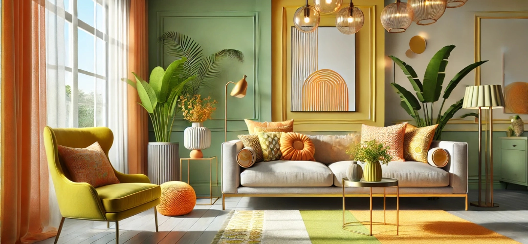
  • Paint walls in lime green and use tangerine for accent pieces like cushions or an area rug.
  • Opt for neutral furniture to let the colors shine.
  • Add playful decor, like colourful artwork or patterned textiles, for a whimsical touch.

11. Classic Combination: White & Navy Stripes

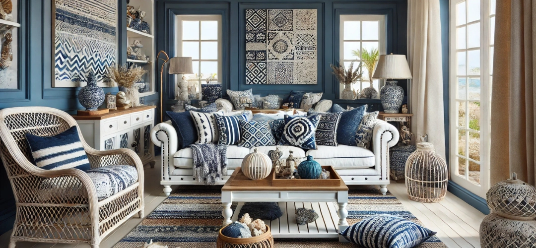
Why It Works: This pairing is timeless and versatile, perfect for coastal-inspired or nautical interiors. White keeps the room light and spacious, while navy stripes add a bold and structured touch.

Indicus Picks: Ocean Navy with Bright White.
Perfect Color Combos to Create a Stylish Living Room Ambiance
Styling Tips:
  • Use navy and white stripes in upholstery or rugs, keeping the walls primarily white.
  • Include wooden furniture in light or medium finishes to complement the coastal vibe.
  • Add nautical decor like rope accents, seashells, or lanterns for a themed look.

12. Calming Cool: Lavender & Powder Blue

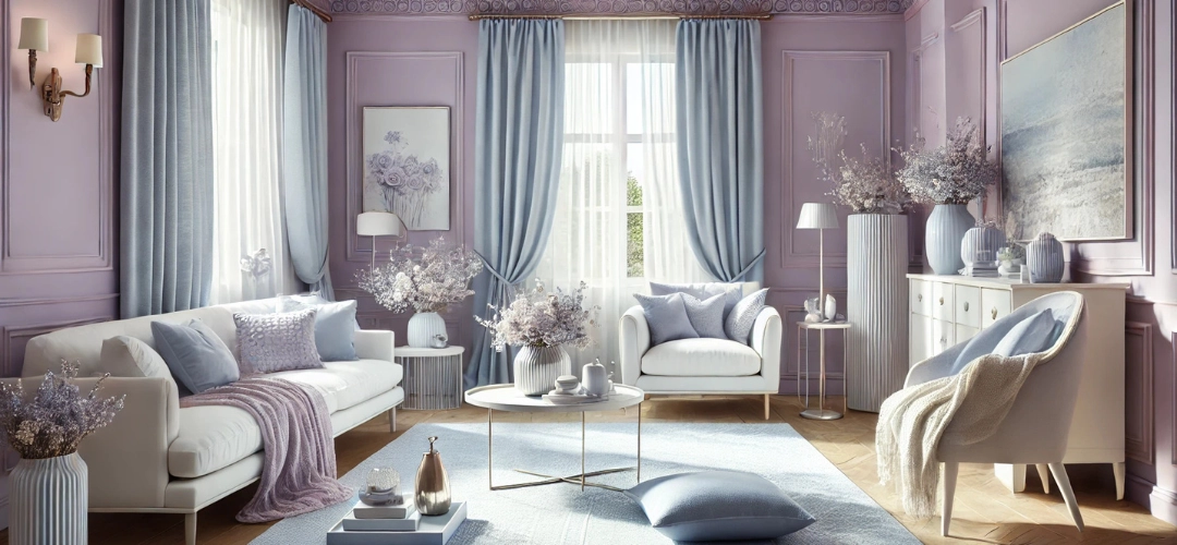
Why It Works: Lavender and powder blue are soothing and serene, making them ideal for a tranquil living space. This duo adds a soft and airy feel, perfect for unwinding.

Indicus Picks: Lilac Mist and Sky Powder Blue.
Perfect Color Combos to Create a Stylish Living Room Ambiance
Styling Tips:
  • Use lavender as a base color on walls and powder blue in soft furnishings like curtains or rugs.
  • Pair with white or cream furniture for a clean and cohesive look.
  • Add silver or pearl-toned accents to complement the cool color palette.

Conclusion

The Indicus Colour Palette provides endless inspiration for creating a stylish living room that suits your taste and personality. From calming neutrals to bold, vibrant tones, these combinations balance aesthetics and functionality, ensuring your living space feels both inviting and stylish. With carefully selected colors and thoughtful styling, you can transform your living room into a true masterpiece.

5 Paint Colours to Make Your Rooms Look Bigger and Brighter

5 Paint Colours to Make Your Rooms Look Bigger and Brighter

Choosing the right paint colour can transform small, dimly lit rooms into vibrant, welcoming spaces. By strategically using specific shades, you can create an illusion of brightness and space. In this guide, we’ll explore the best paint colours for small spaces, helping you make your rooms look bigger, brighter, and more inviting.

1. Sparking Dew (2359P): A Fresh Light Blue

Sparking Dew is a soft, refreshing blue with a hint of aqua that evokes a sense of calm and tranquillity. This shade reflects light beautifully, giving rooms an airy and expansive feel.
  • Why It Works: Its cool undertones enhance brightness and make walls appear as if they’re receding, creating depth. It’s one of the best paint colours for small spaces where a fresh, open vibe is desired.
  • Design Tip: Pair Sparking Dew with trims in crisp whites like Marshmallow Whip (2071P) or soft beiges to highlight mouldings or window frames. Metallic accents in silver or brushed nickel add a modern touch.
  • Best Uses: Ideal for bathrooms, bedrooms, and home offices, this light blue colour complements coastal or nautical-inspired decor beautifully.
Sparking Dew

2. Puritan Beige (2099P): A Warm Neutral Beige

Puritan Beige is a soft, creamy beige that strikes the perfect balance between warmth and brightness. Its timeless versatility makes it a top choice for creating cosy, inviting spaces.
  • Why It Works: Beige tones enhance natural light, making rooms feel more spacious. This shade offers a comforting warmth without compromising on openness, making it one of the best bright paint colours for small rooms.
  • Design Tip: Use Puritan Beige on walls and contrast with trims or furniture in muted greens, greys, or browns. Layering textures like woven baskets and linen drapes enhances its cosy, sophisticated appeal.
  • Best Uses: Perfect for living rooms, hallways, and dining spaces, Puritan Beige provides a soothing backdrop that pairs well with statement decor or artwork.
Purtian Beige

3. Angelic Blue (2988P): A Soothing Pastel Blue

Angelic Blue is a delicate pastel blue that embodies serenity and light. This shade reflects natural and artificial light effectively, giving your space an open and calming atmosphere.
  • Why It Works: The cool, light tones visually expand walls, making a room appear larger and airier. Its soft hue is ideal for creating a soothing environment.
  • Design Tip: Pair Angelic Blue with trims in warm whites like Worn White (2953P) for a polished, balanced look. Soft furnishings in navy, pale grey, or light wood tones add depth. A touch of greenery, such as potted plants, can enhance its fresh, vibrant aesthetic.
  • Best Uses: Perfect for bedrooms, nurseries, and reading nooks, this pastel shade complements traditional and Scandinavian-style interiors effortlessly.
Angelic Blue

4. Worn White (2953P): A Warm Neutral White

Worn White is a warm, understated white with subtle vintage undertones. Unlike stark whites, this shade adds personality and warmth to any room while maintaining a bright and fresh appearance.
  • Why It Works:: Worn White reflects light efficiently, brightening up spaces and making them feel clean and open. It’s a great choice for a timeless and versatile base colour in small rooms.
  • Design Tip: Pair Worn White with bold-coloured furniture or darker wood finishes for contrast. Metallic accents in gold or bronze can elevate the sophistication of this shade.
  • Best Uses: Worn White is an excellent choice for kitchens, living rooms, and multifunctional spaces. It creates a bright backdrop that complements various design styles, from modern to vintage.

5. Chill Grey (2967P): A Modern Grey-Green

Chill Grey is a cool, understated grey-green with subtle blue undertones, making it a versatile option for contemporary and minimalist interiors.
  • Why It Works: Its muted green undertones create a tranquil vibe while visually expanding the room. Chill Grey works well in spaces with both natural and artificial lighting.
  • Design Tip: Pair Chill Grey with soft white trims or light pastels for a cohesive, modern look. Incorporate chrome or brushed silver finishes to enhance its cool tones. For a natural aesthetic, complement it with rattan, jute, or reclaimed wood accents.
  • Best Uses: Ideal for bathrooms, kitchens, and living spaces, Chill Grey brings a clean yet calming energy to both small and large rooms.
Chill Grey

Tips to Maximise the Impact of These Colours

  • Mirrors: Strategically place large mirrors opposite windows or light sources to reflect light and create the illusion of depth.
  • Lighting: Layer lighting with overhead fixtures, table lamps, and floor lamps to enhance brightness. Use warm bulbs to complement neutral tones like Purtian Beige and Worn White.
  • Neutral Flooring: Light wood or neutral-toned flooring can maintain the bright, open feel of the room.
  • Minimalistic Decor: Avoid visual clutter by selecting functional furniture and simple wall art to let these colours shine.
Purtian Beige 02

Conclusion: Brighten Your Space with Indicus Paints

Indicus Paints offers a wide range of shades designed to enhance light and create the illusion of spaciousness. Whether you choose the refreshing Sparking Dew, the cosy Purtian Beige, the serene Angelic Blue, the timeless Worn White, or the modern Chill Grey, these colours can transform your home into a light-filled sanctuary. Pair these shades with thoughtful design elements to create interiors that feel expansive, inviting, and effortlessly elegant.

For even more colour options, explore Indicus Paints’ collection of over 1000+ colours to find the perfect shade for your space. Whether you’re looking for soft neutrals, vibrant accents, or calming pastels, Indicus has something for every style and need.

Lighting Ideas for a Serene Bohemian Bedroom Atmosphere

Lighting Ideas for a Serene Bohemian Bedroom Atmosphere

Lighting plays a crucial role in creating the perfect atmosphere in any bedroom, but it’s especially important when you’re aiming for a serene, Bohemian vibe. Bohemian design emphasises comfort, natural elements, and eclectic touches. In this guide, we’ll explore various lighting ideas to help you craft a peaceful and stylish Bohemian bedroom.

Why Lighting is Important for Creating a Serene Atmosphere

Lighting sets the mood and ambiance of a space. In a bedroom, especially one designed with a Bohemian aesthetic, the right lighting can enhance relaxation and create a calming retreat. Soft lighting can blur the edges of a room, highlight key décor, and make the space feel warmer. For a serene Bohemian bedroom, you should aim for lighting that feels natural, warm, and inviting, avoiding harsh or overly bright light.
Why Lighting is Important for Creating a Serene Atmosphere

Types of Lighting Fixtures for a Bohemian Bedroom

A Bohemian bedroom encourages a mix of different lighting fixtures. Some popular types include:
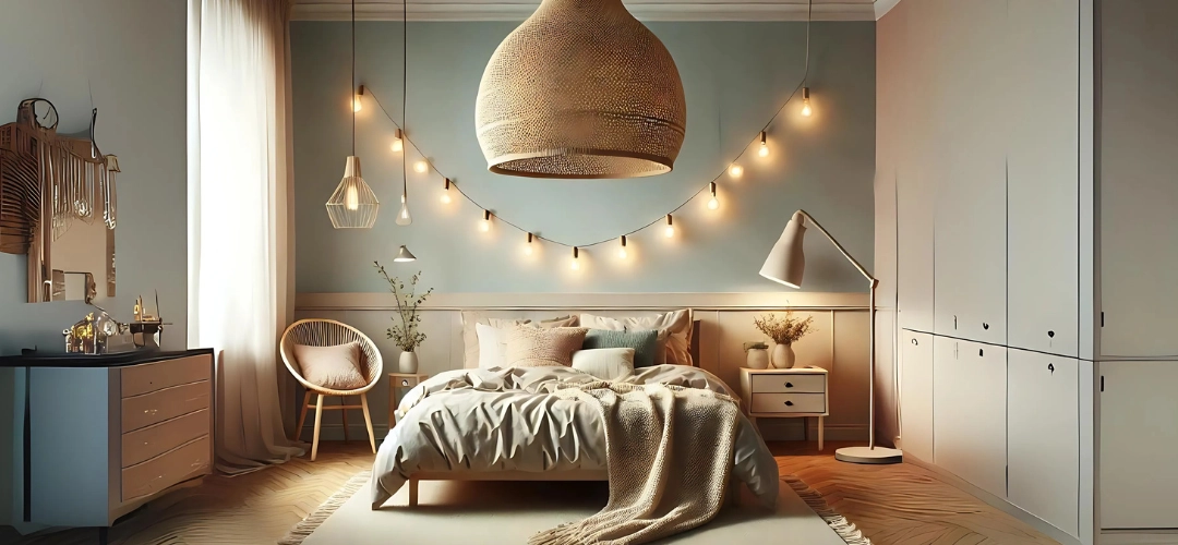
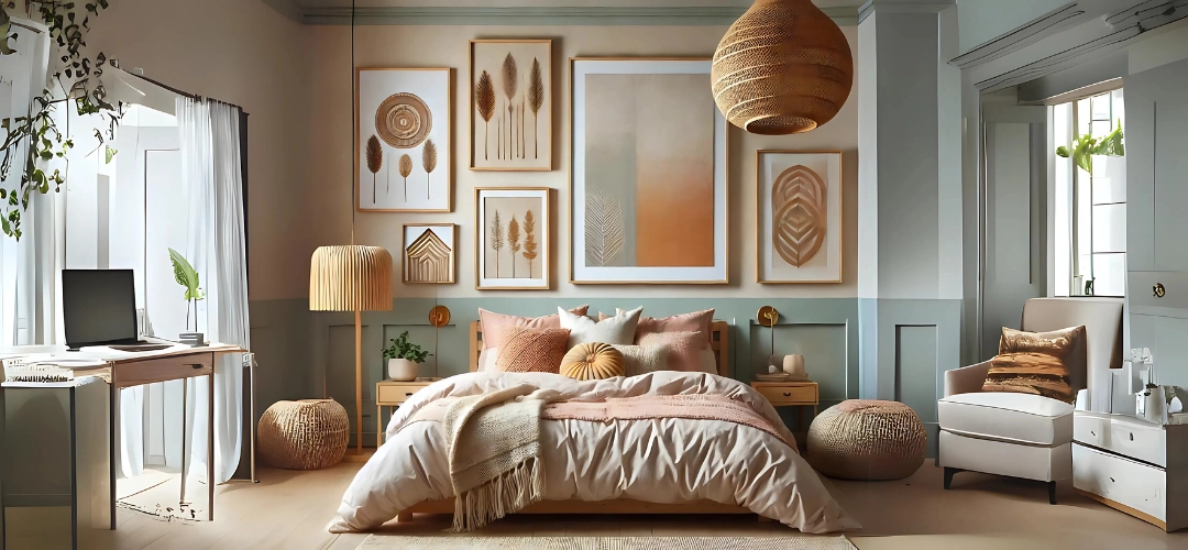
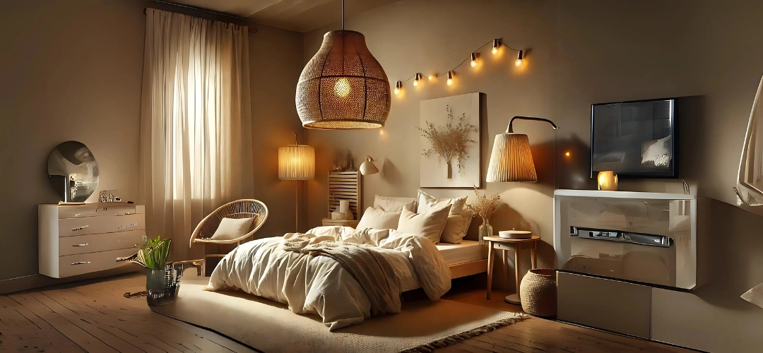
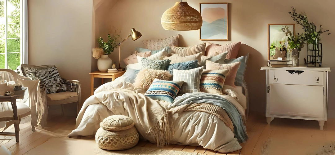
  • Pendant lights: Suspended from the ceiling, pendant lights can be made of natural materials like rattan or wicker, blending perfectly with the earthy, eclectic style of a Boho room.
  • Floor lamps: Tall floor lamps with soft, diffused light are ideal for creating cosy corners or reading nooks in your bedroom.
  • String lights: Often used in Bohemian décor, string lights can create a whimsical, dreamy atmosphere. Drape them over the bed, along a wall, or above a window.
  • Table lamps: Choose table lamps with warm, textured shades or unique bases to add character to your bedside tables or dressers.
Types of Lighting Fixtures for a Bohemian Bedroom

Natural Lighting Ideas for a Serene Atmosphere

Natural light is one of the best ways to create a serene and inviting atmosphere in a Bohemian bedroom. Maximising natural light during the day can help the room feel more open and airy. Here are some tips to enhance natural lighting:
  • Use light curtains: Opt for sheer or light-coloured curtains that allow sunlight to filter through while maintaining privacy.
  • Position mirrors strategically: Mirrors reflect natural light and can make the space feel brighter and larger. Place mirrors across from windows to bounce light around the room.
  • Consider window treatments: Use blinds that allow you to control the amount of light entering the room without blocking it entirely.

Artificial Lighting Ideas for a Serene Atmosphere

Artificial lighting is essential for the evening or when natural light is limited. To maintain a serene Bohemian atmosphere, choose warm, soft lighting options:
  • Fairy lights: These small string lights create a magical ambiance and work well draped around bed frames, windows, or shelves.
  • Lanterns: Lantern-style lighting, particularly those made from natural materials like bamboo or metal, can cast soft, warm light and add a touch of Bohemian charm.
  • Himalayan salt lamps: These lamps emit a soft, pinkish-orange glow that is calming and perfect for creating a peaceful space.
Artificial Lighting Ideas for a Serene Atmosphere

Choosing the Right Light Bulbs for a Bohemian Bedroom

Light bulbs play a significant role in determining the mood of the room. In a Bohemian bedroom, you’ll want to avoid cool or bright white bulbs, which can feel too stark. Instead, opt for:
  • Warm white bulbs: These provide a soft, comforting glow that is perfect for creating a relaxing space.
  • Edison bulbs: Known for their vintage look and warm, amber glow, Edison bulbs fit well with Bohemian décor and add a rustic touch.
  • Low-wattage bulbs: These bulbs produce dimmer light, enhancing the cosy, serene feel of the room.

Creative Lighting Arrangements and Techniques

The way you arrange your lighting can have a big impact on the overall feel of the room. Here are some creative ideas to consider for a Bohemian bedroom:
  • Layering lights: Combine different types of lighting, such as table lamps, pendant lights, and string lights, to create a multidimensional look.
  • Highlighting specific areas: Use lighting to accentuate certain areas, like a cosy reading nook or a piece of art, giving the room an eclectic, curated feel.
  • Hanging pendant lights low: Bohemian design often features low-hanging lighting, especially above nightstands or seating areas, to create a more intimate, serene vibe.
Creative Lighting Arrangements and Techniques

DIY Lighting Projects for a Bohemian Bedroom

If you want to add a personal touch to your Bohemian bedroom, consider creating your own lighting fixtures. Here are some DIY ideas:
  • Macrame light shade: Craft a macramé shade to hang over a lightbulb for a soft, diffused glow that adds texture and character to the room.
  • Repurposed glass jars: Use old glass jars or bottles as lanterns by placing candles or fairy lights inside, adding a rustic, Bohemian touch.
  • Beaded chandelier: Make a chandelier out of wooden or colourful beads to add a playful, eclectic element to your lighting.

Incorporating Plants and Greenery into Your Lighting Design

Plants and lighting are a perfect combination for a serene Bohemian bedroom. Greenery can soften lighting and create a calming atmosphere. Some ways to incorporate plants and lighting include:
  • Hanging plants with lights: Combine string lights with hanging plants for a magical, nature-inspired look. Drape the lights around plant baskets or shelves.
  • Light-filled terrariums: Place small fairy lights inside glass terrariums filled with plants or crystals for a soft glow and natural décor.
  • Table lamps with plant bases: Choose lamps that incorporate plant stands or have bases that allow you to place small pots for a truly Bohemian touch.
Incorporating Plants and Greenery into Your Lighting Design

Conclusion: Achieving a Serene Bohemian Bedroom Atmosphere with the Right Lighting

Creating a serene Bohemian bedroom is all about blending the right lighting elements with natural, earthy décor. By incorporating a variety of light sources, from natural sunlight to string lights and lanterns, you can establish a peaceful, calming atmosphere perfect for relaxation. With the right fixtures, bulbs, and creative arrangements, your bedroom will become the ultimate Bohemian sanctuary.