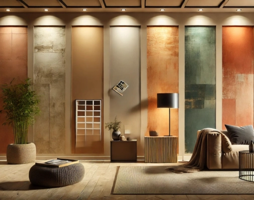
5 Eye-Catching Earthy Wall Colours to Try in Your Home This Year
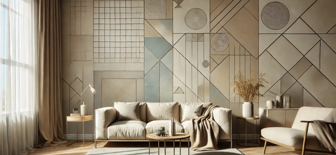
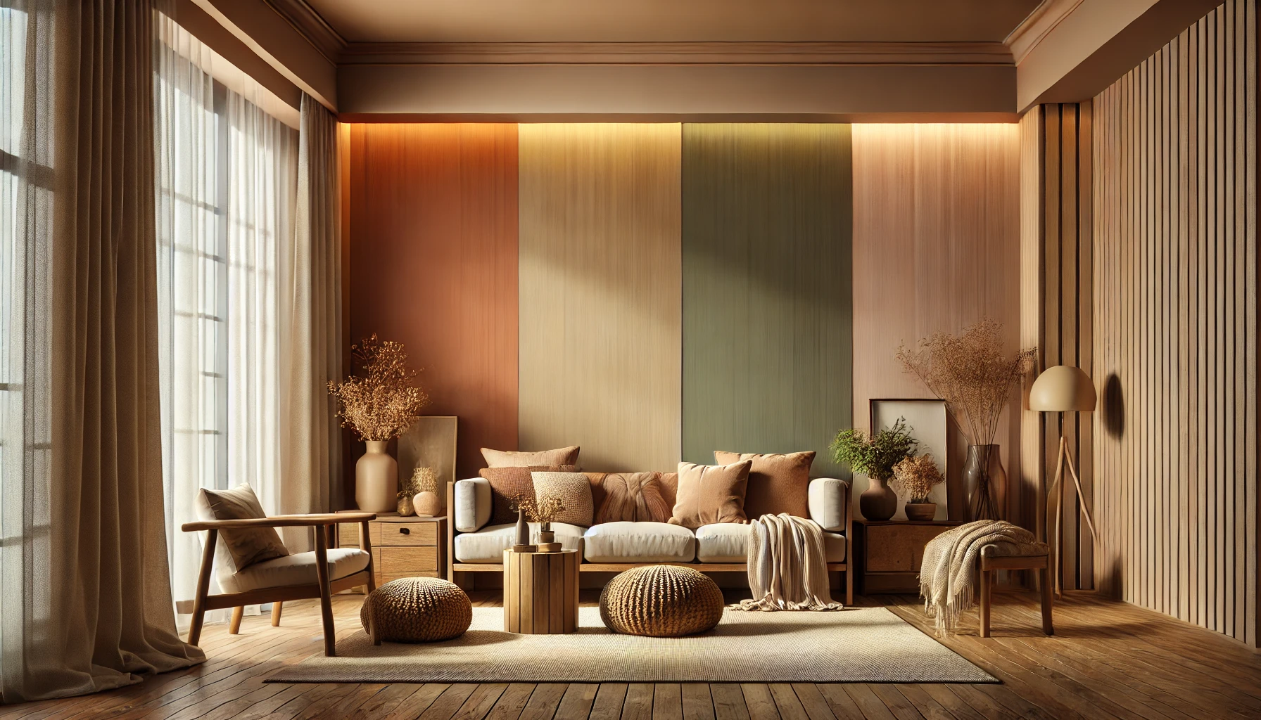
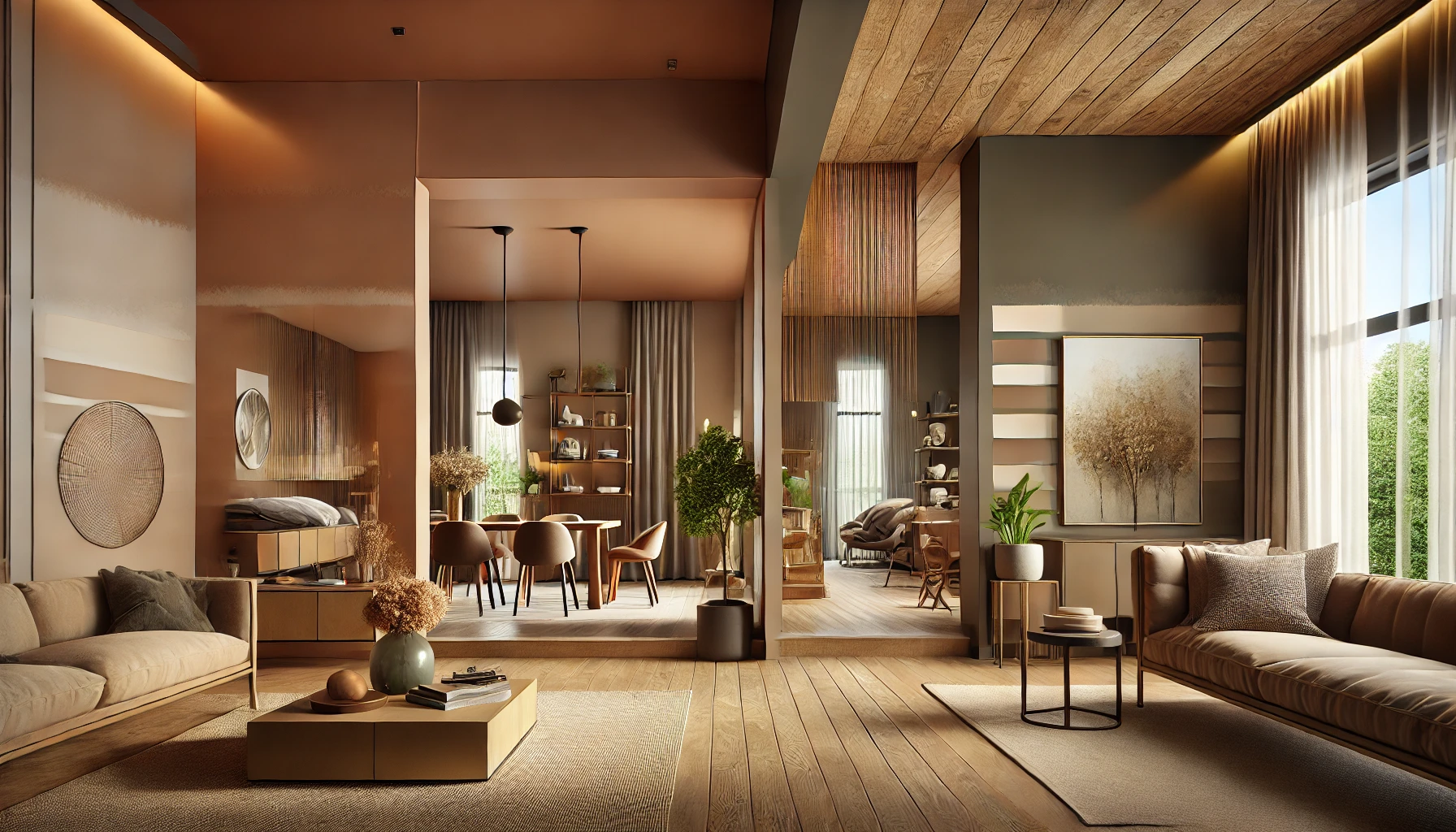
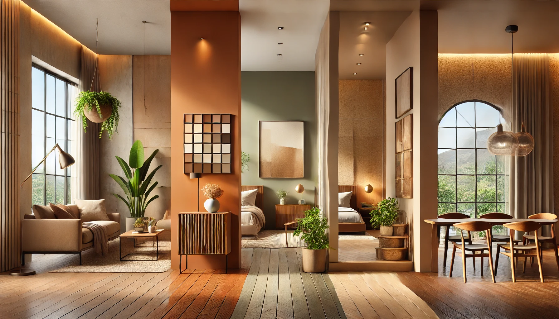
Earthy wall colours have become a leading trend in home interiors, offering a warm, grounded, and sophisticated aesthetic that feels both timeless and inviting. Inspired by natural elements like soil, clay, wood, and stone, these shades bring calmness, warmth, and an organic feel to any space. Whether you’re revamping your living room, bedroom, dining area, or accent wall, earthy hues blend beautifully with various interior styles, making them a versatile and stylish choice.
This year, Indicus Paints brings you a carefully curated selection of rich, nature-inspired earthy tones that will transform your home into a stylish and tranquil retreat. Let’s explore five stunning earthy wall colours from the Indicus Colour Palette that are perfect for your home makeover in 2024!
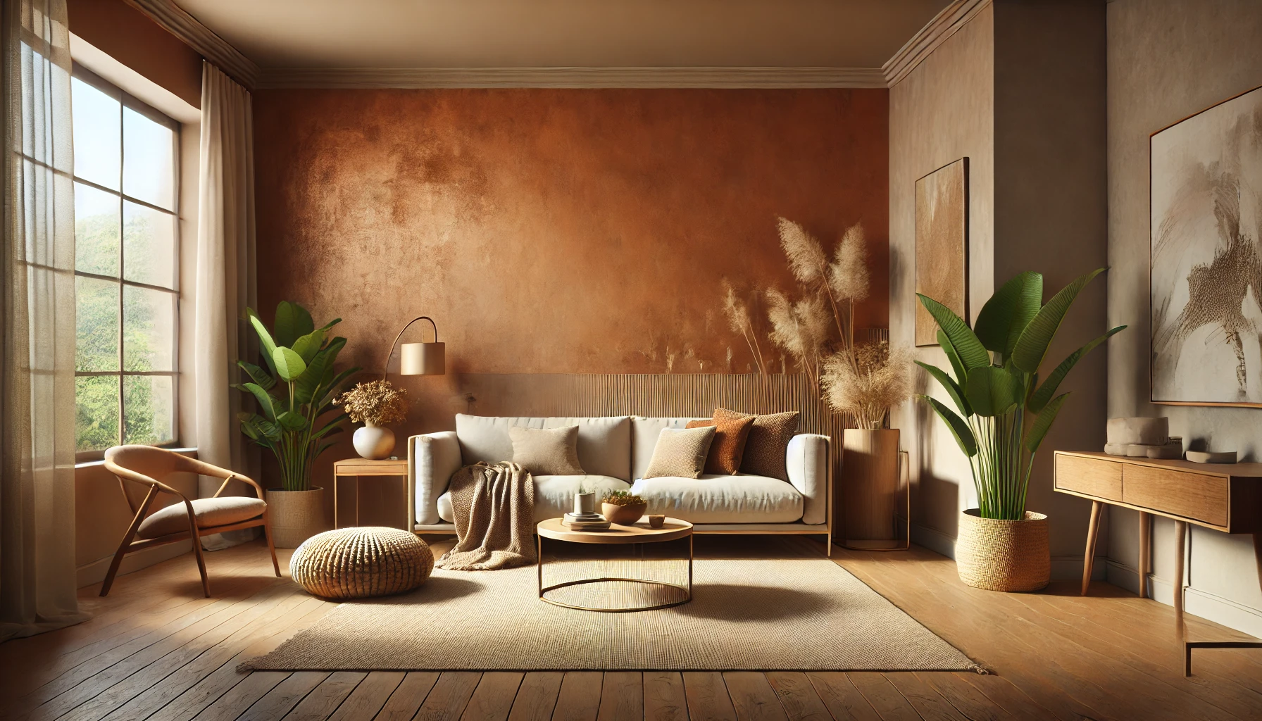
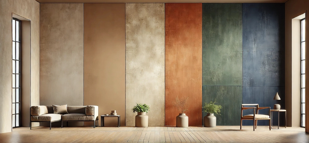
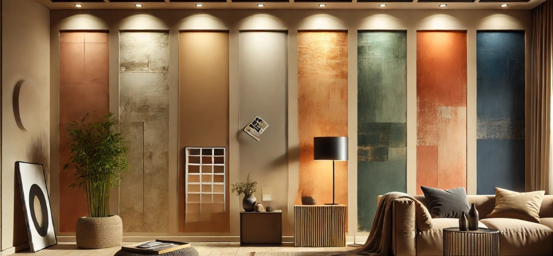
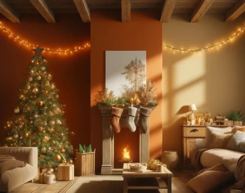
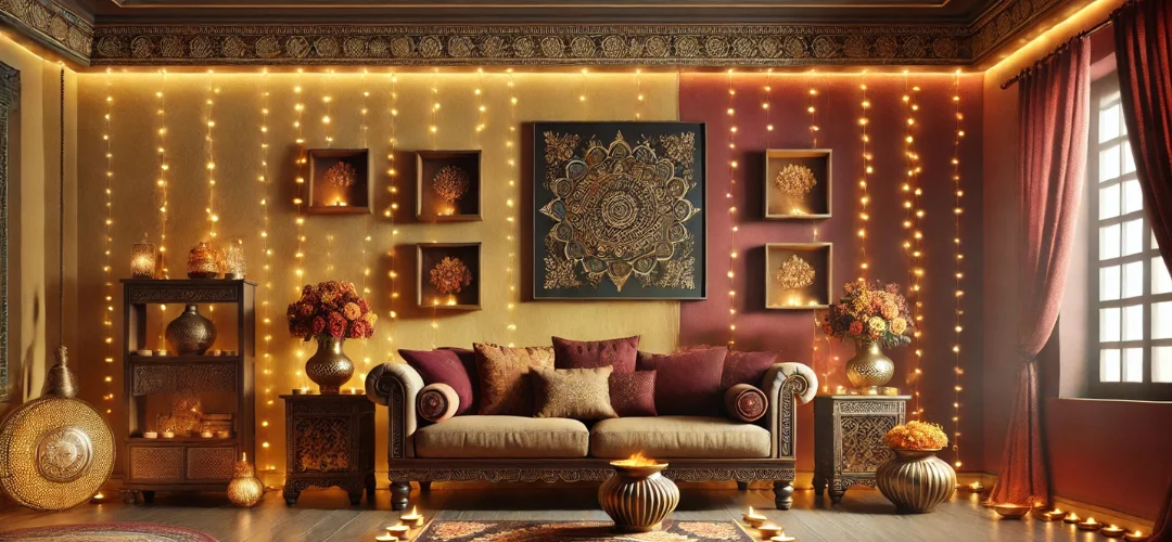
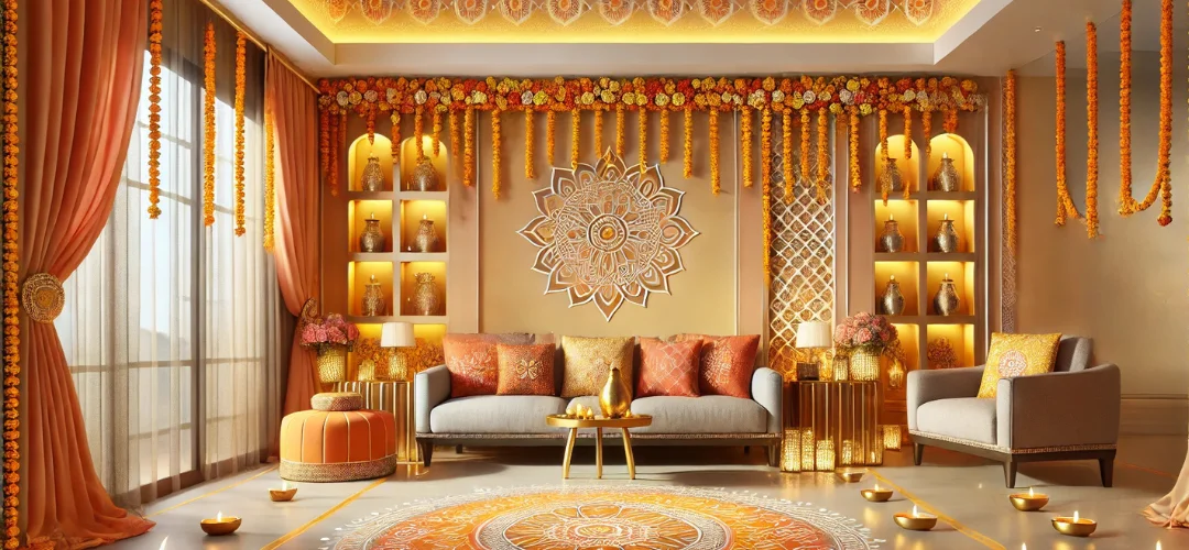
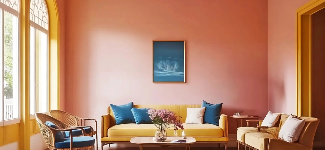
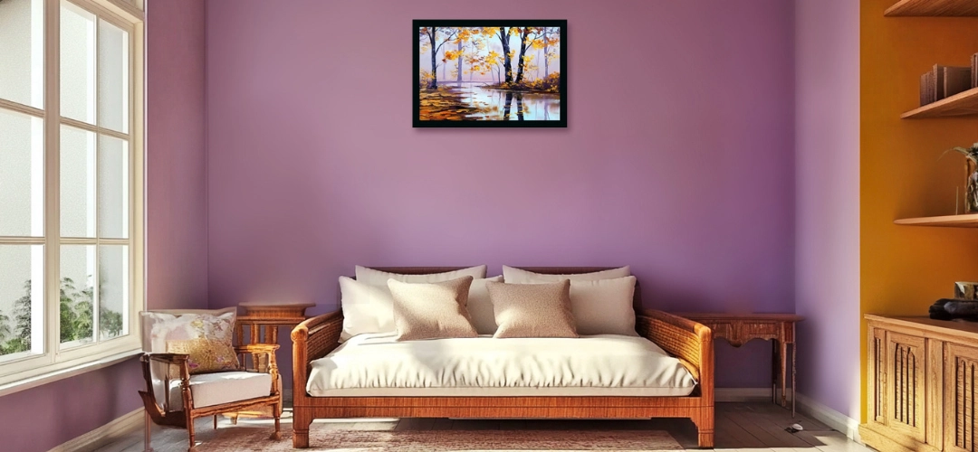
1. Terracotta Bliss – The Perfect Rustic Charm
Why It Works
Terracotta Bliss is a burnt-orange hue that captures the warmth and richness of natural clay and baked earth. It evokes a rustic yet modern feel, bringing vibrancy and warmth to your interiors. This colour is perfect for those who love earthy Mediterranean, Bohemian, or rustic décor styles.
Best Colour Pairings
For a harmonious and inviting palette, pair Terracotta Bliss with:
- Ivory Silk – To create a soft, balanced contrast.
- Sandstone Glow – For a natural, seamless transition.
- Warm Taupe – To add a touch of depth and elegance.
Enhance the look with wooden furniture, woven textures, warm-toned lighting, and ceramic décor to bring out the earthy charm.
Best Spaces to Use It:
🗸 Living Room: Creates a warm, inviting space perfect for entertaining.
🗸 Dining Area: Encourages warmth and togetherness at mealtimes.
🗸 Entryway: Makes a bold first impression with a rich and welcoming atmosphere.
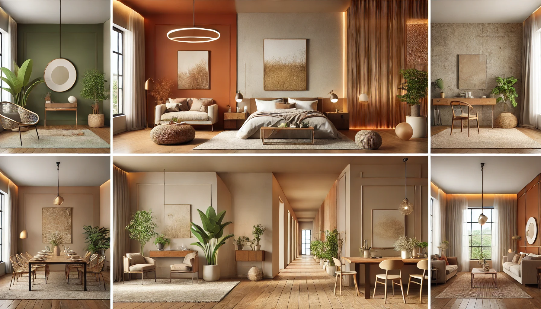
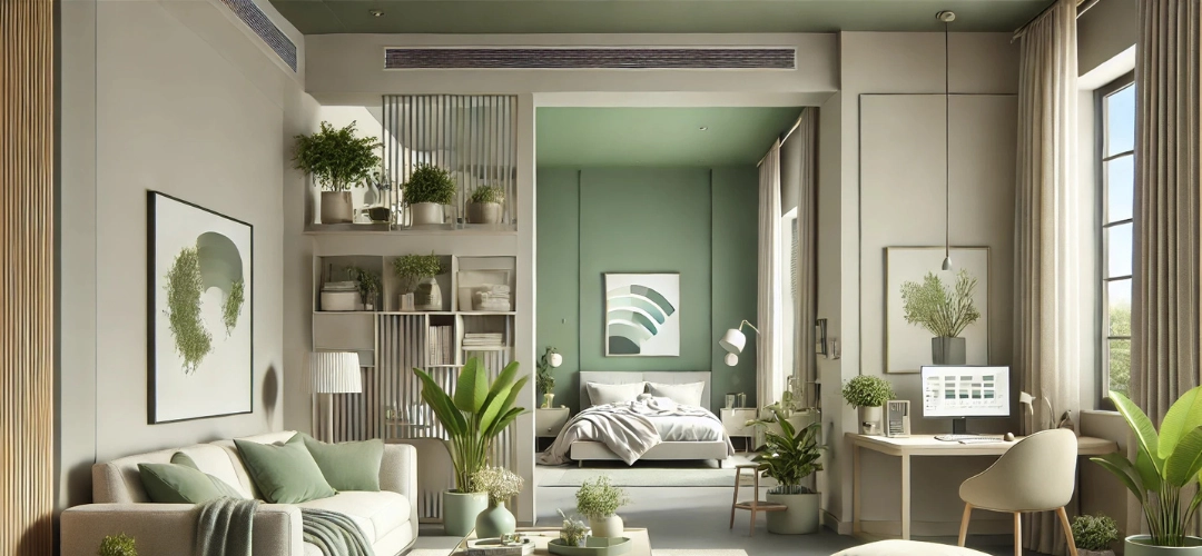
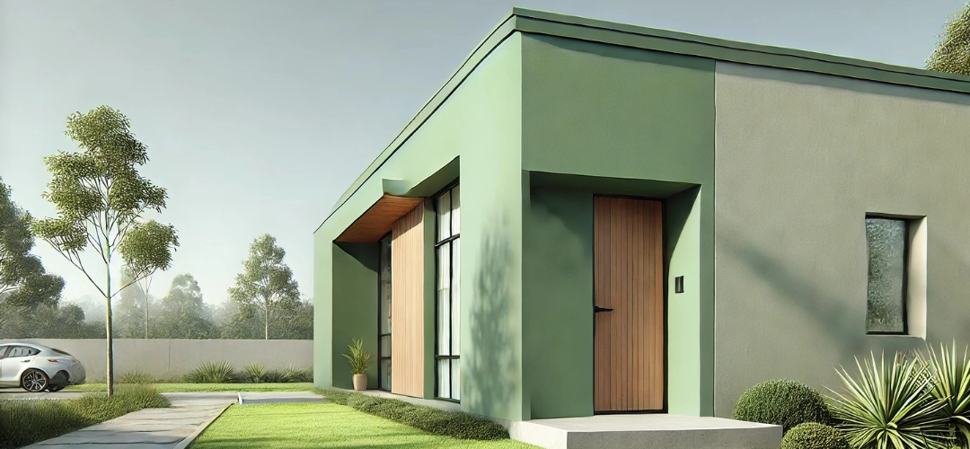
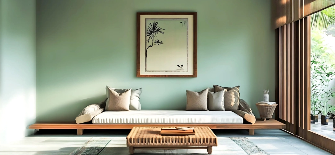
2. Olive Whisper – A Serene Connection to Nature
Why It Works
Inspired by lush olive groves and forest landscapes, Olive Whisper is a muted, earthy green that brings calmness, sophistication, and a deep connection to nature into your home. It works exceptionally well in spaces where you want to create a peaceful and balanced environment.
Best Colour Pairings
For a natural, refreshing look, combine Olive Whisper with:
- Warm Taupe – To add warmth and contrast.
- Rustic Clay – For a bold, earthy palette.
- Sandstone Glow – To maintain a soft and cohesive theme.
Pair with neutral-toned furniture, indoor plants, and soft linen fabrics for a fresh, nature-inspired look.
Best Spaces to Use It:
✔ Bedroom: Creates a serene and restful retreat.
✔ Study Room: Encourages focus, clarity, and relaxation.
✔ Kitchen: Adds a refreshing natural touch for a lively ambiance.
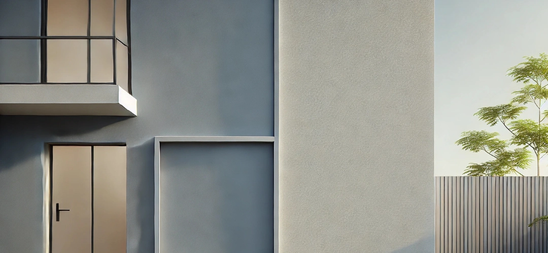
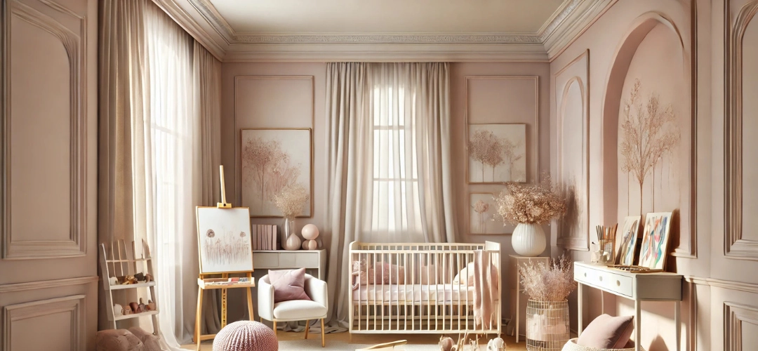
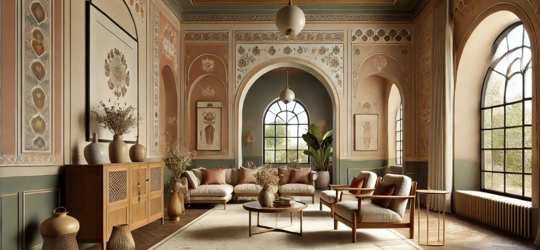
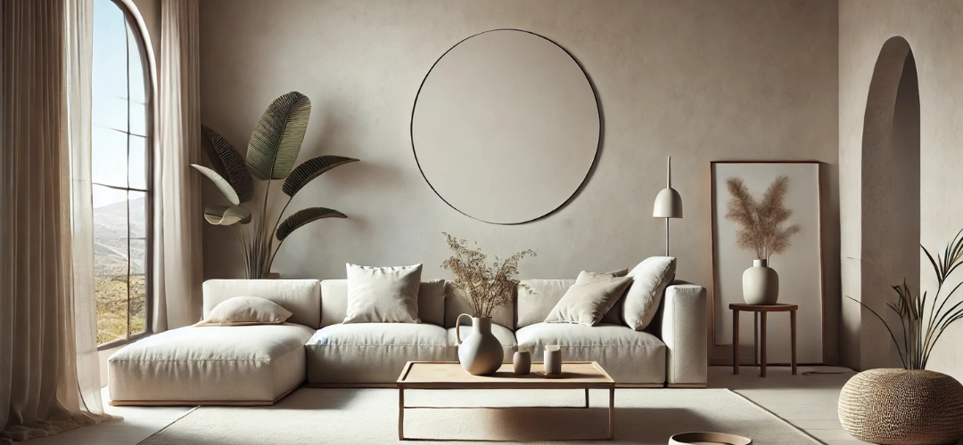
3. Sandstone Glow – A Timeless Neutral for Every Space
Why It Works
If you prefer subtle, elegant neutrals, Sandstone Glow is the perfect choice. This warm beige with sandy undertones provides a light, airy, and sophisticated backdrop, making it a versatile colour that works well with various interior styles, including modern, minimalist, and Scandinavian-inspired spaces.
Best Colour Pairings
For a warm, elegant aesthetic, pair Sandstone Glow with:
- Rustic Clay – To add depth and contrast.
- Ivory Silk – For a clean, contemporary look.
- Olive Whisper – To create an earthy, natural-inspired palette.
Complete the look with woven rugs, wooden accents, linen curtains, and ceramic décor for an effortlessly chic vibe.
Best Spaces to Use It:
✔ Living Room: Keeps spaces bright, open, and elegant.
✔ Hallways & Entryways: Provides a seamless and welcoming transition.
✔ Multipurpose Spaces: Works beautifully as a neutral base for any room.
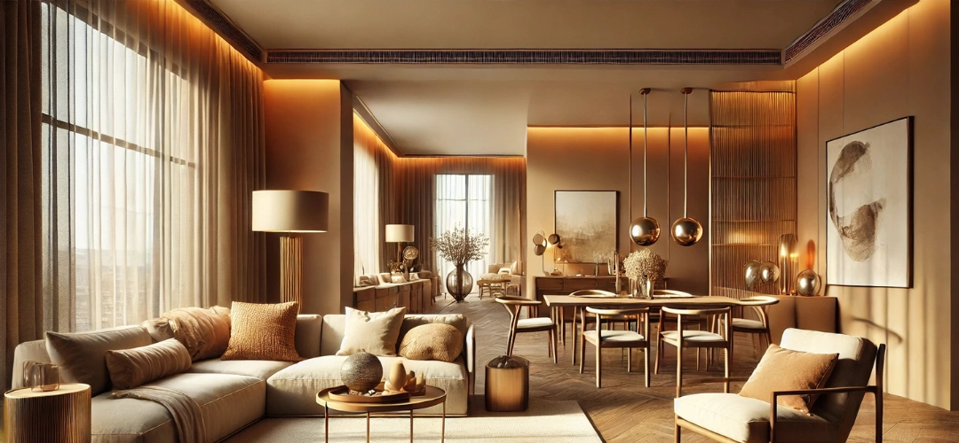
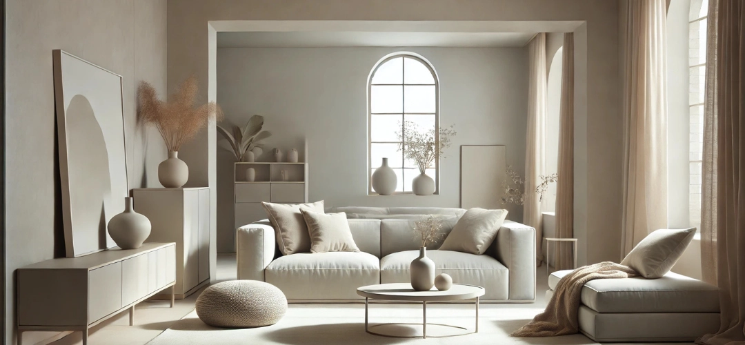
4. Warm Taupe – Understated Sophistication
Why It Works
A perfect blend of grey and brown, Warm Taupe offers a soft, modern, and sophisticated look that is timeless and effortlessly stylish. It’s an excellent choice for homeowners who love neutral, understated tones but still want warmth and depth in their spaces.
Best Colour Pairings
For a modern and refined interior, pair Warm Taupe with:
- Olive Whisper – To introduce an earthy, natural balance.
- Ivory Silk – For a clean and contemporary contrast.
- Sandstone Glow – To create a seamless, neutral aesthetic.
Style with beige upholstery, brass décor, soft lighting, and textured fabrics to enhance the inviting warmth of this shade.
Best Spaces to Use It:
✔ Bedroom: Creates a cosy and elegant retreat.
✔ Living Area: Adds warmth and sophistication without overpowering the space.
✔ Home Office: Encourages focus and productivity while keeping a relaxed atmosphere.
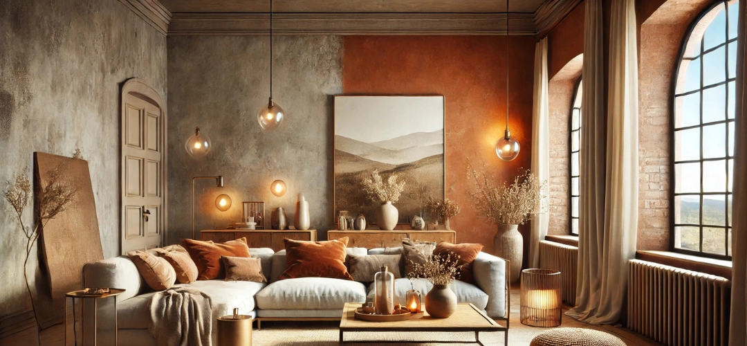
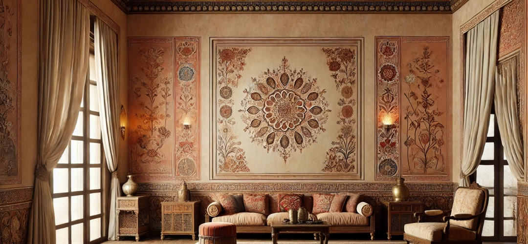
5. Rustic Clay – Bold and Earthy Elegance
Why It Works
For those who love rich, bold earthy shades, Rustic Clay is an exceptional choice. This deep brown with reddish undertones adds drama, warmth, and grounding energy while maintaining a natural, organic aesthetic. It’s ideal for feature walls and spaces that require a bold yet sophisticated statement.
Best Colour Pairings
For a striking yet balanced palette, pair Rustic Clay with:
- Sandstone Glow – To soften the richness of the tone.
- Warm Taupe – For a deep and inviting contrast.
- Ivory Silk – To create a bright and elegant balance.
Incorporate brass or copper décor, dark wooden finishes, and textured rugs to enhance the earthy, luxurious appeal of this shade.
Best Spaces to Use It:
✔ Accent Wall: Creates a bold and artistic focal point.
✔ Dining Area: Adds warmth, depth, and a rich atmosphere.
✔ Library/Study Room: Enhances a sophisticated and intimate setting.
How to Style Earthy Colours in Your Home
To fully embrace earthy tones, here are some expert styling tips:
✔ Layer with Natural Elements – Use wooden furniture, stone textures, and woven fabrics for an authentic, organic look.
✔ Balance with Neutral Tones – Pair bold earthy shades with lighter neutrals to maintain harmony and openness.
✔ Incorporate Statement Pieces – Add dark wood accents, vintage ceramics, and metallic finishes to create depth and contrast.
✔ Optimise Lighting – Warm lighting enhances the cosy and inviting nature of earthy tones, creating a more intimate ambiance.
Conclusion
Earthy wall colours offer a timeless, elegant, and versatile way to refresh your interiors. Whether you prefer the vibrant energy of Terracotta Bliss, the serene appeal of Olive Whisper, or the understated sophistication of Warm Taupe, these shades will help create a stylish and nature-inspired home.
Explore Indicus Paints’ earthy colour palette and transform your home into a warm, sophisticated retreat that embraces the beauty of nature. Let these rich, grounded tones redefine your spaces with comfort and elegance