You are using an outdated browser. Please upgrade your browser to improve your experience.

Indicus Low VOC Paints: A Sustainable Choice for Interior & Exterior Walls

Indicus Low VOC Paints: A Sustainable Choice for Interior & Exterior Walls

In today’s world, sustainability is a priority, and choosing eco-friendly products for your home is more important than ever. When it comes to painting your walls, selecting paints that are both durable and environmentally conscious can make a significant difference. Indicus Low VOC Paints stand out as a top choice for homeowners who are committed to sustainability without compromising on quality.

VOC, or volatile organic compounds, are harmful chemicals found in many traditional paints. They can contribute to indoor air pollution and have adverse effects on health. Indicus Paints, with their Low VOC formulations like Resilio Exterior Emulsion and Admyra Interior Emulsion, provide an eco-friendly alternative. These paints offer a sustainable solution for creating beautiful and safe living spaces while being gentle on the environment.

In this blog, we’ll explore how Indicus Low VOC paints are a great choice for both your interior and exterior walls, offering long-lasting beauty, durability, and eco-friendliness.

What is Low VOC Paint?

Low VOC paints are specially formulated to reduce the amount of harmful chemicals released into the air during and after the painting process. VOCs can cause various health issues, including respiratory problems, headaches, and skin irritation. By choosing Low VOC paints, you contribute to better indoor air quality and a healthier environment.

The major benefits of Low VOC paints include:

  • Safer air quality: Reduces the presence of toxic chemicals in your home.
  • Minimal environmental impact: Helps to reduce the environmental footprint of the products used in your home.

Why Choose Indicus Low VOC Paints?

Indicus Paints offers an impressive range of Low VOC paints designed to deliver stunning results while prioritising health and sustainability. Two of the most popular products in this range are Resilio Exterior Emulsion and Admyra Interior Emulsion. Let’s explore the features and advantages of both paints.

1. Resilio Exterior Emulsion: Durability Meets Sustainability

When it comes to painting your home’s exterior, durability and protection are paramount. The Resilio Exterior Emulsion is designed to withstand various weather conditions while offering a Low VOC formulation. It’s the ideal choice for eco-conscious homeowners who don’t want to compromise on performance.

Key Features:

  • Low VOC Formula: Provides a healthier alternative to traditional exterior paints.
  • Weather-resistant: Offers excellent resistance to rain, sun, and temperature fluctuations, ensuring long-lasting performance.
  • UV Protection: Helps prevent fading and discoloration caused by the sun’s harmful UV rays.
  • Superior Coverage: A single coat is often sufficient to cover surfaces, making it a cost-effective option.
  • Easy Maintenance: Resilio smooth finish makes it easier to clean and maintain, ensuring your home always looks fresh.

Why It’s Perfect for Exterior Walls:

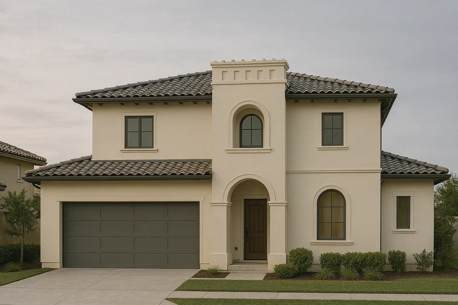
The Resilio Exterior Emulsion is perfect for any exterior surface, including concrete, plaster, and masonry. Its Low VOC formulation makes it suitable for family homes, where air quality is important, and it also meets the growing demand for eco-friendly building materials.
Eco Choice Indian Homes

2. Admyra Interior Emulsion: Beautiful Walls, Healthy Homes

For your interior walls, Admyra Interior Emulsion offers the perfect balance of sustainability and high performance. This paint is specifically formulated for interior surfaces, providing a smooth, lustrous finish that enhances the aesthetics of your home while being easy on the environment.
Eco Choice Indian Homes

Key Features:

  • Low VOC Content: Ensures a healthier indoor environment by reducing the amount of harmful chemicals released into the air.
  • Smooth Finish: Provides a flawless, high-gloss finish that enhances the beauty of your walls.
  • Durability: Resistant to stains and scratches, making it ideal for high-traffic areas.
  • Easy to Clean: The smooth, high-quality finish allows for easy maintenance and cleaning, keeping your walls looking pristine.
  • Range of Colours: Admyra comes in a wide range of beautiful colours to suit your style and home décor needs.

Eco Choice Indian Homes

Why It’s Perfect for Interior Walls:

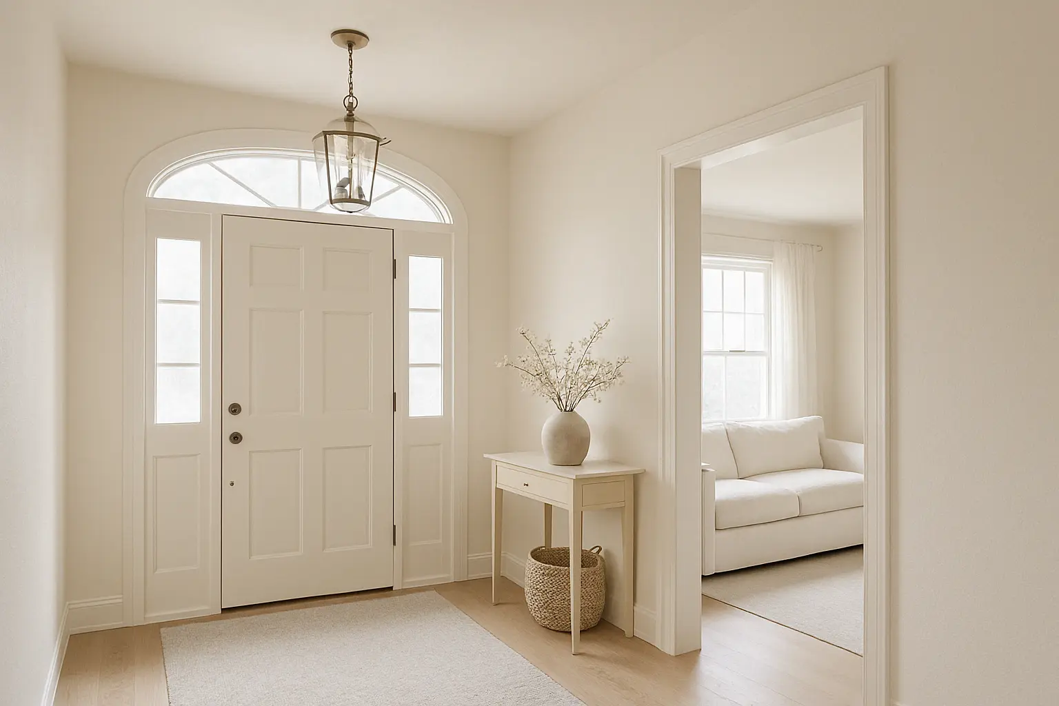
Admyra’s formulation ensures long-lasting colour retention, which means that your walls will stay fresh and vibrant for longer. Its Low VOC content ensures that you can safely apply it in bedrooms, living rooms, kitchens, or any area where your family spends time. This makes Admyra an ideal choice for those seeking both aesthetic appeal and a health-conscious option.

3. Benefits of Choosing Indicus Low VOC Paints

By choosing Indicus Low VOC paints for your home, you’re not just making a style choice, you’re also making a responsible decision for the environment and your well-being.

Key Benefits:

  • Healthier Home Environment: Low VOC paints reduce the release of toxic chemicals, making your home safer for children, pets, and everyone who resides in it.
  • Sustainable: By opting for eco-friendly paints like Indicus, you’re helping to reduce the overall environmental impact associated with traditional paint products.
  • Superior Finish: Both Resilio and Admyra offer smooth, durable finishes that add a premium look to your walls while ensuring the longevity of your paint job.
  • Fewer Chemicals: The reduction of VOCs and other chemicals in these paints means fewer harmful, improving air quality and reducing indoor pollution.
  • Cost-effective: The long-lasting nature of Indicus paints ensures that you don’t need to repaint your walls as often, which ultimately saves you time and money.

Eco Choice Indian Homes

How to Use Indicus Low VOC Paints Effectively

To get the best results with Indicus Resilio Exterior Emulsion and Admyra Interior Emulsion, follow these simple tips:

  • Preparation is Key: Before applying any paint, make sure the surface is clean and smooth. For exteriors, make sure that any grime, dirt, or mildew is removed. For interiors, ensure the walls are dust-free and prepped for painting.
  • Use High-Quality Brushes and Rollers: For an even coat, use brushes and rollers suited to the type of paint you’re applying. A good-quality roller will help you achieve the smooth finish that both Admyra and Resilio are known for.
  • Apply Multiple Coats if Needed: Though both paints offer excellent coverage, depending on the surface and previous wall colour, you might need to apply a second coat for the best results.
  • Allow Adequate Drying Time: Let each coat dry properly before applying another layer. Indicus paints offer quick drying times, but patience ensures a better finish.

Eco Choice Indian Homes

Choosing Indicus Low VOC Paints like Resilio Exterior Emulsion and Admyra Interior Emulsion for your home’s walls ensures you’re making a sustainable, eco-friendly decision while maintaining a premium finish. These paints offer durability, ease of application, and long-lasting beauty while ensuring that your indoor and outdoor spaces remain safe and healthy.

Whether you’re painting your home’s exterior to withstand the elements or refreshing your living room walls with a beautiful sheen, Indicus Paints provides the perfect solution. Choose Indicus Resilio for your exteriors and Indicus Admyra for your interiors and enjoy the perfect blend of performance and eco-friendliness.

Explore Indicus Paints today to find the ideal low VOC paint that fits your needs. Embrace a healthier, more sustainable home while adding a professional touch to your spaces.
The Timeless Appeal of Teak, Mahogany, and Other Rich Brown Wooden Door Colours

The Timeless Appeal of Teak, Mahogany, and Other Rich Brown Wooden Door Colours

When it comes to doors, the colour and finish can make a world of difference. A well-painted or stained wooden door does more than just provide functionality; it’s an essential part of your home’s curb appeal. One of the most timeless and elegant choices for wooden doors is the range of brown shades, especially teak, mahogany, and other rich, warm wood tones. These colours are celebrated for their enduring appeal, bringing both sophistication and warmth to any space.

As design trends evolve, brown wooden doors have remained a staple, making them a sought-after choice for both modern and traditional interiors. With Indicus Woodfina, the richness and depth of these wooden tones are enhanced, offering a sleek, high-quality finish that makes a bold statement while maintaining a sense of natural elegance. In this blog, we’ll explore the beauty and versatility of these timeless brown shades, their advantages, and how Indicus Woodfina can elevate your wooden doors to new heights.

1. Why Brown Wooden Doors Are a Timeless Choice

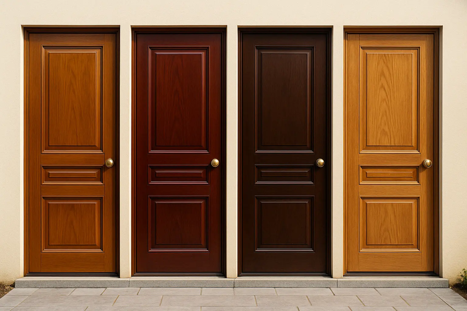
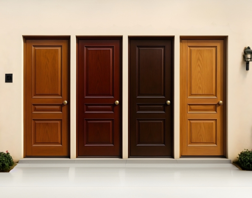
Brown shades, from the deep richness of mahogany to the warm elegance of teak, have been celebrated for their timeless appeal. The natural grain and colour variations in wood offer a unique texture that adds warmth and character to any room or exterior.

Here’s why brown wooden doors, particularly teak, mahogany, and other rich brown hues, continue to be such a popular choice:

  • Warmth and Elegance: Brown tones bring a sense of warmth and richness to a space, making it feel more inviting and homely. The organic nature of wood paired with these colours creates an elegant, timeless look.
  • Versatility: Brown doors are highly adaptable and can complement both modern and traditional interior styles. Whether your décor is sleek and contemporary or rustic and vintage, brown wooden doors are versatile enough to match various themes.
  • Durability: Brown wooden doors, especially those made from hardwoods like teak and mahogany, are not just beautiful, they are incredibly durable and long-lasting, making them an ideal investment for your home.
The timeless appeal of teak

2. Exploring Teak, Mahogany, and Other Rich Brown Tones

Let’s dive deeper into some of the most popular brown wooden door colours:

Teak: Timeless Warmth with a Rich Glow

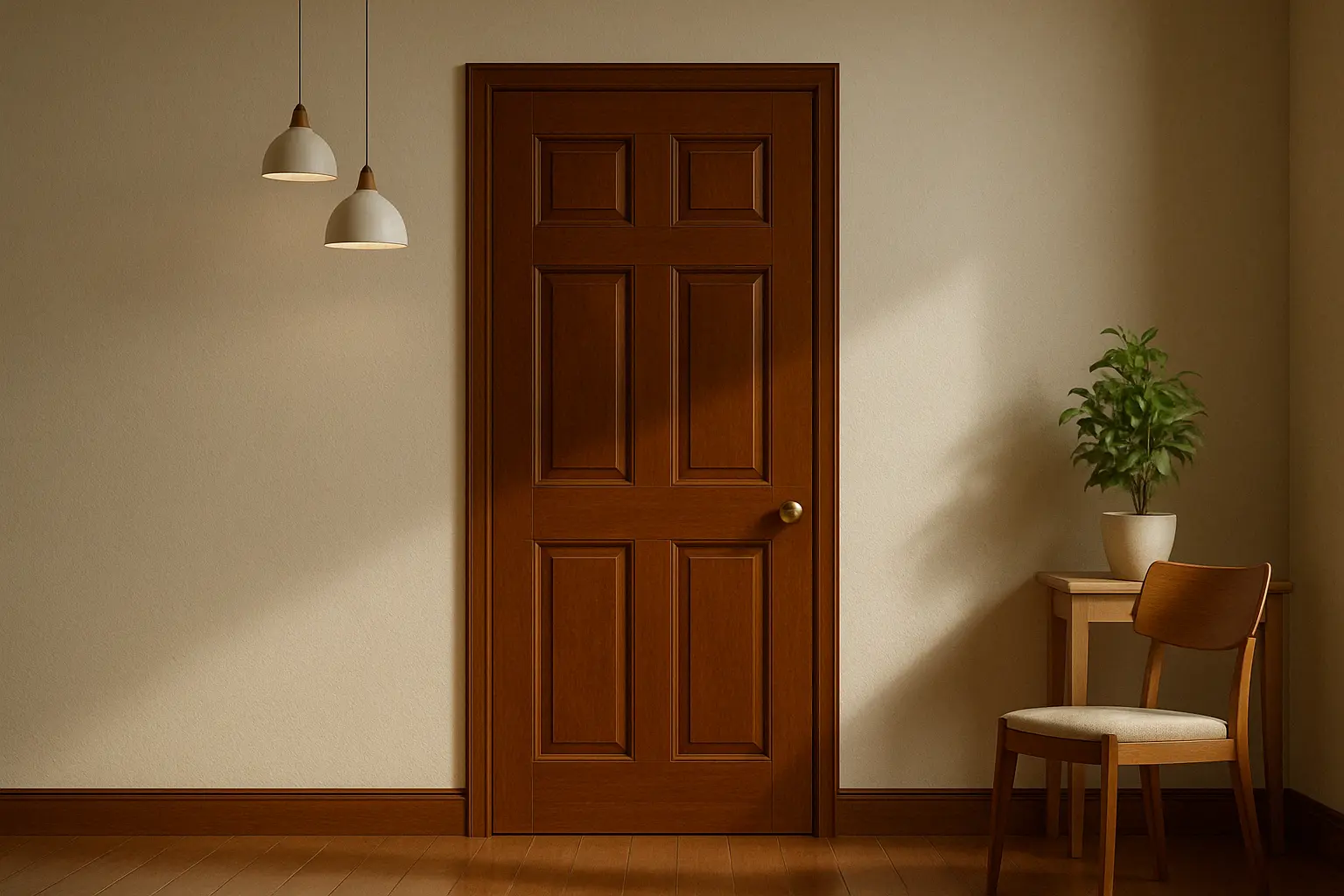
Teak is renowned for its golden-brown hue and natural resilience. It’s one of the most sought-after woods for doors due to its strength and rich colour. Teak doors often develop a beautiful patina over time, adding to their charm.

  • Indicus Woodfina enhances the inherent glow of teak, giving your door a premium, high-gloss finish that highlights the wood’s natural grain.
  • Perfect for: Homes with a warm, earthy interior style or traditional architecture.

Mahogany: Luxurious and Bold

Mahogany is a deep, reddish-brown wood that exudes luxury and sophistication. Its rich, deep hue and distinctive grain make it an excellent choice for doors that demand attention. Mahogany doors are a favourite for formal settings, lending an air of grandeur to your home’s entrance.

  • Indicus Woodfina can amplify mahogany’s bold and luxurious feel, providing an enduring shine that enhances its natural beauty.
  • Perfect for: Formal homes, grand entrances, or traditional interior styles.

Walnut: A Modern Brown Classic

Walnut is another stunning option for wooden doors. With its deep, chocolatey brown tones and beautiful grain patterns, walnut doors add a modern yet timeless feel to any home. Walnut doors can serve as a statement piece, adding both beauty and sophistication.

  • With the Indicus Woodfina finish, walnut doors receive an extra layer of protection while maintaining their stunning depth and elegance.
  • Perfect for: Modern, contemporary homes looking for a rich, dark wood.

Oak: Light, Warm, and Inviting

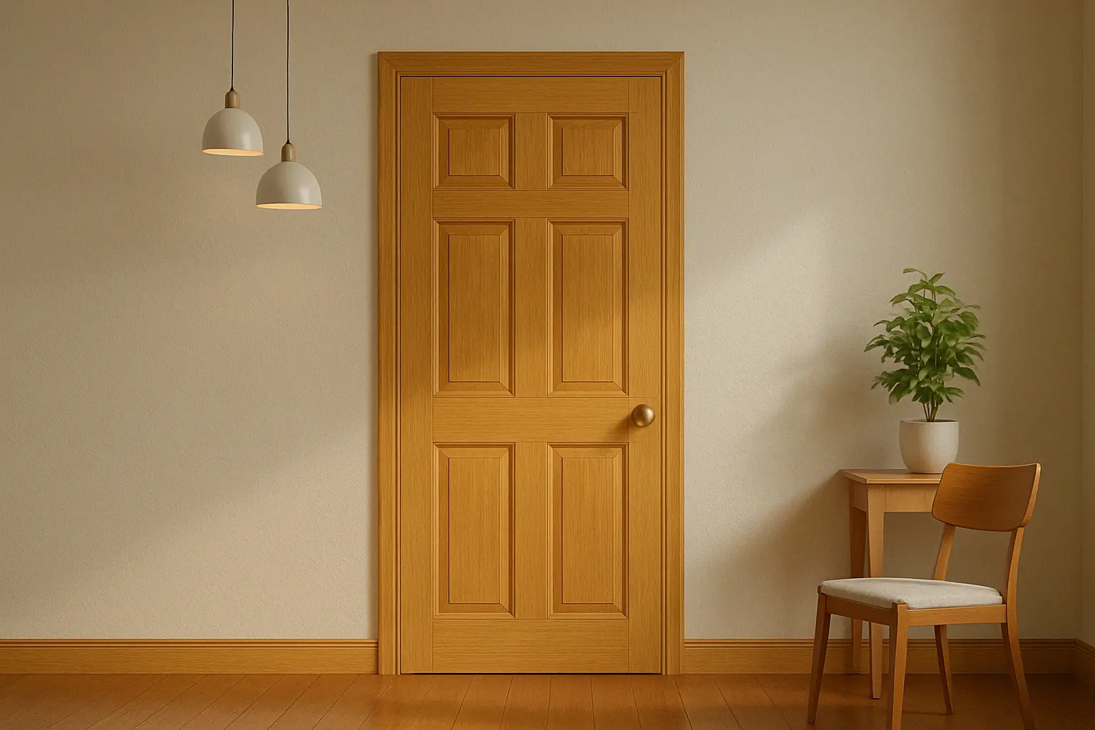
For a slightly lighter yet equally rich tone, oak wood offers a warm, honey-brown hue that creates a bright and inviting atmosphere. Oak is a fantastic choice for those who want a more subtle yet sophisticated wood door that still carries the warmth of brown tones.

  • Indicus Woodfina enhances the lighter, warm tones of oak, making it look polished and fresh without losing its natural appeal.
  • Perfect for: Homes with Scandinavian or minimalist décor that prefer lighter wooden tones.
The timeless appeal of teak

3. How Indicus Woodfina Enhances Wooden Doors

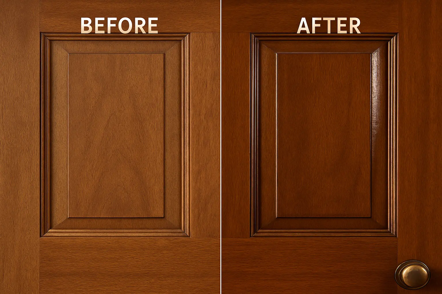
While the natural beauty of wood speaks for itself, a high-quality finish is key to bringing out its full potential. This is where Indicus Woodfina comes in. Designed to complement rich wooden doors, Indicus Woodfina enhances the wood’s grain, colour, and texture with a high-gloss, durable finish.

Key Benefits of Using Indicus Woodfina:

  • Durability: The Indicus Woodfina finish offers long-lasting protection, ensuring that your wooden doors maintain their beauty for years. It resists wear, scratches, and fading.
  • High-Gloss Shine: The glossy finish enhances the natural sheen of woods like teak and mahogany, making the colours more vibrant and eye-catching.
  • Weather Resistance: Especially important for external doors, Indicus Woodfina creates a protective barrier that helps safeguard your wooden doors from the elements, including UV rays and humidity.

By using Indicus Woodfina, you give your doors the durability and shine they deserve while accentuating their natural beauty, making them a standout feature of your home.

The timeless appeal of teak

4. Styling Your Wooden Doors with Brown Shades

Now that we know why brown shades are an excellent choice for wooden doors, let’s talk about how to style these doors in your home.

For Traditional Homes:

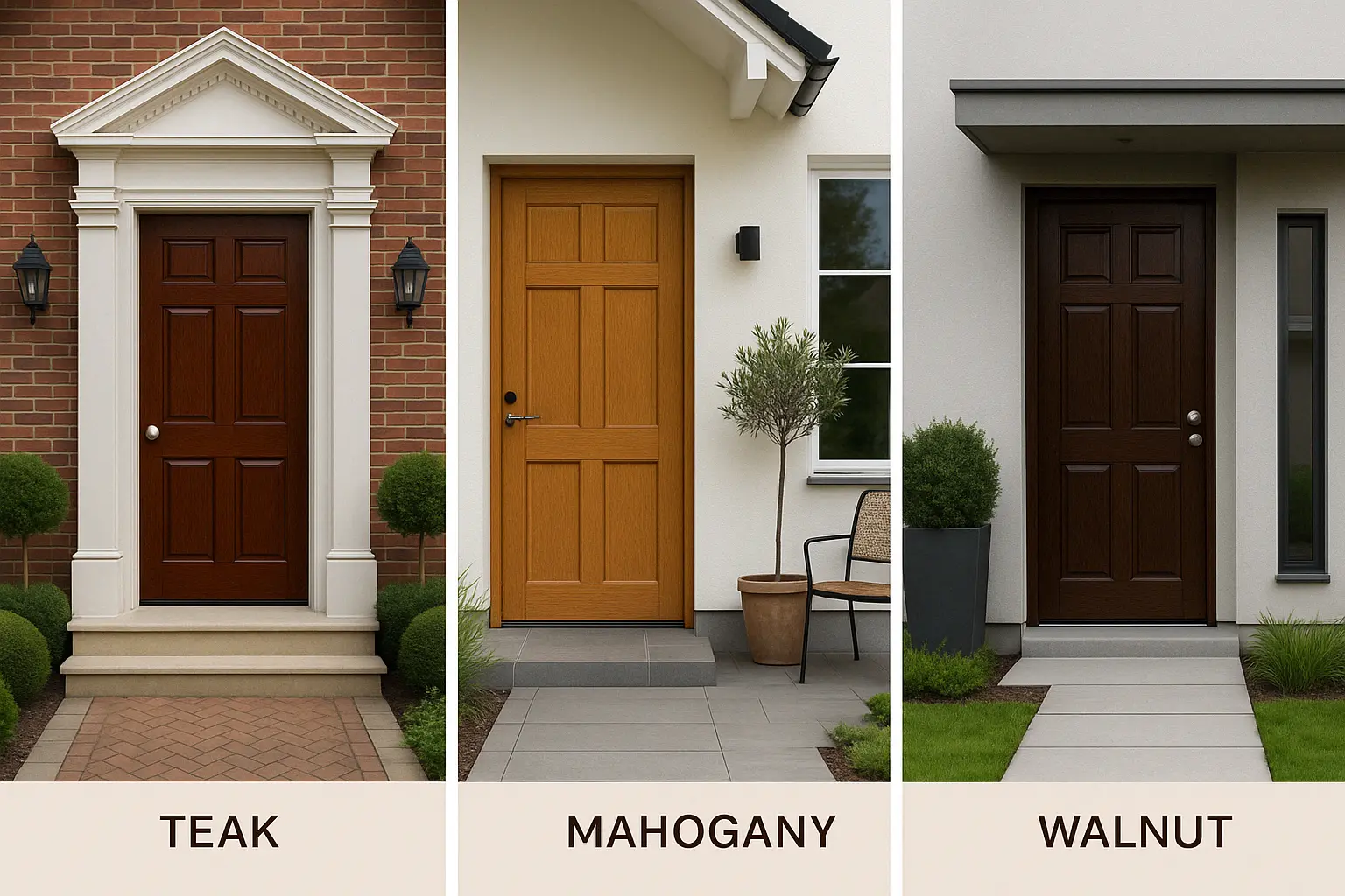
Rich, dark browns like mahogany or teak are perfect for homes with classic or colonial-style interiors. Pair them with warm, earthy tones like olive greens, deep oranges, or creamy beiges to create a welcoming atmosphere that is both classic and inviting.

For Modern Homes:

Lighter shades like oak or walnut work beautifully in modern or contemporary spaces. Pair these wood tones with cooler neutrals like grays, whites, and blues to create a sleek, minimalist look that still feels cozy and stylish.
For Rustic or Industrial Homes:

The rugged, natural feel of woods like walnut or oak can be paired with industrial accents like black metal, brick, and concrete to create an edgy, rustic vibe. Use Indicus Woodfina to keep the natural texture intact while adding a sophisticated shine.

The timeless appeal of teak

5. Maintenance Tips for Wooden Doors

Wooden doors require a bit of care to maintain their beauty and functionality. Here are some tips for ensuring your brown wooden doors stay in top shape:

  • Regular Dusting: Wipe down your doors regularly to prevent dust buildup and preserve their sheen.
  • Cleaning: Use a soft cloth and mild cleaning solution to remove dirt and stains without damaging the finish.
  • Reapplication of Gloss Finish: Every few years, consider reapplying Indicus Woodfina to maintain the door’s shine and durability.
  • Protection from the Elements: If your door is exposed to the outdoors, ensure that the finish protects it from harsh weather conditions by reapplying as needed.
The timeless appeal of teak

Teak, mahogany, and other rich brown wooden door colours offer a timeless elegance that never goes out of style. Whether you’re drawn to the deep reds of mahogany, the golden tones of teak, or the neutral richness of walnut and oak, brown wooden doors bring warmth, character, and sophistication to your home.

Enhancing these tones with Indicus Woodfina ensures that your doors not only look stunning but are protected against the elements for years to come.

Ready to transform your space with a beautifully finished wooden door? Choose from Indicus Paints range of premium products and bring the timeless beauty of brown wooden doors into your home today.

Bright & Cheerful Tones: Wall Colours to Instantly Lift Your Mood

Bright & Cheerful Tones: Wall Colours to Instantly Lift Your Mood

Our surroundings play a significant role in shaping our mood and energy levels. The walls of our home, in particular, can have a profound effect on how we feel and how we interact with the space. Bright and cheerful colours, such as warm yellows, energetic oranges, soft pinks, and light lilacs, can instantly lift your spirits and add vibrancy to your home. These colours not only bring joy but also create an atmosphere that feels welcoming, energising, and full of life.

In this blog, we’ll explore how you can use bright and cheerful tones to instantly uplift your mood at home. Whether you’re decorating your living room, bedroom, or dining area, these colours can transform your space into an energising retreat. Additionally, we’ll highlight how Indicus Paints offers the perfect hues to make your dream of a bright, happy home a reality.

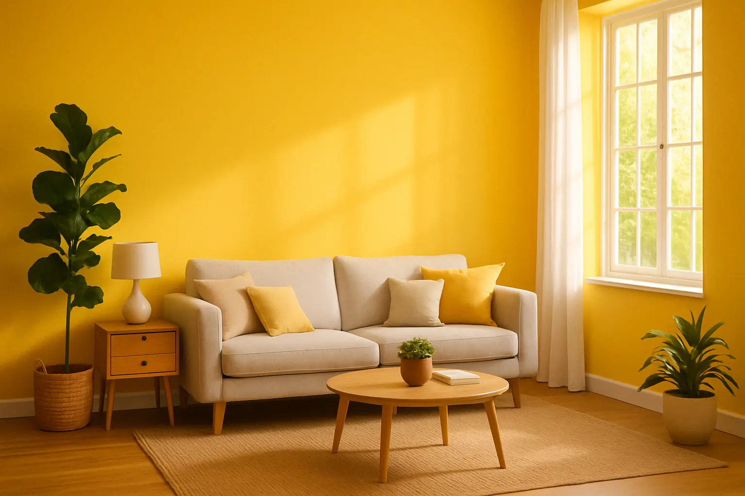
1. Yellow: The Ultimate Sunshine Colour

There’s no colour that radiates warmth and positivity like yellow. Associated with the sun, yellow brings an instant burst of energy and happiness into any room. Whether you choose a soft buttery shade or a bold canary yellow, this cheerful colour can transform your walls into a beacon of light.

Indicus Paints Golden Harvest and Lemon Twist are perfect yellow shades to create a warm, welcoming atmosphere in your space. Yellow also has the power to stimulate creativity and communication, making it an ideal choice for spaces where you spend time socialising, like living rooms and kitchens.

Why It Works:

  • Energising: Yellow naturally evokes feelings of happiness and optimism.
  • Brightens Small Spaces: It makes rooms feel larger and more open.
  • Perfect for Social Areas: Yellow stimulates conversation and is a great colour for gathering spaces.
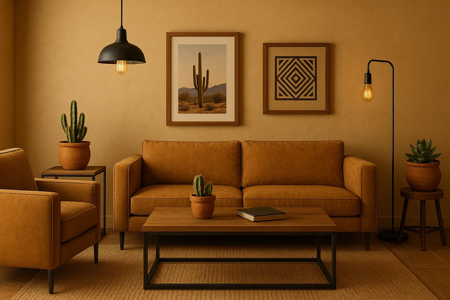
How to Style It:

  • Pair yellow with neutral tones like white or grey for a balanced look.
  • Use yellow as an accent wall or pair it with blue or green for a complementary contrast.
  • Add wooden furniture and plants for a natural, grounding touch.
Bright & Cheerful Tones: Wall Colours to Instantly Lift Your Mood

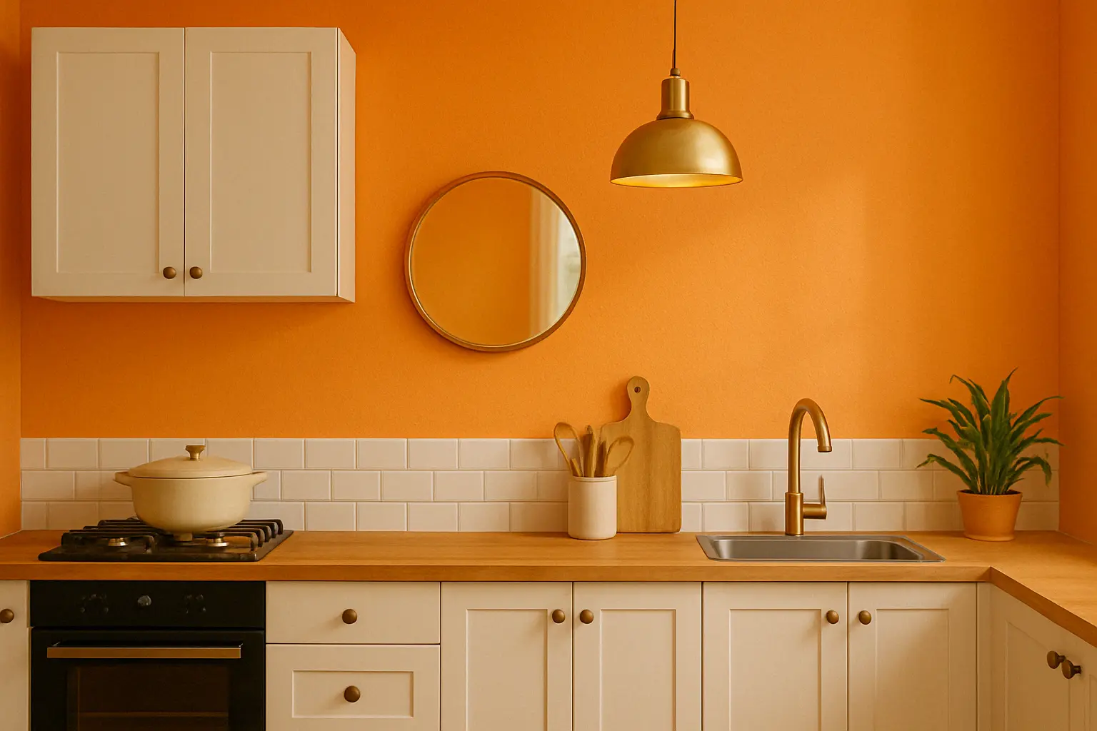
2. Orange: The Colour of Creativity and Enthusiasm

Orange is known for its vibrant energy and ability to create a lively, enthusiastic atmosphere. This colour stimulates creativity and is ideal for spaces where you want to feel inspired or motivated. It works wonderfully in areas like home offices, kitchens, or even playrooms, where activity and energy are desired.

Indicus Paints Sunset Orange and Tangerine Glow bring the warmth of the sun indoors, creating a space that’s both lively and inviting. When used strategically, orange can create a dynamic focal point without being overwhelming.

Why It Works:

  • Encourages creativity: Orange is associated with creativity and positive energy.
  • Boosts energy levels: Ideal for rooms where you want to feel motivated.
  • Creates warmth: Adds a sense of warmth and cheer to any room.

How to Style It:

  • Combine orange with neutral tones like white, cream, or beige to tone down its intensity.
  • Pair with wooden accents or brass details for a retro or eclectic vibe.
  • Use orange on one wall or in accents like furniture or accessories for a subtle burst of energy.
Bright & Cheerful Tones: Wall Colours to Instantly Lift Your Mood

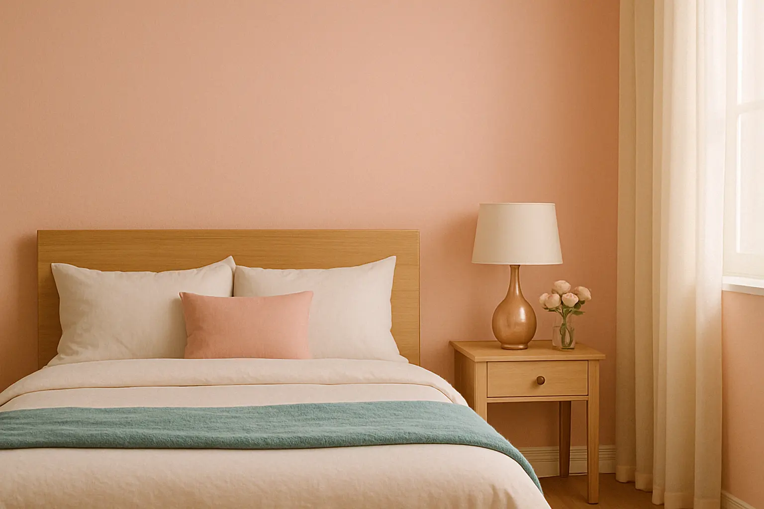
3. Pink: Soft & Playful Elegance

Pink is often associated with love, gentleness, and calmness, yet it can also be playful and full of life. It’s a versatile colour that ranges from soft, romantic hues like blush pink to vibrant shades like fuchsia. Soft pinks and peachy tones are especially known for their soothing and uplifting qualities, making them ideal for bedrooms, bathrooms, and cozy corners.

For a modern twist, Indicus Paints Blush Peach and Cotton Candy offer a soft, pastel pink palette that adds a refreshing vibe to any space. These hues pair perfectly with both neutral and complementary colours to create a space that feels both serene and cheerful.

Why It Works:

  • Soothing & calming: Soft pinks create a peaceful, relaxing environment.
  • Feminine yet bold: Perfect for bedrooms, dressing areas, or living rooms.
  • Versatile: Works with almost any décor style, from modern to vintage.

How to Style It:

  • Pair pink with gold or silver accents for a luxurious, feminine touch.
  • Combine with pastel blues or mint greens for a soft, serene palette.
  • Use pink on furniture or accent pieces to brighten up a neutral room.
Bright & Cheerful Tones: Wall Colours to Instantly Lift Your Mood

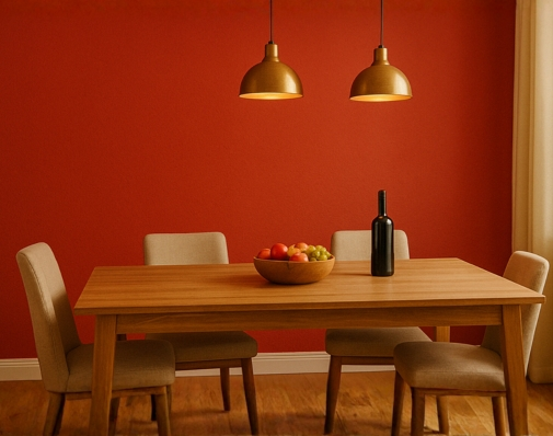
4. Red: Bold & Passionate

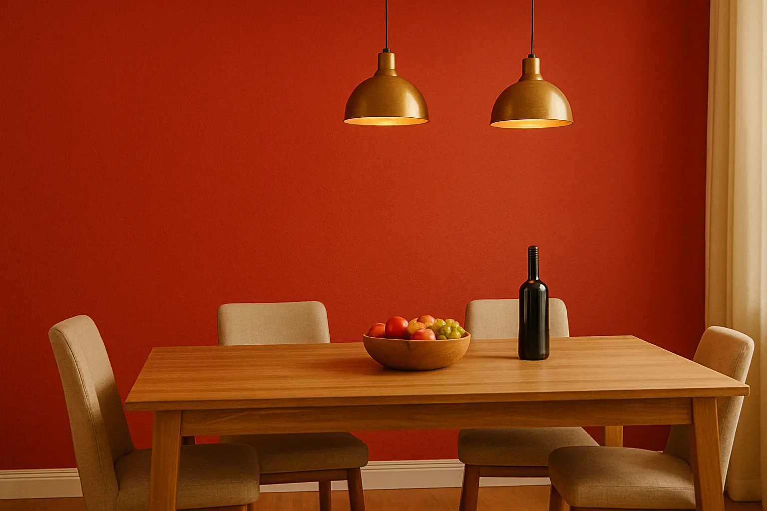
If you’re looking to create a room that exudes passion, red is the perfect choice. This bold and powerful colour can instantly add energy and warmth to any space. Whether used on a feature wall or in accessories, red can elevate your décor and make a statement.

Indicus Paints Crimson Glow and Saffron Glow are rich shades of red that can be used to create an inviting atmosphere in the living room or dining room. Red is also known to stimulate appetite and conversation, making it ideal for dining areas or entertaining spaces.
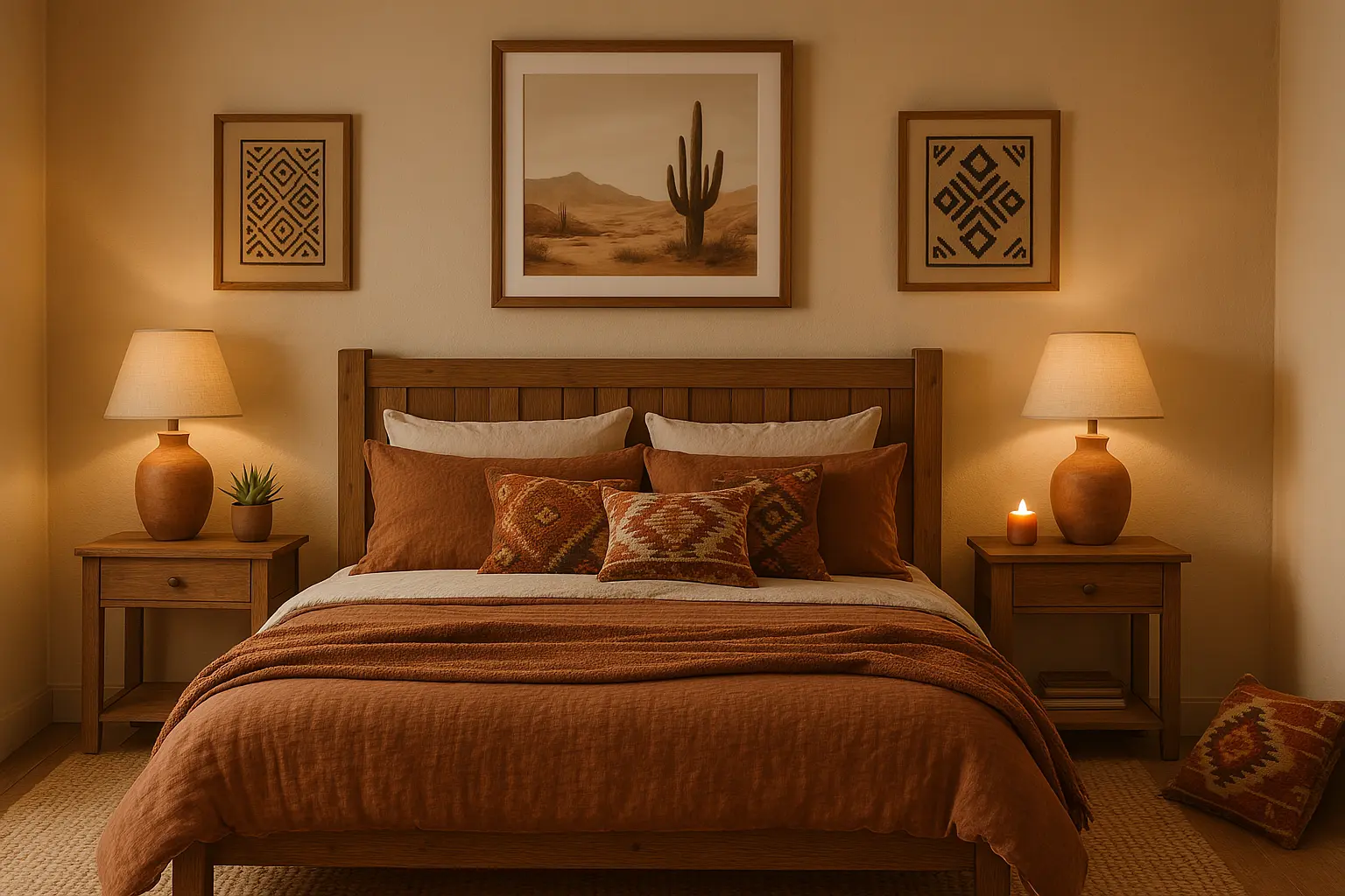
Why It Works:

  • Bold & energising: Red energises a space and adds passion and drama.
  • Creates a sense of warmth: Perfect for colder months or spaces that need a welcoming vibe.
  • Stimulates interaction: Great for social spaces where conversation is key.

How to Style It:

  • Pair with neutral tones like beige or white to balance its intensity.
  • Use red on one accent wall to make a bold statement without overwhelming the space.
  • Combine with metallic accents like gold or brass for a luxurious feel.
Bright & Cheerful Tones: Wall Colours to Instantly Lift Your Mood

5. Lighter Pastels: Soft, Refreshing, and Inviting

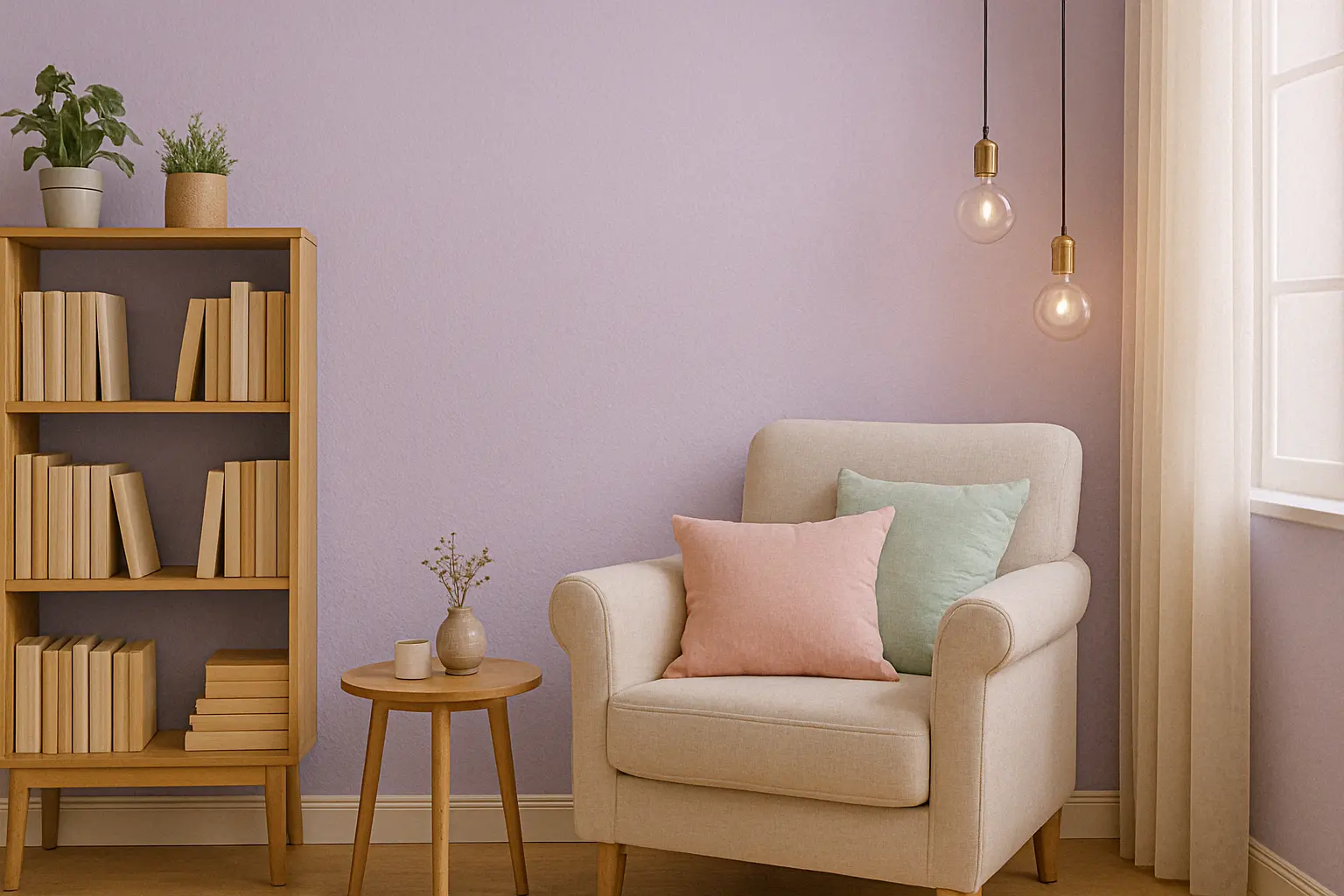
If you prefer a more subtle yet cheerful palette, pastel colours like peach, light pink, and lilac are perfect for creating a refreshing atmosphere. These colours are light, airy, and welcoming, making them ideal for spaces where relaxation is key.

For a soft, pastel touch, try Indicus Paints Soft Rose and Lilac Mist, which add a sense of tranquillity and playfulness to your home. These colours work wonderfully in bedrooms, bathrooms, and smaller spaces where you want to keep the energy light and refreshing.

Why It Works:

  • Soft & serene: Pastels create a calm and peaceful environment.
  • Versatile & adaptable: Works in any room, from bedrooms to hallways.
  • Inviting & refreshing: Perfect for spring and summer, these colours create a cool, fresh feel.

How to Style It:

  • Combine with white furniture or floral décor for a soft, feminine touch.
  • Pair pastel pinks or lilacs with light wood for a Scandi-inspired look.
  • Use pastels in accent pieces like cushions or throw blankets to create a subtle, cohesive vibe.
Bright & Cheerful Tones: Wall Colours to Instantly Lift Your Mood

Bright and cheerful colours are an easy and effective way to refresh your home and uplift your mood. Whether you choose yellow for warmth, orange for energy, pink for playfulness, red for passion, or pastels for a soothing atmosphere, these tones can transform any room into a vibrant, welcoming space.

Indicus Paints offers a wide range of beautiful, high-quality colours that can help you create the exact mood and aesthetic you want for your home. From the bold hues of Crimson Glow and Tangerine Glow to the soft, calming shades of Soft Rose and Lilac Mist, the possibilities are endless.

Ready to brighten up your space? Explore Indicus Paints and bring these cheerful tones to life in your home. Let the colours you choose not only enhance your décor but also inspire positivity and joy every day.

Find the Perfect Wall Colour to Match Your Tamil-Inspired Interiors

Find the Perfect Wall Colour to Match Your Tamil-Inspired Interiors

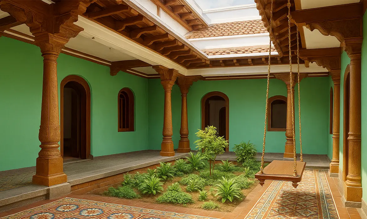
South Indian homes, especially those shaped by Tamil tradition, are more than just structures. They are sensory experiences defined by breezy courtyards, carved columns, vibrant murals, and natural materials. At the heart of these spaces is colour: not just as decoration, but as memory, identity, and function.

Let’s dive deep in translating this rich aesthetic into modern homes using Indicus Paints, giving you both inspiration and clear, practical steps to choose the right shades for each space.

1. Understanding the Colour Logic Behind Tamil Architecture

Before choosing your wall colours, it’s important to understand the design philosophy of traditional Tamil architecture. At its core, Tamil architecture prioritises function over form, with an emphasis on clean lines, easy maintenance, and minimalistic layouts.Wall colours follow this same principle. The palette is typically restrained, with beiges, whites, greens, and earthy tones chosen to enhance the simplicity and practicality of the space. Accent colours are used thoughtfully, often inspired by traditional art forms like Athangudi tiles, Tanjore paintings, and temple murals.Here’s how colour choices were traditionally guided:
  • Heat Reflection: Lighter shades like Divinity Cream and Mission Beige help keep interiors cool in hot climates.
  • Symbolism & Ritual: Yellows and reds, seen in areas like entrances or pooja rooms, represent auspiciousness and spiritual energy.
  • Material Harmony: Colours were selected to complement native materials like wood, stone, lime plaster, and Athangudi tiles.
When you follow this logic, you’re not just picking colours. You’re preserving the soul of the space and avoiding choices that feel out of place or overpowering.
Wall Colour to Match Your Tamil-Inspired Interiors

2. Finding the right Tamil colour

Tamils have always used colours to bring life and feeling into their homes. Over the years, many unique shades have become part of everyday culture. These colours are often known by local names like Kili Pachai (parrot green), Ramar Neelam (Rama’s blue), and Kathiripoo Colour (lavender), each carrying a bit of tradition and familiarity.

One of the first challenges in recreating these heritage-inspired interiors is finding the right modern paint equivalents. To help you get started, we’ve mapped a few iconic Tamil architectural colours to their closest matches in the Indicus colour palette.

Traditional InspirationIndicus ShadeBest Used In
Kaavi (Brick Red)Adventure (2189C)Accent walls, columns, verandas
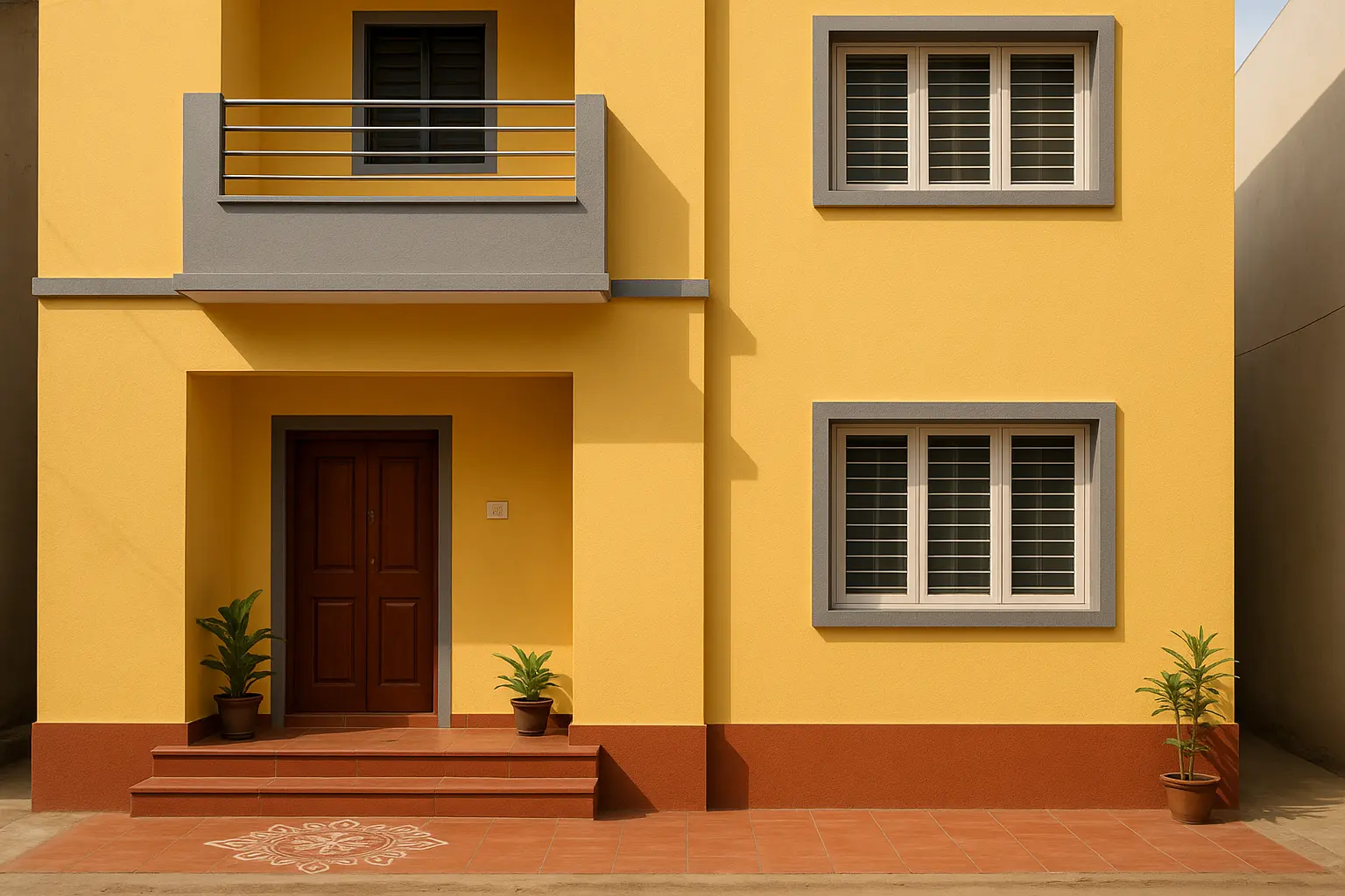
Manjal (Turmeric Yellow)Mustard (2698D)Kitchen walls, dining nooks, entrances
Ramar Niram (Ramar’s colour)Navy Blue (2994C)Bedrooms, window borders, reading corners
Kili Pachai (Parrot Green)Radiant Green 2567CCourtyard-facing walls, balconies
Sandalwood BeigeMission Beige (2078P)Living rooms, hallways
Temple Wall WhiteWhite Cliffs (2505P)Ceilings, pooja spaces, full-room coverage
Coconut Husk BrownAmber Brown (2105C)Doors, trims, furniture
Rose Powder PinkTearose Pink (2122P)Guest rooms, kid-friendly spaces
Temple Stone GreyGrey Shadow (2946P)Guest rooms, kid-friendly spaces

Use a neutral shade for larger surfaces, and layer heritage colours as highlights, trims, or feature walls.

3. Room-by-Room: Where to Use What

In a Tamil home, every room tells a story and every colour carries mood, memory, and meaning. You can’t just pick shades at random and expect your space to feel right. Let’s walk through your home, room by room, and explore how to use Indicus colours to reflect purpose, tradition, and beauty.

Living Room

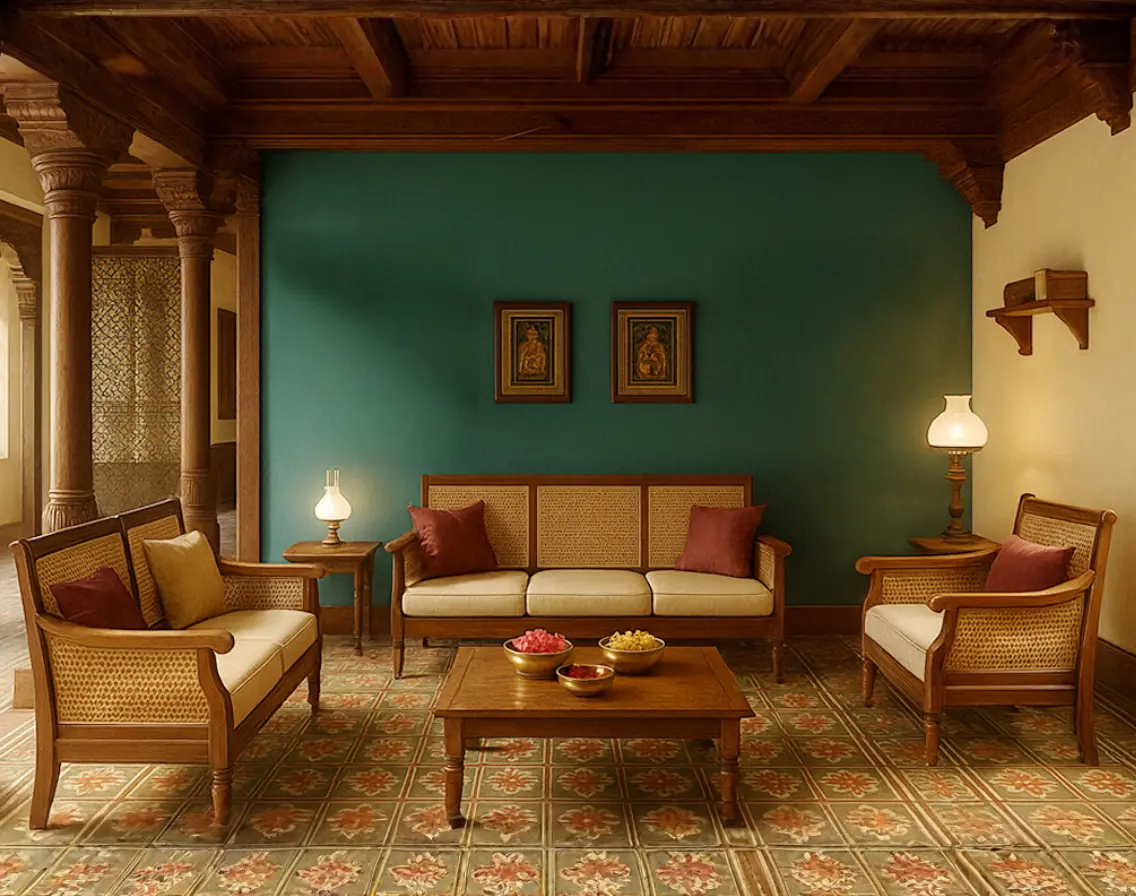
Inspiration: The Tamil living room is where hospitality takes center stage. It is the space where guests are welcomed, conversations flow, and traditions are shared. The design draws from the warmth of Chettinad courtyards, the earthy tones of terracotta flooring, and the grounded elegance seen in ancestral homes and temple halls.
  • Mood: Warm, vibrant, and welcoming
  • Colours:
    • Adventure (2189C) on the main wall—a terracotta-inspired tone that brings earthy depth and boldness
    • Mission Beige (2078P) on remaining walls—a calming, neutral backdrop that lets furniture and accents shine
  • Pair With: Wooden or cane furniture, brass lamps, Athangudi tile flooring, warm white or gold-toned LED lights
  • Cultural Cue: Terracotta tones are found in temple architecture and Chettinad roof tiles, evoking rootedness and warmth
Wall Colour to Match Your Tamil-Inspired Interiors

Dining Room

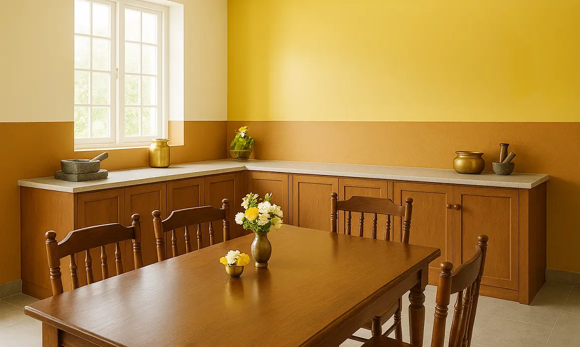
Inspiration: Designed for gathering and conversation, the dining space in a Tamil home balances tradition with ease. Colour choices here are influenced by the vibrancy of Tamil cuisine, using warm yellows, muted browns, and earthy neutrals. Paired with bronze serveware and clean-lined furniture, these tones create a setting that feels rooted in culture and modern in style.
  • Mood: Energetic and bonding
  • Colours:
    • Mustard walls to stimulate appetite and brighten the space
    • Amber Brown (2105C) for trims, door frames, or lower walls—adding depth and contrast
  • Pair With: Bronze serveware, dark wood dining sets, yellow-hued pendant lights
  • Cultural Cue: Mustard yellow reflects turmeric’s sacred and celebratory role in Tamil rituals and cooking
Wall Colour to Match Your Tamil-Inspired Interiors

Bedroom

Inspiration: Tamil bedrooms often embrace a sense of coolness and calm, drawing from shaded verandas, soft indigo fabrics, and the quiet stillness of early mornings. These spaces are designed for rest, reflection, and understated elegance. Choose colours that support relaxation while still honouring the cultural soul of the home.
  • Mood: Calm, grounding, restful
  • Colours:
    • Navy Blue (2994C) or Grey Shadow (2946P)—cool, soothing tones for rest.
    • Accents in Divinity Cream (2702P) or Mission Beige to balance depth with softness.
  • Pair With: Off-white curtains, contemporary artwork for a modern twist, and minimal lighting
  • Cultural Cue: In rooms with limited natural light, choose Grey Shadow over deep blues to avoid a heavy look
Pooja Niche or Entry way

Kitchen

Inspiration: Tamil kitchens are practical, bright, and built for efficiency. Traditionally compact and well-ventilated, they favour surfaces that are easy to clean and colours that reflect light and freshness. Lime-washed walls and earthy tones offer a timeless reference point, making way for modern updates that still feel grounded and familiar.
  • Mood: Clean, bright, and functional
  • Colours:
    • Divinity Cream (2702P) as a base—crisp, light-reflective, and airy
    • Amber Brown (2105C) for cabinetry or backsplash adding a sense of groundedness.
  • Pair With: Brass or steel utensils, patterned tile backsplashes, and potted herbs
  • Cultural Cue: Cream tones are inspired by lime-washed walls seen in agraharam homes and temple kitchens.

Pooja Niche or Entryway

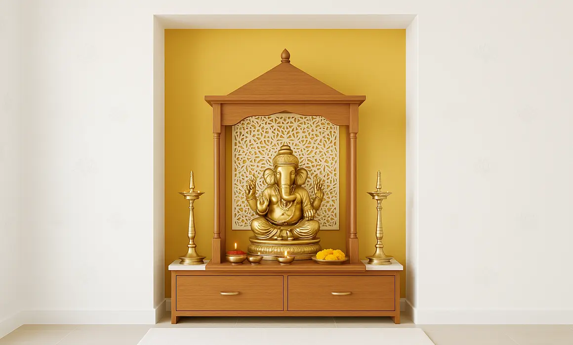
Inspiration: In modern Tamil homes, entryways and compact pooja niches are subtle yet meaningful spaces. Even in smaller layouts, thoughtful use of colour can create a sense of calm and focus. Inspired by temple motifs, kolam outlines, and festive powders, these shades bring a touch of tradition to corners that often serve as both functional and reflective zones.
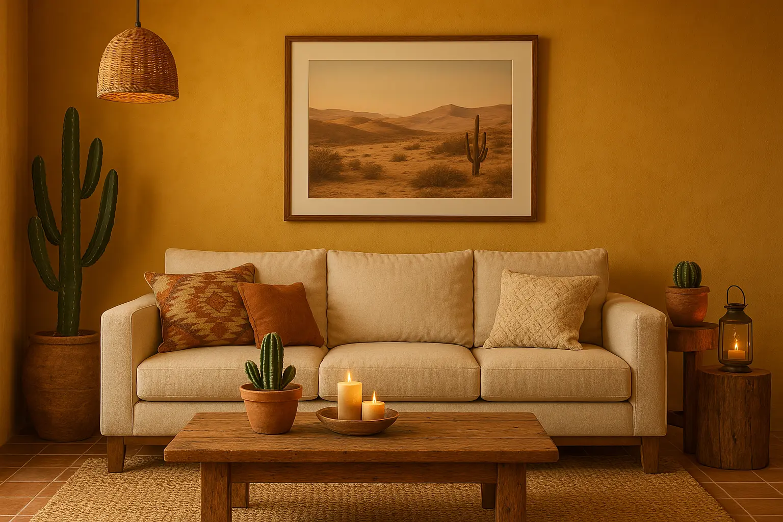
  • Mood: Sacred, serene, and uplifting
  • Colours:
    • Golden Mustard for a devotional base
    • Tearose Pink (2122P) to bring festive softness
    • Grey Shadow (2946P) for trims or kolam-style borders
  • Pair With: Bronze idols, fresh jasmine, wooden shelves, and soft diyas
  • Cultural Cue: Tearose Pink evokes temple rose powders, while grey tones mimic vibhuti (sacred ash) borders seen in shrines
Wall Colour to Match Your Tamil-Inspired Interiors

4. Choosing the Right Paint: More Than Just Colour

here is aesthetics and there is quality. Sure there are a lot of cheap after market paints that would help you achieve a decent result, but quality in terms of consistent colours, coverage, durability, low emissions etc. would help you save a lot more in the long run.

Key factors for considering a good quality paint.
  • Low-VOC, high-quality paints: Safe for kids, elders, and pets.
  • Durable formulations: Withstands humidity and heat in tropical climates.
  • Expansive colour palette.

5. Final Planning Checklist Before You Paint

  • Measure your light exposure: Darker colours like Navy Blue work best in well-lit spaces
  • Choose a neutral base (like Mission Beige or Divinity Cream) to avoid visual clutter
  • Match your furniture material with the colour tone: wood goes well with warm shades
  • Use tester pots before full application
  • Don’t forget trims and borders, they add detail and definition

At Indicus Paints, we offer a wide range of products and colour collections to help you bring your dream home to life, no matter what style you love. Whether you’re drawn to rich, traditional Tamil-inspired colours or prefer clean, modern Scandinavian looks, we have it all. All you need is a vision. We’ll take care of the rest with the right tools, materials, and expert support to guide you along the way.

Visit our Colours page and check out our blogs for more ideas, inspiration, and helpful tips. Let your home reflect meaning, memories, and beauty with every brushstroke.

Serene Ocean Shades for a Tranquil Coastal Bedroom

Serene Ocean Shades for a Tranquil Coastal Bedroom

There’s something uniquely calming about the ocean – a vast expanse of water, the rhythmic sounds of the waves, and the gentle breeze. The ocean’s soothing effect has inspired many, and it can bring a sense of tranquillity and relaxation to any space, particularly the bedroom. If you’re looking to transform your bedroom into a peaceful coastal retreat, ocean shades are the perfect colour choice to create an atmosphere of calm and serenity.

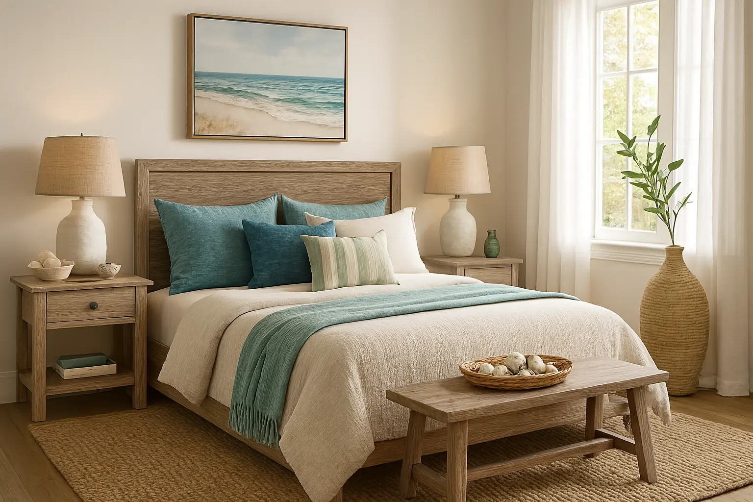
By using the right ocean-inspired hues, you can create a bedroom that feels like an extension of the sea. Whether you’re drawn to the soft blues of a clear sky, the deep greens of the sea, or the soft neutral tones of sandy shores, these colours can evoke the peacefulness of the coast right in the comfort of your home.

In this blog, we’ll explore how to bring the serene beauty of the ocean to your bedroom with the help of Indicus Paints coastal colour palette. From soft blues to muted greens and warm neutrals, we’ll show you how to choose the best ocean-inspired shades to create a tranquil sanctuary.

Soft Ocean Blues: The Calm of the Open Sea

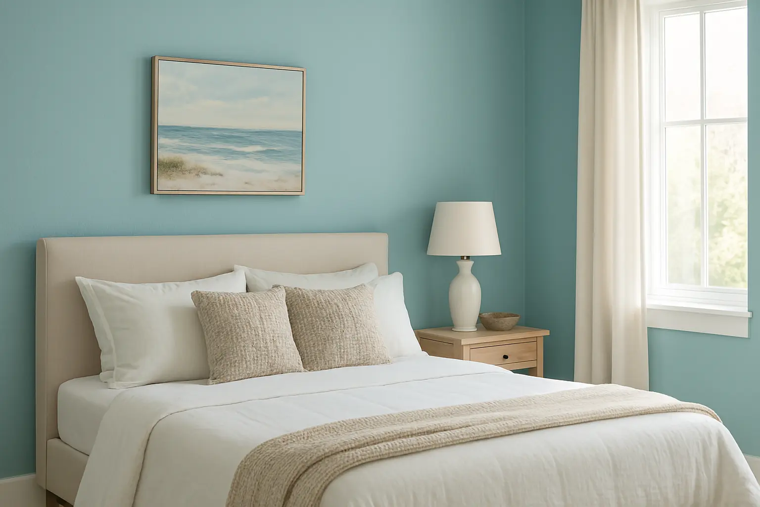
When it comes to creating a tranquil coastal bedroom, soft ocean blues are a natural choice. These shades mimic the calm, clear skies above the sea and the peaceful water below. Blue has long been known for its calming effects, making it an ideal colour for the bedroom – where relaxation is key.

Indicus’ Ocean Breeze is a perfect example of a soft, serene blue that will evoke the peacefulness of the sea. This gentle hue reflects the soft, flowing waves of the ocean, making it perfect for bedroom walls or accents. It brings a cool, airy feel that can make your space feel larger and more open, much like the vast horizon of the sea.

Coastal Bedroom with Soft Ocean Blues
  • Best for: Creating a fresh, airy feel in smaller or darker rooms.
  • Pair with: White furniture, light wooden accents, and nautical-inspired décor to enhance the coastal vibe.

Deep Ocean Greens: The Depth and Mystery of the Sea

For those who love the deeper, richer tones of the ocean, deep greens can provide a sophisticated yet calming atmosphere. Inspired by the deeper parts of the sea, these colours evoke a sense of mystery, depth, and connection with nature.

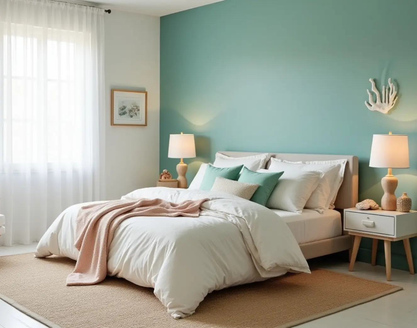
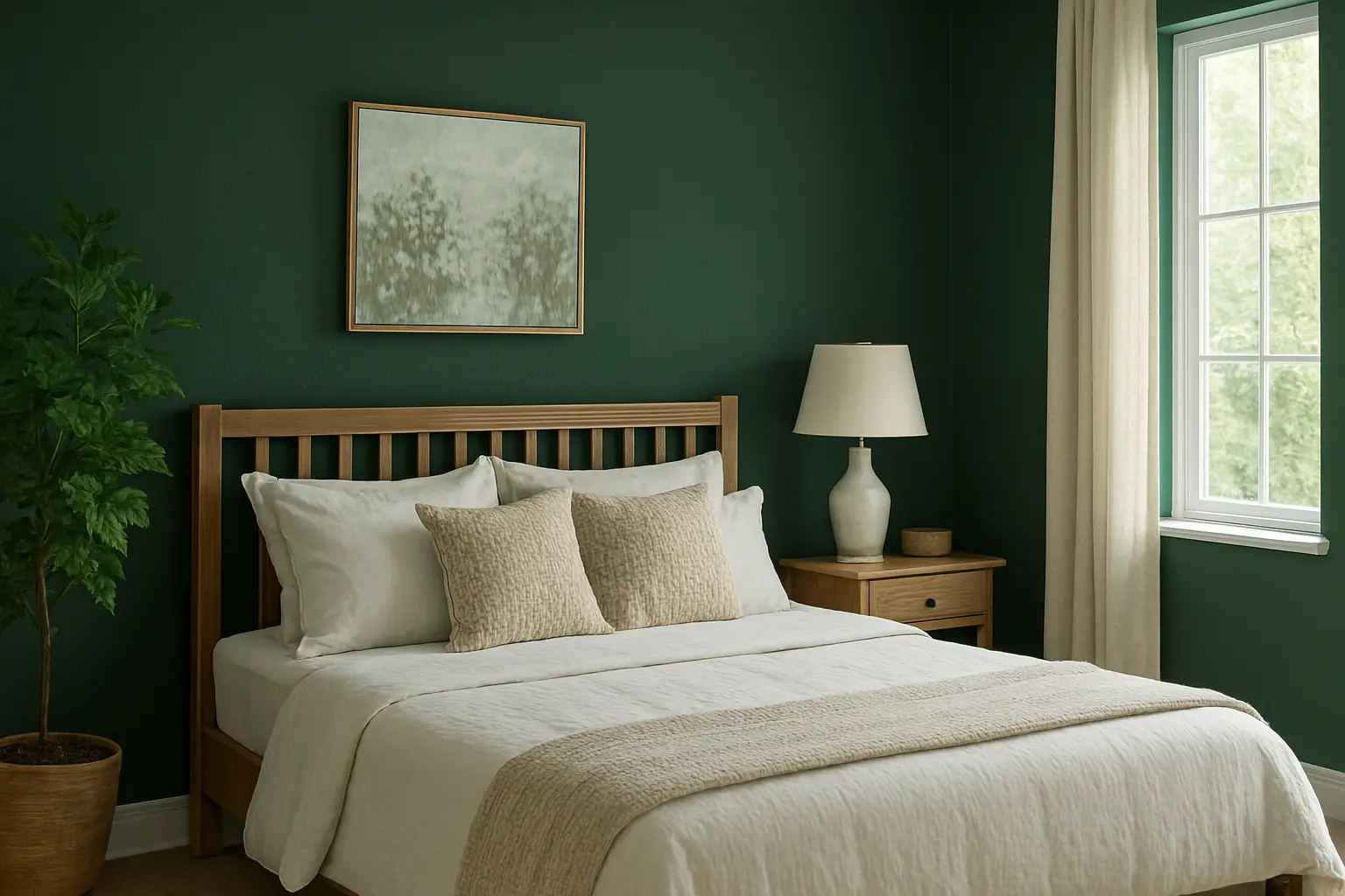
Indicus Verdant Dream and Emerald Calm are two shades that perfectly capture the essence of ocean greens. Verdant Dream brings a fresh, nature-inspired hue that is perfect for creating a serene bedroom atmosphere. Meanwhile, Emerald Calm is a deeper green, ideal for creating a more dramatic focal wall that exudes elegance and tranquility.

These shades are ideal for creating a peaceful, natural ambiance, making them perfect for the bedroom. Whether you use them on accent walls or throughout the room, deep ocean greens will create a soothing, grounded feel that feels both luxurious and serene.

Deep Ocean Greens for a Rich, Serene Bedroom
  • Best for: Larger bedrooms or those with plenty of natural light to balance the depth of the colour.
  • Pair with: Light bedding, natural textures, and dark wood furnishings to create a rich yet inviting atmosphere.

Sandy Neutrals: The Warmth of the Shoreline

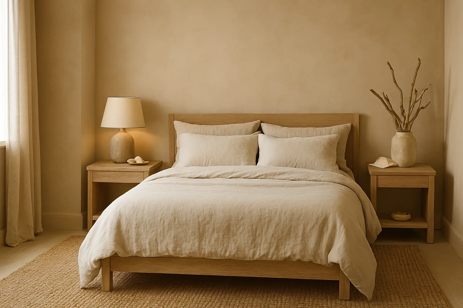
While deep ocean hues capture the richness of the sea, the soft, warm colours of sandy shores evoke the serene beauty of a coastal retreat. Soft beige, warm taupe, and sandy whites can be just as relaxing as the deep blues and greens of the ocean. These neutral tones provide a grounding effect and bring warmth and comfort to the room.

Indicus Saffron Glow and Ivory Silk are perfect shades to mimic the soft sands of a beach, creating a cozy and calming atmosphere in your bedroom. Saffron Glow offers a warm, golden hue that captures the soft rays of the sun on the beach, while Ivory Silk is a soft, off-white shade that provides a clean and neutral backdrop to balance out the deeper ocean shades.

Sandy Neutrals and Warm Beach-Inspired Vibes
  • Best for: A clean, modern look with a beach-inspired feel.
  • Pair with: Natural fabrics like linen or cotton, jute rugs, and simple, minimalist furniture to complete the look.

Seafoam Greens: A Refreshing, Fresh Breeze

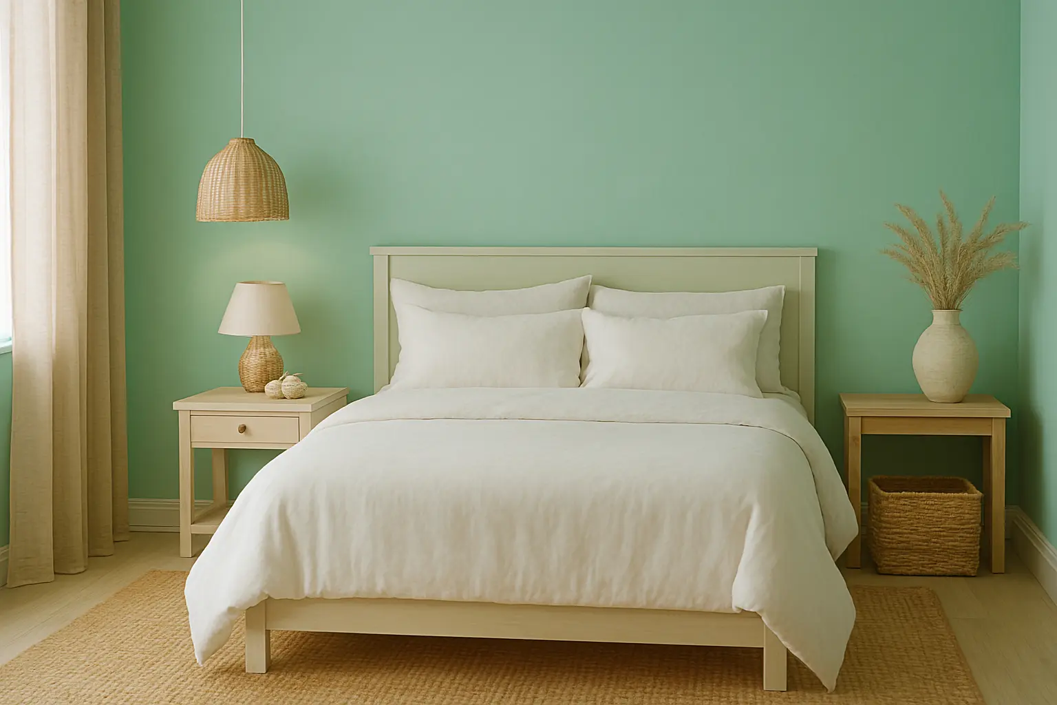
If you want to bring a bit of brightness and freshness to your bedroom, seafoam green is a perfect choice. This light, refreshing shade combines the peaceful energy of blue with the soft warmth of green, reminiscent of the sparkling sea just after a gentle wave has broken. Seafoam green creates an uplifting atmosphere while remaining soothing and light.

Indicus Sea Breeze is an ideal seafoam green to incorporate into your bedroom. It provides just the right amount of vibrancy while still evoking the calmness of the ocean. It’s perfect for smaller spaces where you want to make the room feel larger and brighter.

Seafoam Green for a Fresh and Bright Look
  • Best for: Bedrooms that need a light, refreshing touch without overwhelming the space.
  • Pair with: Soft whites, light wood furniture, and natural woven textures to enhance the light, airy feeling.

Accent Hues: The Splash of Colour from the Ocean’s Edge

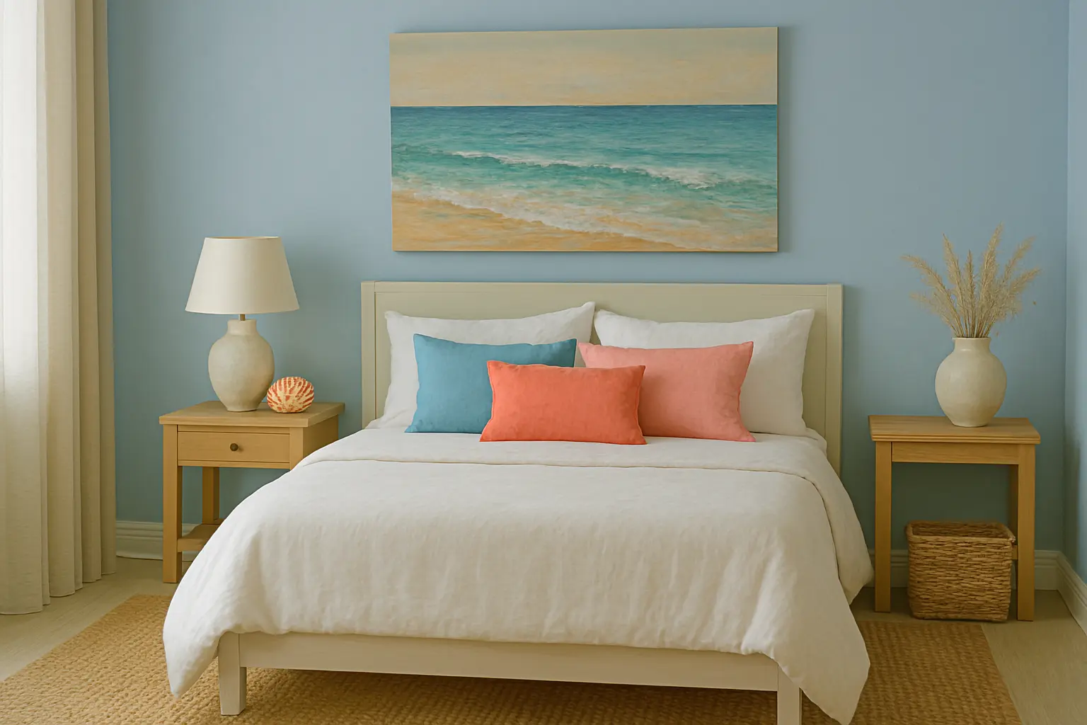
While soft blues, greens, and neutrals make for beautiful main colours in your bedroom, incorporating accent hues inspired by the ocean can really elevate your space. Coral, turquoise, and seashell-inspired pinks add a pop of colour reminiscent of tropical coral reefs and vibrant seashells.

For example, Indicus Coral Blush is a soft, soothing coral that adds warmth to the cooler blues and greens of the bedroom. It’s ideal for creating accents on pillows, throws, or even as an accent wall behind your bed. Aqua Splash is a perfect turquoise tone for adding a hint of vibrant energy to your space without overwhelming the serenity of the room.

These accent hues can be incorporated into furniture, décor, and accessories, creating a dynamic contrast with the more neutral tones of the room.

Accent Hues from the Ocean’s Edge

How to Style Your Coastal Bedroom with Ocean Shades

Creating a serene coastal bedroom isn’t just about the right paint colours—it’s about styling your space to reflect the calmness and beauty of the ocean. Here are some tips for bringing your ocean-inspired vision to life:

  1. Balance cool tones with warm accents: Use soft ocean blues and seafoam greens for walls, and add warmth with sandy neutrals and coral accents.
  2. Incorporate natural textures: Add woven baskets, linen bedding, and driftwood furniture to evoke the coastal vibe.
  3. Keep the furniture light and simple: Choose white or light wooden furniture to maintain an airy, breezy feel.
  4. Add coastal-inspired décor: Seashells, beach-inspired art, and nautical-themed accessories will bring the ocean’s beauty to your space.
Complete Coastal Bedroom Styling

Ocean-inspired shades are the perfect way to create a tranquil, peaceful atmosphere in your bedroom. Whether you prefer the calming blues of the sea, the soothing greens of ocean waves, or the warm neutrals of sandy beaches, the right shades can transform your space into a serene coastal retreat.

With Indicus Paints coastal colour palette, you can easily create a bedroom that feels like an extension of the ocean, bringing in the beauty, calm, and serenity of the sea. Choose from soft blues, vibrant seafoam greens, and warm sandy neutrals to create a space that feels fresh, inviting, and deeply relaxing.

Refresh Your Kitchen with Stylish Striped Wall Colours

Refresh Your Kitchen with Stylish Striped Wall Colours

The kitchen is often referred to as the heart of the home. It’s where we prepare meals, entertain, and spend quality time with family. So, why not make this space as stylish and inviting as possible? If you’re looking to refresh your kitchen and give it a unique, dynamic twist, striped wall colours are the perfect solution.

Stripes have a timeless appeal – they can be bold and dramatic or subtle and sophisticated, depending on how you use them. Whether you opt for vertical, horizontal, or diagonal stripes, incorporating this pattern into your kitchen walls can instantly add texture, depth, and visual interest to your space. In this blog, we’ll explore how you can refresh your kitchen using stylish striped wall colours and provide you with practical tips and inspiration.

Accent Wall Focus

Let’s dive into how Indicus Paints range of colours can help you create a striped wall effect that transforms your kitchen into a stylish haven.

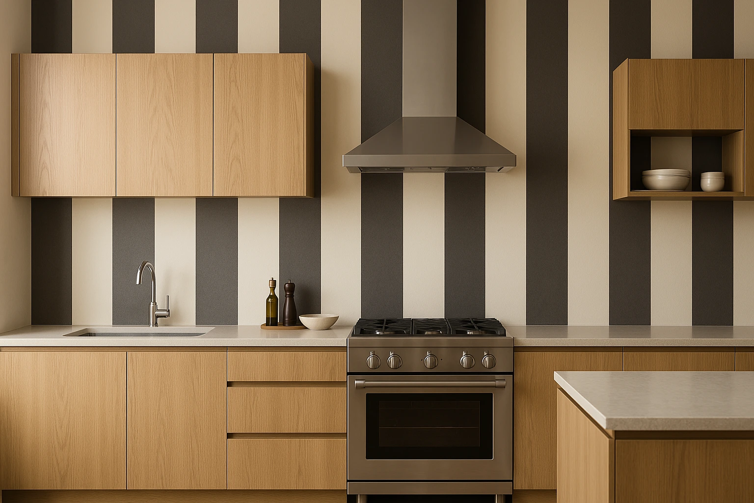
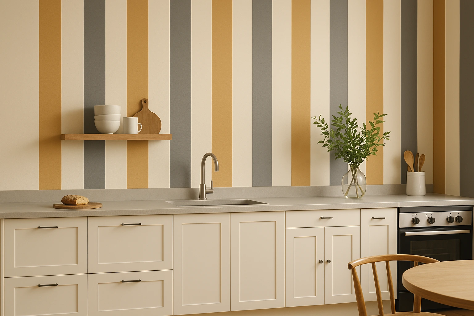
1. Bold Vertical Stripes: Adding Height and Elegance

Vertical stripes are a great choice if you want to create the illusion of height in your kitchen, making it feel more spacious and airy. This type of stripe can also bring a sense of elegance and refinement to your kitchen, especially when paired with the right colour palette.

Indicus Paints’ shades like Ivory Silk or Golden Harvest can be used as base colours, with deeper tones like Earth Ember or Slate Charm for the stripes. The combination of a soft neutral with a rich, contrasting colour creates a visually pleasing effect without overwhelming the space.

Bold Vertical Stripes for Height

Why It Works

  • Creates a sense of height: Ideal for kitchens with low ceilings.
  • Adds a touch of sophistication: Perfect for modern or minimalist kitchen designs.
  • Maximises natural light: Lighter base tones like Ivory Silk will reflect light, making your kitchen feel brighter.

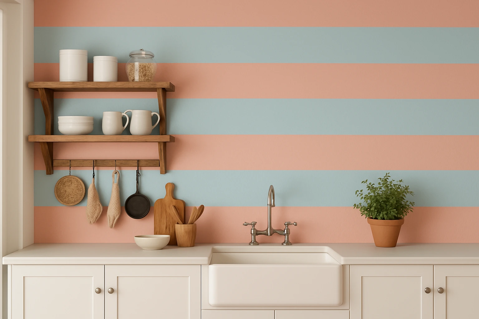
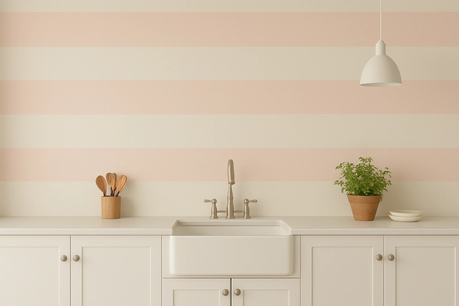
2. Horizontal Stripes: Making Your Kitchen Feel Wider

Horizontal stripes are perfect for kitchens that need a sense of width and openness. When applied correctly, these stripes can visually expand the space, creating a wider and more open feel. Horizontal stripes are also fantastic for adding a bit of drama and fun to the kitchen.

For a classic, beach-inspired vibe, you can combine Soft Rose and Ocean Breeze for a soft, coastal-inspired palette. If you’re looking for something bolder, consider pairing Regal Teal with Golden Harvest for a more dynamic and contemporary look.

Horizontal Stripes for Space-

Why It Works

  • Creates a feeling of spaciousness: Ideal for smaller kitchens that need to feel more expansive.
  • Adds a playful or retro touch: Horizontal stripes can evoke a fun, vintage vibe, perfect for eclectic or retro kitchen designs.
  • Pairs well with other design elements: Stripes go well with open shelving, wooden accents, and modern fixtures.

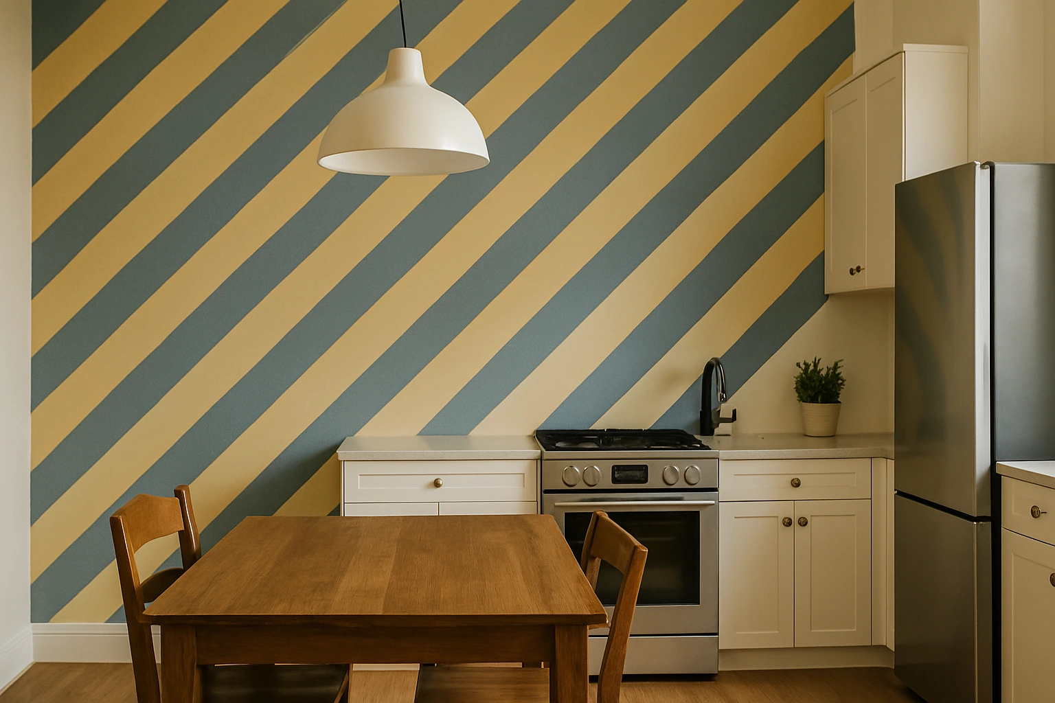
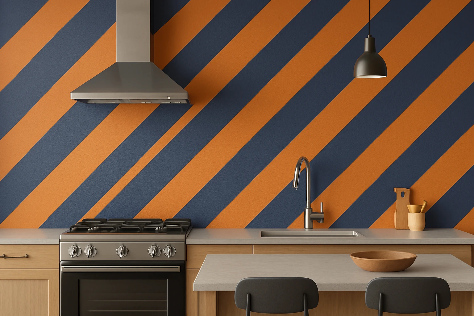
3. Diagonal Stripes: An Energizing Look

If you want your kitchen to stand out with energy and movement, diagonal stripes are the way to go. Diagonal lines add a sense of dynamism to the room and can be used to draw attention to certain areas, like an accent wall or a specific feature, such as a statement stove or island.

Indicus Paints’ colours like Indigo Bliss paired with Ivory Silk or Tangerine Glow with Golden Harvest will create a bold and vibrant atmosphere. The interplay of colours creates a contemporary yet inviting vibe that energises your kitchen.

Diagonal Stripes for Energy

Why It Works

  • Adds visual interest: Diagonal lines create a dynamic, eye-catching effect that draws attention.
  • Works well in larger kitchens: The larger the space, the more striking and impactful diagonal stripes can be.
  • Brings bold energy: Ideal for kitchens where you want to make a statement.

4. Subtle Stripes with Soft Contrasts: A Gentle Touch of Elegance

If you’re looking for a more subtle effect, consider using soft, tonal stripes that blend seamlessly into the background. This style is perfect for those who want to add texture and depth without creating too much contrast. Soft contrasts, like using a combination of Blush Peach and Soft Rose from Indicus Paints, can give your kitchen a relaxed and elegant feel.

This type of stripe works particularly well in minimalist or transitional kitchen designs, where the goal is to keep the space calm and refined while still introducing visual complexity.

Subtle Stripes for a Soft Touch

Why It Works

  • Adds texture without overpowering: Perfect for kitchens where you want a soft, sophisticated look.
  • Neutral and calming effect: for those who prefer subtle design elements.
  • Creates warmth: Soft pastel tones like Blush Peach bring warmth without being too bold.

Choosing the Right Colour Palette for Your Stripes

Selecting the right colours is essential for achieving the perfect striped wall look. When choosing your striped wall colours, you should consider how the colours work with the overall design of your kitchen. The key is to create a balanced contrast that enhances the space rather than overpowers it.

Here are some tips on how to choose the best colours for your striped walls:

  1. Choose complementary colours: Ensure that your colours complement the existing décor. For example, if your kitchen features white cabinets, you might consider stripes in subtle tones of blue, green, or beige.
  2. Keep it simple: Stick to two or three colours to keep the design clean and uncluttered. For example, pairing Soft Rose with Ivory Silk creates a timeless and harmonious look.
  3. Experiment with textures: You can mix different finishes – matte with glossy stripes, or even add metallic accents – to make your stripes stand out even more.

How to Apply Stripes Like a Pro

To achieve a flawless finish with striped walls, follow these simple steps:

  1. Prep the walls: Clean the wall surface thoroughly. Fill in any cracks or holes and sand the surface smooth.
  2. Use painter’s tape: Mark out the areas where you want the stripes using painter’s tape. Make sure the tape is pressed down well to avoid paint bleeding.
  3. Choose your colours: Decide on the colours for your stripes. Always start with the lightest shade for the base colour and work your way to the darker tones.
  4. Apply the first coat: Use a roller to apply your base coat and allow it to dry completely before adding stripes.
  5. Add the stripes: Apply your second coat in a vertical, horizontal, or diagonal direction. Be sure to allow each layer to dry before applying the next one.
Stripped Images

Striped walls are a fun, modern way to refresh your kitchen and add a dynamic touch to the space. Whether you go for bold, contrasting vertical stripes or subtle, soft hues for a minimalist look, striped wall colours can elevate the aesthetic of your kitchen and make it feel more spacious and stylish.

With Indicus Paints vast range of colours, including hues like Golden Harvest, Ivory Silk, and Ocean Breeze, you can create a beautiful, eye-catching design that complements your kitchen’s overall style.

Start your kitchen transformation today with Indicus Paints, and let your walls tell a story of vibrant colours and stunning design.

Rustic Desert Aesthetics: Creating a Cozy and Natural Indoor Space

Rustic Desert Aesthetics: Creating a Cozy and Natural Indoor Space

The desert holds a unique beauty – vast, sun-kissed landscapes, the warm glow of the horizon, and rich, earthy tones that blend harmoniously with the surrounding nature. While the desert might seem harsh and barren at first glance, it offers a wealth of inspiration for creating a rustic and cozy indoor space. Desert aesthetics, with their organic textures, earthy colours, and natural materials, can transform any room into a warm, inviting sanctuary.

Whether you want to infuse your home with the serenity of a desert landscape or you’re seeking a cozy, rustic atmosphere that evokes the tranquility of open spaces, this guide will show you how to create a rustic desert-inspired indoor space. From using warm, earthy tones to incorporating rustic furniture and natural décor, you can easily achieve a space that feels connected to nature and offers a sense of peace and warmth.

Rustic Desert Aesthetics

Embrace Earthy Tones: The Foundation of Desert Aesthetics

The key to rustic desert aesthetics lies in the colours you choose. The desert is filled with earthy hues, from warm sands to the rich browns of rock formations and the cool blues of the sky. These colours not only create a welcoming and grounded feel but also set the tone for the rest of the design.

Indicus Paints offers a beautiful array of earthy tones perfect for creating that rustic desert vibe. Shades like Golden Harvest, Sandstorm, and Earth Ember will instantly transform your walls into a serene backdrop that mimics the colours of the desert landscape.

Rustic Desert Aesthetics
  • Golden Harvest is a warm, golden yellow that evokes the sun’s glow at dawn, perfect for creating a cozy atmosphere in living rooms or kitchens.
  • Sandstorm brings to mind the gentle, sun-kissed sands of the desert, a light, neutral beige that complements any rustic décor.
  • Earth Ember, a deep, rich brown, can be used to add depth and drama to a feature wall or accent furniture.

These earthy tones create a harmonious space, evoking the serenity of the desert and providing the warmth and comfort that rustic desert design is all about.

Natural Materials: Wood, Stone, and Woven Textures

In a rustic desert-inspired space, the use of natural materials is essential. Wood, stone, clay, and woven elements mimic the textures found in desert landscapes, creating a connection to nature that is both soothing and organic.

For furniture and décor, choose weathered wood, exposed stone, or metal elements with an aged finish. Indicus Paints’ Earth Ember or Slate Charm can help achieve the rustic look on wooden furniture, enhancing its natural grain and texture while keeping the space grounded.

Textiles also play a significant role in bringing warmth and comfort to the space. Think woven rugs, linen throws, faux furs, and kilim cushions. These materials provide tactile depth and visual interest while adding a sense of coziness to your living room, bedroom, or dining area.

  • Use woven jute rugs or kilim-style throw pillows to introduce natural texture.
  • For furniture, select pieces made from reclaimed wood or wrought iron to capture the desert’s ruggedness.

These natural textures help you bring a touch of the desert indoors, evoking the earthy beauty of the landscape.

Incorporating Desert-Inspired Décor: Accessories and Art

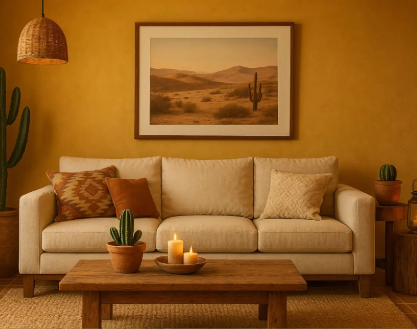
To complete your rustic desert look, incorporate décor pieces that reflect the natural beauty and cultural heritage of desert regions. Rustic clay pots, geometric prints, and tribal art can add character and authenticity to your space.

Consider placing desert plants like cacti, succulents, and aloe vera in clay or terracotta pots to introduce natural greenery while maintaining the earthy feel. Indicus Paints’ warm shades like Saffron Glow and Dusty Rose work beautifully for accent pieces, creating a balanced contrast with neutral tones.

Framed desert photography, handwoven baskets, and rustic lanterns are excellent accessories that add both warmth and personality to your space. Incorporating natural fibers like leather and woven baskets further enhances the desert theme, offering a tactile experience that complements the rustic décor.

Rustic Desert Aesthetics

Lighting: Warmth and Ambiance

Lighting plays a vital role in creating a cozy, inviting desert-inspired space. The soft glow of desert sunsets and the warm, golden hues of desert sands can be replicated with the right lighting choices.
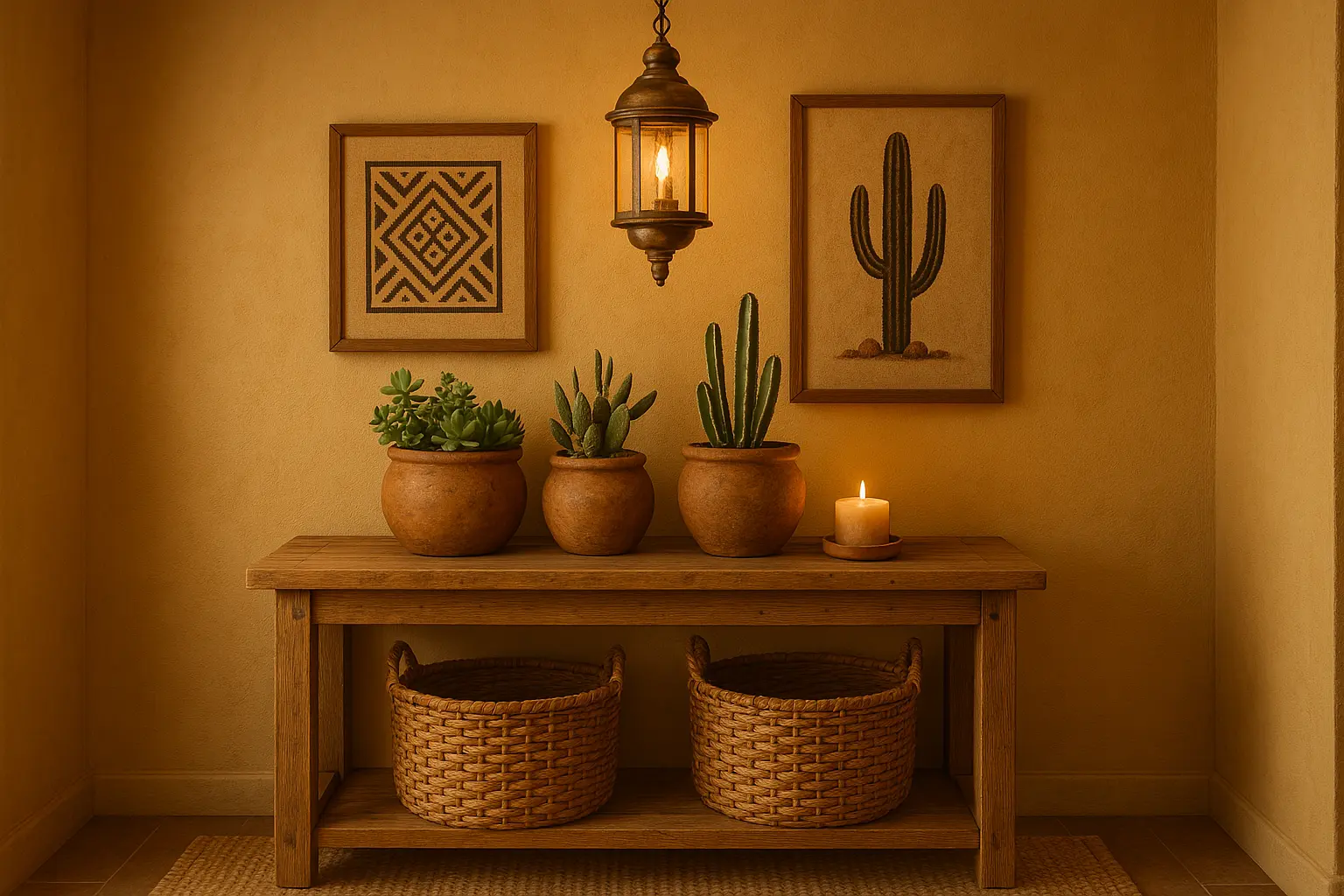
Use warm, ambient lighting that creates a cozy, intimate atmosphere. Edison bulbs, rattan pendant lights, and soft LED fixtures cast a warm glow, perfect for evoking the golden hour in a desert landscape.

To further enhance the rustic desert aesthetic, candlelight adds both warmth and intimacy to your space. Consider placing candles in brass or terracotta holders or even using scented candles with earthy fragrances like cedarwood or sandalwood to bring the scent of the desert into your home.

Blending Modern Comfort with Rustic Desert Elements

While rustic desert aesthetics focus on earthy tones and natural materials, that doesn’t mean you have to sacrifice comfort and style. You can still incorporate modern comforts into your space while maintaining the rustic charm of desert-inspired elements.

Consider modern furniture made of natural wood or metal, with clean lines and minimalistic designs that complement the ruggedness of the desert. Soft, comfortable seating like plush armchairs or a linen sectional sofa works well with earthy colours like Golden Harvest and Sandstorm to create a space that’s both inviting and stylish.

Adding a few contemporary elements, like industrial light fixtures or sleek mirrors, balances the rustic aesthetic, ensuring your desert-inspired home feels both timeless and contemporary.

Rustic Desert Aesthetics

A rustic desert-inspired interior is all about creating a space that connects to nature, evokes warmth, and exudes serenity. Through the use of earthy tones, natural materials, textured fabrics, and desert-inspired décor, you can easily create a cozy and welcoming home that reflects the beauty and simplicity of the desert.

With Indicus Paints stunning range of nature-inspired colours, including shades like Golden Harvest, Earth Ember, and Sandstorm, you can bring the desert’s warmth and tranquillity into your home. Whether you want to create a calming sanctuary or a space full of rustic charm, these shades will help you achieve the perfect desert-inspired haven.

Rustic Desert Aesthetics
Ready to transform your space? Explore Indicus Paints for a wide selection of natural, earthy tones and find the ideal colours to make your rustic desert-inspired dream home a reality.

Captivating Sky-Inspired Colours to Elevate Your Home’s Exterior

Captivating Sky-Inspired Colours to Elevate Your Home’s Exterior

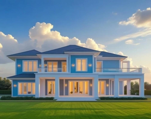
The sky above us has long been a source of inspiration—offering a stunning range of colours, from the soft blues of a clear morning to the vibrant hues of a sunset. Imagine bringing that tranquility and vibrancy into your home’s exterior with captivating sky-inspired colours. These colours can transform your home’s façade into something truly special, providing a fresh, airy feel that reflects the natural beauty of the skies.
Whether you’re inspired by the peaceful blues of the early morning sky, the warm hues of sunset, or the rich tones of twilight, sky-inspired colours offer a wide spectrum of options. With Indicus Paints’ stunning range of colours, you’ll find the perfect shade to infuse your home with the natural beauty of the sky.
1. Serene Blues: The Tranquility of Clear Skies

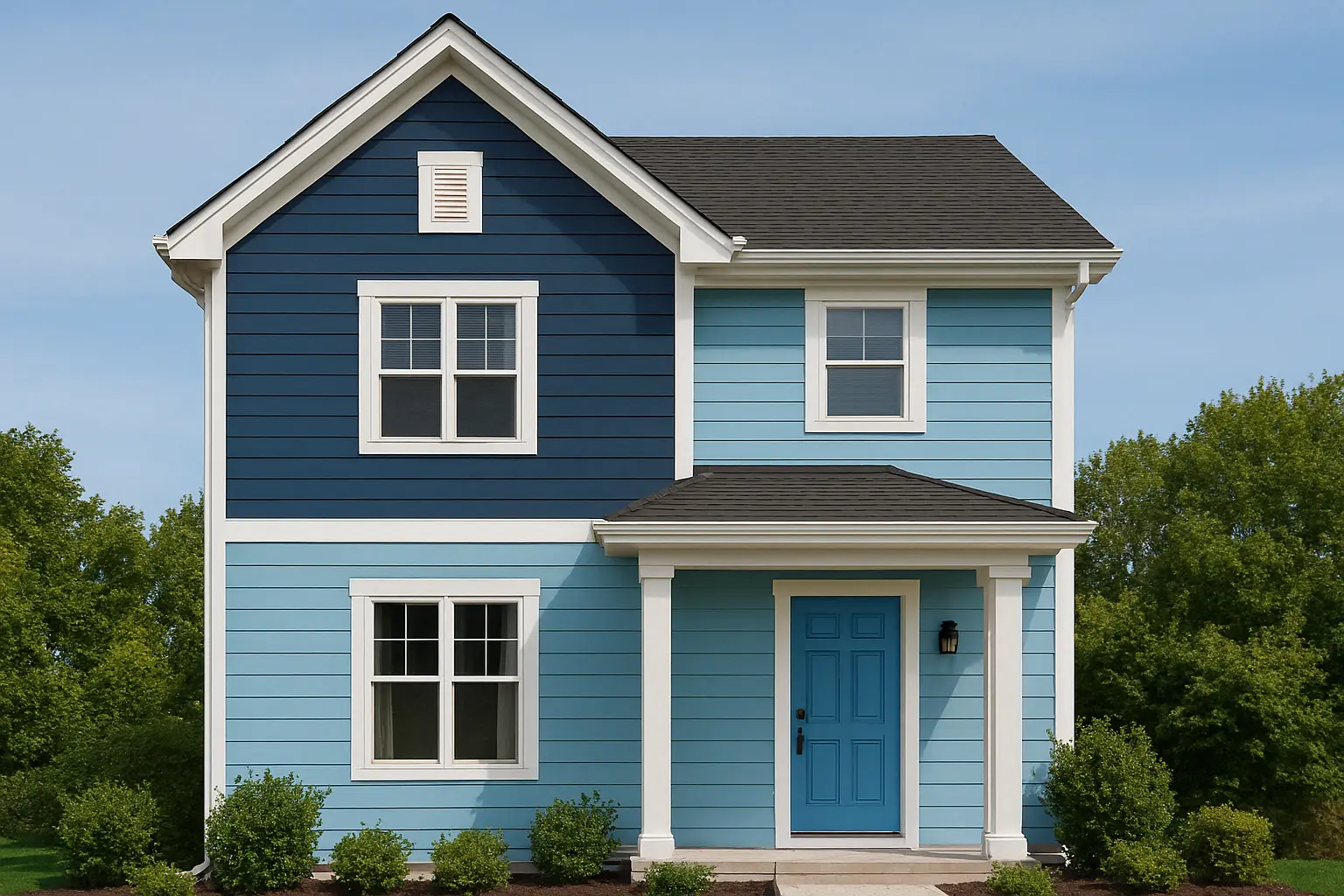
One of the most iconic sky-inspired colours, clear blue is synonymous with calm and openness. The tranquil blues of the sky can create a soothing and inviting atmosphere, making it a great choice for homes that want to exude peace and relaxation.

Indicus Indigo Bliss and Ocean Breeze are two perfect shades to bring the serenity of the sky to your home’s exterior. Indigo Bliss offers a deep, calm blue reminiscent of a quiet evening sky, while Ocean Breeze is a lighter, fresher blue that captures the essence of a clear summer day.

Elevate Your Home’s Exterior
These colours will help your home exude a peaceful and refreshing feel while blending seamlessly with the surroundings.

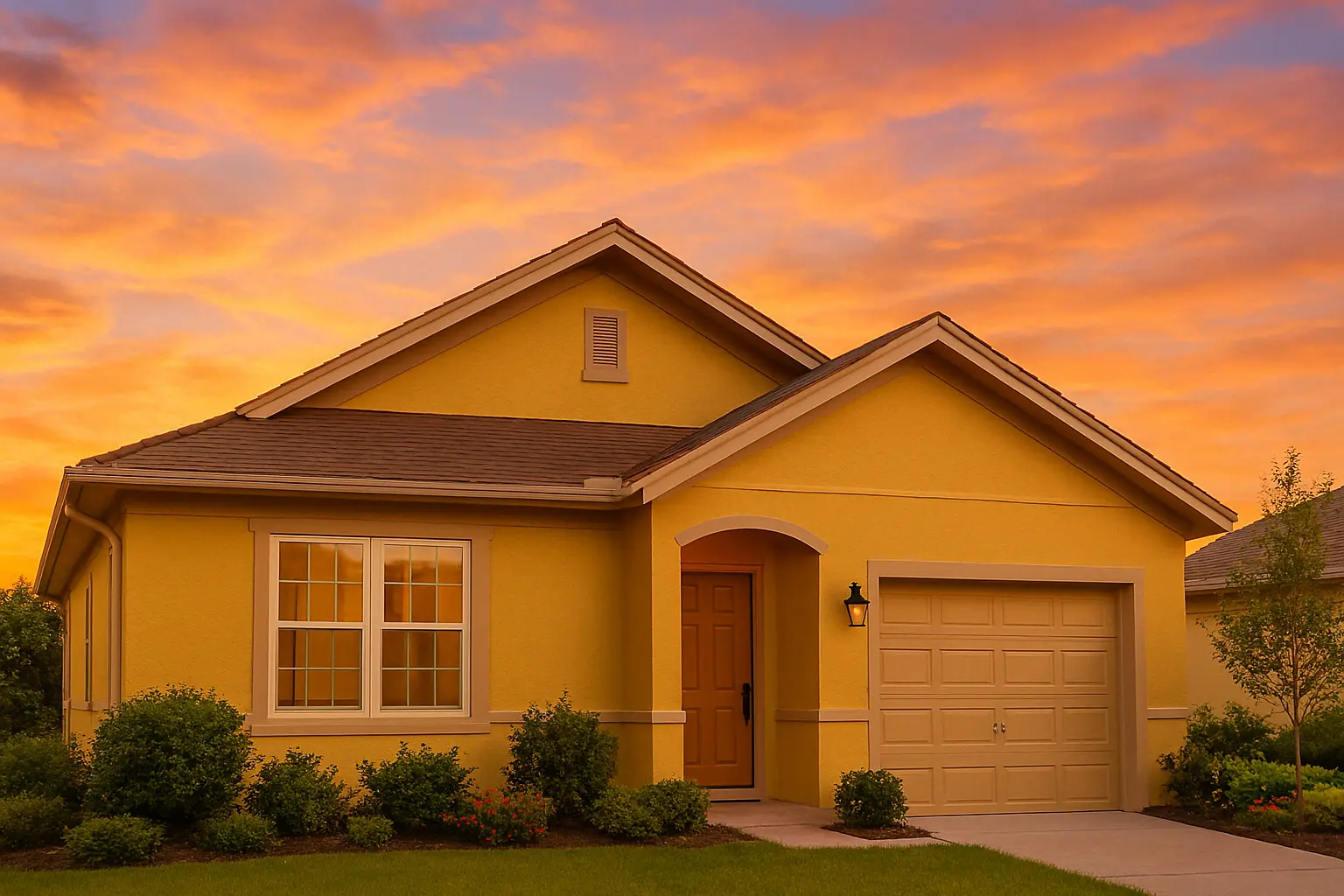
2. Golden Hues: The Warmth of the Sunset Sky

Sunset skies are known for their breathtaking array of golds, pinks, and oranges, and these colours bring warmth, energy, and a sense of welcoming to any home. Incorporating warm, golden tones on your home’s exterior can create a lively and inviting atmosphere, especially when paired with the right architectural features.

Indicus Golden Harvest and Amber Dust offer a perfect representation of sunset-inspired hues. Golden Harvest is a warm, golden yellow that will make your home’s exterior glow with elegance, while Amber Dust provides a soft, muted warmth that adds richness and depth.

These shades can create a welcoming, sunny atmosphere that draws people in and gives your home a warm, inviting character.

Elevate Your Home’s Exterior

3. Dusky Purples: The Majesty of Twilight

Twilight skies offer deep purples and rich blues that evoke a sense of mystery and elegance. These hues are ideal for homeowners who want to add a bit of drama to their exterior while still maintaining a connection to nature’s beauty.

Indicus Regal Teal and Mystic Plum embody the richness of the twilight sky. Regal Teal is a stunning deep shade that brings a touch of luxury and sophistication to your home, while Mystic Plum combines purple and blue tones for a unique, elegant appearance.

This combination of dusky purples brings elegance and creates a bold statement, making your home stand out while maintaining a grounded connection to nature.

Elevate Your Home’s Exterior

4. Soft Grays: The Gentle Transition of Early Morning Skies

The soft grays of the sky just before dawn or as a storm clears provide a perfect neutral backdrop that still evokes nature’s beauty. These shades are ideal for creating a balanced, modern look on your home’s exterior, offering a clean, minimalistic appearance that pairs well with various architectural styles.

Indicus Silver Stone and Moon Shell are elegant, versatile grey shades that can elevate the façade of any home. Silver Stone brings a cool, polished finish to the exterior, while Moon Shell offers a softer, warmer tone perfect for creating a peaceful, harmonious exterior.

These shades are timeless and neutral, creating a perfect backdrop for any style of home while reflecting the serene beauty of the sky.

Elevate Your Home’s Exterior

5. Soft Whites: The Pure Clarity of Cloud-Covered Skies

Cloud-covered skies, often in the early hours of the morning, provide a sense of purity and clarity. Soft whites give a fresh and inviting look to your home, evoking a sense of openness and light.

Indicus Ivory Silk and Alabaster White are perfect for anyone who loves the clean, classic look of white with a touch of warmth. Ivory Silk provides a soft, creamy white ideal for creating a warm, welcoming entrance, while Alabaster White is a crisp, clear white that adds a bright, airy feel to any space.

These fresh, clear whites will give your home an elegant, crisp look, making it feel more expansive and inviting.

Elevate Your Home’s Exterior

How to Mix Sky-Inspired Colours for Your Home’s Exterior

One of the beautiful things about sky-inspired colours is how well they blend together. You can mix deep blues with soft greys for a layered, calming look or pair golden yellows with dusky purples for a dramatic, sunset-inspired palette.

Here are a few tips to combine sky-inspired shades:

  1. Balance light and dark shades: Pair a deeper colour, like Regal Teal, with lighter tones such as Ivory Silk to create contrast without overwhelming the space.
  2. Accent with complementary hues: Accent trims or doors in bold colours, like Golden Harvest, to highlight architectural features.
  3. Consider architectural elements: Soft greys like Silver Stone and vibrant blues like Ocean Breeze are ideal for modern homes, while earthy golden tones work better with rustic or traditional homes.

Bringing the beauty of the sky into your home’s exterior is not just about colour—it’s about capturing the emotions and energy that the sky evokes. Whether you love the calm of a clear morning, the warmth of a sunset, or the elegance of twilight, there’s a sky-inspired colour that will enhance your home and make it stand out in your neighbourhood.

Explore the Indicus Paints collection of colours and find the perfect shades to create your sky-inspired sanctuary today.