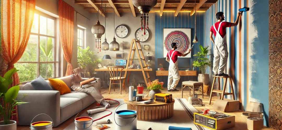
Choosing the Perfect Colour Palette for Your Home with Indicus ColourCast Visualizer
Selecting the ideal colour palette for your home’s interior can dramatically impact its ambiance and style. From energising living rooms with vibrant hues to creating a serene atmosphere in bedrooms, the right colour choice can make all the difference. The Indicus ColourCast Visualizer app makes this process easy by allowing users to explore and apply over 1,000 colours directly to their walls. Whether you’re redecorating a single room or revamping your entire home, this innovative tool is the ultimate companion for interior design.
The Role of Colour in Interior Design
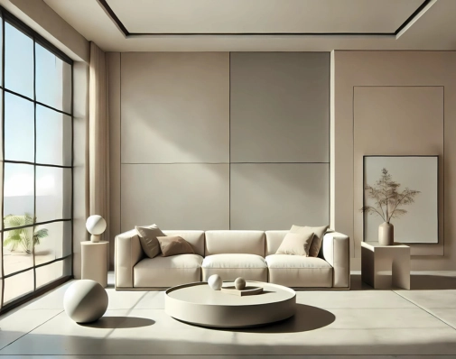
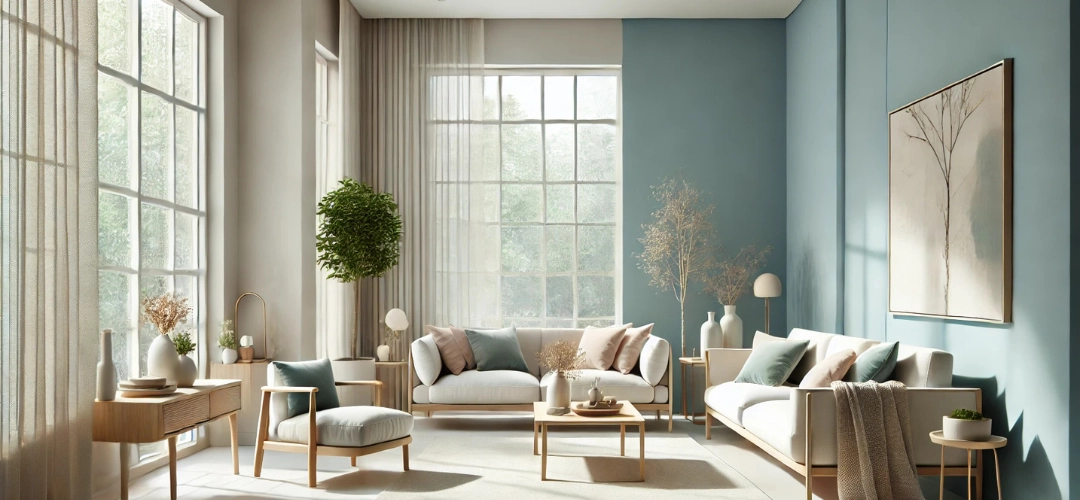
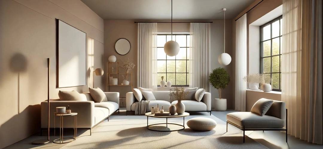
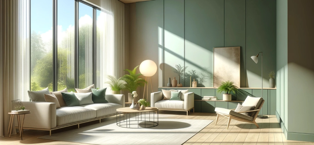
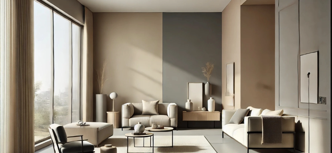
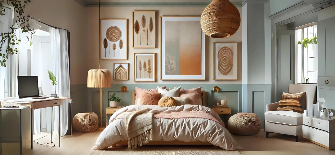
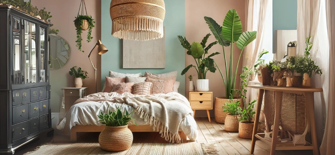
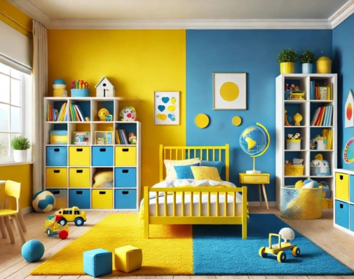
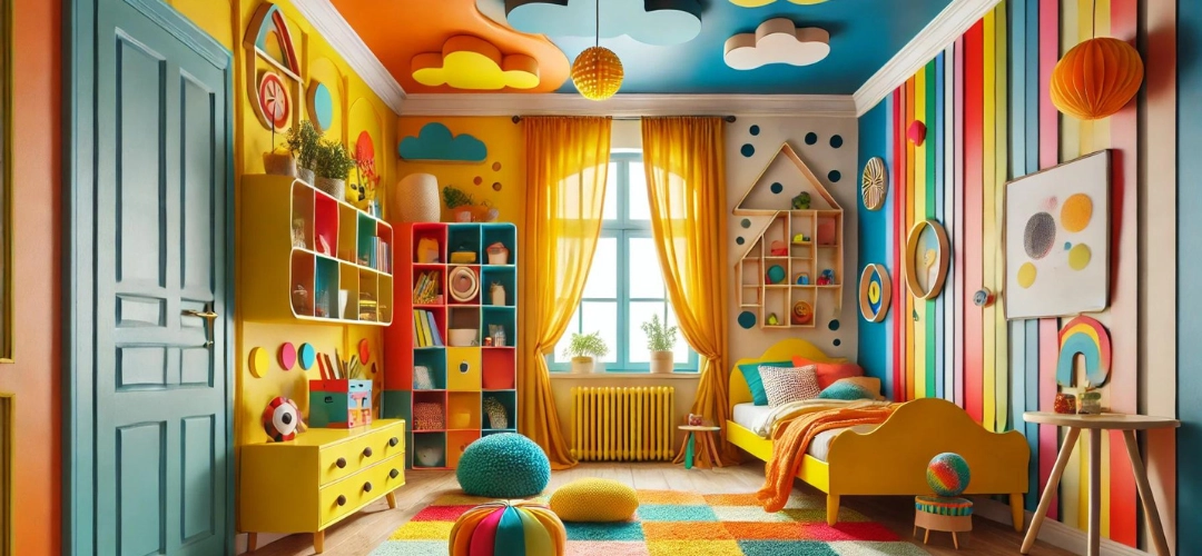
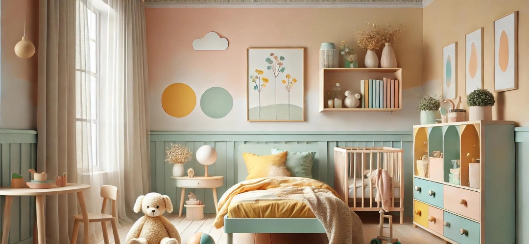
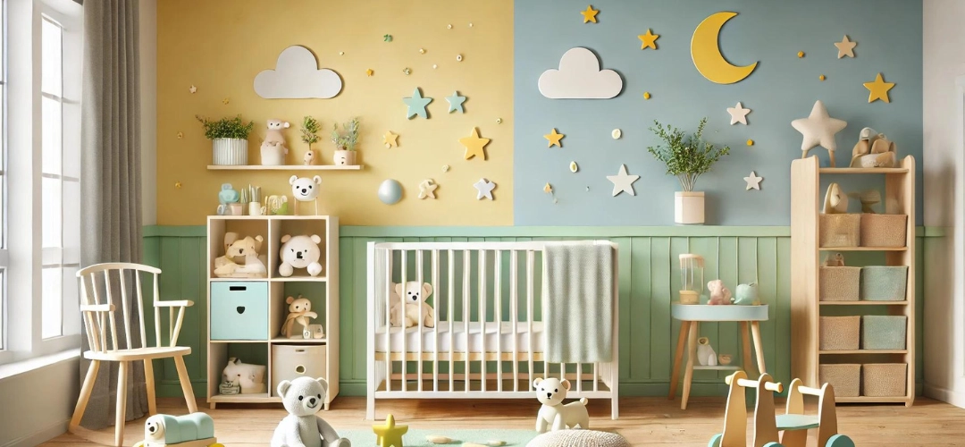
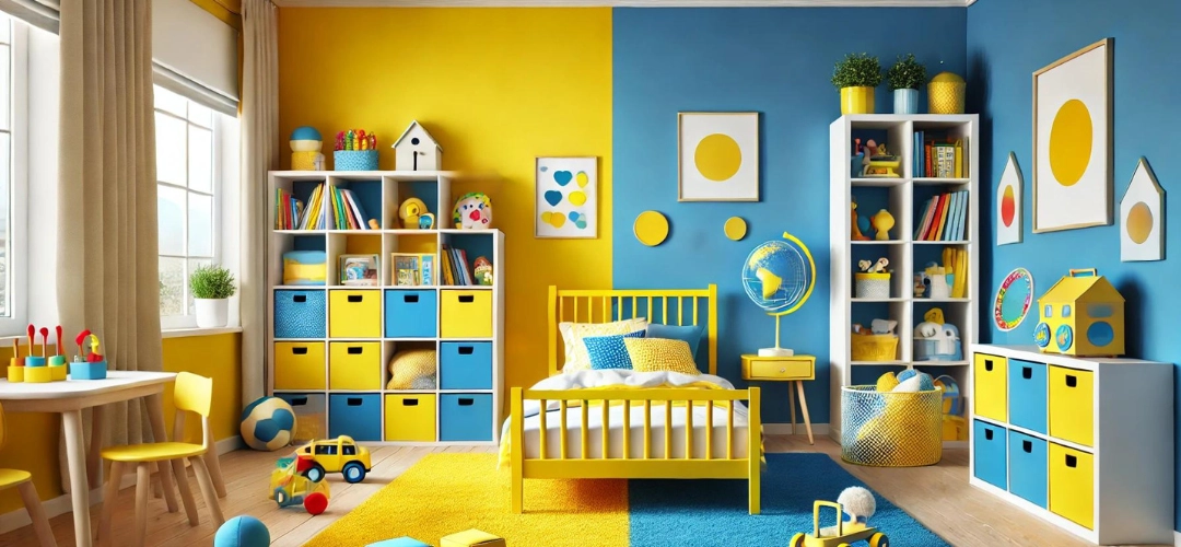
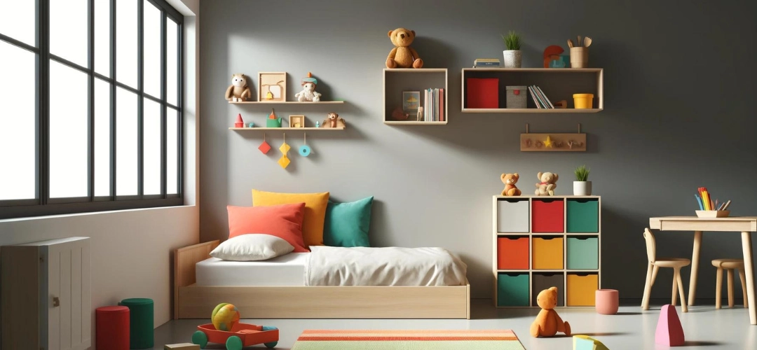
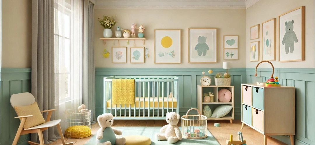
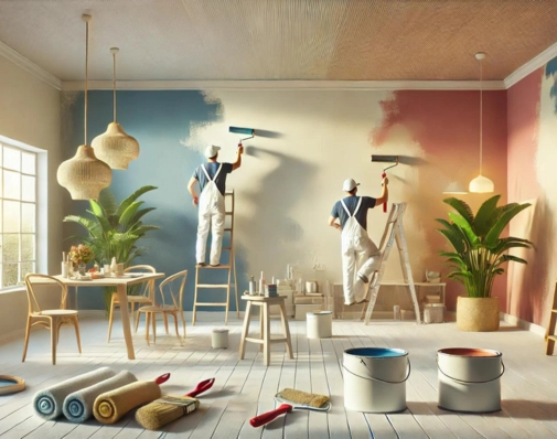
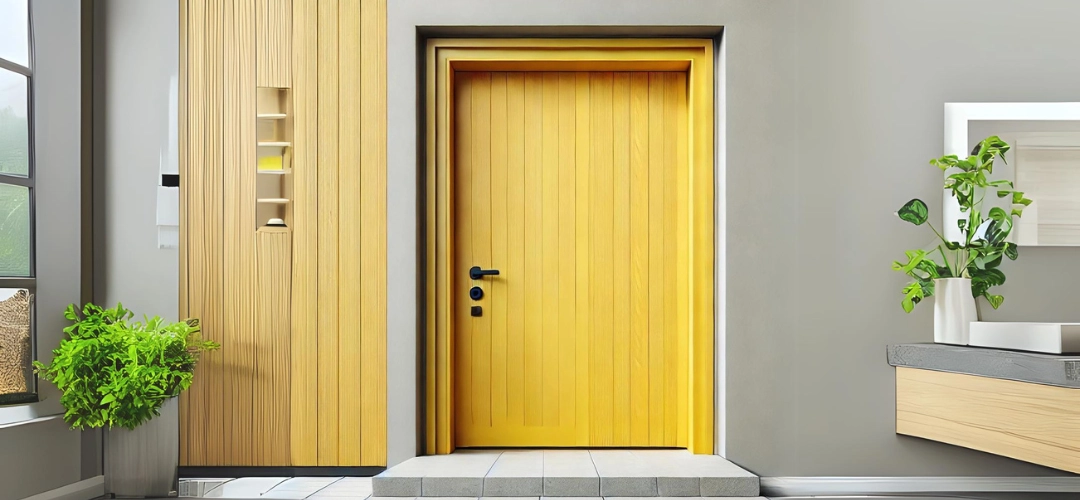
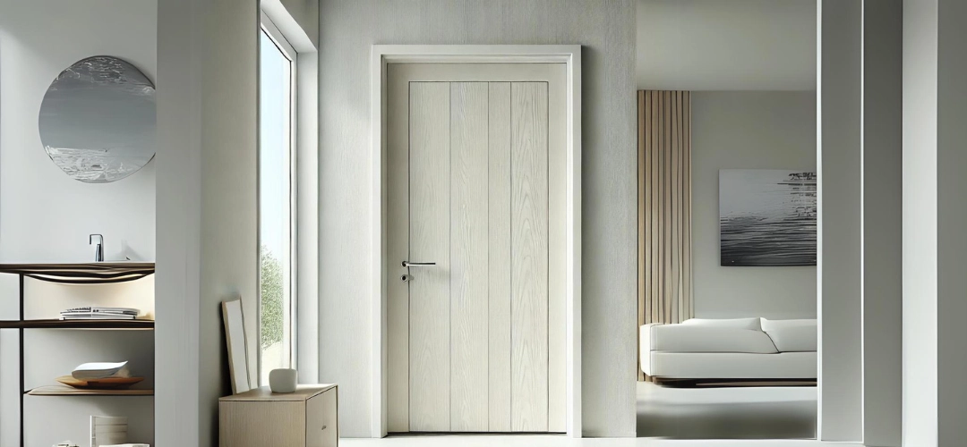
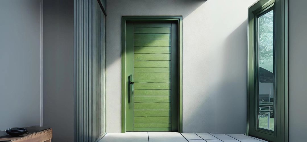
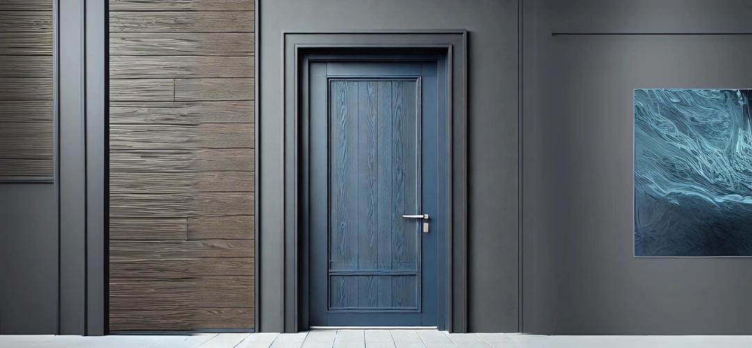
The choice of colours can transform the look and feel of a space. Warm tones like yellows and oranges are perfect for creating welcoming and energetic environments, while cool tones like blues and greens bring calmness and balance. Neutrals such as greys, whites, and beiges remain timeless, offering a clean backdrop for any design style. By selecting the perfect colour palette, you can align your interiors with your personality and functional needs, ensuring your home feels cohesive and inviting.Introducing the ColourCast Visualizer Mobile App
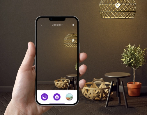
The Indicus ColourCast Visualizer is an innovative app designed specifically for interior design. This powerful tool lets users click a photo of their walls and apply various colours from the extensive Colour Symphony palette. With this real-time colour application feature, the app eliminates the guesswork of choosing paint colours, helping you make confident decisions tailored to your unique space.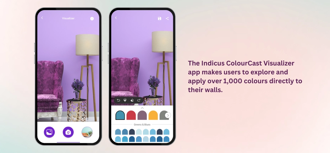
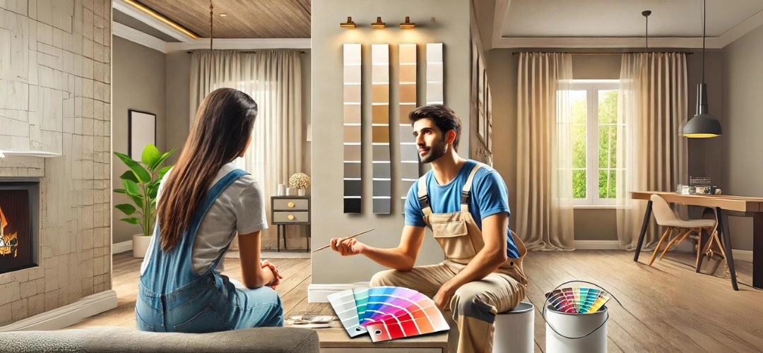
Who Can Use the ColourCast Visualizer and How It’s Helpful
The ColourCast Visualizer is ideal for:- Homeowners: Simplifies the process of choosing the perfect interior colour palette for home makeovers or renovations.
- Interior Designers: Provides a fast and efficient way to showcase colour options to clients in real-time.
- DIY Enthusiasts: Enables experimentation with colours without needing paint samples, making it easier to visualise ideas before committing.
Key Features of the ColourCast Visualizer App
- Click, Apply, and Visualise Colours in Real TimeThe app lets users click photos of their walls and test how various colours look instantly. This intuitive feature allows you to visualise your chosen palette in your actual space, considering factors like lighting and room size.
- Explore Over 1,000 ColoursThe exclusive Colour Symphony palette offers a wide range of shades, from subtle neutrals to vibrant hues, ensuring there’s something for every taste and design style.
- Save and Share Your Favourite PalettesSave your chosen colour combinations directly within the app and share them with friends, family, or designers for feedback. This feature simplifies decision-making and ensures your top picks are easy to revisit.
- User-Friendly and Memory-EfficientDesigned to work smoothly on Android devices, the app is lightweight yet powerful, making it accessible to all users without occupying significant device storage.
Step-by-Step Guide to Using the ColourCast Visualizer
- Download and Set Up the App
Download the ColourCast Visualizer from the Google Play Store here. It’s available exclusively for Android devices. - Click a Photo of Your Wall
Use the app’s built-in camera functionality to capture an image of the wall you want to redesign. This feature ensures accurate visualisation, as it applies colours directly to the photo in real-time. - Explore and Apply Colours
Browse through the extensive Colour Symphony palette and experiment with various shades. Apply colours to see how they look on your walls, helping you narrow down the perfect options. - Save and Share Your Choices
Save your favourite colour combinations and share them with family or friends for feedback. This collaborative approach ensures your final decision is well-informed.
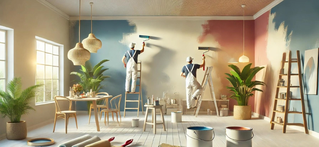
Tips for Choosing the Right Colour Palette for Your Interiors
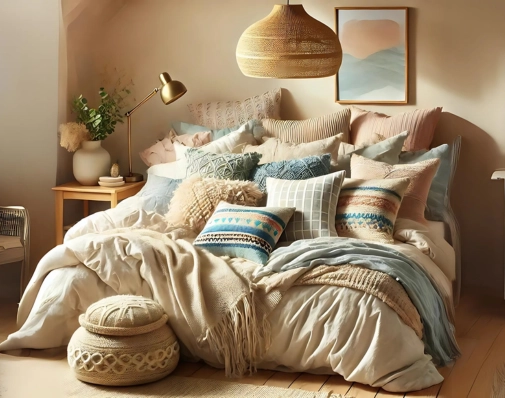
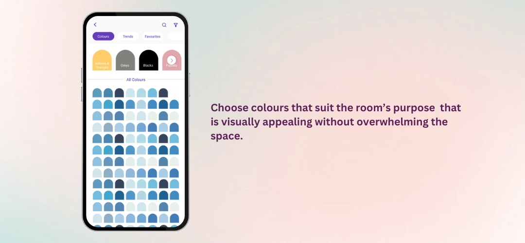
When selecting a colour palette for your interiors, consider the following:- Room Function: Choose colours that suit the room’s purpose. For example, soothing tones like light blues are ideal for bedrooms, while vibrant colours such as yellows and reds work well in dining rooms or play areas.
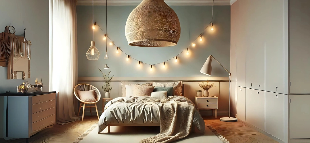
- Lighting: Natural and artificial lighting can dramatically change how colours appear. Use the ColourCast Visualizer to test shades under different lighting conditions.
- Balance and Contrast: Pair bold colours with neutral tones to create a balanced look that is visually appealing without overwhelming the space.
Discovering New Trends and Designs with ColourCast
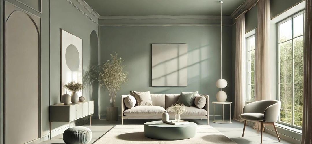
The ColourCast Visualizer keeps you updated with trending interior colours. For 2024, earthy tones like terracottas, sage greens, and soft blues are gaining popularity, reflecting a shift toward calm and nature-inspired interiors. The app’s extensive palette allows you to explore these trends and see how they fit into your home design.The Advantages of Using the ColourCast Visualizer for Interior Design
The ColourCast Visualizer takes the stress out of interior design by allowing users to experiment freely with colours. By clicking a photo of your wall and applying shades in real-time, the app provides a clear visualisation of how your chosen palette will look. This feature reduces the need for physical paint samples, saving both time and money, and encourages creativity by enabling you to explore unconventional ideas without risk.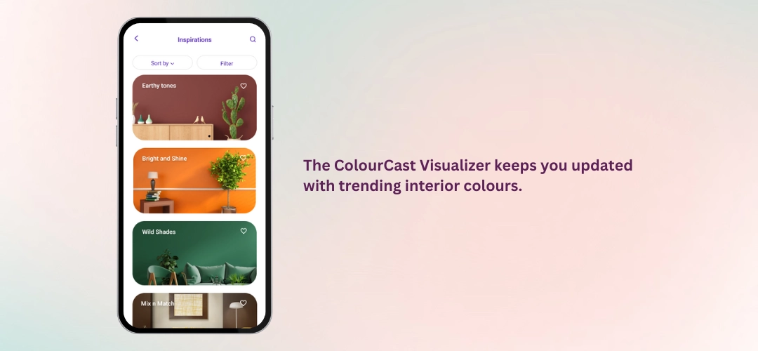
Real User Experiences with the ColourCast Visualizer
Homeowners and interior designers alike have praised the ColourCast Visualizer for its ease of use and accuracy. Many users appreciate the ability to see colours directly on their walls, providing clarity and confidence during the decision-making process. By eliminating guesswork, the app ensures a more streamlined and enjoyable approach to redesigning interiors.How to Access and Maximise the ColourCast Visualizer Experience
The ColourCast Visualizer is available exclusively for Android devices. Download it from the Google Play Store here. To make the most of your experience, ensure you use the app’s built-in camera to capture high-quality photos of your walls for accurate visualisation. Experiment with various colours and combinations to find the perfect palette for your interiors.Expert Tips for Interior Colour Selection
- Start with Neutrals: A neutral base provides flexibility, allowing you to layer bold accents for a dynamic look.
- Focus on Lighting: Test colours under different lighting conditions to see how they appear throughout the day.
- Limit Bold Colours: Use bold hues sparingly as accents to create a balanced, timeless design.