You are using an outdated browser. Please upgrade your browser to improve your experience.

Top Paint Colours to Make Your Home Shine in the Sun

Top Paint Colours to Make Your Home Shine in the Sun

Choosing the perfect exterior paint colour for your home is not just about personal preference – it’s about finding a shade that complements the environment and enhances your home’s visual appeal. In sunny climates, the interplay of light and colour becomes particularly important, as bright sunlight can amplify certain shades while washing out others. While the functionality of paint, such as its UV resistance or heat-reflective properties, depends on its formulation, colour choices can significantly influence the overall aesthetic of your home.

In regions with tropical or warm climates, such as parts of South India, including Tamil Nadu, homes often draw inspiration from the natural surroundings and cultural heritage. This approach ensures a harmonious and visually appealing exterior that stands out while blending beautifully with the landscape.
Top Paint Colours to Make Your Home Shine in the Sun

How Sunny Climates Influence Colour Perception

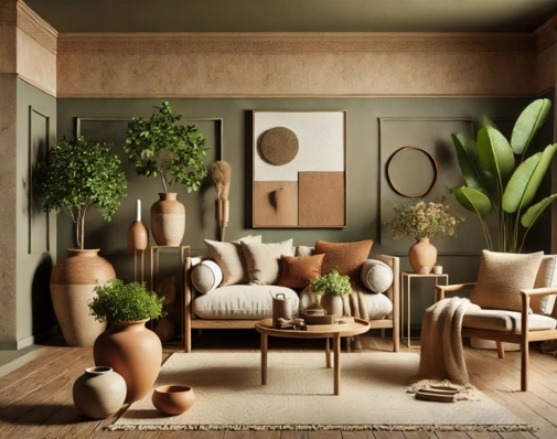
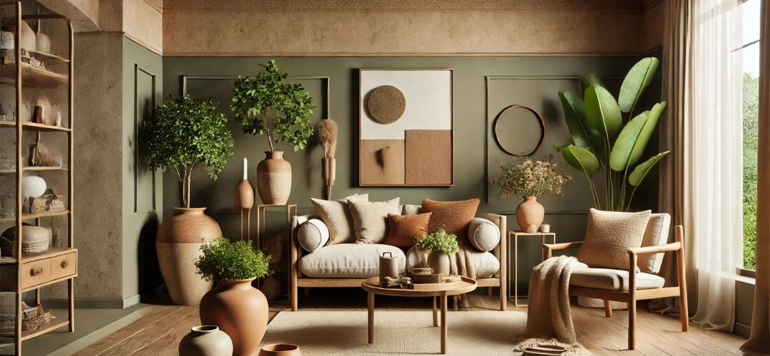
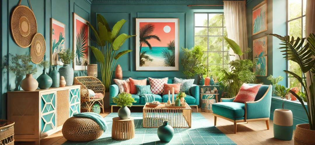
In sunny environments, light colours can appear brighter and more reflective, creating a crisp and clean look. On the other hand, darker tones gain depth and richness, offering a dramatic and sophisticated vibe. The key to selecting the right paint colour is to choose shades that thrive under bright sunlight and retain their vibrancy over time.

Colours inspired by the natural environment, such as earthy tones, coastal blues, and lush greens, often work well in sunny regions. These shades not only create a connection to the surroundings but also look timeless and elegant.

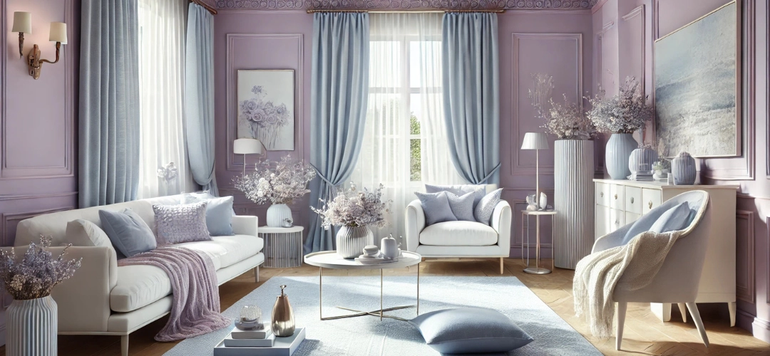
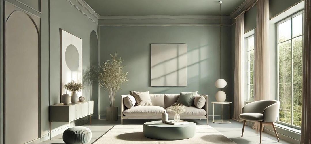
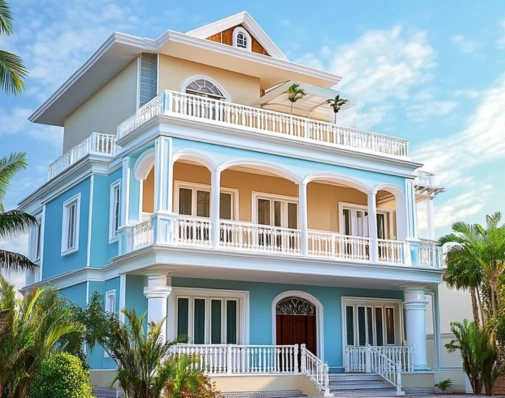
Light and Neutral Colours for Timeless Elegance

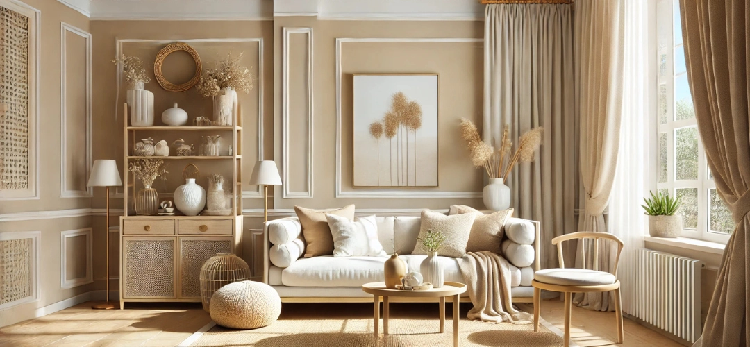
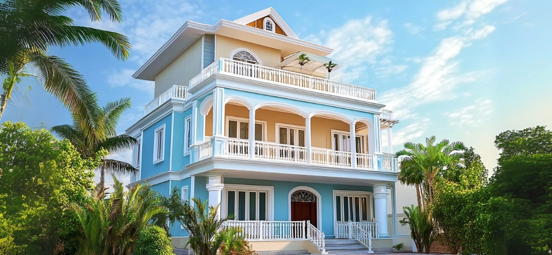
Neutral tones are a popular choice for sunny environments due to their versatility and ability to reflect light. White and off-white shades are classic options that create a fresh and welcoming look, making your home stand out against the bright sky.

Beige and sandstone hues offer a warm and natural aesthetic, blending seamlessly with the surrounding landscape. These colours are ideal for homes with stone or brick elements, creating a cohesive and grounded appearance. Similarly, light grey and silver shades bring a modern edge to homes, pairing beautifully with both traditional and contemporary architecture.
Top Paint Colours to Make Your Home Shine in the Sun

Warm Colours for Vibrancy

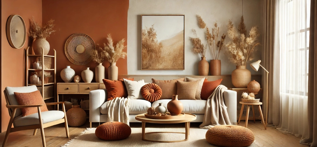
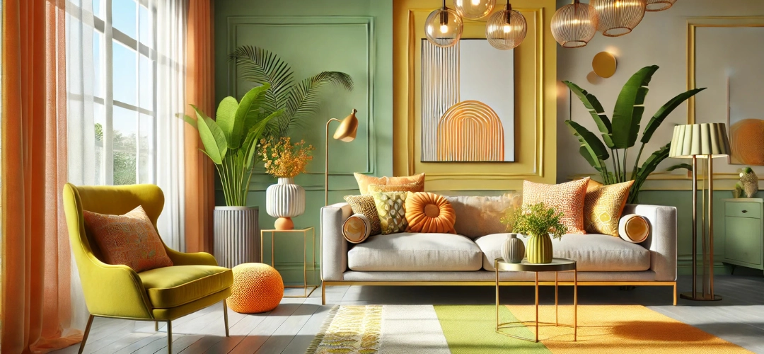
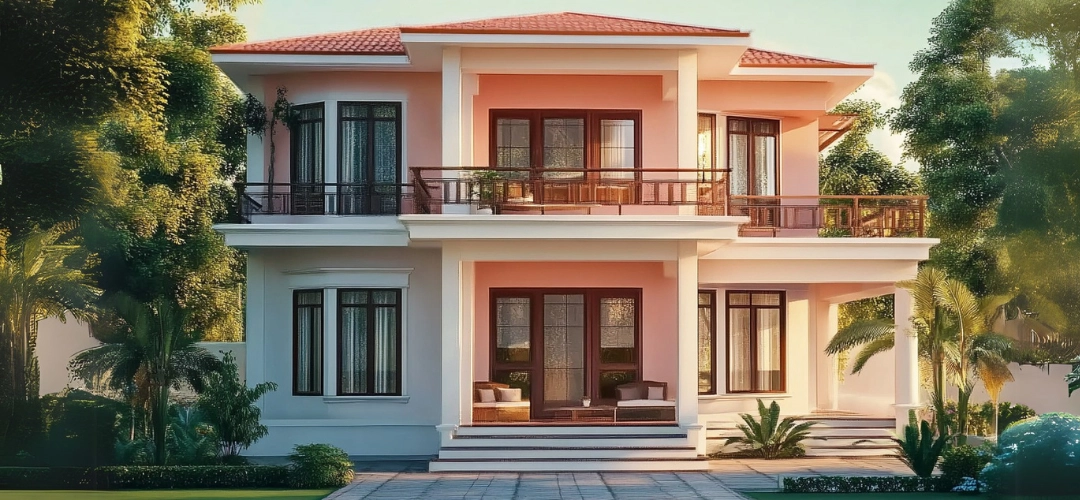
Warm colours can infuse energy and personality into your home’s exterior, making them perfect for sunny climates. Sunny yellows, for example, are cheerful and inviting, reflecting light in a way that makes the home feel bright and uplifting.

Earthy oranges and terracottas are inspired by natural clay tones and work exceptionally well in both rural and urban settings. These shades provide a rustic charm while harmonising with the environment. Rustic reds, a colour often associated with traditional architecture in regions with strong cultural influences, create a bold and striking exterior that remains timeless.

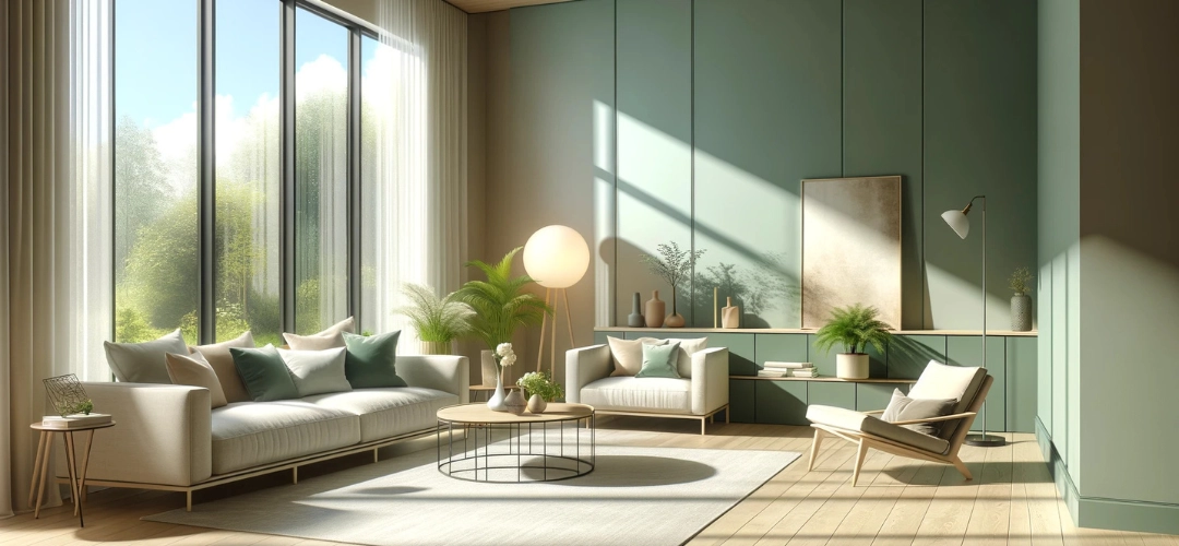
Cool Colours for a Calming Effect

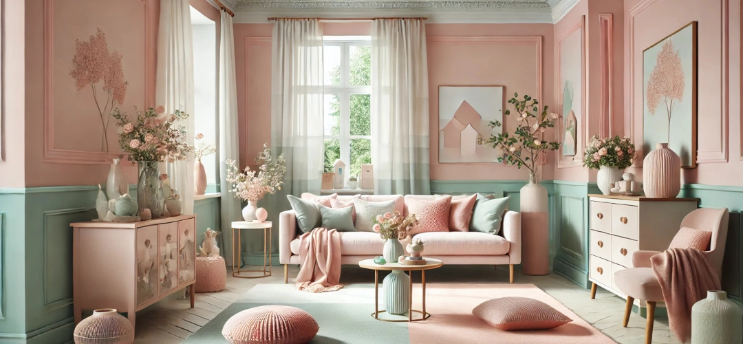
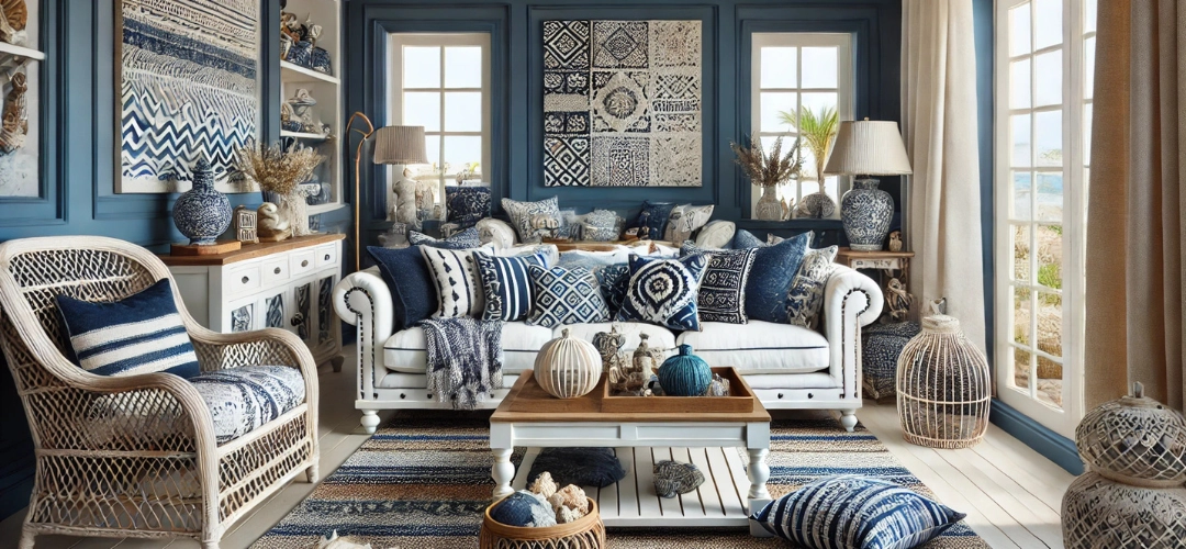
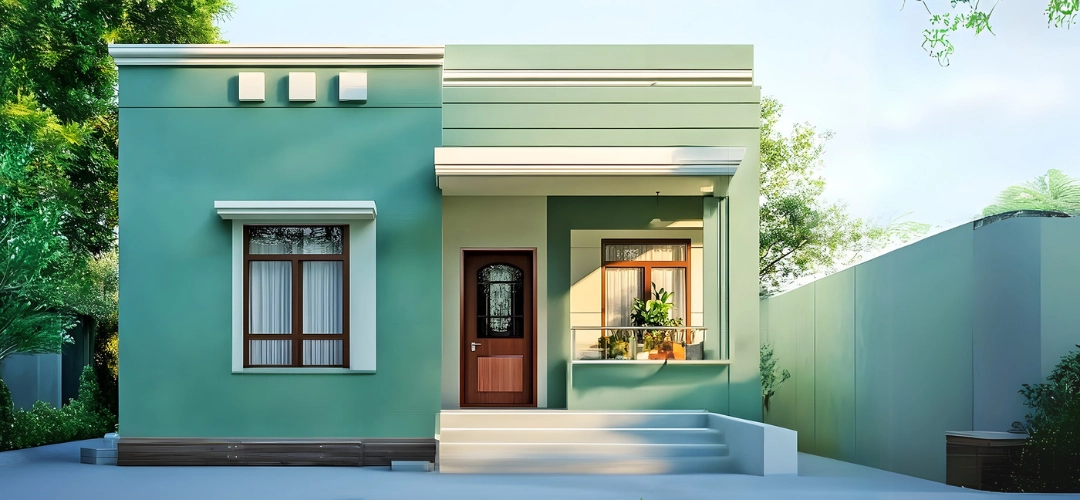
Cool tones bring a sense of calm and serenity, making them ideal for tropical or warm climates. Soft blues and aqua hues mimic the soothing tones of the sea and sky, creating a relaxed and tranquil atmosphere.

For a more natural touch, mint greens and sage tones blend beautifully with gardens and greenery, offering a refreshing and harmonious look. Homes in coastal areas or regions surrounded by lush vegetation can especially benefit from these shades. Pale lavender or lilac, though less common, adds a unique and elegant touch to the exterior.

Bold and Dark Colours for Striking Contrast

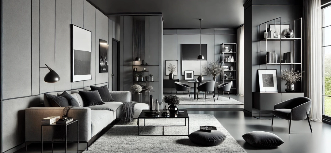
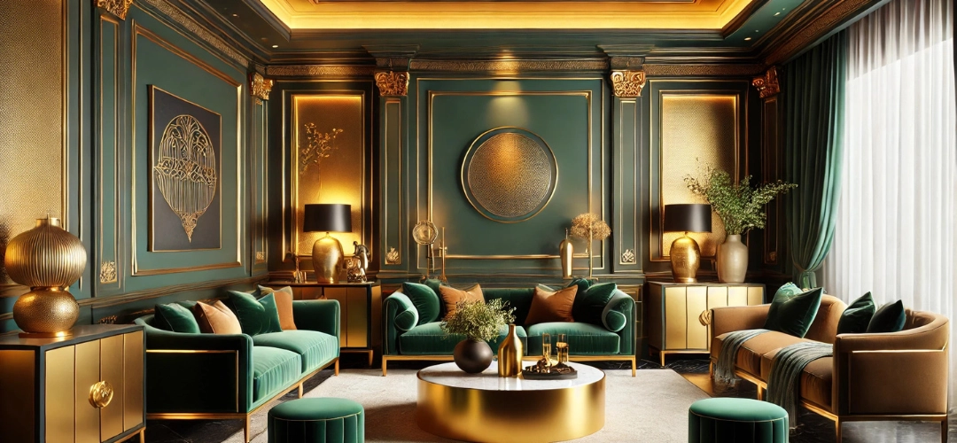
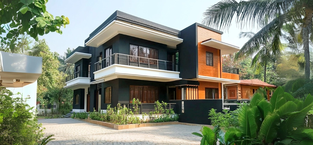
Dark colours can create dramatic and impactful exteriors when used thoughtfully. Charcoal grey and deep navy blue are excellent choices for modern homes, offering a sleek and sophisticated appearance. These shades look particularly striking when paired with light-ed trims or accents.

Forest green, inspired by dense vegetation, is another bold option that creates a natural and grounding aesthetic. Such colours work well in regions where homes are surrounded by greenery, as they blend seamlessly with the landscape while maintaining a distinct presence.
Top Paint Colours to Make Your Home Shine in the Sun

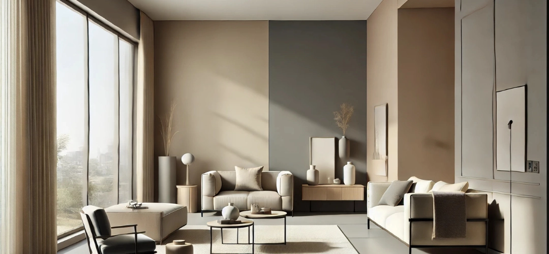
Enhancing Your Home with Trims and Accents

Trims and accents play a vital role in elevating your home’s overall aesthetic. For example, pairing a white or beige base with black or navy trims creates a striking contrast, while a rustic red exterior with cream or grey accents exudes warmth and charm.

Elements like shutters, doors, and window frames are great opportunities to experiment with bolder colours. Vibrant accents, such as yellow or blue, can add personality to the home, while neutral trims provide balance and sophistication.
Top Paint Colours to Make Your Home Shine in the Sun

Practical Considerations for Painting in Sunny Climates

When choosing exterior paint for sunny environments, prioritise high-quality products with UV-resistant properties to prevent fading and peeling. It’s also essential to test your colours in different lighting conditions before committing. The appearance of a shade can vary depending on the time of day, so observing it in morning, afternoon, and evening light ensures the best choice for your home.

Conclusion

Selecting the right exterior paint colour for a sunny environment involves balancing aesthetics with practicality. From timeless neutrals like white and beige to vibrant yellows and earthy reds, the options are vast and versatile. Cool tones like blues and greens bring a sense of calm, while bold, dark shades like charcoal and navy add a modern touch.

By considering the natural surroundings, cultural influences, and the specific lighting conditions of your home, you can create a stunning exterior that reflects both your style and the environment it inhabits. With the right combination of colours, accents, and high-quality paint, your home can become a true standout in any sunny setting.

Perfect Color Combos to Create a Stylish Living Room Ambiance

Perfect Color Combos to Create a Stylish Living Room Ambiance

Creating the perfect living room ambiance is about more than just furniture and lighting; the right color combinations can transform your space into a stylish haven. Indicus Paints offers a versatile palette to help you achieve any look, from vibrant energy to soothing minimalism. Below, we explore some trending color combinations using the Indicus Colour Palette to inspire your next living room makeover.

1. Neutral Elegance: Beige & Soft Whites

Why It Works: Neutral tones create a serene and timeless ambiance. Beige provides warmth, while soft white brightens the space and adds an air of freshness. This combination is versatile and adapts beautifully to both minimalistic and modern interiors.

Indicus Picks: Sand Dune Beige paired with Pure Bliss White.
Perfect Color Combos to Create a Stylish Living Room Ambiance

Styling Tips:

  • Apply beige on walls to create a cozy atmosphere, with white for trim, ceilings, or accents to maintain crispness.
  • Add texture with elements like jute rugs, woven baskets, and linen throws.
  • Use light-coloured wooden furniture or metallic decor like gold or silver vases to subtly elevate the aesthetic.

2. Modern Monochrome: Charcoal Gray & Ivory

Why It Works: This high-contrast combination brings depth and modernity to any space. Charcoal grey provides a dramatic grounding effect, while ivory introduces a soft, airy balance. Together, they create a sleek, contemporary look.

Indicus Picks: Urban Gray with Ivory Glow.
Perfect Color Combos to Create a Stylish Living Room Ambiance
Styling Tips:
  • Use charcoal grey on an accent wall or built-in shelves for a bold statement, complemented by ivory walls or furniture.
  • Incorporate plush ivory furnishings and throws to soften the starkness of the charcoal.
  • Add metallics like gold-framed mirrors, silver candle holders, or chrome lighting for a sophisticated touch.

3. Earthy Retreat: Olive Green & Terracotta

Why It Works: Earth tones evoke a connection to nature, offering a calming and grounded vibe. Olive green brings balance and freshness, while terracotta adds warmth and a rustic charm. Together, they create an inviting, homely feel.

Indicus Picks: Rustic Olive and Clay Terracotta.
Perfect Color Combos to Create a Stylish Living Room Ambiance
Styling Tips:
  • Paint walls in olive green to form a soothing backdrop, and use terracotta in decorative accents like cushions, planters, or area rugs.
  • Pair with wooden furniture in warm tones to amplify the natural theme.
  • Layer in beige or cream fabrics for contrast, and add potted greenery like ferns or succulents to enhance the organic vibe.

4. Bold and Beautiful: Navy Blue & Mustard Yellow

Why It Works: This combination brings energy and sophistication to your living room. Navy blue offers depth and serenity, while mustard yellow provides a cheerful and lively contrast. Together, they form a harmonious yet dynamic look.

Indicus Picks: Deep Sapphire Blue with Golden Mustard.
Perfect Color Combos to Create a Stylish Living Room Ambiance
Styling Tips:
  • Paint navy blue on the walls for an enveloping effect, while mustard yellow accents like cushions, lampshades, or a feature chair bring warmth.
  • Use neutral-toned furniture, such as white or light wood, to balance the boldness of the colors.
  • Layer in patterned textiles, such as navy and mustard area rugs or curtains, for a cohesive and stylish touch.

5. Pastel Perfection: Blush Pink & Cool Mint

Why It Works: This pastel pairing is soft and soothing, making it ideal for a relaxed and inviting living space. Blush pink adds warmth and charm, while cool mint introduces a refreshing and calming element.

Indicus Picks: Rose Petal Blush and Minty Fresh.
Perfect Color Combos to Create a Stylish Living Room Ambiance
Styling Tips:
  • Use blush pink on the walls or a prominent feature area, with cool mint incorporated into furniture or accent pieces like painted side tables.
  • Keep furniture light and simple, such as white or pastel wood finishes, to maintain the airy feel.
  • Add rose gold or copper metallic accents in lighting or decorative pieces to complement the pastel palette beautifully.

6. Tropical Paradise: Teal & Coral

Why It Works: This vibrant pairing instantly energises a space. Teal evokes a sense of tranquillity reminiscent of tropical waters, while coral adds a pop of playful energy. Together, they create a lively and refreshing ambiance.

Indicus Picks: Lagoon Teal with Sunset Coral.
Perfect Color Combos to Create a Stylish Living Room Ambiance
Styling Tips:
  • Paint walls teal to set a bold yet calming tone, and add coral through soft furnishings like throw pillows or an accent chair.
  • Use natural textures like bamboo or rattan furniture to enhance the tropical vibe.
  • Incorporate plenty of greenery, such as large indoor plants or hanging planters, to complete the look.

7. Urban Chic: Black & Ash Gray

Why It Works: A monochromatic scheme with black and grey exudes sophistication and modernity. Black adds depth and boldness, while ash grey softens the look, creating a balanced and chic interior.

Indicus Picks: Midnight Black and Soft Ash Gray.
Perfect Color Combos to Create a Stylish Living Room Ambiance
Styling Tips:
  • Use black sparingly on feature walls or furniture pieces, with ash grey for the remaining walls to create an open feel.
  • Brighten the space with reflective surfaces like glass coffee tables or mirrors.
  • Add pops of color through decor, such as vibrant artwork or colourful throw blankets, to inject personality into the neutral palette.

8. Rustic Warmth: Burnt Orange & Cream

Why It Works: This pairing creates a cozy and inviting ambiance. Burnt orange radiates warmth and energy, while cream tones down the intensity and provides a neutral base. Together, they evoke a sense of rustic charm and relaxation.

Indicus Picks: Amber Rust and Vanilla Cream.
Perfect Color Combos to Create a Stylish Living Room Ambiance
Styling Tips:
  • Use burnt orange as a feature wall or on decorative items like cushions, pottery, or throws.
  • Paint the rest of the walls in cream to keep the space feeling open and balanced.
  • Introduce reclaimed wood furniture and textured fabrics like wool or leather to complete the rustic look.

9. Sophisticated Contrast: Emerald Green & Soft Gold

Why It Works: Emerald green is rich and luxurious, evoking opulence and elegance. Paired with soft gold, it adds a regal touch that elevates the entire room. This combination is perfect for creating a dramatic yet refined ambiance.

Indicus Picks: Emerald Oasis with Golden Glow.
Perfect Color Combos to Create a Stylish Living Room Ambiance
Styling Tips:
  • Paint walls in emerald green to create a bold statement and use gold in accents like light fixtures, frames, or decorative sculptures.
  • Incorporate velvet or satin upholstery in furniture for an ultra-luxurious feel.
  • Add dark wooden pieces or a marble coffee table to enhance the sophisticated vibe.

10. Energetic Pop: Tangerine & Lime Green

Why It Works: This bold and vibrant combination is ideal for lively households. Tangerine offers zest, while lime green adds freshness, creating an uplifting and energetic space.

Indicus Picks: Tangerine Zest and Citrus Lime.
Perfect Color Combos to Create a Stylish Living Room Ambiance
Styling Tips:
  • Paint walls in lime green and use tangerine for accent pieces like cushions or an area rug.
  • Opt for neutral furniture to let the colors shine.
  • Add playful decor, like colourful artwork or patterned textiles, for a whimsical touch.

11. Classic Combination: White & Navy Stripes

Why It Works: This pairing is timeless and versatile, perfect for coastal-inspired or nautical interiors. White keeps the room light and spacious, while navy stripes add a bold and structured touch.

Indicus Picks: Ocean Navy with Bright White.
Perfect Color Combos to Create a Stylish Living Room Ambiance
Styling Tips:
  • Use navy and white stripes in upholstery or rugs, keeping the walls primarily white.
  • Include wooden furniture in light or medium finishes to complement the coastal vibe.
  • Add nautical decor like rope accents, seashells, or lanterns for a themed look.

12. Calming Cool: Lavender & Powder Blue

Why It Works: Lavender and powder blue are soothing and serene, making them ideal for a tranquil living space. This duo adds a soft and airy feel, perfect for unwinding.

Indicus Picks: Lilac Mist and Sky Powder Blue.
Perfect Color Combos to Create a Stylish Living Room Ambiance
Styling Tips:
  • Use lavender as a base color on walls and powder blue in soft furnishings like curtains or rugs.
  • Pair with white or cream furniture for a clean and cohesive look.
  • Add silver or pearl-toned accents to complement the cool color palette.

Conclusion

The Indicus Colour Palette provides endless inspiration for creating a stylish living room that suits your taste and personality. From calming neutrals to bold, vibrant tones, these combinations balance aesthetics and functionality, ensuring your living space feels both inviting and stylish. With carefully selected colors and thoughtful styling, you can transform your living room into a true masterpiece.

How to Paint a Wooden Gate for Long-Lasting Beauty and Protection

How To Paint A Wooden Gate For Long-Lasting Beauty and Protection

Painting a wooden gate is more than just a cosmetic update—it’s an essential step for long-term protection against the elements. Outdoor wood is constantly exposed to changing weather conditions, which can lead to warping, cracking, and rot if not adequately safeguarded. By investing in high-quality, long-lasting outdoor wood coating, you can enhance your gate’s appearance while ensuring its durability. This comprehensive guide will walk you through the best practices, from selecting the right coat to maintaining the finish for years to come.

Paint a Wooden Gate for Long-Lasting Beauty and Protection

Importance of Painting a Wooden Gate for Protection

Painting a wooden gate provides a crucial barrier against moisture, which can seep into unprotected wood and cause rotting and warping. Additionally, a proper coating shields the wood from harmful UV rays, preventing discolouration and decay over time that might occur under prolonged sun exposure. This protective layer not only keeps the wood structurally sound but also elevates the overall look of your property, enhancing its curb appeal and market value.

Paint a Wooden Gate for Long-Lasting Beauty and Protection

Preparing the Wooden Gate for Repainting

Proper preparation is key to a flawless and long-lasting finish. Start by inspecting the gate for any signs of damage, such as cracks or splintering, and repair these areas as needed. Clean the surface thoroughly with a mixture of mild soap and water to remove dirt, mould, or any peeling paint. Sanding the gate is essential to smooth out rough spots and help the new paint adhere better.

Painting the Gate

The process involves the application of multiple layers, including sealers, stains, and topcoats, to create a polished, durable surface. Choosing the right quality materials like Indicus Woodfina, Indicus NC Sanding Sealer etc. would give you a premium high quality finish.

Paint a Wooden Gate for Long-Lasting Beauty and Protection

Steps for Coating a Wooden Gate

  1. Preparation
    • Ensure the wood is well-seasoned and fully dried.
    • For tannin-rich woods, clean the surface with NC thinner to remove inherent oiliness.
    • If the gate has a previous coating, scrape or sand it off entirely before starting.
  2. Sanding
    • o Sand the wooden surface along the grain using abrasive paper no. 180. Follow up with finer grit paper no. 320 or no. 400 to remove loose particles and create a smooth surface.
  3. Repairing Dents
    • Fill any dents or cracks with a wood filler using a putty knife. Allow it to dry for 3-4 hours, then sand the surface again for uniformity.
  4. Sealing
    • Apply 1 to 2 coats of a sanding sealer to fill pores and smooth out the wood. Allow each coat to dry for 2 hours before sanding lightly with abrasive paper no. 320.
  5. Staining
    • Apply 1 to 2 coats of wood stain to enhance the wood’s natural grain and achieve the desired colour. Allow 2 hours of drying time between coats, sanding lightly after each application.
  6. Topcoat Application
    • Apply 2 to 3 coats of a clear protective topcoat to seal and protect the wood. Allow each coat to dry for 8-12 hours. This step ensures a durable, polished finish that can withstand weather and wear.

Tips for a Professional Finish

  • Work in Optimal Weather: Coating should be done in mild temperatures to ensure proper drying and curing.
  • Use Good Quality Tools: Invest in high-quality brushes, rollers, and applicators to avoid streaks, fibres, and uneven layers.
  • Protect Surroundings: Use drop cloths or tarps to prevent spills and splatters on nearby surfaces.
Paint a Wooden Gate for Long-Lasting Beauty and Protection

Maintaining a Wooden Gate

Whether you choose painting or coating, regular maintenance ensures long-lasting protection. Here’s how:

  1. Inspect Regularly: Check for peeling, cracks, or damage every few months and address issues promptly
  2. Clean Periodically: Wash the gate with mild detergent and a soft cloth or brush to remove dirt and pollutants.
  3. Reapply as Needed: Refresh the topcoat every few years to maintain protection and appearance.
Paint a Wooden Gate for Long-Lasting Beauty and Protection

Conclusion

Painting a wooden gate not only preserves its beauty but also protects it from the elements. Proper preparation with NC Sanding Sealer and finishing with weather resistant Indicus Woodfina can ensure a stunning, durable result. With regular maintenance and care, your gate will remain a standout feature of your property for years. Both Woodfina and NC Sanding Sealer work hand in hand to create a professional-grade finish, ensuring lasting beauty and protection.

Choosing the Perfect Colour Palette for Your Home with Indicus ColourCast Visualizer

Choosing the Perfect Colour Palette for Your Home with Indicus ColourCast Visualizer

Selecting the ideal colour palette for your home’s interior can dramatically impact its ambiance and style. From energising living rooms with vibrant hues to creating a serene atmosphere in bedrooms, the right colour choice can make all the difference. The Indicus ColourCast Visualizer app makes this process easy by allowing users to explore and apply over 1,000 colours directly to their walls. Whether you’re redecorating a single room or revamping your entire home, this innovative tool is the ultimate companion for interior design.

The Role of Colour in Interior Design

The choice of colours can transform the look and feel of a space. Warm tones like yellows and oranges are perfect for creating welcoming and energetic environments, while cool tones like blues and greens bring calmness and balance. Neutrals such as greys, whites, and beiges remain timeless, offering a clean backdrop for any design style. By selecting the perfect colour palette, you can align your interiors with your personality and functional needs, ensuring your home feels cohesive and inviting.

Introducing the ColourCast Visualizer Mobile App

The Indicus ColourCast Visualizer is an innovative app designed specifically for interior design. This powerful tool lets users click a photo of their walls and apply various colours from the extensive Colour Symphony palette. With this real-time colour application feature, the app eliminates the guesswork of choosing paint colours, helping you make confident decisions tailored to your unique space.
Indicus ColourCast Visualizer

Who Can Use the ColourCast Visualizer and How It’s Helpful

The ColourCast Visualizer is ideal for:
  • Homeowners: Simplifies the process of choosing the perfect interior colour palette for home makeovers or renovations.
  • Interior Designers: Provides a fast and efficient way to showcase colour options to clients in real-time.
  • DIY Enthusiasts: Enables experimentation with colours without needing paint samples, making it easier to visualise ideas before committing.
How It’s Helpful: The app allows users to click a photo of their walls and instantly apply colours from the palette. This real-time visualisation feature saves time, reduces the cost of buying paint samples, and ensures the chosen colours align with your vision. With the ability to experiment freely, you can explore bold ideas or settle on timeless classics with confidence.

Key Features of the ColourCast Visualizer App

  1. Click, Apply, and Visualise Colours in Real TimeThe app lets users click photos of their walls and test how various colours look instantly. This intuitive feature allows you to visualise your chosen palette in your actual space, considering factors like lighting and room size.
  2. Explore Over 1,000 ColoursThe exclusive Colour Symphony palette offers a wide range of shades, from subtle neutrals to vibrant hues, ensuring there’s something for every taste and design style.
  3. Save and Share Your Favourite PalettesSave your chosen colour combinations directly within the app and share them with friends, family, or designers for feedback. This feature simplifies decision-making and ensures your top picks are easy to revisit.
  4. User-Friendly and Memory-EfficientDesigned to work smoothly on Android devices, the app is lightweight yet powerful, making it accessible to all users without occupying significant device storage.

Step-by-Step Guide to Using the ColourCast Visualizer

  1. Download and Set Up the App
    Download the ColourCast Visualizer from the Google Play Store here. It’s available exclusively for Android devices.
  2. Click a Photo of Your Wall
    Use the app’s built-in camera functionality to capture an image of the wall you want to redesign. This feature ensures accurate visualisation, as it applies colours directly to the photo in real-time.
  3. Explore and Apply Colours
    Browse through the extensive Colour Symphony palette and experiment with various shades. Apply colours to see how they look on your walls, helping you narrow down the perfect options.
  4. Save and Share Your Choices
    Save your favourite colour combinations and share them with family or friends for feedback. This collaborative approach ensures your final decision is well-informed.

Tips for Choosing the Right Colour Palette for Your Interiors

When selecting a colour palette for your interiors, consider the following:
  • Room Function: Choose colours that suit the room’s purpose. For example, soothing tones like light blues are ideal for bedrooms, while vibrant colours such as yellows and reds work well in dining rooms or play areas.
  • Lighting: Natural and artificial lighting can dramatically change how colours appear. Use the ColourCast Visualizer to test shades under different lighting conditions.
  • Balance and Contrast: Pair bold colours with neutral tones to create a balanced look that is visually appealing without overwhelming the space.
Indicus ColourCast Visualizer

Discovering New Trends and Designs with ColourCast

The ColourCast Visualizer keeps you updated with trending interior colours. For 2024, earthy tones like terracottas, sage greens, and soft blues are gaining popularity, reflecting a shift toward calm and nature-inspired interiors. The app’s extensive palette allows you to explore these trends and see how they fit into your home design.

The Advantages of Using the ColourCast Visualizer for Interior Design

The ColourCast Visualizer takes the stress out of interior design by allowing users to experiment freely with colours. By clicking a photo of your wall and applying shades in real-time, the app provides a clear visualisation of how your chosen palette will look. This feature reduces the need for physical paint samples, saving both time and money, and encourages creativity by enabling you to explore unconventional ideas without risk.
Indicus ColourCast Visualizer

Real User Experiences with the ColourCast Visualizer

Homeowners and interior designers alike have praised the ColourCast Visualizer for its ease of use and accuracy. Many users appreciate the ability to see colours directly on their walls, providing clarity and confidence during the decision-making process. By eliminating guesswork, the app ensures a more streamlined and enjoyable approach to redesigning interiors.

How to Access and Maximise the ColourCast Visualizer Experience

The ColourCast Visualizer is available exclusively for Android devices. Download it from the Google Play Store here. To make the most of your experience, ensure you use the app’s built-in camera to capture high-quality photos of your walls for accurate visualisation. Experiment with various colours and combinations to find the perfect palette for your interiors.

Expert Tips for Interior Colour Selection

  • Start with Neutrals: A neutral base provides flexibility, allowing you to layer bold accents for a dynamic look.
  • Focus on Lighting: Test colours under different lighting conditions to see how they appear throughout the day.
  • Limit Bold Colours: Use bold hues sparingly as accents to create a balanced, timeless design.

Complementary Apps and Resources

In addition to the ColourCast Visualizer, consider using apps for furniture arrangement or décor inspiration to see how your chosen colour palette fits with the rest of your design. Platforms like Pinterest can help you discover creative ways to integrate colours into your overall home aesthetic.

Conclusion

The Indicus ColourCast Visualizer is a must-have tool for anyone redesigning their home’s interiors. With the ability to click photos of your walls and apply over 1,000 colours, the app simplifies the decision-making process, saving time and reducing stress. Whether you’re exploring bold new trends or sticking to timeless classics, the ColourCast Visualizer ensures you make confident choices tailored to your style. Download the app today on Android and transform your interiors with ease.

5 Paint Colours to Make Your Rooms Look Bigger and Brighter

5 Paint Colours to Make Your Rooms Look Bigger and Brighter

Choosing the right paint colour can transform small, dimly lit rooms into vibrant, welcoming spaces. By strategically using specific shades, you can create an illusion of brightness and space. In this guide, we’ll explore the best paint colours for small spaces, helping you make your rooms look bigger, brighter, and more inviting.

1. Sparking Dew (2359P): A Fresh Light Blue

Sparking Dew is a soft, refreshing blue with a hint of aqua that evokes a sense of calm and tranquillity. This shade reflects light beautifully, giving rooms an airy and expansive feel.
  • Why It Works: Its cool undertones enhance brightness and make walls appear as if they’re receding, creating depth. It’s one of the best paint colours for small spaces where a fresh, open vibe is desired.
  • Design Tip: Pair Sparking Dew with trims in crisp whites like Marshmallow Whip (2071P) or soft beiges to highlight mouldings or window frames. Metallic accents in silver or brushed nickel add a modern touch.
  • Best Uses: Ideal for bathrooms, bedrooms, and home offices, this light blue colour complements coastal or nautical-inspired decor beautifully.
Sparking Dew

2. Puritan Beige (2099P): A Warm Neutral Beige

Puritan Beige is a soft, creamy beige that strikes the perfect balance between warmth and brightness. Its timeless versatility makes it a top choice for creating cosy, inviting spaces.
  • Why It Works: Beige tones enhance natural light, making rooms feel more spacious. This shade offers a comforting warmth without compromising on openness, making it one of the best bright paint colours for small rooms.
  • Design Tip: Use Puritan Beige on walls and contrast with trims or furniture in muted greens, greys, or browns. Layering textures like woven baskets and linen drapes enhances its cosy, sophisticated appeal.
  • Best Uses: Perfect for living rooms, hallways, and dining spaces, Puritan Beige provides a soothing backdrop that pairs well with statement decor or artwork.
Purtian Beige

3. Angelic Blue (2988P): A Soothing Pastel Blue

Angelic Blue is a delicate pastel blue that embodies serenity and light. This shade reflects natural and artificial light effectively, giving your space an open and calming atmosphere.
  • Why It Works: The cool, light tones visually expand walls, making a room appear larger and airier. Its soft hue is ideal for creating a soothing environment.
  • Design Tip: Pair Angelic Blue with trims in warm whites like Worn White (2953P) for a polished, balanced look. Soft furnishings in navy, pale grey, or light wood tones add depth. A touch of greenery, such as potted plants, can enhance its fresh, vibrant aesthetic.
  • Best Uses: Perfect for bedrooms, nurseries, and reading nooks, this pastel shade complements traditional and Scandinavian-style interiors effortlessly.
Angelic Blue

4. Worn White (2953P): A Warm Neutral White

Worn White is a warm, understated white with subtle vintage undertones. Unlike stark whites, this shade adds personality and warmth to any room while maintaining a bright and fresh appearance.
  • Why It Works:: Worn White reflects light efficiently, brightening up spaces and making them feel clean and open. It’s a great choice for a timeless and versatile base colour in small rooms.
  • Design Tip: Pair Worn White with bold-coloured furniture or darker wood finishes for contrast. Metallic accents in gold or bronze can elevate the sophistication of this shade.
  • Best Uses: Worn White is an excellent choice for kitchens, living rooms, and multifunctional spaces. It creates a bright backdrop that complements various design styles, from modern to vintage.

5. Chill Grey (2967P): A Modern Grey-Green

Chill Grey is a cool, understated grey-green with subtle blue undertones, making it a versatile option for contemporary and minimalist interiors.
  • Why It Works: Its muted green undertones create a tranquil vibe while visually expanding the room. Chill Grey works well in spaces with both natural and artificial lighting.
  • Design Tip: Pair Chill Grey with soft white trims or light pastels for a cohesive, modern look. Incorporate chrome or brushed silver finishes to enhance its cool tones. For a natural aesthetic, complement it with rattan, jute, or reclaimed wood accents.
  • Best Uses: Ideal for bathrooms, kitchens, and living spaces, Chill Grey brings a clean yet calming energy to both small and large rooms.
Chill Grey

Tips to Maximise the Impact of These Colours

  • Mirrors: Strategically place large mirrors opposite windows or light sources to reflect light and create the illusion of depth.
  • Lighting: Layer lighting with overhead fixtures, table lamps, and floor lamps to enhance brightness. Use warm bulbs to complement neutral tones like Purtian Beige and Worn White.
  • Neutral Flooring: Light wood or neutral-toned flooring can maintain the bright, open feel of the room.
  • Minimalistic Decor: Avoid visual clutter by selecting functional furniture and simple wall art to let these colours shine.
Purtian Beige 02

Conclusion: Brighten Your Space with Indicus Paints

Indicus Paints offers a wide range of shades designed to enhance light and create the illusion of spaciousness. Whether you choose the refreshing Sparking Dew, the cosy Purtian Beige, the serene Angelic Blue, the timeless Worn White, or the modern Chill Grey, these colours can transform your home into a light-filled sanctuary. Pair these shades with thoughtful design elements to create interiors that feel expansive, inviting, and effortlessly elegant.

For even more colour options, explore Indicus Paints’ collection of over 1000+ colours to find the perfect shade for your space. Whether you’re looking for soft neutrals, vibrant accents, or calming pastels, Indicus has something for every style and need.

Lighting Ideas for a Serene Bohemian Bedroom Atmosphere

Lighting Ideas for a Serene Bohemian Bedroom Atmosphere

Lighting plays a crucial role in creating the perfect atmosphere in any bedroom, but it’s especially important when you’re aiming for a serene, Bohemian vibe. Bohemian design emphasises comfort, natural elements, and eclectic touches. In this guide, we’ll explore various lighting ideas to help you craft a peaceful and stylish Bohemian bedroom.

Why Lighting is Important for Creating a Serene Atmosphere

Lighting sets the mood and ambiance of a space. In a bedroom, especially one designed with a Bohemian aesthetic, the right lighting can enhance relaxation and create a calming retreat. Soft lighting can blur the edges of a room, highlight key décor, and make the space feel warmer. For a serene Bohemian bedroom, you should aim for lighting that feels natural, warm, and inviting, avoiding harsh or overly bright light.
Why Lighting is Important for Creating a Serene Atmosphere

Types of Lighting Fixtures for a Bohemian Bedroom

A Bohemian bedroom encourages a mix of different lighting fixtures. Some popular types include:
  • Pendant lights: Suspended from the ceiling, pendant lights can be made of natural materials like rattan or wicker, blending perfectly with the earthy, eclectic style of a Boho room.
  • Floor lamps: Tall floor lamps with soft, diffused light are ideal for creating cosy corners or reading nooks in your bedroom.
  • String lights: Often used in Bohemian décor, string lights can create a whimsical, dreamy atmosphere. Drape them over the bed, along a wall, or above a window.
  • Table lamps: Choose table lamps with warm, textured shades or unique bases to add character to your bedside tables or dressers.
Types of Lighting Fixtures for a Bohemian Bedroom

Natural Lighting Ideas for a Serene Atmosphere

Natural light is one of the best ways to create a serene and inviting atmosphere in a Bohemian bedroom. Maximising natural light during the day can help the room feel more open and airy. Here are some tips to enhance natural lighting:
  • Use light curtains: Opt for sheer or light-coloured curtains that allow sunlight to filter through while maintaining privacy.
  • Position mirrors strategically: Mirrors reflect natural light and can make the space feel brighter and larger. Place mirrors across from windows to bounce light around the room.
  • Consider window treatments: Use blinds that allow you to control the amount of light entering the room without blocking it entirely.

Artificial Lighting Ideas for a Serene Atmosphere

Artificial lighting is essential for the evening or when natural light is limited. To maintain a serene Bohemian atmosphere, choose warm, soft lighting options:
  • Fairy lights: These small string lights create a magical ambiance and work well draped around bed frames, windows, or shelves.
  • Lanterns: Lantern-style lighting, particularly those made from natural materials like bamboo or metal, can cast soft, warm light and add a touch of Bohemian charm.
  • Himalayan salt lamps: These lamps emit a soft, pinkish-orange glow that is calming and perfect for creating a peaceful space.
Artificial Lighting Ideas for a Serene Atmosphere

Choosing the Right Light Bulbs for a Bohemian Bedroom

Light bulbs play a significant role in determining the mood of the room. In a Bohemian bedroom, you’ll want to avoid cool or bright white bulbs, which can feel too stark. Instead, opt for:
  • Warm white bulbs: These provide a soft, comforting glow that is perfect for creating a relaxing space.
  • Edison bulbs: Known for their vintage look and warm, amber glow, Edison bulbs fit well with Bohemian décor and add a rustic touch.
  • Low-wattage bulbs: These bulbs produce dimmer light, enhancing the cosy, serene feel of the room.

Creative Lighting Arrangements and Techniques

The way you arrange your lighting can have a big impact on the overall feel of the room. Here are some creative ideas to consider for a Bohemian bedroom:
  • Layering lights: Combine different types of lighting, such as table lamps, pendant lights, and string lights, to create a multidimensional look.
  • Highlighting specific areas: Use lighting to accentuate certain areas, like a cosy reading nook or a piece of art, giving the room an eclectic, curated feel.
  • Hanging pendant lights low: Bohemian design often features low-hanging lighting, especially above nightstands or seating areas, to create a more intimate, serene vibe.
Creative Lighting Arrangements and Techniques

DIY Lighting Projects for a Bohemian Bedroom

If you want to add a personal touch to your Bohemian bedroom, consider creating your own lighting fixtures. Here are some DIY ideas:
  • Macrame light shade: Craft a macramé shade to hang over a lightbulb for a soft, diffused glow that adds texture and character to the room.
  • Repurposed glass jars: Use old glass jars or bottles as lanterns by placing candles or fairy lights inside, adding a rustic, Bohemian touch.
  • Beaded chandelier: Make a chandelier out of wooden or colourful beads to add a playful, eclectic element to your lighting.

Incorporating Plants and Greenery into Your Lighting Design

Plants and lighting are a perfect combination for a serene Bohemian bedroom. Greenery can soften lighting and create a calming atmosphere. Some ways to incorporate plants and lighting include:
  • Hanging plants with lights: Combine string lights with hanging plants for a magical, nature-inspired look. Drape the lights around plant baskets or shelves.
  • Light-filled terrariums: Place small fairy lights inside glass terrariums filled with plants or crystals for a soft glow and natural décor.
  • Table lamps with plant bases: Choose lamps that incorporate plant stands or have bases that allow you to place small pots for a truly Bohemian touch.
Incorporating Plants and Greenery into Your Lighting Design

Conclusion: Achieving a Serene Bohemian Bedroom Atmosphere with the Right Lighting

Creating a serene Bohemian bedroom is all about blending the right lighting elements with natural, earthy décor. By incorporating a variety of light sources, from natural sunlight to string lights and lanterns, you can establish a peaceful, calming atmosphere perfect for relaxation. With the right fixtures, bulbs, and creative arrangements, your bedroom will become the ultimate Bohemian sanctuary.

Brush vs Roller? Find the Perfect Painting Tool for Your DIY Project

Brush vs Roller? Find the Perfect Painting Tool for Your DIY Project

When embarking on a DIY painting project, choosing the right tool is crucial to achieving the best results. Two of the most common tools for painting are the paintbrush and the roller, each with its own advantages and limitations. To help you make an informed decision, this guide will break down the pros and cons of each, factors to consider when selecting a tool, and how to use them effectively.
Perfect Painting Tool

Pros and Cons of Using a Brush

Using a paintbrush offers a number of benefits, particularly when precision is required. A brush provides superior control, making it ideal for painting edges, corners, and detailed areas like trim or moulding. Additionally, brushes allow for a smooth finish when used properly, and they can be utilised on various surfaces, including wood, metal, and intricate textures. However, brushes do have their drawbacks. Painting large areas with a brush can be time-consuming, and without careful technique, visible brush strokes may appear. Achieving an even, smooth finish with a brush requires skill and patience, making it less efficient for larger projects.

Pros and Cons of Using a Roller

On the other hand, rollers are the go-to tool for large, flat surfaces. They can cover a lot of ground quickly and provide consistent, even coverage, reducing the likelihood of streaks or missed spots. This makes rollers perfect for painting walls and ceilings. However, rollers are not as precise as brushes, which limits their use in corners or detailed areas. They are best suited for broad strokes, and while they can speed up large projects, they can also cause splattering if not used correctly or if the roller is overloaded with paint. Additionally, rollers are less effective on rough or textured surfaces compared to brushes.

Factors to Consider When Choosing a Painting Tool

Several factors will influence whether a brush or roller is the right tool for your DIY painting project. First, consider the size of the surface you’re painting. Rollers are ideal for large areas like walls, while brushes are better suited for smaller, more intricate surfaces. Surface texture is another key factor; brushes are better for textured or uneven surfaces, while rollers work best on smooth surfaces. The type of paint also matters; thicker paints are often easier to apply with a roller, while thinner paints might require the precision of a brush. Lastly, think about your skill level and the time you have available. Brushes require more finesse but offer greater control, while rollers are quicker and easier to use for beginners.

Different Types of Brushes and Rollers

Both brushes and rollers come in a variety of styles designed for specific tasks. Brushes, for example, range from flat to angled to sash brushes. Flat brushes are great for covering wide, smooth surfaces, while angled brushes are designed for painting edges and corners with ease. Sash brushes, with their tapered bristles, are perfect for fine detailing on window frames and intricate areas. Rollers also come in different types, with foam rollers providing a smooth finish on flat surfaces and nap rollers available in various thicknesses for both smooth and textured surfaces. Thicker nap rollers are better for rougher textures, while thinner nap rollers are ideal for smooth walls.
Different Types of Brushes and Rollers

Best Uses for Brushes in Painting Projects

Brushes excel in projects where detail and precision are important. They are perfect for painting trim, baseboards, window frames, and other small areas that require careful attention. Brushes are also effective when working with oil-based paints or when painting surfaces that have texture or intricate designs. If you’re doing decorative painting or need to apply paint to hard-to-reach corners and tight spaces, a brush is the tool of choice.

Best Uses for Rollers in Painting Projects

When it comes to large, flat areas, such as walls, ceilings, or floors, rollers are the best tool. Their ability to cover vast areas quickly with consistent coverage makes them invaluable for big projects. Rollers are also excellent for applying multiple coats of paint evenly, ensuring a smooth, professional finish with minimal effort. If you’re painting a large room or exterior wall, a roller will save you both time and energy.

How to Properly Use a Brush for Painting

To get the best results from a paintbrush, proper technique is essential. Start by selecting the right brush size and bristle type for your project. Synthetic bristles are best for latex paints, while natural bristles work well with oil-based paints. Dip the brush about a third of the way into the paint, avoiding overloading it, and tap off any excess paint to prevent drips. Apply the paint with long, smooth strokes, then lightly go over the area to eliminate any visible brush marks. Cleaning the brush immediately after use will help maintain its shape and extend its life for future projects.
Brush for Painting

How to Properly Use a Roller for Painting

Using a roller correctly is also important for achieving a smooth, even finish. First, select the appropriate roller cover based on the surface you’re painting. For smooth walls, a shorter nap roller is best, while rough surfaces require a longer nap roller. When loading the roller with paint, roll it back and forth in the tray to ensure even coverage. Begin painting by using a “W” or zigzag pattern on the wall, then fill in the gaps by rolling without lifting the roller to avoid lap marks. Apply steady, even pressure as you work to prevent splattering or uneven patches.

Conclusion: Choosing the Right Tool for Your DIY Project

In the end, the decision between using a paintbrush or a roller depends on the specific requirements of your painting project. For detailed work, trim, and small areas, a paintbrush offers the precision and control you need. For large, flat surfaces, a roller will provide faster, more consistent coverage. By understanding the strengths and weaknesses of each tool and considering factors like surface type, paint choice, and project size, you can ensure that you choose the right tool to achieve professional-looking results in your DIY painting project.

Why Bright Colours Make Kids Rooms More Fun and Engaging

Why Bright Colours Make Kid's Rooms More Fun and Engaging

Designing a child’s room is an exciting opportunity to create a space that nurtures creativity, play, and learning. One of the most effective ways to make a kid’s room more fun and engaging is by incorporating bright colours. These vibrant hues can stimulate imagination, enhance mood, and transform a simple room into an energetic environment that supports a child’s development. In this blog, we explore how bright colours can make kids’ rooms more enjoyable and share tips on how to use them effectively.
Designing a childs room

The Importance of a Well-Designed Kid’s Room

Designing a child’s room is more than just creating a space for sleeping; it’s about crafting an environment that nurtures creativity, play, and learning. A well-thought-out kids’ room provides a sense of comfort and excitement, helping children feel secure while allowing them to express themselves. By choosing the right colours, parents can make their child’s room a haven of fun, imagination, and learning.
The Importance of a Well-Designed Kids Room

How Colours Affect Children’s Mood and Behaviour

Colours have a profound effect on our emotions, especially for young children. Bright colours, in particular, can influence a child’s mood, cognitive functions, and even behaviour. While soft blues and greens can calm children, vibrant colours like yellow and orange can boost energy, happiness, and engagement. When selecting shades for a child’s room, parents can use colour psychology to their advantage by picking hues that promote the desired mood.
How Colours Affect Childrens Mood and Behaviour

The Psychology of Bright Colours

Bright colours are attention-grabbing and evoke excitement. Children are naturally drawn to them because they are visually stimulating and can trigger imagination. Colours like red, yellow, and orange are associated with positivity, energy, and warmth, while shades like green and blue provide a sense of calm and balance. Incorporating a variety of these hues can create a dynamic and balanced room that feels both lively and cosy.
The Psychology of Bright Colours

Popular Bright Colour Choices for Kid’s Rooms

Some of the most popular bright colour choices for kids’ rooms include:

  • Yellow: A cheerful colour associated with happiness and optimism.
  • Orange: Stimulates socialisation and conversation.
  • Bright Blue: Encourages creativity and can be calming when used moderately.
  • Green: Linked to nature, it offers a refreshing, calming effect while still being vibrant.

We offer a vast palette of colours that can be easily explored through our mobile app, making it simpler for parents to visualise these colours in their child’s space.

Incorporating Bright Colours Through Furniture and Decor

Beyond walls, bright colours can be incorporated through furniture, textiles, and decor pieces. A bright yellow bed frame or a colourful set of bookshelves can add personality to a child’s room without overwhelming the space. Playful decor elements like multi-coloured rugs, pillows, or even a fun painted ceiling can bring life into the room in subtle, creative ways.
Incorporating Bright Colours Through Furniture and Decor

Creating a Theme with Bright Colours

Themes offer an excellent way to tie everything together. Whether it’s a jungle adventure with greens and browns or an underwater world with blues and purples, using bright colours as a foundation makes the theme come alive. Indicus Paints’ wide range of functional coatings and wallpapers also offer endless possibilities for unique designs.

Tips for Using Bright Colours in Small Spaces

In small rooms, it’s important to use bright colours strategically. Here are some tips:
  • Accents, not overload: Use bright colours on accent walls or specific decor items to avoid overwhelming the room.
  • Light contrasts: Balance bright colours with neutral tones like white or light grey to create the illusion of more space.
  • Multi-functional furniture: Choose colourful furniture that serves more than one purpose, such as storage-friendly bed frames.

Safety Considerations When Using Bright Colours

When decorating a child’s room, safety is a top priority. It’s essential to use non-toxic, safe paints that are free from harmful chemicals like VOCs (Volatile Organic Compounds). Brands like Indicus Paints offer eco-friendly paints that ensure the health and safety of your children while providing vibrant hues.

DIY Ideas for Adding Bright Colours to Kid’s Rooms

Parents looking to add personal touches can try fun DIY projects such as:
  • Wall stencils or murals: Let your child choose a theme and paint an accent wall with fun shapes or characters.
  • Painted furniture: A coat of bright, bold paint can revamp old furniture and add character to the room.
  • Creative shelving: Install colourful shelves that not only serve as storage but also as a playful decor element.
DIY Ideas for Adding Bright Colours to Kids Rooms

Conclusion: Creating a Vibrant and Stimulating Space for Kids

Bright colours can transform a kid’s room into a space of creativity, fun, and engagement. By thoughtfully selecting hues and incorporating them through decor, furniture, and paint choices, parents can create a lively yet balanced environment. With quality products from Indicus Paints, it’s easy to achieve this perfect combination of style and safety. Our extensive colour range and user-friendly tools, like the Colourcast app, make the process even more accessible, helping you visualise and create a joyful and vibrant space for your little ones.