
The Complete, No-Confusion Guide to Choosing Home Office Colours
A productive home office starts with colour. The right palette calms your mind, reduces visual noise, and makes small rooms feel purposeful. The wrong one creates glare, eye strain, or a background that looks odd on video. This guide gives you a clear, step-by-step path so you can choose colours with confidence and start painting.
1) Start with the outcome you want from the room
Colour influences attention, stress, and creative energy. If you do not define the outcome, you will pick shades that look pretty but do not support your work.Decide your priority:
- Deep focus and lower stress: Aim for cool, muted families.
- Balanced, long hours at a screen: Choose nature-linked mid-tones that are gentle on eyes.
- Warm energy for creative work: Use controlled warm accent hues against calm bases.
- Professional video presence: Prefer soft, non-reflective mid-tones behind you.
Quick matches from Indicus:
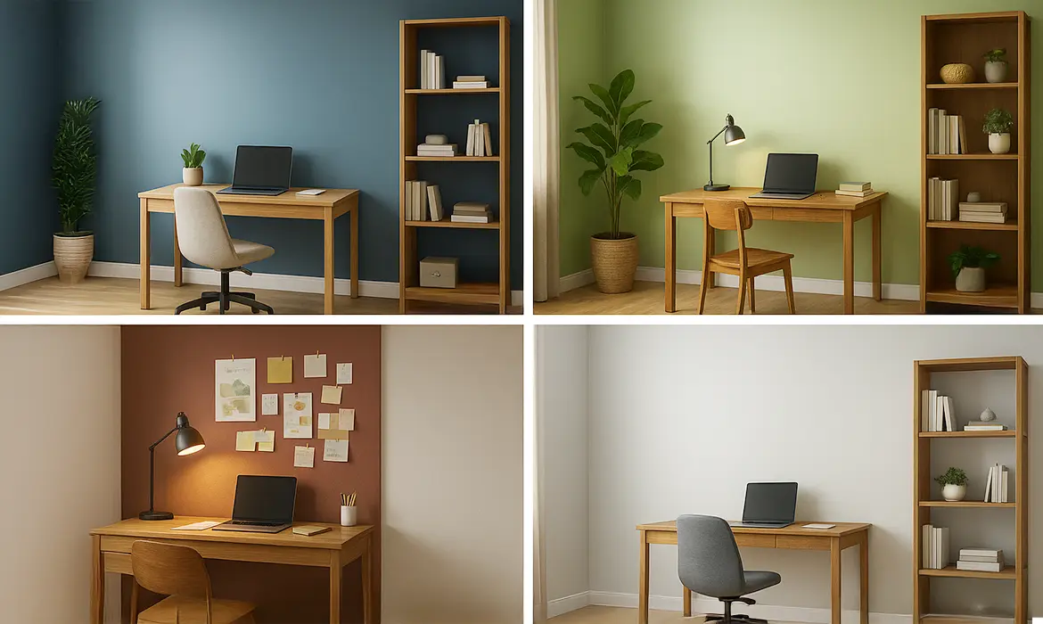
- Focused calm: Aegeon Blue (2396T) as an accent with soft neutrals.
- Balanced nature: Summer Green (2562P) on walls or as a broad accent.
- Warm creative lift: Red Earth (2146D) used sparingly, paired with light neutrals.
- Clear, tidy base: Frozen Dew (2367P) or Brown Tint (2890P) for clean backdrops.
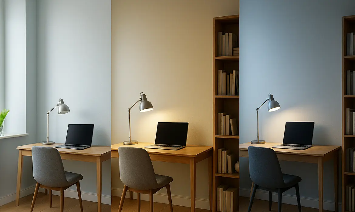
2) Read the light before you pick a shade
The same paint shifts in different light. Indian homes often have strong daytime sun and warm LEDs at night. A colour you love at noon can feel dull after sunset.
What to check?
- Direction of natural light:
- North or South facing rooms with less sunlight tend to feel cooler, so warmer neutrals and soft greens bring balance.
- In contrast, the light in East and West facing rooms can be intense, making cooler blues and gentle greens a calming choice.
- Artificial light:
- Warm LEDs make colours look yellower.
- Cool LEDs can make neutrals look stark.
- Surface reflection:
- Glossy floors, white wardrobes, or glass can bounce colour and change how walls read.
3) Map existing furniture and undertones
Walls sit next to wood, fabrics, and metals. Their undertones either harmonise or fight. Harmony reduces mental clutter.
How to get the paint right?
- Wood:
- Warm teak and walnut goes well with Summer Green (2562P), Brown Tint (2890P), and soft creams.
- Ash or pale oak pair well with Aegeon Blue (2396T) and Frozen Dew (2367P).
- Metals:
- Black and matt brass welcome earthy accents like Red Earth (2146D) in small doses.
- Chrome and white read cleaner with quiet blues and greens.
- Fabrics:
- If your chair is already colourful, keep walls calm so the room does not feel noisy.
4) Choose your base colour family with intent
The base sets 60–70% of what your eye sees. Pick the family for how you need to feel during work hours, then adjust the depth.
Proven families and when to use them:
- Blues for focus:
- What they do: Lower visual noise and steady attention.
- Use cases: Accounting, coding, research, writing.
- Indicus pick: Aegeon Blue (2396T) as an accent or softened on two walls with neutrals elsewhere.
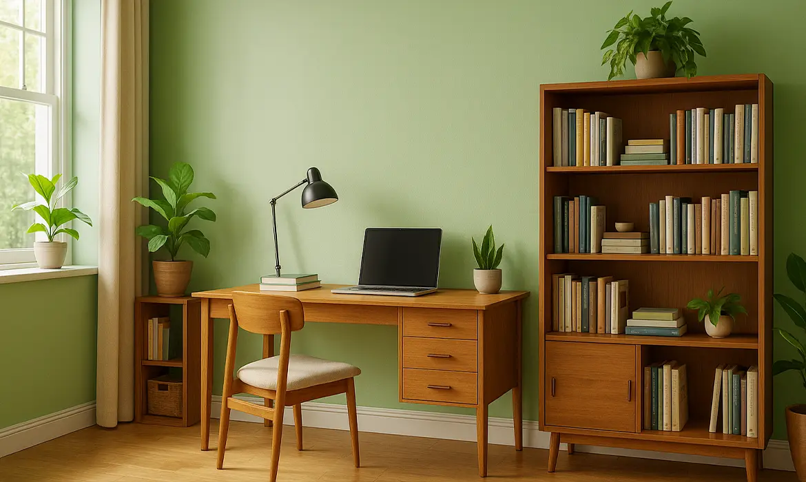
- Greens for balance:
- What they do: Reduce eye strain and feel restorative, like a courtyard.
- Use cases: Long reading, design, teaching.
- Indicus pick: Summer Green (2562P) for main walls.
- Neutrals for versatility:
- What they do: Offer a clean, professional backdrop that adapts to changing décor.
- Use cases: Shared or compact rooms, rental homes.
- Indicus picks: Frozen Dew (2367P) for a fresh, airy look. Brown Tint (2890P) for a warmer, grounded feel.
- Earthy warms for creative lift:
- What they do: Add gentle energy and depth when used in moderation.
- Use cases: Brainstorm zones, backdrop niches.
- Indicus pick: Red Earth (2146D) as a limited accent, not the main field.
5) Build a simple scheme: base, accent, ceiling, trim
A clear structure prevents “colour creep” and keeps the room coherent on camera and in real life.
Use this easy structure:
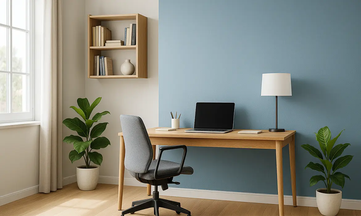
- Base walls (60–70%): One calm colour that suits your light.
- Accent (10–20%): A deeper or contrasting wall behind the desk or shelves.
- Ceiling (10%): Usually lighter than walls to lift height.
- Trim and doors (the rest): A clean, repeatable neutral.
Ready-to-apply pairings:
- Calm focus: Frozen Dew (2367P) walls + Aegeon Blue (2396T) behind desk + white ceiling.
- Nature balance: Summer Green (2562P) walls + Brown Tint (2890P) trim + off-white ceiling.
- Warm creative corner: Brown Tint (2890P) walls + a Red Earth (2146D) niche or pinboard zone.
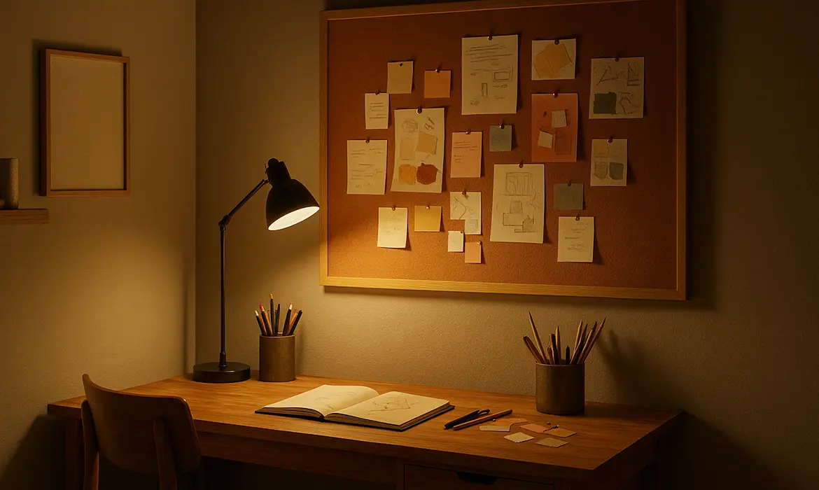
6) Plan for the camera
Your wall becomes your brand on video calls. Harsh whites or glossy finishes cause glare and washing out.
What works consistently:
- Finishes: Prefer matte or eggshell to cut screen glare.
- Tones: Mid-light, muted colours look professional.
- Background styling: Keep shelves minimal so colour remains the hero.
Camera-friendly combos:
- Frozen Dew (2367P) + tidy wood shelving.
- Summer Green (2562P) + white trim for crisp edges.
- Aegeon Blue (2396T) accent behind the desk, with soft neutral side walls.
7) Choose the right finish for function
Finish changes both appearance and usability. The wrong sheen can tire your eyes or make cleaning difficult.
- Matt: Best for work zones to reduce glare and visual fatigue.
- Sheen: Best for living areas and bedrooms, offering a subtle shine that enhances color depth while being a bit easy to clean.
Health and upkeep: Low-VOC, low-odour paints keep indoor air comfortable during long workdays. Washable ranges like Indicus Admyra help walls stay fresh with routine cleaning.
8) Sample smart to avoid surprises
Colours shift with time of day and light temperature. Sampling protects you from costly repaints.
Here’s a quick, reliable method:
- Get sample paints of your final two or three options.
- Paint A4 or A3 cards with two coats, label them, and move them around the room.
- View at 9 am, 2 pm, and 8 pm with your actual lights on.
- Keep one card near your desk, another near the window, and one behind the camera view.
- Decide after 24–48 hours, not immediately.
What you are looking for:
- Does the colour stay calm under evening LEDs?
- Does it clash with your desk or floor?
- Does it look clean on camera without filters?
9) Prepare the surface so the colour reads true
Poor surface preparation changes colour and reduces durability. You do not need a full painting tutorial, just these essentials for accurate results.
- Clean: Wipe oils and dust. Degloss shiny patches lightly so paint bonds evenly.
- Patch: Fill cracks and sand smooth so light does not create shadows.
- Prime where needed: Over dark colours, stains, fresh plaster, or patched areas. Primer evens absorption so the final colour matches the card.
- Coats: Plan for two coats minimum for uniformity. Allow proper dry time between coats as per the can.
- Edges: Use painter’s tape for crisp trim lines. Remove tape while paint is slightly tacky for the cleanest edge.
10) Common mistakes to avoid
Skipping some of these crucial yet often overlooked steps leads to repainting which incurs a toll on the overall budget.- Picking from a phone screen instead of real samples.
- Choosing a bright accent first, then forcing the rest to fit. Always select the base first.
- Ignoring evening lighting, which is when many of us work.
- Using high-gloss on large walls, which increases glare and eye strain.
- Painting every wall dark in a small, low-light room.
11) Your colour-to-paint checklist
- Define the room’s main outcome.
- Note light direction and your evening bulb type.
- List key furniture finishes and undertones.
- Pick a base family that fits your goal.
- Choose a simple scheme: base, accent, ceiling, trim.
- Select finishes for function and comfort.
- Sample on movable cards and review across the day.
- Prepare, prime where needed, and apply two coats.
- Style lightly so the colour can breathe.
Final touches from Indicus Paints
A good home office colour does more than look nice. It focuses your attention, calms your mind, and presents you well on camera. Use the steps above, test your shortlists, and trust what works in your light with your furniture. If you would like a second opinion, our team can help you refine choices and pick the right finish so you feel confident when you open the first can.
Happy painting. Your best workday can start on your walls.