
Muted Valentine-Inspired Tones for Modern Indian Interiors
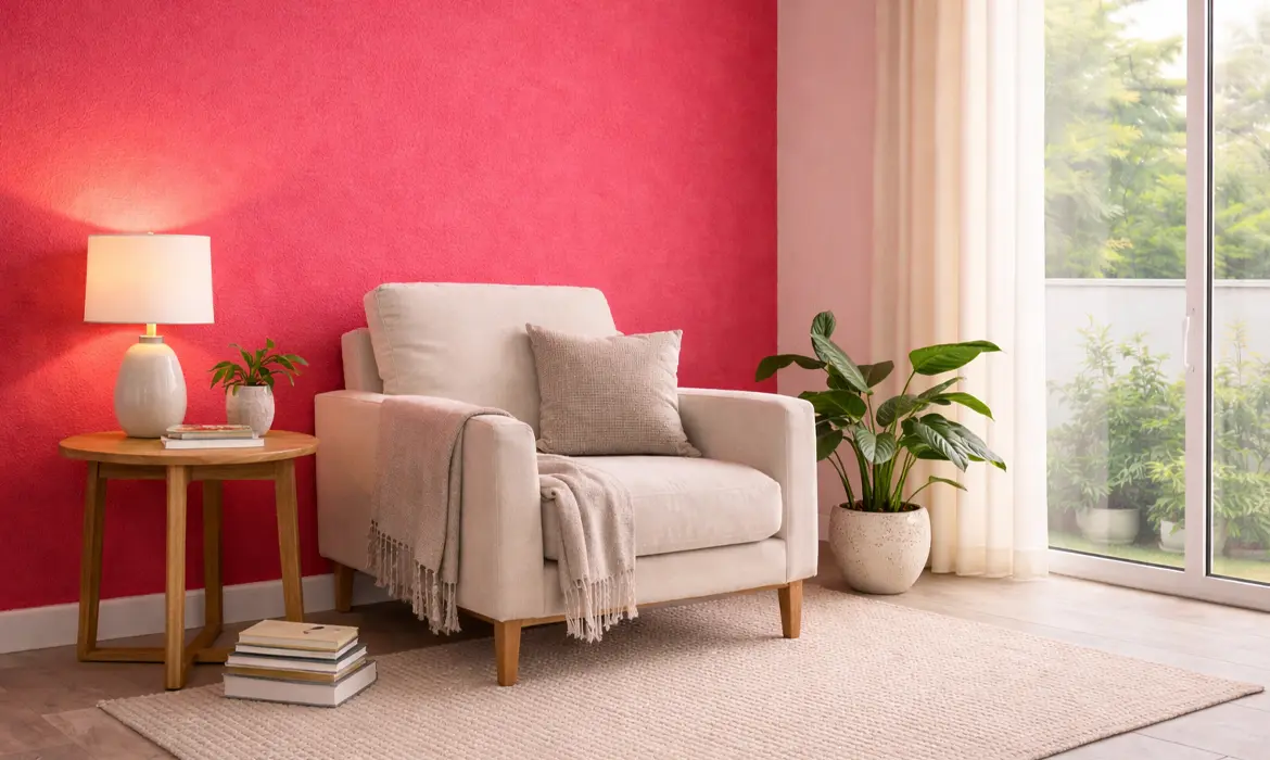
Valentine’s Day has long been associated with bold reds and dramatic pinks. While these shades are expressive, modern Indian interiors are increasingly leaning towards palettes that feel more refined, versatile, and liveable beyond a single season. This shift has brought muted Valentine-inspired tones into focus colours that evoke warmth, romance, and comfort without overpowering a space.
For contemporary Indian homes, where design balances aesthetics with climate, light, and everyday living, muted hues offer a softer, more sophisticated way to celebrate romance. These shades blend seamlessly into modern interiors, creating spaces that feel calm, inviting, and effortlessly elegant all year round.
Key Colour Palette: Soft Romance with Depth
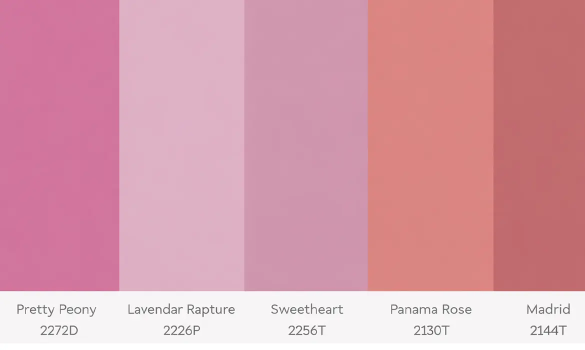
Muted Valentine tones are about subtlety and nuance. Instead of loud statements, they rely on understated warmth and natural elegance. Some of the most popular shades redefining romantic interiors include:
- Peony (2272D) – A toned-down pink with a hint of grey, offering warmth without being overly sweet.
- Lavender Rapture (2226P) – A gentle neutral that carries a soft romantic undertone, ideal for modern settings.
- Sweetheart (2256T) – Where pink meets grey, this shade feels contemporary, calming, and versatile.
- Panama Rose (2130T) – Earthy yet romantic, perfect for Indian homes that favour warmth.
- Madrid (2144T) – A refined blend of brown and pink, adding depth and maturity to interiors.
Where to Use Them: Creating Intimate, Lived-In Spaces
Muted romantic tones are remarkably adaptable and can be introduced across various areas of the home depending on the desired mood.
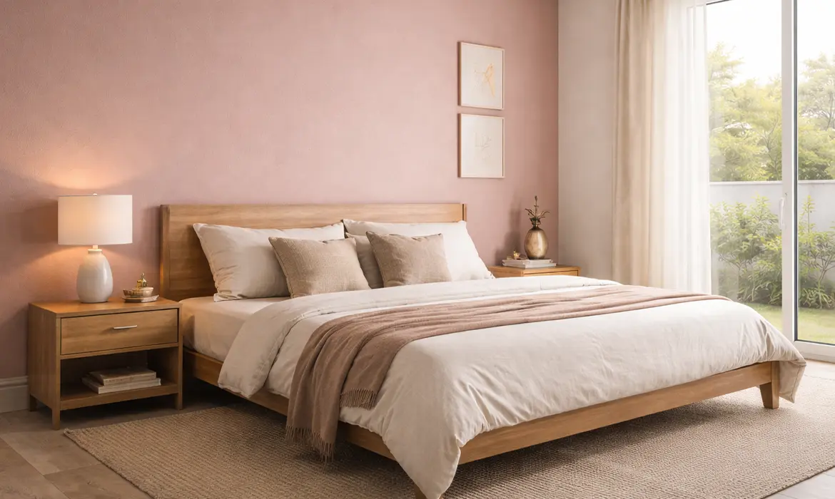
In bedrooms, these shades create a sense of calm and intimacy. Soft blush or dusty rose walls shades help establish a relaxing environment, ideal for winding down at the end of the day.
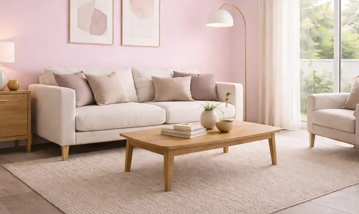
For living rooms, muted Valentine tones add warmth without overwhelming social spaces. Mauve greys or blush beiges work particularly well in homes with open layouts, maintaining a cohesive flow while adding character.
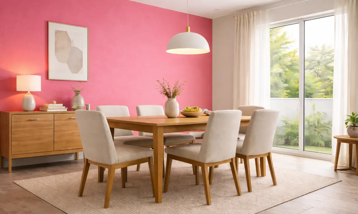
In dining spaces, soft terracotta pinks or cocoa shades create a welcoming atmosphere that feels both elegant and grounded, perfect for shared meals and conversations.
Smaller areas like reading nooks, window seats, or cosy corners benefit greatly from these hues. Used as accent walls, they bring depth and personality without dominating the space.
Pairing Suggestions: Enhancing the Palette Naturally
Muted Valentine tones truly shine when paired thoughtfully with complementary elements. Balance is key, these shades work best when grounded by neutral or natural textures.
Effective pairings include:
- Off-whites and warm ivories to keep the space light and airy
- Soft, warm greys that enhance the modern appeal
- Natural wood finishes that add warmth and authenticity
- Brass or muted gold accents for a subtle hint of luxury
Instead of competing with the wall colour, these elements support it, allowing the space to feel cohesive and visually soothing. The result is an interior that feels styled yet comfortable, modern yet timeless.
Lighting Impact: Letting the Colours Breathe
Lighting plays a crucial role in how muted tones are perceived. In Indian homes, where natural light varies throughout the day, these shades respond beautifully to changing conditions.
Natural daylight highlights the softness of blush and dusty rose tones, preventing them from appearing heavy. In spaces with ample sunlight, muted colours feel fresh and luminous rather than dull.
Warm artificial lighting such as soft LED or warm-white fixtures enhances the romantic undertones of these shades in the evenings. It adds depth and warmth, making rooms feel cosy and inviting without altering the colour’s integrity.
Avoid harsh white lighting, as it can flatten muted tones and strip them of their warmth. Thoughtful lighting choices ensure these colours maintain their elegance throughout the day.
Why It Works in India: Practical, Elegant, and Climate-Friendly
Muted Valentine-inspired tones are particularly well-suited to Indian homes for several reasons. Beyond aesthetics, they align with the realities of climate, lifestyle, and long-term design needs.
- Calming Effect: These tones create soothing interiors, ideal for homes that often serve as a retreat from busy urban life.
- Heat-Friendly Shades: Softer, muted colours absorb less visual heat compared to darker or overly saturated hues, making spaces feel cooler and more comfortable.
- Year-Round Elegance: Unlike festive reds or bright pinks, muted tones don’t feel seasonal. They transition effortlessly from Valentine’s Day to everyday living.
- Versatility: These shades adapt easily to evolving décor styles, whether modern, minimal, or softly traditional.
For homeowners seeking interiors that feel current yet enduring, muted romantic palettes strike the perfect balance.
A Thoughtful Take on Modern Romance
Muted Valentine-inspired tones redefine how romance is expressed in contemporary Indian interiors. They move away from fleeting trends and instead focus on creating spaces that feel personal, balanced, and welcoming.
With thoughtfully curated shades and finishes designed for Indian homes, Indicus Paints makes it easier to explore these softer, modern palettes with confidence. Each colour is crafted to complement Indian light, climate, and lifestyles, ensuring walls that feel warm, expressive, and lasting. Because in modern Indian homes, romance isn’t loud, it’s subtle, enduring, and beautifully lived in.