
Golden Glow: Yellow and Orange Paint Shades for Traditional Interiors and Exteriors
Listen to the audio version of the blog here:
Bringing Warmth Home Through Colour
Long before paint charts existed, Indian homes already understood gold and ochre. Turmeric on a courtyard wall, saffron woven into festival cloth, marigold strung across a doorway, warmth has always been the colour a home reaches for when it wants to welcome someone in. That instinct has not faded with traditional design, it has simply moved from festival to façade. Yellow and orange paint shades are where it shows most clearly today.
Yellow carries optimism and clarity. Orange carries energy and confidence. Together they do not compete, they build on each other, turning a home from merely well-designed into genuinely welcoming.
This curated palette, Gilded lily, Gold dust, Mandarin, King’s ransom 18 and Crocus, moves from soft, refined gold to deep, statement amber, giving traditional homes a colour story built on light rather than shade.
Gilded lily (2056C): Refined Warmth in Soft Gold
Gilded lily (2056C) is a pale, elegant yellow, closer to gold leaf than to sunshine. It brings quiet sophistication rather than energy, suiting formal living rooms, entryways and spaces that need warmth without noise. Its softness pairs naturally with white trims, cane furniture and brass fittings, keeping a room bright without ever tipping into loud.
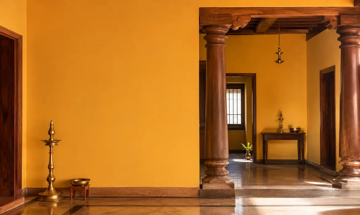
Gold dust (2699D): Honeyed and Earthbound
Gold dust (2699D) carries a deeper, mustard-leaning warmth, drawn from honey and turmeric rather than sunlight. It suits kitchens, dining rooms and any space built around gathering, sitting comfortably against wood, terracotta and natural textures. Where Gilded lily stays formal, Gold dust turns a room genuinely cosy.
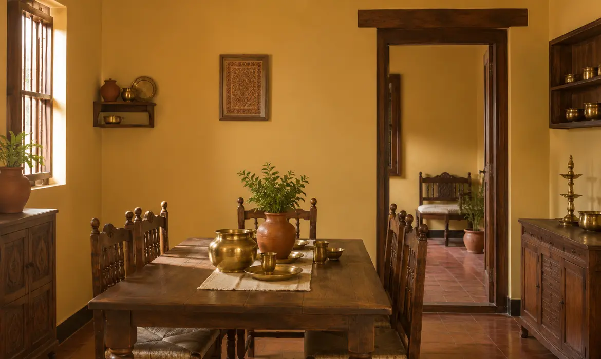
Mandarin (2069D): Citrus Energy for Everyday Spaces
Mandarin (2069D) is a vivid, playful orange, closer to citrus peel than to spice. It suits children’s rooms, kitchens and casual gathering spaces, bringing genuine energy without overwhelming a room built for daily use. On an accent wall or a front door, Mandarin gives a home a burst of personality that is hard to miss.
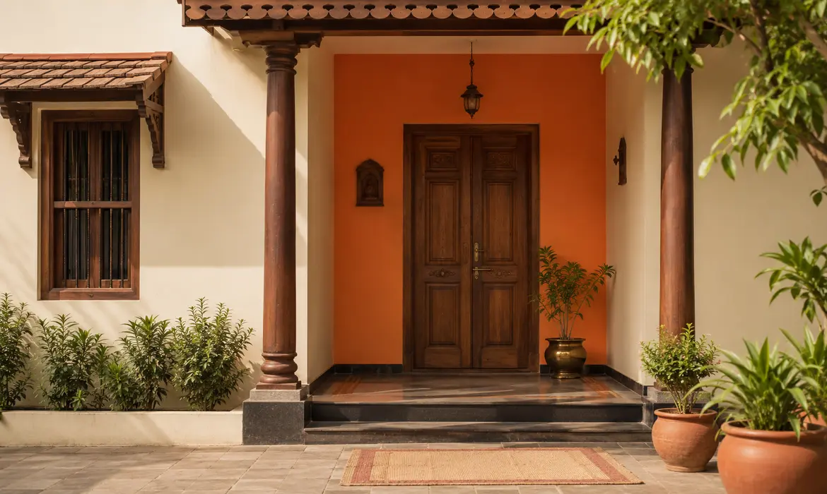
King’s ransom 18 (2028C): Deep Amber for Statement Spaces
King’s ransom 18 (2028C) is the richest shade in the collection, a deep, burnished orange closer to amber than to citrus. It carries real weight, suiting statement walls, home libraries and exteriors that want to be remembered rather than simply noticed. Paired with dark wood and brass, it builds a room that feels considered rather than decorated.
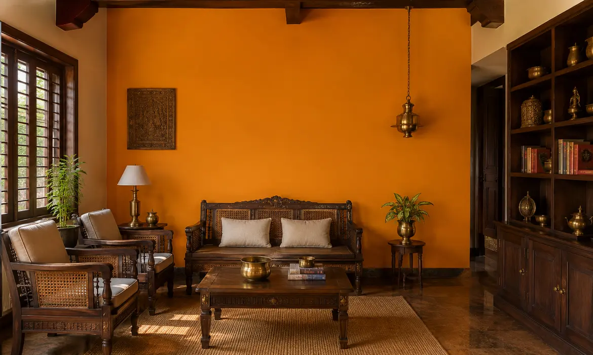
Crocus (2040T): Saffron-Bright and Festive
Crocus (2040T) takes its character from the flower that gives saffron its colour, a bright, spice-warm orange with genuine festivity built in. It suits courtyards, balconies and façades that want to carry a home’s energy outward, performing especially well in spaces designed for gathering, celebration and daylight.
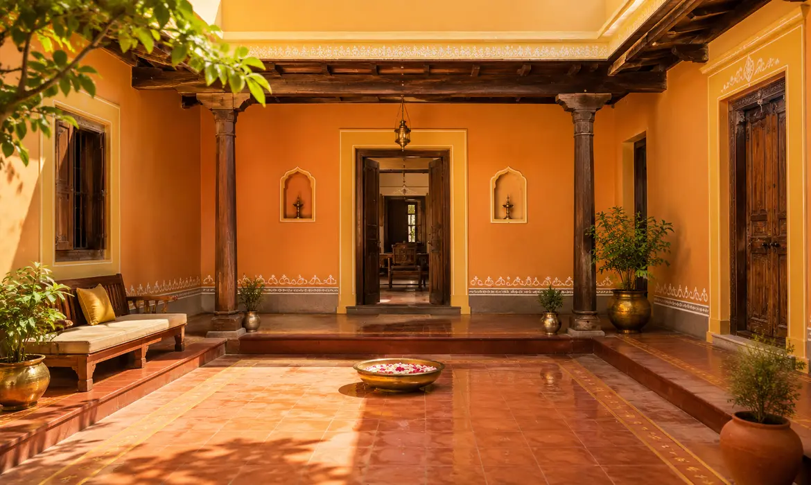
Creating Harmony with Yellow and Orange Combinations
Each shade holds its own on a single wall. Combined, they build a yellow and orange colour palette with real range:
- Gilded lily and Gold dust for layered, understated warmth
- Mandarin and Crocus for genuine festive energy
- King’s ransom 18 as a statement wall against Gilded lily’s restraint
- Gold dust as a base colour with Mandarin accents for depth without noise
Used this way, the palette moves from formal to festive without ever losing its warmth.
Best Applications Across Indian Homes
Indoors, yellow and orange shades for traditional interiors and exteriors build rooms that feel genuinely lived in, living rooms that welcome rather than impress, kitchens and dining spaces built for gathering, children’s rooms that carry real personality and libraries or studies that hold quiet richness rather than brightness. Outdoors, the same warmth strengthens a home’s presence, whether on a main façade in Gold dust or Gilded lily, a statement wall in King’s ransom 18, a courtyard or balcony in Crocus or an entrance highlighted in Mandarin.
Connecting spaces carry this palette particularly well. Staircases, corridors, courtyards and entrance foyers all hold onto warmth longer than any other family of colours, keeping a home feeling welcoming from the front gate to the last room.
A Colour Story Built on Warmth
The pull towards yellow and orange paint shades in Indian homes is not a passing design moment, it is a return to what these colours have always meant here: welcome, abundance and light. Gilded lily, Gold dust, Mandarin, King’s ransom 18 and Crocus carry that meaning onto every wall they touch, moving from refined gold to festive amber without ever losing their warmth.
Explore this palette through Colourcast Visualiser and see how each shade holds up under the light your home actually receives. With Indicus Paints, warmth becomes the ground a home stands on.
A Colour Story Inspired by Nature
The pull towards nature-inspired palettes is not a trend passing through Indian homes, it is a return to something the subcontinent has always understood: that a home built in conversation with its surroundings endures longer than one built against them. Guacamole, Grecian olive, Emerald forest, Aqua electra and Danube sky carry that understanding onto every wall they touch, balancing earthy richness with open, breathing calm.
Explore this palette through Indicus Paints’ Colourcast Visualizer and see how each shade holds up under the light your home actually receives. With Indicus Paints, nature’s colours become the ground a home stands on.