
Find the Perfect Wall Colour to Match Your Tamil-Inspired Interiors
South Indian homes, especially those shaped by Tamil tradition, are more than just structures. They are sensory experiences defined by breezy courtyards, carved columns, vibrant murals, and natural materials. At the heart of these spaces is colour: not just as decoration, but as memory, identity, and function.
Let’s dive deep in translating this rich aesthetic into modern homes using Indicus Paints, giving you both inspiration and clear, practical steps to choose the right shades for each space.
1. Understanding the Colour Logic Behind Tamil Architecture
Before choosing your wall colours, it’s important to understand the design philosophy of traditional Tamil architecture. At its core, Tamil architecture prioritises function over form, with an emphasis on clean lines, easy maintenance, and minimalistic layouts.Wall colours follow this same principle. The palette is typically restrained, with beiges, whites, greens, and earthy tones chosen to enhance the simplicity and practicality of the space. Accent colours are used thoughtfully, often inspired by traditional art forms like Athangudi tiles, Tanjore paintings, and temple murals.Here’s how colour choices were traditionally guided:- Heat Reflection: Lighter shades like Divinity Cream and Mission Beige help keep interiors cool in hot climates.
- Symbolism & Ritual: Yellows and reds, seen in areas like entrances or pooja rooms, represent auspiciousness and spiritual energy.
- Material Harmony: Colours were selected to complement native materials like wood, stone, lime plaster, and Athangudi tiles.
2. Finding the right Tamil colour
Tamils have always used colours to bring life and feeling into their homes. Over the years, many unique shades have become part of everyday culture. These colours are often known by local names like Kili Pachai (parrot green), Ramar Neelam (Rama’s blue), and Kathiripoo Colour (lavender), each carrying a bit of tradition and familiarity.
One of the first challenges in recreating these heritage-inspired interiors is finding the right modern paint equivalents. To help you get started, we’ve mapped a few iconic Tamil architectural colours to their closest matches in the Indicus colour palette.
| Traditional Inspiration | Indicus Shade | Best Used In |
|---|---|---|
| Kaavi (Brick Red) | Adventure (2189C) | Accent walls, columns, verandas |
| Manjal (Turmeric Yellow) | Mustard (2698D) | Kitchen walls, dining nooks, entrances |
| Ramar Niram (Ramar’s colour) | Navy Blue (2994C) | Bedrooms, window borders, reading corners |
| Kili Pachai (Parrot Green) | Radiant Green 2567C | Courtyard-facing walls, balconies |
| Sandalwood Beige | Mission Beige (2078P) | Living rooms, hallways |
| Temple Wall White | White Cliffs (2505P) | Ceilings, pooja spaces, full-room coverage |
| Coconut Husk Brown | Amber Brown (2105C) | Doors, trims, furniture |
| Rose Powder Pink | Tearose Pink (2122P) | Guest rooms, kid-friendly spaces |
| Temple Stone Grey | Grey Shadow (2946P) | Guest rooms, kid-friendly spaces |
Use a neutral shade for larger surfaces, and layer heritage colours as highlights, trims, or feature walls.
3. Room-by-Room: Where to Use What
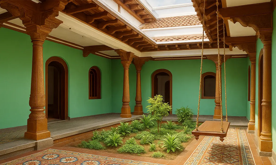
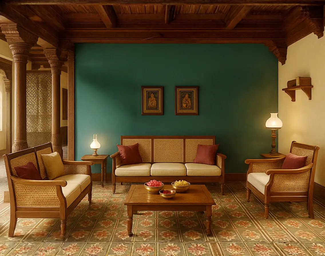
In a Tamil home, every room tells a story and every colour carries mood, memory, and meaning. You can’t just pick shades at random and expect your space to feel right. Let’s walk through your home, room by room, and explore how to use Indicus colours to reflect purpose, tradition, and beauty.Living Room
Inspiration: The Tamil living room is where hospitality takes center stage. It is the space where guests are welcomed, conversations flow, and traditions are shared. The design draws from the warmth of Chettinad courtyards, the earthy tones of terracotta flooring, and the grounded elegance seen in ancestral homes and temple halls.- Mood: Warm, vibrant, and welcoming
- Colours:
- Adventure (2189C) on the main wall—a terracotta-inspired tone that brings earthy depth and boldness
- Mission Beige (2078P) on remaining walls—a calming, neutral backdrop that lets furniture and accents shine
- Pair With: Wooden or cane furniture, brass lamps, Athangudi tile flooring, warm white or gold-toned LED lights
- Cultural Cue: Terracotta tones are found in temple architecture and Chettinad roof tiles, evoking rootedness and warmth
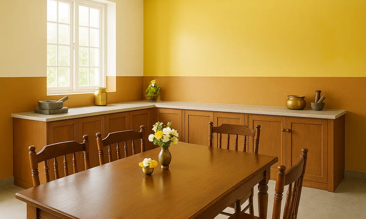
Dining Room
Inspiration: Designed for gathering and conversation, the dining space in a Tamil home balances tradition with ease. Colour choices here are influenced by the vibrancy of Tamil cuisine, using warm yellows, muted browns, and earthy neutrals. Paired with bronze serveware and clean-lined furniture, these tones create a setting that feels rooted in culture and modern in style.- Mood: Energetic and bonding
- Colours:
- Mustard walls to stimulate appetite and brighten the space
- Amber Brown (2105C) for trims, door frames, or lower walls—adding depth and contrast
- Pair With: Bronze serveware, dark wood dining sets, yellow-hued pendant lights
- Cultural Cue: Mustard yellow reflects turmeric’s sacred and celebratory role in Tamil rituals and cooking
Bedroom
Inspiration: Tamil bedrooms often embrace a sense of coolness and calm, drawing from shaded verandas, soft indigo fabrics, and the quiet stillness of early mornings. These spaces are designed for rest, reflection, and understated elegance. Choose colours that support relaxation while still honouring the cultural soul of the home.- Mood: Calm, grounding, restful
- Colours:
- Navy Blue (2994C) or Grey Shadow (2946P)—cool, soothing tones for rest.
- Accents in Divinity Cream (2702P) or Mission Beige to balance depth with softness.
- Pair With: Off-white curtains, contemporary artwork for a modern twist, and minimal lighting
- Cultural Cue: In rooms with limited natural light, choose Grey Shadow over deep blues to avoid a heavy look
Kitchen
Inspiration: Tamil kitchens are practical, bright, and built for efficiency. Traditionally compact and well-ventilated, they favour surfaces that are easy to clean and colours that reflect light and freshness. Lime-washed walls and earthy tones offer a timeless reference point, making way for modern updates that still feel grounded and familiar.- Mood: Clean, bright, and functional
- Colours:
- Divinity Cream (2702P) as a base—crisp, light-reflective, and airy
- Amber Brown (2105C) for cabinetry or backsplash adding a sense of groundedness.
- Pair With: Brass or steel utensils, patterned tile backsplashes, and potted herbs
- Cultural Cue: Cream tones are inspired by lime-washed walls seen in agraharam homes and temple kitchens.
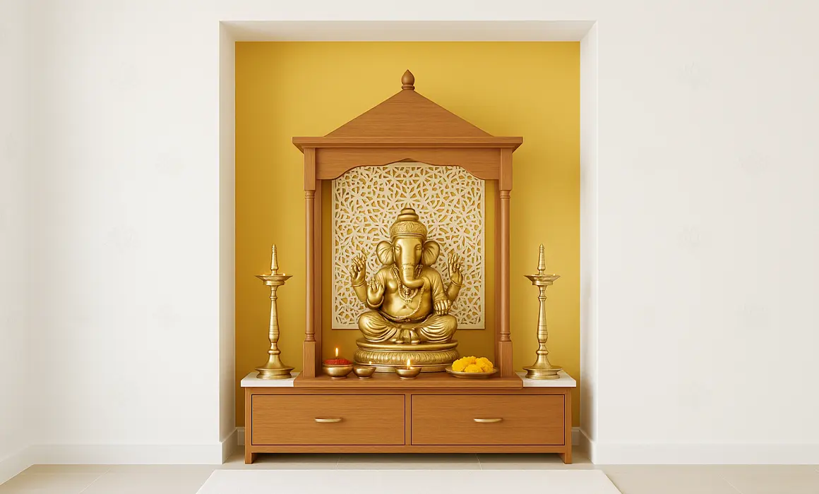
Pooja Niche or Entryway
Inspiration: In modern Tamil homes, entryways and compact pooja niches are subtle yet meaningful spaces. Even in smaller layouts, thoughtful use of colour can create a sense of calm and focus. Inspired by temple motifs, kolam outlines, and festive powders, these shades bring a touch of tradition to corners that often serve as both functional and reflective zones.- Mood: Sacred, serene, and uplifting
- Colours:
- Golden Mustard for a devotional base
- Tearose Pink (2122P) to bring festive softness
- Grey Shadow (2946P) for trims or kolam-style borders
- Pair With: Bronze idols, fresh jasmine, wooden shelves, and soft diyas
- Cultural Cue: Tearose Pink evokes temple rose powders, while grey tones mimic vibhuti (sacred ash) borders seen in shrines

4. Choosing the Right Paint: More Than Just Colour
here is aesthetics and there is quality. Sure there are a lot of cheap after market paints that would help you achieve a decent result, but quality in terms of consistent colours, coverage, durability, low emissions etc. would help you save a lot more in the long run.
Key factors for considering a good quality paint.
- Low-VOC, high-quality paints: Safe for kids, elders, and pets.
- Durable formulations: Withstands humidity and heat in tropical climates.
- Expansive colour palette.
5. Final Planning Checklist Before You Paint
- Measure your light exposure: Darker colours like Navy Blue work best in well-lit spaces
- Choose a neutral base (like Mission Beige or Divinity Cream) to avoid visual clutter
- Match your furniture material with the colour tone: wood goes well with warm shades
- Use tester pots before full application
- Don’t forget trims and borders, they add detail and definition
At Indicus Paints, we offer a wide range of products and colour collections to help you bring your dream home to life, no matter what style you love. Whether you’re drawn to rich, traditional Tamil-inspired colours or prefer clean, modern Scandinavian looks, we have it all. All you need is a vision. We’ll take care of the rest with the right tools, materials, and expert support to guide you along the way.
Visit our Colours page and check out our blogs for more ideas, inspiration, and helpful tips. Let your home reflect meaning, memories, and beauty with every brushstroke.