
Eurasia (2510D): December’s Colour of Stillness and Structure
December brings a natural pause. The year slows, the light cools, and spaces begin to ask for calm rather than stimulation. Eurasia (2510D) is chosen for this month precisely because it aligns with that shift. It is a grounded, quiet, and precise colour — one that supports clarity, resets visual noise, and brings focus back to the essentials.
Where some winter shades feel heavy, Eurasia sits in the sweet spot: clean but not cold, deep but not dark, sophisticated without drawing unnecessary attention. It creates an environment that feels intentional and composed, which makes it ideal for the reflective mood of December.
Why Eurasia Works for December
The decision behind the colour is rooted in how people actually experience their homes at year-end. December is a time of consolidation — finishing work, preparing for the new year, reorganising, and seeking visual calm. Eurasia provides that environment.
Its strength lies in its neutrality with personality. The shade stabilises a space, cools visual clutter, and encourages structural balance in interiors. It also responds well to natural winter light, maintaining its clarity throughout the day without appearing flat or dull.
Where Eurasia Performs Best
1. Living Rooms: A Clean Visual Break
Eurasia sharpens the architecture of a living room. It works especially well on primary walls where you want definition but not dominance. When paired with structured furniture, off-white upholstery, and matte metal finishes, it produces a modern, confident space that feels curated.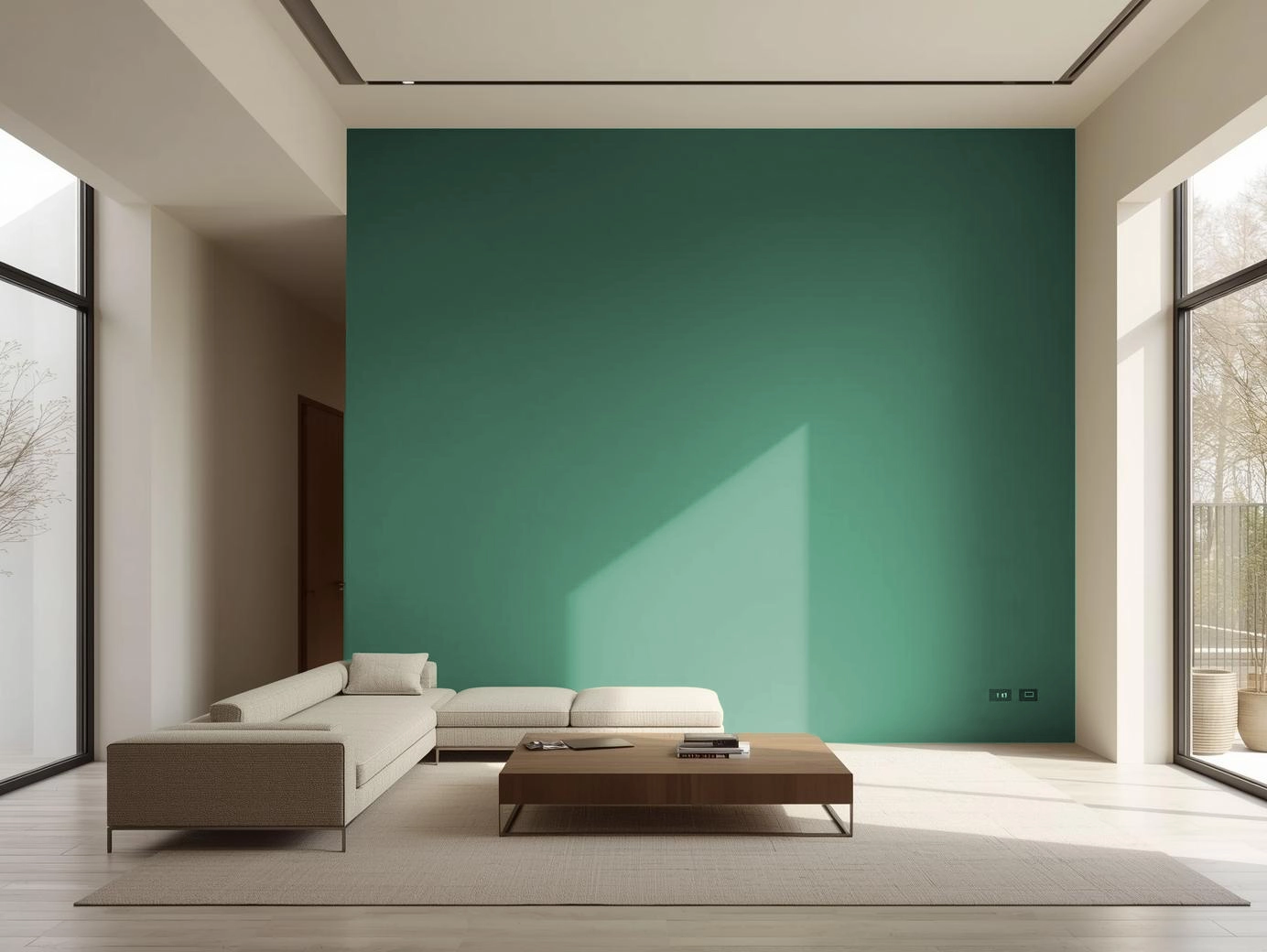
2. Dining Areas: Focused, Warm Minimalism
In dining zones, the colour acts as a stabiliser. It creates a cohesive backdrop for functional furniture and clean table settings. Pair it with light woods or cane for softness, or with charcoal accents for a more contemporary look.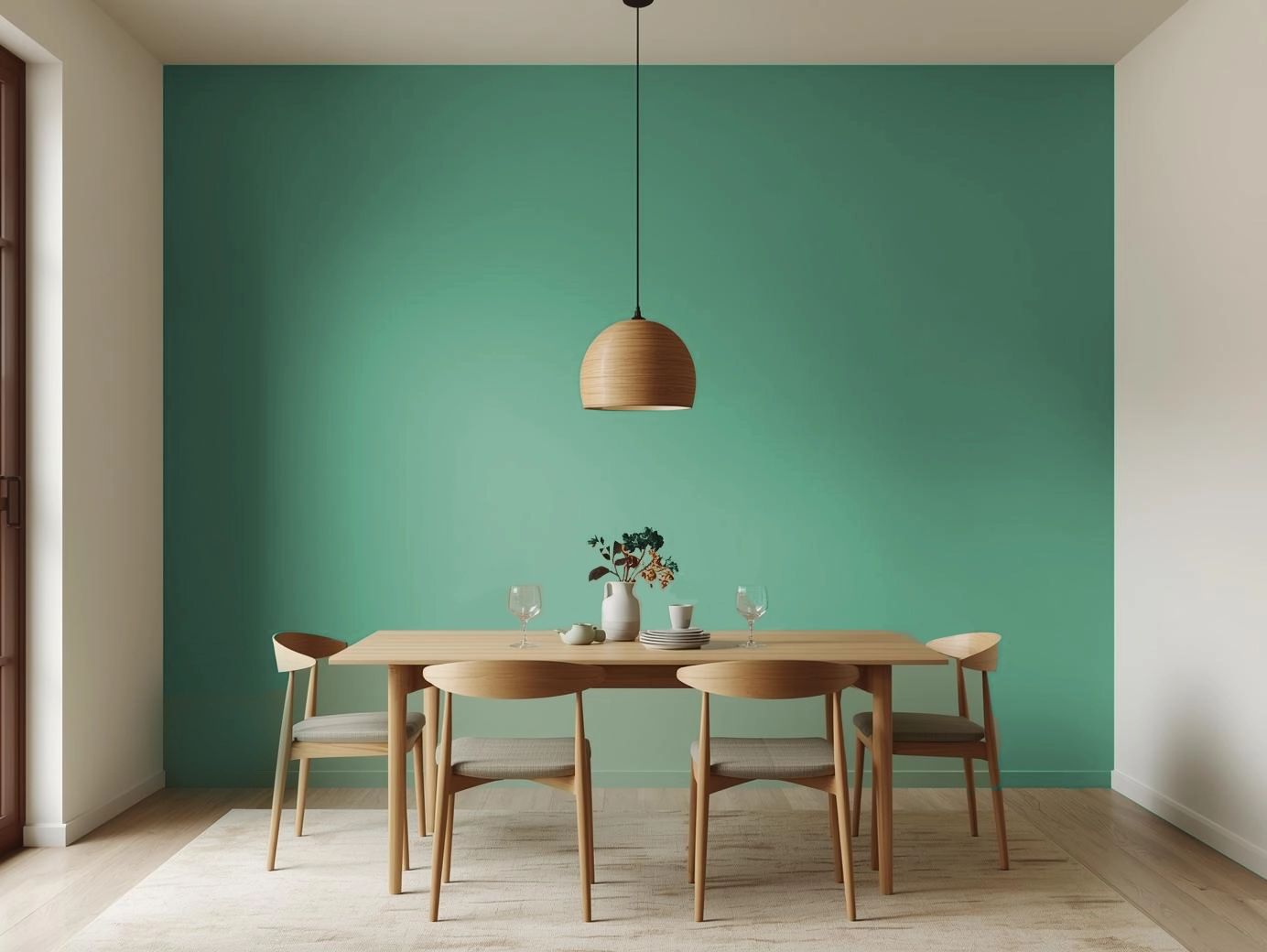
3. Kitchens: Precision and Order
Kitchens benefit from Eurasia’s disciplined undertone. On cabinets or breakfast counters, it communicates neatness and modernity. White backsplashes, brushed steel, and uncluttered counters elevate the shade further, making the space look streamlined and controlled.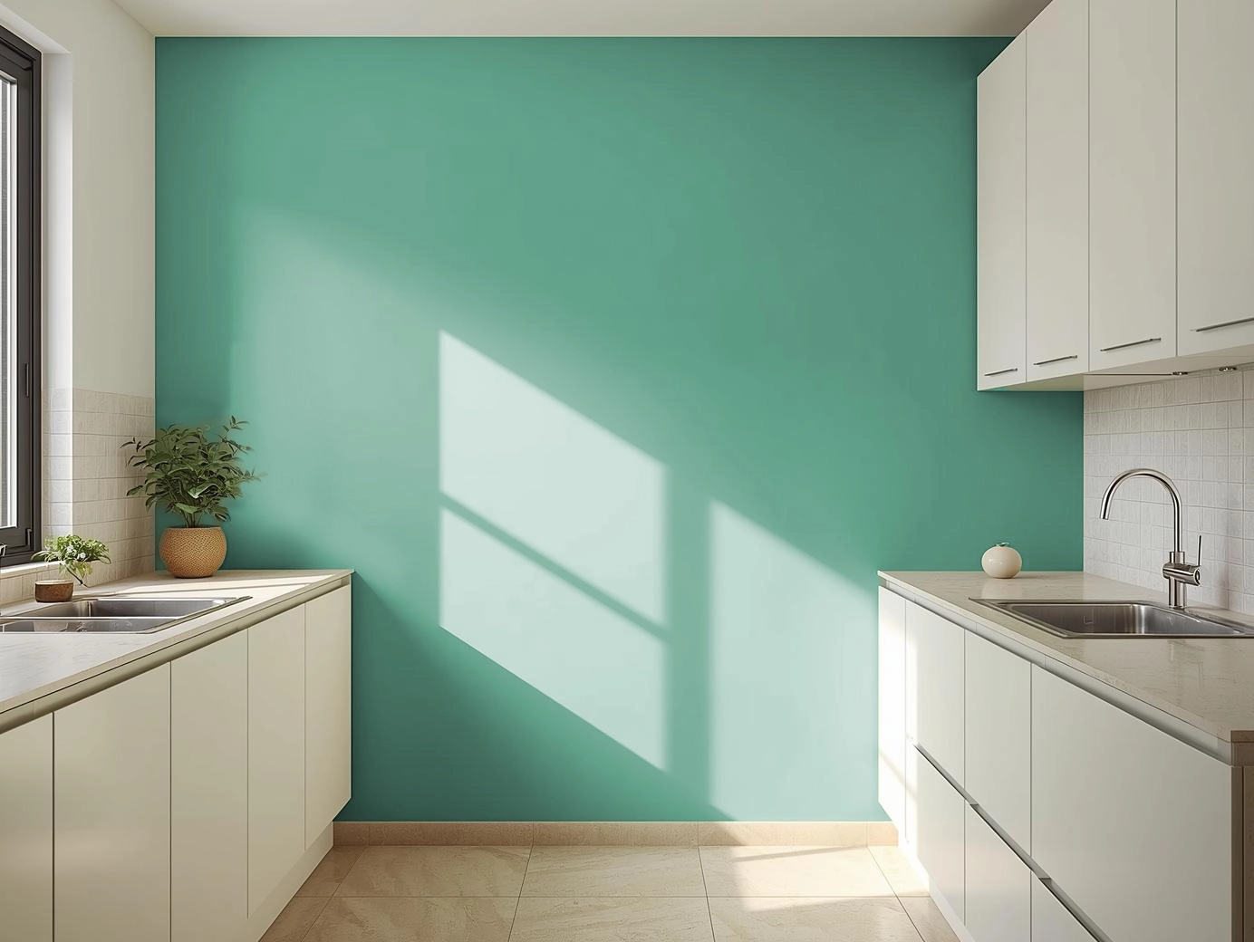
4. Bedrooms: Rest Through Restraint
In bedrooms, Eurasia removes overstimulation. It allows textiles, lighting, and layout to take the lead. Use the shade behind the headboard or throughout the room with warm white lighting to create a minimalist, restful environment that naturally supports unwinding.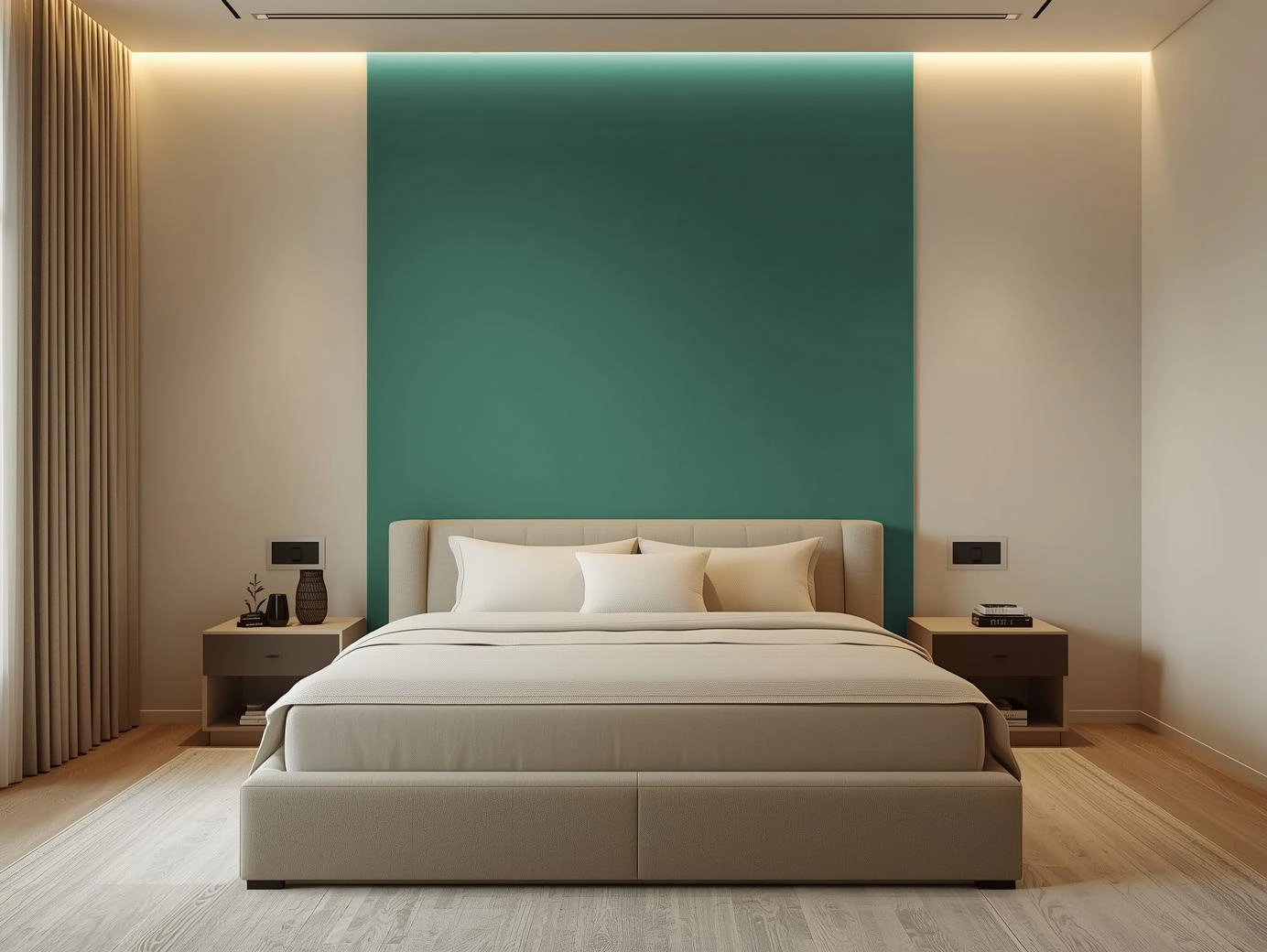
5. Semi-Outdoor Spaces: Crisp Composure
Balconies and courtyards benefit from the cool refinement of the shade. Eurasia sits well against stone, concrete, or greenery, creating a structured, quiet mood ideal for reflective mornings or evening breaks.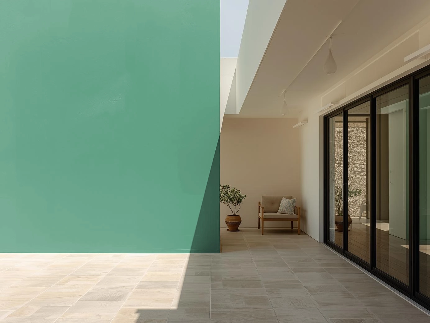
6. Exteriors: Contemporary, Clear Lines
On facades, Eurasia projects clarity and restraint. It works particularly well for modern architecture with straight lines and minimal ornamentation. Offset it with white trims, slate elements, or light natural textures for a controlled, high-end finish.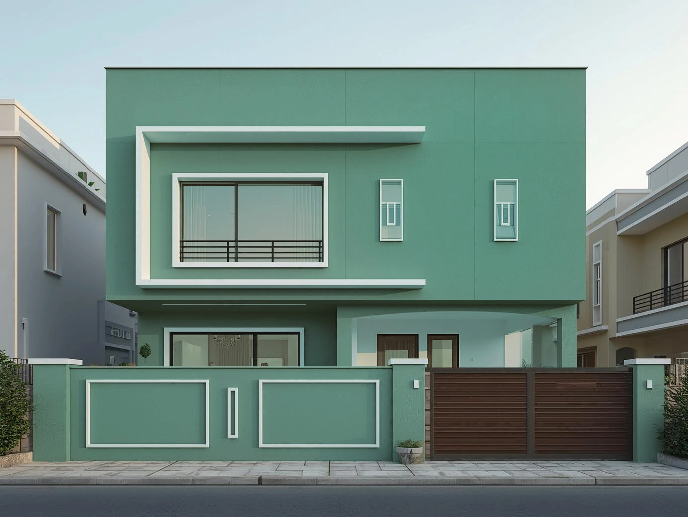
How to Style Eurasia (2510D) Intentionally
- Combine it with controlled neutrals — warm white, light taupe, soft sand, or muted greys.
- Use materials that echo clarity: ash wood, linen, stone, steel, or matte ceramics.
- Prefer clean silhouettes over ornate décor; structure complements this shade better than embellishment.
- Integrate focused lighting — warm LEDs, linear fixtures, or diffused lamps.
- Add greenery sparingly; the shade thrives when visual noise is low.
A Colour for Resetting Spaces
Eurasia (2510D) represents more than a winter palette — it represents a mindset. December is not just the end of a year; it is a recalibration phase. Homes benefit from colours that remove excess, sharpen intention, and bring emotional and visual stability.
Eurasia does exactly that.
It gives rooms the clarity they need to close the year with focus — and enter the next with balance.