
Why Warm-Toned Paint Colours Are Perfect for Your Home This Season
Listen to the audio version of the blog here:
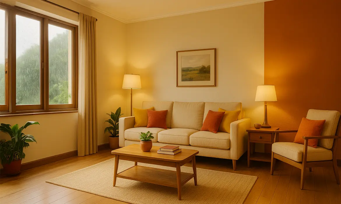
The Power of Warm Tones in Monsoon: Brightening Gloomy Days
The monsoon season brings welcome relief from summer’s relentless heat, but it also introduces overcast skies, high humidity, and a tendency towards gloominess in homes. The natural light dims, and dampness can leave interiors feeling cold and uninspiring. This is where warm-toned paints play a vital role.
Warm colours such as terracotta, mustard yellow, warm beige, and soft amber inject brightness and energy into otherwise dreary spaces. They counterbalance the subdued atmosphere by reflecting light more effectively, thereby enhancing the overall mood of the room. These colours create an uplifting ambience, making the space feel more inviting and lively.
Beyond aesthetics, warm tones can also psychologically impact the household’s mood. Shades of orange and yellow are known to stimulate positivity and activity, keeping spirits high even when the weather outside is dismal. For spaces like the living room or kitchen, where family members gather most often, this can make a significant difference.
Celebratory Vibes During Festive Seasons
From Diwali to the myriad of weddings celebrated in India during this period, the second half of the year is synonymous with celebration. These cultural occasions are traditionally associated with vibrant colours, opulence, and a sense of togetherness.
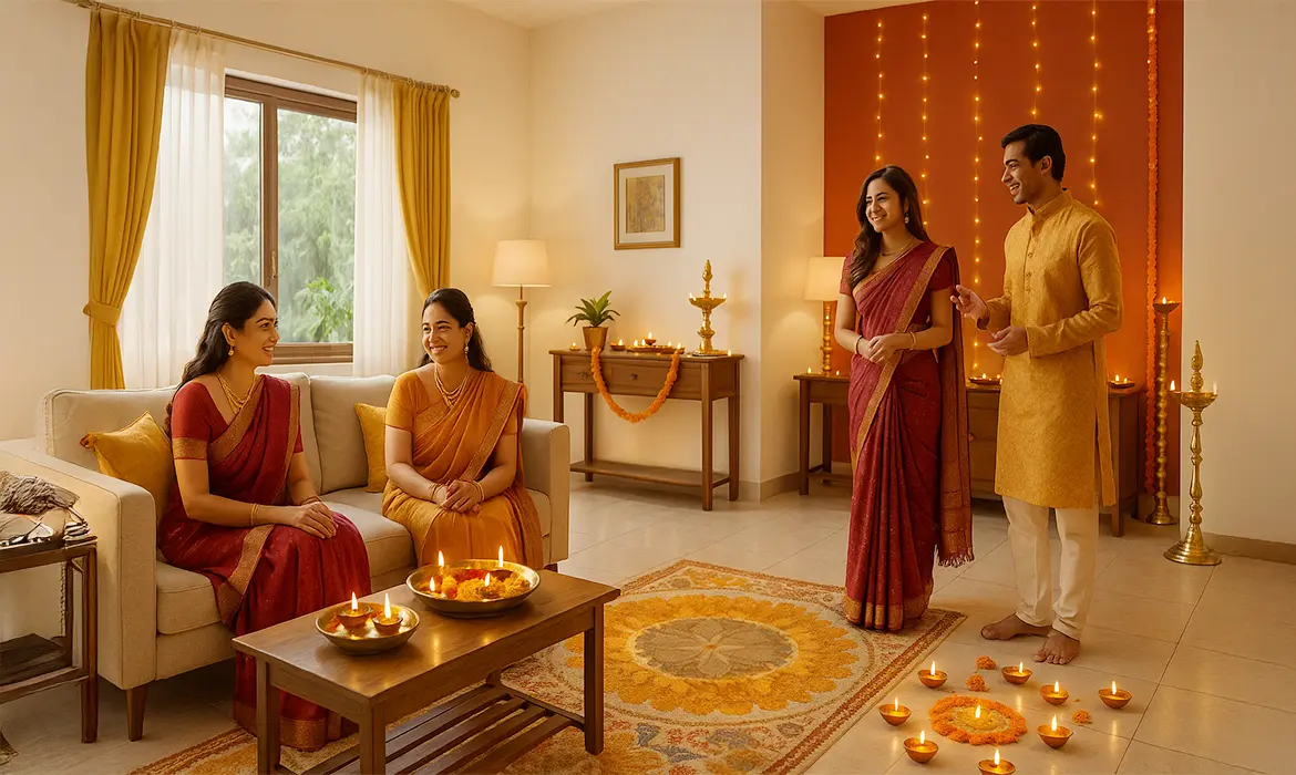
Warm paint colours perfectly align with the festive spirit. Rich reds, deep maroons, warm golds, and burnt oranges harmonise with the cultural motifs of decorations, lights, and attire, creating a cohesive and joyous environment. Such hues don’t just add colour to your walls but also echo the celebratory sentiments of the season.
For example, a living room painted in warm beige or amber can serve as a perfect backdrop for festive decor, allowing traditional lamps, rangoli patterns, and vibrant textiles to stand out. The interplay of these colours enhances the home’s overall warmth, inviting guests to linger longer and feel more connected.
Creating a Cozy Ambience in Winter Months
As the year winds down into winter, the temperature drops, and daylight hours shorten. Homes often risk feeling stark or cold, especially in modern minimalistic designs where the tendency might be towards neutral whites and greys. Introducing warm-toned paint colours becomes essential in adding the much-needed sense of comfort and homeliness during these colder months.
Warm tones such as soft amber, burnt orange, deep red, and earthy browns create a cocoon-like atmosphere, making interiors feel snug and inviting. Bedrooms, reading nooks, and living rooms particularly benefit from these shades, as they help establish a personal retreat from the chill outside.
Moreover, these colours reflect the natural tones of winter, think of the golden hue of a setting sun or the rich colour of fallen leaves, which connects your home’s interior to the changing seasons. This not only makes the home visually appealing but also supports a harmonious relationship with nature.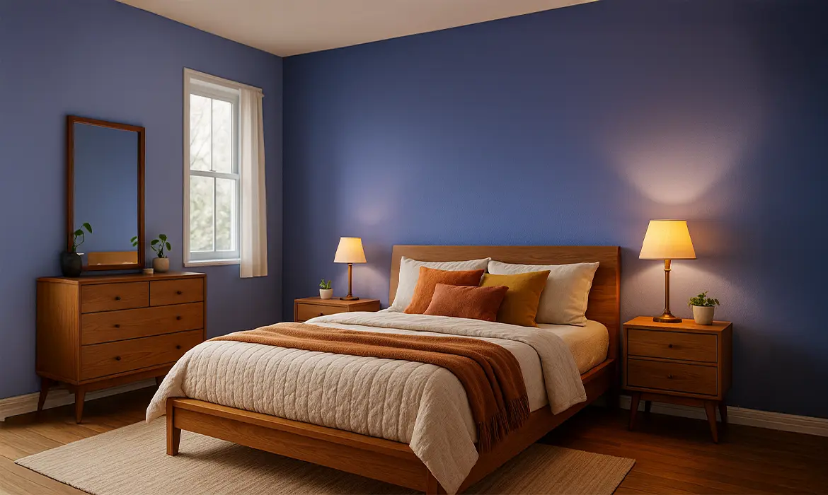
On-Trend: Earthy and Natural Palettes for Modern Design
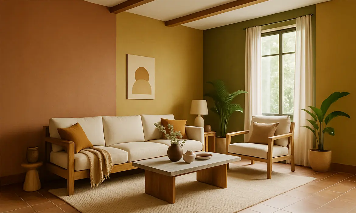
In recent years, interior design has seen a significant shift towards earthy, natural palettes that evoke simplicity, sustainability, and a grounded aesthetic. Warm tones are at the heart of this trend, offering a perfect balance between modern minimalism and traditional warmth.
Designers today favour shades like clay, terracotta, muted mustard, olive green, and warm browns as they pair effortlessly with natural materials such as wood, stone, and metal. These colours provide a timeless appeal and flexibility, allowing homeowners to mix and match furniture and décor pieces without the risk of clashing.
Furthermore, warm tones are highly versatile, complementing both traditional and contemporary design sensibilities. Whether you prefer sleek modern furnishings or handcrafted wooden pieces, integrating warm-toned paints helps unify the space, adding depth and character without overwhelming it.
Choosing a palette inspired by nature helps to create a sustainable and calming atmosphere, which is particularly valuable in an age where wellness and mindfulness have become essential aspects of home living.
Emotional Benefits: Joy, Energy, and Comfort Indoors
The psychological effects of colour cannot be overstated. Warm tones are known to evoke feelings of joy, comfort, and energy. In contrast to cool tones that can sometimes feel sterile or distant, warm colours make people feel more connected to their space and to one another.
For young adults and families aged 18 to 40, who are often juggling work-from-home schedules, remote learning, and social interactions, the right colour can profoundly influence productivity and emotional well-being. Colours like warm yellow and orange stimulate mental activity and creativity, while earthy reds and browns provide a sense of stability and security.
A home painted in warm tones becomes a sanctuary where one feels energised yet relaxed, productive yet at peace. Studies in colour psychology suggest that these hues can reduce stress levels, enhance communication, and even improve appetite when used in dining spaces.
Additionally, warm tones are perfect for creating focal points in a room, such as accent walls that draw attention to architectural features, shelves, or artwork. This allows for personal expression while maintaining a cohesive and inviting environment.
Conclusion: Embrace Warm Tones for a Vibrant, Inviting Home
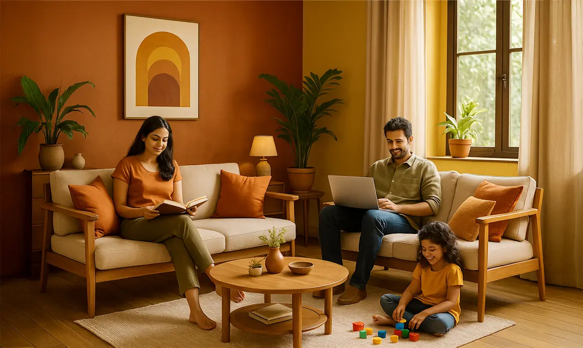
From monsoon to winter, and from festive celebrations to everyday living, warm-toned paint colours offer the perfect solution to transform your home into a vibrant, cosy, and emotionally uplifting space. They not only brighten up interiors during gloomy days but also resonate with cultural traditions, current design trends, and the psychological need for comfort and energy.
At Indicus, we understand the importance of colour in creating a home that reflects your personality and provides lasting comfort. Our ColourCraft palette offers a wide range of carefully curated warm shades, perfectly suited to the demands of this season.
Explore our range today and find the ideal warm tone to enhance your home’s character, inspire joy, and offer unparalleled comfort throughout the seasons. Your home deserves the warmth of colour that speaks to your heart.