
Do Home Interiors and Exteriors Need the Same Colour Palette?
Listen to the audio version of the blog here:
One of the most common questions homeowners ask during renovation or repainting is whether the interior and exterior of a home should follow the same colour palette. It’s a fair concern. After all, your home is a single structure shouldn’t the colours feel connected?
Colour coordination plays a significant role in how cohesive and considered a property appears. The exterior creates the first impression, while the interior shapes everyday experience. However, harmony does not necessarily mean uniformity. A well-designed home feels intentional, even if the colours inside and outside are not identical.
Understanding how to balance continuity and individuality is key to making the right choice.
Do They Need to Match?
The simple answer is no interiors and exteriors do not need to match exactly. What they require is visual harmony.
Matching colours wall-for-wall can make a home feel predictable or overly controlled. Instead, designers focus on creating relationships between shades rather than duplication.
Think of it this way:
- The exterior responds to climate, surroundings, and architectural style.
- The interior responds to mood, lighting, privacy, and lifestyle.
Because these conditions differ, the colours often should too. A façade exposed to strong sunlight may benefit from muted neutrals or dust-friendly tones, while interiors can embrace softer or deeper shades depending on personal comfort.
The goal is not sameness, it is balance.
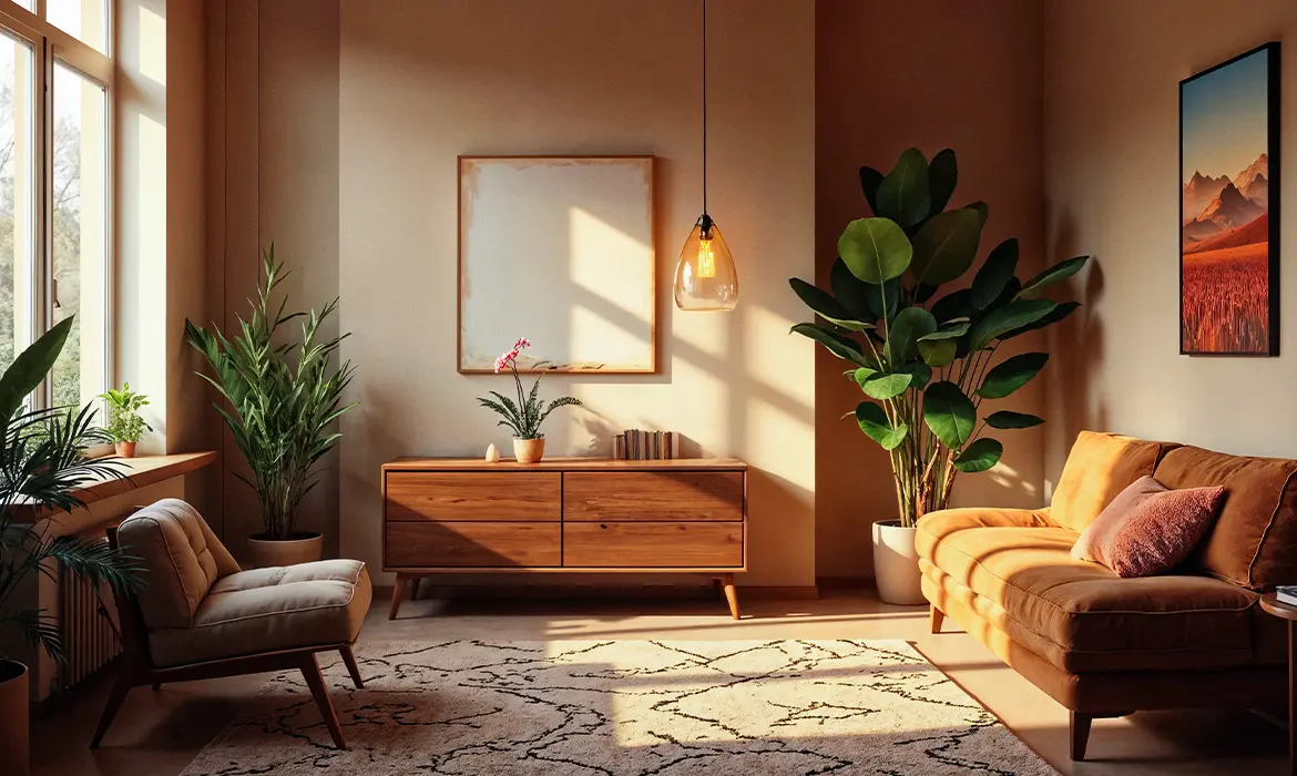
When a Similar Palette Works Well
There are certain architectural styles and layouts where maintaining a related palette inside and outside enhances the overall aesthetic.
Open Layout Homes
Homes with large windows, sliding glass doors, and open courtyards blur the line between indoor and outdoor spaces. In such cases, subtle colour continuity can create a seamless flow.
For example:
- A warm sandstone exterior paired with creamy beige interiors
- Soft greys outside transitioning into pale dove grey interiors
- Muted earthy tones continuing from façade to living areas
This approach works particularly well in modern villas and contemporary urban homes.
Neutral-Led Designs
Neutral palettes naturally lend themselves to subtle coordination. Shades such as:
- Off-white
- Taupe
- Soft greys
- Warm beiges
can be adapted in slightly varied intensities indoors and outdoors without feeling repetitive.
Modern minimalist homes often benefit from restraint. Repeating undertones across the property strengthens architectural clarity while maintaining sophistication.
In these cases, similar palettes enhance unity without overwhelming the design.
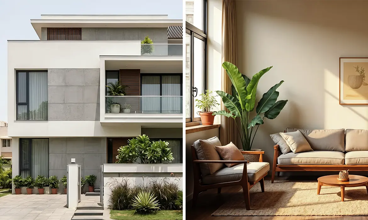
When Different Palettes Make Sense
There are many scenarios where using completely different palettes is not only acceptable but advisable.
Climate Considerations
Exterior walls endure harsh sunlight, rain, pollution, and dust. These factors influence colour selection more heavily outside than inside.
For instance:
- Lighter, reflective tones may be chosen for heat management.
- Mid-tone neutrals may help conceal dust and weathering.
Interior spaces, on the other hand, are shielded from these conditions and can prioritise comfort and personality instead.
Lighting Differences
Natural light outdoors is intense and dynamic. Indoors, lighting is controlled and often softer.
A deep blue or forest green that feels dramatic yet cosy inside might appear overpowering on a façade. Conversely, a pale exterior shade may feel too washed out in an interior room.
Privacy and Personal Style
Your exterior reflects the home’s architectural identity, while interiors reflect personal taste. A calm, neutral exterior might conceal bold or expressive interior choices and that contrast is perfectly acceptable.
In fact, many homeowners prefer:
- Understated façades
- More adventurous interior accents
- Distinct colour stories for bedrooms versus living areas
Difference does not mean disconnection, it simply reflects varied functions.
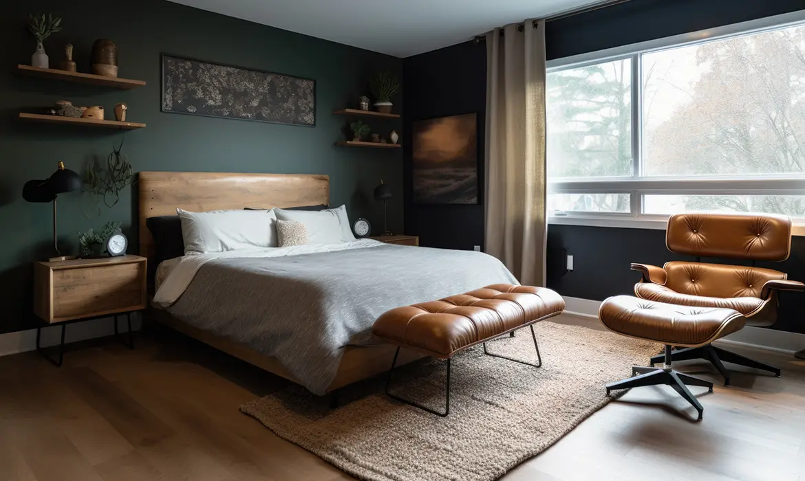
How to Create a Cohesive Look
Even when interior and exterior palettes differ, cohesion can be achieved through thoughtful strategies.
1. Focus on Undertones
Every colour has an undertone, warm, cool, earthy, or neutral. Ensuring that these undertones align across the property creates subtle continuity.
For example:
- A warm beige exterior pairs well with interiors that also lean warm rather than cool grey.
- A cool-toned grey façade works better with interiors featuring blue or neutral undertones.
This invisible link strengthens harmony.
2. Use Complementary Shades
Instead of repeating colours, choose shades that complement each other.
Some effective combinations include:
- Charcoal exterior with soft ivory interiors
- Muted terracotta façade with cream and sage interiors
- Slate grey exterior with warm wooden interiors
Complementary tones create interest while maintaining connection.
3. Create Transitional Moments
Transitional spaces such as:
- Entry foyers
- Verandahs
- Balconies
- Staircases
can serve as bridges between exterior and interior palettes. Introducing a shade here that references both areas ensures a smoother visual shift.
4. Maintain Material Consistency
Even if colours differ, repeating materials such as wood finishes, stone textures, or metal accents can unify the home.
For example:
- Wooden doors visible from outside connecting to similar wood tones indoors
- Brass or black metal fixtures repeated throughout
Material repetition reinforces visual flow.
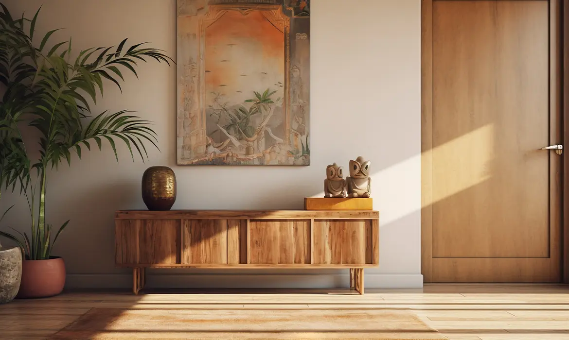
Emphasising Balance: Cohesion Without Uniformity
A cohesive home does not demand identical colours across every surface. Instead, it requires intentional design decisions that consider architecture, environment, and lifestyle.
To summarise:
- Interiors and exteriors do not need to match exactly.
- Visual harmony is more important than duplication.
- Similar palettes suit open and minimalist designs.
- Different palettes may better address climate and personal preference.
- Undertones, complementary shades, and transitions ensure balance.
At Indicus Paints, a thoughtful colour selection allows a home to feel unified yet dynamic. The exterior can maintain architectural dignity and weather resilience, while the interior reflects warmth, individuality, and comfort.
Ultimately, successful colour planning is about dialogue between inside and outside, light and shade, structure and style. When approached with intention, your home can achieve cohesion without sacrificing character. Because in design, harmony is not about sameness it is about balance.