
Unexpected Colour Combinations That Work Beautifully in Indian Interiors
Indian homes have always celebrated colour. From the vibrant blues of Rajasthan to the soft earthy hues of Kerala’s traditional architecture, colour has long been at the heart of Indian design. As modern interiors continue to evolve, homeowners are increasingly exploring palettes beyond the familiar. Today, the best interior colour combinations are those that feel both expressive and effortlessly harmonious, bringing fresh personality and balance into every space.
Pairing contrasting tones or blending bold and subtle shades can transform spaces, making them feel fresh, stylish, and deeply personal. With Indicus Paints’ extensive range of shades curated for Indian homes and climates, creating these beautiful, unconventional pairings becomes effortless.
The Beauty of Contrast: Breaking the Monotony
When chosen thoughtfully, contrasting colours can create a sense of visual excitement without overwhelming a space. Instead of sticking to similar tones, blending opposites brings energy and depth to interiors.Contrast works because it plays with visual tension, the eye moves between light and dark, warm and cool, muted and bright, creating a space that feels alive.Some stunning contrast combinations for Indian homes include:
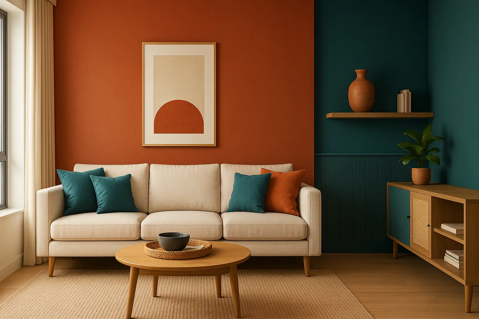
- Terracotta and Teal: The earthy warmth of terracotta beautifully offsets the cool sophistication of teal, making it ideal for living rooms or entryways.
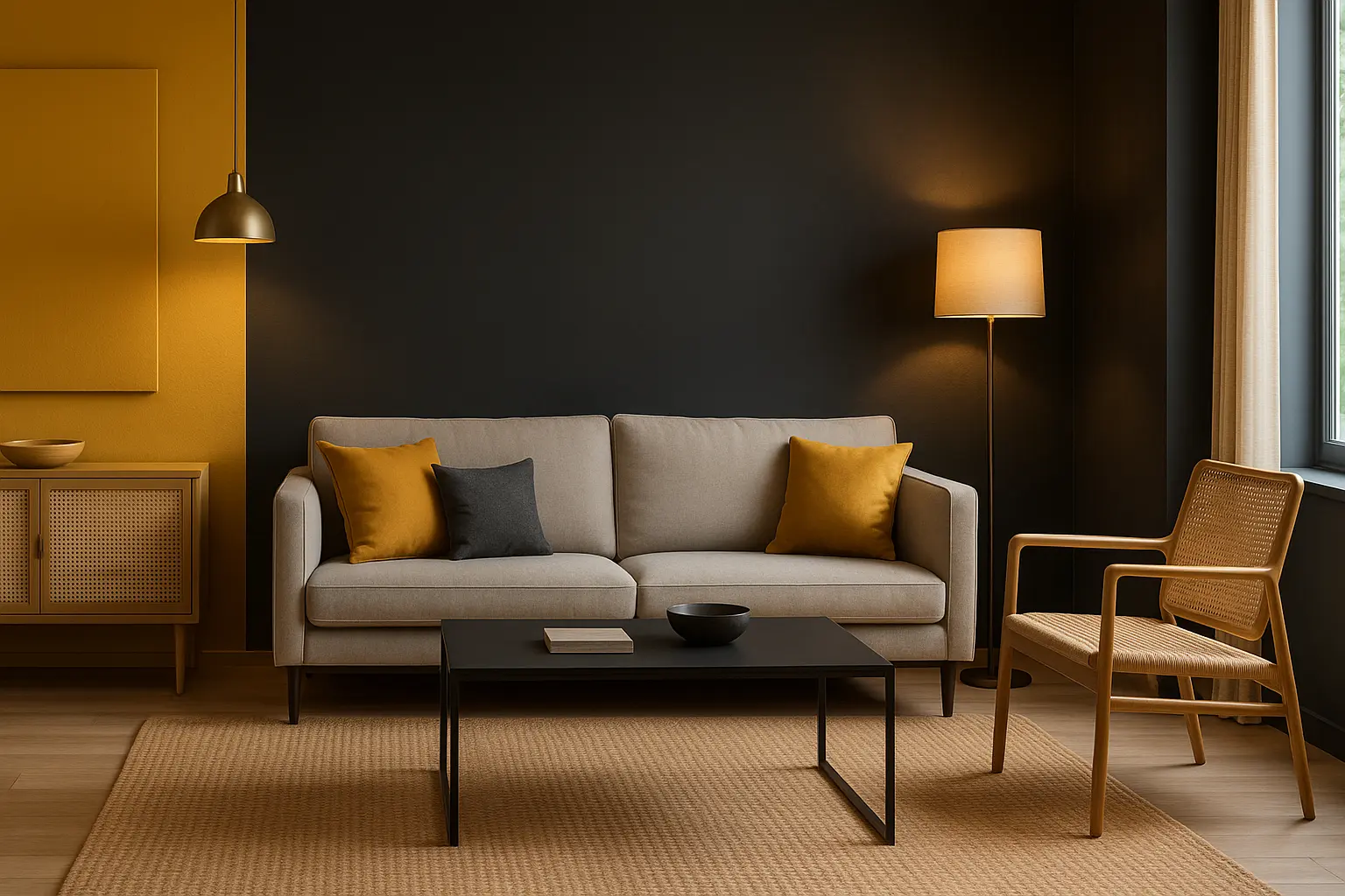
- Mustard and Charcoal Grey: A bold, modern contrast that combines vibrancy with grounded elegance.
- Olive Green and Blush Pink: Soft yet unexpected this pairing adds freshness to bedrooms or quiet corners.
When working with contrast:
- Use one dominant shade (for walls or furniture) and keep the other as an accent.
- Add natural textures through wooden furniture or woven accents to help tie both wall colours together and create a unified, grounded look.
- Ensure lighting complements both hues and warm lighting enhances richer tones.
Soft Meets Bold: Balancing Subtle and Statement Shades
Another way to achieve an unexpected but beautiful look is by pairing a soft neutral base with a bold accent shade. This technique gives the room character while keeping it visually balanced.
Neutrals provide calmness and space for bold shades to shine and this works wonderfully in Indian homes that need both comfort and personality.
Try these pairings for your interiors:
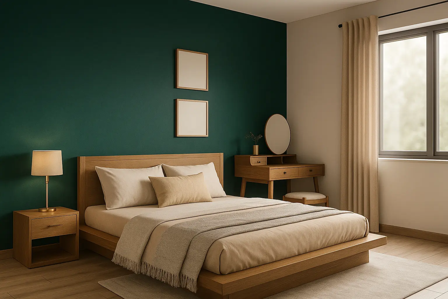
- Beige with Emerald Green: Creates an elegant, nature-inspired aesthetic that feels luxurious yet grounded.
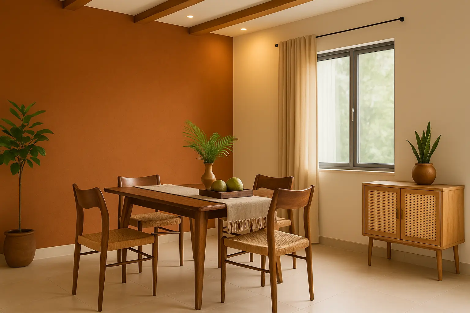
- Soft Grey with Burnt Orange: Adds warmth and vibrancy, perfect for living rooms or dining areas.
- Ivory with Deep Indigo: A timeless duo that reflects both tradition and sophistication.
Styling Tips:
- Use bold shades on a feature wall, headboard backdrop, or statement furniture piece.
- Keep accessories with minimal brass accents or ceramic décor pieces that work beautifully.
- For compact spaces, use the bold hue sparingly to maintain balance.
Earthy Indian Hues with Modern Neutrals
India’s design sensibility has always embraced earth tones colours inspired by clay, spice, and nature. When paired with contemporary neutrals, they create a beautiful balance between the traditional and the modern.
This approach suits homes that carry cultural touches like handcrafted tiles, carved furniture, or brass detailing while maintaining a minimalist look.
A few effective combinations include:
- Clay Brown with Cool White: A warm, grounded tone balanced by crisp freshness.
- Turmeric Yellow with Stone Grey: Perfect for adding brightness without being too loud.
- Brick Red with Off-White: Classic and comforting, yet timelessly stylish.
Design Note:
- Use matte finishes for earthy tones to preserve their natural charm.
- Add textured fabrics like linen or cotton in neutral shades to complement the palette.
- Choose Indicus Paints’ range of natural-inspired hues, designed to withstand humidity and sunlight, keeping your walls vibrant through the seasons.
Playing with Monochrome Accents
For those who prefer a minimalist aesthetic, monochrome interiors can be surprisingly expressive when layered with subtle variations of a single colour. The key is to play with shades, textures, and finishes to avoid flatness.
Monochrome doesn’t mean just black and white. You can create depth using gradients of one hue from dark to light that work harmoniously.
Examples of modern monochrome pairings:
- Charcoal with Silver Grey: Ideal for a sophisticated, urban living space.
- Sand Beige with Warm Cream: A soft and inviting palette for bedrooms or lounges.
- Slate Blue with Sky Blue: Adds serenity and subtle character to compact spaces.
Ways to bring dimension to monochrome palettes:
- Use different wall finishes matte for the main walls, satin for trims or borders.
- Incorporate metallic accents like brushed gold or copper for warmth.
- Layer fabrics and décor cushions, rugs, and curtains in varying tones of the same colour.
Indicus Paints’ modern neutrals and monochrome collections make it simple to achieve this look, ensuring seamless blending between tones.
Finding Inspiration from Indian Elements
India’s landscape, crafts, and architecture offer endless inspiration for colour pairing. From the deep reds of temple bricks to the serene whites of coastal homes, every region has its own visual story. Translating these inspirations into paint combinations allows your interiors to reflect a piece of that heritage.
You can draw colour ideas from:
- Traditional Crafts: Think Rajasthani block prints, Madhubani art, or Kanchipuram silk these patterns often feature striking colour juxtapositions.
- Natural Elements: The burnt sienna of Indian soil, turmeric yellow from the spice markets, or the green of tropical foliage.
- Regional Architecture: Jaipur pinks, Udaipur whites, or the bold blue of Jodhpur’s houses each offer timeless palettes.
Bringing these to life with Indicus Paints:
- Explore curated collections inspired by Indian environments and materials.
- Choose finishes that suit your regional climate matte for cooler tones, weather-resistant emulsions for warm or humid areas.
- Blend traditional hues with modern textures for a balanced, enduring aesthetic.
This approach doesn’t just create stylish spaces it builds a sense of connection to India’s artistry and environment.
Conclusion
When it comes to home design, beauty often lies in the unexpected. Whether it’s pairing terracotta with teal, mustard with grey, or earthy browns with contemporary whites, unconventional combinations can bring warmth, character, and individuality to your interiors.
By balancing contrast, texture, and tone and drawing inspiration from India’s diverse palette you can create spaces that feel both modern and rooted in tradition.
With Indicus Paints, finding that perfect balance becomes effortless. Our wide range of shades and finishes are designed specifically for Indian homes, ensuring each wall tells a story that feels authentic, vibrant, and enduring. Because the most beautiful Indian interiors are often painted with a touch of surprise.